Seasonal Color Analysis for Dark Skin Tones: Palettes and Contrast
 Reviewed by Alexandra Gilmore
Deep skin can belong to many seasonal palettes. Compare undertone, color clarity, and contrast with fabric in daylight.

Seasonal color analysis for dark skin starts with the temperature, clarity, and contrast of your coloring—not with an assumption that deep skin must be a “deep” season. Rich surface melanin can sit alongside warm, cool, or neutral-olive undertones. Deep Winter and Deep Autumn are useful possibilities, but Bright Winter, Warm Spring, and even a softer Summer direction can also be worth testing. Compare saturated jewel tones with rich earthy warms beside your face, then compare crisp contrast with softened combinations. The most convincing palette makes your features easy to see in consistent daylight; no single skin-depth label can choose it for you.
This guide focuses on clothing and accessory decisions for Black women and anyone with a deep or richly pigmented complexion. It explains how to look beneath an overall brown skin color without pretending that an at-home test can measure a biological undertone. For a wider overview of skin-depth terms and swatches, see the dark skin tone palette guide. Here, the question is which seasonal color relationships work best on your face.
Debunking the Myth: Dark Skin Isn't Just “Deep Autumn”
In seasonal analysis, depth describes how dark or light a palette's characteristic colors are. It is not a restriction on who may wear that palette. A person with dark brown skin can have striking contrast between skin, eyes, hair, and teeth; another can have a beautifully blended, low-contrast impression. The same depth of surface melanin can appear more golden, red-brown, blue-red, or olive in different people and in different light. Those observations lead to different fabric comparisons.
Melanin is a major contributor to visible skin color, but skin color is also affected by other pigments and light reflected from tissue. A review of normal skin color describes that blend; a review of pigmentation in ethnic skin documents the diversity of pigmentation and color perception. Neither paper validates fashion “seasons” as a biological diagnosis. Seasonal color analysis is a visual styling framework: it compares colors near the face and helps organize repeatable clothing choices.
That distinction matters because “all dark skin is Winter” and “all brown skin is Autumn” are shortcuts that can hide useful evidence. A vivid cobalt shirt may make one person's features look clear, while a softened deep teal may feel more balanced on another. A terracotta scarf can harmonize with golden warmth yet look disconnected from a cool red-brown complexion. Start with differences you can actually see in paired fabrics, then use a season name as a compact description of the winning pattern.
How to Find Your Undertone with Deep Complexions
Undertone is the relatively persistent color direction you notice beneath the surface appearance: often described as warm, cool, or neutral-olive. Overtone is the more immediate surface impression, which may shift with lighting, sun exposure, or cosmetics. These are styling terms, not precise medical measurements. Under high surface melanin, a quick glance at the wrist may not tell the story. You will learn more from controlled comparisons near your face.
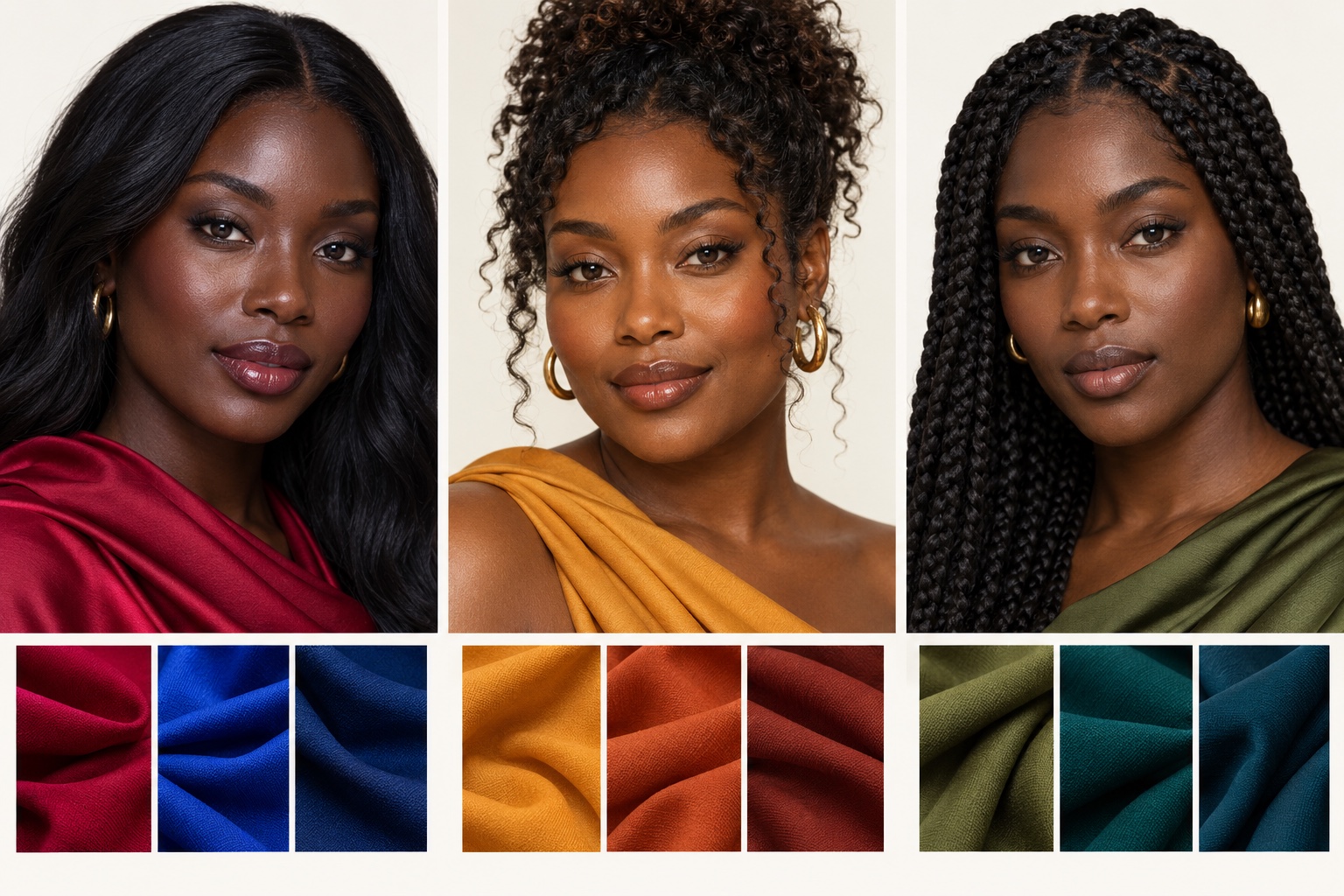
Look for a pattern across several colors
A warm direction may read golden, amber, or yellow-brown, and may connect well with terracotta, marigold, honey mustard, and warm ivory. A cool direction may have a red-brown, blue-red, or plum impression and may gain clarity beside cobalt, blue-based ruby, fuchsia, and cool white. A neutral-olive direction may have a subtle green-gray cast; it can sit between warm and cool, and its best colors may be clear or muted depending on the person's contrast. “Olive” does not automatically mean warm. If both sets appear plausible, test depth and clarity before forcing a temperature label.
Metal tests are clues, not verdicts. Compare yellow gold and silver near the face at the same size and shine; then compare warm bronze with cooler gunmetal. A reflective polished metal may work because of contrast even when its temperature is not your strongest. Wrist veins can also be difficult to see through richly pigmented skin and are affected by light and anatomy. For a repeatable fabric-led procedure, use the daylight undertone comparison for deeper skin; for mixed results, the olive undertone comparison offers a closer look.
A five-minute daylight draping check
Stand facing a window with indirect daylight, and turn off colored lamps. Keep your position and camera exposure fixed if taking photos. Remove a bright scarf or makeup color that could bias the comparison, if practical. Hold each fabric directly below your chin for several seconds. Compare a vivid cool pair such as cobalt and blue-red with a rich warm pair such as terracotta and golden ocher. Then compare a crisp pairing such as cobalt with optic white against a softer pairing such as muted teal with cream. Look for whether your eyes and facial contours stay distinct, whether shadows appear heavier, and whether the garment pulls attention away from your face.
Repeat once on another day. Fabric finish matters: shiny satin, matte cotton, and textured knit reflect light differently. So do white balance and phone filters. If the results change with lighting, keep the shortlist broad and buy no full seasonal wardrobe yet. The goal is a reliable clothing decision, not a perfect label from one photograph.
The Seasonal Categories for Dark Skin
The seasonal directions below are useful starting points. They describe combinations of temperature, depth, and clarity, not fixed skin-color categories. The 12-season comparison chart shows the broader map once you know which contrast and temperature comparisons are most convincing.
Deep Winter: cool, dark, and defined
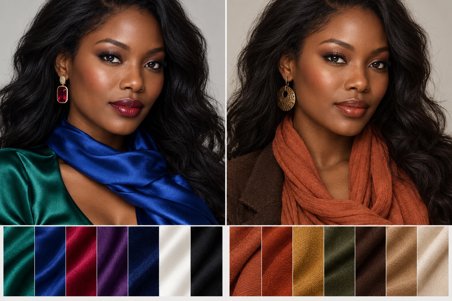
Deep Winter often works when cool, dark colors and clean contrast keep the face distinct. Test emerald, sapphire, blue-based ruby, deep plum, black, and crisp white. Against deep skin, black may feel striking rather than harsh, but that is not automatic. Compare it with deep chocolate or charcoal. If bright cobalt improves the result more than dark navy, explore a brighter Winter direction instead of choosing “deep” solely because your skin is deep.
Deep Autumn: warm, dark, and rich
Deep Autumn is a candidate when rich earth colors look integrated with golden or warm brown coloring. Try terracotta, rust, warm forest green, bronze, chocolate, and creamy ivory. The palette's depth can provide definition without the icy edge of optic white or vivid fuchsia. Test a chocolate jacket and an inky navy jacket in the same light: if the chocolate looks grounded while navy seems disconnected, the warm dark direction deserves a closer look.
Bright Winter: cool and vividly clear
Some people with deep complexions look most alive beside clear, high-chroma color rather than the darkest version of that color. Bright Winter can include electric cobalt, vivid raspberry, saturated emerald, and stark black-and-white combinations. A cobalt cape with magenta can make the face the center of a bold outfit if its clarity echoes the person's natural contrast. Compare vivid cobalt with muted slate blue: if the slate looks flat and cobalt looks coherent, clarity may be the stronger clue.
Warm Spring or Soft Summer: when warmth or softness leads
Warm Spring is worth testing when clear warmth works better than deep autumnal spice: coral, warm turquoise, fresh green, golden yellow, and cream. A person can have deep skin and still prefer this lighter, lively color energy. Soft Summer is a possible direction when cool, muted rose, dusty berry, soft teal, and gentle charcoal look more natural than hard black or neon. Skin depth does not rule it out; only paired draping can show whether softness, coolness, and lower contrast are the consistent pattern.
| If this pair wins near your face | Explore first | Check against |
|---|---|---|
| Cobalt and crisp white | Bright or Deep Winter | Muted slate and cream |
| Ruby and emerald with black | Deep Winter | Terracotta and chocolate |
| Terracotta and warm forest with chocolate | Deep Autumn | Blue-red and charcoal |
| Coral and warm turquoise with cream | Warm Spring | Rust and olive |
| Dusty berry and soft teal with charcoal | Soft Summer direction | Vivid fuchsia and stark white |
Use the table as a decision path, not a diagnosis. A person may like a color from each row. Look for the group that repeatedly gives the most balanced result across several fabrics. If two rows remain close, keep both in your wardrobe and refine the exact shades with time.
High-Contrast vs Rich-Muted Styling
Contrast is the difference in lightness or color intensity between the face, hair, eyes, and clothing. Richly pigmented skin does not create one universal contrast ratio. Deep brown skin with very dark hair and bright whites of the eyes can create a distinct, high-contrast impression. Another person with soft brown eyes, dark brown hair, and a more blended overall effect may feel more comfortable in close, rich values. This is a visual styling observation, not a numerical score to infer from a selfie.
For high-contrast styling, try a saturated jewel-tone top with a clear neutral: cobalt and black, emerald and white, or ruby and deep charcoal. The edges of the outfit remain deliberate. For a rich-muted approach, try ocher and chocolate, moss and warm beige, or dusty berry and soft charcoal. The color can still be deep; “muted” means less intense, not pale or dull. Choose the arrangement that supports your face while fitting your taste and context.
Place two folded shirts or scarves under the chin, one at a time, while keeping makeup and hair placement constant. Compare a crisp cobalt against a smoky navy, then a vivid emerald against a softened forest green. If the clear colors make facial features easier to notice, explore high chroma. If the softer colors let the face remain central, explore muted options. The low-contrast face guide expands on outfit contrast without tying it to skin depth.
Best Clothing Palettes and Metals
Best clothing colors for brown skin are individual. Build a small test rack rather than a universal list: emerald, cobalt, ripe cherry, honey mustard, terracotta, deep teal, ivory, chocolate, and charcoal. Put each color close to the face under the same light. Emerald can be blue-green and crisp or yellow-green and soft; “cherry” can be cool ruby or warm tomato. The actual textile is more informative than the name on a product listing.
A cool, high-contrast capsule could start with black trousers, an emerald shirt, a cobalt jacket, and a silver accessory. A warm, rich capsule could use chocolate trousers, terracotta knitwear, warm ivory, and gold. A softer neutral-olive capsule might pair deep teal, olive, mushroom, and antique metal. For outfit combinations after you identify a palette, see the clothing color matching guide and the seasonal capsule wardrobe guide.
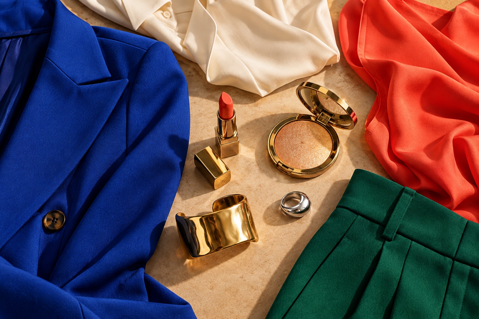
Jewelry is easiest to judge with a matched comparison. Hold similarly sized gold and silver pieces at the jawline. Compare their effect on the face, not the shine of the object alone. Then try brushed bronze or pewter if both polished metals feel too stark. Makeup can be tested the same way: blue-red versus coral-red lipstick, cool berry versus warm bronze blush, and a neutral highlighter against a gold one. Choose products by your preferred finish and the result in daylight; a color season need not dictate every cosmetic purchase. The gold-versus-silver jewelry guide gives a fuller method.
Colors That Make Dark Skin Look Ashy or Dull
“Ashy” here describes a visual effect of a fabric or cosmetic shade, not the health or value of anyone's skin. A gray-dusted pastel can appear disconnected if a person's coloring is clearer and stronger. A very pale beige without enough warmth or depth may merge awkwardly with some brown complexions. A muddy khaki may flatten a face that responds to clean jewel tones. On a different person, a dusty rose, quiet beige, or soft khaki can look elegant. The effect belongs to the specific shade and styling context.
When a color seems to drain definition, compare a nearby alternative rather than banning an entire hue. Trade chalky lavender for saturated plum; compare pale gray-beige with warm ivory or deeper camel; put muddy khaki next to clear emerald or richer olive. If the muted sample wins, keep it. You can also move a difficult color to trousers, shoes, or a bag and place a stronger collar color next to your face. This is a practical way to use a favorite item without rebuilding your closet.
Foundation deserves its own test because pigment, coverage, and oxidation can create a gray cast unrelated to clothing. Match depth first, then compare warm, cool, and olive undertones along the jaw in daylight. The olive foundation guide and foundation shade matching guide address that separate decision.
Dark Skin Color Analysis FAQ
Can dark skin have an olive undertone?
Yes. Olive is a possible color direction at many skin depths. On deep skin it may read as subtle green-gray beneath the brown surface, but photographs and vein color alone are unreliable. Compare olive, muted teal, warm terracotta, and cool berry fabrics near your face in the same daylight. The winning group tells you more about wardrobe choices than a single undertone label.
Does tanning or getting lighter change my season?
Surface depth can change with sun exposure or lighting, which may change how much contrast you enjoy in an outfit. It does not necessarily reverse your persistent warm-cool response. Recheck your favorite colors near the face if your appearance changes, and adjust garment depth or contrast as needed. Avoid using sun exposure as an undertone test.
Should everyone with dark skin wear gold jewelry?
No. Gold can look striking against deep skin, and so can silver, pewter, rose gold, or mixed metals. Compare equal-size pieces in neutral daylight and judge how they frame your face. Your preference and the outfit's color balance matter too. Metal color is a useful clue, not a rule attached to skin depth.
Is black always the best dress color for dark skin?
Black creates strong contrast for many people, but it may look too severe on someone who prefers softened color relationships. Compare a black dress with deep chocolate, ink navy, and charcoal in the same fabric finish. If black wins, wear it confidently. If another dark neutral helps the face stand out more, that is just as valid.
What if I cannot see my wrist veins?
Skip the vein test. Vein visibility varies with skin and lighting and does not determine whether color analysis can work for you. Near-face fabric comparisons are more directly related to clothing decisions. Start with one cool-versus-warm pair and one clear-versus-muted pair, then repeat the comparison on another day.
What is the next step if two seasons still fit?
Keep the overlap colors and compare the disputed dimension. If Deep Winter and Bright Winter both seem plausible, test dark navy against electric cobalt. If Deep Winter and Deep Autumn are close, compare cool ruby with warm terracotta. Our interactive color analysis quiz can provide another starting hypothesis; confirm it with your own fabrics and daylight observations before making large purchases.
Begin with four garments already in your closet: one vivid cool, one rich warm, one soft cool, and one neutral. Photograph each under the same light, identify the color that supports your face most consistently, and build outward from that result. Dark skin offers many possible seasonal directions, and a useful palette is the one you can see working in real life.
💫 Discover Your Complete Color Palette
Use your results as a starting point for comparing real clothing colors in daylight.
Take Color Analysis Quiz →📚 Recent Articles
Compare all 12 seasonal palettes, learn a fabric-led undertone test for dark skin, or build a seasonal capsule wardrobe.