Clothing Color Matching 101: Rules, Contrasts, and Color Wheel
 Reviewed by Alexandra Gilmore
Use the color wheel, contrast, and neutral anchors to build clothing combinations that feel intentional.

Matching clothing colors starts with a color wheel and a clear balance of contrast. Choose one of four reliable schemes: monochromatic shades of one hue, analogous neighbors, complementary opposites, or a three-point triad. Then give the eye a place to rest with a neutral such as ivory, gray, beige, or navy. Keep the temperature and intensity of your main colors reasonably consistent, or use a neutral to separate pieces that feel discordant. These rules are a starting framework, not a ban on unexpected pairings: proportion, fabric, lighting, and your own coloring all affect the final outfit.
If you have wondered how to match clothes colors without buying a new wardrobe, begin with two pieces you already wear. Identify each color's hue, lightness, and saturation, then choose a scheme below. A color wheel helps explain the relationship; a mirror in daylight tells you whether the actual garments work together. For a broader view of personal coloring, see our seasonal color analysis introduction.
The Fashion Color Wheel Explained
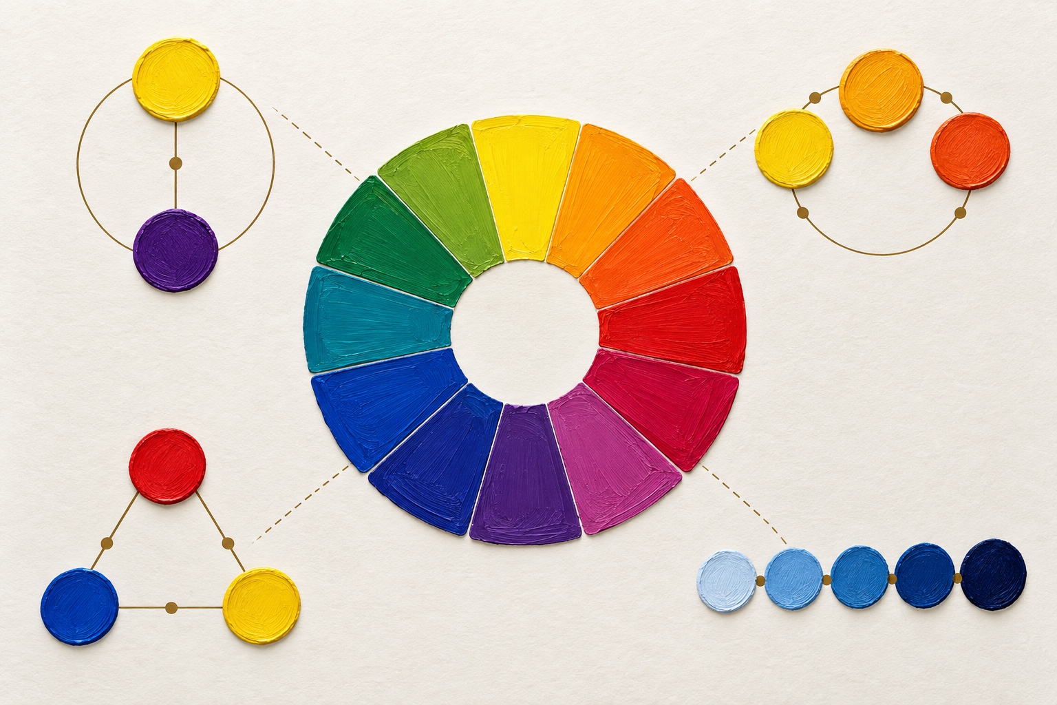
The traditional color wheel arranges hues in a circle. Red, yellow, and blue are the familiar primary colors in a painter's model; mixing neighbors produces secondary colors such as orange, green, and violet, while intermediate mixtures create tertiary colors such as yellow-green and blue-violet. This model is a useful visual map for clothes, although dyed fabric and screens do not follow perfectly simple paint-mixing rules. Use the wheel to find relationships between hues, not to predict an exact garment color from a tiny digital swatch. Adobe's color wheel reference illustrates these standard relationships.
Opposite points on the wheel create a complementary relationship; neighboring points create an analogous relationship. Three roughly evenly spaced points form a triadic color scheme. A monochromatic outfit stays within one hue family and changes its lightness, darkness, or saturation. These four color wheel harmonies give you options from quiet to vivid. The more hues you add, the more deliberately you need to manage their proportions and contrast.
Look beyond hue: value and saturation
Hue is the color family, such as blue or orange. Value is how light or dark it appears. Saturation, also called chroma, is how vivid or muted it is. A pale powder blue and a deep midnight blue share a hue family yet create different levels of contrast against cream. A bright cobalt blouse can overpower muted dusty olive even if the wheel suggests an interesting relationship. When a pairing feels wrong, ask whether hue is really the problem or whether one item is much brighter, lighter, or darker than the other.
Color temperature offers another clue. Yellow-leaning reds, oranges, and many olives read warmer; blue-leaning reds, icy blues, and cool grays read cooler. A color name alone cannot fix temperature: a warm teal and a blue-green teal may behave differently. Put garments side by side in the same daylight and compare their undertones. For examples of how one hue changes with context, our green clothing combinations guide explores olive, emerald, and other greens.
4 Foolproof Color Schemes for Daily Outfits
These schemes describe the relationship between colored pieces. They do not demand that every accessory repeat the same formula. Start with a main garment, choose one partner color, and decide whether the outfit needs a neutral anchor. A small accent can supply the second or third hue if you prefer a restrained look.
1. Monochromatic: one family, several depths
A monochromatic look might combine an oatmeal shirt, camel trousers, and a deeper tan coat. Its success comes from visible differences in value and texture, not from forcing every item to match exactly. Navy trousers, a cornflower shirt, and a dark denim jacket offer a blue version. Give adjacent pieces enough separation that they look intentional rather than like near matches from different dye lots. A crisp shirt against brushed wool or smooth denim adds depth when the hues are close.
2. Analogous: neighboring colors
Analogous colors sit beside each other on the wheel. Olive and teal, blue and blue-violet, or rust and golden ocher can make an outfit feel connected without becoming one-color dressing. Keep one hue dominant and let the neighbor occupy a smaller area. For example, use an olive jacket over a teal knit with charcoal trousers. If both colors are muted, the harmony stays quiet; if both are bright, the same relationship reads bolder.
3. Complementary: controlled opposites
Complementary colors face each other on the wheel, which creates visual energy. Navy and rust are a wearable, softened version of blue and orange. Burgundy with an olive-green accent can work similarly when both are deep and restrained. Avoid assuming every opposing pair must cover equal areas. A navy suit with a rust scarf is easier to balance than a fully saturated blue jacket over fully saturated orange pants. Let one color lead and use the other as an accent or a muted variation.
4. Triadic: three spaced hues, one leader
A triad uses three areas of the wheel. Burgundy, mustard, and navy can make a rich outfit when navy occupies the largest area, burgundy comes second, and mustard appears only in a scarf or small bag. A triad with three equally bright, equally large garments is harder to wear because the eye has no clear priority. If your first attempt feels busy, reduce the saturation of one piece, replace a garment with a neutral, or move the third hue into an accessory.
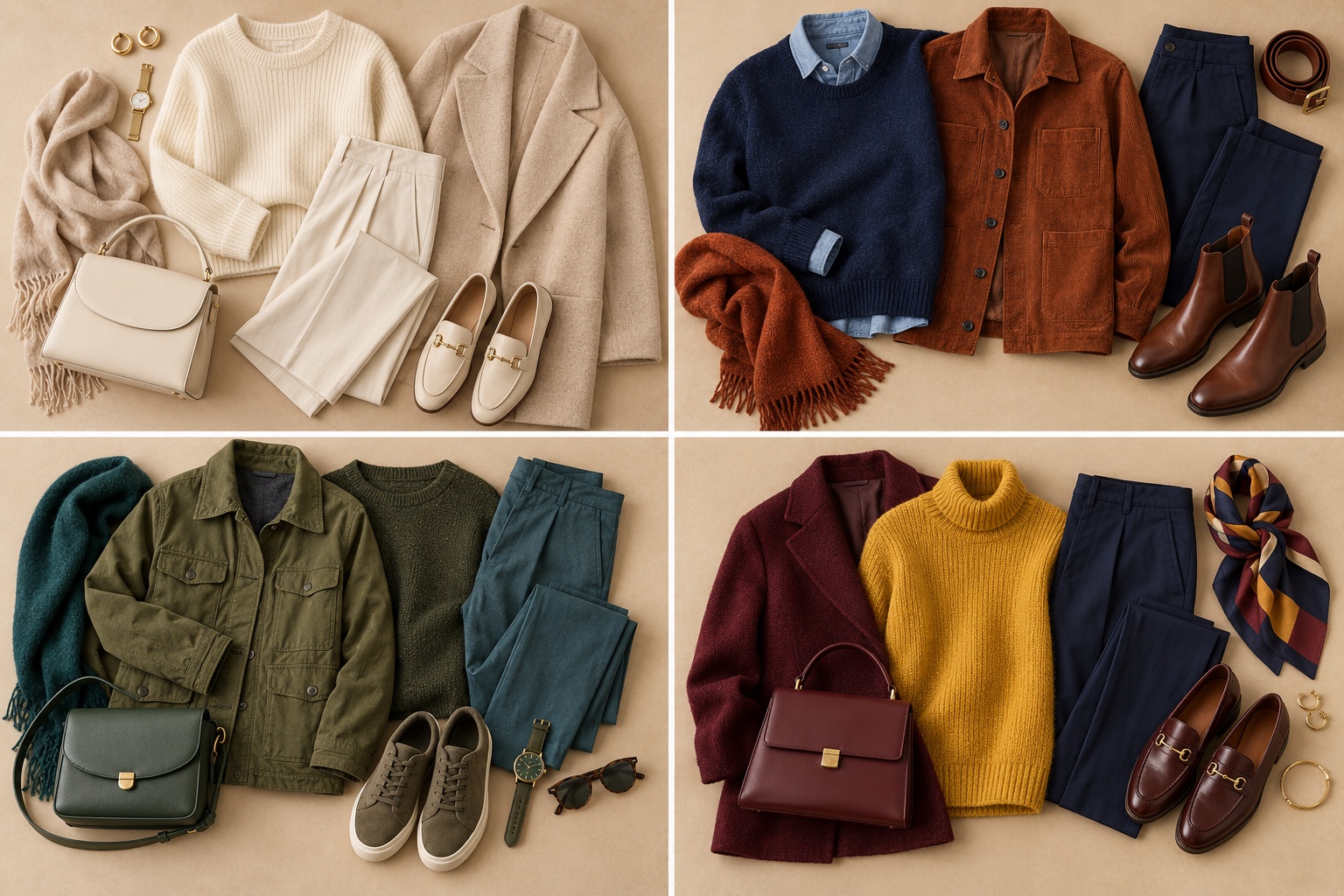
Try each formula with clothes you own before shopping. Photograph the outfits in consistent daylight and compare them side by side. The most useful result is not that a theoretical scheme is “correct”; it is that you learn which level of contrast and color area you enjoy wearing. Our wardrobe color chart guide can help turn successful pairings into repeatable outfits.
The Role of Neutral Buffers
A neutral buffer is a garment or visible layer that separates stronger colors and provides a calm area. White, ivory, beige, gray, charcoal, and navy can all serve this purpose, but they are not interchangeable. White tends to sharpen a bright pairing; cream softens it. Cool gray can support blue-violet; warmer beige often supports rust and olive. Navy supplies a dark anchor, though it still has a blue hue. Choose the neutral for the specific colors and occasion.
Imagine a vivid orange jacket and saturated blue trousers. Put a white T-shirt between them and the high-contrast edge moves away from the face while the outfit gains breathing room. A gray blazer over the shirt can soften the total color area further. Alternatively, keep the jacket and replace the blue trousers with navy. The complementary idea remains, but its saturation and value become easier to manage.
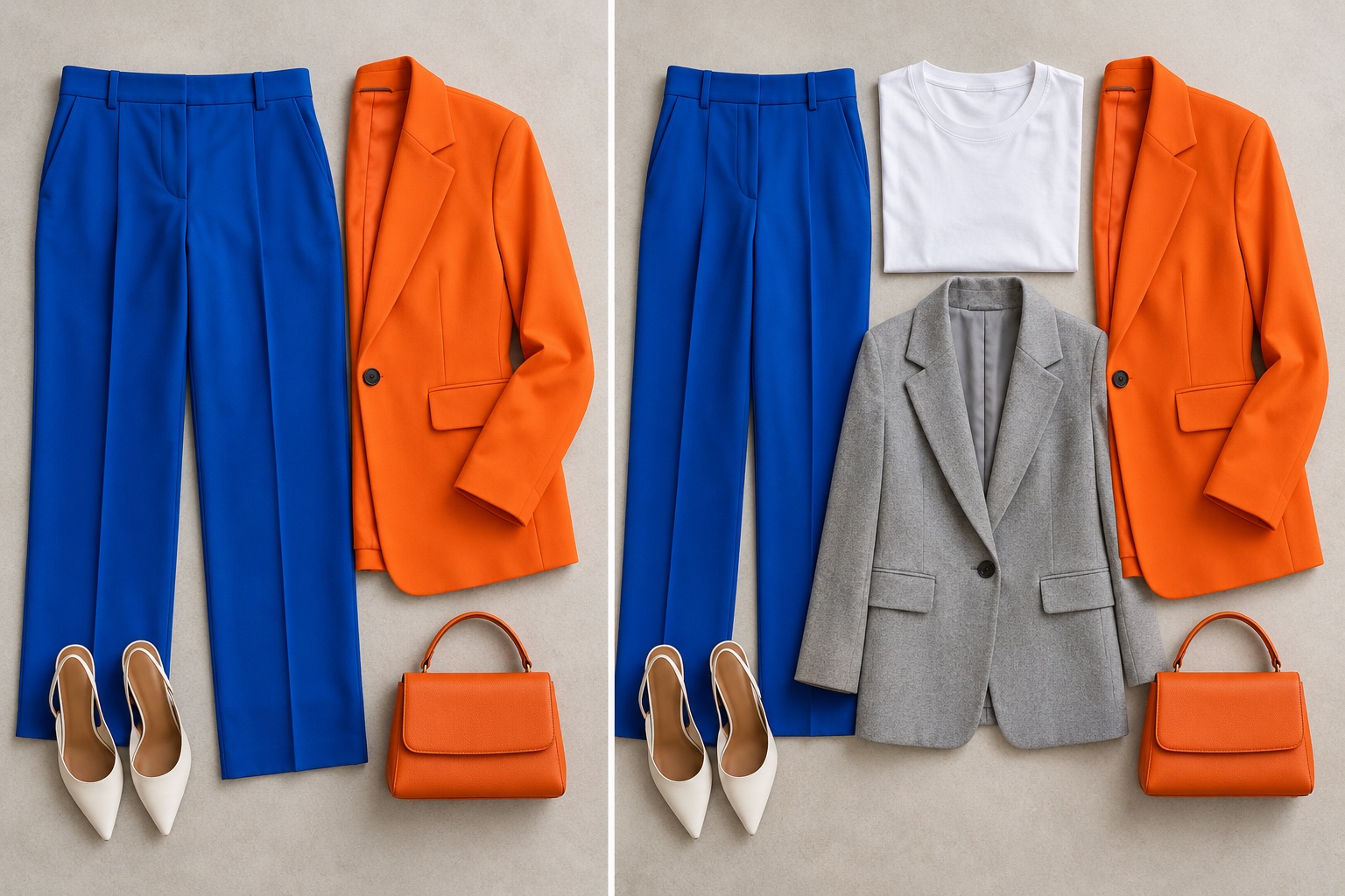
A buffer can be small. An ivory collar between a bright scarf and a dark jacket, a tan belt at the waist, or a neutral shoe can stop two strong colors from competing at every edge. Repeating a neutral in more than one place, such as a cream shirt and cream sneakers, makes the outfit feel connected. For a detailed dark-neutral example, see what colors go with navy clothes.
Choose a contrast level before adding color
Contrast is the visible difference between elements. A white shirt under a black jacket creates high value contrast even without a vivid hue. Camel with cream makes a lower contrast combination. You can keep color contrast high and value contrast moderate, as with a medium rust scarf on medium navy; or keep color subtle and value contrast high, as with pale blue against deep blue. Decide which kind of contrast you want the eye to notice first. If an outfit feels loud, lower one variable rather than removing all color.
Temperature Harmony: Never Clash Warm and Cool
The heading is a reminder to check undertones, not an absolute prohibition. Warm and cool colors can look excellent together when their roles are clear. The potential clash happens when two pieces have similar visual strength but very different undertones and no bridge. A cool icy blue blouse against a yellow-orange terracotta jacket can look disconnected; adding charcoal trousers, a cream top layer, or an accessory that repeats one hue may connect the parts.
To compare temperature, place two garments together near a window with no colored light. Ask whether one makes the other look dull, gray, or unexpectedly orange. Then try a neutral layer between them. A warm beige may reinforce terracotta, while cool gray may reinforce blue. Ivory can sometimes bridge both because it introduces warmth without the strong yellow cast of some creams. There is no universal “warm with warm only” rule: proportion and saturation can make a mixed-temperature look deliberate.
Personal color analysis adds another question: which garment sits near your face? A cool blue pair of pants can coexist with a warm top; a cool blue scarf at the neckline may have a different effect on the same wearer. If you want to explore your preferred near-face colors, start with the interactive color analysis quiz, then confirm ideas with real garments in daylight. Your palette can guide shopping, while the outfit still needs its own internal balance.
Fabric Texture & Color Perception
The same named color appears different across materials. Matte cotton scatters light and often looks flatter or softer. Satin or silk throws highlights and shadows, so a burgundy dress can appear brighter at the folds and deeper between them. Coarse wool creates tiny dark spaces in the weave, which can make a color appear more muted or complex. Denim wash, pile direction in velvet, and transparent layers add still more variation. That is why a digital color chip is only a starting point for matching clothes.
Use texture to control intensity. If a glossy teal blouse and shiny rust skirt feel too forceful together, swap one for matte cotton, brushed wool, or washed denim. In a monochromatic outfit, do the reverse: mix a smooth piece with a textured one so similar beige tones do not collapse into a single flat block. Consider finish when matching accessories too. A metallic gold shoe catches more light than a matte tan leather shoe even if both seem warm in a product photo.
Check a full outfit while standing, not only as a flatlay. Fabric drape changes which colors touch, how much each color occupies, and where shadows fall. A rust scarf that looks tiny on a table may become the strongest color near your face. A long navy coat can cover most of an analogous outfit. Take a quick full-length photo in daylight and adjust the layer, fold, or accessory size before deciding the colors themselves fail.
Outfit Color Formula Cheat Sheet
Use these ten clothing color combinations as tested starting arrangements, then change depth or saturation to fit your garments. The table says what leads, what supports it, and how to keep the look balanced. It is a decision tool for assembling an outfit, not a claim that the exact shades flatter every person.
| Formula | Main pieces | Balance move |
|---|---|---|
| 1. Soft monochrome | Cream shirt + camel trousers + tan coat | Separate close shades with knit, leather, and wool textures. |
| 2. Blue monochrome | Pale blue shirt + navy pants + medium denim | Keep the three blue values visibly different. |
| 3. Quiet analogous | Olive jacket + teal sweater + charcoal pants | Let olive lead; choose similarly muted colored pieces. |
| 4. Cool analogous | Blue shirt + violet scarf + gray skirt | Use violet as an accent, not an equal-size panel. |
| 5. Warm analogous | Rust top + ocher accessory + dark brown pants | Ground the neighboring warm hues with brown. |
| 6. Soft complement | Navy jacket + rust scarf + ivory shirt | Put the opposite hue in a smaller accessory. |
| 7. Bright complement | Cobalt top + orange bag + white jeans | Let white occupy space between the vivid colors. |
| 8. Deep complement | Burgundy knit + olive overshirt + black jeans | Match their depth and keep both colors restrained. |
| 9. Wearable triad | Navy suit + burgundy blouse + mustard scarf | Make navy dominant and mustard the smallest area. |
| 10. Neutral first | Gray blazer + white tee + bright green skirt | Use one saturated statement and two calm anchors. |
When choosing among these, begin with the piece you must wear. If it is a patterned shirt, pull one color from the print and use that for a solid layer; let the rest of the outfit stay neutral. If it is a bold dress, decide whether shoes should repeat its hue, anchor it with a neutral, or add a small complementary accent. This order avoids trying to solve every color decision at once.
A quick three-step check is useful before leaving: first, identify the dominant hue; second, name the scheme and neutral; third, inspect the outfit in daylight from a few feet away. If the colors seem disconnected, change only one variable: hue, value, saturation, or area. For more examples built around a single garment, see our green outfit guide and navy outfit guide.
Color Matching FAQ
What is the three-color rule for outfits?
It is a simple limit: use up to three noticeable color families to keep a look easy to read. One can dominate, one can support, and one can appear as a small accent. Neutrals may count visually if they occupy a large area, so a white shirt, black pants, and vivid coat already make a coherent three-part look. The rule is a planning aid, not a strict maximum; prints and layered neutrals can contain more than three colors without looking chaotic when their proportions are controlled.
What color shoes go with a bright dress?
A neutral shoe is the simplest choice: nude-to-you leather, tan, gray, black, white, or metallic, depending on the dress and occasion. Repeat the dress color only if the shades are close enough to appear intentional. A contrasting shoe can work when it is a smaller color accent and another accessory supports it. For a vivid warm orange dress, a calm chocolate or cream shoe usually feels easier than an equally vivid blue shoe; the latter can work when you want deliberate complementary contrast.
How do I match colors with a print?
Treat the print as the source of your palette. Choose one visible hue from it for a solid jacket or accessory, then use a neutral for the remaining large garment. If the print is small and muted, a stronger solid can take the lead; if it is large and vivid, let it be the focal point. Compare the actual fabric colors in daylight because a product photo may hide how warm, cool, or saturated a printed hue is.
Can black and brown be worn together?
Yes. Make the difference deliberate: a rich chocolate coat over black trousers, with one more brown element such as a belt or bag, looks connected. A very dark brown that almost matches black may need texture or a lighter bridge so the pairing does not look accidental. Both can act as neutrals, but their temperatures and finishes still matter.
How can I tell whether two colors clash?
Check the garments together under the same daylight. If one makes the other appear dull or oddly tinted, compare their saturation and undertones. If both are fighting for attention, make one smaller, softer, or darker. Try a neutral layer before rejecting the pair. Your own preference also matters: some high-contrast looks are intentionally energetic, and “clash” can simply mean the outfit is louder than you intended.
The best color matching guide for outfits is one you can use with real clothes. Start with one scheme, control the size of each color, and inspect the complete look in daylight. If you want a personal palette to help select the hues closest to your face, take the color analysis quiz and test its suggestions with garments you already own.
💫 Discover Your Complete Color Palette
Ready to discover all the colors that make you look radiant? Our comprehensive color analysis will reveal your complete personal palette - perfect for hair, makeup, and wardrobe decisions.
Take Color Analysis Quiz →