Light spring: Color palette and styling tips

Key Takeaways
- To understand the light spring color palette, it's important to embrace the combination of warmth and lightness, which results in a fresh, radiant, and harmonious look that complements those with warm or neutral undertones.
- It's all about choosing colors that play nicely with your own skin, eye and hair tones, and about sticking to softly-lit values and medium amounts of chroma to preserve a fresh, airy appearance.
- By including core neutrals and carefully selected accent colors, it allows you to build versatile wardrobes and visually interesting ensembles without high contrast or overly dark colors and maintaining the integrity of the palette.
- Adjacent seasonal palettes — light summer or true spring, for example — can help you hone your wardrobe and add flexibility, but it's still crucial to discern which shades actually flatter your features.
- Accessories, makeup and hair color should be in tune with the light spring palette to maintain cohesion and natural brightness–think subtle touches instead of statements.
- There's something about wearing light spring colors that just makes you feel better about yourself and the world around you, empowering your mood and your style.
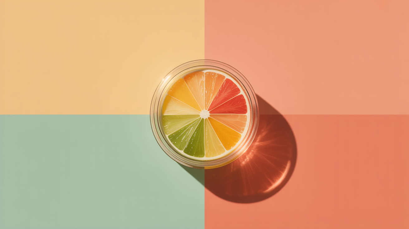
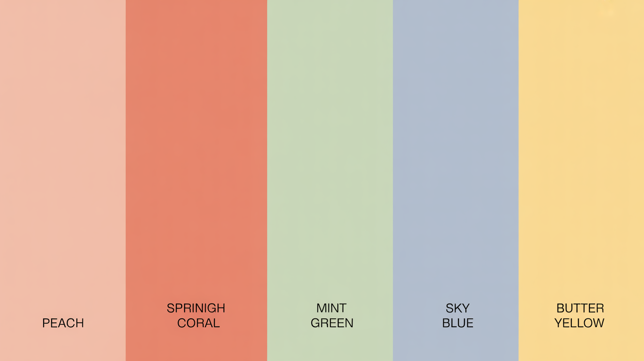
A light spring color palette consists of gentle, lively hues that evoke fresh leaves, blue skies, and early blooms. Typical colors in this palette are pale green, soft blue, blush and butter yellow.
💫 Discover Your Complete Color Palette
Ready to discover all the colors that make you look radiant? Our comprehensive color analysis will reveal your complete personal palette - perfect for hair, makeup, and wardrobe decisions.
Find My Season →These hues translate beautifully for fashion, graphic design and artwork, providing a tranquil yet luminous accent. To assist selecting or applying these hues, the following part discusses essential advice and easy methods to mix them.
📚 Recent Articles
The Light Spring Essence
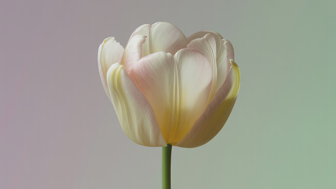
The light spring essence combines the warmth and lightness, making any look feel softly energized. This palette is famous for its bright, fresh take – colors that represent the first few days of spring. With warm undertones and a subtle golden glow, these shades are simultaneously vibrant and tender.
Light spring's features tend to be radiant and soft and show up best on colors that are light, warm and bright but never harsh or too deep. Understanding undertones and color harmony helps you create a palette that works for both your style and your natural coloring.
1. The Overall Vibe
Light spring shades are breezy and luminous and whisper a soft promise of hope. Featuring shades like soft peach, light coral, mint green, warm aqua and sky blue. Each color has a freshness that reverberates the very first spring blooms, perfect for those who desire a renewal and lightheartedness in their appearance.
Donning these hues can buoy spirits and generate equilibrium. Lightness in the palette guarantees combinations won't be weighted. Not having deep, dark, or cool shades around you contributes to an overall cohesive, harmonious appearance.
Light spring clothing picks tend to effortlessly go from casual to office, while remaining fresh, airy, and cheerful.
2. Skin Undertones
Most light springs have warm or neutral undertones, with a peachy or golden tinge to their skin. These notes strengthen the subtle golden shimmer of the season.
By sallying forth to test colors by holding them near your face, you'll discover which are best for your skin. Warm, light tones — think champagne, soft apricot, or light gold — generally flatter most.
Super cool tones like icy blue or stark white can compete and make skin look washed out.
3. Eye Colors
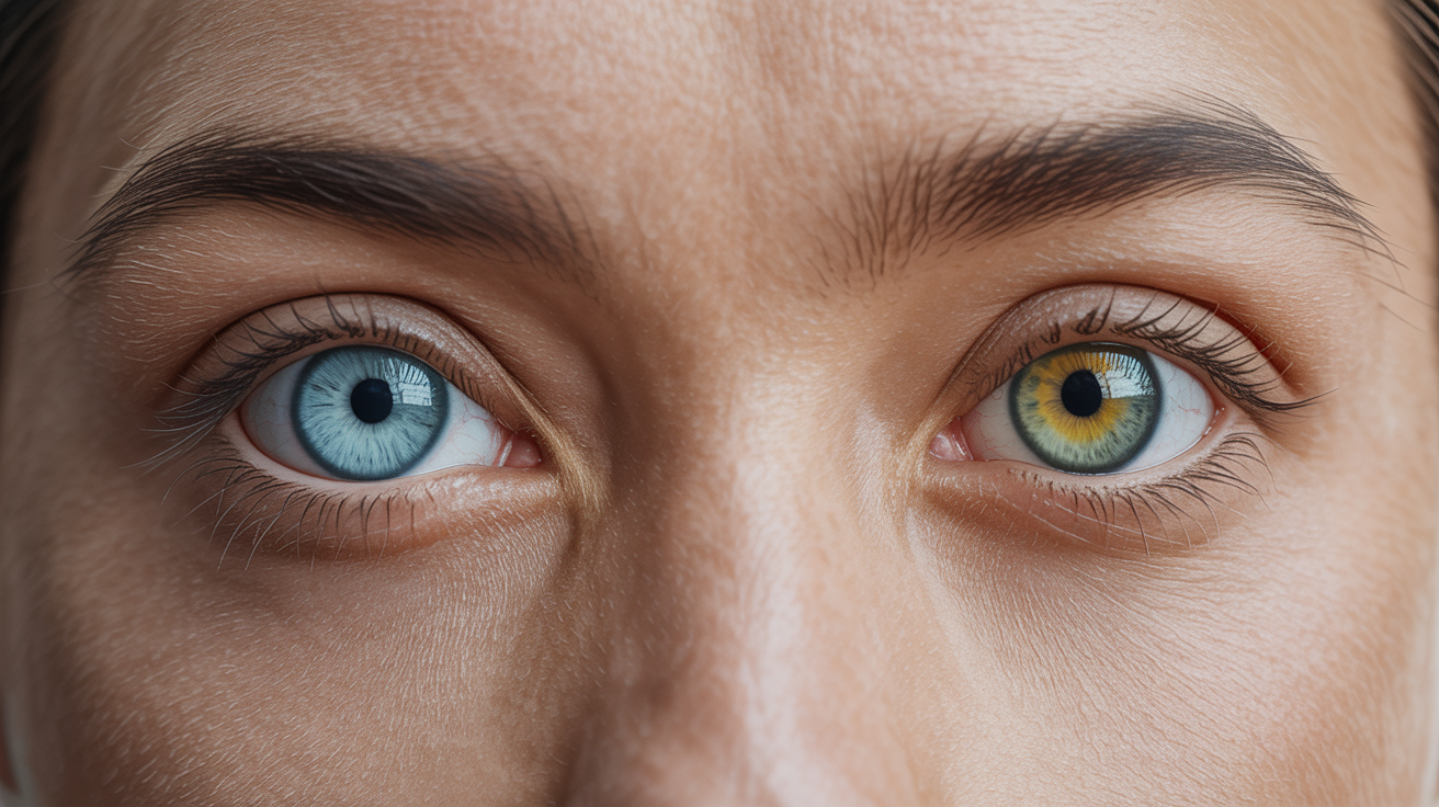
Typical eye colors of light springs are light blue, aqua, green or hazel. These eyes possess a bright, gentle hue, often flecked with gold or green.
When you use your eye color to guide your clothing and makeup selections, you can help increase the natural brightness. Soft, gentle tones accentuate eye color, whereas aggressive or heavy colors tend to dominate.
Makeup in warm peach or gold can add a touch of depth without detracting from the eyes.
4. Natural Hair
Light spring hair colors tend to be honey blonde, golden blonde or pale strawberry blonde. They've got an inherent lightness and warmth to them, resonating with the entire palette.
Hair color can impact which palette shades are most flattering. Highlights to suit the warmth and softness of the light spring palette.
Keeping away from super dark or cool hair colors helps the look feel fresh and together.
5. Your Contrast Level
Light springs have a low to medium contrast. That's why the contrast between your hair, skin and eye color is minimal.
Clothing and makeup that have soft fades – not harsh contrasts – keep the balance. Monochrome ensembles in different light spring tones are effective.
Stay away from black, dark brown and harsh white to maintain the balance of the look.
Your Color Palette

A light spring color palette mixes the crisp brightness of spring with the gentle casualness of summer. It's a group characterized by warmth, lightness, and subtle brightness. Your color palette is more than a color list. It's about selecting hues that complement your skin, hair, and eyes.
Armed with specifics about hue, value, and chroma, you now have the ability to select colors that enhance your appearance and fit your personality — be it clothes or makeup. Seasonal color analysis divides palettes into Light Spring, Light Summer, True Spring, and True Summer, each defined by nuanced variations.
For Light Spring, the most flattering colors are fresh and warm, inspired by light pinks, soft greens, and peaches. Selecting the right palette can help you feel comfortable in what you wear, help you stand out in a subtle way, and make it easier to curate a wardrobe that feels authentic.
Hue
Hue refers to the unmixed color, and in the light spring palette, that translates to warm, soft shades that reflect the season's vitality. Most light spring personalities thrive in warmer tones like coral, apricot, buttery yellow, and mint.
These colors will harmonize with light blue, green, hazel or light brown eyes and softer hair colors. Experimenting with combinations of these colors can get you a look all your own – for example, a pale aqua top with a peach scarf or a light rose and mint mix for a crisp feeling.
It's important to select shades that complement your skin, so the color appears organic and uncontrived. Warm skin tones fare best with these shades, while cooler undertones may want to diffuse the warmth with a hint of neutral beige. Every color selection impacts how your entire palette complements your natural coloring.
Value
Brightness indicates how light or dark a color is. Light spring does best with lighter values because they keep the overall look airy and soft. Pastel pinks, light blues, pale yellows and gentle greens are all safe bets.
Darker hues, such as forest green or deep burgundy, can appear too harsh and detract from the light spring mood. When constructing outfits, layering lighter tones—say, a pale blue button-down beneath a light beige jacket—keeps things interesting without sacrificing the airy vibe.
This keeps the look vibrant, not weighty. By concentrating on light values, the color palette stays fresh and very spring-vibe-y.
Chroma

Chroma is the level of brightness or dullness of a color. Light spring colors are generally clear and somewhat bright but never too strong. Imagine soft coral, muted gold, or light turquoise — colors that are happy but not overbearing.
Too much saturation, such as neon pink or fire engine red could overwhelm the soft spring appearance. The true art lies in balancing gentleness and brilliance.
Introducing various chroma levels—such as a vibrant peach top with a more gentle mint—adds dimension without feeling overly harsh. That way you maintain the outfits interesting and personal, allowing the bright spring palette to shine in a considerate manner.
Beyond the Basics
Light spring is unique in seasonal color analysis as it bridges warmth and fragility. It's like light summer and true spring, but there's a subtle character that demarcates its position. Each seasonal palette has different tones, values and chroma that determine how colors work with skin, hair and eyes. Knowing these subtleties is crucial for developing a closet or selecting cosmetics that come across as authentic and expressive, yet flattering.
Diving into the specifics of each palette keeps you out of the traps and instills a more conscious attitude toward style.
Light Summer

| Attribute | Light Spring | Light Summer |
|---|---|---|
| Temperature | Warm | Cool |
| Chroma | Medium | Low to Medium |
| Value | Light | Light |
For light spring individuals, borrowing from light summer can enhance their light spring capsule wardrobe if done cautiously. Choose lighter, more cooling colors like pale turquoise or a soft sky blue, ensuring they still possess some warmth. Combining these colors can provide a stunning contrast without clashing with the inherent warmth of light spring skin tones.
Understanding the distinction between light spring and light summer is essential for creating a harmonious wardrobe. Selecting the right shades that align with your seasonal color palette helps avoid washed-out or overly high-contrast looks, allowing for a more cohesive style.
Light spring colors stimulate golden or peachy undertones, while light summer emphasizes pink or rosy tones. This knowledge aids in making informed decisions about daily outfits and accessories, ensuring you highlight your best color.
Incorporating these principles into your styling can lead to beautiful light spring outfits that reflect your unique coloring. By focusing on the right shades, you can create a wardrobe that celebrates the essence of the spring color season.
True Spring
| Attribute | Light Spring | True Spring |
|---|---|---|
| Brightness | Soft | Vivid |
| Chroma | Medium | High |
| Value | Light | Medium |
In my mind, spring colors are vivid, bold and saturated—bright coral, sunshine yellow and grassy green. Light spring, by comparison, is warm but a softer, lighter warmth.
Wearing true spring shades can swamp light spring people. The bolder shades can sometimes seem too strong and detract from your face. Light spring's best colors are more pastel, like peach, light apricot or pale gold, which offset their lighter features.
You can get a little taste of that real spring energy by incorporating its colors as accents. Accessories like scarves, bags, or statement jewelry in true spring shades can really add a pop — without being too overpowering. This keeps the peace while still savoring the wider scope of spring.
The Misconceptions
A pervasive myth is that the light spring palette is all washed out pastels. In fact, light spring colors can be fresh and snappy—coral, soft peach or pale jade. These tones are vivid, yet not shrill or excessively bright.
Light spring colors pop in both casual and professional environments. Not black and white which are too harsh, but light spring does really well with softer neutrals like ivory, sand or warm brown. Denim works well for bottoms or jackets, providing a laid-back but still composed look.
Donning additional color can be intimidating if the trend leans toward cool- or muted-toned. Having confidence that your palette works and pairing less than 10% of prints beyond the light spring spectrum maintains clothes visually aligned.
For makeup, peach, sand and coral tones accent a natural, healthy glow, while conch pearls complete a jewelry look.
Curate Your Wardrobe
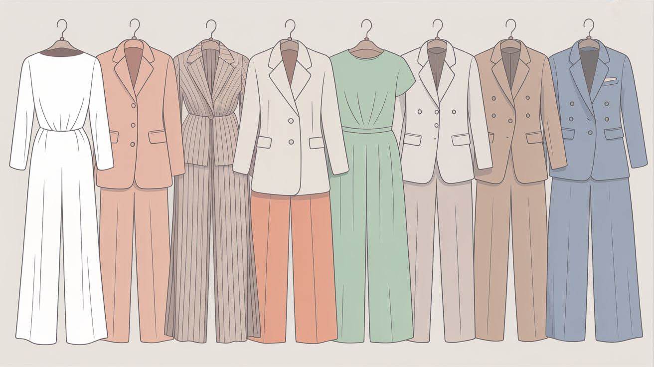
To curate a light spring wardrobe is to select items appropriate to your style, your needs, and what feels right for your skin tone, eye color and hair. A curated wardrobe makes dressing simple, reduces drudgery and expresses your individuality.
To their surprise, a lot of people discover that the task of curating one's wardrobe is not just practical, but a great way to educate themselves on what looks and feels best. Constructing a capsule wardrobe–where all of it coordinates with all of the rest–saves time, simplifies how you dress and keeps things exciting.
It's all about investing in a small number of well-constructed, versatile pieces — if you want to spare yourself decision fatigue and bask in a pristine, effortless closet.
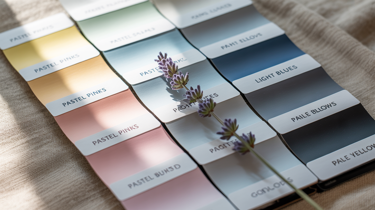
Core Neutrals
- Soft beige: This light, creamy shade works as a blank canvas, easy to pair with most colors.
- Light taupe: A gentle gray-brown that blends seamlessly into spring outfits, offering warmth without heaviness.
- Ivory: A crisp, off-white tone that brightens ensembles and flatters most skin tones.
- Warm gray: A soft, non-cool gray that grounds bright shades without overpowering them.
- Pale sand: Subtle, yellow-tinged neutral that brings warmth and balance.
Play these neutrals as the foundation of your spring wardrobe. They're perfect for base layers—pants, skirts, lightweight sweaters and jackets.
They complement accent colors and help calm bright colors, so ensembles aren't overwhelming. Neutrals make it simple to trade out pieces and mix up your ensembles, allowing you to derive more mileage from less.
Best Accent Colors
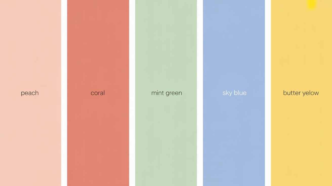
- Peach: gentle, warm, and perfect for soft pops of color.
- Light coral: uplifting, works well for blouses or scarves.
- Mint green: cool and refreshing, ideal for shirts or accessories.
- Sky blue: calm, pairs well with nearly any neutral.
- Butter yellow: bright but soft, adds a sunny note without being loud.
Accent colors save your outfits from being flat. Test these hues in your tops, scarves, kicks or bags.
Mix and match for different moods, or layer two accents for a cheered up look. Even a basic pop of color can change the entire vibe of a neutral palette, making each look feel new.
Color Combinations

- Ivory and peach: soft, warm, and gentle on most skin tones.
- Light taupe and mint green: makes a calm but interesting pairing.
- Warm gray and light coral: subtle but lively, perfect for work or daywear.
- Soft beige and butter yellow: sunny yet balanced, good for spring events.
Balance is key when mixing these. Stick to one or two accent colors with your neutrals, unless the occasion demands more.
Always consider location—whether you're at work, going about your day or attending a special event—and select outfits that suit the occasion.
Patterns and Prints
Pattern and print selections should still suit the light spring spirit. Soft shades florals, subtle stripes or mini geometrics play best.
Opt for prints with a slightly lighter ground—ivory, beige or pale sand—to keep things cohesive and not too harsh. Stay away from big, brash patterns that dominate the outfit.
Pair prints with solid neutrals for balance. For instance, a mint green floral blouse with light taupe pants.
This keeps the outfit exciting but still muted. Choose prints that reflect the light spring palette, which keeps your wardrobe cohesive and simple to accessorize.
Elevate Your Look
Light spring color palettes are defined by their fresh, soft hues that add a delicate, warm glow to your style. This is more than just color selection. It means paying attention to the accessories, makeup, and hair that harmoniously flatter your natural features.
Focusing on these areas and focusing on shape, undertones, and unique preferences helps build a look that feels effortless and refined. By combining clever pops of color with appropriate finishing touches, you can create a timeless yet versatile wardrobe.
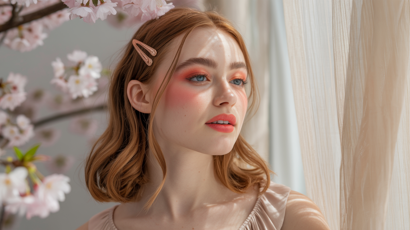
Makeup
Warm pinks, peach and soft coral shades complement well the lips and cheeks, providing a natural, healthy glow. Brown mascara and eyeliner is excellent for softening your eyes without the harshness black can sometimes have, particularly for lighter skin and eye colors.
These shades make the eyes appear brighter and more awake. Opting for blush in soft apricot or rose can emphasize the natural warmth in the skin, and a subtle sprinkling of highlighter imparts additional sheen.
Stay with a foundation that suits your skin's undertones. Skip cool or too matte finishes, which can tone the effect down. A dewy or satin base keeps the look alive and fresh.
Top with a light dusting of translucent powder in the T-zone to douse shine, but leave cheeks radiant.
Jewelry
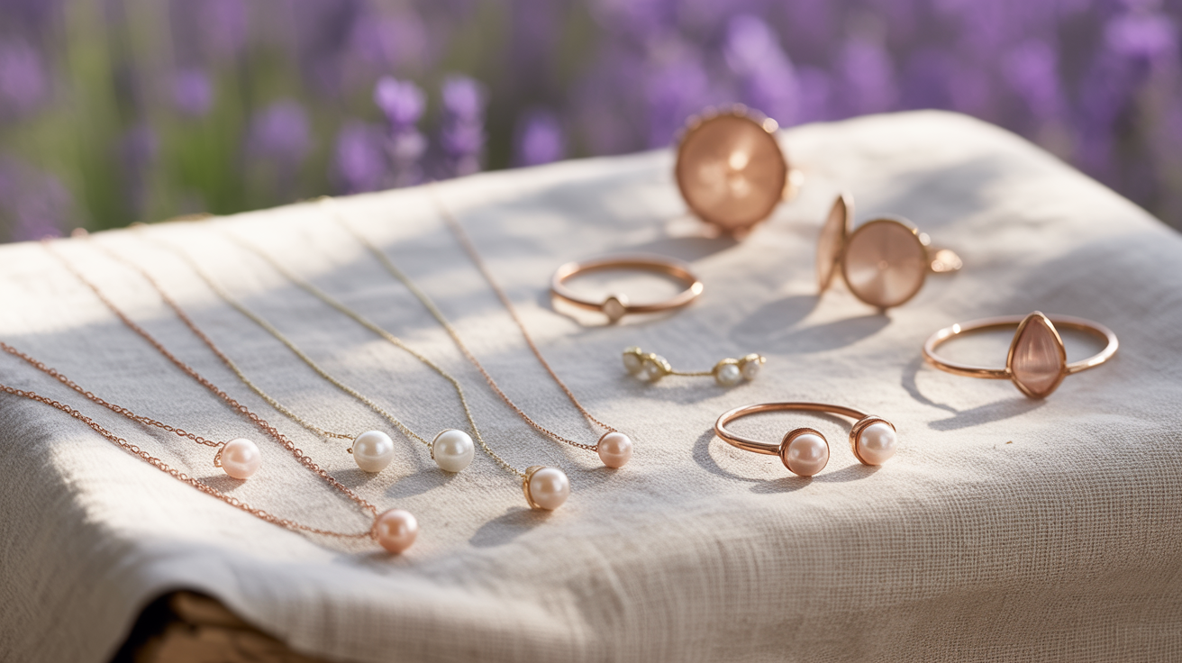
Rose gold jewelry complements the warmth of the light spring palette. Light gold and muted silver would be nice. They mix in with most light spring shades and don't eclipse softer features.
Choose stud earrings, delicate chain necklaces and small rings over statement jewelry. These understated selections highlight your natural coloring and maintain the look grounded.
Hardware such as bag clasps, zips and belt buckles in pale metals can compliment the softness of your palette. Mix and match as necessary, concentrating on things that warm rather than cool.
Steer clear of black or overly shiny jewelry as those tend to distract from the harmony of your outfit.
Hair Color
Golden blonde, strawberry blonde, light golden brown and warm medium brown are the best shades to suit the light spring palette. Try to maintain a light and bright color, steer clear of ashy or dark tones that will cause your complexion to appear fatigued.
You can add subtle highlights or balayage for depth and to enhance the natural lightness. Collaborate with a professional stylist to select the optimal color and location for highlights.
Take into account face shape and undertones before selecting a new color. It's a texturizer with the intent to maintain that reflective, soft hair. It pulls the whole light spring look together.
The Psychology of Your Colors
Light summer colors skew far more cool than the light spring season. Soft blues, lavenders, and cool mint greens tend to dominate this palette, with yellow undertones less prevalent. In contrast, light spring colours are characterized by their warm coloring, featuring shades that are soft and vibrant, often with a radiant appearance.
Light spring color palettes operate in this subtle realm influencing the way we feel, behave and even how others perceive us. These gentle, warming shades—imagine peach, coral, soft yellows, mint and sky blues—have traditionally been associated with optimism, development and fresh beginnings.
These colors are not only eye-pleasing, but can establish a mood and attitude for your presentation to the world. That connection between color and emotion is a major component of psychology. Research indicates that colors can influence our mood or even alter our decision making.
Light spring shades make you feel joyous and calm. Warm hues such as pale peach or butter yellow can energize and ignite happiness, while soft greens and blues can instill calmness and equilibrium.
The impact of a light spring palette is not just scientific, it's about personal history and culture. We may either be drawn to or recoil from certain colors depending on what we were exposed to as children or what a color symbolizes in our culture.
In certain locations, yellow represents joy; in others, it means something else. Your own memories, too—perhaps a pastel pink top recalls an enjoyable night out, or mint green recalls a childhood moment. This makes color selection a means to share your narrative and to craft your own daily mood.
There's more to colors than just appearance. Color analysis, which matches your optimal shades with your skin, hair and eyes, stems from the theory that the correct colors can boost your mood and self-image.
Who doesn't feel 'brighter' and more confident when they wear colors that complement them? Light spring colors tend to suit people with warm, clear complexions and gentle eye colors but anyone can wear them in order to bring brightness and warmth to their appearance.
These tones tend to brighten and make faces appear fresher and more awake and therefore, feel more prepared to take on the day.
With the light spring palette, being who you are can be a conscious choice. By selecting colors that align with your mood or that you desire to create, you can influence how you feel and how others perceive you.
If you want to come off more open and cheerful, light spring hues such as coral or pale yellow are powerful options. For a serene, clean appearance, mint or sky blue tend to assist.
Try adding small touches– like a scarf, shirt or even a bag to get a sense of these colors before you make the bigger changes. It's not about conforming, it's about utilizing color as a catalyst to boost your spirits and reveal your authentic self.
Conclusion
To work a light spring color palette, combine soft pinks, clear peach, light green and pale blue. These colors feel fresh and work with many skin tones. Match cotton shirts in blush or mint with light tan trousers. Test out shoes in gentle beige or cream. Add a pop with a simple lemon or sky blue scarf. These colors are fit for work, weekends or nights on the town! Opt for light, soft fabrics to keep it breezy. Baby steps, a pastel tee or pale bag, can transform your look pronto. For more tips, see our complete guide or sign up for our upcoming style chat. Discover your perfect light spring combination and allow your style to speak for you.
Frequently Asked Questions
What is a light spring color palette?
Light spring individuals have soft colors with warm and fresh qualities, such as peach, light coral, mint green, and pale yellow, creating a breezy visual that truly stands out in the light spring season.
Who suits the light spring color palette?
Light, warm skin tones and light spring eyes tend to fit this seasonal color palette best, making it ideal for those with a subtle warm natural coloring.
How can I build a wardrobe with light spring colors?
Begin with base pieces in soft neutrals like cream or light beige, perfect for the light spring season. Add in accent pieces of pastel pink, mint, or pale blue for a radiant appearance.
Are there colors to avoid in the light spring palette?
Yep, no dark or cool or overly bright colors. Black, deep navy, and neon can overwhelm the natural softness of a light spring palette.
Can men use the light spring color palette?
Yes, the guys can wear a light spring color palette! Light blue shirts, khaki trousers, and soft green accessories look great, especially for light spring individuals, keeping the look fresh and accessible.
How do light spring colors affect mood?
There's something so uplifting about light spring colors that embody the light spring season. They create a friendly and energetic aura, making you appear accessible and jovial with the right shades.
What fabrics work best with the light spring palette?
Lightweight fabrics like cotton, linen, and silk enhance the fresh, airy feel of the light spring season palette, making the light colors appear organic and alive.