Warm vs. Cool Olive Skin: How to Tell Your Undertone
 Reviewed by Alexandra Gilmore
Olive skin is not automatically warm; its gray-green cast can sit over warm, cool, or neutral coloring. Compare matched fabric pairs in indirect daylight and judge your whole face, then use veins, jewelry, and tanning history only as supporting evidence when the obvious shortcuts conflict.

Key Takeaways
Olive skin is not automatically warm. The olive or gray-green cast you see can lean warm, cool, or sit close to neutral, so the useful question is which temperature makes your face look more even. Compare controlled pairs of fabric in the same daylight and judge the effect on your whole face rather than relying on veins, jewelry, or tanning history alone.
💫 Discover Your Complete Color Palette
Ready to discover all the colors that make you look radiant? Our comprehensive color analysis will reveal your complete personal palette - perfect for hair, makeup, and wardrobe decisions.
Take Color Analysis Quiz →- Olive describes an appearance, not a temperature result. Fair, medium, and deep skin can all look olive, and each depth can lean warm, cool, or neutral.
- Fabric comparisons are more useful than isolated clues. Cream versus cool white or tomato red versus blue-red shows how color behaves next to your face.
- Mixed results are normal. You may be neutral olive, or temperature may matter less for you than depth and chroma.
- Diagnosis and palette advice belong to different steps. Confirm your direction here, then use the dedicated warm, cool, or neutral olive guide for clothing colors.
📚 Recent Articles
Is Olive Skin Warm, Cool, or Neutral?
It can be any of the three. "Olive" usually describes a muted green, gray, or golden-green impression in the skin. "Warm," "cool," and "neutral" describe the direction that looks most harmonious beside it. Those ideas overlap, but they are not interchangeable.
Warm olive skin tends to hold its color beside yellow-based reds, warm ivory, camel, and golden browns. Cool olive skin often looks clearer beside blue-red, cool white, charcoal, berry, and blue-green shades. Neutral olive skin may handle both sides when the colors share a similar depth and intensity. None of these outcomes depends on whether the skin is fair, tan, or deep.
This distinction explains a familiar problem at the makeup counter. A foundation can be close in depth but still turn orange, pink, or gray after you blend it across the jaw. The mismatch may come from temperature, an overly saturated base, or both. Clothing gives you a larger area to compare and is often easier for a first check.
It also explains why two people who both describe themselves as olive can give opposite advice. One may need warm, muted colors; the other may need cooler colors with the same muted quality. Their shared olive appearance does not guarantee a shared palette. Treat warm olive, cool olive, and neutral olive as working descriptions of a visual response, not fixed biological types.
First Confirm That Your Skin Looks Olive
Look at your face, neck, and upper chest in indirect daylight. Olive skin often appears less clearly pink, peach, or golden than the skin around it. You may notice a muted green-gray or golden-green cast, especially beside a truly rosy or peach complexion. A foundation shade at the correct depth may look too pink or orange even when it is described as neutral.
Do not turn that observation into a claim about a separate green pigment. Visible skin color is complex. DermNet's overview of skin pigmentation identifies melanin, haemoglobin, and, to a much smaller degree, dietary carotenoids as contributors to visible skin color. In personal color analysis, olive is a practical description of how the combined color reads, not a medical diagnosis.
Compare more than one area because facial redness, freckles, a tan, or pigmentation can disguise the underlying pattern. The jaw and neck are usually more useful than the cheeks. If you are still unsure whether the starting point is olive at all, use the broader undertone test for olive skin before choosing a warm or cool label.
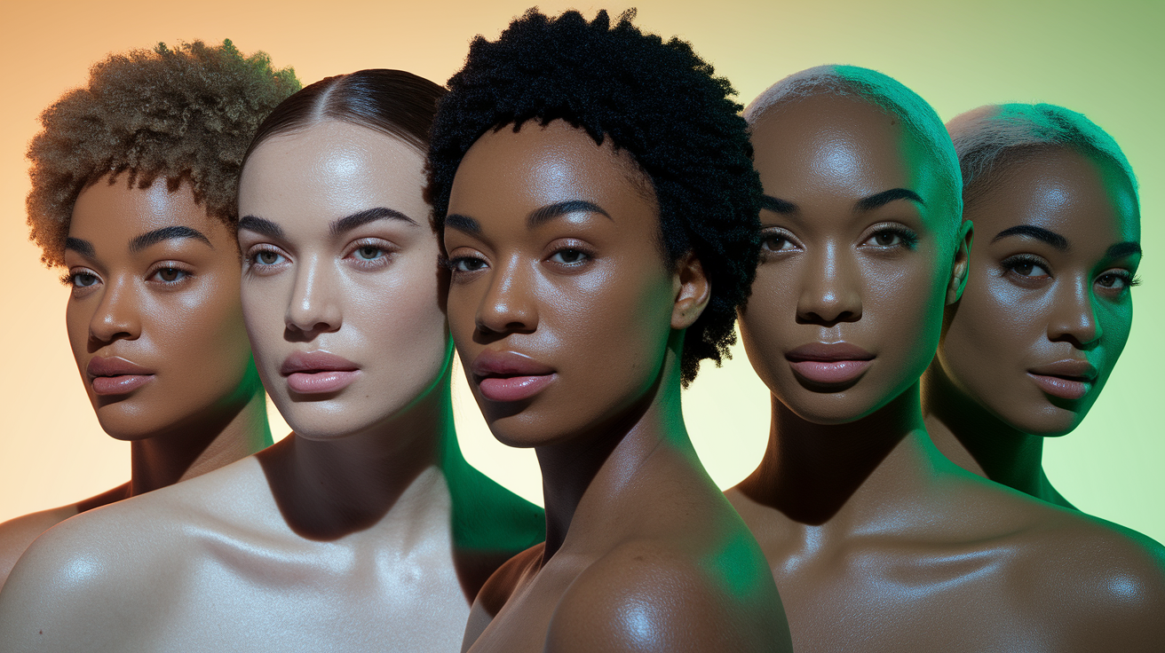
Warm vs. Cool Olive Skin Comparison Chart
Use the chart as a set of hypotheses to test. No single cell proves your undertone. A consistent response across two or three fabric pairs matters more than a perfect match to every description.
| What you compare | Warm olive direction | Cool olive direction | Neutral or unclear result |
|---|---|---|---|
| White fabric | Warm ivory keeps the face even | Cool white looks cleaner than cream | Both work when depth is similar |
| Red fabric | Tomato, brick, or rust is steadier | Blue-red, berry, or wine is steadier | Medium muted reds beat both extremes |
| Neutral fabric | Camel or warm taupe supports the skin | Charcoal or cool taupe looks more connected | Balanced navy or espresso is easiest |
| Visible warning sign | Cool colors can make the skin look gray | Warm colors can increase yellow or sallow areas | Very warm and very cool colors both feel separate |
| Likely next step | Test a warm olive palette | Test a cool olive palette | Let depth and chroma decide first |
The warning signs are deliberately modest. A color does not need to create a dramatic glow to be useful. Look for a smoother transition from face to neck, clearer definition around the eyes and mouth, and less attention drawn to gray, yellow, or red patches.
Versions within one color family are especially revealing. Someone may look tired in pale yellow yet balanced in ochre, or disconnected in icy blue but comfortable in deep teal. That does not make the first temperature result useless. It means depth or chroma is modifying it. Write down the exact fabric that worked instead of recording only "warm" or "cool."
A Four-Pair Draping Test for Olive Undertones
Prepare the light and fabrics
Stand near a window in indirect daylight. Turn off overhead lamps and move away from colored walls or curtains. Use solid fabrics with similar texture and depth whenever possible. A dark, brilliant blue and a faded pale orange change too many variables to tell you anything useful about temperature.
Pull your hair back at first and keep makeup the same for every comparison. Hold each fabric under the chin so it covers the same area. Give yourself only a few seconds before swapping. Long inspection makes it easy to talk yourself into seeing a difference that is not really there.
Pair 1: warm ivory and cool white
This pair is easy to find, but match the brightness as closely as you can. Warm ivory supports a warm olive direction when the skin looks settled rather than more yellow. Cool white supports a cool direction when it sharpens the face without creating a gray cast. If bright white is simply too strong, try a softer cool white before calling the result warm.
Pair 2: tomato red and blue-red
Red exposes temperature differences more clearly than many neutrals. Tomato red carries more orange; blue-red moves toward cranberry or raspberry. Watch the mouth, under-eye area, and jaw. The better red should belong in the same picture as your face. The weaker one may make the skin look oddly green, yellow, or drained.
Pair 3: camel and charcoal
Camel is a practical warm neutral, while charcoal gives you a cooler comparison without the severity of black. If both feel heavy, repeat with warm taupe and cool gray. If both work, note whether one is slightly easier and move on rather than forcing a verdict.
Pair 4: peach and berry
A scarf, T-shirt, or even a large piece of matte paper can work here. Peach often supports warmer coloring; muted berry is a useful cool comparison. Keep the intensity close. A neon berry will defeat a soft peach regardless of undertone.
| Result across four pairs | Working interpretation | What to test next |
|---|---|---|
| Warm wins three or four | Likely warm-leaning olive | Try several medium-depth warm olive colors |
| Cool wins three or four | Likely cool-leaning olive | Try cool reds, charcoals, and blue-greens |
| Two warm and two cool | Neutral olive or a poorly matched test set | Repeat with equal depth and chroma |
| Every pair looks wrong | Temperature may not be the main issue | Compare light/deep and soft/clear instead |
Take a quick phone photo of each pair only after you have made an in-person note. A simple score such as warm, cool, or no clear difference is enough. If one pair strongly disagrees with the other three, check whether it was brighter, darker, or shinier. Retest that pair rather than averaging a badly matched comparison into the result.
Why the Usual Undertone Tests Give Mixed Results
Vein color is a weak shortcut. Veins can look blue, green, teal, or purple depending on skin depth, lighting, and the area of the body. Seeing greenish veins does not by itself prove warm olive skin, and blue veins do not rule olive coloring out.
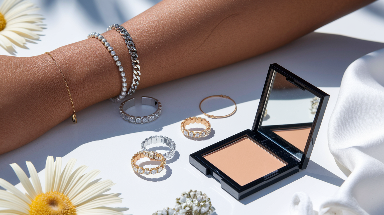
Gold versus silver jewelry can be useful as a preference test, but the finish, size, and brightness of the metal change the comparison. Brushed gold and bright silver are not equal opponents. Try similar pieces near the face and treat the result as one vote rather than the final answer.
The sun test answers a different question. How readily skin burns or tans relates to its response to ultraviolet exposure, not to which clothing temperature looks more balanced. Do not expose unprotected skin to the sun for a color test. Your existing tanning history cannot settle warm versus cool either.
Even white fabric can mislead when one sample is much brighter than the other. Olive coloring is often muted, so a brilliant white may overwhelm the face for reasons of contrast or chroma. That is why the four-pair method repeats the temperature question instead of betting on one clue.
How Depth and Chroma Change the Answer
Temperature is only one part of a useful palette. Depth describes how light or dark a color appears. Chroma describes how clear or muted it is. Two people can both be cool olive and need very different clothing because one has fair, soft coloring while the other has deep, high-contrast coloring.
If the correct temperature still looks wrong, adjust one of those qualities. A warm rust may suit you better than pale peach because it has more depth. A muted berry may work where vivid fuchsia dominates. A balanced navy can succeed on neutral olive skin even when both icy gray and camel fail.
Contrast adds another layer. Dark hair, defined brows, and bright eyes can carry a stronger light-dark jump than blended features at the same skin depth. Keep this separate from temperature: black and white may be too sharp on a cool olive person, while charcoal and soft white still confirm the cool direction. The result should become more specific as you test, not more restrictive.
This is also where fair and pale olive skin needs its own treatment. Low depth can make very dark test fabrics look harsh even when their temperature is right. The fair and pale olive color guide separates that depth-specific problem from the warm-versus-cool question.
What to Do After You Know Your Direction
Use the result to choose a small trial palette, not to replace your wardrobe. Start with one neutral, two everyday colors, and one accent. Wear them near your face in ordinary settings and notice which pieces you reach for without needing extra makeup or styling.
If warm won consistently, continue with the guide to colors for warm olive skin. If cool won, use the dedicated cool olive color palette. When both sides worked and medium, balanced colors were easiest, the neutral olive palette is the more useful next step.
Those pages handle full clothing recommendations. Keeping that advice separate prevents a diagnosis article from becoming another generic list of jewel tones and earth colors. It also makes it easier to revise your result later: if a warm palette feels too yellow, return to the comparison pairs before buying more clothes.
Can a Photo Identify Warm or Cool Olive Skin?
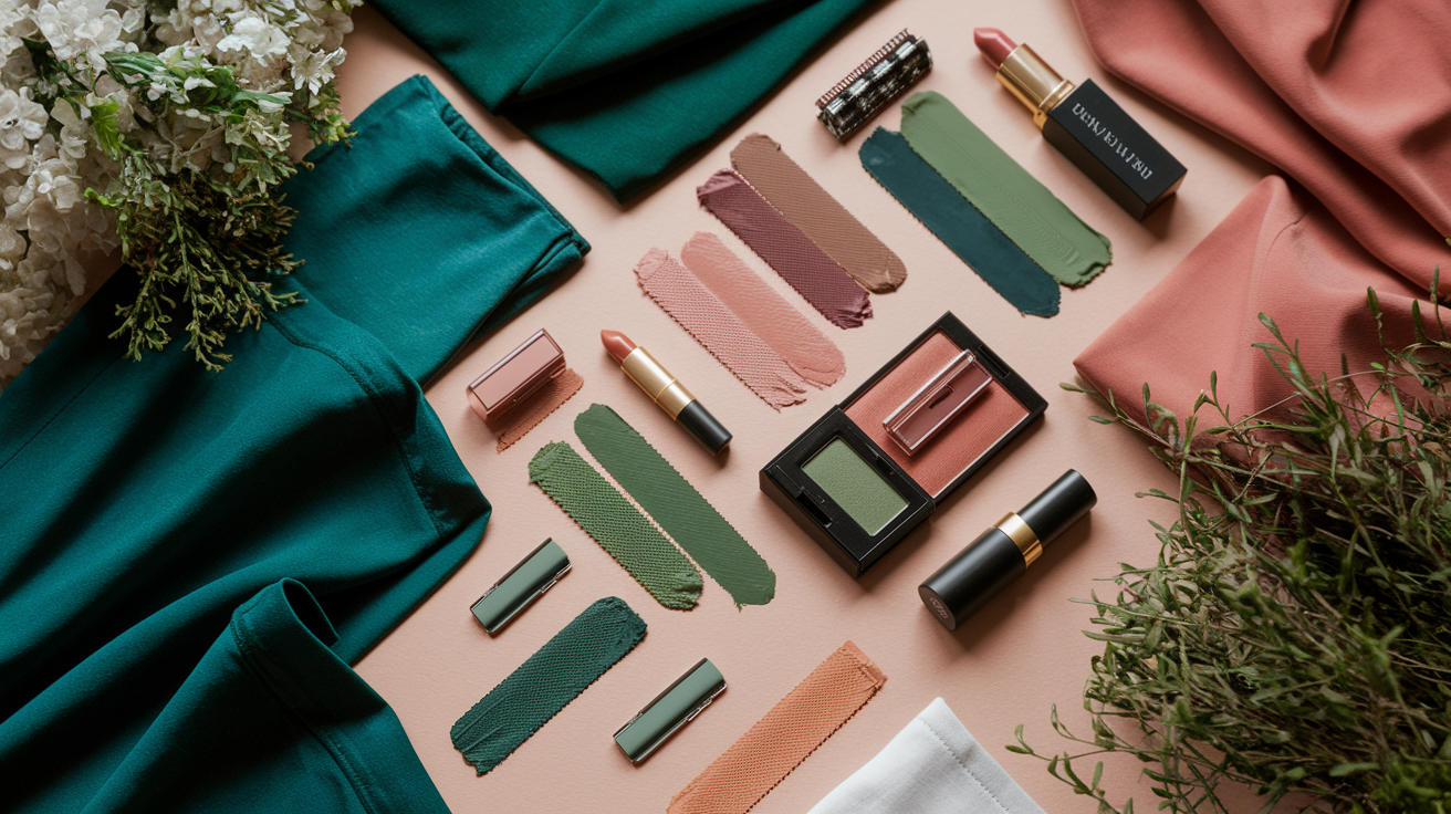
A photo can record fabric comparisons, but it should not be the only evidence. Cameras and apps adjust exposure and color. Adobe's Lightroom color documentation shows how directly this affects the judgment: the Temp control changes warmth or coolness, while Tint shifts the green-magenta balance.
Photograph every drape in the same indirect daylight, from the same position, without beauty filters. Keep the original files and compare them on one screen with Night Shift or similar display filters turned off. If an online test gives you a warm, cool, or neutral result, use it as a hypothesis and check two of its representative colors in person.
People Also Ask
Is olive skin usually warm or cool?
Olive skin can lean warm, cool, or neutral. The visible olive cast does not decide temperature by itself. Compare several warm and cool fabric pairs and look for the direction that keeps your face most even.
How do I know whether I have olive skin?
Check the face, jaw, neck, and upper chest in indirect daylight. Olive skin may have a muted green-gray or golden-green cast and may make otherwise correct foundation depths look too pink or orange. Compare several areas because facial redness can hide the pattern.
What is the difference between warm olive and cool olive skin?
Warm olive skin tends to look steadier beside warm ivory, tomato red, camel, and peach. Cool olive skin more often prefers cool white, blue-red, charcoal, and berry. Depth and chroma still affect which exact versions work.
Can olive skin be neutral?
Yes. A neutral olive result is likely when matched warm and cool fabrics both work and very warm or very cool colors look separate from the face. Balanced, medium-intensity colors are often the easiest starting point.
Common Questions: The Ultimate Color FAQ
Does green vein color mean I have warm olive skin?
No. Vein appearance changes with lighting, skin depth, and body area. Use it as a clue at most, then compare warm and cool fabrics near the face.
Is olive skin the same as a neutral undertone?
No. Olive describes a visible color impression, while neutral describes a temperature balance. Olive skin can be neutral, but it can also lean clearly warm or cool.
Can fair skin have an olive undertone?
Yes. Olive coloring can appear at fair, medium, or deep skin depths. Fair olive skin is often missed because redness and low depth can hide the muted green-gray cast.
Does tanning change warm olive skin into cool olive skin?
A tan changes visible depth and may change outfit contrast, but it does not prove that the underlying temperature direction changed. Repeat the fabric test if your usual colors start behaving differently.
Should warm olive skin wear only gold jewelry?
No. Metal color, finish, size, and personal style all matter. Similar gold and silver pieces can provide a useful comparison, but jewelry should not overrule several clear fabric results.
What if warm and cool olive tests keep disagreeing?
Match the fabrics more closely for depth and intensity, then repeat the test. If the split remains, work from a neutral olive palette or test light/deep and soft/clear before returning to temperature.