The 12 Seasons of Color Analysis: Visual Chart and Comparison
 Reviewed by Alexandra Gilmore
Compare all twelve color seasons by temperature, value, chroma, and sister-season flow.

The 12-season color analysis system expands the traditional four seasons into twelve related palettes. It describes color along three dimensions: temperature (warm to cool), value (light to deep), and chroma (clear to muted). Each Spring, Summer, Autumn, and Winter family has three subseasons, with some palettes sharing a leading quality with a neighboring family. This 12 season color analysis chart maps every subseason, its dominant dimension, and a practical color comparison. Use it as a visual guide to test fabric near your face, not as a diagnosis based on skin, eye, or hair color alone.
Start with the master chart below, then compare neighboring palettes rather than memorizing twelve labels at once. A palette is a useful range of relationships: an example swatch and its hex code are digital references, not a universal formula for every dye, screen, or person. If you want a broader starting point, read the four-season overview before moving through this more detailed map.
The Architecture of the 12-Season System
Traditional seasonal color analysis groups palettes into Spring and Autumn, which generally lean warm, and Summer and Winter, which generally lean cool. The twelve-season model keeps those four families but splits each into a light, true, bright, soft, or deep expression. A person can respond well to some colors from more than one group. The system is a way to organize comparisons, not a biological classification.
Hue, value, and chroma explain the chart
Munsell's color system describes hue as a color family, value as lightness, and chroma as intensity away from a neutral gray. Seasonal styling borrows this vocabulary: temperature concerns the warmer or cooler direction of a hue; value describes how light or dark the fabric reads; chroma describes how vivid or softened it looks. The twelve palettes do not have official fixed Munsell coordinates. The Munsell model simply gives us consistent language for why two blues can behave differently at a neckline.
Compare powder blue and cobalt: both are blue, but powder blue has a higher value and much lower intensity. Compare tomato coral and dusty rose: the first feels warm and clear, while the second feels cool and muted. A color can be warm yet muted, or cool yet bright; reducing every decision to “warm versus cool” misses much of the chart. For color controls on a screen, Adobe's color guide explains related hue, saturation, and brightness terms.
From four families to twelve subseasons
Each family has a central “True” season where temperature is the clearest family trait: True Spring is distinctly warm, True Summer distinctly cool, True Autumn warmly earthy, and True Winter cool and high contrast. The other eight sit closer to a boundary. Light Spring and Light Summer both prioritize lightness; Bright Spring and Bright Winter share clarity; Soft Summer and Soft Autumn share mutedness; Deep Autumn and Deep Winter share depth. These are the principal flow-season bridges. The names Light, Soft, Bright, and Deep describe the dominant color property, not a required appearance.
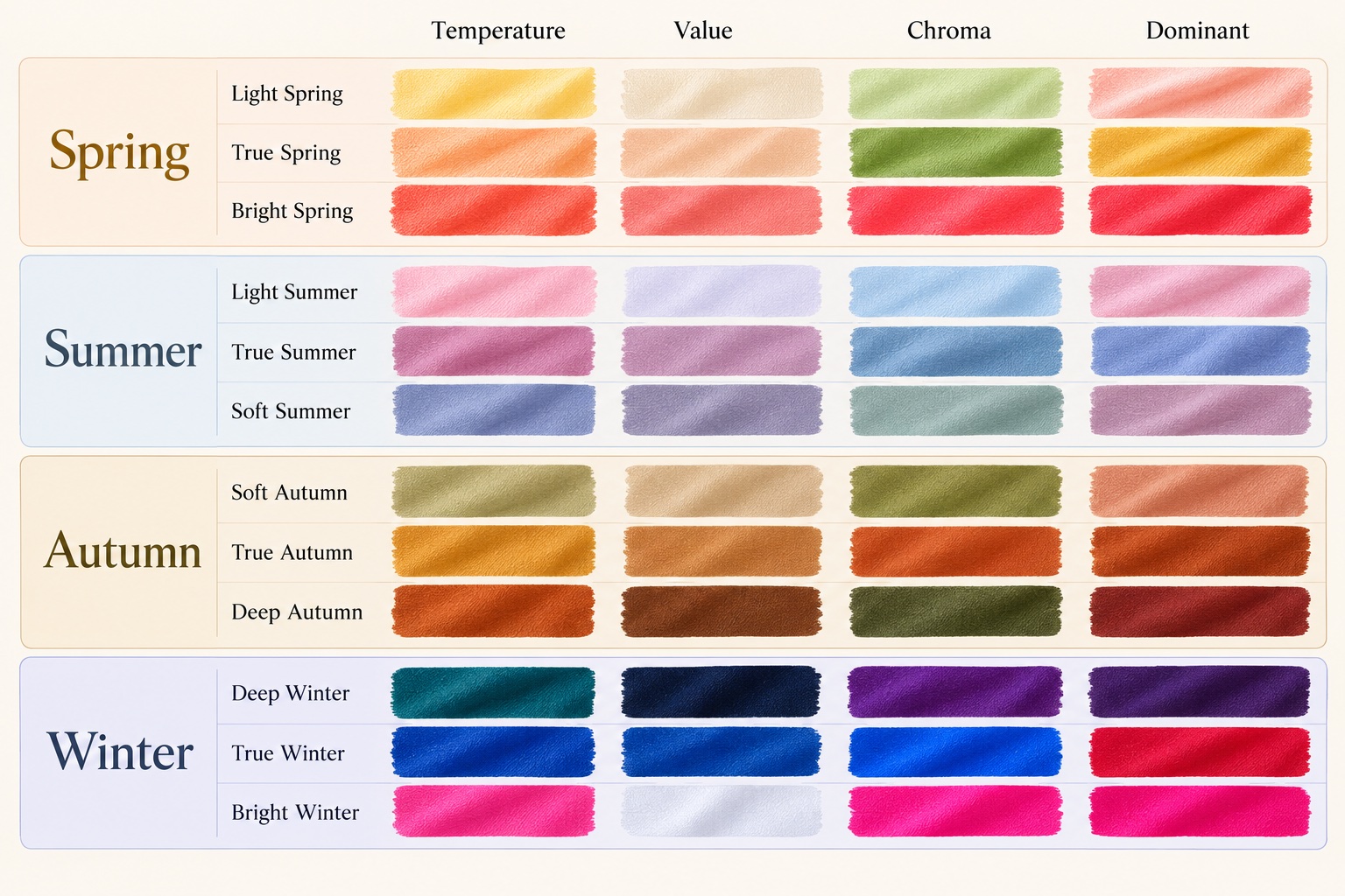
The 12 Seasons Comparison Master Chart
This decision table gives a first-pass comparison. “Neutral-warm” and “neutral-cool” indicate a lean, not an exact halfway point. Value and chroma are relative to the other seasonal palettes. A representative swatch is one useful test color, not the entire palette.
| Subseason | Temperature | Value | Chroma | Dominant quality | Test swatch |
|---|---|---|---|---|---|
| Light Spring | Neutral-warm | Light | Clear to gentle | Lightness | Apricot #F4B183 |
| True Spring | Warm | Light to medium | Clear | Warmth | Tomato coral #E86645 |
| Bright Spring | Neutral-warm | Medium to varied | Very clear | Clarity | Clear turquoise #14B8B2 |
| Light Summer | Neutral-cool | Light | Soft to gentle | Lightness | Powder blue #A9C5DA |
| True Summer | Cool | Light to medium | Soft | Coolness | Cool rose #B77D98 |
| Soft Summer | Neutral-cool | Medium | Muted | Softness | Dusty mauve #9B7D91 |
| Soft Autumn | Neutral-warm | Medium | Muted | Softness | Muted sage #9AAB85 |
| True Autumn | Warm | Medium to deep | Rich, softened | Warmth | Burnt sienna #B65B35 |
| Deep Autumn | Neutral-warm | Deep | Rich | Depth | Dark olive #4F5B33 |
| Deep Winter | Neutral-cool | Deep | Clear | Depth | Deep teal #075564 |
| True Winter | Cool | Varied, high contrast | Clear | Coolness | Cobalt #214DA0 |
| Bright Winter | Neutral-cool | Varied, high contrast | Very clear | Clarity | Electric fuchsia #D62983 |
Read across a row before comparing labels. For example, both Light Spring and Light Summer favor light fabric, but Spring tends toward peach and warmth while Summer tends toward blue and coolness. Both Deep Autumn and Deep Winter support dark colors, but dark olive carries earthy warmth while deep teal can sit in a cooler, clearer contrast scheme. These are starting hypotheses for draping.
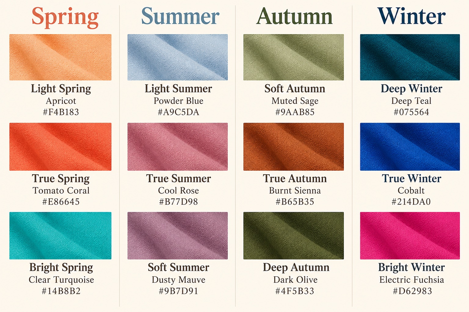
The Spring Subseasons
Spring palettes share a fresh warm direction, but they differ in what matters most. A useful three-way test places apricot, tomato coral, and clear turquoise beside the face under the same daylight. Keep the fabric size and finish as similar as possible. For a broader family comparison, see Spring versus Summer palette differences.
Light Spring: airy warmth
Light Spring is led by high value. Peach, pale warm aqua, light coral, fresh cream, and clear light yellow feel buoyant rather than icy. This palette can borrow some gentle light colors from Light Summer, but usually prefers a warmer cast. When comparing the two, try pale apricot against cool powder blue, then repeat with another matched pair. If both are comfortable but dark saturated color overwhelms the look, lightness may be the key dimension. Light Spring does not require blonde hair or fair skin; the fabric response matters more than a portrait stereotype.
True Spring: golden warmth
True Spring puts warmth first. Tomato coral, marigold, grassy green, golden yellow, and warm turquoise create a sunny effect without Autumn's heavy brown base. Compare a clear tomato coral with Bright Spring's more electric hot coral: if warmth feels more important than sharpness, True Spring may fit better. Its warmer colors can overlap with True Autumn, but Spring versions generally feel lighter and fresher. A tan or golden hair does not prove this season; use multiple textiles near the face.
Bright Spring: lively clarity
Bright Spring, sometimes called Clear Spring, is led by high chroma and a neutral-warm lean. Clear turquoise, poppy red, hot coral, and vivid lime work with intentional contrast. It shares clarity with Bright Winter, but the Spring version usually has a little more yellow or warmth. Compare a warm turquoise and an icy electric blue at similar intensity. If muted colors consistently seem disconnected but the warmer vivid option feels balanced, Bright Spring is worth exploring. The Bright Spring guide shows outfit and neutral choices.
The Summer Subseasons
Summer is generally cool and lower in chroma than Winter. Light Summer is airy, True Summer is most unmistakably cool, and Soft Summer is grayed and muted. The word “soft” describes the palette's reduced chroma, not personality or facial features. Compare actual cloth instead of photos, since a camera can make powder blue look icy or dusty mauve look brown.
Light Summer: delicate coolness
Light Summer pairs coolness with high value: powder blue, misty lavender, pale rose, soft aqua, and cool light gray. It flows toward Light Spring through lightness but usually looks less golden. A strong charcoal or very saturated magenta may feel too heavy next to the face when used in a large area. If peach and powder blue are both plausible, try them in identical cotton and add a second pair, such as warm light aqua versus cool pale aqua. Our Light Summer versus Soft Summer comparison helps separate lightness from mutedness.
True Summer: cool first
True Summer, also called Cool Summer, is anchored by cool rose, blue-based raspberry, slate blue, periwinkle, and cool navy. It is softer than Winter and usually less pale than Light Summer. Compare cool rose with warmer dusty peach: if the blue-based version remains harmonious at similar depth and softness, temperature may be the strongest clue. True Summer can borrow a restrained cool color from True Winter, but a fully icy, stark combination may be more forceful than needed. Our Summer neutrals and accent colors guide gives more combinations.
Soft Summer: cool-muted balance
Soft Summer sits at the muted boundary with Soft Autumn. Dusty mauve, smoky blue, soft plum, sage, and grayed teal illustrate its low chroma. Relative to Soft Autumn, these colors tend to have a cooler, rosier, or bluer cast. Try dusty mauve beside muted sage in similar fabrics; then compare two versions of teal, one cool and one warm. If both seasons contribute wearable colors, prioritize the specific shade that works instead of forcing a rigid label. Soft Summer can include medium-depth accents, so “soft” does not mean pale only.
The Autumn Subseasons
Autumn generally favors warm, rich, somewhat softened color. Its lightest-looking edge is Soft Autumn, its warm center is True Autumn, and its darkest edge is Deep Autumn. Brown, rust, olive, and teal are common names, but the exact temperature and depth distinguish one Autumn palette from another. The Autumn palette guide offers a family-level view.
Soft Autumn: gentle earth tones
Soft Autumn leads with muted chroma and a neutral-warm direction. Muted sage, oatmeal, warm taupe, soft terracotta, and dusty olive feel earthy without the stronger saturation of True Autumn. It shares softness with Soft Summer, so a warm sage and a cool dusty mauve make a useful comparison. Do not assume a warm person must suit every orange: bright tangerine can be too sharp for a muted palette. A medium, calm contrast often gives these colors room to work.
True Autumn: warm and rich
True Autumn centers warmth in burnt sienna, pumpkin, moss, mustard, camel, and warm forest green. Compared with True Spring, Autumn colors are typically deeper and more browned or earthy. Put clear tomato coral beside burnt sienna, keeping the two fabrics equally prominent. If the richer grounded color sits more comfortably, consider Autumn; if the fresh one wins repeatedly, explore Spring. The Soft Autumn versus True Autumn guide shows how saturation changes within this family.
Deep Autumn: warm depth
Deep Autumn, also called Dark Autumn, is led by low value. Dark olive, espresso, aubergine, oxblood, and deep petrol teal form a rich palette with warmth under the surface. It shares depth with Deep Winter, yet often looks better in brown-based or olive-leaning darks than in icy black-and-white contrast. Try dark olive and cool deep teal, then warm espresso and blue-black. The useful clue is whether warmth persists as colors deepen. Dark skin or dark hair does not automatically imply Deep Autumn; people with many appearances can respond to deep, warm fabric.
The Winter Subseasons
Winter generally supports cool, clear color and stronger contrast. Deep Winter emphasizes darkness, True Winter emphasizes coolness, and Bright Winter emphasizes vivid chroma. Black and white appear often in examples, but one black shirt is not a season test: finish, fit, makeup, and the rest of the outfit can change its effect.
Deep Winter: cool depth
Deep Winter combines dark colors with a cool or neutral-cool direction. Deep teal, blue-black, burgundy, emerald, and dark plum can create contrast without relying on every color being electric. It flows toward Deep Autumn because both support depth. A dark olive versus deep teal comparison can show which temperature family feels more connected to the face. If cool depth wins but icy bright colors feel too sharp, Deep Winter may be a stronger starting point than True or Bright Winter. See True Winter versus Deep Winter for a closer comparison.
True Winter: cool, defined contrast
True Winter, sometimes called Cool Winter, puts coolness first. Cobalt, blue-red, icy pink, cool emerald, black, and optical white create crisp combinations. Compare cobalt with a warmer vivid turquoise at similar saturation; then test cool crimson against tomato red. A repeated cool preference matters more than eye color. True Winter can borrow some cooler, softer shades from True Summer, though it usually sustains sharper contrast than Summer. Use an icy accent sparingly if a full high-contrast outfit feels too theatrical for your style.
Bright Winter: cool electric color
Bright Winter, also called Clear Winter, is the highest-chroma cool Winter edge. Electric fuchsia, vivid cobalt, clear emerald, and icy lemon can stand beside black and white with strong definition. It shares clarity with Bright Spring, but the Winter side is typically cooler. Compare electric fuchsia with warm hot coral, then icy turquoise with a warmer green-leaning turquoise. If softness is the first quality that fails and cooler vivid colors consistently win, Bright Winter is a useful working palette. The same vivid garment can be worn by anyone as a deliberate statement; the chart describes a repeatable harmony, not permission.
Sister Seasons and Color Borrowing
“Sister seasons” are neighboring palettes linked by a dominant dimension. Light Spring and Light Summer share high value. Bright Spring and Bright Winter share clarity. Soft Summer and Soft Autumn share muted chroma. Deep Autumn and Deep Winter share depth. These four bridges are especially useful when a person can wear colors on both sides of a temperature boundary. True Spring and True Autumn also share warmth; True Summer and True Winter share coolness, though value and chroma still differ.
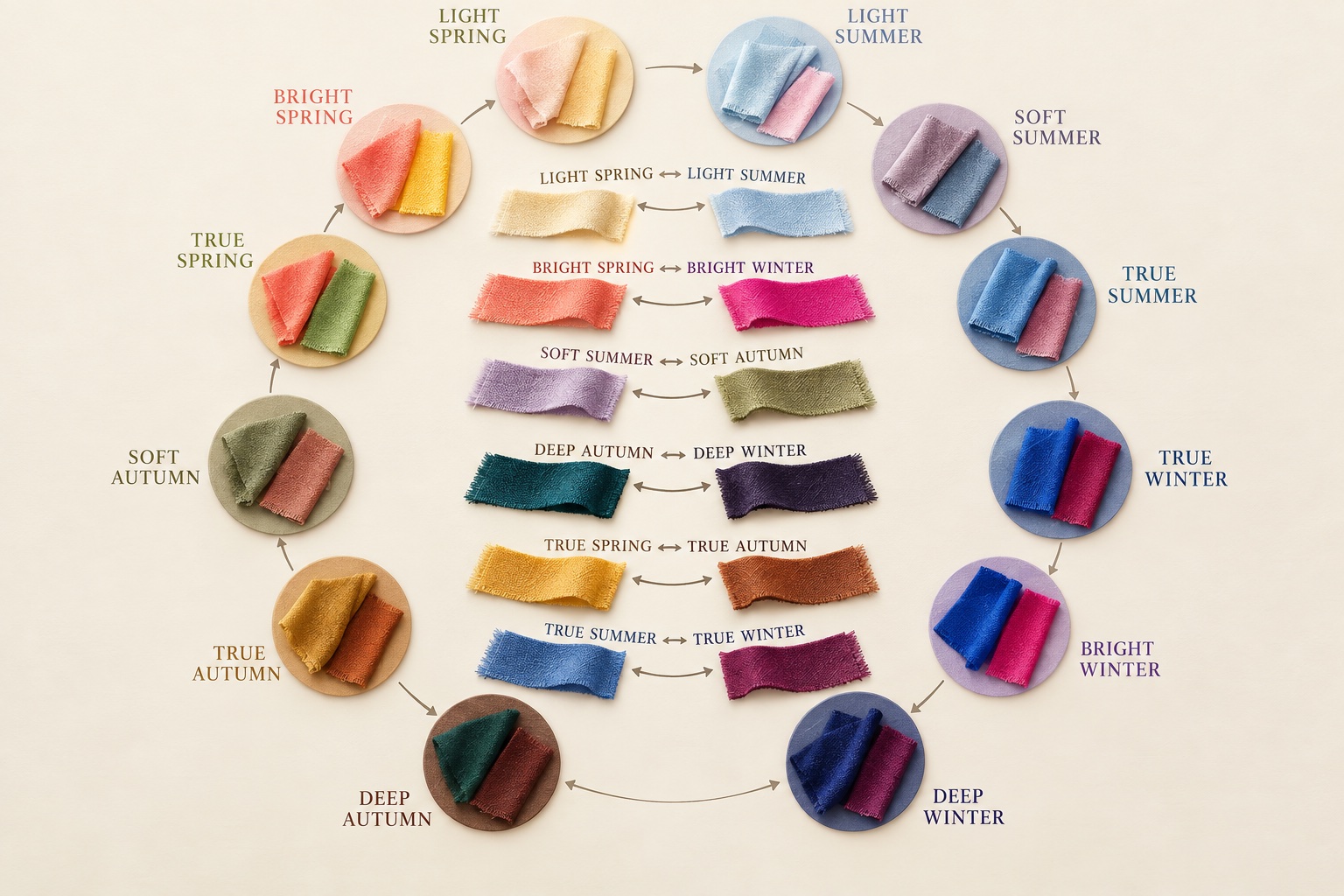
| Bridge | Shared quality | What to compare |
|---|---|---|
| Light Spring ↔ Light Summer | Lightness | Pale apricot versus cool powder blue |
| Bright Spring ↔ Bright Winter | Clarity | Warm turquoise versus icy cobalt |
| Soft Summer ↔ Soft Autumn | Mutedness | Dusty mauve versus warm muted sage |
| Deep Autumn ↔ Deep Winter | Depth | Dark olive versus cool deep teal |
| True Spring ↔ True Autumn | Warmth | Fresh tomato coral versus earthy sienna |
| True Summer ↔ True Winter | Coolness | Soft cool rose versus crisp cobalt |
Borrowing works best when you keep the shared dimension and adjust the one that differs. A Light Summer wardrobe could borrow a pale Spring aqua if the yellow cast is modest. A Deep Autumn outfit could add a dark Winter teal while keeping its earthy neutrals. Put borrowed colors in a scarf or top first, observe them in daylight, then decide whether they earn a larger place. If you are building outfits from multiple palettes, the clothing color charts and wardrobe guide can turn a working color range into repeatable combinations.
12 Seasons System FAQ
What is the difference between four seasons and twelve seasons?
The four-season system groups colors by broad warm/cool and fresh/soft family relationships. The twelve-season system adds three subseasons to each family and makes lightness, depth, and chroma more explicit. Neither system changes your coloring. Twelve labels can make a difficult boundary easier to describe, but a smaller system may be enough to choose useful garments.
Is twelve-season color analysis more accurate than sixteen-season analysis?
There is no universal clinical accuracy ranking for styling systems. Sixteen-season systems divide some boundaries further or use different naming rules. Their extra labels can help a trained consultant describe a nuanced drape result, but they can also add complexity without improving daily choices. Compare the frameworks in our 12 versus 16 seasons guide and judge them by whether the suggested colors work for you.
What if I seem to sit between two seasons?
First compare the two neighboring palettes on the dimension they share. If both Light Spring and Light Summer work, keep the fabrics light and vary only warmth. If Soft Summer and Soft Autumn both work, keep chroma muted and vary temperature. Use several pairs, consistent daylight, similar fabric finishes, and little or no changing makeup. Record the exact colors that work; a mixed wardrobe is more useful than a forced label.
Can an online quiz determine my exact subseason?
An online quiz can organize observations and suggest a starting range, but photos and self-reported features are affected by light, white balance, display settings, and personal interpretation. Test its result with physical fabrics near your face. Our interactive color analysis quiz can help you narrow the possibilities; treat the output as a hypothesis to verify. If several controlled comparisons remain ambiguous, an in-person draping session may provide another perspective.
Do the twelve seasons work across all skin tones?
Yes as a comparative styling framework, provided examples and drapes include a full range of complexions. Light and deep name the value of the most characteristic palette colors, not the required depth of a person's skin. Do not exclude a season from a portrait stereotype. The dark skin tone palette guide discusses contrast and undertone without assuming one palette from skin depth.
The useful result of a 12 season color wheel is a short list of colors to test, plus a way to explain why a neighboring shade succeeds or fails. Begin with two or three drape pairs from the master chart, notice the repeated pattern, and build outward from clothes you already own.
💫 Discover Your Complete Color Palette
Ready to explore your personal palette? Use our color analysis quiz as a starting point, then compare its suggestions with real fabric in consistent daylight.
Take Color Analysis Quiz →