Dark Skin Tone Palette Guide

Finding colors that genuinely complement a deep complexion is more nuanced than most style guides suggest. Whether you're shopping for clothing, selecting makeup shades, or planning a craft project, the standard advice—"wear neutrals," "try pastels"—often falls flat because it was never built around the full spectrum of dark skin tones.
A well-constructed dark skin tone palette does something different. It starts with your specific undertone (warm, cool, or neutral), maps that to hues that create contrast or harmony where you actually want them, and gives you repeatable references—hex codes, RGB values, color names—you can use anywhere.
Here's what makes that harder than it sounds:
- Dark skin tones aren't a single shade. They span rich espresso browns, deep mahogany, cool ebony, and warm chestnut, each with distinct undertones that respond differently to color.
- Color theory, as it's commonly taught, is built on lighter reference points. Applying it to deep complexions requires deliberate adjustment, not just a direct translation.
- The beauty and fashion industries have historically struggled to acknowledge this complexity—a gap that's well-documented in how poorly many makeup lines have matched or even addressed darker skin tones.
This guide closes that gap with a practical framework. You'll find the core color codes used to represent dark skin tones, a breakdown of undertone families, the hue categories that tend to work best across fashion and makeup, and a clear method for identifying your own personal palette. By the end, you'll have concrete tools—not vague principles—to choose colors with confidence.
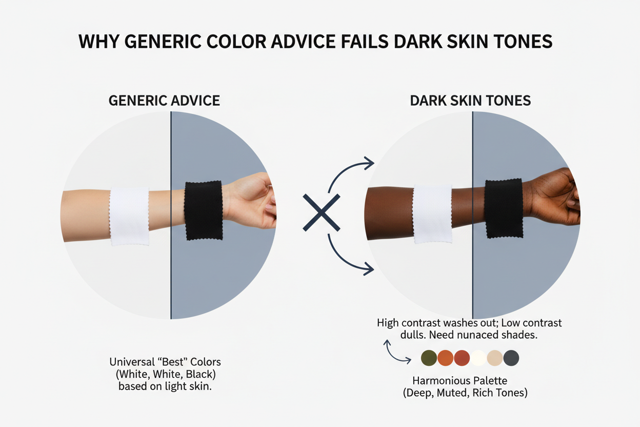
Why Generic Color Advice Fails Dark Skin Tones
Most mainstream color guidance was built on a narrow reference range. Style systems developed decades ago were calibrated against lighter skin tones, which means their rules about which colors "pop," which shades feel "washed out," and which combinations create flattering contrast don't translate to deep complexions.
The consequences show up everywhere:
- Makeup brands have repeatedly drawn criticism for failing to match or even acknowledge the full range of brown and deep skin tones. The undertone complexity within dark skin—the difference between a warm red-brown and a cool blue-black—has historically been collapsed into a handful of "deep" shades.
- Fashion advice defaults to "neutrals are safe" without specifying which neutrals actually work against rich melanin, or why some earth tones enhance deep skin while others dull it.
- Color theory frameworks taught in most style contexts assume that contrast and vibrancy behave the same across all skin depths. They don't.
People with deep complexions end up with advice built for someone else, then left to figure out why it isn't working. This guide starts from how color actually behaves on dark skin, not how it's assumed to.
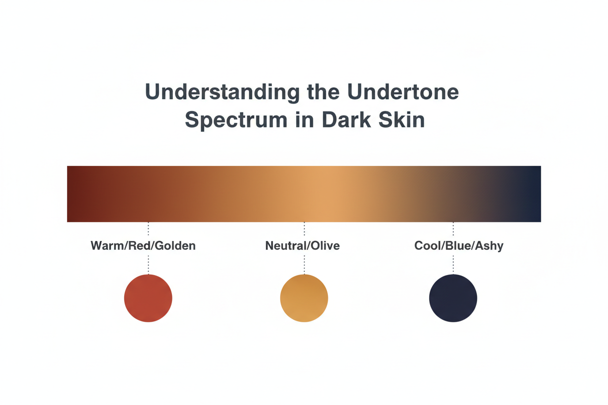
Understanding the Undertone Spectrum in Dark Skin
Undertones in dark skin follow the same three-category framework—warm, cool, and neutral—but the visual cues that reveal them work differently than they do on lighter skin. Standard tests like "look at your veins" or "hold a piece of white paper next to your face" are less reliable when melanin levels are high. The surface depth of the skin can mask or shift what you see.
Warm, Cool, and Neutral: What Each Undertone Looks Like on Deep Skin
With deep complexions, you'll get more from watching how your skin reacts to specific colors than from vein or paper tests. Here's what to look for:
Warm undertones in dark skin typically carry golden, amber, or red-brown casts. Your skin may look bronzed in natural light. Colors in the orange and terracotta family tend to feel like they belong without effort. Gold jewelry reads richer against your skin than silver does.
Cool undertones in dark skin present as blue-black, ashy, or plum-adjacent depths. Your complexion can look almost jewel-like in certain light. Silver and white-gold jewelry tends to complement your skin more naturally than yellow gold. Colors with blue or purple bases often enhance rather than clash.
Neutral undertones sit between the two. Your skin may carry hints of both red-brown warmth and subtle ash without either one taking over. Both gold and silver jewelry tend to work, and you have more flexibility across color families than either of the other undertone types.
One thing worth keeping in mind: in dark skin, undertones are embedded within a deep base, not sitting on top of it. You're reading for warmth or coolness in how color interacts with you—not for a visible tint on the surface.
The Core Dark Skin Tone Palette: Key Hex Values and Color Codes
Color palettes built around dark skin tones give you reference points that work across any medium—shopping, design, makeup matching, craft projects. Community-documented palettes on sites like Color Hex and SchemeColor include hex codes, RGB breakdowns, and cross-format values, which makes them practical to use and easy to share.
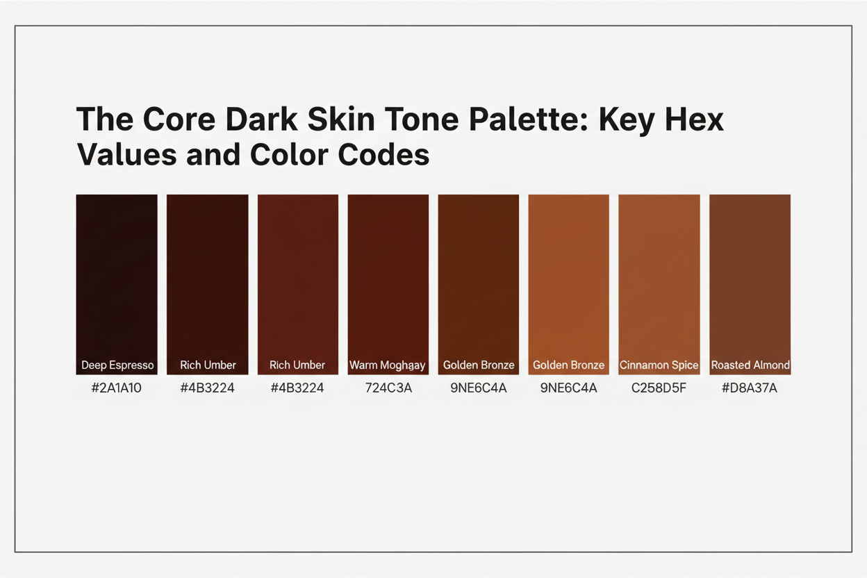
A representative dark skin tone palette covers several shades. Exact values vary by source and by person, but the general range looks something like this:
| Shade Description | Hex Example | Approximate RGB |
|---|---|---|
| Deep espresso brown | #3B1F0A |
59, 31, 10 |
| Rich mahogany | #6B3226 |
107, 50, 38 |
| Warm chestnut | #8D5524 |
141, 85, 36 |
| Medium brown | #C68642 |
198, 134, 66 |
| Cool ebony | #1C1008 |
28, 16, 8 |
These are reference anchors, not rigid definitions. Your actual skin tone will sit somewhere within or near this range.
Reading the Color Codes: How to Use Hex, RGB, and PANTONE Values
Each color code format has a different practical use:
- Hex codes (e.g.,
#8D5524) are for digital applications—website design, app interfaces, digital makeup try-on tools. If you're using a color-matching app or browsing a brand's site with digital swatches, hex values are your most portable reference. - RGB values (e.g., 141, 85, 36) describe the same color in terms of red, green, and blue light intensity. Design software and digital photo editors use these.
- CMYK values translate the color into print terms—useful when working with a designer, ordering printed swatches, or dealing with fashion production.
- PANTONE® and RAL numbers are industry-standard references that carry across mediums. If you need to communicate a skin tone reference to a makeup brand, textile manufacturer, or interior designer, PANTONE numbers are the most widely understood format. Sites like SchemeColor publish the closest PANTONE equivalents alongside hex and RGB data for documented dark skin tone shades.
You don't need to memorize any of this. Save or screenshot the hex code for your closest match, then run it through a free converter when you need it in another format.
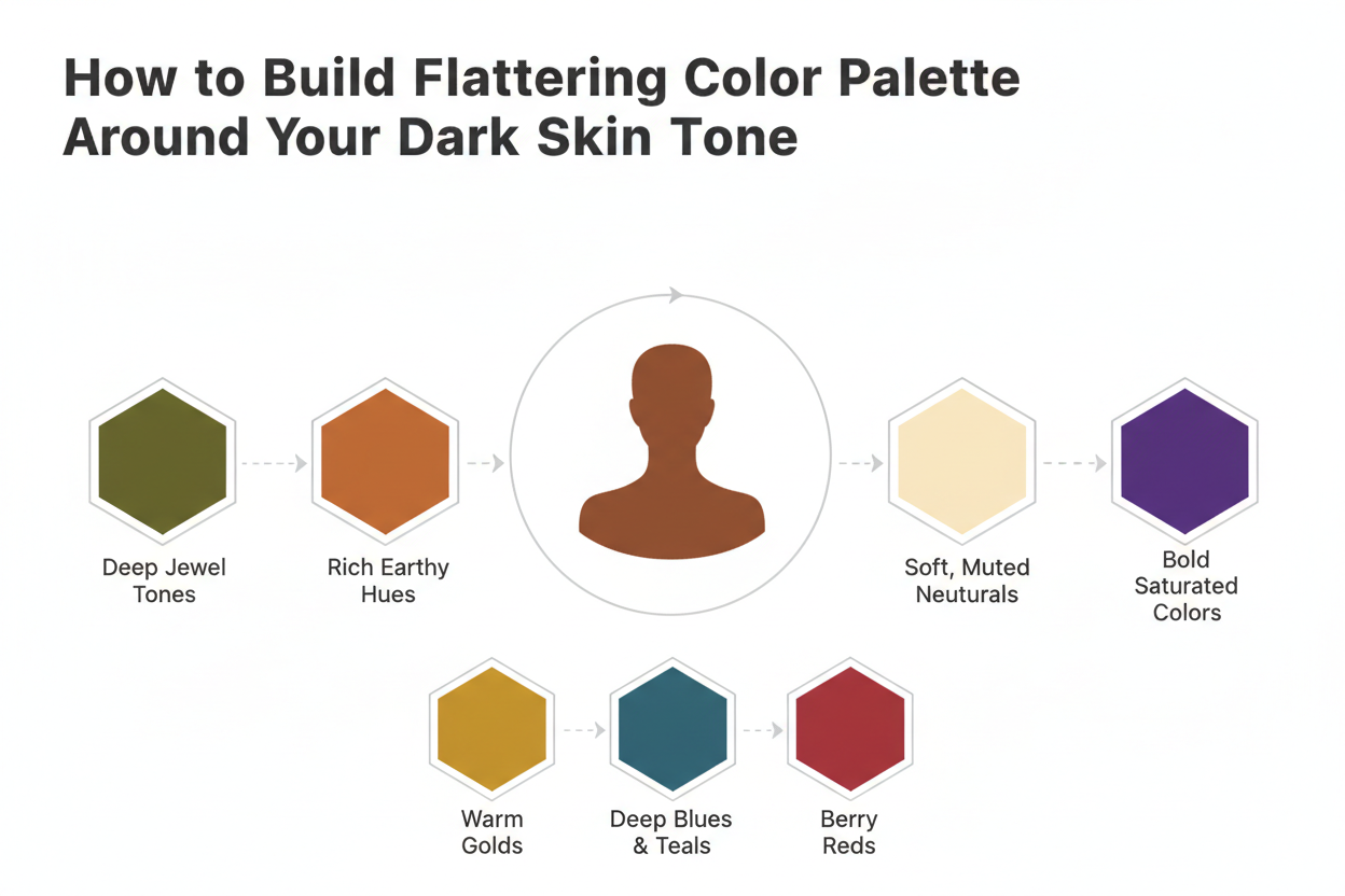
How to Build a Flattering Color Palette Around Your Dark Skin Tone
The core idea is simple: use color theory to find hues that work with your actual coloring—skin tone, hair, eyes—then build from there. In practice, that means adapting the standard framework for the depth and richness of dark skin.
Here's a repeatable process:
Step 1: Confirm your undertone category. Use the visual cues in the undertone section above. If you're still not sure, the most reliable test is to hold a clearly warm fabric (burnt orange or mustard) next to a clearly cool one (cobalt or lavender) near your face in natural light, no makeup. One will almost certainly look more right.
Step 2: Identify your contrast level. Deep skin tones tend to create strong natural contrast against mid-range and light colors. That's an asset—bold, saturated colors often look striking against a deep complexion without tipping into overwhelming. Notice whether your hair and eyes add more contrast or read closer to your skin tone.
Step 3: Select anchor colors from hue families that work with your undertone.
- Warm undertones: burnt orange, terracotta, warm olive, gold, rust, deep coral
- Cool undertones: cobalt, emerald, deep plum, berry, icy lavender, cool white
- Neutral undertones: most saturated hues work; the choice becomes more about personal preference and contrast level
Step 4: Add depth and neutrals that belong to your undertone. Neutrals aren't interchangeable. Warm undertones tend to look better with camel, chocolate brown, and off-white than with grey or cool white. Cool undertones pair well with charcoal, slate, and bright white.
Step 5: Test before committing. People with dark skin can usually move more boldly than conventional style advice suggests. High-contrast, saturated combinations tend to read as intentional rather than excessive. Try a saturated shade in one piece before committing to a full outfit or product line.
Ready to skip the guesswork? A personalized color analysis can map your exact undertone and build a palette specific to your coloring. Take the quiz at color-analysis.app to get your results.
Best Hue Families for Dark Skin Tones
Some color families just work reliably across dark skin tones, regardless of undertone. The reason comes down to contrast and how deeply saturated pigments interact with rich melanin.
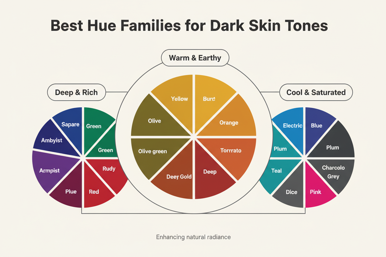
Jewel tones are the most dependable starting point. Emerald green, sapphire blue, deep amethyst, ruby red — all carry enough saturation to read clearly against a deep complexion without disappearing. They work with the richness of dark skin rather than fighting it.
Earth tones can be deeply flattering, but specificity matters more here than in other color families. The versions that land best tend to be clay-rich and saturated: burnt sienna, terracotta, warm ochre, chocolate brown. Dusty, muted earth tones — greyed-out taupe, pale khaki — often don't have enough contrast to look intentional.
Bold, saturated brights like cobalt, fuchsia, tangerine, and chartreuse are particularly at home on deep complexions. The skin provides a strong natural backdrop, so these colors don't have to fight for attention.
Deep, moody darks are underused. Burgundy, forest green, ink navy, deep eggplant — worn near dark skin, these create a tone-on-tone richness that reads as sophisticated rather than heavy.
Hues to approach with caution:
- Very pale pastels (baby pink, mint, lavender) often lack the contrast to register clearly — though this is a contrast issue, not a hard rule
- Beige and greige tones that closely match the skin can flatten the whole look
- Highly muted or greyed-out shades tend to read as dull rather than subtle
Applying Your Dark Skin Tone Palette Across Fashion, Makeup, and Craft
The same palette logic works across every medium. What shifts is how you reference and apply the color data.
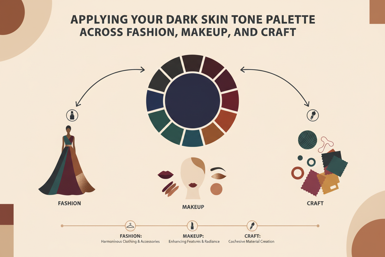
Fashion and personal styling: Use your anchor colors to pick statement pieces—a jewel-tone blouse, a saturated coat—and build your neutrals around your undertone. Deep skin tones carry bold color well, so there's no reason to default to muted palettes out of habit. Hex and PANTONE references help when shopping online, especially for brands that publish detailed color descriptions.
Makeup: This is where the gap in mainstream guidance shows up most clearly. Foundation matching depends on accurate undertone identification—a shade that matches your depth but not your undertone will read ashy or orange, even with good coverage. Start with your hex reference when using digital shade-matching tools. For lip and eye color, the same rule applies: bold, saturated pigments tend to perform better on deep skin than sheer formulas that disappear against rich melanin.
Yarn and craft projects: Color selection in fiber arts follows the same principle. In theory, this should be simple—identify which hues work with your coloring and build from there. In practice, craft guidance has the same historical gaps as fashion and beauty. If you're choosing yarn or fabric to wear near your face, treat it like a garment: test it against your skin in natural light and lean toward saturation. The jewel tones and warm earth tones that work in clothing tend to work in wearable craft projects too.
Design and digital contexts: If you're working on branding, illustration, or UI that needs to represent dark skin tones accurately, hex and RGB values from community palettes are a practical starting point. Cross-reference with PANTONE values when a project spans both digital and print.
How to Discover Your Personal Dark Skin Tone Palette
General guidelines get you most of the way there, but a personal palette is more precise than any category. The demand for individualized color advice for dark skin is real, and the frameworks in this guide only go so far before personal variables start to matter more than general rules—your specific undertone, hair depth, eye color, the occasions you're dressing for.
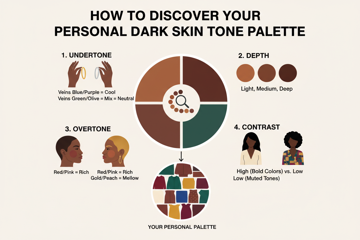
The most reliable path to a personal palette is a structured color analysis that accounts for all of those variables together. A digital quiz or professional color analysis takes the general framework and turns it into specific recommendations for your coloring. Less guesswork, more a repeatable reference you can use every time you shop, select makeup, or plan a project.
The sections above give you the vocabulary and the logic. A personalized analysis gives you the map.
People Also Ask
What colors look best on dark skin tones?
Jewel tones tend to work well on dark complexions. Emerald, sapphire, deep amethyst, and ruby all hold up because their saturation doesn't get lost against rich melanin. Saturated brights like cobalt, fuchsia, and tangerine do the same. For earth tones, go warmer and richer: terracotta, burnt sienna, warm ochre. The dusty, muted versions tend to fall flat. Basically, the deeper the complexion, the more it can handle bold, saturated color without anything looking overdone.
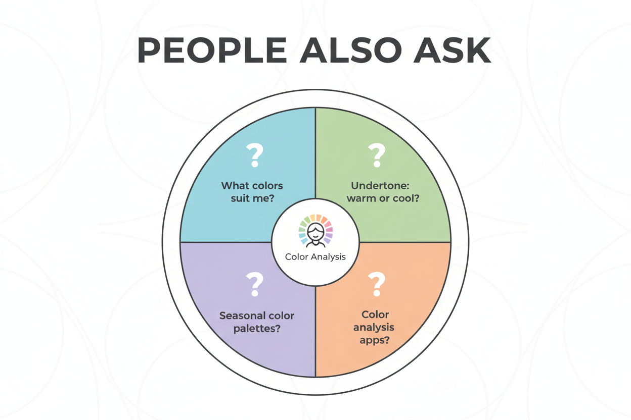
How do I find my undertone if I have dark skin?
Standard undertone tests—checking vein color or holding white paper next to your face—work less reliably on deep complexions because surface melanin can mask the cues. A fabric test is more dependable: hold a clearly warm fabric (burnt orange or mustard) and a clearly cool fabric (cobalt or lavender) near your face in natural light, without makeup. Whichever looks more harmonious tells you your undertone direction. You can also pay attention to colors you already know work. If gold jewelry consistently looks better than silver, your undertones run warm. If silver looks cleaner, they run cool. The point is reading how color interacts with your skin, not hunting for a visible surface tint.
What is the hex code for dark skin tone?
There's no single hex code for dark skin—the range is too wide for that. Community-documented palettes use multiple reference points across the spectrum. Some commonly cited anchors:
#3B1F0A— deep espresso brown#6B3226— rich mahogany#8D5524— warm chestnut#C68642— medium brown#1C1008— cool ebony
These are starting points, not definitions. Sources like Color Hex and SchemeColor publish corresponding RGB, CMYK, and PANTONE® values for each shade, which helps when you need to cross-reference across different mediums.
What colors should people with deep complexions avoid?
No hard rules, but some categories consistently underperform on dark skin:
- Very pale pastels (baby pink, mint, soft lavender) often lack the contrast to read as intentional rather than washed out
- Beige and greige tones close to the skin's own depth tend to flatten everything out
- Muted or greyed-out shades can read as dull rather than subtle — deep skin needs pigment that can hold its own against a rich backdrop
These are contrast considerations, not absolutes. The stronger the saturation, the more reliably a color shows up.
How do I build a color palette for dark skin?
Start with undertone. Use the fabric test or just pay attention to which metals and color families have reliably worked for you in the past. That tells you whether you're pulling warm, cool, or neutral.
From there, note your contrast level. If your hair and eyes are close to your skin tone, you have low contrast. If they're significantly lighter or darker, you have high contrast. This affects how bold you can go without a look feeling overwhelming.
Once you know your undertone, pick anchor hues from the families that match it. Warm undertones tend to work well with burnt orange, rust, and gold. Cool undertones do better with cobalt, plum, and cool white. Neutral undertones have more flexibility across saturated colors generally.
Neutrals matter too. Warm complexions usually pair better with camel and chocolate brown than cool grey. Cool complexions tend to look sharper with charcoal and bright white. Getting the neutrals wrong can throw off an otherwise solid palette.
Then test before you commit. Try one saturated piece before building a whole wardrobe around a new color. If it works, expand from there.
Why do makeup shades often not match dark skin tones?
Mainstream shade ranges were built around light skin. That's the short answer.
The longer one: two problems compound each other. First, the number of deep shades has historically been too small for the actual variation in dark complexions. Second, the undertone complexity within dark skin—the difference between a warm red-brown and a cool blue-black base, for instance—gets flattened into a handful of generic "deep" options. A foundation can match your depth and still look ashy or orange because it missed your undertone entirely. Both have to be right at the same time.
FAQ
What is a dark skin tone palette and how is it different from a general color palette?
A dark skin tone palette is a curated set of colors—identified by hex codes, RGB values, or PANTONE references—selected specifically to complement deep and rich complexions. It differs from a general color palette in two ways.
First, scope: general color palettes are often built around a broad, averaged skin tone range that historically skewed toward lighter complexions. A dark skin tone palette focuses on the specific depth, saturation, and undertone dynamics relevant to deep skin.
Second, purpose: it accounts for the higher melanin levels in dark skin, which change how hues read. Colors that appear bold on lighter skin may register differently against a deep complexion, so the palette emphasizes contrast, saturation, and undertone alignment rather than applying universal rules.
How do I identify my undertone if I have a deep or dark complexion?
Standard methods—checking vein color or holding white paper next to your face—are less reliable on dark skin because surface melanin can obscure the signals. More useful approaches:
- The fabric test: Hold a warm-toned fabric (burnt orange, mustard) and a cool-toned fabric (cobalt, lavender) near your bare face in natural light. The one that looks more harmonious points to your undertone.
- Metal observation: If gold jewelry consistently looks more flattering, your undertones lean warm. Silver reads cleaner on cool undertones.
- Pattern recognition: Look at colors you already know work well and notice whether they cluster toward warm or cool families.
The goal is reading how color interacts with your skin, not looking for a visible tint on the surface.
Which color families are most flattering for dark skin tones?
Several categories reliably complement deep complexions across fashion, beauty, and craft:
- Jewel tones: emerald, sapphire, deep amethyst, ruby — their saturation holds its own against rich melanin
- Saturated brights: cobalt, fuchsia, tangerine, electric yellow
- Warm earth tones: terracotta, burnt sienna, warm ochre, cognac
- Deep, moody neutrals: chocolate brown, charcoal, inky navy
The general principle from color theory: deep complexions pair well with colors that have strong pigment and a clear identity. Muted, greyed-out, or very pale versions of any color tend to look flat against dark skin — low contrast, no pop.
Can I use hex and PANTONE color codes to match my skin tone for makeup or fashion?
Yes, and it's one of the more practical uses of standardized color references. Community-documented palettes—like those on Color Hex—publish hex, RGB, and PANTONE values for a range of dark skin tone reference points. You can use them to cross-reference shades across different contexts (screen, print, fabric swatch, foundation), communicate precisely with makeup artists, tailors, or designers about your exact depth and undertone, and identify adjacent colors on a color wheel that are likely to complement your specific shade.
Screen calibration and material finishes affect how a color reads in practice, so treat the codes as a starting reference rather than a final answer.
Why have mainstream brands historically struggled to represent dark skin tone palettes accurately?
The problem is structural. Color systems in fashion and beauty were largely developed around a narrow skin tone reference range, and that calibration has carried forward ever since. Two issues compound each other:
- Not enough deep shades: The number of deep shades has routinely been too small relative to the actual variation within dark complexions.
- Undertone flattening: The complexity within dark skin — a warm red-brown base versus a cool blue-black base, for example — often gets collapsed into a small cluster of generic "deep" options.
This is precisely why makeup brands have faced criticism for not matching, or even acknowledging, the range within brown and dark skin tones. A product can match depth while missing undertone entirely, leaving a result that looks ashy or off-warm even when the coverage is otherwise fine.
How does color theory apply differently to dark skin compared to lighter complexions?
Color theory itself doesn't change—the relationships between hues, saturation, and value stay the same. What changes is the starting point from which those relationships are evaluated.
Deep skin tones sit in a different place on the value scale, which shifts how contrast works:
- Contrast requirements: Colors need enough saturation or lightness difference to show up clearly against a deep base. Pale pastels that create high contrast on light skin may create low contrast on dark skin, making them look washed out.
- Undertone interaction: Warm undertones in dark skin respond to color the same way warm undertones do in any complexion—they harmonize with golden, red-adjacent, and earthy hues—but the effect plays out against a much richer backdrop.
- Saturation tolerance: Deep complexions can carry highly saturated colors without the combination feeling like too much, partly because the skin tone itself provides a rich, anchoring ground.
Color theory gives you the framework. Understanding where deep skin sits within it is what makes the advice actually useful.
Is there a quiz or tool that can identify my personal dark skin tone color palette?
Yes. The color-analysis.app quiz analyzes your personal coloring—including deep and dark complexions—and generates a tailored color palette based on your skin tone depth, undertone, and contrast level. It's built to handle the nuances that mainstream color advice tends to miss for dark skin, rather than just applying the same generic rules to everyone.
For the most accurate result, take the quiz in natural light without heavy makeup. It also helps to have a warm-toned and cool-toned fabric or color swatch nearby to anchor your undertone responses.