Bright Spring Color Palette: Complete Guide to High-Contrast Warmth
 Reviewed by Alexandra Gilmore
Explore the clear, warm, high-contrast colors of Bright Spring and how to wear them.

Bright Spring, also called Clear Spring, is the clearest and most vivid subseason in the Spring family. It sits between True Spring and Bright Winter: its colors combine high chroma, a neutral-warm direction, and lively light-to-dark contrast. Poppy red, warm turquoise, canary yellow, and hot coral usually express that energy better than dusty pastels or muted earth tones. Clear navy, warm charcoal, creamy ivory, and warm espresso can ground the palette without making it dull. A color season is a styling framework, not a diagnosis from eye or hair color; compare real fabrics beside your face before adopting any chart.
For the parent palette and its three subseasons, see the Spring color palette guide.
This guide shows how to recognize Bright Spring colors, separate the palette from its neighboring seasons, and use it in clothing, makeup, hair, and jewelry. Start with the quality of a color: does it look clean and luminous, or softened by gray? Then consider warmth and contrast. Our 12-season color analysis guide explains the wider map; the sections below focus on this particular high-energy corner of Spring.
What Defines the Bright Spring Color Season?
The bright spring color palette is led by clarity. A clear coral looks fresh and almost lit from within; a dusty salmon of similar lightness looks quieter. Bright Spring also leans warm, although it can borrow some cooler-looking vivid colors from its Winter neighbor. Finally, its best combinations usually keep visible contrast: a bright accent against a clean dark or light neutral, rather than several similarly muted middle tones.
Color professionals often describe color using hue, value, and chroma. Munsell's color system uses hue for the color family, value for lightness, and chroma for strength away from gray. Applied as wardrobe language, Bright Spring suggests neutral-warm hues, medium-to-high value across its lively accents, and high chroma. This is a descriptive analogy, not a claim that seasonal palettes have fixed Munsell coordinates. Adobe's explanation of hue, saturation, and brightness is another useful way to think about why two shirts called “blue” can look entirely different.
Clarity comes first
Compare a vivid coral top with a gray-dusted peach top at similar depth. If the clear color makes your features easier to see and the muted version looks separate or flat, that points toward clarity. Repeat with turquoise versus smoky teal and poppy red versus muted brick. A single flattering color is too little evidence: fabric finish, daylight, makeup, and personal preference can all affect the result.
Warmth and contrast complete the picture
Bright Spring warmth is lively rather than heavy or earthy. Think yellowed turquoise, tomato-leaning red, and fresh lime rather than icy blue, blue-red, or brown olive. Its contrast can come from a coral blouse against navy trousers, or an ivory shirt under a dark jacket with a vivid scarf. The outfit need not be loud from head to toe. One clean color close to the face may carry the whole look.
Key Physical Features of Bright Spring
Illustrations often show sparkling eyes, radiant skin, and hair that contrasts with the face. Eyes may look clear blue, green, hazel, or brown and sometimes show a defined limbal ring. Skin may look peachy, golden, warm olive, or neutral-warm; hair can range from light blonde to deep brunette. These examples help visualize the season, but none is required. The same eye color can occur in several seasons, and a tan, dye, or colored contact can change the apparent contrast.
Rather than sorting people by a checklist of features, look at the response to fabric. Does a vivid warm top keep your face visually present without needing more makeup? Does a dusty top make the eyes or mouth seem less defined under the same light? Does a cool icy color feel disconnected while a green-leaning turquoise feels cohesive? These are comparative observations, not measures of health or beauty. If your complexion is deep, do not rule out Bright Spring because a stock portrait shows pale skin; saturation, warmth, and contrast can work across skin depths.
For the fairest comparison, stand near a window in indirect daylight, remove strong color from the background, and hold fabrics at the same height. Compare similar textures and depths. A shiny coral will catch more light than a matte dusty peach, so repeat the test with matched finishes if you can. Phone cameras often change white balance between shots; live observation matters more than one image.
Bright Spring vs Sister Seasons: True Spring and Bright Winter
Bright Spring shares warmth with True Spring and clarity with Bright Winter. Its middle position can make both neighboring palettes partly wearable. The useful question is which property fails first when you move away from Bright Spring: does extra goldenness become too heavy, or does extra coolness become too icy? Keep fabric depth and brightness similar while you test.
| Decision point | Bright Spring / Clear Spring | True Spring | Bright Winter |
|---|---|---|---|
| Leading quality | Clear, vivid color with neutral-warm lift | Warm, sunny color with golden ease | Clear, vivid color with cool contrast |
| Try near the face | Hot coral or green-leaning turquoise | Golden apricot or marigold | Icy fuchsia or cool electric blue |
| Useful dark neutral | Clear navy or warm charcoal | Warm chocolate or camel brown | Cool black or blue-black |
| If this wins | Clarity plus a little warmth looks balanced | Golden warmth matters more than sharpness | Coolness and stark contrast remain comfortable |
A simple bright spring vs true spring test is hot coral against golden apricot. Both are warm, but the coral is crisper and often slightly pinker. If apricot looks harmonious and coral feels too electric, True Spring may be more useful. For Bright Spring versus Bright Winter, compare green-leaning turquoise with icy cobalt, or poppy red with blue-based crimson. If cool, almost icy shades consistently win, explore Bright Winter instead. Our Bright Spring style examples show how clarity changes the effect of a complete look.
Do not decide from black alone. Many people can wear black as a deliberate fashion choice, and neckline, makeup, hair color, and lighting alter the result. A sequence of paired drapes gives a better picture than one dramatic comparison. If the results are mixed, borrow colors from both palettes and prioritize the specific shades you wear well.
The Complete Bright Spring Color Palette
Build the bright spring colors around clean, saturated accents. Poppy red is a warm red without brick brownness. Tangerine and mango add sunny orange; hot coral bridges orange and pink. Canary yellow reads bright rather than ocher, while lime zest remains fresh rather than olive. Vivid turquoise and clear aqua supply blue-green contrast. Warm magenta can work when it stays bright and slightly warm. Clear navy, ivory, and espresso give the accents structure.
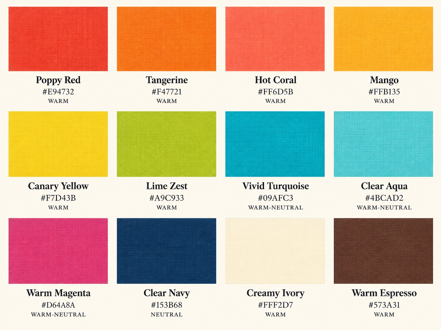
The hex codes in the image are digital starting points, not standardized seasonal measurements. #E94732 suggests poppy red; #09AFC3 suggests vivid turquoise; #153B68 suggests a clear navy. A fabric with the same digital label can differ in finish and appearance. Use the grid to identify the color relationships: reds with energy, yellows without muddiness, blue-greens with clarity, and neutrals that hold a clean edge.
Signature accent groups
Reds and pinks: poppy, watermelon, hot coral, and warm magenta. Choose a red that feels crisp rather than browned, and a pink with visible life rather than powdery gray. Oranges and yellows: tangerine, mango, canary, and warm lemon. These work well as a top, scarf, or bag when a full yellow outfit feels too much. Greens and blues: lime zest, clear grass green, turquoise, and aqua. Their brightness matters more than a literal color name on a store label.
Start with two accents you genuinely enjoy. A coral blouse and turquoise scarf give you range across warm red-orange and blue-green. Add a vivid yellow or lime later if you like that energy. Buying an entire preset palette at once is unnecessary; test each color against your own face and existing wardrobe.
Colors Bright Spring Must Avoid
“Avoid” means test carefully near the face, not discard or forbid. Muted olive, dusty lavender, flat taupe, smoky blue, and gray-beige can lack the clarity that makes Bright Spring outfits feel alive. A shade can be warm yet still too muted: muddy mustard is warmer than icy lemon, but its brown-gray cast may dull the crisp effect. Likewise, a bright cool color can be exciting yet feel icy against neutral-warm coloring.
Try a direct swap before deciding. Compare muddy olive with clean leaf green; dusty lavender with warm magenta; flat taupe with ivory or clear camel. Keep the fabric area and finish similar. If a muted shade is a favorite, wear it below the waist or place a clear neckline color between it and your face. Styling is flexible, and a garment's cut and personal meaning may outweigh a color-chart preference.
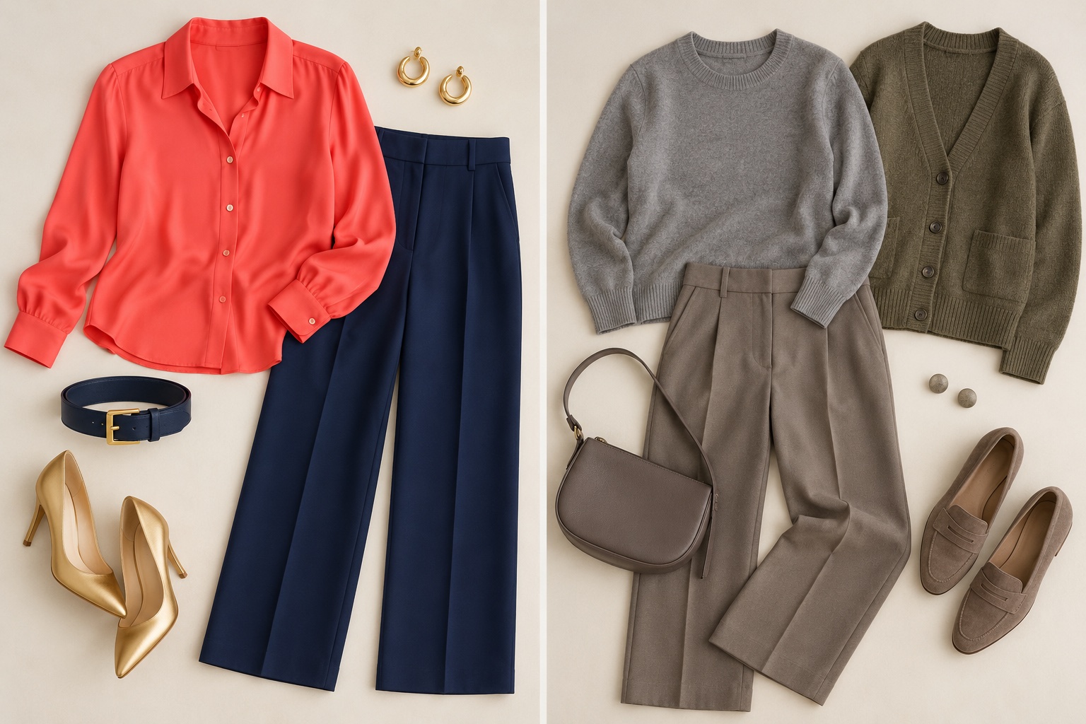
Notice that the left flatlay is not “better” in every context. The right look is quieter and may suit someone whose features respond to soft color. The comparison isolates the bright spring clothing colors principle: clean color plus intentional contrast. Your own face, not the flatlay, determines which direction is useful.
Wardrobe Neutrals and Everyday Styling
Clear navy is an easy anchor for Bright Spring because it creates depth without the icy severity black can have at the neckline. Creamy ivory supplies a light counterpart. Warm charcoal is a useful dark gray when it has a clean edge rather than a dusty cast; espresso adds brown depth without drifting into muddy taupe. Camel can work when it is clear and golden, but a flat, grayed camel may make the palette feel tired. Compare each neutral beside coral and turquoise: if the accent still looks vivid and the outfit feels connected, the neutral is doing its job.
For work, try navy trousers, an ivory shirt, and a coral or turquoise jacket. For a weekend, use dark clear denim with a canary knit and gold hoops. For evening, a poppy red dress with warm gold jewelry can carry the entire palette; a navy dress with a vivid lip is quieter. A patterned garment can combine two accents if its background is clean. Our seasonal capsule wardrobe guide offers a method for repeating favorite colors across a small set of pieces.
Use contrast deliberately rather than evenly spreading bright color everywhere. One vivid top above dark pants creates a strong focal point. An ivory collar inside a navy jacket brings light back to the face. If two bright accents compete, give one a smaller area: coral top, turquoise earrings, navy trousers. If you prefer a restrained outfit, use an ivory shirt, navy suit, and a small coral scarf. The palette should support your style and dress code.
A useful shopping check is to take one familiar accent with you, such as a coral scarf. Place it beside a prospective navy, camel, or espresso item in daylight. If the colors look crisp together, the new neutral may be versatile. If the pairing becomes dusty or heavy, keep looking. This is more reliable than memorizing a retailer's color name.
Makeup, Hair, and Jewelry Recommendations
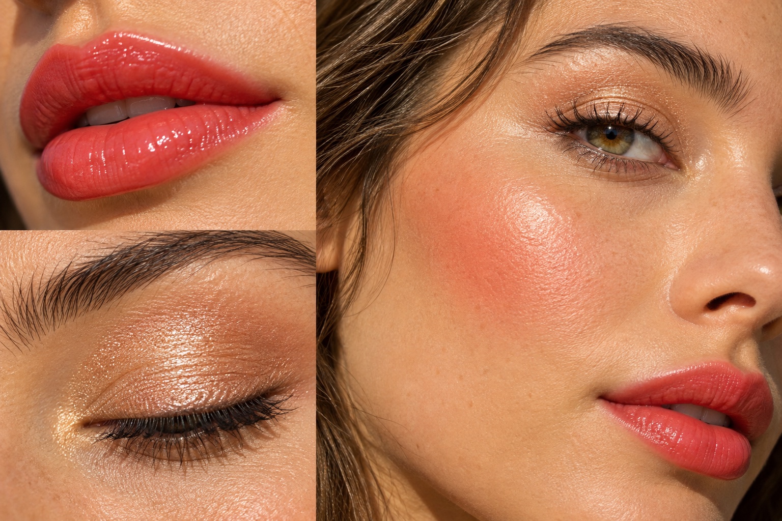
Bright spring makeup usually benefits from a clear finish and a little warmth. Glossy coral-red or watermelon lips echo the palette's vivid accents; peach blush adds warmth without the brown cast of a muddy terracotta. Champagne shimmer can light the eyelid, while a defined brown or navy liner gives contrast. Keep the amount comfortable: a sheer coral lip can communicate the same color direction as a bold lacquer. Compare colors on your own skin, because pigment and finish change after application.
Hair color can reinforce this clear, warm impression when it is chosen with your natural contrast in mind. Glossy warm brunette, clear golden blonde, or bright copper accents may work better than smoky ash or overly muted beige, but no color season requires dye. If you already like your hair, keep it and place vivid color in clothing or makeup. If you change it, test a small swatch and ask a color professional how the shade will fade; a glossy result can become muted after several washes. Explore more options in our Bright Spring hair color guide.
Gleaming yellow gold often repeats the palette's warmth and light. Bright rose gold can work if it does not become dusty; highly polished mixed metals may also look lively. Silver is possible, especially in a small shiny piece alongside a warmer color. Compare metals beside the face in similar shapes and finishes. A heavy matte silver necklace and a delicate polished gold chain test size and shine as much as temperature; the gold versus silver jewelry test explains that limitation.
Bright Spring FAQ
Can Bright Spring wear black?
Yes. Black can be a purposeful dramatic neutral, especially away from the face. If a black neckline feels severe, compare it with clear navy or warm charcoal, or add an ivory collar, coral scarf, vivid lip, or shiny gold earrings. Keep black pieces you enjoy; the palette simply offers alternatives for days when you want a warmer, livelier frame.
Does a tan affect Bright Spring?
A tan may change visible skin depth and which foundation shade fits, but it does not automatically change the color relationships you prefer. Retest very light ivory and dark navy after a substantial change in skin tone, because the amount of contrast you enjoy may shift. Protect your skin according to appropriate health guidance; tanning is not a way to test or achieve a season.
What is the best white shirt shade for Bright Spring?
Start with clean creamy ivory rather than grayish off-white. It provides light contrast while keeping a hint of warmth. Some people also enjoy crisp white, especially with coral or turquoise nearby. Hold both shirts under the chin in the same daylight and choose the one that makes the face and outfit feel connected.
Is Clear Spring the same as Bright Spring?
Many 12-season systems use the names interchangeably. Both describe a vivid palette at the Spring-Winter boundary, with clarity first and warmth present. Individual analysts may draw slightly different borders, so compare actual fabric swatches instead of assuming every branded palette has identical colors.
How can I test Bright Spring without buying a palette?
Use two pairs from clothes or fabric samples: vivid coral versus dusty peach, then green-leaning turquoise versus icy blue. Keep depth, texture, and lighting as similar as possible. Repeat on another day if the result is close. The interactive color analysis quiz can organize your observations, while real draping remains the practical check.
💫 Discover Your Complete Color Palette
Ready to discover all the colors that make you look radiant? Our comprehensive color analysis will reveal your complete personal palette - perfect for hair, makeup, and wardrobe decisions.
Take Color Analysis Quiz →