Autumn color palette essentials: A complete guide

Key Takeaways
- Autumn color palettes include warm, earthy, rich tones that add a cozy feel and seasonal flair, which is perfect for the closet and your home.
- Getting a grasp on undertones, saturation and value among autumn shades helps you style cohesively and make individual selections that complement you as an individual.
- Discovering your own, personal autumn subtype – true, soft or deep autumn – ensures wardrobe building becomes easy and you choose the colors that naturally make you look your best.
- By integrating surprising neutrals and vivid accent colors, along with metallics, it makes autumn looks both versatile and sophisticated, as well as fun to play with.
- Craft a fall wardrobe - Choosing quality core pieces in key seasonal shades, layering, and incorporating statement pieces for individuality.
- Mixing fall prints and textured fabrics not only contributes to warmth and interesting visuals, but encapsulates the psychological warmth and celebratory nature of the season.
An autumn color palette, meaning a combination of warm and earthy tones commonly associated with the fall season — think burnt orange, mustard yellow, olive green and deep brown.
💫 Discover Your Complete Color Palette
Ready to discover all the colors that make you look radiant? Our comprehensive color analysis will reveal your complete personal palette - perfect for hair, makeup, and wardrobe decisions.
Find My Season →These hues are born of nature's transitions as leaves turn and light shifts. So many of us incorporate this palette into design, fashion, and home decor to imbue a space with that cozy, calm vibe.
The body will demonstrate specific applications of these colors in everyday life.
📚 Recent Articles
The Autumn Color Palette Essence
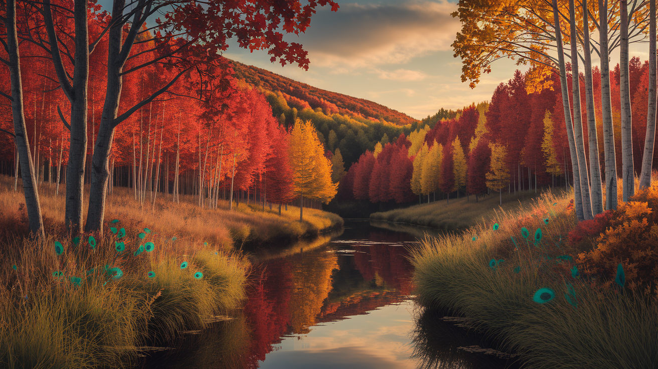
Autumn's palette is ripe with rich, warm, earthy tones. These colors recall the season's transforming terrain, where leaves transition from verdant green to rich reds, golds and browns. What makes this palette so special at its core is comforting, warmth, and a cozy feeling unlike brighter spring tones or vivid winter contrasts.
Staples such as burnt orange, mustard yellow, rust, camel, terracotta, peacock blue, olive and deep green. Burgundy and amber frequently make an appearance in accessories, inspired by fall gemstones such as garnet or amber, further heightening the earthy vibe. These colors are stunning and nostalgic and warming – perfect for your style or your space.
1. The Warmth
Warm shades are the foundation of the autumn color palette and tend to give skin a healthy glow. Reds — rust, burnt orange and goldenrod paired with camel — infuse a warmth and softness with coziness. These hues are welcoming, perfect for those autumnal days spent layering clothes, scarves and knits as the temperatures begin to drop.
Layering up with these warm tones instills outfits with a cozy, welcoming ease that translates beautifully from casual to workwear. You can blend in neutral tones like beige or taupe to avoid overpowering the look and keep things grounded. Experimenting with various warm shades assists people figure out which tones complement their personal style and skin tones.
2. The Undertone
Undertones are important in selecting autumn colors that complement. Most autumn shades contain a golden or red base, which can activate the skin's natural glow — especially those with warmer color profiles. Try a color on by holding it at your face in natural light– instinct will most often tell you if it works with your skin, or not.
Golden-brown, muted green and rich ochre are all great undertones for many autumn wardrobes. Knowing undertones allows you to craft outfits with subconsciously cohesive color schemes, which in turn helps you pare down your wardrobe and develop an effortless mix-and-match system.
3. The Saturation
Autumn's palette ranges from subdued, earthy browns to dramatic, saturated burgundies and peacock blues. Highly saturated colors, such as deep red or rich teal, can serve as statement pieces—a scarf or jacket—to bring the punch. Dressing both muted and intense colors in the same outfit keeps the look fresh without loud.
When playing with saturation, the mood shifts—muted tones are calm and understated, while vivid hues pack an energetic punch. Mixing these together adds dimension and intrigue.
4. The Value
Value is the degree to which a color is light or dark, and it's critical in fall style. Light camel or beige blends beautifully with dark chocolate brown. Introducing darker values, like deep olive or burgundy, helps ground lighter colors and gives richness.
Using contrasting values—light sweaters with dark pants—produces a balanced, visually-stimulating effect. Playing with value in the autumn palette results in ensembles that feel layered, dynamic and personal.
Discover Your Autumn Subtype
Autumn subtypes come from seasonal color analysis, a technique that assists individuals in discovering colors that showcase their attributes. True, Soft, Warm and Deep Autumn are the subtypes. These categories are based on specific combinations of skin, hair and eye color, and identifying your subtype can help simplify selecting clothes and makeup that highlight your assets.
By dressing in colors that match your subtype, it's an effortless way to inject style and confidence, because it works with your natural look instead of against it.
True Autumn
True Autumns are a blend of warm, soft and deep in their coloring. Their skin often has golden or olive undertones, hair is typically medium brown to deep auburn and eyes are warm brown, green or hazel. These guys shine in colors that are neither too bright nor too muted.
Core colors for True Autumn:
- burnt orange.
- Olive green.
- Warm beige.
- mustard yellow.
- Teal.
- Chocolate brown
Classic tonal pairings such as olive green and camel or burnt orange and chocolate brown keep the look clean and cohesive. These pairings echo the vibrancy of fall foliage.
For those seeking more energy, add brighter accents like turquoise or coral. These colors lend themselves perfectly to scarves, belts or shoes to provide some pop without clashing.
Soft Autumn
Soft Autumns have low contrast features, frequently with ashy hair and soft grey, blue or grey-hazel eyes. Their skin is typically fair to medium with a warm, muted peachy or beige undertone. Soft Autumns can look like Summers at first glance, yet their warmth is delicate and most beautifully coaxed out by muted colors.
Top shades are mushroom brown, sage green, and rosewood pink. These tones mix easily into the majority of wardrobes and compliment Soft Autumn's subtle complexion.
Layering similar hues such as soft peach with sand or a pop of brighter dusty teal creates a chic but not harsh appearance. This subtype thrives on colors inspired by earth and leaves.
Casual wear might feature subdued blue jeans paired with a sage green sweater or rosewood pink scarf. It's a soft, natural effect that is very easy to wear all year round.
Deep Autumn
Deep Autumns have bold, dramatic features. Hair is usually dark brown, deep chestnut or dark auburn with warm undertones and eyes are dark and intense (deep brown or black-brown). Skin is generally medium to dark with a golden or olive undertone.
Working colours are brick red, forest green and dark brown. These shades form a striking, statement-making appearance that accentuates Deep Autumn's theatrical traits.
High-contrast styles – like dark brown with olive or brick red with black – add definition and energy. Pairing deep colors with neutrals like charcoal or espresso adds a contemporary flair.
For those who want to strut a bit, blending in a smidge of mustard or peacock blue can provide a fresh, modern spin.
Beyond The Obvious Colors
Autumn color schemes tend to conjure those bold leaf reds, burnt oranges and golden yellows. The season extends beyond the obvious colors, featuring overlooked shades and finishes that bring texture and modernity to your wardrobe. Venturing outside of your go-to colors can result in new, wearable, expressive looks.
- Dusty lavender for muted layering
- Olive green with blush pink for contrast
- Slate blue as a cool base
- Soft ochre as a gentle neutral
- Pops of teal or cobalt
- Bronze and pewter metallics
- Creamy beige to lighten darker tones
- Deep plum as an accent
- Rose gold accessories
- Mustard yellow for warmth
Unexpected Neutrals
Warm greys, soft taupes and muted mushroom tones quietly hanging in the background, but doing a lot of heavy lifting. These neutrals pair nicely with traditional fall hues but don't attract too much attention themselves, making them perfect for staple items.
Pants, cardigans, and outerwear in these shades serve as the backdrop for bolder decisions — allowing your accent colors to pop without competing. Pairing these neutrals with deeper fall tones such as rust or forest green creates a totally modern pairing.
For instance, a taupe sweater beneath a deep burgundy blazer still feels subtle but seasonal. When serving as a backdrop, neutrals allow you to layer in brighter or metallic accents with ease, providing overall flexibility to your wardrobe. Surprise neutrals belong in your leisure and formal wear — a subtle, chic counterbalance to flashy colors.
Vibrant Accents
- Pumpkin orange scarves
- Berry-toned hats
- Chartreuse socks
- Scarlet handbags
Vivid hues like pumpkin orange, magenta or electric blue can ignite autumn ensembles. These bright pops keep the palette from becoming too subdued or obvious. Accessories are a fool-proof way to test out daring shades—think fuchsia scarf or emerald earrings—particularly when teamed with neutral basics.
Throwing color accents on an outfit shows your own personal flavor and creativity. If you go for a more muted look, a neon pop of color is all you need! These color accents personalize fall looks to feel fresh and vibrant.
Metallic Tones
Metallics such as gold, bronze and copper lend a bit of a polished edge to the fall palette. They still ring true to season's warm tones with a sleek, modern twist. A hint of metallic threading in knitwear or bronze shoes takes a look from subtle to chic.
Metallic accents, whether a gold belt or copper jewelry, play well with both day and evening looks. These finishes absorb the light and provide visual interest without overpowering the overall aesthetic. Pair metallics with other fall hues or neutrals for a cohesive, yet elevated look.
How to Build an Autumn Wardrobe
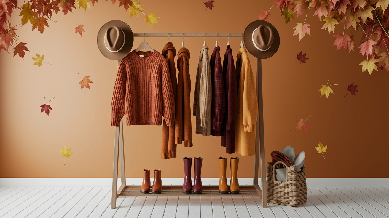
An autumn wardrobe revolves around rich hues, tactile fabrics, and pragmatic pieces that navigate those temperature fluctuations. Selecting clothes that correspond to your autumn type—like Soft Autumn, which loves muted colors like olive, blush and camel—makes every piece complement your tone and the season's vibe.
By paying attention to basics in autumn colors, and shopping smart, you build a wardrobe that is both cohesive and practical.
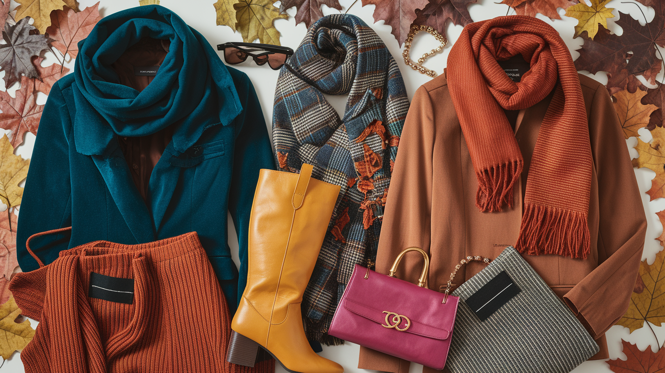
Core Garments
- Sweaters: Opt for chunky knits in muted shades, such as forest green or taupe, which offer warmth and a nod to autumn's earthy palette.
- Cardigans: A mid-weight cardigan in camel or olive can layer well and serve as a colored neutral for Soft Autumn types.
- Tailored Jackets: A wool-blend blazer or structured jacket in rust or deep brown provides polish and works for both work and leisure.
- Trousers: Choose corduroy or soft wool in muted olive or warm grey, which mix easily with most autumn tops.
- Long-Sleeve Shirts: Neutral or softly patterned shirts offer versatility and can be worn alone or under layers.
All-round staple pieces in autumnal hues make mixing and matching easy. Premium materials — like merino wool and brushed cotton — feel good on, wear well and suit the seasonal requirements.
Choosing washed-out colours or medium-to-dark shades, on the other hand, is how you avoid clashing and keep your wardrobe pulls together.
| Garment | Description | Recommended Color |
|---|---|---|
| Sweater | Chunky knit, relaxed fit | Forest green, taupe |
| Cardigan | Mid-weight, soft fabric | Camel, olive |
| Tailored Jacket | Structured, wool-blend | Rust, deep brown |
| Trousers | Corduroy or wool, straight cut | Olive, warm grey |
| Long-Sleeve Shirt | Neutral or subtle pattern, breathable fabric | Blush, soft ivory |
Layering Pieces
Layering is key to autumn's shifting weather. Light scarves in blended wool or cashmere stave off chill without bulk. Accounting for warmth and texture are suede or quilted vests.
Mixing textures—like combining a velvet vest with a chunky knit sweater—adds dimension and intrigue. Layered outfits can effortlessly transition from day to night by switching out lighter outerwear or adding a scarf.
The effect here keeps the look grounded while ensuring you can layer up for any sudden temperature drop or sunshine surprise. Suede, velvet and knits are textures that fit the autumn aesthetic.
They balance shapes and color. For prints, stay within 90% of your autumn palette so there isn't too much of a jarring contrast. Layering means both comfort and style, and makes each and every piece pull double duty.
Statement Items
Statement pieces express your style and differentiate your wardrobe. Go for a statement trench in deep burgundy or a patterned scarf in rich, earthy hues. Special touches—like a suede bag or brass or wooden jewelry—can ground an outfit and highlight your best attributes.
Statement makers transform easy outfits into head-turning ensembles. A pop jacket or textured hat adds punch without busting the fall palette. These should feel personal and match the rest of your wardrobe, so the look remains cohesive.
Confidence counts when sporting statement pieces. Bold choices, in combination with muted base layers, enable your personality to blaze while keeping the outfit rooted in autumn's warmth.
Styling Autumn Patterns and Textures
For fall, pattern and texture is way more than just design filler in autumn wardrobes. They define the mood, warmth and depth of every look – essential for function and style. Pattern mixing and textural pieces not only showcase ingenuity, but help mirror the changes seen outdoors during the season.
The perfect pairing evokes all the rich, earthy colors and textural coziness of fall, creating visual appeal as well as functional warmth to any ensemble.
The Prints
Fall prints – think plaids, florals and animal prints – favor classic appeal and seasonal vibes. Plaids galore, scarves, coats, trousers – and florals in dusty or jewel tones reminiscent of the last blooms of the year. Animal prints, like leopard or snake prints, enjoy a moment in the fall spotlight, bringing a flirty punch without dominating the canvas.
Prints can be the center of attention in an outfit, adding character and visual interest. For instance, a plaid skirt with a solid sweater keeps the look grounded but fun! Florals on a scarf or dress can ease heavier fabrics and add a touch of lightness, even as the temperature drops.
Animal prints bring a subtle sense of drama, particularly when they're used as an accent. To offset printed pieces, anchoring them with solids is essential. This prevents visual noise and keeps everything in balance.
By adhering to a single statement print per ensemble, or combining prints of a similar scale and complimentary hues, there is a nice refined ending. Seasonal moods—like the coziness of falling leaves or the crispness of early evenings—can be echoed through print selections, allowing your look to become a statement of fall as well.
The Fabrics
Wool, cashmere and corduroy in particular are precious autumn fabrics, providing both warmth and texture. Chunky knits, suede and velvet are well loved, both adding dimension and coziness to everyday looks. These textures are perfect for falling temps, but visually lush, mirroring the season's layered landscape.
Texture is at the heart of creating a warm, cozy vibe. A chunky knit, for instance, is a statement when matched with a sleek silk skirt or elegant trousers. This contrast catches the eye and cuts through the monotony.
Layering fabrics—pairing a wool coat with a velvet scarf or corduroy pants—introduces complexity and adaptability for weather fluctuations. Choosing fabrics to carry the autumn color scheme is also important.
Jewel tones such as emerald or ruby fit perfectly in velvet or cashmere to impart a beautiful richness and vitality. Scarves, hats, belts, etc. Are easy ways to bring in texture. Warm metals in jewelry, gold and bronze, resonate with the hues of autumn and bring the whole look together.
The Psychology of Autumn Hues
Autumn color schemes are special to design and fashion at a personal level because of the powerful psychology these colors convey. Golden yellows, olive greens and rich browns aren't just indicators of the changing season, burnt orange, mustard and deep burgundy. They mold how we feel in a space or about ourselves, sometimes igniting powerful emotional reactions and guiding our daily decisions from dress to interior design.
| Autumn Color | Psychological Impact | Example Uses |
|---|---|---|
| Burnt Orange | Energizes, sparks creativity, brings warmth | Accent chair, sweater, table decor |
| Mustard Yellow | Boosts optimism, adds brightness, inspires nostalgia | Throw blanket, wall art, scarf |
| Deep Burgundy | Feels decadent, creates drama, adds richness | Upholstery, jacket, centerpiece |
| Olive Green | Soothes, connects to nature, grounds energy | Plant pots, bedding, trousers |
| Rich Brown | Comforts, adds stability, evokes earthiness | Wooden furniture, shoes, rugs |
| Golden Yellow | Lifts mood, recalls sunlight, feels inviting | Curtains, pillows, jewelry |
Warm fall colors indicate coziness and sentimentality. These tones evoke memories of family dinners, of leaves falling and warm seasonal glow. Even in contemporary environments, these tones can alter the feeling of a room or wardrobe. A burnt orange blanket or mustard yellow pillow can take a bare room and make it feel like home.
In personal style, these hues can accentuate skin tone, eye color and hair, providing a warm vibrance and a feeling of cohesion. It's easy to harness the psychology of fall colors to create a welcoming cozy atmosphere. Earthy tones and natural materials—wood, linen, wool, stone—mix with those deep colors for texture and warmth.
A table dressed with olive green napkins, earthy brown serving bowls and golden yellow candles can prepare the scene for relaxed, yet meaningful, get togethers. In workspaces, a hint of burgundy or mustard can invigorate without overpowering, aiding concentration and comfort.
Fall colors connect intimately to seasonal festivities and rituals. Across the globe, the spirit of fall is alive with bonfires, festivals and holiday feasts. These activities tend to borrow from the same palette–flaming oranges, sunshine golds, autumnal greens–that denote enthusiasm and happiness.
Maximalist at heart, autumn is for lovers of art, craft and the handmade, with striking colour combinations that express imagination and a passion for the outdoors. Rich, saturated hues can feel dramatic and decadent — particularly when layered in both wardrobe and interiors.
Conclusion
To select fall hues, begin with warm browns, mustard yellows, saturated reds and forest greens. These colors flatter numerous skin complexions and appear crisp whether you're inside or out. Watch how a rust jacket or olive scarf transform your look immediately. Experiment with new hues, like copper or burnt orange, in tiny ways initially—perhaps socks or a knit hat. Experience how each color aligns with your taste and spirit. Aim for plaids or houndstooth to really add dimension. Utilize sturdy fabrics such as wool or corduroy to accentuate the color. Test drive these tips in your everyday ensembles. Share what works, swap ideas and stay fresh all season.
Frequently Asked Questions
What colors are included in the autumn color palette?
Popular colors are burnt orange, olive green, mustard yellow, rich browns, and deep reds. They represent the natural transformation of the autumn landscape.
How can I identify my autumn subtype?
Consider your skin tone, hair, and eye color. Autumn subtypes—deep, soft, or warm autumn, for example—are based on your compatibility with particular shades. Referencing a color analysis chart to discover your best fit.
Are there cool colors in the autumn palette?
Autumn palettes are predominantly warm. A few toned down, cool shades like teal or moss green can, particularly for soft autumns. The trick is picking warm colors.
Can autumn colors work for any skin tone?
Yes, autumn colors can suit many complexions. It's about discovering the right shade and intensity. Warm undertones in autumn colors tend to look best on medium to deep complexions. Lighter hues can complement fairer skin.
What patterns and textures match the autumn palette?
Organic textures like wool, suede and corduroy go great with autumn color palettes. Plaid, houndstooth and leaf motifs complete the seasonal look. These selections bring dimension and saturation to fall closets.
How do autumn hues affect mood and perception?
Autumn colors are supposed to be warm, comforting, and relaxing. These colors tend to emanate a cozy, grounded feeling, which is why they're a popular choice for clothing and home decor during the colder seasons.
How can I start building an autumn wardrobe?
Start with the flexible foundations in autumn hues of camel, burgundy and forest green. Add textured pieces and accessories in complimentary tones. Layering is everything when it comes to nailing the autumn look and remaining cozy as the temps cool down.