True Winter vs Deep Winter: Contrast, Chroma, and Darkness Comparison
 Reviewed by Alexandra Gilmore
Compare icy cool clarity with shadowy depth using matched drapes, wardrobe colors, makeup, and metals.

True Winter vs Deep Winter comes down to which quality leads: icy cool clarity or rich shadowy depth. True Winter, also called Cool Winter, is distinctly cool and looks especially crisp in optical white, blue-based fuchsia, royal blue, and jet black. Deep Winter, also called Dark Winter, stays cool to neutral-cool but makes darkness the priority: midnight navy, blackberry, cool burgundy, deep teal, and blackened purple can carry more visual weight. Both can wear black and saturated jewel tones. The useful question is whether a clear, cold light-dark contrast brightens your face more than a dark, rich color field. Compare matched fabrics at the neckline in steady daylight, rather than deciding from hair, eye, or skin color alone.
If both contrasts feel too strong, compare the softer cool direction in the Soft Winter makeup and outfit guide.
See Deep Winter celebrity style examples for illustrative outfit contrasts, then confirm with fabric on your own face.
These adjacent Winter palettes overlap, so a favorite sapphire sweater does not prove either label. This guide separates temperature, chroma, depth, and contrast; then it turns those differences into clothing, makeup, and jewelry choices. Seasonal color analysis is a styling framework, not a diagnosis. Your complexion can be fair, medium, deep, or olive in either group. For the shared foundation, see the Winter color palette guide.
Cool Clarity vs Shadowy Depth: The Core Dimension Explained
Temperature describes whether a color leans cool or warm; value describes how light or dark it is; chroma describes how clear or muted it looks. Adobe's color picker documentation distinguishes hue, saturation, and brightness as separate controls. Seasonal systems use related visual dimensions, though a fabric and a face cannot be reduced to three software sliders. Keeping the dimensions separate prevents a common mistake: calling every dark color “Deep Winter” or every vivid one “True Winter.”
True Winter's leading quality is coolness. Its blues feel blue rather than greenish, its reds lean toward cranberry or blue-red rather than tomato, and its light accents look icy rather than creamy. Clear color and strong light-dark separation support that cool impression. Imagine optical white beside cobalt and black: all three edges remain clean. The Cool Winter palette guide expands the practical range.
Deep Winter's leading quality is depth. The palette remains recognizably Winter, yet more of an outfit can sit in the dark half of the value range. Picture blackened berry, ink navy, pine, and charcoal with a smaller icy accent. Compared with True Winter's bright fuchsia, its berry may be closer to blackberry. Compared with a clean cobalt, its blue may be midnight or Prussian. Deep Winter's proximity to Deep Autumn allows a little more complexity and neutral-cool softness in some dark colors; it does not turn mustard, rust, or orange into automatic Winter staples. See the complete Deep Winter palette for outfits and swatches.
| Decision point | True / Cool Winter | Deep / Dark Winter |
|---|---|---|
| Leading dimension | Unmistakable coolness and clarity | Rich, cool to neutral-cool depth |
| Best light accent | Optical white and clear icy blue | Icy accents used against a dominant dark base |
| Statement color | Royal blue or vivid fuchsia | Blackberry, oxblood, or deep teal |
| Easy neutral | Jet black, crisp white, cool charcoal | Black, midnight navy, deep charcoal, cool espresso |
| What to compare | Clear blue-red versus darker wine at equal coverage | Dark wine versus bright blue-red at equal coverage |
Use the table as a starting hypothesis. Cloth fiber, lighting, makeup, and the size of a colored area all change the impression. A person may wear colors from both palettes beautifully without needing a perfect subtype label.
Physical Contrast: Snow White Vivid Contrast vs Rich Melanin Depth
The phrases “snow white” and “rich melanin depth” describe two possible visual examples, not rules for who belongs to a season. A fair person with dark hair may have striking light-dark contrast, while a deep-skinned person can also have high contrast between the whites of the eyes, iris, hair, and clothing. Either person could find True Winter or Deep Winter useful. Melanin amount by itself does not determine a palette. The important observation is what happens when fabric changes beside the face.
For a fair, high-contrast face, optical white and jet black may repeat visible extremes without hiding the features. For another person, a dark burgundy or ink blue may build a smoother, richer frame than a large bright-white collar. The same person can change the effect by moving white from a full shirt to a narrow trim. Compare garment area as well as hue: a thin icy scarf against navy is a different test from a white blazer.
Try a repeatable draping sequence. Face a window in indirect daylight; wear minimal makeup if comfortable, cover strongly colored hair if it distracts, and keep the camera exposure fixed. Hold each fabric directly beneath the chin for several seconds. First compare optical white with deep charcoal. Then compare vivid royal blue with midnight navy. Finally compare fuchsia with blackberry. Ask whether your eyes and facial contours become clearer, whether shadows seem exaggerated, and whether the color commands more attention than the person. Repeat on another day before making a large wardrobe decision. Our color analysis guide for dark skin tones discusses contrast across a broader range of complexions.
Color Palette Breakdown: Arctic Pastels vs Blackened Jewel Tones
“Arctic pastel” means a very pale color with a distinctly cool, clean cast, such as icy blue or icy pink. It is not a dusty baby blue softened with gray. A True Winter can place that light accent beside black or charcoal to create a sharp edge. Bright magenta, electric blue, blue-red, and emerald add clear color. Deep Winter can also use icy blue, but it often works as a smaller flash against blackened navy rather than as the whole outfit's dominant field.
Deep Winter's jewel tones look as though the lights have been lowered without turning the colors muddy. Oxblood remains red-purple rather than brick orange; blackberry remains purple-red rather than brown; deep teal stays cool rather than yellow-green. Dark chocolate can work when it is blackened and neutral-cool, not golden cocoa. Texture matters: matte wool can absorb light and make the same nominal shade look deeper than satin. Compare actual garments instead of relying on an online swatch.
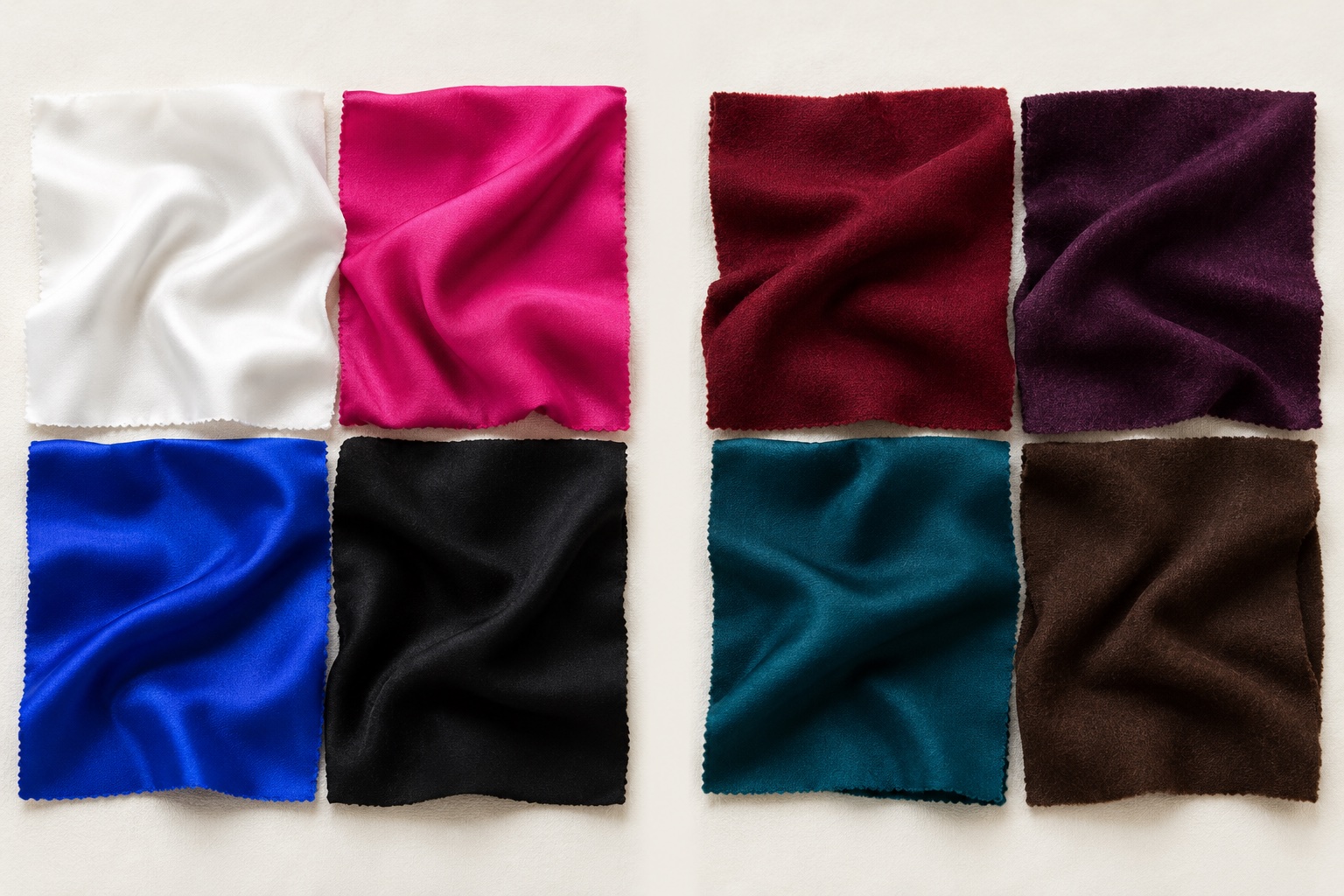
For a small capsule wardrobe, a True Winter might combine black trousers, a white shirt, a cobalt knit, and a fuchsia scarf. A Deep Winter could keep black trousers, add an ink-navy knit, a wine blouse, and an icy-blue scarf. Both can borrow the other's accent. The distinction is which combination feels easiest near your face without extra makeup or styling effort. If both sets seem too intense, compare a neighboring season rather than forcing a Winter result.
The White and Black Test: Pure Optical White vs Softened Black
Start with three light fabrics: optical white, yellowed cream, and icy pale blue. True Winter often benefits from the sharp neutrality of optical white; cream may appear disconnected because its yellow cast introduces warmth. Deep Winter is still a Winter, so cream is not a default winner there either. A dark outfit may simply make optical white less necessary. Deep charcoal or blackened navy can provide the depth that organizes the face, with a narrow white or icy accent for contrast.
The phrase “softened black” needs care. Deep Winter does not require faded gray-black, and True Winter does not own pure black exclusively. Both palettes can use black. In this test, compare jet black with charcoal, blackened navy, and cool espresso at the same neckline. If pure black looks clean but a broad white collar feels overpowering, a darker overall Deep Winter outfit may be more comfortable. If black plus white looks energized and every cream or brown substitute seems dull, True Winter becomes more plausible.
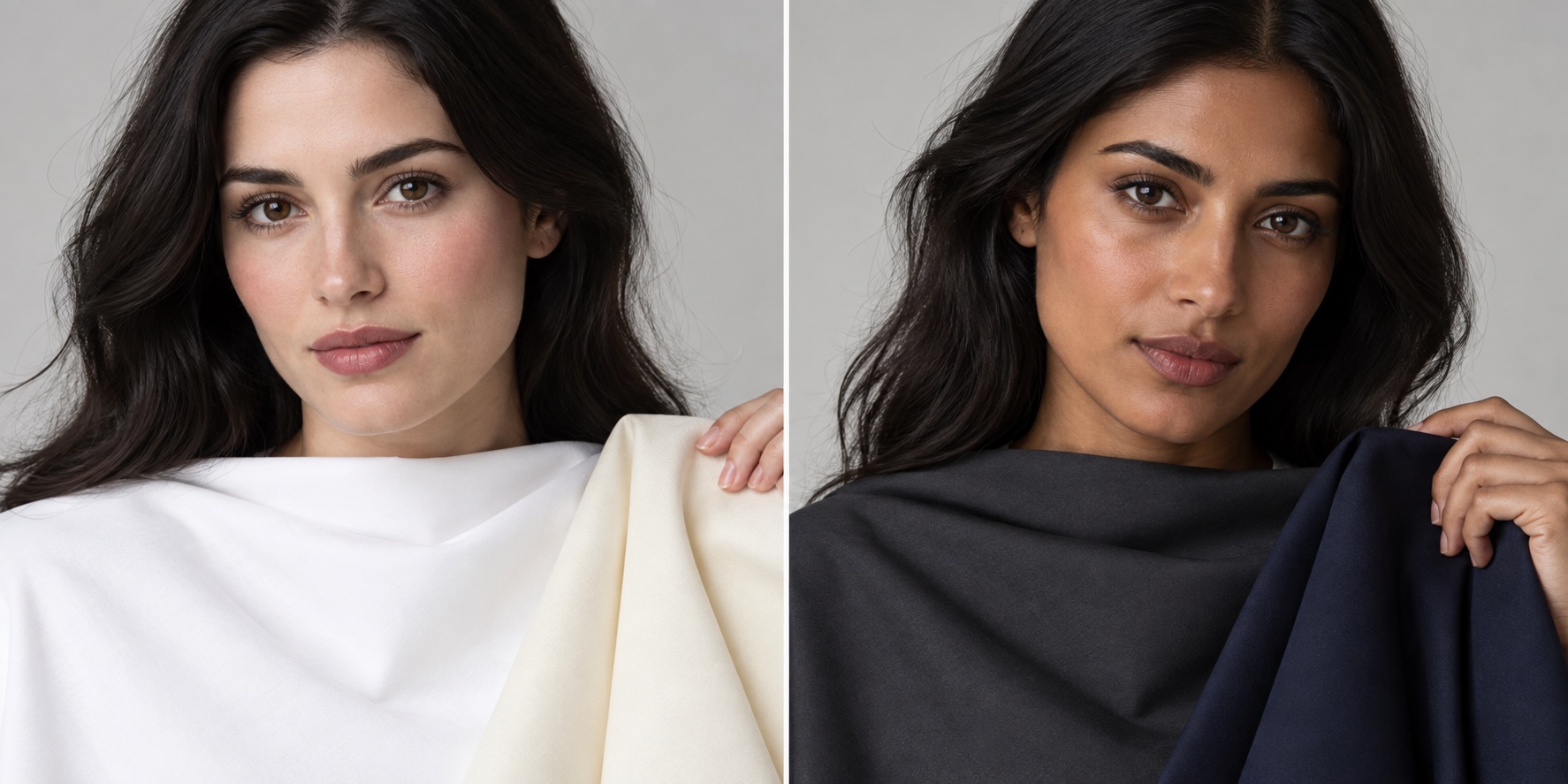
Do not use the generated models above as a before-and-after proof. They are different people and illustrate wardrobe proportions. Your own side-by-side test should use the same person, position, light, camera settings, and amount of makeup. A photo can be useful as a record, but phone white balance may make cream look whiter or navy look black. If possible, let a second observer compare the real fabrics in person.
Sister Season Bleed: The Autumn Influence in Deep Winter
In the 12-season map, Deep Winter borders Deep Autumn. They share a preference for darkness, which explains why a deep espresso or pine can look plausible on both at first glance. The boundary is temperature and clarity. Deep Winter normally keeps a cool or neutral-cool cast; Deep Autumn moves toward golden brown, warm olive, copper, and rust. A dark color is not automatically cool. Check whether the color's undertone looks blue-purple or yellow-orange when placed beside another dark swatch.
Make a matched-depth comparison: blackened cool burgundy versus warm brick, cool espresso versus golden chocolate, and pine versus olive. If cool dark colors sharpen the eye area while warm dark ones seem heavy or yellow, Deep Winter is a stronger hypothesis. If the warm dark set repeatedly makes the face look more even and vivid, explore the Deep Autumn palette. This approach is more informative than comparing midnight navy to pale camel, because the two fabrics differ in darkness as well as temperature.
That Autumn adjacency also explains cautious flexibility with metals and leather. A small antique-gold detail or deep brown bag may blend into a Deep Winter outfit when black, cool burgundy, or navy dominates. It does not mean the palette becomes warm overall. If a warm piece is a favorite, keep it farther from the face or pair it with a strong cool neckline. Color analysis is a guide to visual emphasis, not a prohibition on owning anything else.
Makeup Comparison: Vivid Fuchsia Lipstick vs Deep Wine Blackberry
Makeup can be a quick comparison because lip color sits close to the face, but test shades with the same opacity, finish, and application. A sheer berry balm and a full-coverage wine lipstick differ in more than hue. True Winter often handles a crisp blue-based fuchsia, cool cherry, or vivid raspberry without the lip becoming disconnected from the face. Deep Winter may look more balanced with blackberry, plum, cool wine, or blackened red. Both can use a classic blue-red; the question is whether the clearest or deepest version feels more harmonious.
Try two lipstick swatches along the jawline first, then wear one at a time with the same neutral eye makeup and clothing. If vivid fuchsia seems fresh and deep wine looks dull or theatrical, note the preference for clarity. If the dark wine brings the eyes forward and fuchsia feels too bright, note the preference for depth. Darker skin may need a more saturated pigment for a fuchsia to read clearly; fair skin may need a sheer application of wine. Adjusting pigment strength is practical, and it does not change the underlying comparison.
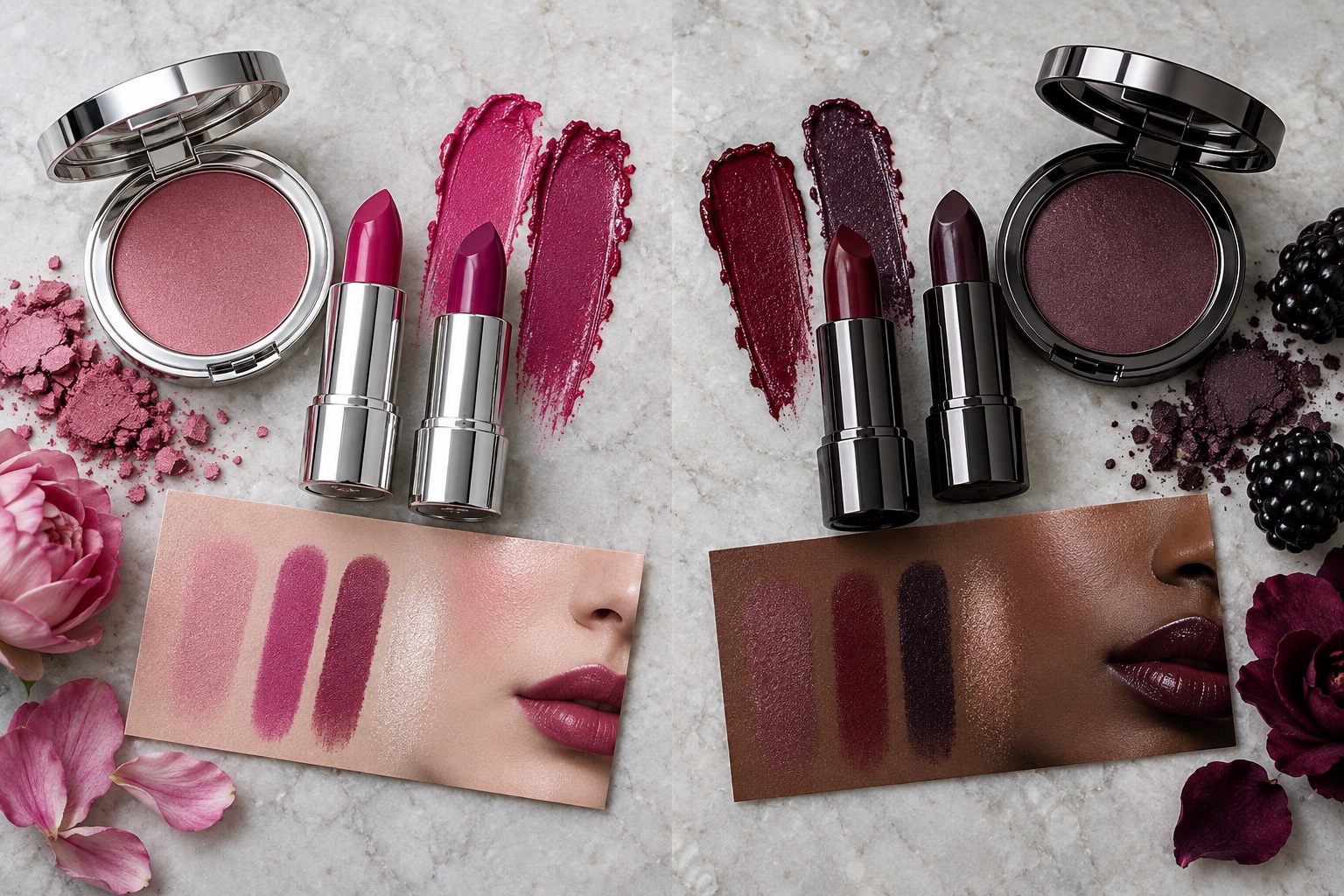
For eyes, True Winter can use crisp charcoal liner, silver shimmer, or a clear blue-purple accent. Deep Winter can build a smoky charcoal, ink navy, or deep plum eye while keeping the color cool. Neither requires heavy makeup. For more examples of the darker branch, read the Deep Winter makeup guide. If all strong cool makeup seems to sit on top of the face, revisit the season premise rather than buying more products.
Jewelry Choices: Polished Sterling Silver vs Blackened Gunmetal and Antique Gold
Polished sterling silver, white gold, and platinum repeat True Winter's crisp coolness. A reflective silver earring can create a clean highlight near the face, especially beside black, cobalt, or optical white. Deep Winter also wears cool metals well, but blackened gunmetal, pewter, dark silver, or a smoky stone may connect more naturally with an ink-navy or burgundy outfit. Finish and scale matter as much as metal category: a tiny silver stud and a large mirror-bright necklace create very different amounts of light.
Antique gold is an experiment, not an automatic Deep Winter signature. An aged, muted gold detail can work in a mostly dark cool outfit, especially when it is small or farther from the face. Strong yellow gold may lead the eye away from cool features. Compare the same earring shape in bright silver, gunmetal, and subdued gold under daylight. If the silver looks cleanest, that can support True Winter's cool emphasis; if gunmetal integrates better, it may support Deep Winter's depth emphasis. Jewelry alone cannot settle the season, and personal style remains a valid reason to mix metals.
Winter Comparison FAQ
Can Deep Winter wear pastel blue?
Yes, particularly an icy blue without gray or yellow in it. Deep Winter often uses it as a smaller light accent against black, charcoal, or midnight navy. A large powder-blue garment may remove the dark emphasis, while a scarf, shirt collar, or earring keeps the palette anchored. Compare both proportions beside your face.
What if I have olive skin?
Olive describes a visible greenish or grayish cast, not a fixed warm or cool season. Olive complexions can be fair or deep and may respond to either Winter subtype. Compare cool fuchsia with blackberry, then compare black-and-white with black-and-navy in the same daylight. Our Deep Winter olive-skin guide offers more specific examples without treating olive as a diagnosis.
How do I know if I am Deep Winter or True Winter?
Use two matched comparisons on several days. First test equally cool colors at different depths: vivid fuchsia versus deep blackberry, and royal blue versus midnight navy. Next test dark colors at different temperatures: cool burgundy versus warm brick. If clear cold colors consistently light up your features, favor True Winter. If dark cool colors bring more definition while vivid ones dominate, favor Deep Winter. If evidence is mixed, use the shared Winter colors and keep testing.
Can both seasons wear black and white?
Both can wear black, and both can use white. True Winter often enjoys a larger area of optical white against black. Deep Winter may prefer a dark majority with white or icy blue used more sparingly. The difference is proportion and overall effect, not a ban on either neutral.
What if vivid fuchsia works but I also like warmth?
Consider whether Bright Winter's clear, slightly more neutral edge explains the result, or whether the garment's finish and lighting are affecting your impression. Compare the Bright Winter palette alongside these two before committing to a label. A single warm accessory is not enough to reclassify an entire wardrobe.
The practical result is a small set of reliable near-face colors. Keep the shades that make your features visible and feel good to wear. If you want a structured starting point before repeating the drape test, try the interactive color analysis quiz and treat its palette as a hypothesis to check in real daylight.
💫 Discover Your Complete Color Palette
Ready to discover all the colors that make you look radiant? Our comprehensive color analysis will reveal your complete personal palette - perfect for hair, makeup, and wardrobe decisions.
Take Color Analysis Quiz →