Summer Palette Neutrals and Accent Colors

If you've ever built a capsule wardrobe around classic "universal" neutrals — camel, ivory, warm beige — and found the results oddly flat or draining, your seasonal coloring may be the reason. For Summer types, the conventional neutral playbook simply doesn't apply.
Summer color palette neutrals are cool, muted, and soft by nature. They share the same gentle, calming quality as the season itself: think the blue-grey of overcast morning light rather than the warm gold of a summer afternoon. When chosen correctly, these shades don't just sit in the background — they actively enhance the cool-toned, low-contrast features that define Summer coloring.
This guide covers exactly that:
- What distinguishes a Summer neutral from a general-purpose neutral
- The core shades to anchor your wardrobe around
- Accent colors that bring Summer neutrals to life without overwhelming them
- The most common mistakes Summer types make when picking neutrals — and how to avoid them
- Sub-season differences between True Summer, Soft Summer, and Light Summer neutral palettes
Whether you're new to seasonal color analysis or refining a wardrobe you've already started building, the goal here is practical clarity: the right Summer neutral makes every outfit look intentional and every feature more defined — with almost no effort.
What Makes a Color a 'Summer Neutral'?
Not every soft or subdued shade qualifies as a Summer neutral. Three specific properties have to work together — and all three need to be present.
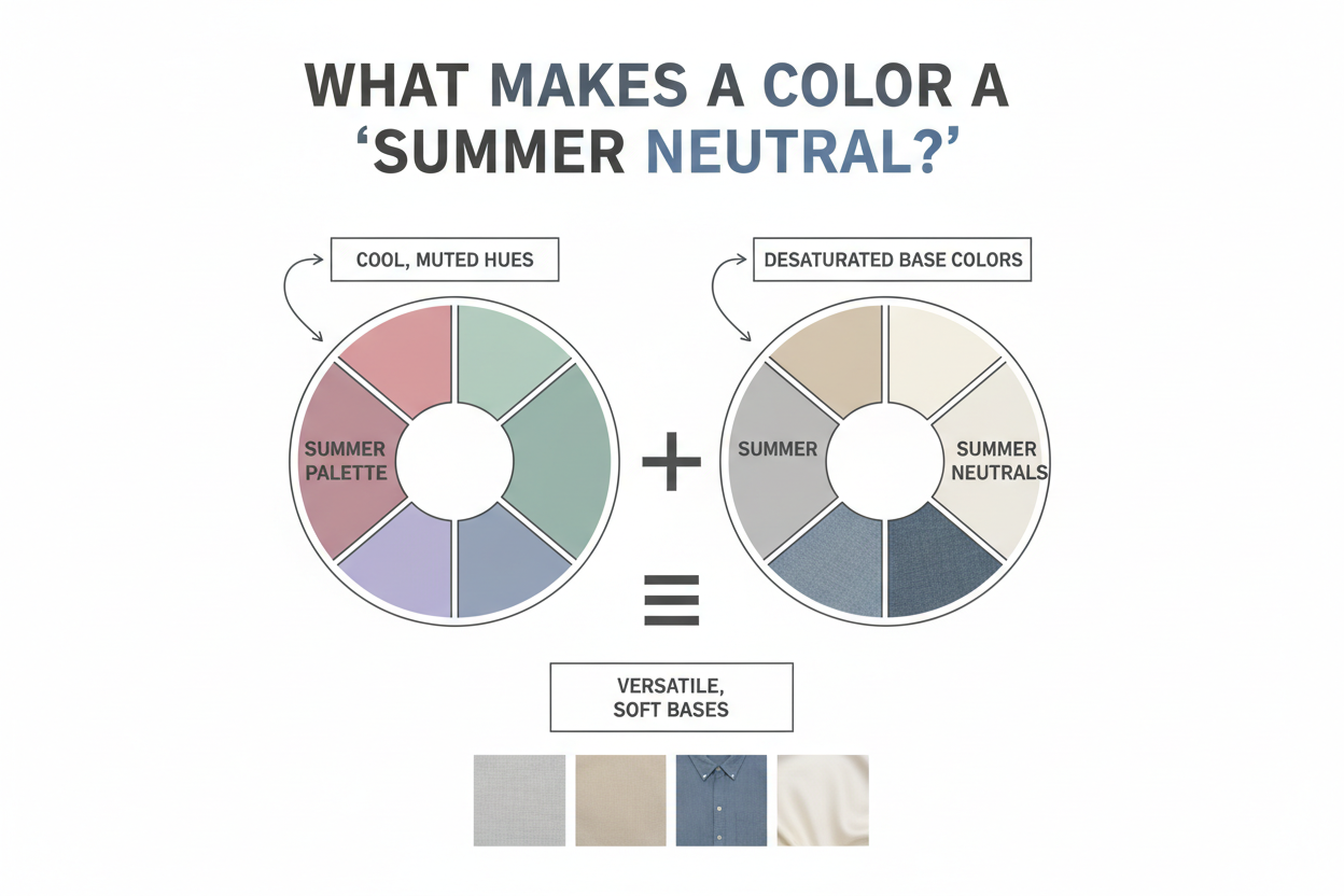
Cool undertone. Summer neutrals lean blue, blue-grey, or blue-pink rather than yellow, orange, or gold. A taupe with a warm, peachy cast isn't a Summer neutral, even if it reads as low-key on the hanger. The coolness is non-negotiable.
Low saturation. True Summer in particular lives on the muted side of the color wheel. Shades are dusty, hazy, gently washed — not vivid or crisp. A cool grey is a Summer neutral; a bright silver isn't. The closer a shade gets to its pure, clean hue, the less likely it is to work.
Soft contrast. Summer coloring is defined by the gentle relationship between skin, hair, and eyes — no sharp divisions, no high drama. A Summer neutral should hold that softness. This is why stark white and true black consistently underperform: they introduce contrast that fights the features rather than frames them.
Think of True Summer colors as having the quality of a dive into cool, calm water — gentle, refreshing, never jarring. A qualifying neutral should feel like a natural extension of that, not a disruption.
When all three conditions are met — cool, muted, low-contrast — the neutral disappears into the outfit in the best possible way. The wearer's coloring leads. Nothing competes.
Not sure if you're a True Summer, Soft Summer, or Light Summer? Before investing in a neutral wardrobe, take the color analysis quiz → to confirm your season. The sub-season changes which shades perform best, and the differences are specific enough to matter at the point of purchase.
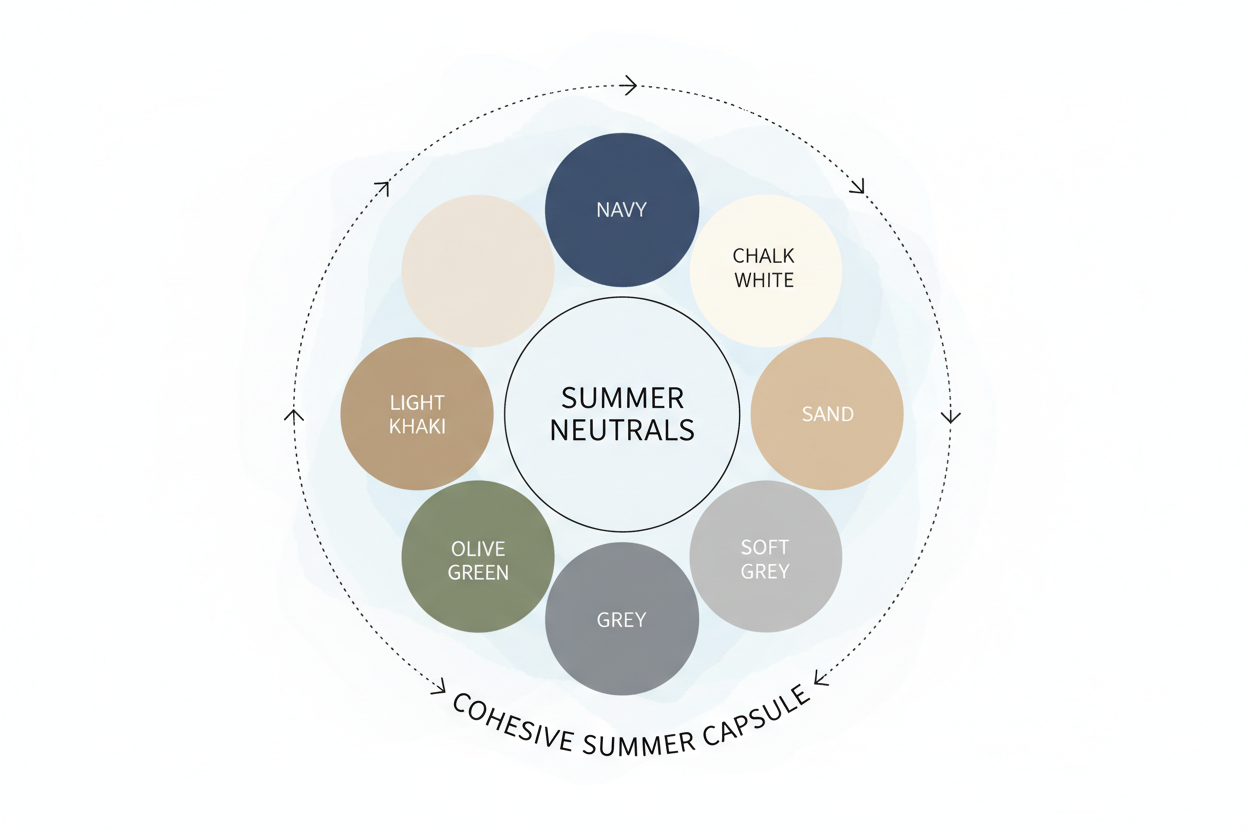
The Core Summer Neutral Palette: Shades to Build Around
These shades consistently work as foundational neutrals for True Summer coloring. Each one earns its place by hitting all three criteria above: cool undertone, muted saturation, and gentle contrast.
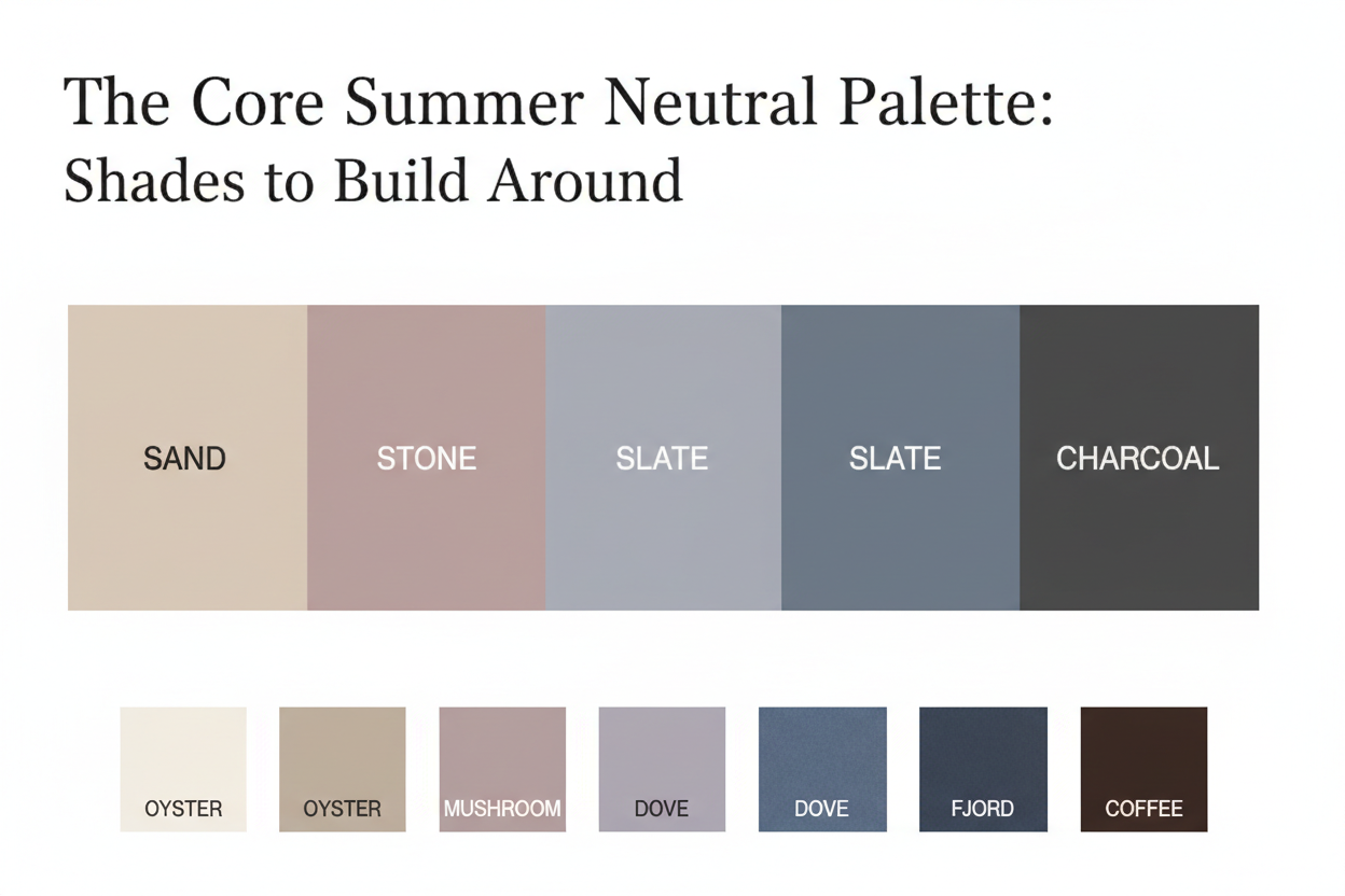
Soft rose-taupe A dusty, pink-inflected nude that reads as neutral rather than colorful. Warm taupe or camel creates visible tension against cool Summer skin; rose-taupe doesn't. It works for trousers, blazers, and shoes without competing with the face.
Cool grey (mid-tone) The closest thing True Summer has to a universal black replacement. A blue-leaning grey in the medium range — not too pale, not too dark — anchors suiting, knitwear, and outerwear for this season. Skip greens that pull warm and silvers that read too clean or bright.
Dusty blue-grey Somewhere between a proper grey and a slate blue, this is one of the most versatile shades in the Summer toolkit. It functions as a near-neutral that adds quiet interest without cranking up contrast. Scarves, tailored trousers, structured blazers — it handles all of them reliably.
Muted navy Not sharp uniform navy. A softened, slightly greyed version that sits closer to denim than midnight blue. This shade does the job black would normally do in a Summer wardrobe, without the complexion-draining effect true black often creates.
Soft white / cool off-white A white with a barely-there blue or grey cast, not yellow or cream. Worn near the face in shirts or tops, it reflects cool light rather than warm — which suits the season's natural coloring.
Blue-tinted greyish lilac Right on the edge of neutral territory. A very muted lavender-grey gives Summer types a statement-adjacent option that pairs with everything above and adds just enough color to avoid looking monochromatic, without tipping into bold accent territory.
Sub-season note: True Summer can handle the coolest and slightly more saturated versions of these shades. Soft Summer should lean toward the warmer or more muted end within each. Light Summer should reach for the paler end of each range. More on this below.
Why Summer Neutrals Are Worth the Investment
There's a standard cost-per-wear calculation in personal styling: divide the price of a garment by how many times you'll wear it. For a well-chosen neutral that anchors a wardrobe across multiple seasons and years, that number gets very small very fast.
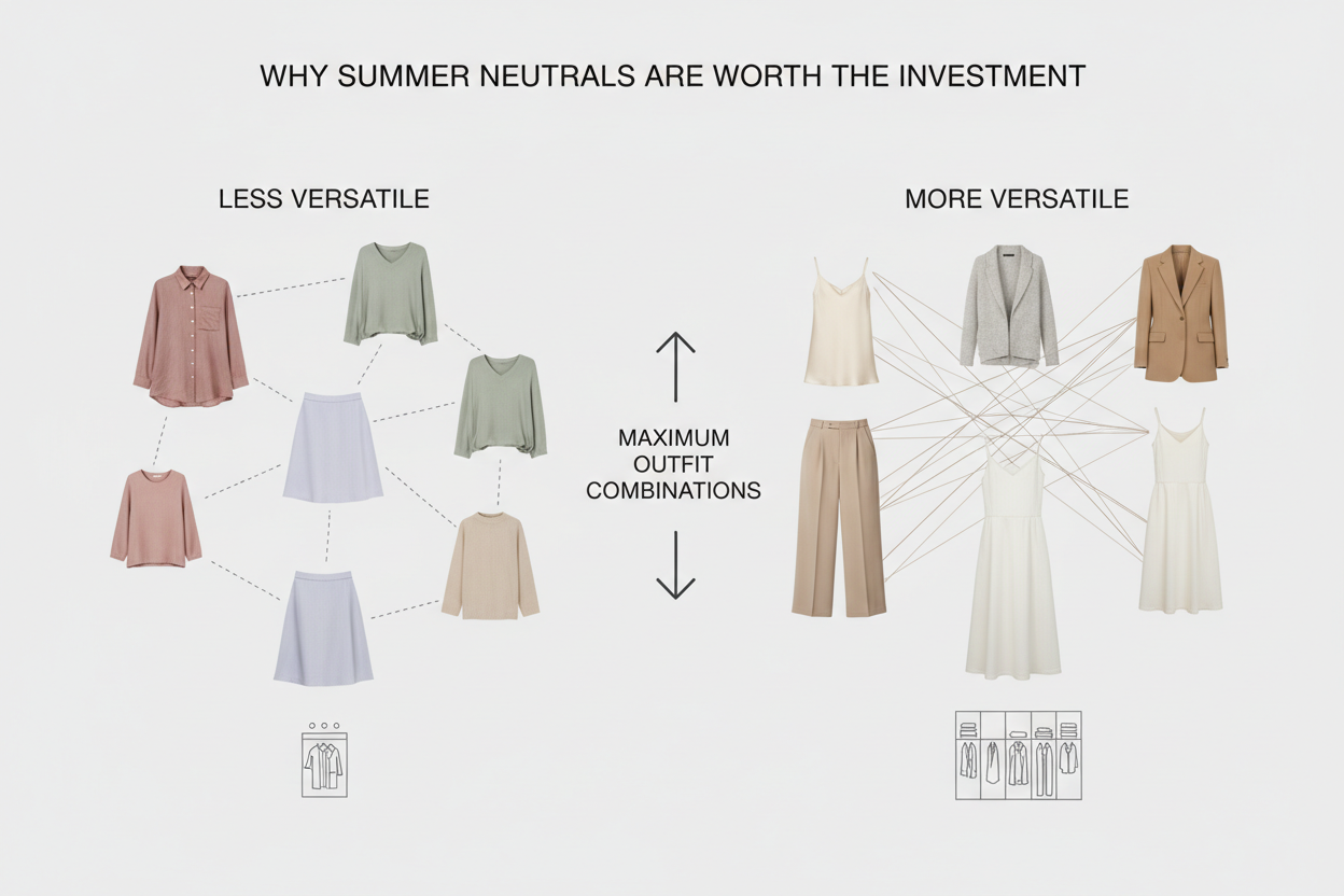
The logic applies to any wardrobe, but it matters more for Summer types specifically. Getting the undertone wrong on a neutral is more expensive than it looks.
Wrong-undertone neutrals don't sit quietly. A camel coat, a warm ivory blouse, a tan leather belt — these pieces don't just fail to help. They actively compete with cool Summer coloring, pulling attention toward the warmth of the fabric and away from the face. Near the face especially, a mismatched undertone can dull the complexion, flatten features, and produce the washed-out look that reads as tired rather than put-together.
The right undertone changes all of this. The same money spent on a correctly-matched grey or rose-taupe coat will wear well, look intentional, and work with the coloring every time — not against it.
The investment case is also specific to neutrals rather than accent pieces. Neutrals do more work: they form the base of most outfits, get worn most often, and need to mix across the widest range of other pieces. The return on getting a neutral right is higher than on any single statement item.
A wardrobe built on the wrong foundations requires constant workarounds. One built on the right ones tends to come together on its own.
Accent Colors That Activate Summer Neutrals
A Summer neutral palette, however well-chosen, reads as flat without the right accents. The goal isn't to stay entirely in the grey-and-blush zone — it's to add color in a way that stays within the season's natural contrast range.
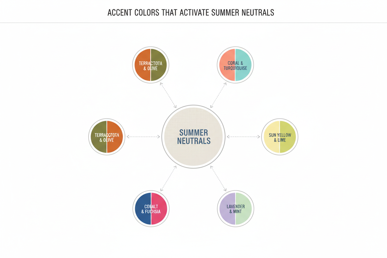
The relevant question isn't just which hue but how much of it. Summer accents should feel like they belong to the same soft, cool world as the neutrals they're paired with. Once an accent starts to look vivid, sharp, or warm, it pulls focus away from the wearer rather than toward them.
Accents that consistently work:
- Dusty rose / soft berry — A cooled-down, muted pink-red that reads as sophisticated rather than sweet. Works well against grey and blue-grey neutrals.
- Soft teal — A blue-green that leans grey and cool rather than tropical. Adds more visual interest than a pure blue while staying well within the muted register.
- Muted lavender — Probably the most flattering accent category for True Summer. Blue-inflected, gently washed, and naturally harmonious with the season's skin undertones.
- Powdery cornflower blue — Deeper than a baby blue but never saturated enough to feel bold. Works both as a near-neutral and as a deliberate accent depending on placement.
- Soft sage (blue-leaning) — A grey-green that works as a muted accent rather than a statement, especially in accessories and layering pieces.
Accents to approach with caution:
- Warm coral or orange-red — However muted, these introduce warmth that works against the summer palette's logic.
- Bright or neon versions of any hue — High saturation clashes with the soft-contrast foundation and can make the wearer look washed out by comparison.
- Pure warm yellow — Even a "soft" yellow can introduce enough warmth to disrupt the undertone harmony.
The "ethereal in pastels" effect some Summer types pull off effortlessly comes down to this: they're wearing colors that match the natural saturation and temperature of their features. Others in the same shades look washed out not because pastels don't suit them, but because the specific hue — its undertone, its saturation level — doesn't align with their coloring. Accent choices follow the same logic as neutral choices: cool, muted, and within the season's contrast range.
Ready to identify your exact accent range? Start the color analysis quiz → and get a personalized palette rather than working from a general Summer template.
Building a Cohesive Summer Capsule Around These Neutrals
A cohesive wardrobe isn't about owning the right individual pieces — it's about having pieces that work together across most combinations. Summer neutrals are particularly well-suited to this because they share an undertone axis, which means almost everything can mix with almost everything else.
The structural approach:
Anchor with two or three core neutrals. Muted navy, cool mid-grey, and soft rose-taupe cover the widest range of outfit contexts. These become trousers, blazers, coats, and bags — the highest-worn, highest-leverage pieces.
Layer in cool off-white and dusty blue-grey. These work as secondary neutrals for tops, knitwear, and layering pieces. They add variety without adding complexity.
Add two or three accent colors at lower volume. Muted lavender, dusty rose, and soft teal each sit naturally within the Summer palette. Keep them in pieces that don't dominate an outfit — a blouse, a scarf, a pair of earrings — rather than using them as a base.
Connect pieces through undertone rather than exact color. A cool grey blazer works with a muted lavender blouse and a dusty blue-grey trouser not because the shades are close, but because they share a cool, low-saturation undertone. That's what creates the pulled-together look.
Use accent pieces as bridges. A soft teal scarf, for example, connects a cool grey coat to a dusty rose knit in a way that feels intentional rather than accidental.
What to avoid stocking:
- Camel, tan, or warm ivory as foundation pieces — they'll isolate rather than integrate
- Multiple bold-contrast or warm-toned accessories that can't reference the rest of the wardrobe
- Pieces bought in isolation because they looked right in the store without being checked against the rest of the palette
The result is a wardrobe where most combinations work without deliberate effort — which is, practically speaking, what "cohesive" means.
Common Mistakes Summer Types Make With Neutrals
Even with a solid grasp of the season's principles, a few errors come up often enough to be worth naming.
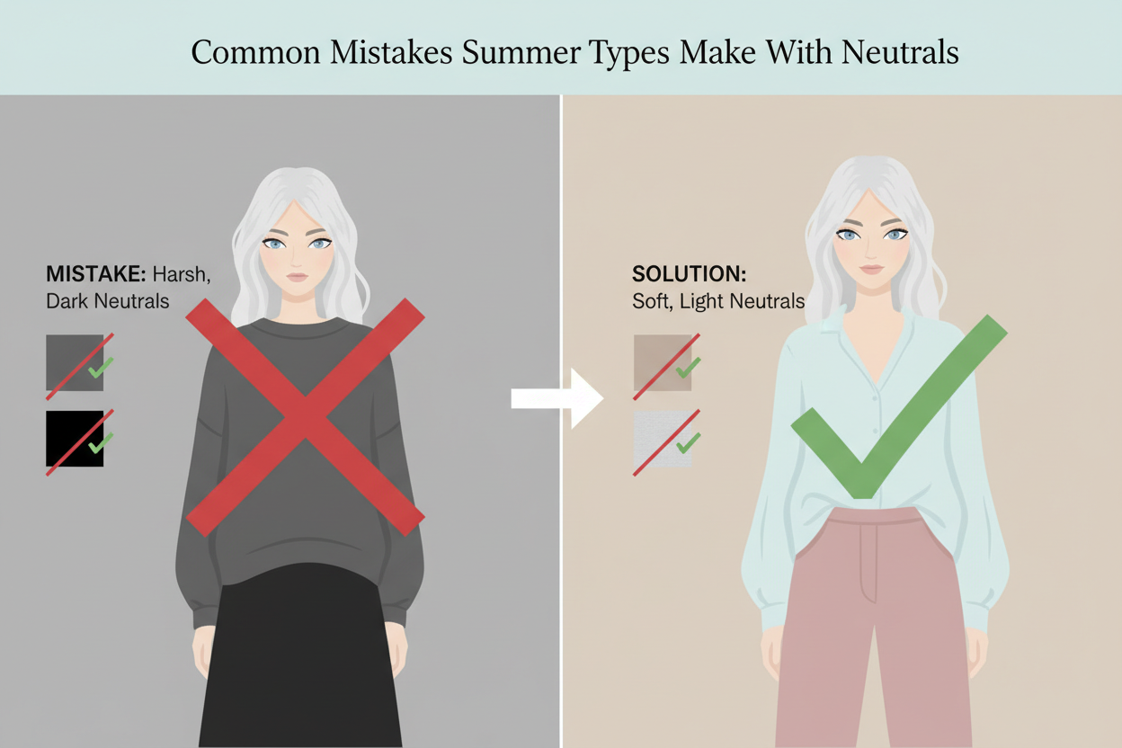
Defaulting to warm beige or camel as the "safe" choice. Camel is probably the most common neutral mistake Summer types make. It shows up in every capsule wardrobe guide and gets stocked everywhere at accessible prices, which makes it feel like a default. But its warm yellow-orange undertone runs directly against Summer's cool base — worn near the face, it tends to make Summer complexions look sallow or tired rather than polished.
Using black as the primary dark neutral. True black introduces more contrast than most Summer coloring can support. Against soft, cool features, it can look heavy and leave skin appearing dull. Muted navy or dark cool charcoal does the same structural job with far less visual tension.
Building a high-contrast black-and-white base. Black and white together are clean and graphic, but they rely on maximum contrast — the opposite of Summer's soft, blended quality. A pale grey and soft white pairing gets you the same light-and-dark dynamic without fighting the season.
Choosing accents that are correct in hue but too saturated. A Summer type who reaches for a bright cobalt accessory thinking "it's a cool blue" isn't wrong about the hue. The saturation is the problem. An accent that intense tends to overwhelm the neutrals rather than activate them, and makes the face read as paler by comparison.
Ignoring undertone when buying "neutral" accessories. Tan leather bags, gold jewelry, warm-toned brown belts — these feel low-key, so they seem safe. But they quietly introduce warmth at the accessory level, which undermines the cool-neutral foundation and keeps the wardrobe from feeling pulled together.
The pattern across all five is the same: warm undertone, high contrast, or high saturation. Any one of them disrupts the cool, muted harmony that Summer coloring depends on.
How to Confirm Your Summer Season Before Committing to a Neutral Palette
Knowing Summer neutrals as a category gets you part of the way there. Knowing which specific shades work for your sub-season is what actually matters when you're standing in a store deciding whether to buy something.
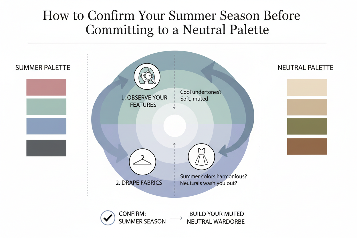
Summer isn't a single uniform season. It covers True Summer, Soft Summer, and Light Summer — each with distinct coloring, and therefore distinct neutral needs. Getting the specific shades right means knowing which of the three you are.
More broadly, seasonal color analysis is the necessary first step before any significant wardrobe investment. A cohesive wardrobe comes from choosing neutral colors based on your own features and coloring — not from following a general seasonal template or a universally recommended palette. This isn't a decorative principle; it's a practical one. The reason some people look effortlessly put-together in certain shades and washed out in others comes down to exactly this: whether their coloring and their palette are actually aligned.
Before spending on Summer-specific neutrals — especially the higher-investment pieces like coats, tailored trousers, or quality knitwear — knowing your season removes the guesswork and protects the investment.
True Summer vs. Soft Summer vs. Light Summer: Neutral Differences
All three Summer sub-seasons share the cool-and-muted axis, but they diverge in ways that make specific shade choices genuinely different.
True Summer is the coolest of the three — the palette most closely associated with the blue-grey, calm quality that defines Summer at its core. True Summers can wear the most distinctly blue-leaning neutrals: slate blue-grey, blue-tinted rose-taupe, clearly cool-toned navies. They can also handle slightly more saturation than the other two sub-seasons before things start to feel off.
Soft Summer shares the muted quality but brings in something warmer and dustier. Soft Summers often find that slightly greyer or more beige-adjacent versions of Summer neutrals work better than the purest cool interpretations — a warm taupe that still leans cool, a softer navy with less punch. The key quality here is "muted" more than "blue-cool."
Light Summer needs the same cool undertone but in much lighter values. Dark neutrals like charcoal or deep navy can feel heavy against Light Summer's delicate coloring. Pale grey, soft rose-white, and a lighter dusty blue-grey tend to work better as foundations. Accents should stay in the lighter, airier end of the Summer palette too.
The practical takeaway: a shade that works perfectly for a True Summer may read too heavy for a Light Summer or too blue for a Soft Summer. Sub-season specificity matters, and it's worth knowing where you land before building out a neutral wardrobe.
Saturation Rules: How Bright Is Too Bright for a Summer Accent?
Color theory gives you the technical answer, but most people need something they can actually use at a store without a reference chart.
A useful visual test: hold the potential accent piece near your face in natural light. Step back from the mirror slightly. Ask two questions:
- Does the color seem to glow or vibrate against the surrounding neutrals? If yes, the saturation is probably too high.
- Does your face look more defined, or does your eye drift toward the garment? If the color pulls attention before your face does, it's likely too intense.
A rough rule for Summer accents: if the color reads as "bold" to someone else, it's almost certainly too saturated. Summer accents should feel cool and interesting, not like a statement. The difference between "that's a beautiful lavender blouse" and "she's wearing lavender" is roughly where the saturation line sits.
A simpler check: if the hue is vivid enough to name instantly — "teal," "pink" — rather than "a sort of dusty blue-green" or "a muted rosy tone," it may be too bright for the Summer palette.
Summer accents work best when they feel like a natural intensification of the neutral base rather than a break from it. The goal is activation, not interruption.
People Also Ask
What are the best neutral colors for a True Summer color palette?
True Summer neutrals have three things in common: cool undertone, muted saturation, and low contrast. The ones that consistently work:
- Muted navy (greyed, not sharp or crisp)
- Cool mid-grey (blue-leaning, mid-value)
- Dusty blue-grey (somewhere between slate and soft denim)
- Soft rose-taupe (pink-inflected, never peachy or warm)
- Cool off-white (grey- or blue-cast, not cream or ivory)
- Greyed lilac (on the neutral edge of lavender)
Warm staples like camel, ivory, and tan don't work here. They pull yellow or orange, which fights the naturally cool complexion and creates visual tension instead of a cohesive look.
How do I choose wardrobe neutrals based on my seasonal color analysis?
The idea behind seasonal color analysis is simple: your best neutrals should match your own features — your skin's undertone, your hair depth, the contrast between them — not some generic capsule wardrobe list.
A practical approach:
- Identify your season first. True Summer, Soft Summer, and Light Summer each have slightly different neutral ranges, even though all three share the cool-and-muted axis.
- Match undertone before shade. A grey that leans slightly green or warm will underperform even if the value looks right. Look for clearly blue-cool or neutral-cool.
- Match saturation to your natural contrast level. Lower-contrast Summer coloring needs softer, less distinct neutrals — not bolder ones.
- Test near your face. In natural light, a well-matched neutral makes your complexion look clearer. A mismatched one makes it look flatter or more tired.
Buy neutrals before confirming your season and you'll end up with expensive pieces that don't work together — which is exactly what color analysis is supposed to prevent.
What accent colors go with Summer season neutrals?
Summer accents work best when they share the same cool, muted quality as the season's neutrals. The most reliable options:
| Accent | Why It Works |
|---|---|
| Dusty rose / soft berry | Cool-leaning pink-red; pairs cleanly with grey and navy |
| Muted lavender | Blue-inflected and naturally harmonious with Summer skin tones |
| Soft teal | Blue-green that stays cool and low-saturation |
| Powdery cornflower blue | Deeper than pastel but never vivid; works as near-neutral too |
| Blue-leaning sage | Muted grey-green; functions as accent or layering piece |
The guiding rule: accents should feel like an extension of the neutral palette — slightly more colorful, not a jump into a different temperature or saturation range. Warm coral, bright cobalt, and pure yellow are popular choices that tend to clash with Summer neutrals rather than complement them.
Why do some people look washed out in certain neutral shades?
The washed-out effect happens when a color's undertone or saturation doesn't match the wearer's natural coloring. The shade isn't unflattering in the abstract — it's just not aligned.
Two mismatches cause this most often for Summer types:
- Warm undertones near cool complexions. A camel, ivory, or warm beige near a cool Summer face reflects warm light back onto the skin, dulling the complexion and flattening features. The fabric's warmth competes with the skin's coolness rather than supporting it.
- High-contrast neutrals against low-contrast features. True black or stark white against soft, blended Summer coloring creates a jarring visual disconnect — the contrast of the outfit exceeds the natural contrast of the person, and the face appears to recede.
This is also why some people look effortlessly luminous in pastels and muted tones while others wearing the same shades look faded. Usually it comes down to undertone and saturation, not the category of shade itself.
Is black a good neutral for True Summer coloring?
Black is generally not recommended for True Summer, and the reasons are specific.
True Summer features are soft and blended — gentle contrast between hair, skin, and eyes. Black near the face introduces a sharpness that exceeds what Summer coloring naturally produces. The result tends to be a complexion that looks dull or drawn rather than framed.
Pure black is technically cool in temperature, but high-contrast in practice. Near Summer features, that contrast level is often more draining than even a warm neutral would be.
Better options:
- Muted navy handles the same structural role — dark base, versatile, professional — without the contrast problem
- Dark cool charcoal is the closer equivalent in the grey family and works better for high-stakes situations where black would typically appear
Black worn away from the face — trousers, footwear, bags — is less of an issue. But as a primary wardrobe neutral, it's worth replacing with one of the season's darker cool-toned options.
FAQ
What is the difference between a True Summer neutral and a universal neutral like beige or camel?
Universal neutrals — beige, camel, tan, ivory — are built around warm, yellow-leaning undertones. They're marketed as versatile because they work well with warm and golden complexions. True Summer neutrals work on the opposite axis: cool-undertoned, muted in saturation, and low in contrast.
Where camel reflects warmth back onto the skin, a cool grey-taupe or dusty blue-grey works with the natural blue or pink undertones in Summer complexions. In practice, a True Summer neutral tends to make the face look clearer, while a warm universal neutral can flatten or dull cool-toned features. They may fill similar wardrobe roles — base layer, bottoms, outerwear — but they don't produce the same result at the collar.
Can a True Summer wear warm-toned neutrals like tan or ivory?
Technically yes, but not near the face. Warm neutrals like tan, camel, and ivory have yellow or orange undertones that clash with cool Summer complexions. The effect is usually a complexion that looks duller or more tired — not because the shade is ugly on its own, but because it's bouncing the wrong temperature of light back at your skin.
Further from the face — shoes, bags, lower-body pieces — it matters less. But as a go-to neutral in tops or anything near the neckline, warm shades will consistently fall flat compared to their cool equivalents. A cool off-white with a grey or blue cast does what ivory was supposed to do, without the fight.
How many neutral pieces should anchor a Summer capsule wardrobe?
There's no fixed number. The idea is that neutral pieces form the backbone of the wardrobe — the things you reach for most often and combine most freely. Five to eight foundational pieces is a reasonable starting point:
- 2–3 bottoms in core neutrals (muted navy, cool grey, soft greyed charcoal)
- 2–3 tops or layers in lighter neutrals (cool off-white, dusty blue-grey, soft rose-taupe)
- 1–2 outerwear or transitional pieces in a medium-depth neutral
Cost-per-wear is the right lens here. A neutral in the right shade gets worn constantly, across seasons and combinations, so the per-wear cost drops over time. A neutral that's slightly off tends to sit in the closet — which is its own kind of expensive.
What is the best grey shade for True Summer coloring?
A cool mid-grey with a blue or neutral lean is the most reliably flattering grey for True Summer. Specifically:
- Blue-cool grey — sits somewhere between slate and a soft denim tone; works as a near-neutral and pairs with almost every accent in the Summer family
- Mid-value cool grey — not too light (which can wash out) and not charcoal-dark (which increases contrast)
- Greyed lavender-grey — on the warmer edge of what works, but the pink-blue cast keeps it in range
Avoid greys with a green, yellow, or warm brown undertone. Warm greige reads as the wrong temperature for True Summer. A quick test in natural light near the face will show whether a grey adds clarity or flattens — the difference is usually visible within a few seconds.
Are navy and soft white considered neutrals in the Summer palette?
Yes, both work as primary neutrals in the True Summer palette, though each has conditions.
Muted navy is probably the most versatile True Summer neutral. It fills the role black would play in other palettes — outerwear, formal occasions, dark base — while staying on the cool-and-muted axis the season calls for. The one condition: the navy should read as greyed or dusty, not sharp and saturated.
Soft white works as the lighter neutral, but only if it carries a cool grey or blue cast. Stark, crisp white is too high-contrast and too pure for most Summer coloring. A powdery or slightly greyed white keeps the contrast soft. Ivory and cream lean warm and don't belong here.
Together, navy and soft white give you the contrast range most Summer wardrobes are built around.
How do I know if an accent color is too saturated for my Summer palette?
The most reliable check is whether the accent color feels like it's competing with your face or supporting it. A few signals to watch for:
- The color draws more attention than your complexion. If people notice the color before they notice you, the saturation is probably too high.
- Your skin looks flatter or more uneven next to it. High-saturation accents reflect intense light that can make cool, softly pigmented Summer skin look less healthy by comparison.
- It doesn't blend with the neutrals you've already chosen. Summer accents should feel like an extension of the neutral palette — slightly more colorful, not a different temperature or energy entirely.
A useful rule of thumb: if the accent would look at home in a Spring or Autumn palette — bright, warm, vivid — it's probably too saturated for Summer. The right Summer accent looks muted, slightly greyed, and naturally cool even when it's the most colorful piece in the outfit.
Do Summer neutrals work for all three Summer sub-seasons or only True Summer?
The core Summer neutrals — cool undertone, muted saturation, low-to-moderate contrast — apply across all three sub-seasons, but the specific shades shift at the edges.
- True Summer uses the fullest range of classic Summer neutrals: cool mid-grey, muted navy, dusty rose-taupe, soft cool white.
- Soft Summer tilts slightly warmer and lower in contrast. Neutrals get even more muted, with more tolerance for greyed warm tones like a very cool taupe or warm-leaning greige — provided saturation stays low.
- Light Summer works within a higher-value range. Lighter, softer versions of the same neutrals — pale grey, soft blush, powder blue-grey — read better than deeper shades, which can overwhelm the naturally delicate contrast of Light Summer coloring.
If you're not sure which sub-season you are, the shades that hold up across all three — a cool medium grey, a muted navy, a greyed off-white — are the safest place to start. Take the color analysis quiz to identify your specific sub-season and narrow down your neutral palette from there.