Light Summer vs Soft Summer: Key Differences, Draping, and Swatches
 Reviewed by Alexandra Gilmore
See whether airy lightness or smoky softness leads your best cool colors.

The core Light Summer vs Soft Summer difference is the leading color dimension: lightness versus mutedness. Light Summer favors airy, cool colors such as powder blue, icy lavender, and soft baby pink. Soft Summer favors grayer, smoky colors with a little more depth, including dusty rose, slate blue, sage, and heather gray. Light Summer can lose its delicate brightness in murky colors; Soft Summer can seem overpowered by the clearest pale pastels. Both belong to the cool Summer family, so the most useful test compares fabrics of similar temperature near your face rather than relying on hair or eye color alone.
The Summer color palette overview places both subtypes beside True Summer.
These palettes overlap. A powder-blue top may suit someone who mostly wears Soft Summer, and a muted mauve scarf may work for someone who otherwise prefers Light Summer. Use the comparisons below to identify a repeatable pattern across several colors. For a broader view of the family, see the Summer palette neutrals and accent colors. Seasonal analysis is a styling framework, not a diagnosis or a rule about which colors you may wear.
The Core Dimensional Difference: Value (Lightness) vs Chroma (Mutedness)
Value describes how light or dark a color appears. Chroma describes how clear or muted its color appears. Temperature is a third dimension: both Summer palettes generally lean cool, although Soft Summer often sits nearer neutral-cool. In Light Summer, high value is the first impression. The palette feels sunlit and delicate even when a color is not especially vivid. In Soft Summer, low chroma is the first impression. Gray seems blended into rose, blue, green, and violet; the overall palette can carry medium depth without becoming dark or heavy.
Adobe's color picker guide separates saturation from brightness, a useful reminder that pale and muted are different properties. Digital sliders do not assign a person's season, and photographs can change both properties. They help explain why a light powder blue and a darker slate blue are not interchangeable even when both are cool blues. In a fabric test, ask whether the best colors seem primarily light or primarily softened.
A quick distinction: Light Summer's pink may look like a cool baby pink with a little translucent clarity. Soft Summer's pink reads dusty rose or mauve, as though a veil of gray were mixed in. The light pink may look crisp on one person and disconnected on another; the muted rose can look quiet and elegant on one, flat on another. That repeated relationship matters more than a single favored shade.
Physical Appearance Breakdown: Eyes, Hair, and Complexion Compared
Descriptions of seasonal coloring are clues, not entry requirements. Light Summer examples often have a low to medium level of contrast among hair, eyes, and skin, with an overall light impression. Hair may be ash blonde or light brown; eyes may appear gray-blue, light blue, green, or softly mixed. Soft Summer examples often show similarly gentle contrast, but the overall impression can be more shaded: ash brown or dark blonde hair, gray-green or muted brown eyes, and complexions that read cool or neutral-cool. These are common illustrations, not a checklist that proves a result.
A brunette can be Light Summer, and someone with fair hair can prefer Soft Summer. Skin tone can be fair, medium, deep, or olive in either palette. Hair dye, tanning, colored contacts, and lighting can change the perceived contrast of a portrait. The decisive observation is how a consistent set of near-face colors behaves. Does a very pale cool scarf leave your eyes and facial contours visible, or does a slightly deeper smoky scarf bring them into focus? Look at the whole face rather than trying to match the eye to a named swatch.
Contrast is also affected by how much fabric you wear. A narrow pale collar beside a medium gray jacket is different from a full pale-pink blouse. Someone who enjoys deeper color can still use Light Summer by placing the deeper shade below the face or in a small accent. Someone who likes pastels can wear them within Soft Summer by selecting grayer versions and balancing them with slate or taupe. Clothing area and texture are adjustable; a season name is only one guide to those decisions.
Sister Season Influences: Light Spring Influence vs Soft Autumn Warmth
In a twelve-season arrangement, Light Summer sits beside Light Spring. They share a light overall value, but Light Summer stays cooler and typically less vivid. Light Spring brings peach, warm aqua, and creamy ivory; Light Summer shifts toward cool pink, powder blue, and cool off-white. A pale color alone does not make something Light Summer. If warm peach repeatedly does more for you than cool pink at the same lightness, investigate the Light Spring palette.
Soft Summer sits beside Soft Autumn. The pair shares muted chroma, and each can contain sage-like greens, taupes, and gentle rose-browns. Soft Summer generally cools those colors toward blue-gray, dusty mauve, and cool mushroom; Soft Autumn warms them toward olive, camel, and peach-brown. The neighbor influence does not mean every Soft Summer color is warm. To isolate temperature, compare a cool dusty rose and a warmer muted peach of similar depth and softness. Our Soft Summer vs Soft Autumn comparison takes that boundary further.
Those two neighbors explain a useful diagnostic order. First test whether lightness or softness is the stronger shared trait. Then test temperature within that group. If pale peach and pale cool pink both look good but every medium muted shade feels heavy, lightness may be the clue. If dusty cool rose and dusty warm peach both seem easier than clear pastels, mutedness may be the clue. The final palette can still include borrowed colors from adjacent seasons.
Direct Palette Comparison Table: Powder Blue vs Slate, Baby Pink vs Dusty Mauve
The table compares useful fabric directions rather than fixed paint formulas. Dye, weave, and screen settings can change a named shade. Look for the visual relationship in a real garment: airy versus smoky, and lighter versus medium depth. For fuller season-specific lists, see the Light Summer guide and the Soft Summer guide.
| Decision point | Light Summer | Soft Summer |
|---|---|---|
| Leading quality | Airy lightness | Smoky, gray-softened color |
| Blue | Powder blue, light periwinkle | Slate blue, smoky denim |
| Pink | Cool baby pink, delicate rose | Dusty rose, muted mauve |
| Green | Pale cool mint, light aqua | Dusty sage, softened sea glass |
| Purple | Icy lavender, misty lilac | Heather violet, muted plum |
| Easy neutral | Cool off-white, dove gray | Heather gray, cocoa taupe, slate |
| Potential mismatch | Gray-heavy medium shades can feel murky | Very clear pastels can feel too bright |
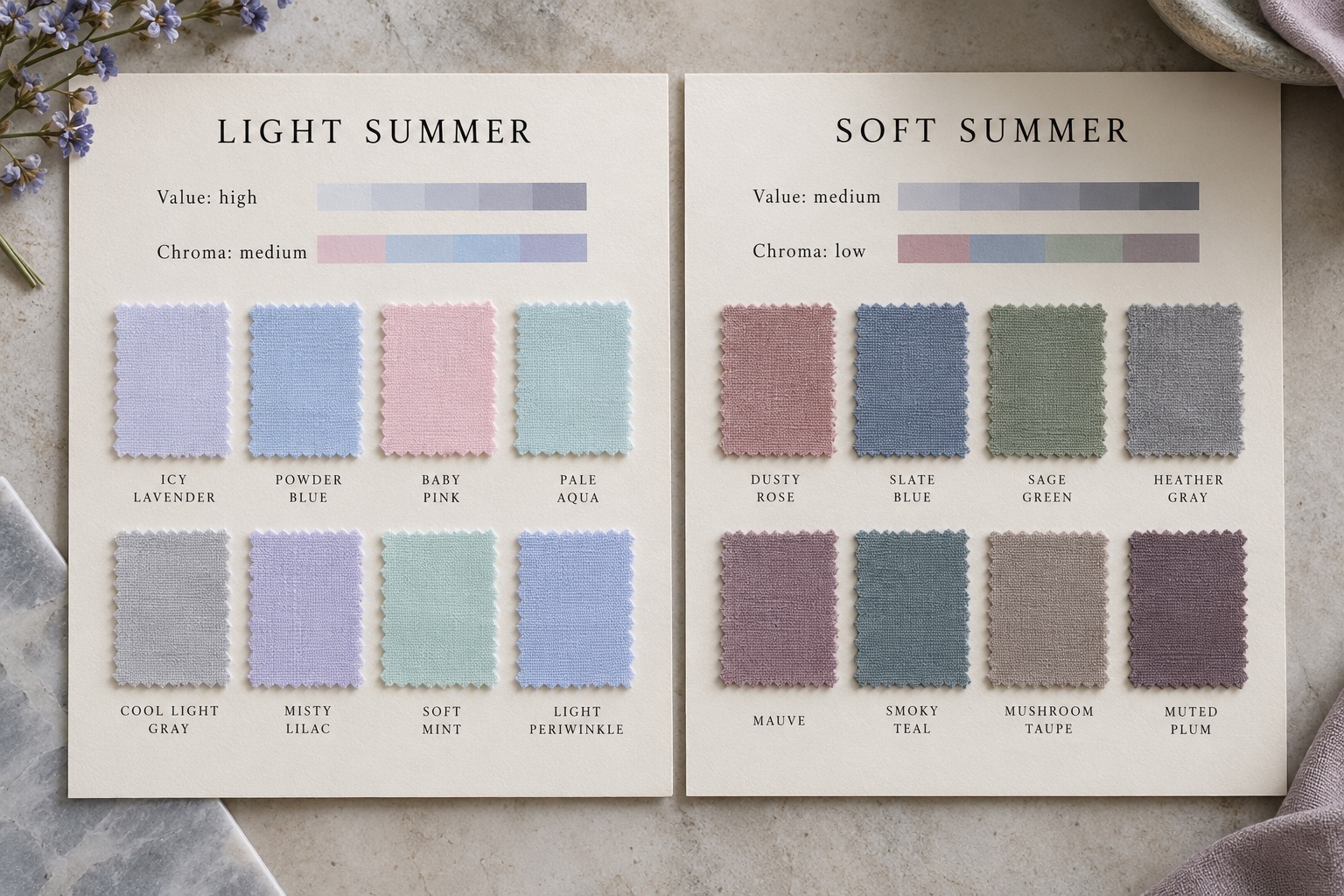
Start with the strongest pairs: powder blue versus slate blue, baby pink versus dusty mauve, and cool mint versus sage. Each pair changes more than one attribute, so do not treat one comparison as a scientific proof. Add a second pair that holds value closer while changing softness, and another that holds softness closer while changing value. This makes your own response easier to interpret.
The At-Home Fabric Draping Test: Powder Pink vs Dusty Sage
Gather four to six unpatterned fabrics: powder pink, dusty sage, powder blue, slate blue, cool light gray, and heather gray. Choose similar finishes if possible. A glossy silk and a matte wool change the amount of reflected light, which can make a fair comparison difficult. You do not need exact palette cards or new purchases; a shirt, scarf, or towel can work if the color is close enough and large enough to frame the face.
- Stand facing a window in indirect daylight, away from strongly colored walls. Keep your hair, makeup, and camera exposure consistent for the whole session.
- Hold powder pink directly beneath the chin for a few seconds, then replace it with dusty sage in the same position. Look at the eyes, mouth, and overall facial outline, not just the fabric.
- Repeat with powder blue against slate blue. Swap the order to reduce the effect of your first impression.
- Try cool light gray against heather gray. Note whether a very light neutral makes your features clear or whether a slightly deeper neutral gives them more definition.
- Write down which fabric set feels consistently easier to wear. Repeat on another day before assigning a subtype.
Powder pink and dusty sage also differ in hue, so their comparison is an accessible first impression rather than the final decision. If one is better, test a closer match: powder pink against dusty rose for value and chroma, then dusty sage against pale sage for depth. The most useful result is a pattern across several pairs. A single fabric may fail because its particular hue is too warm, too cool, or simply not your preferred color.
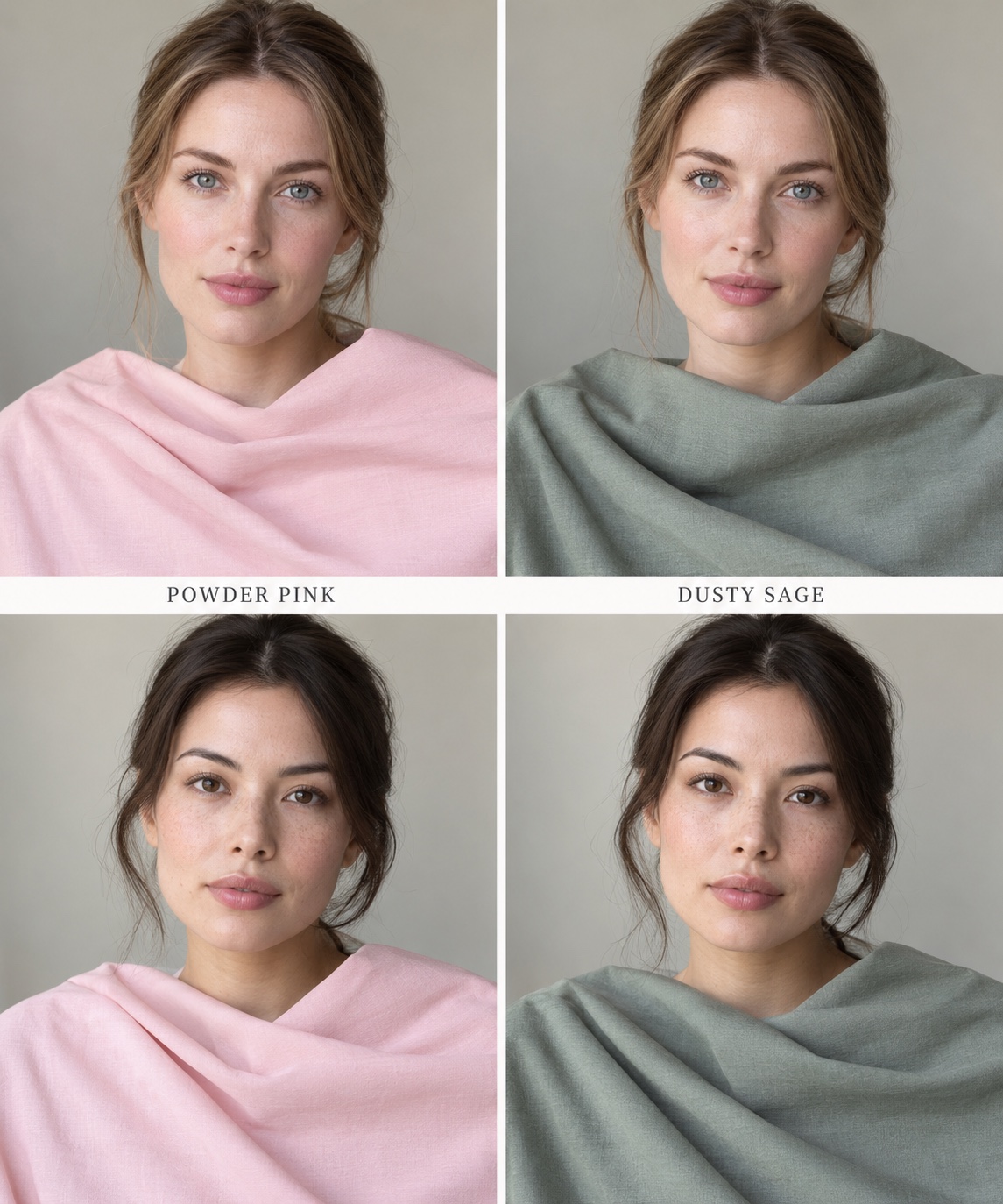
Keep the photos only as notes if you like; phone white balance can exaggerate a color shift. If you and a friend disagree, ask what each of you sees rather than voting on a label. Does the fabric pull attention away from your eyes? Does one shade make the face appear more defined with less styling effort? It is acceptable for both to work. In that case, try more matched pairs and build a practical wardrobe from the overlap.
Wardrobe Neutrals: White and Dove Gray vs Charcoal and Cocoa Taupe
Light Summer often finds its easiest near-face neutrals in cool off-white, dove gray, light stone, and pale blue-gray. Pure optical white may be too sharp, while yellow cream may introduce warmth. A white shirt can still work when the white is softened or when a powder-blue scarf sits between shirt and face. Pair a dove-gray jacket with a pale lilac top and light-wash denim for a low-contrast outfit that stays airy.
Soft Summer can use medium heather gray, slate, muted navy, cool mushroom, and cocoa taupe. Here cocoa taupe means a gray-brown with a cool or neutral cast, not a golden chocolate. Charcoal can be useful as a dark accent, especially in a textured fabric, but a full jet-black neckline may dominate the muted palette. A slate blazer over dusty-rose knit with gray trousers shows how Soft Summer can keep contrast gentle while adding depth.
The distinction is not that Light Summer can never wear charcoal or Soft Summer can never wear white. Change the area and distance from the face. Charcoal trousers can anchor a light outfit; a pale shirt can brighten a muted outfit under a slate jacket. Test the largest area closest to your face first, then use accessories to bridge less typical colors. If neither neutral group works, revisit the temperature of the fabrics before assuming the season is wrong.
Makeup Showdown: Light Sheer Lip Gloss vs Muted Velvet Berry
Makeup offers a small, inexpensive comparison near the face. Light Summer often works with cool petal-pink blush, a clear or sheer pink lip gloss, soft rose balm, and pale lavender or cool taupe shadow. Soft Summer can draw on dusty-rose or muted plum blush, a soft mauve lipstick, smoky taupe shadow, and a gray-brown or slate liner. The right intensity varies with skin depth and personal preference; these are color directions, not required products.
Compare finishes fairly. Sheer gloss will look lighter than an opaque velvet lipstick even if the underlying hue is similar. Try a cool pink and muted mauve in the same sheer formula first. Then, if you want more color, compare two equally opaque products. A very dark plum is not automatically Soft Summer; it may add more depth than this palette typically uses. A light shade is not automatically Light Summer if it is warm peach or neon pink.
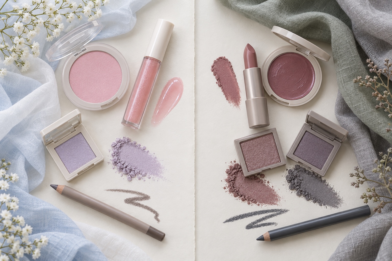
If blush color is hard to judge, wear the same neutral top for both trials and look at the full face in indirect daylight. A shade that looks beautiful in its pan may read differently on skin. Keep any product that you enjoy, even if it falls outside the suggested group. Palette comparisons should make choices simpler, not turn ordinary makeup into a pass-or-fail test.
Light Summer vs Soft Summer FAQ
Can a brunette be Light Summer?
Yes. Hair color alone cannot assign a season. A brunette may have an overall light, low-contrast effect or simply respond best to light cool fabric near the face. Compare several pale cool shades with grayer medium shades before relying on a hair-color stereotype. Hair dye and highlights can also change the apparent contrast without changing your skin's response to fabric.
What if I look good in dusty green?
Dusty green is a promising Soft Summer clue, but it is shared with nearby muted palettes, especially Soft Autumn. Compare a cool gray-sage with a warmer olive-sage of similar depth. Then compare your favorite sage with a pale cool mint. If muted colors consistently work better than pale clearer ones, Soft Summer becomes a useful hypothesis; if warmth wins, explore Soft Autumn.
Can I wear colors from both palettes?
Absolutely. The seasonal boundaries are a way to organize observations, not a prohibition. Many people use a light summer base with a few muted accessories, or a Soft Summer wardrobe with pale blue accents. Keep the pieces that already work. Focus a new purchase on the shade, finish, and garment area you are actually going to wear.
What is the quickest Light Summer draping test?
Hold powder blue and slate blue at the same neckline in steady indirect daylight, then repeat with cool baby pink and dusty mauve. The lighter set should repeatedly leave the face clearer for a Light Summer hypothesis. Check the result with a gray pair and note the limitations of photos. A single favorite blue is not enough to settle the comparison.
What if both palettes seem too light or too muted?
Try a cooler, somewhat stronger Summer direction such as True or Cool Summer, or reconsider whether Summer is the best family. Our True Summer guide shows its cooler center. If you want an organized starting point, use the interactive color analysis quiz, then check its suggestions against real fabrics. Keep the answer that helps you dress, even if it crosses a named boundary.
💫 Discover Your Complete Color Palette
Ready to discover all the colors that make you look radiant? Our comprehensive color analysis will reveal your complete personal palette - perfect for hair, makeup, and wardrobe decisions.
Take Color Analysis Quiz →