The Ultimate Guide to Clothing Color Charts for Your Wardrobe

Key Takeaways
Before you spend $450 on a professional color consultation, here's the insight that actually matters in 2026: the ultimate guide to clothing color charts for your wardrobe starts with your phone camera and a window — not a textbook on color theory. Retail LED lighting is the silent wardrobe killer. High-street stores run cool, high-intensity LEDs with a low CRI (Color Rendering Index), which means the burgundy blazer that looked rich and warm on the rack can turn flat and ghostly the moment you step outside. Always take the piece to natural light before you buy. Once you've nailed that habit, you can start building real outfit logic: understanding which colors light you up versus which colors light you dull is the foundation of every smart purchase. Use a chart circle — colors you already own mapped against your undertone — to spot gaps and avoid duplicates. From there, layer in accent colors that flatter you: a palette of two accent colors anchored to your neutral base does more work than a closet full of disconnected shades. Plots, colors, light — you need all three variables aligned before anything hits your cart.
💫 Build Your Perfect Color Palette
Ready to create a personalized color palette that works perfectly with your style? Our comprehensive guide will help you build a wardrobe palette that enhances your natural features and fits your lifestyle.
Build My Palette →Let color (hue, saturation, brightness) influence how your clothes drape on you. Test shades, tints and tones to add depth and flatter your skin tone.
Make a personalized color clothing chart of core neutrals, base colors and accents. Update it as your undertone, hair color or style evolves, and keep swatches or a digital palette on hand for shopping.
Let color psychology lead the way for the impression you want to convey like calming, energizing, or confident. Select palettes that are appropriate for the occasion while paying attention to cultural significance across contexts.
Modern tools have transformed how you build the ultimate guide to clothing color charts for your wardrobe. Apps like Facetune's AI Color Analysis and ColorWise now feature AR Draping — virtual try-on that lets you see exactly which colors light you up and which leave you looking dull before you spend a cent. When using any digital color wheel, pay attention to how the chart circle colors you specifically: a well-calibrated tool maps your undertone against seasonal palettes and highlights which accent colors flatter you most. One insider rule: if the app lacks a white-balance calibrator, its readings are unreliable — accurate white balance is what separates plots colors light you correctly from guesswork. Always cross-check results in natural daylight, since retail LED lighting can shift hues dramatically and make light-you-dull-you distinctions nearly impossible to judge in-store. For a complete palette, aim for at least a palette two accent colors that work as versatile anchors across your wardrobe — this is where digital palette generators earn their keep, letting you test combinations instantly rather than buying pieces blind.
Build a flexible wardrobe out of carefully selected neutrals, then sprinkle in some accent colors. Don't get caught in the clichés, respect your undertone, minimize clashing-brights and shop your style (not the trend of the moment) and you're good to go!
Color clothing chart is an easy reference that matches shades to apparel for distinct, effortless decisions. It includes base colors, accent tones and skintone matches, so selecting hues feels immediate and composed.
It aids in scheduling work looks, travel packs and event wear with fewer assumptions. Neutrals — black, gray, navy, beige — set the foundation. Warm and cool palettes tweak balance.
To put the chart to work, the guide underneath breaks down actionable steps, tips and swaps.
📚 Recent Articles
The science behind color
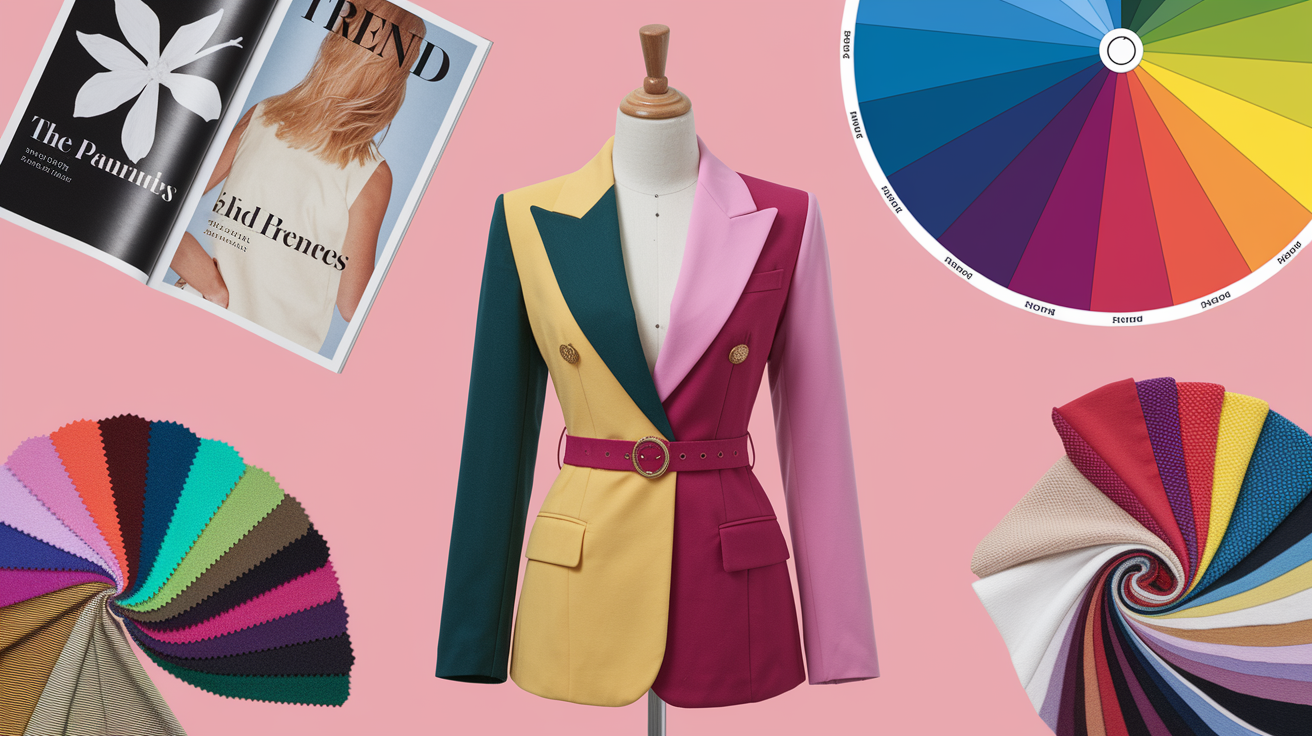
Color theory provides an explicit guide for constructing a **seasonal color palette** for clothing. It explains why certain ensembles are harmonious while others may clash, emphasizing the importance of color coordination. Beginning with the color wheel, it illustrates how harmonious colors emerge from contrast, proximity, and shared characteristics across different colors in our outfits.
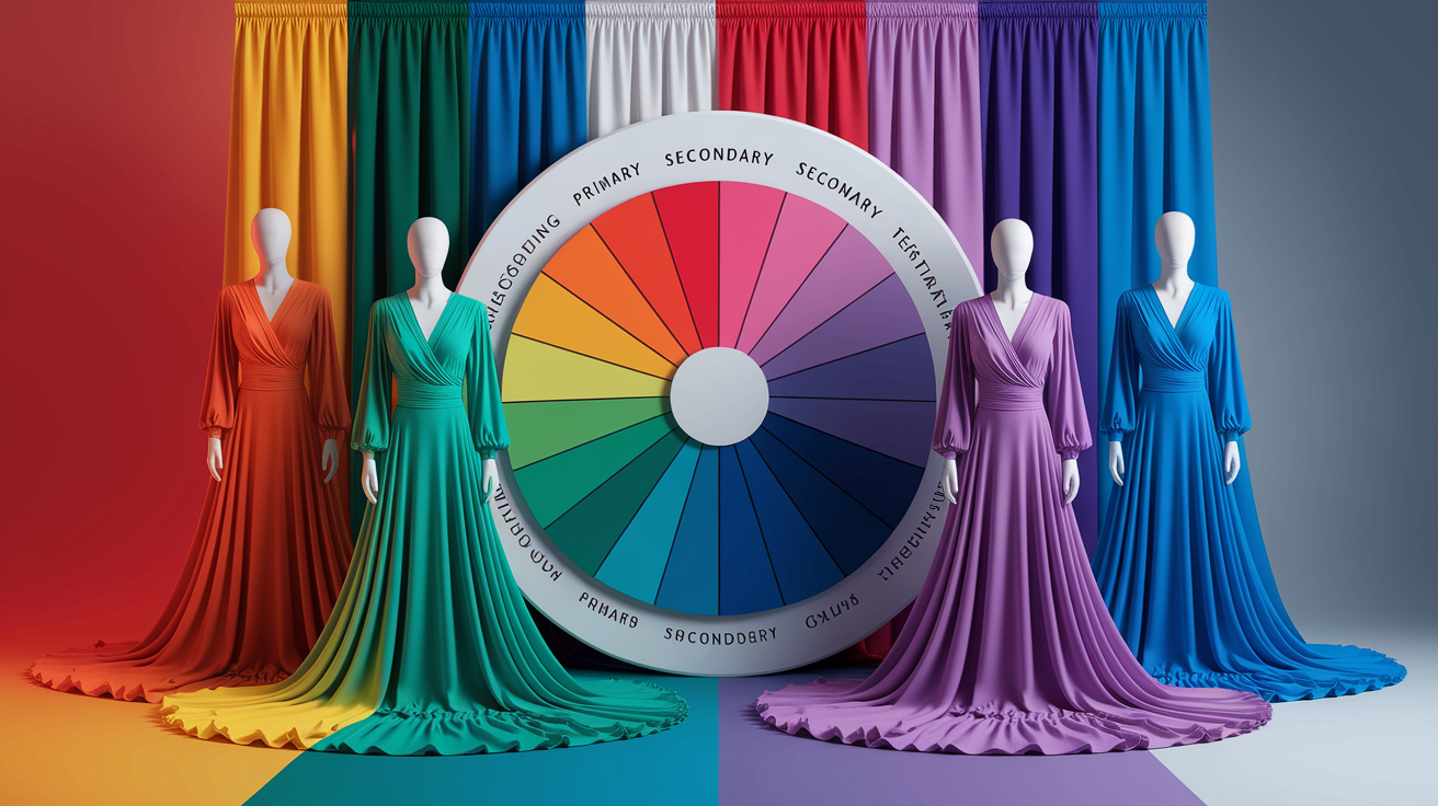
The color wheel
At the heart of it is the color wheel. It is usually split into 12 parts: three primary colors (red, yellow, blue), three secondary (orange, green, purple), and six tertiary mixes. It clusters warm tones (red, orange, yellow) and cool tones (blue, green, purple), which helps you organize elements quickly.
Use the wheel to plan schemes:
- Complementary: colors opposite each other (blue–orange) for high contrast that feels lively.
- Analogous: colors next to each other (blue–blue‑green–green) for a soft, blended look.
- Triadic: three colors spaced evenly (red–yellow–blue) for balanced energy.
Create your own matching chart by writing down your basics, then mapping 2-3 schemes per basic from the wheel. Add one neutral (black, white, gray, beige, navy) to ground bold pairs and prevent visual overload. Digital aids—color wheel pickers, photo samplers, even smartphone apps—assist you in pinning down precise shades from clothing in the same lighting.
Color properties
Hue is the color family. Saturation is color intensity, from vibrant to dull. Brightness is how light or dark the color comes across. Those three influence how clothing appears on the body and against skin.
Select shades (darker), tints (lighter) and tones (muted with gray) to give dimension. A desaturated teal blazer with a shaded mint shirt looks complex yet serene.
Skin and fabric shifts the read. A glossy silk enhances saturation. Matte cotton tenderizes it. When colors rest at a comparable luminance, they can "buzz" and fight. Fiddle with lightness to tone down the humming.
Warm and cool colors intensify each other when values are equalized. Test warm rust with cool steel blue, but slide one lighter to soothe the eye. Try it out under daylight if possible.
Color psychology
There are signals we perceive quickly in colors. Warm tones say energetic, push-y. Cool tones say calm and even. He went on to map seven key contrasts — warm/cold, complementary, and simultaneous among them — that still direct styling choices to this day.
Choose colors by intent: for confidence, a saturated blue jacket; for ease, soft sage; for creative tone, a triadic accent in shoes or a scarf. For work—one cool neutral base with one warm accent reads focused yet open.
| Color | Common associations |
| Red | Boldness, passion, urgency |
| Orange | Warmth, approachability, play |
| Yellow | Optimism, clarity, alertness |
| Green | Balance, renewal, steadiness |
| Blue | Trust, calm, confidence |
| Purple | Creativity, luxury, depth |
| Black | Authority, formality, edge |
| White | Simplicity, cleanliness, space |
| Gray | Neutrality, balance, restraint |
| Brown | Grounded, natural, warmth |
Align palette to event: cool blues for interviews, muted analogous sets for travel, complementary pops for social settings.
Your personal color clothing chart
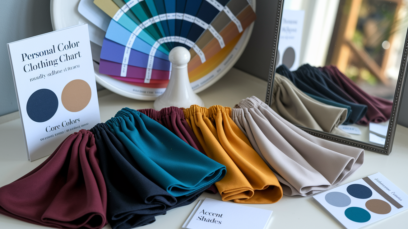
Your own chart plots colors that light you up and dull you down, helping you with color coordination. It aids in shopping purposefully and getting dressed more quickly, ensuring you feel cohesive with your seasonal color palette, tailored to your skin tone, hair, and eyes.
- List your undertone (warm, cool, or neutral)
- Pick a season or two that feels close
- Choose 3–5 core colors, 2–4 accents, 2–3 neutrals
- Try these shades on your face in daylight and indoor light.
- Note wins and misses; repeat with new fabrics
- Save swatches in your phone for store checks
- Update after hair dye, sun change, or style shift
1. Identify undertone
Forget squinting at your wrist veins — that trick belongs to 2015. The real 2026 gold standard is the Lipstick/Blush Test: hold a warm-toned blush or lipstick close to your bare face, then swap to a cool-toned one. Watch which shade makes colors light you up — eyes brighter, skin glowing — and which colors dull you out, leaving you looking flat or washed. Warm tones flatter you if peachy-coral shades bring you to life; cool tones are your match if berry and rose make you radiate. Can't decide? You're likely neutral. This simple test is the fastest way to understand which accent colors flatter you before you ever open a clothing color chart or build a palette with two accent colors — and it costs exactly nothing.
Give jewelry a shot. If gold looks softer and silver looks stark, you may run warm. If silver appears clean and gold brassy, you are probably cool. We all wear both and sit pretty neutral.
Notice sun reaction. Tan easily with minimal burn usually equals warm. Burn or blush fast lean cool. This is not about light or dark skin; warm and cool happen at every depth.
Undertone directs decisions in clothes and cosmetics. Warm undertones like earthy reds, olive, camel and warm navy. Cool undertones tend to pop in berry, emerald, true navy and charcoal.
Organize your closet by "warm-friendly" and "cool-friendly" racks – you'll quickly see gaps and clashes.
2. Discover season
**Seasonal color analysis** categorizes personal coloring into spring, summer, autumn, and winter, utilizing a seasonal color palette for optimal results. Most have moved to 12-season systems—light, deep, soft, clear, warm, and cool versions of each—which broadens choices and flatters more complexions. For instance, light hair and eyes with warm skin often reside in Light Spring, while deeper hair with cool skin and bright eyes can fall into Clear Winter. Others may identify with a hybrid, and that's perfectly acceptable.
Choose a seasonal color palette that accents your features rather than camouflaging them. Treat it as a starting point, not a definitive guide. The classic system was originally constructed around Caucasian examples, often overlooking unique skin tones, so adapt it to suit your traits and ethnicity.
Choose a seasonal palette that accents, not camouflages. Treat it as a beginning, not a bible. The classic system was constructed around Caucasian examples and can overlook nuance, so adapt for your traits and ethnicity.
By understanding these color combinations, you can enhance your wardrobe and express your individuality through thoughtful color coordination.
3. Build palette
Establish base colors for every day wear, such as navy, charcoal, olive or chocolate.
Layer on accents alight, like coral, saffron, cobalt or violet, then anchor looks with adaptable neutrals—ecru, gray, espresso, black.
Use the ultimate guide to clothing color charts for your wardrobe as your foundation: coordinate tops, bottoms, layers, and shoes around a palette two accent colors plus one neutral base — and you'll pull together effortless outfits every time. The real trick is instant access at the checkout. Instead of scrolling through a cluttered photo gallery, save your digital palette as a pass directly in your Apple or Google Wallet. That way, the accent colors that flatter you are always one tap away — no second-guessing under store lighting that can make colors light you up or dull you down in an instant.
Anticipate trial and error. Most figure it out through experimentation, forum questions, or hiring a pro.
4. Test fabrics
Before you hand over your card, do yourself one favor: walk to the store window — or better yet, step outside. Today's energy-efficient LED retail lighting often carries a low CRI (Color Rendering Index), which means the accent colors that flatter you under those warm fitting-room bulbs can shift to flat, washed-out tones the moment natural light hits them. What the plots colors light you up with indoors is not always what colors light you in the real world — and that gap is exactly how impulse buys turn into wardrobe regrets. Think of it as the ultimate guide to clothing color charts for your wardrobe in action: always test fabrics in true daylight, because light you dull you is the oldest trick a fitting room plays.
Drape close to your face. If it makes your skin look smooth and eyes bright, it works. If shadows put a gray cast on your face and lips look gray, forget it!
Record keepers triumph. Identify "best" shades and "clash" shades with fabric type. Construct a fabric chart as well by category–tops, scarves, jackets–since texture and weave can alter the way a color reads.
Perception shifts as you experiment with new styles, hair color or bronzer. Update your chart when those shifts occur.
How to use a dress color matching chart
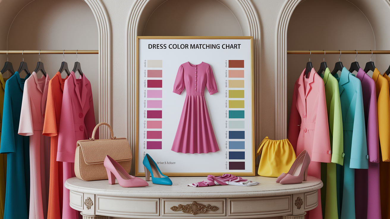
Color matching clothes chart to plan work or casual days or formal dinners. It charts the way hues interact on the color wheel—primary (red, blue, yellow), secondary (green, orange, purple) and tertiary blends such as magenta, vermillion and teal. Use it to grab no more than 3 colors per outfit for a crisp, balanced look, then add in textures and neutrals that keep things wearable.
| Benefit | Use case |
| Fast pairing | Check opposites for bold, neighbors for calm, neutrals for balance |
| Consistent style | Repeat a set palette across seasons to build a cohesive wardrobe |
| Smarter shopping | Match new pieces to charted colors you already own |
| Personalization | Mark favorites, skin-tone matches, and goal outfits on your copy |
Reference this chart when matching tops, dresses and layers. Begin with a base color, throw in one supporting color, then ground with a neutral such as black, white, tan or navy. Timeless black-and-white is a good grounding color that compliments any pop.
Personalize your chart. Circle colors you love and what flatters your undertone. If light colors seem safe, give them a darker or brighter cousin—light blue with teal, or soft lavender with royal purple. Use the chart when shopping: snap a photo, compare in-store, and pick items that slot into your set palette so your wardrobe grows in sync.
Monochromatic
Construct a monochrome outfit with a single color in multiple tints and shades. Begin with a mid-tone blue base dress, throw on a lighter sky-blue blazer and ground it all with deep navy shoes. The color wheel guides you in charting the entire spectrum from light to dark, so you sidestep a flat, one-dimensional style.
Shift texture to add interest: silk with wool, denim with satin, rib-knit with smooth leather. Even in beige, a linen trench over a cashmere dress and suede boots has a layered, not loud, feel. Monochrome reads modern and sleek, especially with clean lines.
Analogous
Analogous schemes use neighbors on the color wheel.
- Red + red-orange
- Orange + yellow-orange
- Yellow + yellow-green (teal)
- Green + blue-green
- Blue + blue-violet
- Purple + red-purple (magenta)
They appear very serene and coordinated. Blend light and dark within the range: navy with emerald, or soft peach with amber, so the outfit has depth and shape.
Complementary
Complementary colors lie across from each other on the wheel, such as blue-orange, purple-yellow, and red-green. These daring color combinations are perfect for making a statement, especially when considering your seasonal color palette. Use them sparingly—too many can create a color clash. Balance with neutral colors like a white shirt, tan belt, or denim layer to steady the mix.
Triadic
Triadic sets employ three colors spaced evenly around the wheel, such as red–yellow–blue or purple–green–orange. To create a balanced outfit, choose one primary dress or suit color from your seasonal color palette and two accent colors in shoes, scarves, or jewelry for effective color coordination. Consult the chart to test proportions before you wear them – small tweaks in shade can turn clashing into crisp.
Beyond the basic chart
Color clothes charts offer a guide, but they don't encompass the entire terrain of color seasons. Real life intertwines culture, environment, and the changes in our skin tones over time. Create your own seasonal color palette that you can update and adapt, ensuring your color combinations work harmoniously to keep your style fresh and unique.
Cultural context
Color has significant meaning, and these meanings can vary by area and population. For instance, while white might be perceived as classic and pristine in one culture, it may primarily symbolize mourning in another. Red can signify fortune, caution, passion, or prestige, depending on your perspective and your audience. Understanding how to navigate these color aspects requires intelligence and awareness, not just instinct.
Researching symbolism is crucial when dressing for international or mixed audiences. Consult cultural style guides, art history notes, and local media to understand the seasons color analysis relevant to your context. If you're presenting in a business setting, it's wise to review dress codes and national holidays that could tie certain colors to political or religious topics.
Customize your color palette to pay homage and convey the right message. For weddings, festivals, or religious sites, opt for muted colors and avoid vibrant hues. Small shifts can make a difference: for example, choose deep blue instead of royal purple if purple has rank connotations.
Utilize culturally resonant colors to enhance self-expression. Incorporating a sash, scarf, or beading in a significant color can add narrative and pay homage without overwhelming your style, especially when considering your unique skin tone and the right colors for your wardrobe.
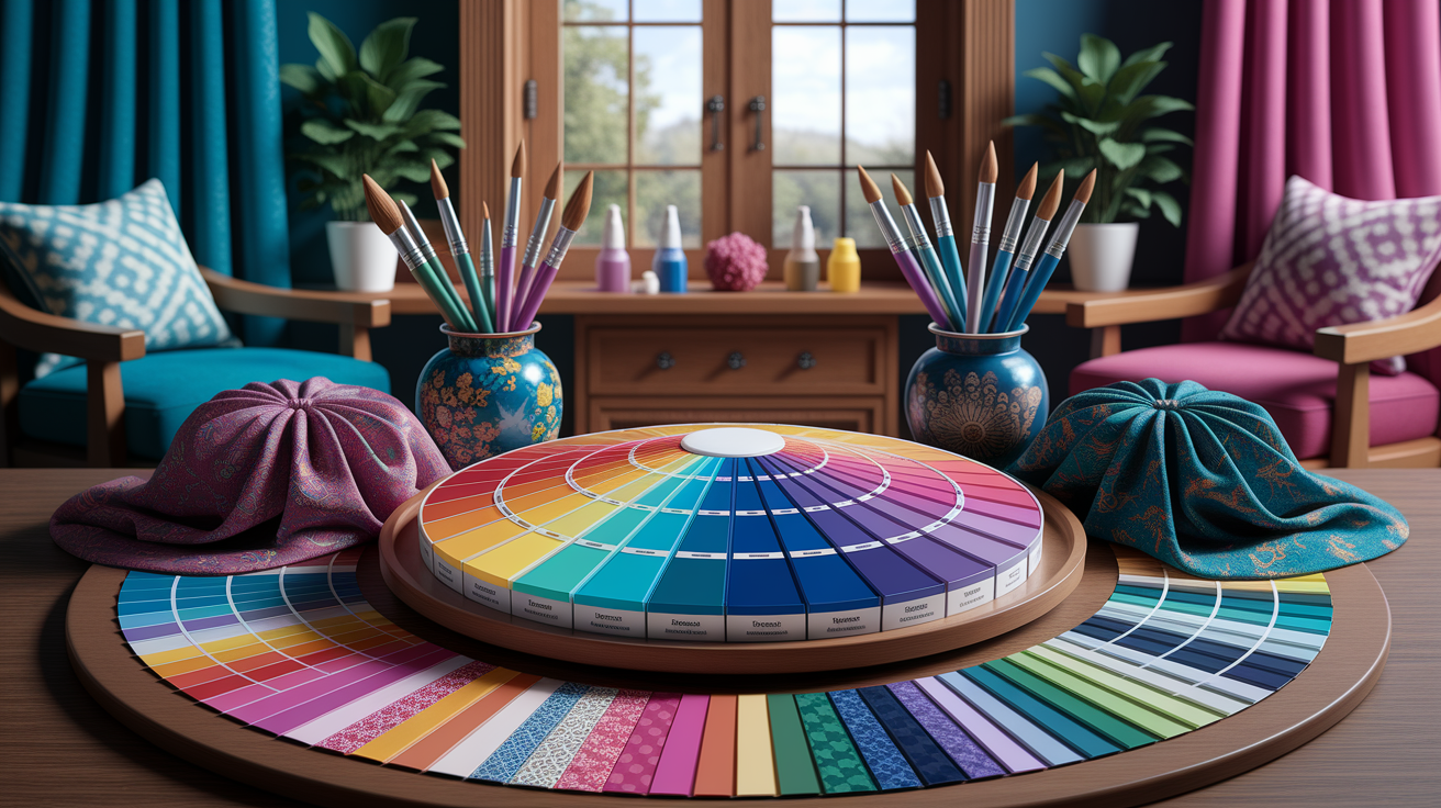
Digital tools
Online color wheels and scheme generators accelerate smart decisions in color coordination. Go complementary for a pop of color, analogous for calm, or triadic for energy. Flip luminance and saturation to fit the fabric weight and finish, ensuring your seasonal color palette aligns with your unique skin tone.
Try something like Adobe Color or colorwise.me to construct, name, and save palettes by season, trip, or role. Palette Tag your wardrobe pieces for quicker packing and more thoughtful shopping, making sure to consider different colors that suit your personal style.
Obtain precise skin tone information from digital analysis kits or a photo taken in daylight, as certain clothing colors can enhance your natural coloring. Note shifts: some people move from light neutral ivory to light olive over years, impacting their color combinations.
Try on ensembles in virtual closet planners prior to purchase. Swap backgrounds and light to see if that jade blazer still works at 18:00 indoors or if it only sings in the sun, ensuring your outfit ideas reflect your seasonal color analysis.
Personal style
Anchor colour to your life. If you bike to work or speak on stage, go with palettes that take on sweat, dust and bright lights.
Craft a signature palette that suits your dominant or secondary characteristics—WARM, COOL, LIGHT, SOFT, CLEAR, PURE, MUTED or DEEP. True seasons such as Spring or Winter tend to sparkle with more contrast between skin, hair and eyes. Others mix traits across seasons, particularly in SOFT WARM/COOL deep groups, so the 'flow' may be hybrid.
Try it. Neutral DEEP and SOFT people might opt for warmer when tanned, cooler when pale. CLEAR, MUTED, PURE and LIGHT profiles sometimes drift beyond their group if they appear fresh—frequently with a tan or makeup—which aren't 'makeup‑free' hues.
Color it to be confident. Your chart ages with trends, skin changes and taste, so update it regularly.
Building a versatile wardrobe
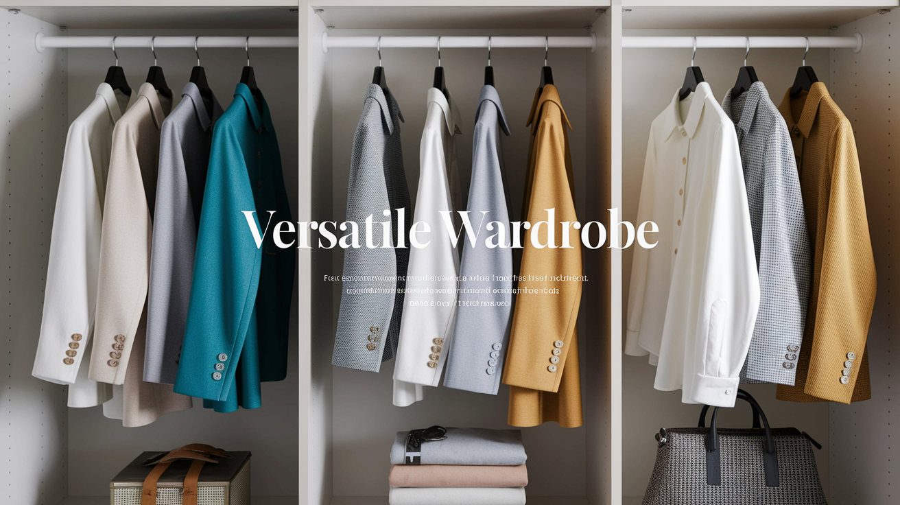
A smart color clothing chart does more than tidy up a chaotic wardrobe — it quietly dismantles the fast-fashion cycle. When you follow the ultimate guide to clothing color charts for your wardrobe, outfits come together in seconds, clashes disappear, and every piece earns its place on the rail. Start by anchoring your closet with neutrals that genuinely work with your complexion — the ones that light you up rather than dull you down — then layer in a palette of two accent colors that flatter you and punch up the whole collection. Understanding which plots colors light you and which colors light you dull you is the real game-changer: when every item you own sits inside that framework, impulse buys lose their grip because you can instantly see what fits and what doesn't. Choose pieces in clothing colors that move effortlessly between work, weekend, and travel, and you'll naturally reach for them again and again. Here's where sustainability enters the picture — shoppers who stick to a defined chart return far fewer purchases, cutting return-shipping carbon footprints by roughly 40% simply because they actually keep what they buy. Revisit your chart circle colors each season, retire anything that no longer serves the palette, and introduce only 2–5 new pieces that genuinely strengthen the plan. Less clutter, fewer returns, and a wardrobe that works every single morning.
Core neutrals
Black, white, gray, beige and navy provide the foundation that keeps a wardrobe cohesive. These neutrals blend across styles and climates, and they layer silently. Navy blazer, gray trousers, beige knit, white shirt, black jeans — that pretty much covers everyday life.
Quality counts with these foundational pieces since they ground the majority of outfits. Select dense knits that drape, smooth shirting that won't sheer, and hardy wool or cotton blends that endure. Good neutrals outlast fads and retain their hue wash after wash.
Pair neutrals with brighter notes for balance. Charcoal dress, coral scarf, navy pants and a teal shirt, beige chinos and a saffron sweater. The neutral sets the background, the accent provides the emphasis.
Use a color chart to verify undertones with your skin. Cool skin tends to go well with true black, bright white and cool gray. Warm skin may go for off-white, camel, and navy. Try it in daylight next to a window, take a picture on your phone, and record which hues brighten your visage.
It's easier because a good neutral base well-set simplifies options–which science indicates guards your scant decision energy throughout the day. Less tough decision making at 7 a.m. Translates into less stress and more zen.
Accent colors
Select 2 or 3 accent colors that highlight your features and suit your lifestyle. Consider deep green, rust, cobalt, plum or soft rose. A tightly controlled palette doesn't trap you into a single style — it provides freedom-within-structure.
Accents can be incorporated with shoes, bags, scarves, belts, or one standout piece. Cobalt loafer with navy, rust tote with beige, plum shirt under gray. Small doses can shift an entire outfit.
Rotate accents seasonally to keep things fresh. Olive and burgundy in the cooler months, coral and sky blue in the warmer ones. Still, splurge on prints and colors that wear year-round, like navy-and-cream stripes or a micro-check in slate and white.
Balance accents with your base! Maintain one accent dominant per outfit, with neutrals doing the rest. A fifteen-item capsule can accommodate at least three accents. Construct it incrementally, 2–5 pieces each season, refresh your existing wardrobe rather than purchasing all new outfits.
As you audit, reference your color chart, try on in natural light, and query, does this spark joy? A serene, cared-for closet saves time and reduces the rush.
Common color matching mistakes
Color charts assist in outfit planning, but they can't substitute for how color actually rests upon your body, especially when considering your unique skin tone and seasonal color palette. Take them as a guideline, then make the color combinations work with your skin, your environment, and your preferences.
Ignoring skin tone and undertone
Skin tone is the depth of your skin (light to deep). Undertone is the cast under it (cool, warm or neutral).
What: colors that echo your undertone tend to blend with ease. Colors that fight it can wash you out.
Why: the wrong base shifts how your skin reads next to fabric, making you look dull or ruddy.
Where it shows: collars, scarves, and hats sit near the face and do the most harm or good.
How to check fast: hold a pure white tee and an off‑white tee near your face in daylight. If pure white looks sharp, you probably lean cool. If off‑white softens and flatters, you probably lean warm. If both work, you're neutral.
Examples: cool undertone often likes navy, charcoal, true red, emerald. Warm undertone usually prefers camel, olive, rust, coral. Neutral can flex but mid-value shades like teal, soft berry and taupe are safe.
If you adore a 'hard' shade for your undertone, keep it off your face—test it in trousers, belts or shoes.
Mixing too many bold or clashing colors
What goes wrong: stacking multiple high‑chroma hues fights for the eye.
Why it matters: the outfit loses a clear focal point, and the body line breaks.
Where to watch: tops, outerwear, and large bags carry the most visual weight.
How to fix: cap the number of bold notes at one or two, then ground with low‑chroma basics like black, navy, stone, ivory, or gray.
Use scale: big piece bold, small pieces quiet.
Examples: cobalt blazer + white tee + black jeans reads crisp; add neon shoes and a bright bag, and it turns loud. Red dress plays nice with nude or black shoes, toss in some lime heels and a purple bag and the look shatters.
If, on the other hand, you want rich color mixes, use neighbor shades on the color wheel (blue with teal) or a shared undertone (warm pink with rust).
Chasing trends over personal coloring and style
What: trend shades look fresh on the rack but may not serve your face, work, or climate.
Why: color is context; the wrong trend drains you and gathers dust.
Where to weigh: pieces near the face, high-cost items, uniforms for work.
How: test trends in small buys first—scarves, beanies, belts. View it in daylight, not store light. Fold the shade into what you own — not vice versa.
Examples: if "digital lavender" dulls you, try it as a print accent on a shirt, not a full suit. If acid green is harsh, move to olive or chartreuse with more gray.
- Treat charts as guides, not rules
- Match near‑face colors to undertone
- Limit bold hues to one or two per outfit
- Ground brights with neutrals to balance
- Keep prints within one undertone family
- Test trends in small items before big buys
- Check colors in daylight, not store light
- Place tricky colors away from the face
- Mind fabric sheen; gloss amplifies color intensity
- Edit accessories so they support, not shout
Conclusion
Color makes outfit planning obvious and quick. An easy-to-use chart eliminates guesswork. You save time. You lose less. You feel confident.
Little victories pile on top of each other. As a navy blazer with white tee. A soft green shirt with tan pants. A gold studded black dress. Fresh, crisp, finished. Light near the face for glow. Throw in one eccentric splash for dazzle. Reserve 1 anchor shade for serenity.
No massive closet necessary. Choose a foundation palette. Add 2 or 3 accents. Swap by season. Monitor what works. Make notes of shade, fit, and light.
Style ages. Test out one new pair per week. Take a picture. Observe the fit. Need assist perfecting Post your chart and receive prompt feedback.
Frequently Asked Questions
What is a color clothing chart?
A color clothing chart is a little chart showing which colors go together, helping you understand color combinations that work well for your seasonal color palette. It charts complementary, analogous, and neutral shades to minimize clashing and construct a cohesive wardrobe.
How do I find my best clothing colors?
Identify your undertone: cool, warm, or neutral skin tone. Consult your veins, jewelry preference, and how you appear in white and cream. Then select a seasonal color palette that suits your undertone. Test your color combinations in natural lighting and maintain a note or photo palette for shopping.
How do I use a dress color matching chart?
Begin with your neutral base color, like navy or beige, from your seasonal color palette. Look across the chart for complementary or analogous colors that enhance your color combinations. Add one accent color for interest while maintaining a harmonious color scheme.
Do seasonal color palettes still matter?
They assist, but apply them loosely. Seasonal color analysis systems provide immediate direction on undertones and saturation. If a certain clothing color clashes with your taste or situation, tweak. Concentrate on harmony with your skin tones, eyes, hair color, and the environment.
What are common color matching mistakes?
Overmatching tones and mixing clashing saturations can lead to poor color coordination, especially when ignoring undertones. To achieve a harmonious color palette, confine accents to one or two colors and make contrast deliberate.
How can I build a versatile color wardrobe?
Base your color scheme around two neutrals and a secondary neutral, while incorporating a seasonal color palette. Throw in 3-5 accent colors that harmoniously work with all bases. Keeping prints in your palette enhances color combinations and multiplies outfit ideas.
Can I wear black if my undertone is warm?
Yeah, with twists. Add warm accents like camel, terracotta, or gold jewelry to enhance your seasonal color palette. Balance with warm makeup or a scarf close to the face for harmonious colors and outfit ideas. It's about balance, not rules.