Soft Autumn vs True Autumn: How to Tell the Muted and Warm Seasons Apart
 Reviewed by Alexandra Gilmore
Compare muted neutral-warm earth tones with rich golden warmth using drapes, wardrobes, and makeup.

Soft Autumn vs True Autumn is chiefly a difference in warmth and color intensity. Soft Autumn is neutral-warm and muted: dusty sage, peach taupe, almond, and softened olive usually blend with its gentle coloring. True Autumn, also called Warm Autumn, is distinctly golden-warm and can carry stronger mustard, copper, pumpkin, and rich olive. Both belong to the warm, earthy Autumn family, but bright golden hues can dominate a Soft Autumn look while a very grayish palette may flatten a True Autumn look. The most useful test is to compare equally sized fabrics beside your face in steady daylight, keeping makeup and camera settings consistent.
An orange that flatters you can also point toward Spring; the orange season comparison separates peach and tangerine from earthy terracotta.
If richer depth wins over both palettes here, the Deep Autumn style examples provide a further visual comparison.
Think of these as neighboring palette directions, not identities that can be read from one eye or hair color. A person with fair, medium, deep, or olive skin can experiment with either. This guide compares color dimensions, visual examples, drapes, wardrobe neutrals, and makeup so you can decide which set supports your features and preferences. For the wider family, start with our Autumn color palette guide; for full palettes, see Soft Autumn and True Autumn.
The Munsell Color Difference: Neutral-Warm Muted vs Absolute Golden Warmth
Color is easier to compare when you separate hue, value, and chroma. Hue names a color family, value describes lightness or darkness, and chroma describes how vivid or grayish a color appears. The Munsell Color Company’s introduction explains those three dimensions. Seasonal palettes are a styling interpretation, not a Munsell measurement of a person. The vocabulary simply helps isolate what changed between two fabrics.
Soft Autumn sits near Soft Summer in the twelve-season map. It keeps a warm lean but lets a little neutral softness into the mix. Imagine an olive green with a veil of gray, a peach that resembles washed linen, or a brown softened toward mushroom. True Autumn sits at the warm center of the Autumn family. Gold, orange, yellow-brown, and warm green are more obvious. It can use richer pigment without losing its earthy character. “True” does not mean every shade must be fluorescent: a mustard wool coat is saturated relative to a dusty sage cardigan, but it is still far from neon.
Value is a separate question. Either palette can include light and dark pieces, from ivory to chocolate. If a dark chocolate top succeeds where a pale taupe fails, you may be responding to depth rather than warmth. If the colors are similarly dark and only the golden one looks stronger, temperature becomes a better clue. Compare like with like before assigning a season.
| Decision point | Soft Autumn | True / Warm Autumn |
|---|---|---|
| Leading quality | Muted, blended color with a neutral-warm lean | Unmistakable golden warmth with medium-rich color |
| Useful light neutral | Oyster, almond, soft warm beige | Golden cream, rich ivory, light camel |
| Useful dark neutral | Mushroom brown, softened olive, cocoa | Espresso, warm chocolate, deep olive |
| Test accent | Dusty sage or muted peach | Mustard, copper, or pumpkin |
| Possible warning sign | Strong gold draws attention away from the face | Grayish taupe makes a warm face look less lively |
This is a decision table, not a verdict. Note the direction that works repeatedly across several fabric pairs. One flattering garment, one camera photo, or one metal finish is too little evidence.
Features Comparison: Soft Blended Hazel and Gray Eyes vs Golden Amber and Topaz
Season descriptions often picture Soft Autumn with mouse-brown or ash-touched brown hair, softly hazel, green-gray, or gray eyes, and low visible contrast. True Autumn examples often show copper or rich auburn hair, amber or topaz eyes, freckles, and a golden cast. Those are illustrations of a relationship among colors, not admission rules. Dark brown eyes, black hair, or deeper skin can also appear within a warm, muted or warm, vivid wardrobe story.
Instead of matching yourself to a reference photo, look for an overall effect. Are the edges between your hair, eyes, and skin softly blended, so dusty colors sit comfortably beside your face? Or do golden fabrics repeat visible warmth and make your eyes or hair seem more defined? Both questions concern how a fabric interacts with the face. Gray eyes do not automatically make someone Soft Autumn, and auburn hair does not automatically make someone True Autumn. Dye, lighting, colored contacts, and makeup can also change the apparent feature mix.
The hero portraits are fictional styling examples. They deliberately use familiar features to make the palette distinction easy to see, but comparing two different people cannot diagnose your palette. For your own test, hold a muted and a stronger warm fabric beneath the same chin, at the same time of day, with a mirror or a fixed-exposure photo. If eyes and skin appear clearer in both, you may have room to borrow from both neighboring palettes.
True Autumn Vibrant Spices vs Soft Autumn Gentle Earth Tones
Build two small piles of fabric. For Soft Autumn, choose dusty sage, muted moss, peach taupe, warm mushroom, almond, and a gently smoked teal. For True Autumn, choose mustard, copper, pumpkin, golden olive, warm teal, and rich chocolate. Keep the fabric finishes similar; a glossy satin copper beside a matte cotton sage will introduce shine as another variable. Put each swatch directly under the chin, one at a time, and watch whether the color supports your eyes and skin or becomes the first thing you see.
Soft Autumn’s “soft” refers to lower chroma, not a ban on personality or a requirement to wear only pale colors. A deep olive or cocoa coat can still look rich when its edges are muted. True Autumn’s warmth does not require wearing orange from head to toe. A golden-olive jacket, cream shirt, and copper scarf can express the palette with one strong accent. If a muted autumn vs warm autumn palette comparison feels subtle, focus on one hue family: dusty peach beside clear apricot, muted sage beside golden olive, and softened cinnamon beside copper rust.
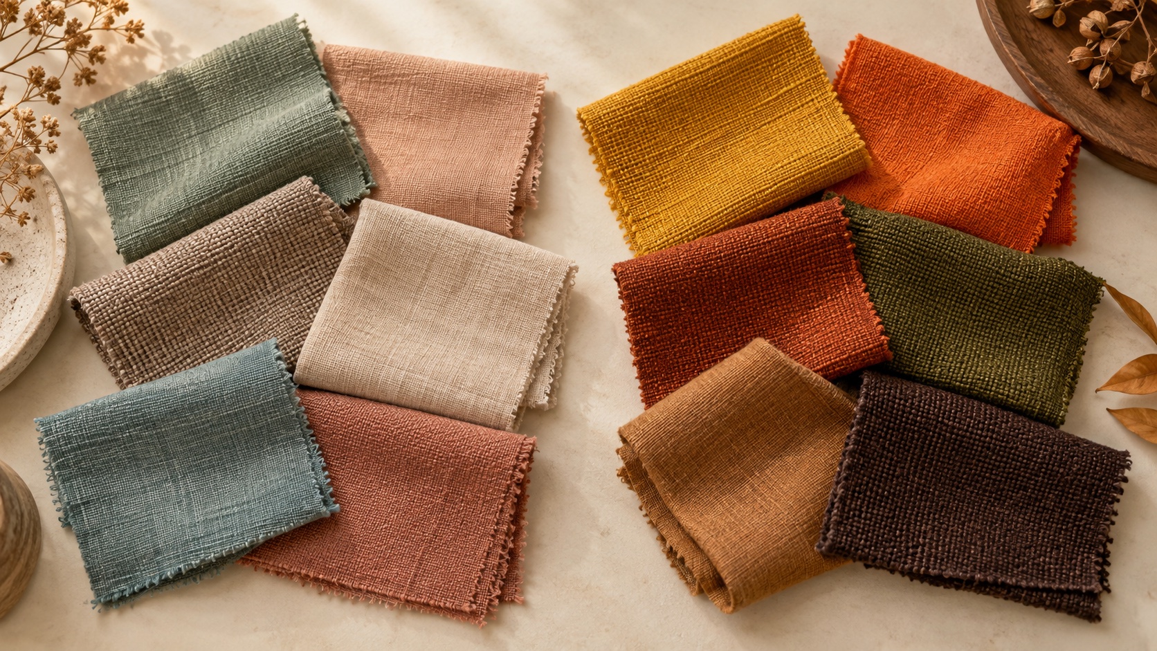
Notice shared ground. Warm ivory, some olive greens, soft chocolate, and earthy teal can bridge the palettes. If you love a stronger True Autumn shade but it overpowers your face as a shirt, use it as a bag, skirt, or narrow print accent. Conversely, a True Autumn can use a quiet Soft Autumn neutral as a base, then add a rich warm color near the face. A seasonal label is useful only when it helps you make choices you enjoy wearing.
The Fabric Drape Test: Mustard Yellow vs Soft Almond Latte
Mustard gold and almond latte offer a practical first contrast because both are warm, yet one is more golden and saturated. Gather a mustard scarf or shirt and an almond-beige one of similar weight and finish. Sit by a north-facing window or in indirect daylight. Remove strong makeup if you are comfortable; tie back colored hair if it distracts. Keep the background plain. Hold each fabric at the same height beneath your chin, and take a few seconds to look at the whole face rather than only the garment.
If mustard makes your eyes look clearer and the skin appear even while almond seems faded, True Autumn becomes more plausible. If almond integrates with your features while mustard is the only thing you notice, Soft Autumn becomes more plausible. Avoid calling a face “sallow” on the basis of one photo: warm indoor bulbs, camera white balance, and reflected fabric color can all cast yellow onto skin. Repeat the test on another day, then compare dusty sage with golden olive and muted peach with pumpkin.
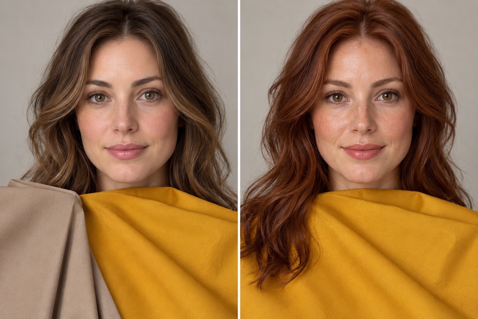
Use a simple three-column note: fabric, what you observe, and conditions. For example, “mustard wool; eyes appear clearer; cloudy daylight,” then “almond wool; softer overall effect; same window.” If the result switches when you change light or garment finish, pause before choosing a subtype. Our quiz vs professional draping comparison explains what each approach can and cannot show.
Neutral Palettes: Oyster and Taupe vs Rich Camel and Espresso
Neutrals often reveal the difference more reliably than a dramatic orange. Soft Autumn can build a wardrobe around oyster, almond, mushroom, warm taupe, softened cocoa, and gray-green olive. These colors have warmth, but it is whispered rather than glowing. Against a Soft Autumn face, a hard black blazer or very yellow camel coat may draw a heavy outline. If you love black, soften the neckline with an oyster shirt, warm scarf, or lower-contrast jewelry.
True Autumn tends to favor richer cream, caramel, camel, cognac, warm chocolate, espresso, and golden olive. The same taupe that serves as an easy Soft Autumn base may seem dull next to a True Autumn’s stronger golden coloring. A camel coat with copper knit and espresso boots creates depth without losing warmth. Espresso here means a warm dark brown; a blue-black espresso would change the temperature test.
A two-outfit comparison can clarify the choice. Outfit A: oyster tee, mushroom trousers, sage cardigan, muted peach scarf. Outfit B: cream shirt, camel trousers, rust sweater, dark chocolate belt. Try both in similar silhouettes. If one outfit looks cohesive but the other requires stronger makeup or a brighter lip to feel balanced, that is useful evidence. Still, fit, texture, and personal taste matter; adjust one variable at a time.
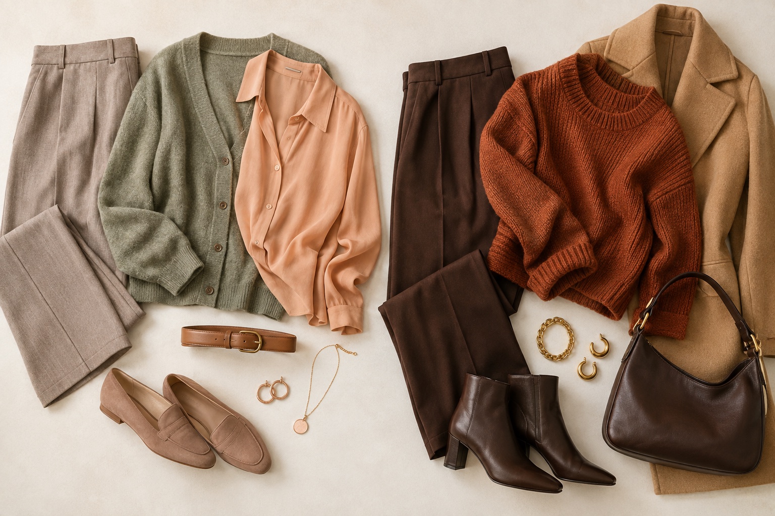
For more ideas after you identify the leading quality, explore the full Soft Autumn color palette or the True Autumn color palette. This page helps you choose between them; the full guides cover a larger range of clothing combinations.
Makeup Swatches: Soft Nude-Peach vs Warm Terracotta and Brick Red
Makeup sits close to the face, so it can make the palette difference easy to notice. For Soft Autumn, compare a soft nude-peach lip, muted warm rose, peach-beige blush, and almond-taupe eye shadow. Satin or softly diffused finishes echo the muted palette. For True Autumn, try terracotta, warm brick red, copper, cinnamon, and bronze. A richer warm lip can look integrated rather than separate when the palette has room for stronger golden color.
Make the test fair: use products with similar coverage and finish, apply them at the same strength, and keep the clothing neutral. A sheer peach balm versus opaque brick lipstick tests pigment amount as much as hue. Swatch them on your own skin, then try each on the lips or cheeks. Undertone descriptions on packaging are inconsistent, so look at the actual product in daylight. If a muted peach disappears pleasantly into the face while terracotta becomes the focus, note a Soft Autumn direction. If terracotta gives definition and peach looks washed out, note a True Autumn direction.
Neither palette dictates an exact makeup formula. Darker skin may need more pigment to make a “soft” peach visible; fair skin may prefer a sheerer brick. That adaptation changes application strength, not necessarily the color family. For a deeper dive into the muted side, see our Soft Autumn makeup guide. A lipstick result should support, rather than replace, the fabric comparison.
Common Misdiagnosis Pitfalls and How to Spot Them
Letting hair or eye color decide everything
Hazel and amber eyes occur in many palettes, and hair dye can shift the whole impression. Even “mouse brown” and “auburn” are broad descriptions. Treat feature examples as prompts for observation. The more reliable question is how multiple comparable fabrics behave next to your own face. A good result does not require looking like the person in a seasonal chart.
Confusing depth with warmth
Soft Autumn vs Deep Autumn is a different boundary. Deep Autumn’s leading quality is darkness; it can carry deep chocolate, oxblood-like warm red-brown, forest olive, and rich teal. If both sage and mustard seem weak but dark warm colors look strong, compare the Deep Autumn palette before forcing a Soft-versus-True answer. Use colors of similar depth when testing warmth, then vary depth separately.
Trusting one photograph or one garment
Phones adjust exposure and white balance automatically. A shiny satin scarf reflects more light than matte wool, and a print adds contrast that a solid swatch does not. Try real fabrics in diffuse daylight and repeat with two or three color pairs. If your preference persists, it is more useful than an isolated photograph. If neither palette consistently wins, keep your best shared colors and revisit later.
Treating palette lists as prohibitions
Color analysis is a tool for directing attention, not a rule against a favorite shirt. Place a challenging color away from the face, use it in a smaller area, or pair it with a reliable neckline. Personal style, comfort, and budget are legitimate reasons to keep pieces that sit outside a suggested palette. The practical result is a shortlist of near-face colors that makes shopping simpler.
Soft vs True Autumn FAQ
Can Soft Autumn wear mustard?
Yes, especially a softened ochre or muted antique mustard rather than a clear, bright yellow-gold. Try it as a skirt, bag, or small pattern if a large mustard top dominates your face. Compare the exact garment with dusty sage or almond in daylight; fabric finish and area matter as much as the color name.
What jewelry metal suits each palette?
Soft Autumn often works with brushed gold, champagne gold, bronze, and warm rose gold because their softened shine follows the palette. True Autumn can carry richer yellow gold, copper, brass, and polished warm metal. These are styling tendencies, not a reliable undertone diagnosis. Compare earrings of similar size and shape by a window, then choose the effect you prefer. Our gold vs silver jewelry guide explains the limits of a metal test.
Is Soft Autumn the same as Warm Autumn?
No. Warm Autumn is another name for True Autumn in many twelve-season systems. Both are Autumn palettes, but Soft Autumn leads with muted color and a neutral-warm lean, while Warm or True Autumn leads with unmistakable golden warmth. Different analysts may name or divide palettes differently, so compare the actual fabric groups rather than relying only on labels.
How is Soft Autumn different from Deep Autumn?
Soft Autumn prioritizes muted chroma. Deep Autumn prioritizes depth and can usually handle darker, weightier colors near the face. If dark espresso and deep olive consistently beat both dusty sage and clear mustard, explore Deep Autumn as a separate hypothesis. A dark Soft Autumn outfit can still exist; the question is which quality dominates the best colors.
What if colors from both palettes work?
That is common near a seasonal boundary. Keep the shared earth tones you like, then test several paired accents rather than demanding a perfect label. An interactive color analysis quiz can give you a starting palette to compare with your own drapes. Use the result as a styling hypothesis, and adjust it to your real garments and lighting.
If you are still undecided, save photographs or notes from three repeatable comparisons: mustard versus almond, golden olive versus dusty sage, and terracotta versus nude-peach. Choose the set that supports your features most consistently. You can wear favorite colors from either side while using that result as a practical guide for tops, scarves, and makeup.
💫 Discover Your Complete Color Palette
Ready to discover all the colors that make you look radiant? Our comprehensive color analysis will reveal your complete personal palette - perfect for hair, makeup, and wardrobe decisions.
Take Color Analysis Quiz →