The Ultimate Guide to the Bright Winter Color Palette

Key Takeaways
- The bright winter color palette is built on razor-sharp contrast and cool, crystalline clarity — and in a year when runways are drowning in beige, terracotta, and warm earth tones, knowing how to shop for your season takes real strategy. Anchor every outfit in stark neutrals (true black, optical white, deep navy), then cut through the trend noise with electric blue, vivid magenta, or emerald green accents. Under warm store lighting, use your phone's daylight white-balance mode to verify true cool saturation before you buy — bright winter colors lose nothing to a beige-heavy season when you shop with intention.
🌸 Discover Your Seasonal Color Analysis
Ready to discover your seasonal color type? Take our comprehensive seasonal color analysis to identify whether you're a Spring, Summer, Autumn, or Winter, and guide you to the perfect colors that enhance your natural beauty.
Discover Your Season →- For balance, opt for cool-based, saturated colors rather than warm or muted shades. Focus on cobalt blue, fuchsia, emerald, icy turquoise and electric blue and bypass earthy browns and soft pastels.
- Build your base with cool neutrals like black, white, cool gray and navy for easy mixing. Layer on one bold accent at a time to increase punch without overloading your style.
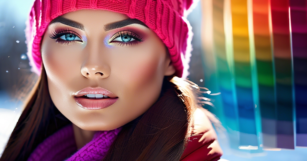
- Align makeup and hair with the palette using cool, vivid options such as berry lips, icy blush, sapphire shadow and cool dark hair. Stay away from warm bronzers and golden highlights to ensure the look remains cohesive.
- Accessorize with light-reflecting finishes like silver jewelry or crystal accents. Allow geometric or abstract prints in crisp, high-contrast colors to echo the bright winter palette.
- Take the palette beyond outfits to home, branding and digital for a cohesive, invigorating vibe. Begin with low doses if brave color seems scary then develop your courage one vivid piece at a time.
Stop wasting money on greige. Every year, people spend hundreds of dollars on muted, trend-driven pieces that wash them out — and the bright winter color palette is the antidote. The bright winter season is defined by high contrast, cool undertones, and unapologetic vibrancy: these are bright winter colors that hold their intensity under any lighting, from fluorescent offices to golden-hour sunsets. Also known as Clear Winter, this season sits at the crossroads of Winter's cool depth and Spring's electric clarity — making the bright winter color analysis one of the most striking and precise in the entire seasonal system. In 2026, as trend cycles push warm earth tones like terracotta and khaki, knowing your bright winter palette is more valuable than ever: a professional digital color analysis ($150–$300) can save you upward of $500 a year in wardrobe mistakes. Free AI apps are a starting point, but they routinely miss the nuance of bright winter neutrals and the cool-versus-warm edge cases that define this season. Your colors are not muted. They are not warm. They are not beige. They are vivid, cool, and built to make you look undeniably alive.
Consider bright whites, frosty blues, fuchsia and smoky black with clean, cool complexions. Strong color combinations like cobalt and magenta are a good match but muted or warm feeling colors can tone it down.
In everyday attire, crisp edges and shiny finishes complement this range. Coming up next — key swatches, outfit tips & makeup cues.
📚 Recent Articles
What defines a bright winter?
Bright winter resides in the cool half of the color wheel and features crisp, high-contrast coloring and a clear, vibrant appearance. This bright winter colour palette assists in seasonal color analysis, matching clothes, makeup, and accessories to natural coloring for a bright winter wardrobe that enhances your features.
1. The core contrast
Bright winter requires strong contrast between hair, skin, and eyes. Think dark hair beside light or cool-fair skin, or crystal-clear eyes against deep lashes. The face comes across as sharp instead of soft.
Mirror that with outfits that cut clean lines: white with black, bright navy with white, charcoal with icy turquoise. Think of anchors such as charcoal grey, ebony or bright navy, then splash a high-chroma accent.
The modern obsession with greige walls, warm oak desks, and "cozy" beige-on-beige layering is, frankly, a Bright Winter's worst enemy. These blended, low-contrast environments actively drain the face of its natural clarity — blurring features, flattening skin tone, and erasing the very contrast that makes a bright winter type so striking. Soft heather mixes and tonal neutrals dissolve everything into one muddy value. The antidote? Lean hard into the bright winter color palette — stark black, crisp white, and cool silver as your bright winter neutrals — and let vivid electric blue or fuchsia accents cut through the ambient warmth. In a greige office, a single high-contrast outfit built on the bright winter color palette does more for your presence than any lighting upgrade ever could.
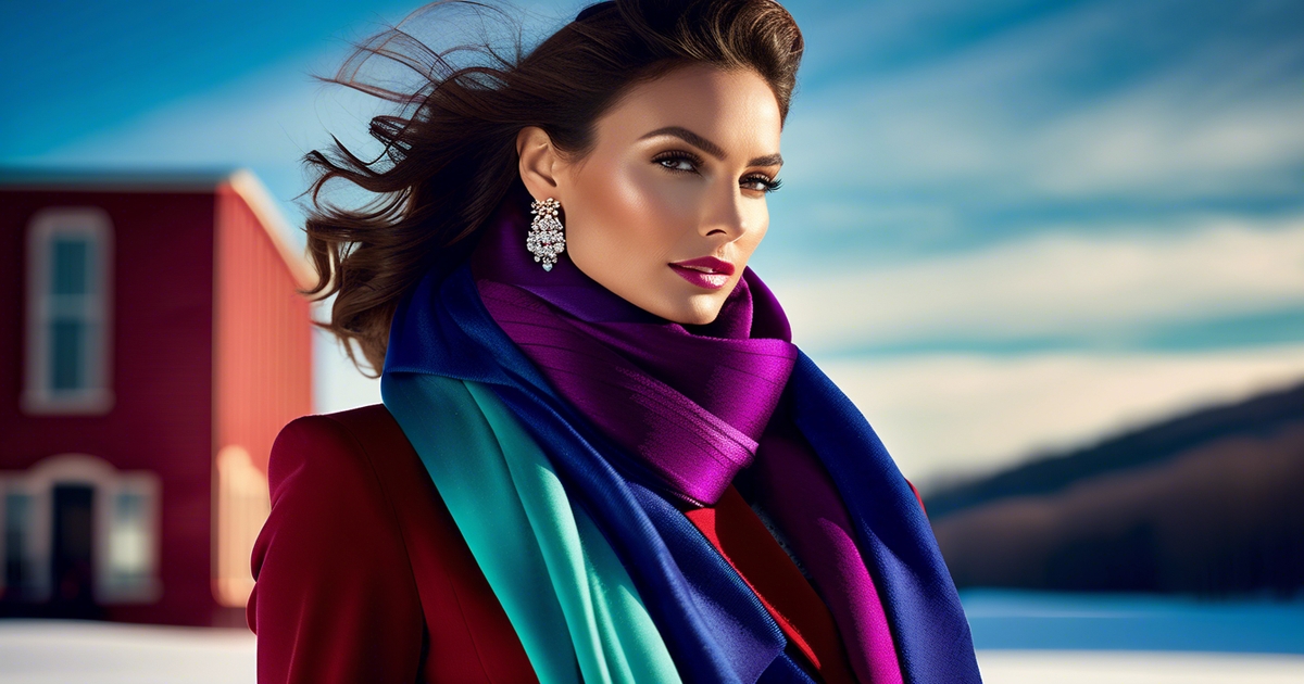
Examples that pop: a white shirt, black blazer, and cobalt scarf; a bright navy coat with hot pink knit; a silver-grey dress with icy emerald earrings. Statement silver jewelry amplifies the pop against beautiful contrasts of deep ruby reds, deep purples, midnight blue or emerald green.
2. The color temperature
Undertone is cool to neutral-cool. Skin might appear neutral initially, but it leans towards blue instead of yellow.
Choose colors with cool bases: true white, cobalt blue, fuchsia, icy turquoise, emerald, and clear berry. These provide a crisp, clean edge, like sun on frost.
Stay warm, yellow-based shades off the roster—mustard, tomato red, camel and peach battle the inherent coolness. If you want something soft, go for silver grey or cool taupe, instead of beige.
Small test: place pure white beside the face, then cream. If white brightens and cream dulls you're probably cool territory.
3. The chroma level
Brightness reigns here. Vibrant, saturated colors trump muted or dusty shades any day.
Bright winter selections—cobalt, hot pink, icy turquoise—lift the face in pictures, dimness. Bright winter is the lightest of winter, though not as light as bright spring.
Ditch soft autumn browns and powdery pastels that appear washed out on bright winter skin. High chroma makes your eyes lift and your jawline sharp, low chroma adds shadows and grey.
Neutrals that work on repeat: charcoal grey, ebony, silver grey, cool taupe, dark espresso brown, bright navy, and white. Grey, black, white and navy are secure everyday wagers.
4. The sister season
Compared with true winter, bright winter is cleaner and frequently a bit lighter, like a crisp, frosty morning instead of deep night.
Against bright spring it has the same high brightness but it is cool whereas bright spring is warm and more yellow based.
Undertone and chroma split them: bright winter is cool, high-chroma; bright spring is warm, high-chroma; true winter is cool, deep, and very stark. A fast visual guide or chart can assist putting difficult colors next to each other.
Transitioning can seem difficult if your wardrobe skews warm or muted. Begin with white over cream, silver over gold, one clear accent scarf to try out the transition.
The essential bright winter colors
Bright Winter pulls cool, clear, and vivid colors—pure brights reflecting a crisp sky post-snow. Embrace a bright winter colour palette with high contrast and crisp edges while avoiding dusty, warm, or earthy tones.
- Electric blue, cobalt, and sapphire
- Emerald green and cool teal
- Fuchsia, raspberry (iced), and ruby red
- Lemon yellow and icy lilac
- Chrome, Newbridge silver, and metallic cool grays
- True white, inky navy, and solid black
Your power palette
Think in laser-bright hits: electric blue, fuchsia, emerald green, ruby red, cobalt, and lemon yellow. These colors are clear and brilliant, like a bright winter day, and flourish alongside sparkling white or jet black.
Lights in this palette are icy and candied—think Sugar Plum Fairy—so iced lilac and iced raspberry that transition from office to evening without tension. Greys are metallic, not chalky; they read clean but less steely than other Winter palettes, keeping you lively instead of severe.
Utilize power hues as accents. Experiment with an emerald coat, a cobalt knit or fuchsia silk shirt beneath a black blazer. One great piece makes a statement and elevates basics you already have.
Steer clear of powdery or matte finishes — on Bright Winter skin they fall flat and drain the life out of every look. Your bright winter colors deserve fabrics that fight back. Here's a quick Fabric Cheat Sheet to keep your palette razor-sharp:
- Satin & silk-satin — the gold standard. The sheen mirrors the luminosity of the bright winter color palette, keeping Electric Blue electric and Vivid Magenta vivid.
- Mercerized cotton — a smart everyday pick. The mercerization process locks in chroma, so high-saturation hues stay true wash after wash.
- Recycled polyester & synthetic blends — underrated heroes. They hold dye intensity better than most natural fibers and drape cleanly against high-contrast styling.
- Glossy leather & polished metal hardware — instant contrast amplifiers that echo the cool, reflective quality of the bright winter palette.
- Natural linen — proceed with caution. Let's be blunt: linen is a risky purchase for Bright Winter dressing. Its open weave and matte texture actively mute high-chroma colors, turning a punchy Electric Blue into something closer to a washed-out denim. If you love the texture, seek out linen-synthetic blends that compensate with a tighter weave and added sheen.
The rule is simple: if a fabric dulls the color in the store under warm lighting, it will do the same thing in daylight. Prioritize surfaces that reflect light rather than absorb it, and your bright winter colors will always read with the clarity and intensity they're meant to have.
Create an easy chart for grabs. Combine brights (cobalt, emerald, fuchsia, ruby, lemon) and lights (iced lilac, iced raspberry), then splash on the metals (chrome, Newbridge silver).
Pin it in your closet or save it on your phone! Bless you, dear reader, for helping me see it side by side and keeping me cohesive and confident.
Your neutral ground
Black, optic white, cool gray and navy do the heavy lift. They outline color, provide form and bring immediate contrast. Warm beiges, camel, tan or cream confuse that clear tone and mute the skin's cool undertone.
Accessorize with brights. Navy suit, chrome belt. White shirt. Graphite skirt. Polish off with Newbridge silver jewelry, clean and reflective without yellow cast.
Keep your contrast high. Wear black pants with an icy lilac blouse, or a white sweater with a cobalt scarf. The bright accent remains bright precisely because the neutral ground is cool and crisp.
Your accent shades
Top accents for fast styling: cobalt, emerald, fuchsia, ruby, lemon, iced lilac, iced raspberry, chrome, Newbridge silver.
Accent it with bags, belts, scarves, eyewear, watches or a cool raspberry lip. Satin headband > matte one. Metallic sneakers in chrome or cool silver keep the look fresh.
Flip by month to renew! Winter: ruby and chrome. Early spring: lemon and iced lilac. High summer light: cobalt with white. Autumn chill: emerald with navy and silver.
Styling your bright winter look
Bright Winter sits at the sharpest end of the winter family, characterized by high contrast and bright winter colours. Opt for crisp lines and a bright winter colour palette to complement your cool undertone and natural brightness.
Wardrobe foundations
- Checklist: sharp coat in bright navy or charcoal grey; tailored blazer in black or bright navy; slim wool trousers in cool taupe or dark espresso brown; pencil or A-line skirt in black; crisp white and silver grey shirts; bright-navy and charcoal knitwear; day dress in black or midnight blue; evening wear in rich ruby or emerald; outer layer white scarf; tights in black; shoes in black or cool deep brown; bag in bright navy or black; belt in silver or black.
Choose timeless shapes—single-breasted blazers, streamlined trenches, shift dresses, straight-leg pants. These shapes allow the palette to do the work and keep outfits timeless across seasons.
Leave earth tones and soft pastels for supporting characters. They dull the contrast that makes Bright Winters glow. Organize your closet by color, white to black, then bright pops. It accelerates decisions and safeguards palette purity when you get dressed in the dim morning glow.
Makeup philosophy
Cool, vivid shades sync best: berry or cherry lips, icy pink or cool rose blush, sapphire or charcoal liners, and crisp black mascara. Match weight to outfit: stronger lip for stark black-and-white, softer but still clear tones for bright navy days.
Steer clear of warm bronzers, orange-based corals, and muted nudes — they turn ashy and flat against a bright winter complexion. And yes, champagne gold is a trap: that warm shimmer dulls the natural clarity that defines the bright winter color palette, so swap it for pearl or metallic silver every time. A cool-toned contour or sheer taupe sculpts without muddying, while silver and icy-pink highlighters deliver the clean, high-contrast gleam this season demands. When building your bright winter eyeshadow palette, reach for vivid magentas, electric blues, and crisp whites — the same saturated hues that anchor the bright winter colors in your wardrobe. One modern challenge worth knowing: digital screens and warm studio lighting can wash out bright winter skin tones on video calls. Counter this by using Zoom's built-in cool filter or a Snap Camera cool-tone overlay, and set a stark white background to let that signature high-contrast pop come through exactly as it does in real life.
Maintain chroma consistent with the palette's brightness. If you're wearing black and white with green earrings, go with a berry bold lip, not beige.
Hair color harmony
Choose cool or neutral bases: true black, dark brown, or cool ash brown. These hues mirror classic closet colors—charcoal, black, ivory, navy—and outline the face with sharp contrast.
Avoid golden blondes, warm reds and caramel highlights. They suck heat that combats the cold heart of Bright Winter. For lift, incorporate hint of silver or platinum, particularly around the face, to reflect silver jewelry and cool hardware.
Keep hair in sync with your palette for a cohesive, groomed look.
Accessorizing with impact
Shiny silver jewelry, chrome hardware, and crystal details make it even brighter, perfect for showcasing your bright winter wardrobe. A mirror-finish cuff paired with a white shirt presents a clean and crisp look. It's best to avoid gold, bronze, and earthy leather tones that compete with the cool base of your bright winter colour palette. Gunmetal can work if it reads clean and bright.
Use accessories to add a single accent: an emerald bag with a charcoal coat, a deep purple scarf over bright navy, or ruby earrings with a white knit. One pop of color trumps three muted pieces, allowing your bright winter fashion to stand out.
Curate high-impact staples: silver hoops, crystal studs, sleek black belt, bright navy bag, emerald scarf, midnight blue heels. Construct the majority of your outfits out of Bright Winter neutrals—charcoal grey, ebony, silver grey, cool taupe, dark espresso brown, bright navy and white—and then incorporate one bright accent.
Deep ruby reds, deep purples, midnight blue or emerald green all go beautifully with statement silver, providing contrast without noise. Bright Winter is the brightest winter, dark winter leans deeper, true winter leans cooler.
If you're minimal, stick to simple shapes and allow a single bold color to do the talking, rather than washing it out with muteds or warms. They lie across from your icy, vivid palette and muddy your inherent crispness.
Beyond fashion: a lifestyle
Bright winter isn't just about garments; it extends to designing spaces, signals, and habits with crisp clarity and sharp contrast. The aim is simple: keep bright winter colours crisp across home, brand, and screens, ensuring that identity reads clean and strong while the eye rests and the mind stays alert.
Home interior
Employ crisp white walls with cool grays and then add bold pops—electric blue cushions, fuchsia art, emerald glass or a scarlet throw. Maintain clean lines. A single colorful rug can ground a room without words.
Plants with glossy dark leaves suit the cool mood more than warm-toned foliage. Forget warm woods, beige paint, cream textiles and dusty pastels. They mute the look and dull the energy. If you're a wood lover, go for cooler stains or blackened oak.
Add shine to push light: chrome lamp bases, polished steel legs, mirrored side tables, or a high-gloss lacquer tray. Sheer white curtains amplify the daylight, and matte black frames inject edge and contrast. Small embellishments–glass vases, crystal bowls–enhance transparency.
Construct a mood board before purchasing. Pin snowy backdrops with neon signage, Nordic white kitchens with cobalt stools or galleries with charcoal floors and bright art. Throw in fabric swatches, paint chip set and metal samples, then test them in daylight and at night.
Brand identity
Being clear makes folks decode you quickly. A bright winter brand relies on contrast, cool temperature and clean fonts. Think white or slate base, a robust black, and two or three brights employed with purpose.
Sans-serif type with generous spacing reads fresh and modern. Stay away from earthy or muted colors—they sap strength and smear identity.
| Element | Color | HEX | Usage |
|---|---|---|---|
| Primary | Icy White | #FFFFFF | Backgrounds, negative space |
| Secondary | Deep Charcoal | #222831 | Text, logos |
| Accent 1 | Electric Blue | #0077FF | CTAs, links |
| Accent 2 | Fuchsia | #E00070 | Highlights, tags |
| Neutral | Cool Gray | #CBD3D9 | Dividers, cards |
Establish guidelines for proportion (70% white, 20% charcoal, 10% highlights), least contrast for legibility, and logo clear space in x-heights.
Digital presence
Begin with fresh, crisp backgrounds and striking accents that direct the eye. Keep navigation streamlined. Put CTAs in electric blue or fuchsia, and combine with transparent signals.
Employ smart, crisp-shot photography with cool lighting. Stay away from sepia or muted filters. Black or white vector icons keep screens neat.
Trim chaos. Limit typefaces to 2. Employ plenty of white space. Stick to a short palette so posts look like a family.
Create reusable templates: story frames with white ground and cobalt borders, slide decks with charcoal type and bright tabs, and thumbnail covers with a consistent accent stripe. Color echo over time builds trust and recall.
Common styling challenges
Bright Winter lives for cool, high-contrast, clear colors that define the bright winter colour palette. The actual stress is choice overload, seasonal stock gaps, and the tug of war between trends and what works for you. The goal was to demonstrate how to rock the bright winter wardrobe with confidence in a way that calls to your style, your work, and your life.
Overcoming color fear
So start small. Try a vivid scarf in cyan, a fuchsia bead, or electric-blue socks with dark denim. One pop near the face can light up skin without feeling loud.
Base them on neutrals. Match charcoal, optic white, or inky navy with one hot accent—magenta knit, cobalt belt, or emerald bag. This maintains equilibrium for offices, trips, and elegant affairs.
It defeats the challenge of pairing skin tone, hair color and personal style when the choices seem infinite.
Practice within the palette! Experiment with triads such as cobalt + charcoal + white, or magenta + navy + silver. Exchange each one at a time to discover what compliments your undertone and hair depth.
Keep score with snap shots in the afternoon sun to test clarity and contrast. Don't say leave the comfort zone without boundaries. Establish a 'two-bright rule,' or try out a full-bright look on your off days initially.
If you're Deep Winter, sharpen the look with higher contrast (black + white + one jewel tone) to keep it elegant, not busy.
Navigating print and pattern
- Favor crisp contrast: white/black graphic checks, cobalt/white stripes, or magenta/charcoal abstracts.
- Avoid overwhelmed, mixed or dusty prints. They silence Bright Winter's purity.
- Choose geometric, pixel, or sharp florals over watercolor styles.
- Scale matters: mid to bold scale for coats and dresses; small to mid for shirts and ties.
- Keep your print color count to two or three for cohesion.
- Anchor prints with Bright Winter neutrals: black, white, ink navy, cool gray.
- Menswear hack: if spring/summer stock runs warm, look for cool stripe shirting and high-contrast micro-checks.
- Day-to-night: switch a soft-neutral shoe for chrome, patent, or a jewel-tone heel to lift the pattern.
Blending with trends
Pick trends in Bright Winter shades: choose a cobalt suit over olive, a fuchsia satin skirt instead of terracotta, or a neon-trim sneaker rather than beige. If a trend dwells in warm, earthy or muted palettes, pass – your clarity is the statement.
Go for a hot shape in your classic Bright Winter colors. A boxy blazer (ink navy), cargo skirt (cool black) or metallic silver bag keeps the look fresh and of the moment for your season.
This assists with seasonal transitions and varied environments—office, travel, night out—while pulling together a uniform appearance with footwear and accessories.
Protect your style sovereignty. Let palette lead, then trend, then change up the contrast depending on occasion and time of day.
The psychology of clarity
Clarity, of color and of mind, means simplicity, concentration, and mastery. Bright winter colours depend on crisp, cool, high-contrast colors—imagine sapphire, fuchsia, emerald, ice blue, and crisp white—that read fresh rather than soft. These hues slice through sensory clutter just as a clean room or a clear bullet point allows the mind to unwind and focus.
Sharp, vivid colors seem invigorating because they eliminate vagueness. The brain digests clean, high-contrast input more quickly than murky mixtures, just as it's easier to absorb and remember clear and concise information. Clutter research demonstrates that messy environments sap your attention and memory, whereas tidy ones bolster your concentration.
The same goes for our clothes. Your crisp cobalt coat or white shirt with a navy jacket comes across as organized. That order can relieve stress from decision fatigue and liberate brain space for the activity at hand, especially when you incorporate bright winter colour palettes into your winter wardrobe.
Mood tends to rise when visual cues synchronize with intent. Bright winter colors are like daylight on a gray morning—crisp and alert. Proponents say people feel less anxious and have a steadier mood in white spaces. Color can reflect that calm by erasing the 'noise' of bland shades.
Picture a clean desk, a pared-back to-do list, and an ice-blue knit: the mind settles because the scene is clear. There is a related phenomenon in winter itself, when stark landscapes—snow, bare trees, pale sky—can bring a similar clarity of mind, assisting some to see what's important and choose with greater confidence.
There's an interesting subconscious way that confidence and rapport show up in how colors frame the face. High-clarity colors light up eyes and skin which reads as alert and credible. In professional spaces, crisp lines and bold colors indicate professionalism because they communicate intention and minimize visual noise.
A crisp white shirt with a ruby tie, or a black dress with a vivid teal scarf, indicates you appreciate clarity in decisions, like a well-written brief or a precise plan. That same clarity will make you feel more open and warm – a bright smile nearby cherry red feels welcoming, not formal.
Consider bright winter as a canvas for your personality. Begin with a single statement–emerald tops, icy white sneakers, cobalt bag–then create contrast with black or navy. Avoid shapes and allow color to do the work.
If you desire more effortlessness, go with color near the face and neutral underneath. Use a small test: stand by daylight, hold a bright piece up, and note if your features look sharper and your gaze more steady. When your ambitions are explicit, outfits that reflect that precision can amplify motivation and keep you focused.
Conclusion
Bright Winter reads clear and sharp. Sharp edges. High contrast. Daring shades that don't flinch in icy illumination. A cobalt scarf on a dreary day. A bright white t-shirt underneath a black coat. A cherry lip that brightens the face. Little changes pack major victories.
To construct simplicity, begin with a constrained color palette. Black & white and cobalt and fuchsia and icy gray. Throw in a star piece per look. So shape be clean. Let the shine be clean, not noisy. For mood, antilight air. Declutter Bright choices. Empty head.
Encountered this piece in person. A friend of mine switched to bright blue and white at work. She had more "you look fresh" in one week than all last year.
Up for a taste? Post an outfit plan or color swap today.
Frequently Asked Questions
What defines a Bright Winter in color analysis?
Bright Winter mixes cool undertones with high contrast and clear, vivid colors from the bright winter color palette. It falls in between Winter and Spring, featuring crisp whites, inky blacks, and jewel tones with a cool base, emphasizing clarity and bright winter fashion.
Which colors are essential for a Bright Winter palette?
Select cool, high-saturation colors from the bright winter colour palette. Best picks include true black, pure white, icy pastels, cobalt, fuchsia, emerald, and cool red. Avoid muted, dusty, or warm tones, as silver metals complement bright winter wardrobes better than gold.
How do I style a Bright Winter look for everyday wear?
Anchor your ensembles with high-contrast basics and a bright winter wardrobe. Add a pop of bright colour, like cobalt or fuchsia, while maintaining clean, sharp lines for a vibrant winter palette.
Can Bright Winter wear black and white together?
Yes. Black and white is perfect for the bright winter wardrobe. It increases contrast and enhances the bright winter colours, while adding a bright punch of color, like a teal scarf or ruby lip, to make the look come alive.
What are common styling mistakes for Bright Winter?
Common missteps include wearing warm or muted colors, low contrast outfits, and matte-heavy finishes, which can dull the complexion. Instead, embrace bright winter colours, crisp whites, and reflective accents for a vibrant winter wardrobe.
How does "clarity" affect Bright Winter psychology?
Bright, saturated colors from the bright winter color palette communicate confidence and vibrancy. They hone presence and communication, making bright winter fashion a sharp and confident choice.
How can I adapt Bright Winter to a business setting?
Opt for structured cuts in black, charcoal, or navy to enhance your bright winter wardrobe. Add a precise pop with a cobalt blouse, emerald tie, or cool red lip, complemented by silver or gunmetal accessories.