Cool winter color palette: A detailed exploration

Key Takeaways
- What to look for in the Cool Winter color palette: cool undertones, high value contrast, and the strong chromatic intensity that give it its signature vivid, dynamic look.
- Choosing colors with blue-based undertones and balancing value contrast optimizes both your personal style and the harmonious impact of an outfit or decorating scheme.
- Featuring key Cool Winter colors — from icy tints and true primaries to deep neutrals, vivid accents and metallic sheens — these color palettes work for fashion and interiors and for a variety of occasions.
- With a little color psychology and the right high-chrome shades, you can inspire better mood, energize your eye and cultivate spaces or an aesthetic that feels simultaneously rejuvenating and impassioned.
- Good styling with the Cool Winter palette takes into account fabric choices, pattern usage and layering for added depth.
- Even fair-haired folks can pull off cool winter colours by playing with combinations, accessories and styling to create a balanced, non-harsh look.
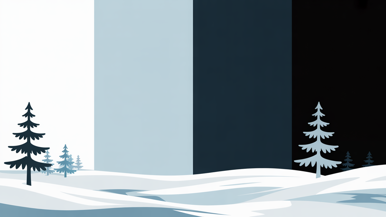
A cool winter color palette employs colors such as icy blue, deep green, soft gray, and crisp white, which are commonly found in winter clothing and aesthetics. These hues assist in making interiors serene and invigorating, while ensembles featuring these colors provide a crisp, neat appearance.
💫 Discover Your Complete Color Palette
Ready to discover all the colors that make you look radiant? Our comprehensive color analysis will reveal your complete personal palette - perfect for hair, makeup, and wardrobe decisions.
Find My Season →Most choose this palette because of its sheer elegance and how well it complements both contemporary and traditional environments.
Next, how to use these colors well.
📚 Recent Articles
What Defines Cool Winter?
These colors are crisp, clear and bold — concentrating on dramatic pairings that suit people with remarkable, high-contrast coloring. The impact is crisp and earthy, reminiscent of a jewel-toned, shadowed snow landscape.
The Undertone
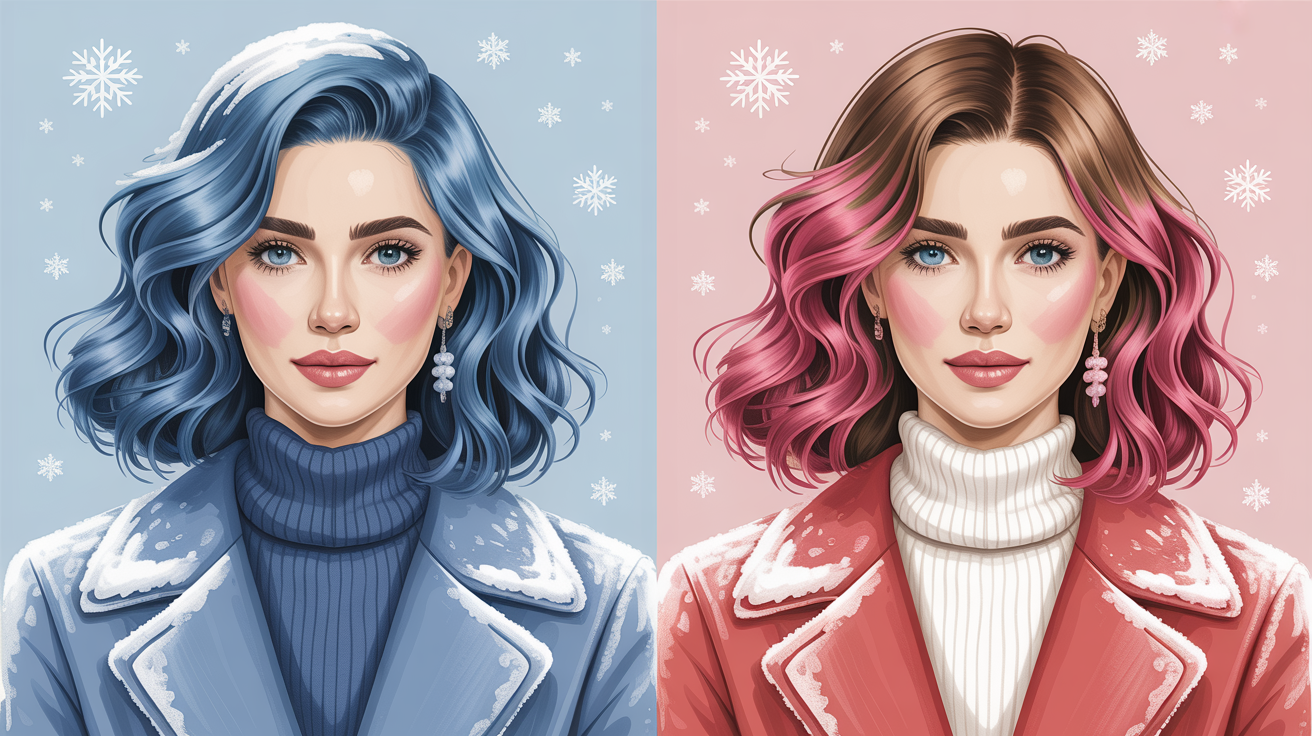
Cool Winter's undertones are blue or pink, never golden or warm. These undertones are what distinguishes Cool Winter from other palettes whose colors tend to seem muted or earthy, rather than the icy, intense quality of Cool Winter's.
Blue undertones lend the skin a crisp, clean finish, best complemented with pure whites, navy blues or jewel tones such as amethyst. By choosing clothing and makeup to match these cool undertones, you avoid dullness and add harmony to the complexion.
Undertones are super important when it comes to discovering hues that give you an inborn flair of sophistication, which is why they're a crucial element in both your closet and cosmetic selections.
The Value
Dark shades add depth and drama to the Cool Winter palette. Value contrast—jet black with pure white, for example—intensifies facial features. This contrast is typical of Cool Winters, who can have jet black or blue-black hair with very fair skin or dark brown hair with icy blue eyes.
How light strikes these hues also plays a role – rich, saturated shades look crisp, even in dimmer light, and maintain their punch in glaring daylight. There's something about mixing light & dark values in one outfit that adds balance and keeps it all bold but not over-bearing.
Below is a table showing classic Cool Winter dark shades and how they work:
| Color Name | Shade Depth | Value Contrast | Example Use |
|---|---|---|---|
| Jet Black | Deep | High | Coat, trousers |
| Navy Blue | Deep | High | Suits, knits |
| Charcoal Gray | Deep | Medium-High | Blazers, scarves |
| Emerald Green | Deep | High | Dresses, accessories |
| Aubergine | Deep | Medium | Outerwear, makeup |
The Chroma
Chroma refers to the purity or intensity of a color. Cool Winter colors are saturated, never faded or muted. Rich blues, electric magentas and vivid emeralds are staples, as they retain their brilliance and never become warm or muddy.
High-chroma colors allow Cool Winter types to make a splash in casual and dress clothing. Sporting a vibrant sapphire dress or fresh white shirt/black pant is timeless and makes a statement.
Chroma doesn't just make others see you differently, it makes you feel different in your outfit—strong, confident, polished.
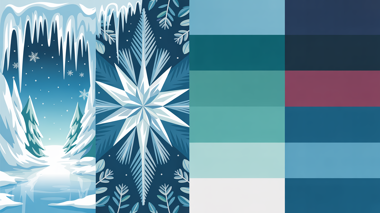
The Essential Cool Winter Color Palette
The essential cool winter color palette is bold, clear and inspirational – taking its cues from the crispness and bold contrasts of a bright winter sky. This palette is known for its cool, rich colors that tend to span in the mid to deep range, rarely ever going either too dark or too muted. Consistency in your colors builds a signature look that is both complementary and unique.
These staple hues provide a great base for innovative mix-and-match, keeping the palette useful season-round.
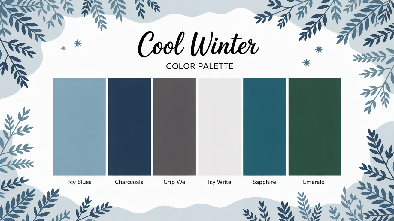
Key Cool Winter Colors:
- Icy white
- Black
- Charcoal gray
- Navy blue
- Sapphire blue
- Emerald green
- Cardinal red
- Deep burgundy
- Forest green
- Bright purple
- Silver and platinum
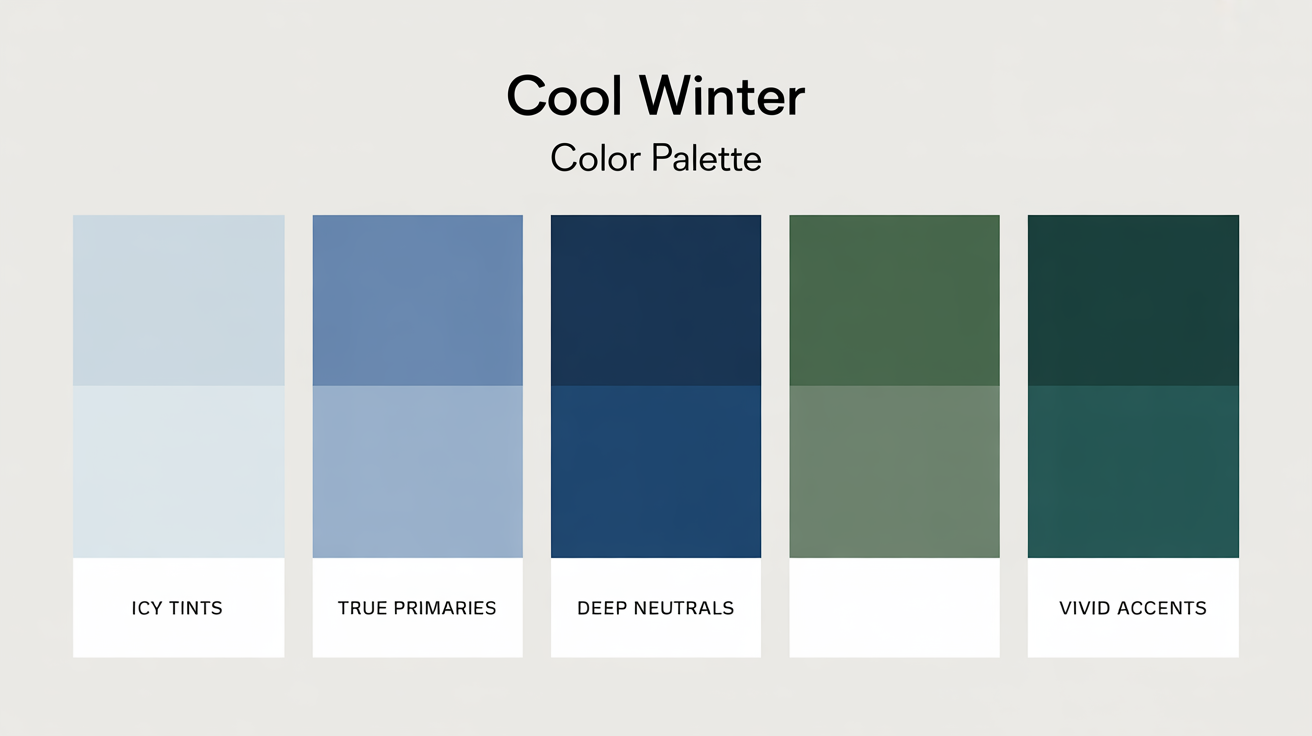
1. Icy Tints
Icy shades—such as icy pink, icy blue, and frosted lavender—that provide a clean, new feel. These light colors act as mirrors, by bouncing light, which makes your face glow and brings out your eyes. Icy tints play up perfectly on scarves, shirts or even sneakers, tipping a cap to winter's crisp clarity.
When layered, they bring dimension to ensembles without stifling your style. No muted, grayish pastels — go for crisp, clear tones.
2. True Primaries
Sapphire blue and emerald green are great examples of statement-making true primaries. They're bold, bright, and indisputably cool in undertone. When combined with classic cuts and understated jewelry, these tones do all the talking – whether you're in the office or at brunch!
You can blend any primaries blue/green with black pants or a charcoal skirt for a crisp impact. These colors are seasonless and versatile, both formal and casual.
3. Deep Neutrals
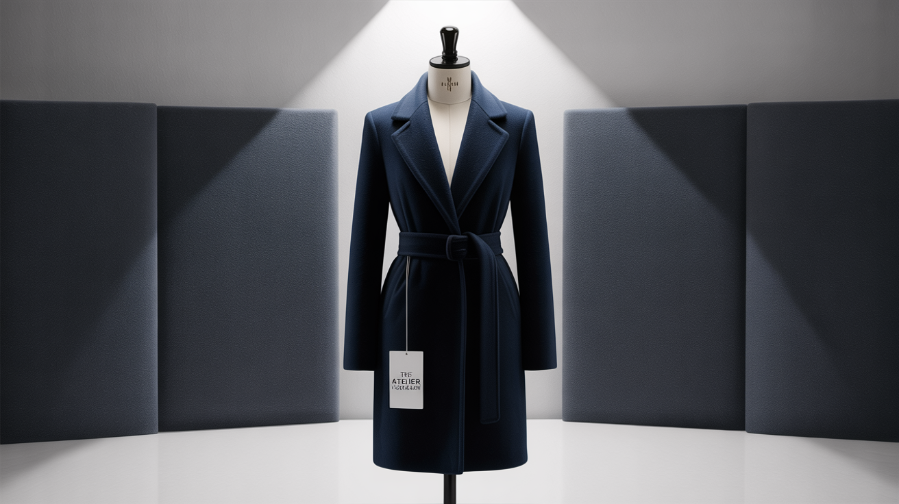
Neutrals like black, navy and charcoal grey form the foundation of the cool winter wardrobe. These tones provide the framework, and can be a wear-it-all-over look or foundation for pops of color. Popping in a cardinal or rich blue breaks it up and adds interest.
Deep burgundy and forest green add a touch of warmth, without contradicting the palette's cool vibe.
4. Vivid Accents
Bright reds, rich purples and cobalt blue are all beautiful accent colors. Try a cardinal red scarf or purple beanie to attract attention. Accessories in these colors can accentuate your finest features, like lips or eyes.
Even a subtle splash—say a belt or shoes—can take an outfit from bland to wow. These eye-popping hues are best in small doses over neutrals or frostier tones.
5. Metallic Sheen
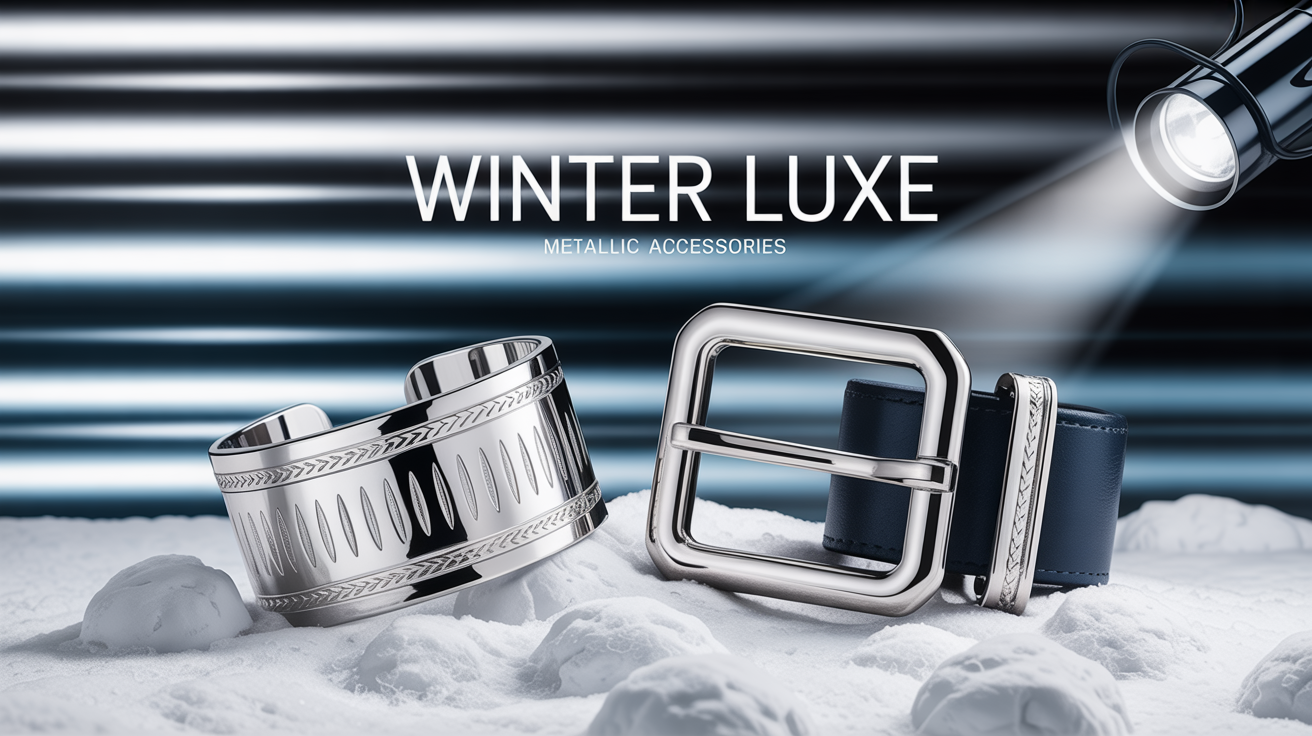
Metallics such as silver, platinum, etc. Go best with cool winter colors. A silver necklace or platinum clutch add intrigue and a little glimmer. These metals amp up the chill factor, linking palette and dark hues.
Metallic shoes or belts can refresh a traditional outfit, giving them a more modern and chic vibe.
Beyond the Swatches
A cool winter color palette incorporates icy blues, crisp whites, deep charcoals, and jewel tones such as sapphire, emerald, and amethyst. These aren't just colors — they're meaningful, transformative, emotional, they transform our perception of spaces and ourselves. Understanding how these colors interact and what they communicate can transform how you shop for clothes, decorate a room, or even apply makeup.
Color Psychology
- Icy blue cools and calms, frequently associated with reason and concentration.
- Pure white is for clarity, openness, and a fresh start.
- Deep charcoal adds depth, stability and a feeling of modernity.
- Jewel tones like sapphire and amethyst provide richness, confidence and creativity.
- Silver and platinum jewelry play well with these hues, contributing sparkle without overshadowing the ensemble.
- Even when you combine colors from the cool winter palette with some texture, like patent leather or metallics, it still reads personal style and confidence.
- Sticking to makeup that adheres to the cool winter palette helps maintain balance with your skin tone.
- Experimenting with fresh color combinations like navy and stark white or emerald and charcoal allows you to flirt with atmosphere and personal expression.
Visual Energy
Bright, bold hues in the cool winter palette—say, cobalt blue or rich magenta—infuse any room or ensemble with a beat. For me, these hues are the ones that make a room feel alive, or allow a simple outfit to pop with clean lines and contrast. It's the interaction between colors — like sapphire and icy gray — that helps give you that tailored, contemporary vibe.
Colors can flip from soothing to vibrant based on context and application. A deep amethyst wall calms a bedroom, while a magenta scarf invigorates a business ensemble. I think layering colors, like mixing jewel tones with silver or patent leather accessories, adds depth without sacrificing the palette's fresh feel.
Contrast is key. A cobalt blue jacket over a white shirt attracts attention without being too busy. These color selections influence the perspective others have of your space or fashion, so combine strategically.
The Black & White Exception
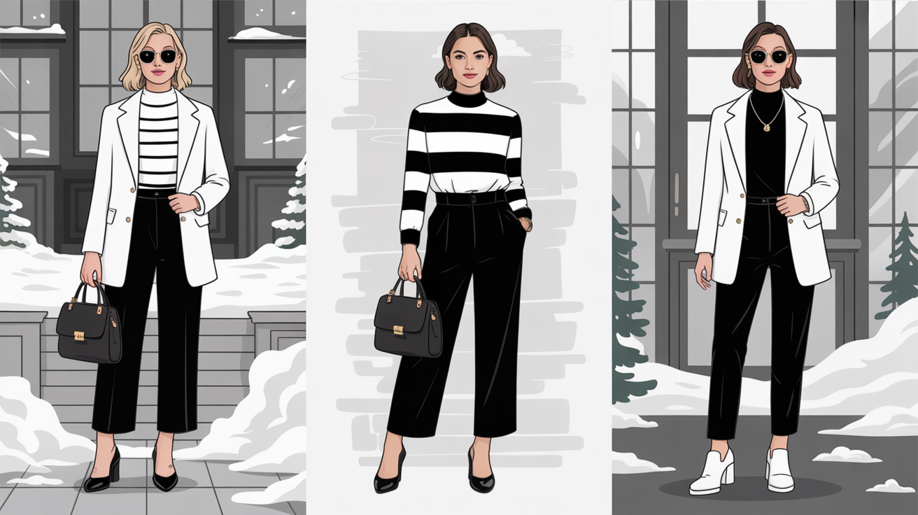
Black and white are classics in the cool winter palette. Their fresh lines and contrast are forever in style. A black suit or white coat is a powerful foundation to any wardrobe. When worn in combination, they make other hues pop — allowing a sapphire necklace or emerald bag to sparkle.
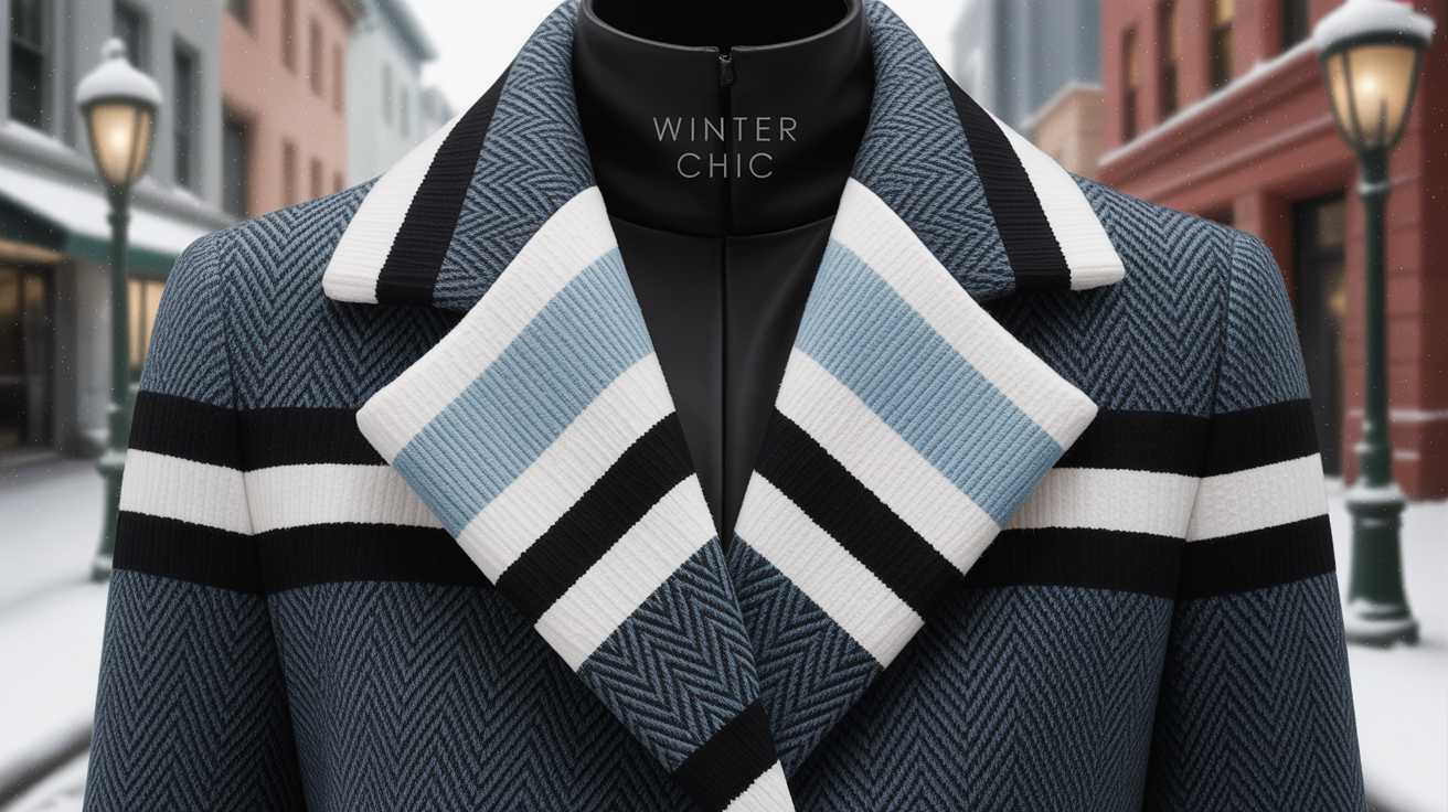
Patterns in black and white—such as stripes or checks—add interest without being too overwhelming. These patterns play well in both fashion and home decor, tipping their hat to traditional style. Silver or platinum jewelry fits right in, matching the cool crispness of the palette.
For my vintage-vogue loving readers, black and white always do the trick.
Styling Your Palette
A cool winter color palette focuses on cool, clear and bold tones that complement a variety of skin, hair and eye colors. This palette sidesteps warm colors such as orange, beige and brown, since these tend to look off against the cool undertones characteristic of winter types.
Styling your palette is more than simply selecting the good colors — it's harnessing them to express your personal style and foster a polished, purposeful appearance for any event. Versatility is key, and playing with combinations hones your intuition for what feels authentic to you while being conscious to keep under 10% of your outfit out of the cool winter palette.
High Contrast
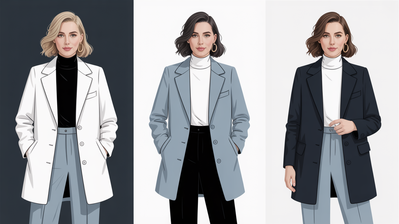
High contrast defines cool winters styling. Teaming deep navy or jet black with crisp white or icy pastels is a sure bet for a sharp, sophisticated look that really pops. This works particularly well for high contrast types – think dark hair with blue eyes or platinum blond hair with dark eyes.
We can do this to bring attention to certain features, like a white scarf with a dark coat to bring focus to your face. Layering provides an additional dimension. Think charcoal blazer over a white shirt with a hint of cobalt blue or true red.
This not only creates visual interest but provides for changeable surroundings. Don't allow too many similar mid-tones to blend together, flattening the look and sapping the signature cool winter clarity.
Fabric Choice
Fabric choice animates the cool winter palette. Opt for crisp fabrics such as wool, cotton and fine synthetics to maintain colors' sharp, vibrant appearance. Matte and glossy textures both do the trick, but fuzzy or muted fabrics will muffle a bright color.
Textures are significant. A black structured wool coat combined with a silky scarf in emerald or royal blue gives off a sleek, modern vibe. Lightweight knits or blends layer well in cooler months while maintaining the sharp look.
The vibe of your look shifts with fabric as well. Glossy satins or sleek leathers offer a polished stroke, while matte ones read day-to-day. Choose what fits the event but never lose sight of the palette.
Pattern Power
Patterns provide intrigue while remaining true to the cool winter palette. Geometric and abstract prints–such as black and white stripes, or blue and silver checks–add a touch of contemporary style. Throws with bold, cool-toned patterns – magenta on navy- assist in evening out solid color blocks.
Pairing patterns with solids is a great way to keep looks fresh. For instance, a patterned shirt with a solid blazer in a matching cool tone keeps the look together.
Prints can distract or focus attention to specific areas, such as wearing a printed skirt with a plain top to emphasize your lower half. Patterns allow you to express originality and remain in your palette.
Just be sure to keep the overall color balance in check and steer clear of warm neutrals like cream or beige in your prints.
Decorating with Cool Winter
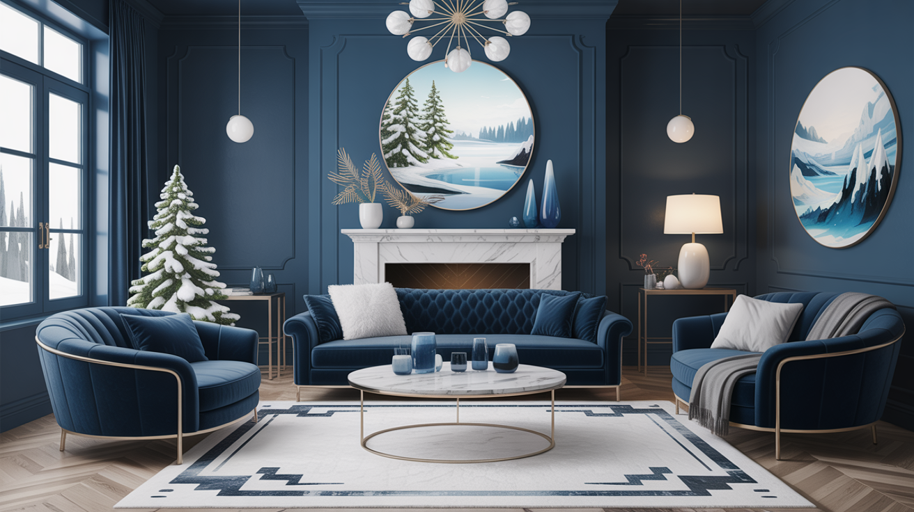
The cool winter color palette emphasizes crisp, icy tones and distinct contrasts. Its electric blues, rich jewel tones and icy whites mirror winter's sparkling crispness. In decorating, this palette lends a space a fresh, crisp vibe while incorporating a little depth and drama.
Equally important is balancing these bold colors and clean lines with the right materials and accents, so rooms are inviting – not cold.
Room by Room
- Entryway: Navy blue walls with silver frames and bright white trim.
- Living Room: Amethyst sofa, emerald green cushions, charcoal rug, and glossy white coffee table.
- Kitchen: Pure white cabinets, icy blue backsplash, and chrome fixtures.
- Bedroom: Soft steel blue bedding, pale lilac curtains, deep blue throw.
- Bathroom: Crisp white tiles, clear glass accents, and sapphire towels.
Bedrooms go best with the more muted shades from the palette—steel, pale lilac, soft blue. These shades assist in constructing a tranquil zone for unwinding.
In living rooms, these bold shades — emerald, navy, amethyst — invigorate the space and ignite conversation. Mix and match colors in each room to represent your style, yet maintain a cohesiveness throughout your home.
Material Matters
Materials have a huge affect on Cool Winter colors. Pick sleek fabrics such as velvet, satin or smooth leather to complement the palette's sharpness. Matte finishes on walls or woodwork help ground the space, while glossy finishes or glass can make the colors pop.
Reflective surfaces — like polished chrome or metallic tiles — make jewel tones pop. Natural materials such as stone, marble or pale woods ground the coolness of the palette.
These bring in some warming and keep it from feeling too stark. They're the right materials to really accentuate that contrast and depth that make Cool Winter colors so amazing.
Art & Accents
Artwork in Cool Winter hues—imagine abstract prints in sapphire, amethyst or emerald—packs a punch. Accent pieces in icy or clear shades, such as glass vases or silver candle holders, complete the look.
Intermingle geometric shapes and clean lines in your art and accessories to reflect the palette's coolness. Mixing up the size and style of art pieces keeps displays interesting and one large jewel tone piece can ground the room and serve as a conversation starter!
| Cool Winter Shade | Home Decor Use | Example Pairings |
|---|---|---|
| Navy Blue | Large surfaces | Walls, rugs |
| Pure White | Trim, ceramics | Kitchen, bathroom, frames |
| Amethyst | Furniture, accents | Sofa, pillows, artwork |
| Emerald | Statement pieces | Cushions, vases, lamp bases |
| Silver/Platinum | Hardware, accessories | Lighting, handles, trays |
Common Misconceptions
A lot of us believe the Cool Winter palette is too rigid, or only works for a limited population. In fact, Cool Winter colors are great for a lot of skin tones, hair colors and style preferences. The palette is far more open and artistic than most people realize. These tips dispel some of the most frequent misconceptions.
Too Harsh
The notion that Cool Winter colors are invariably too bold or too sharp overlooks how subtle this palette can be. Although shades of true blue, fuchsia and emerald can appear aggressive, there are ways to dial them back for every day wear. By layering lighter shades, such as an icy gray or soft lavender, over the bolder tones, you even out the look.
This trick maintains the vibrancy of the outfit but makes it less harsh. Accessories provide yet another simple avenue for infusing Cool Winter colors. Experiment with a scarf, watch strap or shoes in a bold color, with everything else neutral. Mixing in white, silver or navy goes a long way towards making bold colors more accessible.
Personal comfort takes priority. If you're color-shy, go with a softer tint, or restrict it to a small area close to the face. Cool Winter styling is about figuring out what feels right and having fun with colors in a personality-appropriate way.
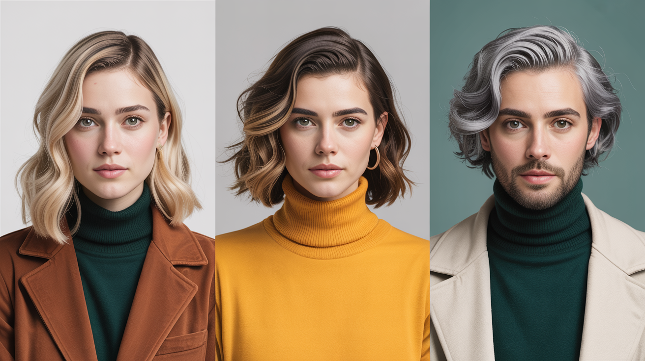
Only Dark Hair
There's a common misconception that Cool Winter colors are only appropriate for dark-haired individuals. The palette is superb for blondes, grays, reds or even pastel hues. For instance, platinum blonde and silver hair can complement sapphire blue or icy pink beautifully.
Brunettes may prefer cobalt or charcoal and redheads, pure white or teal for contrast. Personal characteristics—such as eye color and skin undertone—are more significant factors than hair color by itself. Mix and match some of the other Cool Winter shades with your natural coloring and see what fits.
There are endless permutations to discover, and color analysis isn't limited to gender or ethnicity. Cool Winter insights can be applied to casual or business attire for men and women, of any background. Fashion is about expressing yourself, not about guidelines or restrictions determined by your hair color. With the right picks, anyone can capitalize on the palette.
Limited Options
It's a myth that Cool Winter translates to nothing but black, navy, or gray. The palette features fluorescent magenta, glacial turquoise, truer-than-truer red, pine green, and even soft beige. Each provides a fresh approach to constructing looks that feel like your own.
All that, plus mixing unexpected colors—icy violet with emerald or clear red with silver—lets you create one-of-a-kind looks. Cool Winter colors are perfect for business, casual or party events – they simply work.
Creativity is crucial. Trading in your neutrals for a pop of color will transform your look– and your mood! The palette is fluid — it expands with your fashion, your maturity, and your desired image.
Conclusion
To discover the proper cool winter palette, begin with fresh tones such as icy blue, pristine white, midnight navy or frosty charcoal. These colors work beautifully on both fashion and interiors. Spruce up with pops of pure pink, transparent teal or striking emerald for statement style. Smooth textures and shiny accents come together for crisp, contemporary styles. Go for soft knits or glass decor to keep things minimal but elegant. Go with clean edges and brilliant light to make colors pop. No rule book. Combine, try and see what suits. For additional advice, consult trusted guides or color charts. Looking for a change? Experiment with a cool winter palette and observe how it transforms for you.
Frequently Asked Questions
What is a cool winter color palette?
A cool winter color palette is cool, clear and bold. Typical colors include frosty blues, rich purples and jet blacks. These colors work well with cool undertones to make a fresh, crisp look.
Who looks best in cool winter colors?
Cool undertones, usually with dark hair and bright eyes, wear cool winter colors best. This palette intensifies their natural contrast and makes them pop.
Can you use cool winter colors in home decor?
Ok, so cool winter colors are great for home decor. Employ icy blues, crisp whites, and bold blacks for a modern, refreshing vibe throughout any room.
How do I know if I am a cool winter?
If you have cool undertones, dark hair and bright eyes, you might be a cool winter. Pro color analysis will confirm your season.
Are pastel colors part of the cool winter palette?
Most pastels are too soft for cool winter. Icy versions of pastels, such as icy pink or icy blue, do work in the cool winter palette since they are clear but cool.
Can I mix warm tones with a cool winter palette?
Stay away from warm tones. Blending them together will make your appearance drab. Stick with cool, clear shades for optimal effect.
Is black a cool winter color?
YES, true black is a classic cool winter color. It really makes contrast pop and compliments the other cool winter shades.