Beige Skin Tone: Warm, Neutral, Cool, and Best Colors
 Reviewed by Alexandra Gilmore
Beige describes a complexion or foundation family, not an undertone by itself. Identify your depth first, then compare warm beige, neutral beige, and cool beige at the same depth on the jaw and neck so inconsistent brand names do not steer your makeup or clothing palette.

Key Takeaways
A beige skin tone is best treated as a descriptive complexion or foundation-shade label, not as a separate undertone. It usually points to a light-to-medium or medium shade family with a softened tan, cream, or light-brown appearance. The modifier does the useful work: warm beige leans golden, yellow, or peach; neutral beige balances warm and cool cues; cool beige leans rosy, pink-beige, or cool taupe.
Start with depth, then identify direction. Compare bare skin in indirect daylight and test equal-depth warm, neutral, and cool swatches from the same foundation formula along the jaw into the neck. Brand names are not interchangeable, so a shade called Natural Beige in one range may differ from Natural Beige in another.
For clothing, begin with colors that match your beige direction, then adjust for contrast. Warm beige often works easily with cream, camel, olive, teal, rust, and tomato red. Neutral beige can test balanced navy, mushroom, soft white, pine, berry, and muted teal. Cool beige can begin with cool taupe, charcoal, blue-red, dusty rose, pine, and cool navy. These are starting points, not restrictions.
💫 Discover Your Complete Color Palette
Ready to discover all the colors that make you look radiant? Our comprehensive color analysis will reveal your complete personal palette - perfect for hair, makeup, and wardrobe decisions.
Take Color Analysis Quiz →This guide focuses on beige labels, foundation matching, clothing, and metals. For a full explanation of W, N, C, golden, rosy, and olive foundation codes, use the foundation label decoding guide. If the skin itself looks distinctly gold rather than softly beige, the golden skin tone guide owns that comparison.
📚 Recent Articles
What Does Beige Skin Tone Mean?
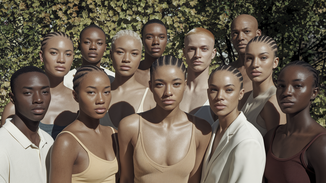
Beige is familiar because it names a family of muted cream-to-light-brown colors. In complexion descriptions, it usually suggests skin that looks softly tan, sandy, creamy, or light brown rather than strongly pink, gold, red, or olive at first glance. In foundation ranges, beige may appear in a shade name such as Ivory Beige, Desert Beige, Pure Beige, Warm Beige, or Rose Beige.
The word alone does not identify undertone. A beige shade can sit in a warm, neutral, or cool group. It may also appear beside a formal shade code that carries more information than the name. For example, a brand may pair Beige with a C, N, or W code, or describe the shade in plain language as cool pink, neutral, warm peach, or golden. Read the full description instead of assuming every beige product is warm.
It also helps to separate depth from direction. Depth describes how light or deep a complexion or foundation is. Direction describes whether the color leans warm, neutral, cool, or olive. Two people may both fit a medium beige depth while needing different undertones. The same person may also move between light beige and medium beige across seasons while keeping a similar undertone direction.
Beige is not a medical category, ethnicity, or fixed color-analysis season. It is a shopping and description tool. Use it when it helps narrow the field, then rely on controlled comparisons to choose the actual foundation or clothing color.
Warm vs. Neutral vs. Cool Beige
The three labels describe different directions within a similar depth family. They are easier to compare side by side than in isolation.
| Beige direction | Typical color impression | Foundation clue | Clothing starting point |
|---|---|---|---|
| Warm beige | Creamy beige with golden, yellow, or peach warmth | Neutral may look pink or flat; very golden shades may still turn orange | Cream, camel, olive, warm teal, rust, coral |
| Neutral beige | Balanced beige without a dominant pink or yellow cast | Warm looks orange and cool looks pink while neutral disappears more evenly | Soft white, mushroom, balanced navy, pine, berry, muted teal |
| Cool beige | Beige with rosy, pink-beige, or cool taupe direction | Warm shades look yellow or orange; rosy or cool-neutral shades sit more quietly | Cool taupe, charcoal, dusty rose, blue-red, pine, cool navy |
Warm beige is not an undertone category by itself. It is a compound label: beige gives the approximate shade family, while warm gives the direction. Within warm beige, one formula may lean peach, another golden, and another yellow. If a warm beige match is close but looks too orange, try a less saturated warm or a neutral beige at the same depth.
Neutral beige does not mean colorless. It can contain both warm and cool pigments without either side dominating. Some neutral-beige complexions lean slightly warm or slightly cool, which is why neutral-warm and neutral-cool descriptions can be more useful than forcing a perfect center.
Cool beige may be described as rose beige, pink beige, cool sand, or cool taupe. Surface redness can make a complexion look cooler than its foundation match, so compare the face with the jaw, neck, and upper chest. A cool-beige foundation should connect those areas, not simply copy redness on the cheeks.
Beige Skin Tone Diagnostic Table
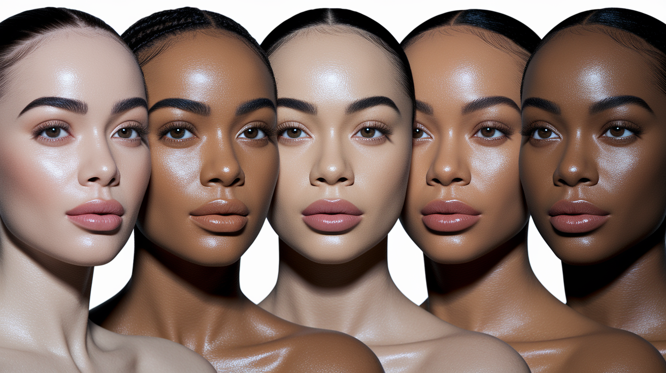
No single clue proves a beige direction. Use several observations under the same conditions, then look for the option that creates the fewest mismatches.
| Check | Warm beige clue | Neutral beige clue | Cool beige clue |
|---|---|---|---|
| Bare skin in daylight | Creamy, peach-beige, or softly golden direction | Balanced beige with no clear pink or gold lead | Rosy beige or cooler taupe-beige direction |
| Equal-depth swatches | Warm blends; neutral looks pink, flat, or gray | Neutral blends; warm turns orange and cool turns pink | Cool or cool-neutral blends; warm looks yellow |
| White comparison | Cream often connects more easily than stark white | Soft white and cream may both work | Cool white may look cleaner than yellowed cream |
| Red comparison | Tomato, coral, or brick often feels connected | Balanced red or muted berry may be steadier | Blue-red, raspberry, or cool rose often looks cleaner |
| Metal comparison | Yellow or antique gold repeats warmth | Gold and silver can look similarly balanced | Silver or white metal often creates a clean connection |
Fabric and metal results describe styling as much as undertone. A person may prefer the sharper contrast of silver even when warm foundation fits better. Give the most weight to bare-skin comparisons and foundation swatches; use clothing and metals to refine the palette.
How to Check Your Beige Direction in Daylight
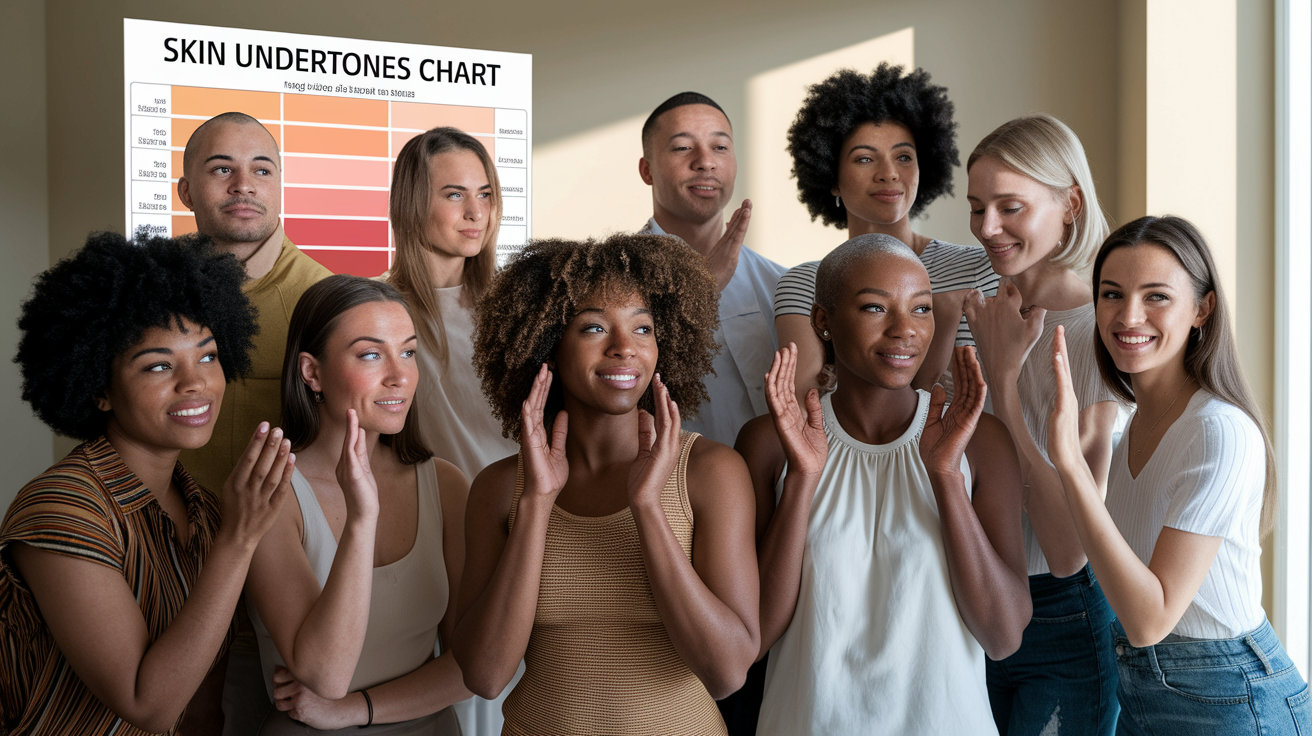
A controlled setup makes small beige differences easier to see. Stand near a window in indirect daylight. Turn off warm bulbs, remove strongly tinted makeup, and keep a bright shirt or colored wall from reflecting onto the face. If you take reference photos, disable beauty filters and compare images made in the same place and light.
- Name current depth first. Decide whether the closest foundation group is fair, light, light-medium, medium, or tan. Do not use beige as a substitute for that step.
- Compare several areas. Look at the lower cheek, jaw, neck, and upper chest. Cheek redness or a recent tan can distort one area.
- Use paired fabrics. Compare cream with cool white, camel with cool taupe, tomato red with blue-red, and olive with pine. Keep size, texture, and distance from the face similar.
- Swatch one formula. Apply warm, neutral, and cool candidates at nearly identical depth from the lower cheek across the jaw. A hand swatch is useful for texture but not for matching the face and neck.
- Let the product settle. Recheck in daylight after normal dry-down. Note whether a stripe becomes orange, pink, yellow, gray, or simply too light or deep.
- Repeat once. A second session reduces the effect of changing light, temporary redness, and first-impression bias.
Vein color and sun reaction do not need to lead this process. Veins can look blue, green, or purple through different skin depths and lighting. Tanning and burning patterns describe sun response, not a cosmetic shade label. They may add context, but they should not override a clear jaw-to-neck match.
Foundation Labels and Matching Clues
Foundation systems combine several pieces of information: depth, undertone direction, sometimes saturation, and sometimes a familiar shade name. One label may be systematic, such as a depth number plus C, N, or W. Another may use names such as Sand, Natural Beige, Warm Beige, Rose Beige, or Golden Beige. The name is a clue inside that range, not a universal color standard.
| Label pattern | How to read it | What to verify |
|---|---|---|
| Warm Beige | Beige depth/family with a warm direction | Whether the formula leans golden, yellow, peach, or orange |
| Neutral Beige | Beige family intended to balance warm and cool pigments | Whether it stays neutral on your neck rather than turning pink or gray |
| Cool/Rose Beige | Beige family with rosy or cool direction | Whether it matches the neck instead of only covering facial redness |
| Golden Beige | Beige family with a clearer yellow-gold direction | Whether it blends or becomes too saturated and orange |
| Natural Beige | A product-specific name that may be neutral, warm, or something between | The brand's code, description, and real swatch |
Mismatch color helps narrow the next test. If foundation becomes orange, it may be too warm, too saturated, too deep, or missing an olive component. If it becomes pink, it may be too cool or red. Gray can mean too light, too muted, too olive, or a poor formula match. A yellow stripe may have the right direction but too much saturation. Change one variable at a time.
Save the exact brand, formula, shade, and date when you find a match. The same shade name can change across formulas, and your current depth may shift. For online shopping, compare manufacturer descriptions and reliable swatches against a known match, but plan to confirm the product on the jaw and neck.
Best Clothing Colors for Beige Skin
Clothing works best when temperature, depth, and clarity are considered together. A pale camel and a dark rust are both warm, but they create very different contrast. Start with the direction that matches your beige result, then move lighter, deeper, clearer, or softer until the face looks defined.
| Direction | Neutrals | Accent colors | Simple outfit formula |
|---|---|---|---|
| Warm beige | Cream, oatmeal, camel, cognac, chocolate, warm navy | Olive, teal, tomato, rust, coral, terracotta | Cream shirt + olive trousers + cognac shoes |
| Neutral beige | Soft white, mushroom, taupe, balanced navy, espresso | Pine, muted teal, berry, dusty blue, balanced red | Soft-white knit + navy trousers + berry scarf |
| Cool beige | Cool white, cool taupe, charcoal, cocoa, cool navy | Dusty rose, raspberry, blue-red, pine, plum, cool teal | Cool-taupe jacket + navy top + raspberry accent |
Beige clothing can work on beige skin, but an almost identical value may erase definition. Choose a beige that is clearly lighter, deeper, warmer, or cooler than the skin, or add contrast through a collar, scarf, jacket, glasses, or jewelry. Texture also separates similar colors: matte linen, satin, suede, and knit fabric reflect light differently even when the hue is close.
Black and white are options, not tests you must pass. If optic white looks stark, try soft white or cream. If flat black dominates, compare charcoal, espresso, or navy. High-contrast coloring may still look excellent in crisp black and white, while lower contrast may prefer gentler transitions.
Best Metals for Beige Skin
Warm beige often connects easily with yellow gold, antique gold, bronze, brass, and copper. Cool beige may find silver, platinum, white gold, or cooler rose gold more integrated. Neutral beige can often wear both, especially when the metal finish and scale fit the person's contrast.
Compare similar pieces. A large polished gold earring reflects more light than a tiny matte silver stud, so that comparison measures size and finish as well as temperature. Use two chains or two earrings of similar size, then look at the skin, eyes, and jawline rather than the metal by itself.
Mixed metals are fine. Repeating each metal elsewhere in the outfit makes the mix look deliberate. Jewelry preference may also favor contrast over harmony, so do not let a favorite metal overrule a foundation result that is clear across the jaw and neck.
Beige vs. Golden and Yellow Skin
Beige, golden, and yellow can appear in the same product name, but they answer different questions. Beige usually describes a muted shade family or approximate depth. Golden describes a clearer yellow-gold or honey direction. Yellow undertone is broader and may be golden, muted, neutral-yellow, or olive-influenced.
A person can have warm beige skin without looking distinctly golden. Another can match a Golden Beige foundation because the shade combines the needed depth and golden direction. Someone else may have a clear yellow undertone but need a label called Sand or Warm rather than Beige. Product names do not replace the swatch.
Keep the detailed intents separate. Use the golden complexion guide when the main question is what golden skin means. Use the yellow-undertone color guide for a broad practical palette, or the yellow-undertone clothing guide for outfit matrices. This page stays with beige terminology and matching.
Common Beige Skin Tone Mistakes
- Assuming beige means warm. Beige shades can be warm, neutral, cool, golden, rosy, or olive-leaning.
- Using beige as both depth and undertone. Name the depth first, then the direction.
- Trusting the shade name across brands. Natural Beige, Pure Beige, and Warm Beige are product-specific colors.
- Matching cheek redness. A base should connect the lower face, jaw, neck, and chest rather than reproduce temporary redness.
- Testing only on the hand. Hands often differ from the face and neck in depth and sun exposure.
- Comparing different depths and formulas. Keep formula and depth close when testing undertone direction.
- Using veins or jewelry as proof. Those clues are affected by lighting, skin depth, reflection, scale, and personal contrast.
- Following a warm-only wardrobe. Cool and neutral colors can provide excellent contrast even when the foundation direction is warm.
The useful result may be a compound description: light warm beige, medium neutral beige, cool rose beige, or neutral-warm beige. A precise working label is better than a simple label that repeatedly produces orange, pink, or gray foundation matches.
People Also Ask
What skin tone is beige?
Beige usually describes a softly muted light-to-medium or medium complexion/shade family. It does not determine undertone, so look for a warm, neutral, cool, golden, rosy, or olive modifier and confirm it with daylight swatches.
Is beige a warm undertone?
No. Warm Beige is one possible compound label, but Neutral Beige and Cool or Rose Beige also exist. Beige alone is incomplete information.
Can cool skin wear beige clothing?
Yes. Cool taupe, rose beige, mushroom, and gray-beige are useful starting points. A warmer camel can also work as contrast if the rest of the outfit connects with the person's coloring.
Is natural beige foundation neutral?
Not necessarily. Natural Beige is a product-specific name. Check the brand's undertone code and description, then test the actual shade on the jaw and neck.
Common Questions: The Ultimate Color FAQ
How do I choose between warm, neutral, and cool beige foundation?
Choose close depth matches in one formula and swatch all three across the jaw into the neck. Check them after dry-down in indirect daylight. The best direction leaves the least visible color boundary.
Why does beige foundation look orange on me?
It may be too warm, too saturated, too deep, or missing an olive component. Compare a neutral shade and a muted or olive alternative at the same depth before changing formulas.
What colors look good on warm beige skin?
Cream, camel, cognac, chocolate, olive, teal, tomato red, rust, coral, and terracotta are practical starting points. Adjust their depth and brightness to your personal contrast.
What colors look good on neutral beige skin?
Try soft white, mushroom, balanced navy, espresso, pine, muted teal, berry, dusty blue, and balanced red. Neutral beige often handles both warm and cool accents when saturation is controlled.
What colors look good on cool beige skin?
Cool white, taupe, charcoal, cool navy, dusty rose, raspberry, blue-red, pine, plum, and cool teal are useful starting points. Compare clear and muted versions to find the right intensity.
Can beige skin be olive?
Yes. Beige can describe the depth/family while olive describes a muted green-gray direction. If standard warm shades turn orange and neutral shades look peach or pink, test olive candidates at the same depth.
Sources and Method Notes
This guide treats beige and undertone names as practical cosmetic labels rather than medical categories. The distinction between skin tone/depth and undertone direction, the C/N/W examples, and the recommendation to confirm a match in natural daylight were checked against the official Estée Lauder Foundation Shade Finder on August 4, 2026. Other brands may use different names and codes, which is why the article recommends checking each range rather than translating shade names automatically.