The Ultimate Guide to the Deep Winter Color Palette

Key Takeaways
- Deep winter thrives on cool, dark, high-contrast hues — black, charcoal, midnight navy, and deep purples are the true power players of the deep winter color palette in 2026. Forget digital lavender: if it reads too pastel, it kills the drama. Instead, test a deep winter purple accent under natural light and pair it with a black base for that signature high-contrast impact the deep winter type is built for.
🌸 Discover Your Seasonal Color Analysis
Ready to discover your seasonal color type? Take our comprehensive seasonal color analysis to identify whether you're a Spring, Summer, Autumn, or Winter, and guide you to the perfect colors that enhance your natural beauty.
Discover Your Season →- Maintain depth, coolness, clarity and contrast as your 4 style anchors. Combine dark neutrals with pure jewel tones — steer clear of warm, dusty or pastel shades that fade you.
- Build your base with black, charcoal, deep navy and cool taupe, then accent with power colors like sapphire, emerald and burgundy. Play with icy pink, turquoise or electric purple as accessory or makeup highlights.
- Stand apart from neighboring palettes by selecting cooler and clearer options than dark autumn, somewhat softer and deeper variations of true winter, and more saturated, less neon shades than bright winter.
- Stick to your palette through wardrobe, makeup, jewelry and textures. Opt for silver or pewter metals, high-contrast patterns and rich velvet or leather fabrics for polished punch.
- Employ color psychology deliberately–to convey power, enigma, or opulence–and customize selections to your society, illumination, and taste. Whip up swatch books, capsule checklists, and mood-boards to keep you confident and on point.
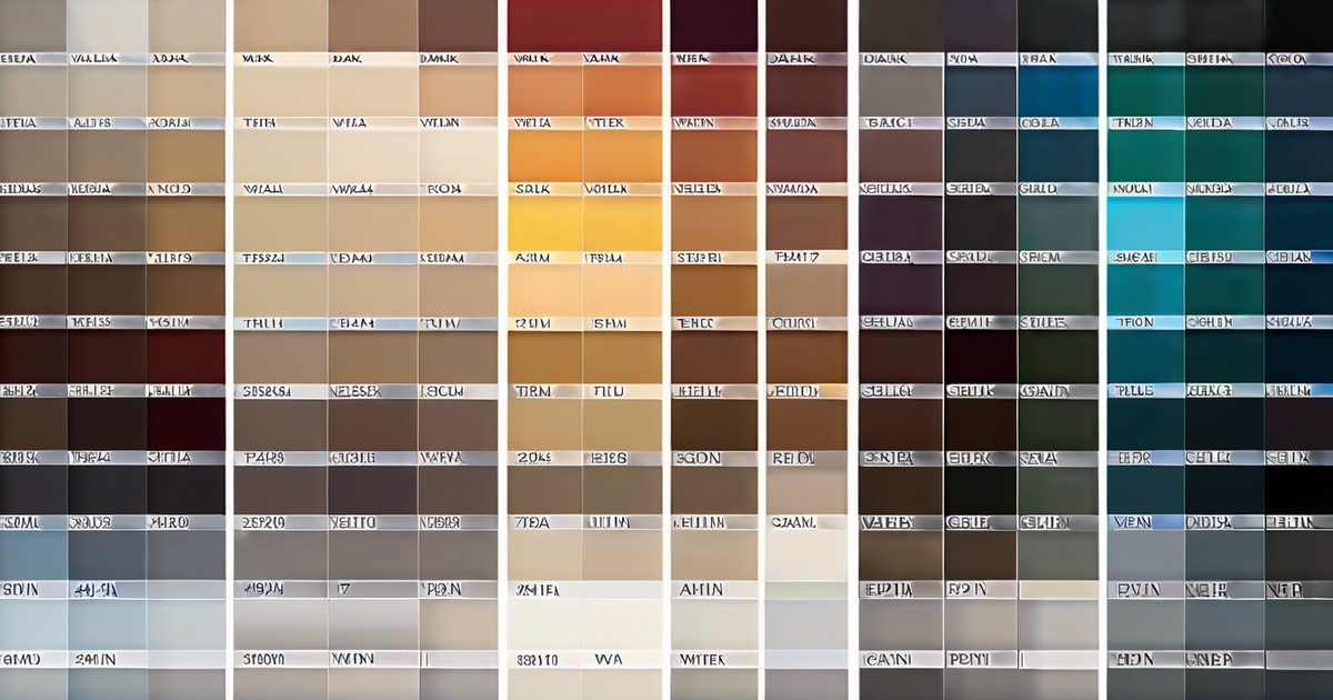
Dark winter color palette combines deep, cool, and high-contrast hues which retain saturated pigment in dim illumination. I'm talking inky navy, forest green, burgundy, charcoal, and true black — set with crisp white or icy gray for balance.
Metals like silver provide that clean shine, while jewel tones—emerald, sapphire and ruby—keep the mood bold. To anchor outfits, rely on tailored cuts and sleek fabrics such as wool, leather and satin.
Coming up next, easy ways to construct outfits and select makeup that coordinate.
📚 Recent Articles
What defines the dark winter color palette
A cool, deep, high-contrast range grounded on blackened bases represents the dark winter colour palette. It combines True Winter's icy edge with dark autumn colours, creating smoky, neutral-cool shades. Think stormy nights, dense pine, and wet ink, where the colours land low in value and high in chroma, appearing bold, crisp, and dramatic.
1. The depth
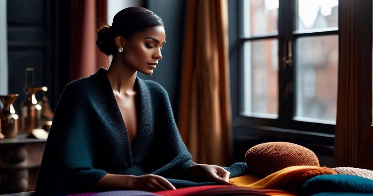
Dark winter is the darkest of all the winter types. Its hues gravitate to black, not just charcoal, but genuine near-black strata upon which to build the scheme. This depth mirrors winter nature: night skies, wet bark, deep shadows on snow.
It has rich colors but doesn't go muddy. Midnight blue, forest green, aubergine, oxblood and ink purple all stand their ground. These work because the pigments are dense, almost compressed, but not muddy.
Maintain depth in clothes and makeup. A black coat, ink trousers and a deep kiss beat medium, dusty picks. Eyeliner can be jet or plum-black; blush remains cool and contained.
Keep this deep winter palette cheat sheet close: black, cool espresso (not the muddy warm-brown version often mistaken for Dark Autumn), midnight navy, bottle green, aubergine, blackberry, inky teal, and midnight teal — one of the most complimented colors in the deep winter color palette right now.
2. The coolness
Undertones run neutral-cool, with an ever preference for blue rather than yellow. Even reds lean blue-red; greens sit on the blue side — purples feel cold rather than berry-warm.
Pick them with an icy edge. Forget warm gold, tomato red, camel or honey beige. These can clash with cool winter skin, dull the eyes and combat the deep hair tones typical of Dark Winters—think dark brown or black hair, with cool deep eyes such as dark brown or hazel.
Compare swatches in the daylight. Put a blue-red next to an orange red and the right pick will brighten skin and sharpen features.
Same with teal vs. Jade, fuchsia vs. Coral, silver vs. Gold.
3. The clarity
Colors are fresh, not muted. High chroma translates to sapphire blue, emerald, ruby and icy fuchsia come off vivid and clean.
Consider this your 2026 no-buy list: Butter Yellow, Peach Fuzz, terracotta, chocolate brown, and anything that reads dusty or muted. No matter how hard these shades trend, they are a complexion killer for the deep winter type — they wash out your natural contrast and dull the very depth that makes deep winter colors so striking. Skip muddy olives, beige-leaning taupes, and powdery pastels for the same reason. If a color looks like it has been left out in the sun too long, it has no place in your deep winter color palette. Instead, go inky: reach for midnight teal, electric magenta, and crisp white trims that snap against black with the high-contrast drama that deep winter palette colors demand.
For fast picks, track your clearest shades: sapphire, emerald, ruby, cobalt, inky teal, blue-red, icy pink, and silver.
4. The contrast
Dark Winter sings to the call of contrast, especially with its dark winter colour palette. Pairing black or midnight with a bright accent, like icy pink or electric magenta, highlights the striking contrast that defines this season. The blend evokes winter's harsh illumination, making it a perfect fit for dark winter clients.
Utilizing two dark anchors alongside a bright spark near the face enhances the overall palette. Low-contrast mixes—such as charcoal with slate—often fall short in this colour season.
Metallics make all the difference. For the deep winter color palette, gunmetal and blackened chrome are the definitive 2026 choices — they deliver cool depth and quiet authority that yellow gold simply cannot match. Hematite and cool silver round out the lineup, adding luminosity while preserving the high-contrast, razor-sharp aesthetic that defines deep winter jewel tones. Reach for gunmetal chains and blackened hardware when you want edge; switch to polished silver when the look calls for elegance. Either way, warm-toned gold stays firmly off the table.
Distinguishing deep winter colors
Deep winter, often called dark winter, showcases a cool, deep, and dark aesthetic with high clarity. This season features a neutral-cool temperature that emphasizes depth in both lights and darks, maintaining crisp edges rather than dusty ones. During this time, individuals shine in dark winter colours like midnight blue, dark purple, and charcoal, while intense warm tones tend to clash with their cool undertones.
Metallics reflecting this clarity, such as dark silver and pewter, accentuate the face without introducing yellow warmth. The aim is to achieve harmony with skin and hair, focusing on high contrast and a cool base, ensuring a clean depth that complements the overall dark winter colour palette.
| Palette | Temperature | Depth | Clarity | Best Neutrals | Avoids |
|---|---|---|---|---|---|
| Dark Winter | Neutral-cool | Very deep | Clear to crisp | Black, charcoal, pewter | Warm browns, olive, rust |
| Dark Autumn | Warm-neutral | Very deep | Muted to soft | Espresso, chocolate, bronze | Icy brights, blue-black |
| True Winter | Cool | Deep | Icy, high | Black, optic white, silver | Warm, smoky tones |
| Bright Winter | Cool-neutral | Medium-deep | Very bright | Black, cool navy, chrome | Dusty, muted, earthy |
Try constructing your own comparison chart with swatches in daylight (approximately 5500 K), to catch shifts in warmth and clarity.
From dark autumn
Deep winter is cooler, and a bit brighter than deep autumn. There's less brown, less golden warmth, and more blue-based pigment grounding the palette.
Seek lighter lights and crisper contrast. Where dark autumn leans earthy—warm bark, moss, tobacco—dark winter jumps to cool ink, blue-black and sorts of lights that pop off snowy. That's why olive, rust, pumpkin and camel struggle on deep winter skin – they mute the inherent contrast and introduce yellow warmth.
Choose blue-based darks instead: midnight navy, aubergine, mulberry, blackened plum.
From true winter
Dark winter sits a shade warmer, a bit softer and darker than true winter's ice. Imagine a touch of smoke over a jewel hue instead of a headlamp-bright primary.
Take true winter as your anchor, then move one notch deeper and less harsh. Trade cobalt for ink navy, fuchsia for blackberry, icy cyan for teal with blue core.
Equilibrate darkness with a hint of warmth, not heat—cool burgundy over cherry red, pewter over mirror silver—to maintain genuineness and effortlessness.
From bright winter
Bright winter has the same neutral-cool base, but its colors sparkle at higher brightness, as well. Deep winter mutes the glare and introduces depth, making the look luxurious rather than neon.
Bypass highlighter shades and near-neon pinks, acid limes and electric turquoise. Prioritize saturated depth: blackberry, midnight blue, deep red, and blue-black.
Side-by-side swatches help: the right dark winter shade holds color in shadow; the bright winter twin buzzes on the surface. Statement silver or dark silver jewelry can seal the look without tipping warm, and dark gold works when its tone reads cool.
Your essential color spectrum
Your key color spectrum is the palette of hues that harmonize with your skin, hair, and undertones so your features appear crisp and vibrant. Dark Winter sits in the cool, deep, and high-contrast space: intense hues, crisp clarity, no dusty or earthy veils. More polished depth than warmth.
For quick use: 1) Key neutrals—black, charcoal, deep navy, dark brown; 2) Power colors—emerald, sapphire, deep burgundy; 3) Accents—icy pink, turquoise, vivid purple; 4) Avoid—warm, muted, pastel tones.
Maintain a small swatch book or photo chart on your phone. Try combos such as black with burgundy, navy, or forest green to achieve sharp contrast that empowers confidence and presence.
Core neutrals
Go first with black, charcoal, deep navy and dark brown. These transport the chill, theatrical foundation Dark Winter requires while remaining adaptable for desk and dinners.
Use them as the spine of a capsule: coats in charcoal, trousers in deep navy, a black blazer, and dark brown boots. Mix in dark greys and cool taupes for interest that still honors the palette's crispness.
A slate scarf beside a midnight shirt comes across sophisticated, not monochromatic. Create a mini wardrobe—tops, layers, bottoms—with just these neutrals for mix-and-match simplicity.
When in question, go black with forest green or deep navy with gunmetal jewelry. Metals such as silver, gunmetal and black hardware reflect the palette's cool depth and appear sharp in every light.
Power colors
Jewel tones are your power switch: emerald green, sapphire blue, deep burgundy, and midnight blue. They provide vibrancy without glare.
Wear them for statements—an emerald knit, a burgundy dress or a sapphire tie. Put one near the face to illuminate eyes and skin. If you run cool with dramatic contrast, these hues frame your features rather than fight with them.
List your top five in your swatch book for fast shops: emerald, sapphire, deep burgundy, forest green, and wine.
Accent shades
Add small sparks: icy pink, turquoise, vivid purple, or deep rose/fuchsia as "near-neutrals" that pop without noise.
Experiment with accents in belts, bags, sleek sneakers, lipstick or a beanie. Modern, too, is a fuchsia lip with a charcoal coat.
Rotate accents by season–icy pink in winter light, turquoise in summer sun—to keep looks fresh. Jot your favorites down in an easy table or card to direct fast selections.
Colors to reconsider
Warm, muted or pastel shades combat Dark Winter's cool intensity. Earthy tones with warm bases can gray the skin and dull the eyes.
Reduce beige, orange and yellow-based browns. They mute contrast in a way that comes across as blah.
- Avoid: camel, apricot, peach, warm olive, mustard, rust, tan, cream, coral. Maintain a 'do NOT wear' list in your phone to avoid slip-ups and save time.
How to apply your palette
Emphasize depth, coolness and crisp contrast. Try to keep choices consistent between clothes, accessories, hair and make-up so the look reads cohesive from head to toe. Construct layers of like tones, then sparkle or shimmer for bounce.
Patterns work when colors remain crisp and cool, not muted or warm. Dark Winter is cooler and a little bit brighter than Dark Autumn, which is warmer and richer.
Wardrobe essentials
Start with a tight base featuring essential pieces like black trousers, charcoal blazers, and midnight coats, complemented by deep jewel-toned tops. Rich winter colours such as deep purples, midnight blues, and deep reds serve as excellent day-to-night players. The dark winter colour palette is rounded out with deeper hues that are just as striking as black, so mix in espresso, aubergine, pine, and blackberry for a vibrant look.
Select your neutrals first—black, charcoal, cool navy, and slate—and then fill in with two or three accent colours you adore—garnet, sapphire, or fuchsia. Opt for pieces that flatter your physique; when clothes fit well and enhance your natural colouring, the result appears effortless and polished.
Add that layer of refinement with cool burgundy scarves, inky teal gloves, and black or oxblood boots. These little accents echo the overall dark winter colour scheme and tie your looks together beautifully.
Build a capsule checklist that includes black trousers, charcoal jeans, a cool navy skirt, a crisp white or cool ivory shirt, and a deep jewel knit. Stick to fabrics with a bit of heft—wool, leather, velvet—that absorb colour nicely and enhance your seasonal colour type.
Makeup philosophy
Match your base to your skin tone, not the palette. We're aiming for a smooth base that honors your natural undertone. Dark Winter frequently comes across neutral-cool, so stay away from yellowish casts.
Select eyes, cheeks and lips in deep, cool, intense hues that complement your neutral-cool complexion. Think sapphire or gunmetal shadow, deep rose or fuchsia blush and berry, wine or blue-red lips. Experiment with matte or satin finishes to find what fits your style and skin texture.
Lean into contrast around the eyes: charcoal or black liner, bold mascara, crisp brows. It refines under bold shades.
Build your deep winter kit with intention: a cool-toned foundation and concealer that never pulls warm, gunmetal and plum eyeshadows that echo the deep winter jewel tones your coloring craves, black liner and mascara for maximum contrast, deep rose or fuchsia blush, blue-red, wine, and berry lipsticks, plus a cool-toned highlighter. When testing deep winter purples and bold lip shades, head straight to Sephora or Ulta — their 2026 high-CRI LED lighting (CRI 90+) renders cool pigments with remarkable accuracy, so what you see in the mirror is what you actually get. No more second-guessing under fluorescent strips or running to the parking lot for a reality check. Before changing your hair color, consult a professional colorist: even a half-shade shift in depth or warmth can disrupt the high-contrast signature that makes the deep winter palette so striking.
Jewelry and metals
Silver, pewter, rhodium and antiqued gold suit Dark Winter best because they echo cool depth. Stones such as garnet, ruby, emerald and sapphire provide sophisticated color that reflects your outfit.
Avoid yellows or very shiny golds that lean warm. It can counteract the palette clarity and dull your skin.
Organize your jewelry by metal and stone color. A no-brainer tray system accelerates dressing and maintains looks consistent.
Patterns and textures
Pick high-contrast prints with clear, cool hues: black-and-white houndstooth, navy with crisp emerald stripes, berry checks. Test fabrics near your face; if your eyes brighten and your skin looks even, it does.
Sprinkle in some velvet, leather, wool, satin, coated denim to add some depth. Combine a subtle pattern with a strong solid—charcoal pinstripe pants with a sapphire sweater—so the ensemble is in equilibrium.
If you want play, stack textures in one color family: black leather skirt, matte knit, and satin shoe. The hue remains constant but the canvas moves. One word of caution though — when sourcing sustainable pieces for your deep winter color palette, watch out for recycled polyester fabrics. They often carry a subtle greyish cast that dulls the luminous clarity of deep winter jewel tones like midnight teal, deep azure, and rich plum. That muted veil is the last thing you want when your whole look depends on high-contrast depth. For leather goods, seek out tanneries certified to Silver-rated sustainability standards — they deliver the cool, clean blacks and navies that deep winter colors demand, without compromising on chromatic intensity.
The psychology of your colors
Dark Winter combines Winter's cool foundation with depth and softened edges, so the palette comes across refined, compelling, and stable. These hues influence not only how others interpret you—subtle authority, control, and a touch of mystery—but how you feel in your own skin. Utilized well, they bolster personal branding in high‑stakes rooms and casual circles.
Design with purpose: track your mood with each shade then scale contrast, saturation or texture to match your intent.
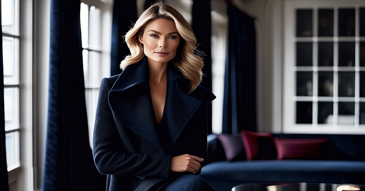
Evoking authority
Deep, cool anchors such as black and navy indicate competence, order and follow‑through. They border the face with neat lines, which aids Dark Winters—frequently with luxuriant hair and lustrous eyes—to appear polished and exact. Pure black is a jewel in this town; this type can rock it head‑to‑toe without it leaching temperature.
High contrast is your tool. Near‑black suit with a crisp white shirt, or midnight navy with a sharp icy shirt, sharpens lines and focus. In meetings, this contrast communicates clarity and makes your message sticky.
- Top picks for authority: pure black, midnight navy, charcoal, ink blue, deepest burgundy
- For interviews: black suit, white shirt, ink tie, navy dress, black pumps
- For meetings: charcoal jacket, cool white knit, navy blouse, black trousers
- For presentations: black dress with silver cuff; navy suit, white pocket square.
Projecting mystery
Dark Winter features sensual and mystical notes, so hues such as eggplant, forest and midnight blue imply depth without clamor. Your eye interprets these as shadow and space, which plays wonderfully off of deep brown, hazel, or near‑black eyes that already seem intense.
Layering creates interest. A black base with sheer midnight shirt adds depth without weight. Discreet patterns—herringbone, soft pinstripes—thank a deep inspection but remain professional.
Makeup and accessories come to the rescue. Experiment with deep rose or fuschia blush to activate the face with a cool berry lip or onyx studs. A forest scarf just grazing the collarbone pulls the eye upward.
Build a small mood board: swatches of black, midnight, eggplant, pine, gunmetal, and a hint of icy white. Introduce textures that soak up light—suede, matte leather—and observe which combinations seem earthy or overly severe.
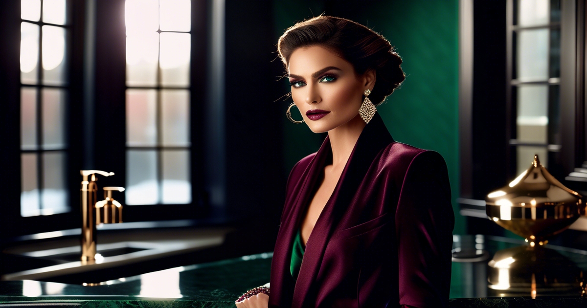
Communicating luxury
Jewel tones and cool metals feel sophisticated. Think garnet, sapphire, amethyst with silver, white gold or gunmetal. They communicate concern, not dazzle.
Texture closes the communication. Ink velvet blazers, aubergine silk blouses or a satin skirt in deep teal look luxe yet understated. Even a black wool coat with a bit of shine can elevate a simple ensemble.
Little decisions matter. Deep gemstone jewelry, sleek belts and structured bags in black or charcoal keep lines clean. For night, go bold: a sapphire slip with a black tux jacket. For day, stay classic: black trousers, icy white shirt, amethyst earrings.
Dark Winters can thrive without clutter because the palette is dark, cold and muted at its essence. Compile an inventory of ensembles combining one jewel tone with earthy blacks or navies, then alternate according to your feelings and atmosphere.
Beyond the seasonal rules
Seasonal color analysis should direct, not imprison. Dark Winter flourishes when you make it your own, embracing your unique dark winter colour palette, culture, and light. The myth that you have to be one season is OLD news, as dark winter clients can explore various colour combinations.
Your personal style
If you love the Old Money aesthetic but dread the beige overload, here's the truth: beige is a death sentence for the deep winter color palette. It washes out your naturally high-contrast features and flattens everything that makes your coloring so striking. Instead, build your winter deep palette around jet black, midnight navy, charcoal, and Prussian blue — these are your true power neutrals. Swap trending beige for cool silver-grey to soften an all-dark look without losing any of that signature depth. A tailored charcoal suit paired with a crisp white shirt and gunmetal accessories nails the Old Money mood at 100% — no beige required. Add a woodland teal scarf or a merlot pocket square for a refined accent, and finish with a cool-berry lip to keep the contrast sharp and intentional.
Experiment with quirky combinations to express personality. Emerald with burgundy, or violet with slate, somehow manage to feel both bold and polished. Bring in a statement piece from a sister season—like a Deep Autumn leather belt in warm espresso or a rust suede bag—the common depth maintains unity, while the warmer accent enlivens your overall look.
Compensate for mood and expansion. On chill days, rely on sleek neutrals and smart surfaces—merino, crisp cotton, smooth satin. When you want impact, pump brightness with frosty highlights—snow white piping, silver hardware. Mix fabrics across seasonal associations: a tweed skirt (autumn leaning) with a sleek winter-weight coat can look rich and intentional.
Maintain a straightforward style journal. Snap outfits, note lighting, list what felt right: colour combinations, fabric mixes, and which neutrals beat black for you. Trends emerge, and duplications become effortless.
Cultural context
Colors convey various meanings depending on the location. For instance, burgundy may appear stuffy in one context but festive in another. If deep red signifies festivity, opt for a wine dress. Conversely, if it seems somber, switch to royal blue or forest teal for a calm and respectful look. Consider the seasonal color type when choosing your outfit.
Match activities and customs. For ceremonies that like a muted tone, dress in dark navy-slate and battleship grey, then accessorize with a cool jewel earring. For elan-soaked events, toss in magenta or cobalt pops and maintain a cool foundation.
Think beyond your own background. Nordic winters blend inky blues with crisp white, while East Asian formality may lean towards elegant navy. Mediterranean nights might embrace vibrant hues like saturated teal and fuchsia, reflecting the rich colouring of Dark Winter's dark features.
Create a quick-reference note for hues to wear or avoid by region or event, acceptable contrasts, and which dark winter colour combinations feel welcome.
The light factor
Light transforms all. Natural daylight, which keeps Dark Winter clean and cool, warm indoor bulbs can pull the swatches toward yellow. I test outfits by a window, in office LED, and at night streetside to identify shifts.
Certain colors morph. Prussian blue can appear gorgeous in noon daylight but pallid under warm halogen. Emerald can get muddy if the fabric is warm undertoned. Pay attention to sheen fabrics—they reflect color and can amplify brightness.
Photograph in various configurations—day, shade, warm indoor, cool LED—and compare. If a shade flops under regular light for you, play with a cooler cousin or deepen the value.
This is where cross-season testing helps: some Deep Autumn accessories hold better under amber light, and the depth still suits a Dark Winter base.
Conclusion
To nail a dark winter palette, opt for rich, cool colors in stark contrast. Consider jet, ink navy, pine, ruby, fuchsia and ice. Skin appears clear. Eyes seem bright. Outfits seem crisp and composed. Black coat, dark teal scarf. BURGUNDY LIP WITH A SLATE TOP Silver studs with a fresh white shirt. Little switches have alot of pull.
To try out a tone, just hold it to your face. Try it in daylight. If your features pop, it works. If you flake, forget it. Style bristles with little victories.
Set to construct your set? Experiment with one deep base, one bright accent and one cool light. Give a glance, shoot a quick question, or exchange picks with the gang.
Frequently Asked Questions
What defines the Dark Winter color palette?
Imagine inky jewel tones with distinct contrast, characteristic of a dark winter colour palette. Black, charcoal, midnight navy, and pure white ground the overall palette, while accents feature rich emerald, ruby, cobalt, and fuchsia.
How do I know I'm a Dark Winter?
You probably have cool undertones and a strong natural contrast, making you suited for a dark winter colour palette with deep, vibrant colours. Black provides equilibrium rather than severity, and silver jewelry complements your look more than yellow gold. If pastels or warm colours flatten your appearance, a professional colour analysis may reveal that you are a dark winter client.
Which colors are essential for my wardrobe?
Begin with dark winter colours like charcoal, black, midnight navy, and cool espresso. Add jewel-toned accents from the dark winter colour palette: emerald, teal, cobalt, cranberry, and magenta. For light notes, select icy pastels and crisp white.
How can I build outfits with my palette?
High contrast is essential in a dark winter colour palette. Combine dark neutrals with vibrant highlights, such as pairing black with emerald or navy with magenta. To enhance your look, select sleek textures and polished finishes that complement the overall palette's intensity.
What makeup shades work best for Dark Winter?
Choose cool, rich winter colours for your look. Foundation should be in cool or neutral tones. Lips can feature dark winter colours like berry, wine, or fuchsia. For eyes, opt for dark grey, charcoal, or navy shades.
How does color psychology support Dark Winter?
The dark winter colour palette communicates confidence, concentration, and strength. Its high contrast level enhances presence and clarity, making jewel tones appear decadent and definitive—ideal for events where you want to project a sleek and dependable image.
Can I wear warm colors if I'm Dark Winter?
Indeed, with a few adjustments, you can achieve a striking contrast by opting for the coolest variation of a warm color, like cool burgundy instead of warm rust. Maintain a dark winter colour palette for a cool, deep overall appearance, balancing with bold dark winter neutrals and fresh white.