The Ultimate Guide to the Deep Autumn Color Palette

Key Takeaways
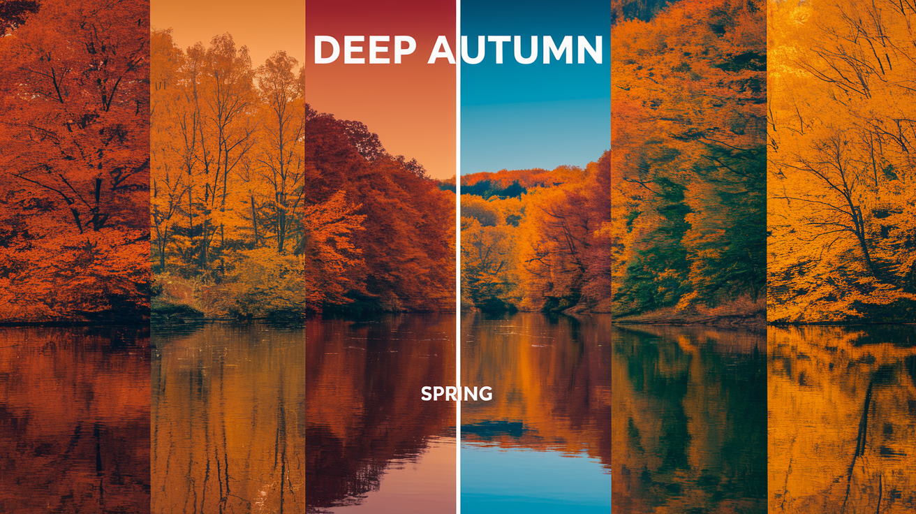
- The deep autumn color palette is built on rich, saturated earth tones that feel both grounded and luxurious — think deep chocolate browns, golden olive, smoldering burnt orange, and warm mustard yellow. These aren't just pretty shades; they're the colors that make deep autumn skin literally glow.
- The autumn deep palette stays warm and richly muted — never icy, never neon. The best colors for deep autumn lean into golden, copper, and smoky tones that build depth without creating jarring contrast. When in doubt, reach for espresso over jet black: warm-undertoned darks are always your friend.
- Wondering if color analysis deep autumn is your season? If you have warm-toned skin, dark or medium-deep brunette hair, and rich brown, hazel, or dark olive eyes, the signs are pointing in one direction. A swatch comparison against your face in natural daylight will confirm it fast.
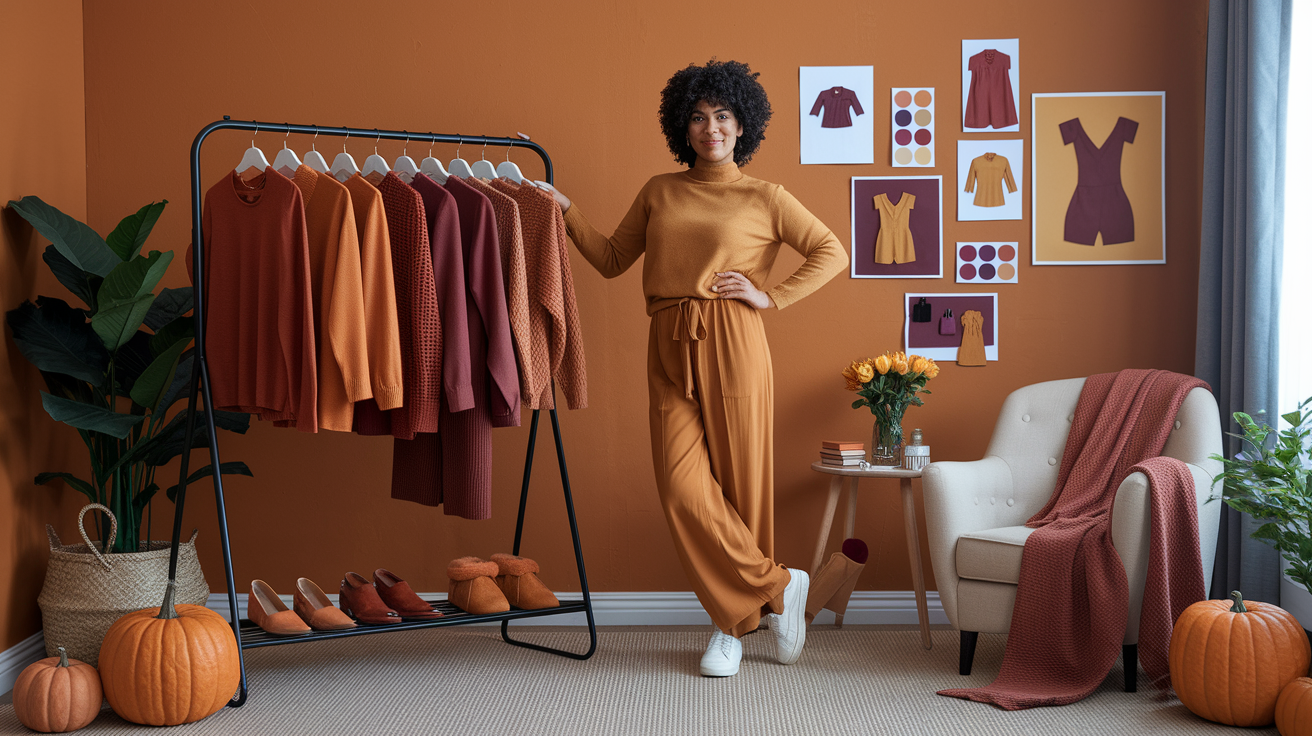
- Anchor your wardrobe in the best colors for autumn palette neutrals: camel, warm taupe, deep autumn browns, and rich beige. Layer in mustard, dark teal, forest green, and brick red as your statement pieces — these deep autumn color combinations create outfits that feel intentional and effortlessly polished.
- For makeup, the best color for deep autumn looks are built on bronze, terracotta, deep berry, and golden brown. Skip the cool pinks and frosty highlights — they fight your undertone. Gold and copper jewelry with warm gemstones (think amber, citrine, or tiger's eye) complete the picture perfectly for deep autumn skin tone.
- Make your autumn color palette work long-term by building a simple system: group your wardrobe by depth, keep a physical swatch card of your core tones, and photograph the outfits that land best. Consistency is what turns a great palette into a signature style.
💫 Learn Seasonal Analysis
Ready to explore the complete seasonal color analysis system? Discover how Deep Autumn fits into the 12-season framework and learn about all the seasonal types.
Learn Seasonal Analysis →Forget everything you thought you knew about neutrals — in 2026, espresso has officially dethroned jet black as the go-to power shade for anyone working a deep autumn color palette. This warm, brown-toned near-black does something cool black simply cannot: it makes Deep Autumn skin glow rather than drain. The autumn color palette is built on rich, high-intensity hues — burnt orange, deep olive, mustard, brick red, dark teal, and lush plum — all anchored by warm undertones that demand equally warm neutrals. A professional draping session with a certified analyst will run you $300–$500 on average (up to $800 in major cities), but if you want to map your autumn deep color palette before committing that budget, a quality AI color analysis app gets you 95% of the way there for under $15. Consider this your roadmap to dressing with intention — and looking expensive doing it.
Consider deep olive, pine green, auburn, rust, burnt orange, mustard, camel and cocoa brown. These shades flatter deeper complexions with warm undertones and embrace layered textures such as wool, suede and leather.
Gold and bronze metals tone well. For balance, add cream or soft moss.
For some real-life outfits, fabric swatches and makeup picks, the following sections break it down in easy steps.
📚 Recent Articles
What defines the deep autumn color palette
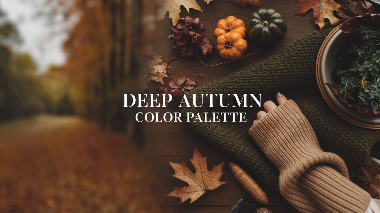
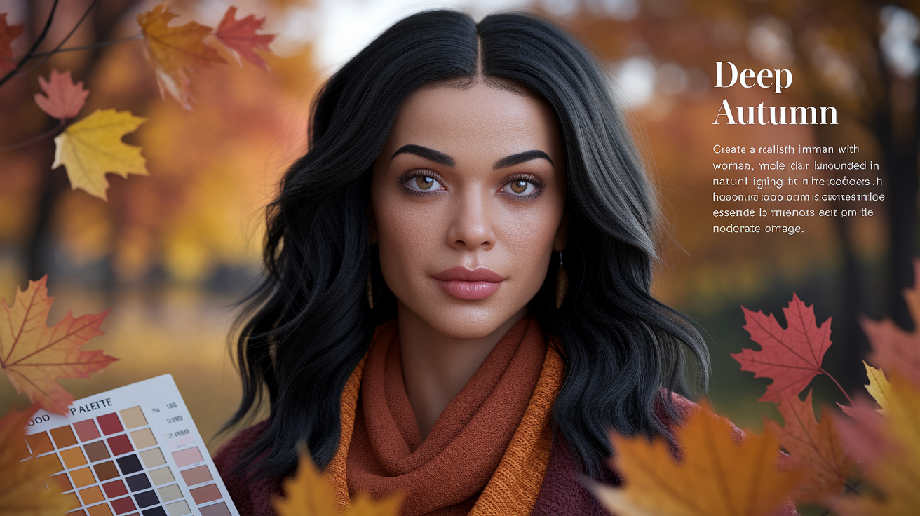
Marked by rich, dark autumn colors and warm hues with earthy undertones, Deep Autumn marries autumn's spice and soil with a trace of winter's shadow. With a dark autumn palette of deep browns, olive greens, burnt oranges, and golden yellows forming dominant notes, the mood is warm and muted, fitting those with dark hair, deep eyes, and warm skin tones.
1. The core essence
Depth and warmth lie at the center of this palette. Think chocolate brown, forest green, ripe aubergine, deep mustard, pumpkin, wine and midnight teal. These colors feel weighty and earthy like moody greens in a shaded forest or spice tones of a seasonal kitchen.
Earthy, robust shades compose a natural harmony. They come across as organic, not brash, and they reverberate fall's late-season leaves, dark wood, and sun-warmed clay. These cues are important as they direct you toward colors that resonate as lived-in and peaceful.
Muted always wins over stark — and nowhere is this more obvious than with black. Pure jet black is a Dark Winter move: it has a cool, high-contrast edge that simply doesn't belong in the deep autumn color palette. On a Deep Autumn complexion, jet black can read as harsh and draining, making skin look dull and tired rather than luminous. If you've ever put on a classic black outfit and felt somehow washed out despite the drama of the color, this is exactly why. The best colors for deep autumn skin tone lean warm and rich — so instead of reaching for jet black, make espresso, bitter chocolate, or warm black your go-to darks. These shades carry brown undertones that harmonize with your natural warmth, keeping your face the focal point rather than fighting it. Think of them as your secret weapons on the dark side: all the depth and sophistication of black, none of the cool-toned clash. Washed black — slightly faded, slightly warm — works on the same principle. It softens the contrast just enough to stay within the autumn deep color palette without sacrificing edge.
It's about complementing, not competing. On Deep Autumn characteristics—dark brown or black hair with accents of mahogany, red, auburn or gold, deep eyes, warm skin—these hues accentuate depth without sharpness.
2. The temperature
Deep Autumn is warm-leaning. Stay away from cool, blue-based colors that make golden undertones look dull.
Rely on gold, copper, warm browns and toasty neutrals for your clothes and makeup. Opt for bronzed highlighter, terracotta blush, chestnut or coffee liner, and warm red or brick lips.
Pass on frosty or icy shades–icy pink, baby blue, silver-gray. They conflict with the palette's warmth.
Build a warm-hue list: chocolate, espresso, dark olive, forest green, pumpkin, rust, deep mustard, midnight teal, aubergine, wine, camel, and warm taupe.
3. The value
This palette leans toward dark to medium-dark values. It's what makes it a deep Autumn color palette and its signature within the greater Autumn clan.
Go for deep forest green, chocolate brown, dark olive, oxblood and midnight teal to ground looks. They complement the face and hold up deeper hair and eyes.
Skip very light pastels. Pale pinks and powdery shades can wash out Deep Autumn skin, and light, cool pastels mute the warmth that defines this type.
Sort your wardrobe by value: group darker bases together, then add mid-tone layers. Medium to large scale prints in the darker values keep the look cohesive.
4. The chroma
Chroma sits neutral to moderate—colors are saturated but muted, not neon. They come across as smoky and rich, not crisp and earthy.
Pick softened shades: rust over bright orange, forest over kelly green, wine over cherry red, midnight teal over electric teal.
No high-chroma brights or primary tones that disrupt harmony. Neon, pure royal blue and fire-engine red tug too strongly.
Muted vs. Bright guide:
- Muted: Rust, aubergine, forest, midnight teal, and oxblood keep the palette rich without pushing it into neon territory.
- Bright: Neon orange, cherry red, kelly green, electric teal, and cobalt are useful comparison shades because they reveal how quickly Deep Autumn can look overpowered.
Are you a deep autumn
Deep autumn are people who have dark hair, warm skin undertones and rich earthy eye colours rather than cool. Skin usually tans quickly, seldom pinks and tends golden or olive. Natural contrast low to moderate–facial features meld rather than have a harsh light-dark delineation.
If you're not sure, try a color analysis quiz or see how your look compares to warm, deep celebrities. Notice how deep, rich, warm shades brighten your face whereas cool icy tones mute you.
Skin tones
Deep autumn skin encompasses warm ivory and golden beige to bronze, caramel, deep olive, and black skin with a warm or neutral-warm undertone. The surface can be olive or yellow but the undertone remains warm.
After sun, the skin tends to take on a bronze or caramel tint rather than rosy flush. That warmth is the reason cool toned bases can go flat or gray.
Avoid cool or pink based foundations. They combat the heat and tend to appear ashy, particularly on olive or deeper skin.
1. Foundation: For color analysis deep autumn types, the goal is warm or neutral-warm coverage — think golden beige, warm sand, honey, caramel, chestnut, and espresso with golden or red-gold undertones. The shade that deserves special attention is Golden Olive: it reads warm and earthy, making it a natural fit for the deep autumn color palette. Don't confuse it with Cool Olive, which carries grey or ashy undertones and will instantly dull a Deep Autumn complexion. When shopping in-store at Sephora or Ulta, use the shade-finder tools and filter by descriptors like 'warm', 'golden', 'neutral-warm', or 'olive-warm' — these tags are your fastest route to the right match. If you're browsing online, cross-reference foundation swatches against your autumn deep color palette reference card before adding anything to your cart.
2. Blush: terracotta, warm cinnamon, burnt apricot, brick peach, spiced rose, russet. Creams melt into warm skin and maintain dimension. Steer clear of cool baby pinks and blue-based roses.
Eye colors
Typical deep autumn eyes are dark brown, deep hazel, dark olive and deep greenish-brown. Many irises have amber/golden flecks that add warmth and depth.
That glow goes hand-in-hand with warm, earthy tones. Cool blue or slate gray shadows can jar and cast a pall over the eyes.
For liner and mascara, experiment with warm brown, deep espresso or softened charcoal. Going pure black is a bit too much, go soft matte.
Eyeshadow guide:
- Neutrals: Warm taupe, camel, chocolate, espresso, and chestnut form the easiest everyday base.
- Greens: Olive, moss, khaki, and dark olive keep the palette earthy without losing depth.
- Reds/Oranges: Brick, rust, copper, and burnt orange are the warm accents that add energy without looking synthetic.
- Golds: antique gold, bronze, brass
- Accent: aubergine, warm navy, maroon. No icy silver, cool gray and baby blue.
Hair colors
Most deep autumn hair is dark or black-brown, deep chestnut or deep auburn golden or red warm. Others are medium to dark brown with yellow or golden undertones that show in sun.
Enhance with golden, copper, or reddish highlights: think chestnut with bronze ribbons, espresso with warm toffee balayage, or deep auburn lowlights to add dimension.
Ashy or platinum blondes wash out this palette. Even jet or blue-black can seem too cool for some, they hang weighty and suck heat.
Color ideas: dark chocolate brown, espresso warm, chestnut, mahogany-brown, deep auburn, black-brown with bronze balayage, warm mocha, cinnamon brown.
If your features don't sit well in these, you may be a neighboring season—test warm navy, mustard yellow, deep aubergine, maroon, dark olive, brick red, and chocolate brown.
If they lift you, you're likely deep autumn. If not, explore alternatives. Always assess the full mix: eyes, skin, hair, and how rich warm colors wear on your face.
Your ultimate color spectrum
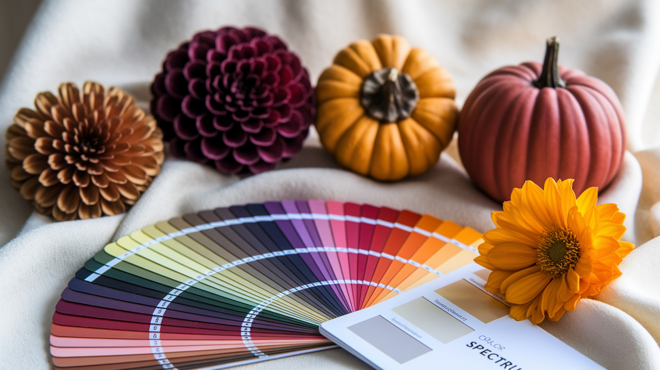
A Deep Autumn spectrum is warm, rich and intense, designed to compliment skin, hair and eyes with rooted depth. It's best when the neutrals & statements & accents are a symbiotic set across your wardrobe/makeup/decor.
Make a mini swatch set on card or a digital chart to remember selections and maintain looks cohesive at a glance.
Foundational neutrals
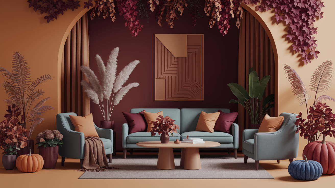
Think chocolate brown, olive, camel, warm taupe, and deep beige to begin with. These ground the palette and resonate autumn earth, tree bark and dry grass, which pair nicely with vibrant hues.
Utilize them for pants, sweaters, jackets, leather products, couches and carpets. They establish a zen foundation that allows bolder shards to glimmer without clatter.
They transition effortlessly from dressy to formal. A camel blazer, olive chino or taupe dress transitions from day to night with a shoe change.
Really make a two bottoms in chocolate and olive, twotops in taupe and beige, one camel layering capsule, with your leather belt and bag to match.
Statement colors
Burnt orange, deep teal, mustard yellow and forest green add punch without breaking harmony. They resonate with spice hues and brooding forest greens, which is why Deep Autumn complexions can handle saturation.
Stick them on coats or dresses or knit sets or a feature wall! A pumpkin scarf with a camel coat, or midnight teal slip under a chocolate blazer, reads bold yet balanced when anchored by neutrals.
Pair one with one or two neutrals to keep focus. Too many bold colors together are like too many voices together – they compete, especially around the face, and can overwhelm the eye.
- Burnt orange: cardigans, scarves, ceramic vases
- Deep teal: slip dresses, velvet pillows, tiled backsplashes
- Mustard: boxy knits, lamp shades, table linens
- Forest green: tailored coats, wool trousers, accent wall
Accent shades
Rich burgundy, copper, warm gold and deep fig purple provide tiny bursts of highlights or shadows. They function in earrings, belts, watchstraps, lipstick, nail color, cushion piping, lamp bases, drawer pulls.
Rotate seasonally. Copper and gold seem bright in summer light. Burgundy and fig bear winter evenings. Wine is for occasions. Aubergine is for creative offices.
| Accent shade | Best use in fashion | Best use in interiors |
|---|---|---|
| Burgundy/wine | lipstick, suede boots | throws, artwork frames |
| Copper | jewelry, belt hardware | table lamps, planters |
| Warm gold | hoop earrings, clutch | mirrors, drawer pulls |
| Deep fig purple | silk scarf, blouse | cushions, bedspread trim |
Colors to reconsider
1. Icy pastels: swap mint and baby pink for olive and ripe aubergine. Pastels wash out warm depth.
2. Cool grays: trade for warm taupe or mushroom. They keep harmony with skin undertones.
3. Stark black and pure white: choose chocolate or deep beige. High contrast can look harsh.
4. Electric neons: skip them entirely — and while you're at it, steer clear of Digital Lavender and Millennial Pink. These trending shades are the fastest way to wash out the deep autumn color palette's natural warmth and richness. Instead, reach for rust, pumpkin, or deep mustard: high-saturation hues that stay true to the best colors for deep autumn skin tone and make your complexion genuinely glow.
5. Cool blues and pinks: move to midnight teal and brick rose. They echo forest shade and spice.
How to master your style
Deep Autumn lives in the warm, deep and muted side of the 12 season system. Master it and you know your undertone, hair, and eye depth, then coordinate your picks across clothes, makeup and accessories. Found your palette in olive, camel, chocolate and deep olive green and then accessorize with rich accents.
Record what works, snap outfit shots and jot down color combos you adore.
Wardrobe building
Start with neutrals that match the season's warmth and depth: olive, camel, espresso, charcoal-brown, deep navy (not ink), and warm taupe. Forget harsh black and icy gray, they dull skin and fight for top billing with your face. Punctuate with statement pieces in spice tones like rust, cinnabar, paprika, mustard, bottle green, teal and aubergine.
A rust blazer elevates a camel knit, a teal silk shirt enlivens espresso trousers. Go for quality earth-tone fabrics for wearability and comfort. Wool, cashmere, silk twill, brushed cotton, and suede drape well and retain color.
Layer lightweight but warm pieces—merino, flannel shirts, quilted vests—to skate from late summer to winter without a full reset. Mix textures to deepen the palette: suede boots with a leather belt, a chunky wool cardigan over a smooth satin slip, corduroy with silk.
One hero texture and let the rest back it up. You don't want noise.
Checklist: camel coat, olive trousers, chocolate jeans, deep navy blazer, rust knit, mustard scarf, bottle green dress, aubergine skirt, leather belt in dark brown, suede ankle boots. Building a capsule wardrobe around the deep autumn color palette is easier when you shop with intention — brands like Reformation and Everlane consistently deliver the rich earth tones and deep autumn browns that define this season. Use a capsule wardrobe app like Indyx to input your autumn deep color palette hex codes and filter purchases by undertone, so every new piece integrates seamlessly. This approach makes the best colors for deep autumn skin tone work harder across fewer, better items.
Makeup philosophy
Consider warm, earthy, and bright enough to complement your inherent intensity, especially for those with a dark autumn complexion. Shades like bronze, terracotta, and deep berry fit well within the dark autumn color palette. Soft smoky eyes in chocolate or olive, paired with a warm bronzer and a raisin lip, create a balanced look that showcases the beauty of dark autumn colors.
Steer clear of cool pink blush and frosty taupe — these shades fight against your warm undertones and can leave your complexion looking flat and ashy. For the best color for deep autumn skin, reach for MAC Chili (a cult-favorite for good reason), NARS Dolce Vita blush, and the Urban Decay Naked Heat palette. One insider note on MAC Chili: the formula runs on the drier side, so always apply a hydrating lip primer first — skip that step and you'll feel it by midday. A little prep goes a long way in keeping your deep autumn look polished from morning to night.
When selecting products, consider those that highlight your dark autumn hair and eye color. Fenty Sun Stalk'r bronzer in Caramel Cutie and Pat McGrath Bronze Seduction for rich shimmer are excellent choices to elevate your autumn wardrobe and accent colors for the season.
Perfect patterns
Pick motifs that echo the season: foliage, vine florals, plaid, paisley, small animal prints in warm hues. Dark bases—chocolate, deep olive, midnight brown—provide depth and cohesion.
Mix prints carefully! Pair scale and texture, not just color: a small houndstooth blazer over a large floral dress in rust and bottle green. Keep a palette steady to avoid clash.
Make a moodboard with fabric swatches, runway stills and home accents like terracotta throws or olive cushions. Viewing the big picture makes decisions seem coherent.
Jewelry choices
Gold, bronze, and copper remain the ultimate metals for the deep autumn color palette — these warm, rich finishes work in perfect harmony with the season's characteristic undertones, making skin look luminous rather than washed out. Antique and hammered textures add depth that suits the autumn deep palette beautifully. If you love silver or platinum, you don't have to give it up entirely: the key is layering. Keep antique gold closest to the skin as the dominant metal, then introduce aged or oxidized silver as a secondary accent further from the face — this way the warmth stays where it matters most. This approach to deep autumn color combinations is one of the smartest ways to embrace the mixed metals trend of 2026 without compromising your natural glow. For gemstones, lean into the colors that mirror autumn light itself: amber, tiger's eye, garnet, smoky quartz, citrine, carnelian, and green jasper all echo the best colors for deep autumn skin tone and feel completely at home within the autumn color palette.
Add wood beads, leather cords, horn or clay for a grounded note. Classic styles: signet rings, coin pendants, hoop earrings in brushed gold, cuff bracelets with warm stones, chain necklaces in medium weight, and vintage-look brooches on camel coats.
Scale is important with body shape and features, so you want to complement your lines with appropriately sized jewelry that serves you.
The psychology of your palette
Deep autumn tones—dark, warm, rich—trigger your brain to interpret warmth, stability, and ease. Earthy browns, olive, rust, and deep teal all feel grounded because they mirror soil, bark, and dusk light. The impact: calmer heart rate, gentler concentration, rootedness.
In seasonal color analysis, Deep Autumn resides where warmth and depth collide. Folks of this season frequently exchange harsh black and white for olive, camel, espresso, and warm navy to appear put together, not drained. Color decisions define attitude and identity, so deploy them purposefully at home, at work, and on your body.
Emotional resonance
Deep autumn hues cultivate coziness and security by resonating with natural protection. Tobacco brown walls and a moss throw make a room feel safe, not sleepy. On the body, a camel coat or walnut leather bag surrounds the face with serenity.
Tone rooms in communal areas with these hues. In a studio or office, a russet accent wall with warm white (not blue-white) softens glare and stress. Deep tones inspire contemplation and calm innovation.
Experiment with deep teal for concentration areas, aubergine for reading nooks and umber for creative corners. Emotional benefits people report include:
- More confidence and ease when shades complement natural coloring.
- Less anxiety from harsh contrast; softer blends feel kind.
- Feeling genuine, like your face and attire concur.
- Gentle warmth that supports rest and thoughtful work.
Cultural perceptions
In so many cultures, autumnal colors signify harvest and abundance. Consider grain, ripe fruit, spice, and clay — the palette keeps with food and soil and craft — which grounds in heritage and love.
Deep, warm colors signify luxury and heritage. Ox-blood leather, antique gold trim, dark walnut woods–these materials age well, so the hues read timeless rather than trendy. Seasonal festivals tend to lean on marigold, saffron, burgundy and deep green.
The colors cue connection and tradition, which is why they seem societal as well as individual. To weave meaning into choices, pair color with motif: olive with geometric borders, rust with handwoven textures, camel with subtle metallics that nod to craft lineages without copying them.
Branding impact
Deep autumn colors can communicate security and trust. Warm navy and espresso suggest dependable delivery. Olive and bronze imply down-to-earth mastery.
To come across as premium and timeless, employ low-chroma, warm-leaning colors, restrained contrast and natural textures. Matte papers, uncoated labels and copper accents work better than high-gloss neon.
Forget frosty blues and cold whites if you desire a coordinated statement. They can cool the tone and combat the warmth-driven narrative.
Practical guide:
- Logos: anchor in espresso or warm navy; sprinkle with rust or ochre highlights.
- Packaging: camel base, olive secondary, bronze foil for marks.
- Digital: off-white (warm), deep teal buttons, aubergine headlines.
- Photography: wood, stone, and fabric backdrops; golden-hour light.
- Wardrobe for founders: olive jackets, camel knits, deep teal shirts to align presence with brand.
How deep autumn compares
Deep autumn occupies the cozy, shadowed warmth of the autumn season, characterized by dark autumn colors. Our deep autumn is much more likened to this, as it prefers the earthy, low-glare color with remarkable depth and medium chroma. This dark autumn color palette complements individuals with dramatic dark features and a touch of warmth – typically dark brown to warm black hair, dark hazel or dark olive eyes, and warm undertoned skin. The main thing is black, the second is warmth.
| Palette | Temperature | Depth | Chroma | Hallmark Colors | Avoid |
|---|---|---|---|---|---|
| Deep Autumn | Warm-neutral | Very dark | Medium | dark brown, chocolate, warm navy, aubergine, maroon, brick red, dark olive, mustard | icy, pastel, cool pinks, light grays |
| True Autumn | Warm | Dark-medium | Medium | golden camel, rust, pumpkin, olive, warm teal | icy tones, stark black-white |
| Soft Autumn | Warm-neutral | Medium | Low | smoky taupe, dusty rose-beige, soft moss | high-contrast, bright, icy |
| Dark Winter | Cool-neutral | Very dark | Medium-high | black, ink navy, burgundy, emerald, fuchsia, icy accents | muted browns, warm mustard |
Versus true autumn
Deep autumn, compared to true autumn, is darker and just a bit more muted. It embraces shadow—chocolate, warm navy, dark olive—whereas true autumn prefers medium-value goldens like camel, pumpkin and warm rust.
Real autumn glows, deep autumn earth. Deep autumn has higher contrast in outfits and richer, heavier pigments than deep autumn. The finish feels polished, not sunny.
Key color differences:
- Deep autumn: dark brown, deep aubergine, warm navy, maroon, brick red, mustard, dark olive.
- True autumn: goldenrod, camel, pumpkin, warm coral, leaf green, butterscotch.
- Avoid for deep autumn: anything too cool, too light, or overly muted.
Versus dark winter
Dark winter is cooler and more neutral, deep autumn stays warm. They have in common their depth, but otherwise differ both in temperature and in chroma. Dark winter embraces crisp black, ink navy, emerald and pure burgundy with frosty undertones.
Deep autumn eschews the icy, jewel-like clarity, leaning earthbound and warm. If you have warm black or deep chestnut hair and dark olive or black-brown eyes, deep autumn's warmth will come across as natural. Deep winter's cool fuchsia or icy pink can sap that warmth, while deep autumn's brick red or maroon injects some.
Overlap and exclusives:
- Overlap: very dark teal/inky navy (choose warmer for deep autumn), deep burgundy (muted for autumn, clearer for winter).
- Dark winter only: black, icy cyan, electric fuchsia, true emerald.
- Deep autumn only: dark olive, mustard yellow, aubergine, chocolate brown.
Versus other seasons
Deep autumn shuns high-bright coral, lemon and clear turquoise — those feel too playful and cool compared with spring. Against summer palettes, it bypasses pastels and gray-mixed shades that wash the face.
Compared to soft autumn, deep autumn is not as muted — it desires more heft and intensity even while remaining grounded. Deep autumns dazzle in deep browns, chocolate, mustard, dark olive, maroon, brick red, and warm navy.
Maintain hair depth and warmth – going light, cool or ashy can wash out your natural intensity. You can borrow a few shades of deep winter here and there, but avoid icy edges.
Main traits that set it apart:
- Warm-neutral temperature; very dark value; medium chroma.
- Earth before ice; depth before brightness.
- Higher outfit contrast than other autumns, softer than deep winter.
Conclusion
To sum it up, deep autumn is rich and bold. Colors sizzle brown and deep. Consider forest green, espresso, copper and deep teal. Skin appears clear. Eyes appear bright. Hair takes on dimension. Outfits seem powerful with low contrast. Gold prevails. Leather, suede and knit bring it to life. Prints keep it grounded. Makeup is warm and deep leaning. Bronzers glow Berry lips do it.
A snap check does the trick. Add a deep teal scarf. Check to see if the skin settles. Go for copper hoops. Alert if eyes open. Test espresso on black If you look hot, you discovered your lane.
Prepared to construct your set? Start with one hero shade, like pine or rust. Toss in one neutral staple, like camel. Send over your selections or request a swift revision.
Frequently Asked Questions
What defines the Deep Autumn color palette?
Deep Autumn is characterized by rich, warm hues and dark autumn colors. Imagine deep olive, espresso, auburn, teal, mustard, and brick red, all of which enhance the dark autumn palette's opulence.
How do I know if I'm a Deep Autumn?
You probably have warm undertones, dark autumn hair, and deep autumn eyes. Your most flattering neutrals are dark browns, deep olive, and warm charcoal, while gold jewelry enhances your dark autumn complexion better than silver. Cool pastels will wash you out, as a pro color analysis will tell you.
Which colors are must-haves for Deep Autumn?
Core colors for a dark autumn wardrobe include deep olive, forest green, and warm burgundy, while accent colors like paprika and burnt orange can enhance your dark autumn look. Neutrals such as warm charcoal and dark chocolate complement this dark autumn palette beautifully.
What colors should Deep Autumns avoid?
Skip the cool, icy or dusty pastels, and instead embrace dark autumn colors. Avoid harsh white; opt for creamy ivory and deep navy or espresso to complement dark autumn wardrobes. These choices enhance warm tones and create a more inviting atmosphere.
How can I build outfits with the Deep Autumn palette?
Begin with a deep neutral foundation, such as espresso slacks, perfect for a dark autumn wardrobe. Throw on a warm-colored top–rust or teal, complemented by a dark autumn color palette. Layer it with camel or olive, and complete with gold-tone jewelry and tan or cognac leather.
What makeup shades suit Deep Autumn?
Opt for warm, rich hues that complement your dark autumn complexion. Base with a golden undertone and consider bronze, olive, and deep teal eyeshadows. Blush in terracotta or warm rose, and choose brick, rust, or warm berry lipcolors.
How does Deep Autumn compare to Deep Winter?
Both are deep and high-contrast, with Deep Autumn showcasing dark autumn colors that are warm and earthy, like olive, rust, and camel, while Deep Winter features cool and clear tones, including jewel accents and sharp, clean black-and-white.