Low Contrast Face: Best Colors, Makeup, and Styling Guide
 Reviewed by Alexandra Gilmore
Find your facial contrast in daylight, then use tonal colors, soft definition, and value-matched outfits.

A low contrast face occurs when your skin, eyes, and hair share a similar level of lightness or darkness, creating a soft, blended impression without stark boundaries. Very high-contrast color blocks, such as optic white against pitch black, can draw attention away from those features. Try tonal dressing, neighboring colors, medium-value neutrals, and softly blended makeup instead. This is a starting point, not a ban on bold color: the goal is to repeat the degree of contrast you enjoy seeing around your face. Check your own coloring in even daylight before choosing a palette.
Low contrast describes the relationship among features, not how light your skin is. A person with deep brown skin, dark brown eyes, and dark hair can have low facial contrast; so can someone with pale skin, light eyes, and blond hair. Here is how to recognize that relationship and turn it into practical clothing and makeup choices.
What Is a Low Contrast Face?
In color analysis, value means a color's position from light to dark, as described in the Munsell explanation of color value. Facial contrast is the difference in value between skin, iris, brows, and hair. If these features sit near one another on that scale, their edges appear softly connected. If dark hair and brows frame much lighter skin, the value gap is larger. Color intensity, or chroma, is a separate quality: two colors can be equally light but one muted and the other vivid.
Look beyond hair color names. “Brown hair” covers ash beige-brown through near-black. A hazel iris may be close in value to medium brown skin or may stand out clearly against it. Brows often create more contrast than the hair on your head. The overall impression depends on what surrounds your face today, including dyed hair, facial hair, glasses, and makeup. No numerical score can capture all of that, and a photograph is only a visual aid.
How to know your contrast level with a grayscale photo
Take a front-facing photo by a window in indirect daylight. Remove a strong color filter, keep your camera's beauty mode off, and include your hairline, eyes, and shoulders. Convert a copy to black and white. Compare the gray value of the skin at your cheek with your eyebrows, iris, and hair near your face. If the boundaries look gentle and the features remain close in value, low contrast is a useful working description. If hair or brows form a clearly darker frame against skin, you may be medium or high contrast.
Repeat with a second photo before deciding. Automatic exposure can lighten a dark face, flatten shadows, or change the apparent iris color. A naturally shaded eye socket is not proof of high contrast; move into more even light. When the answer is mixed, test garments beside your face. The full contrast-level guide can help you place a medium result between the two ends.
Check clothing before assigning a label
Hold a black-and-white pairing just below your chin, then swap to two colors close in value, such as taupe and cocoa or soft navy and slate blue. Keep fabric size, lighting, and position the same. Ask whether you notice the face first and whether the eyes stay defined. If the sharp pair seems to arrive before your features while the softer pair makes your face easier to read, lower outfit contrast is worth exploring. If both work, you may be comfortable with a wider range than the photo suggested.
Low Contrast vs High Contrast: Visual Comparison
Low and high contrast are ends of a visual range, not judgments about beauty or a person's background. The same individual can shift the impression with a haircut, brow tint, glasses, or a dark collar. Use the table as a decision aid for clothes close to the face; try the actual fabrics rather than matching yourself to a model.
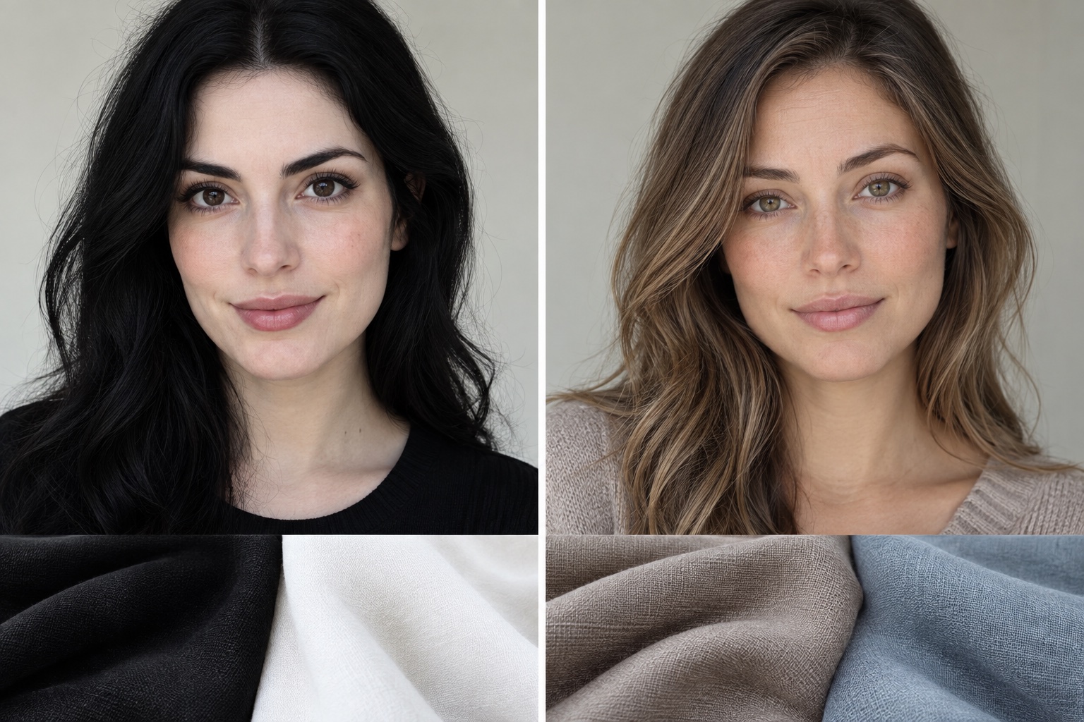
| What to compare | Lower facial contrast | Higher facial contrast | First outfit to test |
|---|---|---|---|
| Skin to hair and brow value | Nearby light-to-dark levels | Clear light-to-dark separation | Try taupe with cocoa, then white with black |
| Eyes within the face | Iris blends gently with surrounding features | Iris or dark lashes appear strongly defined | Compare soft blue-gray with crisp cobalt |
| Print near the face | Soft edges and small value steps often feel balanced | Bold light-dark motifs may echo the face | Compare a blurred print with a stark stripe |
| Makeup definition | Diffused edges can add shape without dominating | Graphic lines can repeat existing definition | Compare smudged brown with solid black liner |
The table describes likely starting points. A low-contrast face can wear a vivid color if its value relates well to the rest of the outfit, and a high-contrast face can wear a quiet monochrome look. Proportion matters too: a small bright earring is a different test from a large black-and-white collar. For the reverse case, see the high-contrast face guide and quiz.
Best Clothing Colors for Low Contrast Coloring
There is no single low contrast color palette for everyone. Start by matching the size of the value steps in the outfit to the gentle steps among your features. Then choose a temperature and clarity that suit you. A cool, softly colored person might test dusty blue, mushroom, mauve, slate, and soft navy. A warm counterpart might test oatmeal, camel, muted olive, clay, and cocoa. Someone whose coloring is clear rather than muted can still keep value changes modest while choosing fresher hues.
Choose face-framing neutrals by depth
For light low-contrast coloring, test ivory, light stone, pearl gray, pale denim, and soft greige. For medium coloring, try taupe, mushroom, cocoa, muted navy, or olive-gray. For deep low-contrast coloring, charcoal, espresso, ink navy, deep plum, and dark olive can form a smooth frame without forcing a bright white edge. “Medium-value neutrals” are a useful default for many readers, but the right midpoint depends on your own skin, hair, and outfit. Do not assume all low-contrast people must dress in beige.
Place each candidate directly below your face. Does it make the iris clearer? Does the jaw retain shape without the fabric becoming the first thing you see? Compare similar fabric textures so sheen does not change the result. For more ways to test a whole palette, the 12-season comparison chart separates value from warmth and chroma.
Build neighboring color pairs
Analogous colors sit next to each other on the color wheel, such as blue with blue-green or rose with mauve; Adobe’s color-wheel guide explains this relationship. They give you a noticeable color story while keeping transitions gentle. You can also choose one hue in two depths: dusty teal with deep teal, muted plum with smoky lilac, or clay with warm cocoa. Keep the face-framing piece in your best tested shade; use the deeper or brighter shade farther away if it feels too strong under the chin.
Prints work when the colors share a similar depth and their edges are not the entire visual event. Look for a small floral in two muted shades, a low-contrast check, or a watercolor pattern. If a black-and-white pattern is a favorite, break its edge at the neckline with a scarf, open jacket, or a solid color close to your face. The best colors for a low contrast face are the ones that preserve the face's definition, not a universal list of forbidden shades.
The Tonal Dressing Strategy
Tonal dressing repeats one color family in nearby values. Monochromatic dressing uses one hue or closely related versions of it; it need not be a single flat shade. A low-contrast face often feels at home with this rhythm because the outfit's transitions echo the soft transitions among skin, iris, and hair. A gradient outfit can still include light and dark pieces as long as the largest jump is not placed immediately around the face.
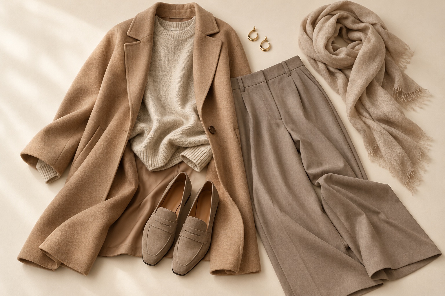
A three-piece tonal formula
Choose a top near your face in a flattering value. Add a layer one step lighter or darker, then trousers or a skirt another gentle step away. For example, an oatmeal sweater, camel jacket, and taupe pants make a warm light-to-medium run. A slate-blue blouse, smoky navy cardigan, and dark denim make a cooler medium-to-deep run. Repeat one color in a small accessory so the combination looks intentional.
Vary material to prevent a tonal outfit from looking flat: matte cotton against brushed wool, ribbed knit against smooth twill, or suede against polished leather. Texture creates interest without a harsh value jump. If you like a white shirt and black trousers, add a mid-value layer near the face, choose an off-white instead of optic white, or trade jet black for softened charcoal. These are styling options, not rules to erase a favorite outfit. The seasonal capsule wardrobe guide shows how to repeat such anchors across multiple looks.
How much contrast can an outfit include?
Start small. Try a dark bag, belt, or shoe before placing a very dark collar under your chin. A bright scarf might work if it is narrow, partly covered, or tied so your face remains the focus. Stand several feet from the mirror and notice where your eye goes first. Then take a closer look: do your eyes and brows still have definition? Contrast is adjustable through area, placement, and texture, so the answer need not be all or nothing.
Makeup Guidelines: Soft Definition Over Harsh Lines
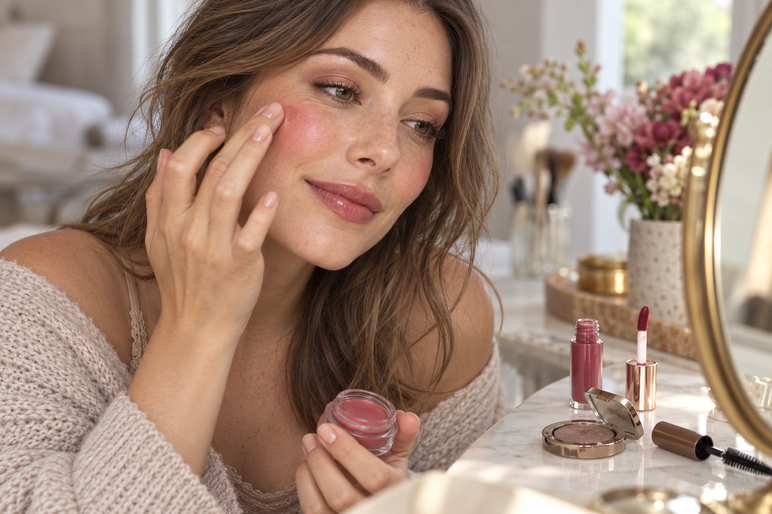
Low contrast makeup adds shape while keeping transitions blended. Begin with the features you already have rather than trying to manufacture a new contrast level. A cream blush in a natural rose, peach, or berry direction can blend into the skin without a sharp stripe. Choose color based on your undertone and preference, then apply a little at a time. A satin or softly diffused finish often keeps the face cohesive, while heavy opaque blocks can become the first feature you notice.
Eyes, liner, and brows
Try taupe, soft bronze, mauve-brown, or muted plum eyeshadow, depending on whether cool or warm shades suit you. Blend the outer edge. Smudge a brown, charcoal, or soft plum pencil close to the lashes instead of drawing a thick solid black wing. Brown-black or brown mascara may define light lashes gently; deep low-contrast coloring may still look natural with black mascara. Use a brow pencil close to your existing brow color and fill sparse areas rather than outlining a new dark shape.
Cheeks and lips
Choose blush that leaves a soft color transition across the cheek. For lips, a nude close to your natural lip depth, a rose-brown, or a sheer berry stain can work better than a sharply outlined opaque mouth when you want a low-key look. “Nude” must be matched to your complexion: a pale beige can look chalky on medium or deep skin. Blot the edge of a brighter lipstick if you want color without a graphic border. If you love a strong red lip, keep the rest of the makeup quiet and wear it intentionally; facial contrast is a styling clue, not a prohibition.
Try makeup in daylight before deciding it is too strong or too faint. Phone cameras, bathroom LEDs, and ring lights alter the apparent saturation and depth. A softly defined face should still look like you at conversational distance.
Which Color Seasons Have Low Contrast?
Low facial contrast may appear in several seasonal palettes. Season names describe the overall balance of temperature, value, and chroma, not a single hair-eye-skin formula. Soft Summer often combines cool-to-neutral, muted colors with gentle value changes: smoky blue, dusty rose, and cool taupe are useful tests. Soft Autumn shifts toward warm-to-neutral muted shades such as soft olive, camel, and clay. The Soft Autumn versus True Autumn guide helps separate muted warmth from a stronger warm palette.
Light Summer can be low contrast through light, cool, delicate values even when its colors are fresher than Soft Summer's. Light Spring can also show a close value range among lighter warm features, while its best colors may be clearer and more luminous. That distinction matters: do not automatically place every low-contrast face into a muted season. Compare a soft fabric with a clearer one at nearly the same depth. If the clearer one brings your eyes forward, preserve the light value relationship and test more clarity.
A person with deep skin and similarly deep hair and eyes can also have low facial contrast without belonging to these four commonly cited seasons. Look at draping results across all three dimensions before assigning a label. The Light Summer versus Soft Summer comparison is useful if your coloring is cool and you are unsure whether lightness or softness matters more. An interactive color analysis quiz can organize your observations and suggest a palette to test beside your face.
Low Contrast Styling FAQ
Can a low contrast face wear black or other dark colors?
Yes. Try black below the waist, in a small accessory, or under a softer face-framing layer. Near the face, compare it with charcoal, espresso, soft navy, or deep olive in the same light. Deep low-contrast coloring may handle dark shades especially well because the dark value is already present in the face. The issue is the size of the jump, not whether a color has a dark name.
What eyeglass frames suit low-contrast coloring?
Try translucent, tortoiseshell, soft metal, taupe, muted navy, or a frame near your brow and hair value. A thick jet-black frame can become the strongest line on a soft face, which may be exactly the effect you want. Compare thin and thick frames from a few feet away. Fit, shape, and comfort matter as much as color.
Will changing my hair color change my contrast level?
It can. Darkening light hair or brows increases the value difference against lighter skin; lightening hair can reduce it. But undertone, eye value, hair placement, and root growth still matter. Before a permanent change, hold a wig, fabric, or digital mockup near the face in consistent light. A dramatic dye can be a valid style choice even if it changes your natural contrast.
Is low contrast the same as muted coloring?
No. Low contrast refers mainly to small light-to-dark differences among facial features. Muted describes color intensity: a muted color looks grayer or less saturated than a clear color. A person can have low value contrast and still look best in clear light colors. Test value and saturation separately.
Can someone with deep skin have a low contrast face?
Absolutely. Deep skin with deep hair, brows, and irises may have close values across the face. Compare the features to one another rather than comparing the person to a light-skin example. Deep tonal outfits can be rich and distinct without a white or pale accent near the face.
What should I try first if I am unsure?
Take a grayscale daylight photo, then try one close-value outfit and one sharp-value outfit at the same mirror. Note which makes your eyes and facial outline easier to notice. If the result repeats, use that contrast range for your next top or scarf. If it remains mixed, keep both options and explore temperature and clarity with the color analysis quiz.
💫 Discover Your Complete Color Palette
Ready to discover all the colors that make you look radiant? Our comprehensive color analysis will reveal your complete personal palette - perfect for hair, makeup, and wardrobe decisions.
Find My Color Palette →