Skin Undertone Test at Home: 5 Easy Checks
 Reviewed by Alexandra Gilmore
Test your skin undertone at home with controlled foundation and fabric comparisons, then use jewelry, white paper, and veins as supporting clues. Follow five steps, score mixed results, and know when neutral or olive may be the better working answer.

Skin Undertone Test at Home: Quick Answer
The most reliable skin undertone test at home is a series of controlled comparisons, not one shortcut. Remove makeup, stand in indirect daylight, and compare warm, cool, neutral, and—when available—olive foundation swatches at the same depth. Then compare matched warm and cool fabrics near your face. Use gold and silver, white paper, and vein color only as supporting clues. Choose the result that repeats across tests and makes the face and neck look most even.
Once you have a stable undertone direction, compare it with a broader season guide: the True/Warm Autumn palette guide and the Cool/True Winter palette guide show how undertone combines with depth, chroma, and contrast.
If foundation repeatedly looks orange, pink, or gray even when its depth seems right, undertone may be the missing part of the match. This guide gives you a five-test sequence you can complete with items you already own, plus a simple way to record mixed results without forcing yourself into the wrong category.
💫 Discover Your Complete Color Palette
Ready to discover all the colors that make you look radiant? Our comprehensive color analysis will reveal your complete personal palette - perfect for hair, makeup, and wardrobe decisions.
Find My Color Palette →📚 Recent Articles
Prepare for an Accurate Home Test
Set up once so every comparison uses the same conditions. Test on a day when your skin is not sunburned, freshly exfoliated, or temporarily flushed. Remove foundation, concealer, bronzer, self-tanner, and strongly colored lipstick. If dyed hair reflects color onto your face, pull it back. Wear a neutral gray, beige, or white top, or cover your neckline with a neutral towel.
Stand near a window in bright indirect daylight. Turn off warm bathroom bulbs and cool overhead LEDs. Direct sun is too changeable and can create hard shadows. If you take photos, keep the camera, distance, exposure, and white balance fixed; otherwise the phone may “correct” each image differently.
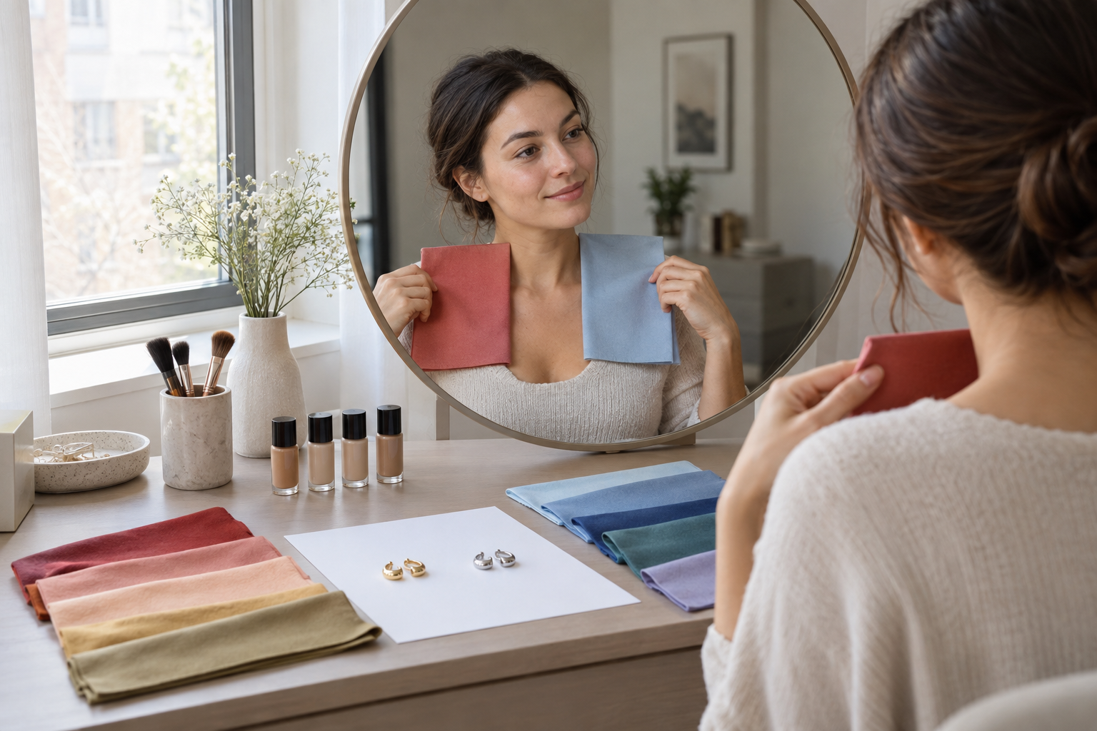
Gather two similar fabrics—one warm and one cool—plus foundation samples at the same depth, plain gold and silver jewelry of similar size, uncoated white paper, a mirror, and a note on your phone. Judge the skin around the eyes, mouth, jaw, and neck. The useful option tends to make shadows, redness, and grayness less noticeable; the less useful option may look separate from the face even when you like the object itself.
Five Skin Undertone Tests to Do at Home
Run the tests in this order. The first two compare color directly beside the face and deserve the most weight. The remaining three are supporting checks. Record warm, cool, neutral or close, olive possible, or unclear after each test.
1. Compare Foundation Undertones Along the Jaw
Choose neighboring shades from one formula at the same depth: warm or golden, cool or rosy, and neutral. Add an olive option if the range offers one. Draw narrow stripes from the lower cheek across the jaw toward the neck. Let them dry for 10 to 15 minutes because some formulas deepen or shift as they set.
Look for the swatch that recedes into both face and neck. If the warm shade turns orange, it may be too yellow or saturated. If the cool shade stays visibly pink, it may be too rosy. If neutral looks gray while warm looks orange, an olive or muted neutral base may be worth testing. Do not change depth and undertone at the same time; a shade that is simply too light or dark cannot settle the comparison.
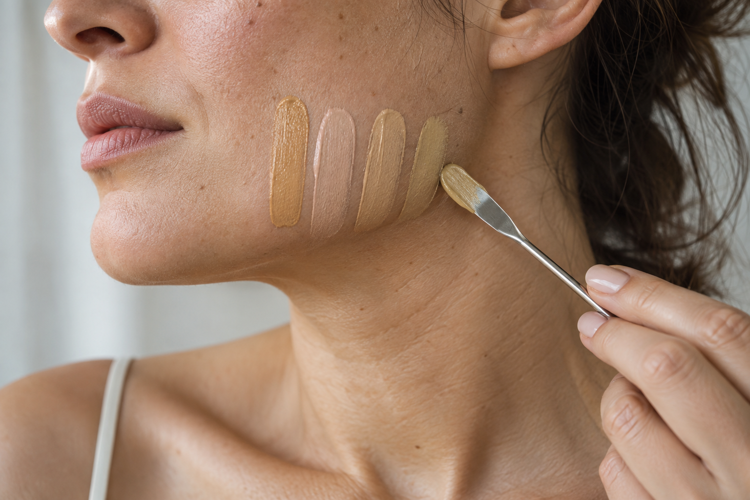
Record: the base that disappears most cleanly, plus any orange, pink, gray, or green-gray mismatch. Foundation labels differ between brands, so treat the result as evidence about this formula rather than a permanent label.
2. Drape Matched Warm and Cool Fabrics
Hold one fabric at a time directly under your chin. Use pairs with similar depth and intensity: cream versus crisp white, camel versus cool taupe, tomato red versus blue-red, or moss versus blue-green. Switch quickly while keeping your head and the light still.
Watch the face, not the fabric. Does one side make under-eye shadows stronger, emphasize redness, or disconnect the jaw from the neck? Does the other make the complexion look calmer and the eyes more defined? Repeat with at least three pairs. One favorite color is not enough; you are looking for a pattern across matched comparisons.
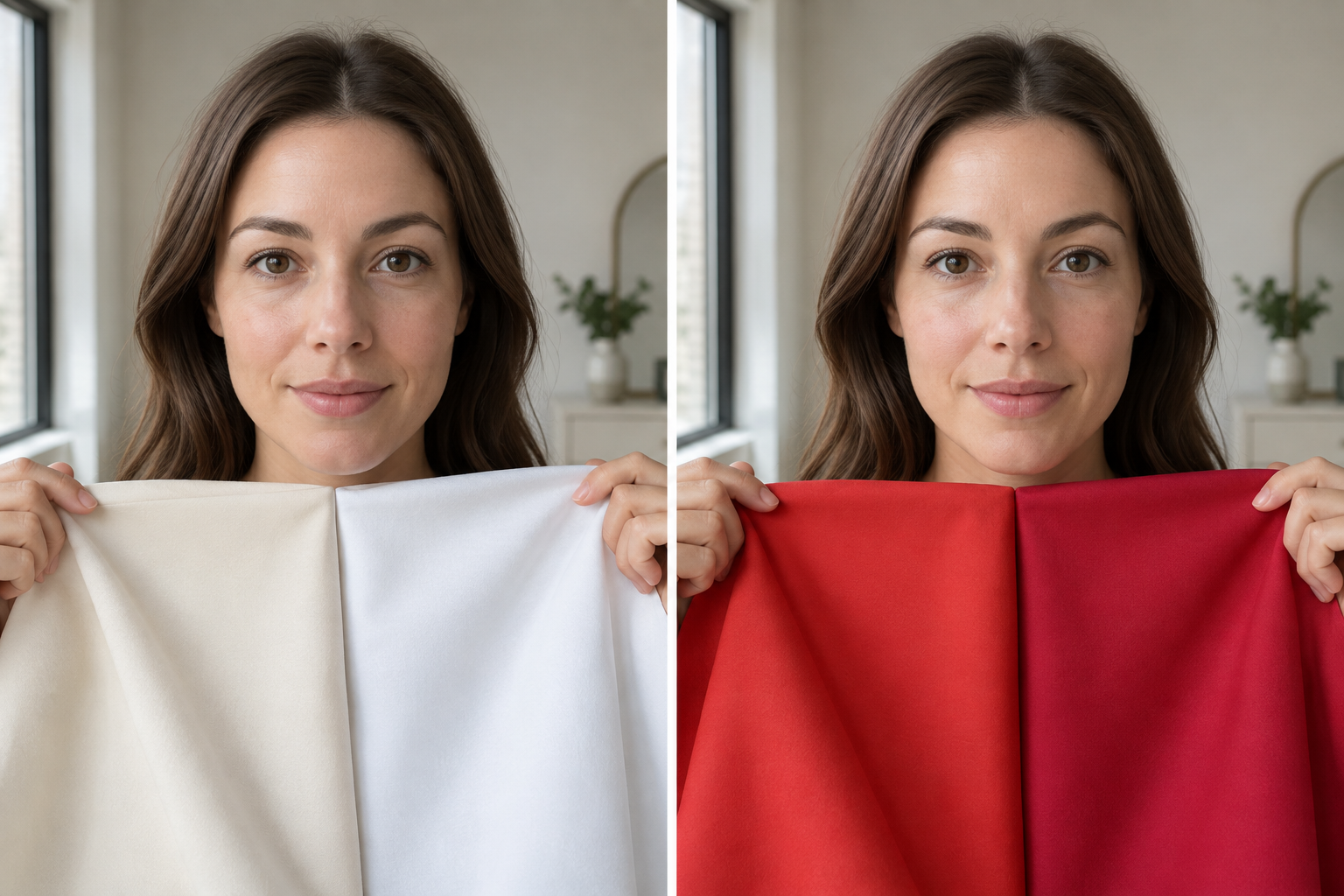
Record: warm if several cream, camel, tomato, or moss drapes improve the face; cool if several white, cool taupe, blue-red, or blue-green drapes do; neutral or unclear if the result changes with depth or intensity. For the concept behind these categories, use the separate skin undertone guide; keep this test focused on visible comparisons.
3. Compare Gold and Silver Jewelry
Place plain yellow-gold and silver-colored pieces beside the face. Keep their size, shine, and shape as similar as possible. A large polished hoop will attract more attention than a tiny matte stud regardless of temperature. Compare one metal, switch to the other, then reverse the order to reduce first-impression bias.
Gold may support a warm result when it looks integrated and the skin stays even. Silver may support a cool result when it looks cleaner and does not deepen shadows. If both work, neutral is possible—but finish, contrast, hair color, and personal taste may also explain the tie. The focused gold versus silver test shows how to control those variables.
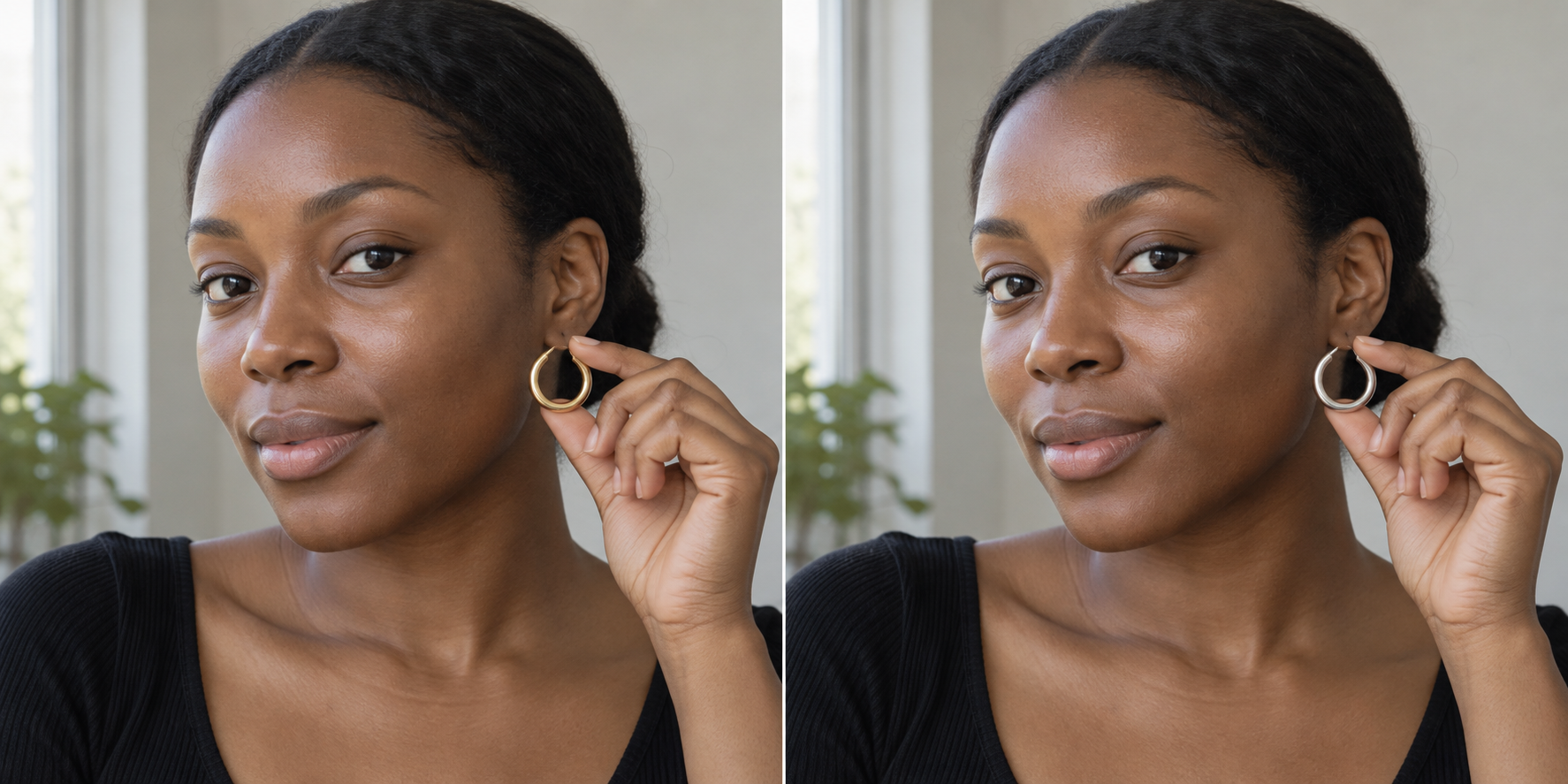
Record: gold, silver, both, or finish-dependent. Give this result less weight than foundation and fabric because jewelry differs in more than color temperature.
4. Use White Paper as a Reference
Hold a sheet of uncoated white paper beside—not in front of—the jaw. In neutral daylight, the reference may make a pink-red, yellow-golden, or green-gray cast easier to notice. Check the neck and upper chest as well as the face. If the face appears pink but the neck does not, temporary flushing or surface redness may be influencing the reading.
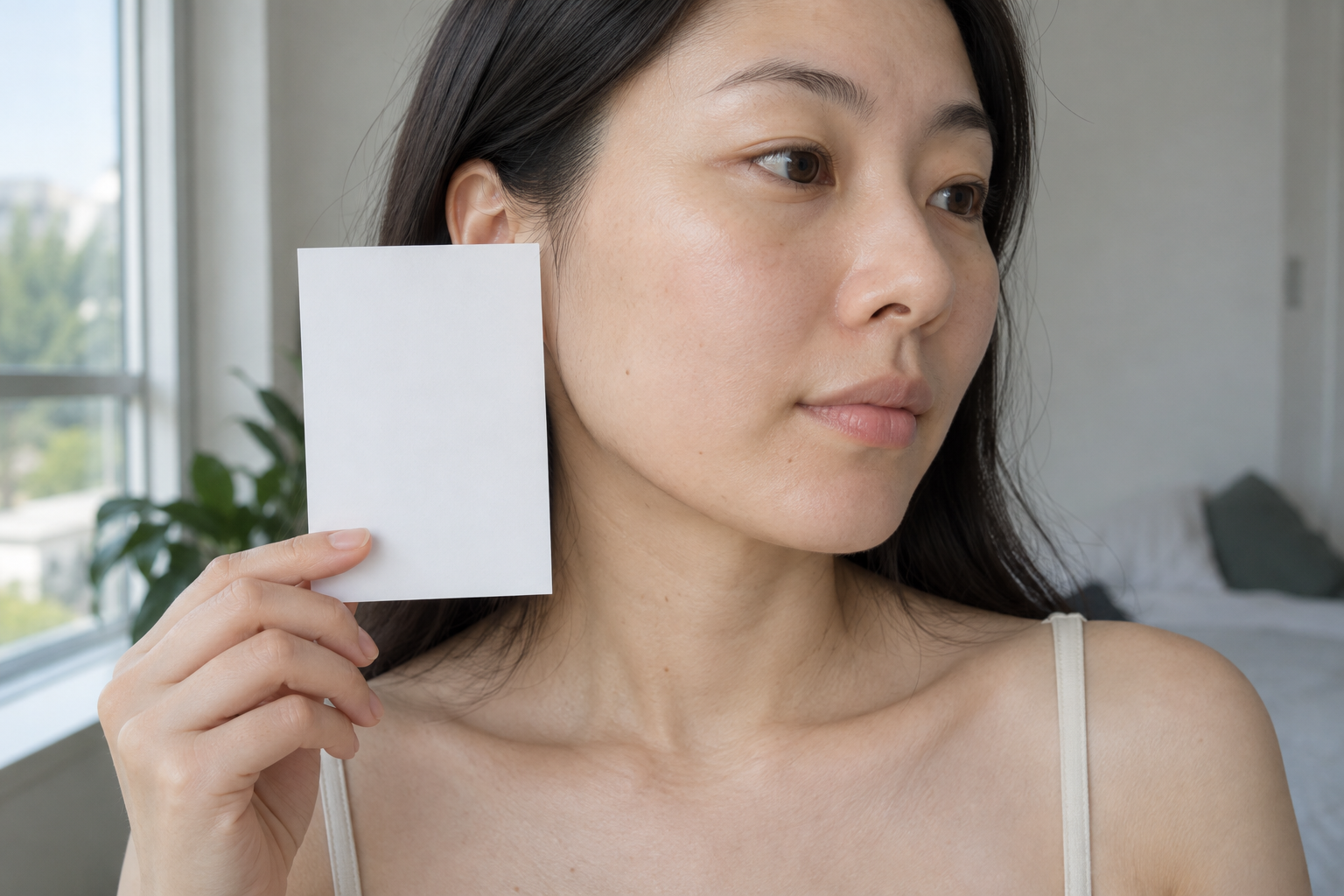
Paper is a reference, not an answer key. Wall color, reflected clothing, the paper's own blue or cream cast, and your eyes' adaptation can change what you see. A skin-tone assessment review identifies lighting, body location, flushing, and pigmentation conditions as important sources of variation (peer-reviewed review in dermatology research).
Record: the cast you observe and whether it repeats across face, neck, and chest. Mark the test unclear if the areas disagree.
5. Check Vein Color as a Final Clue
Look at several visible veins on the inner wrist and forearm in daylight. Blue or purple can support a cool reading; green can support a warm reading; blue-green can fit neutral or olive coloring. Many people cannot place their veins in one category, especially through deeper pigmentation or when vessels lie farther below the surface.
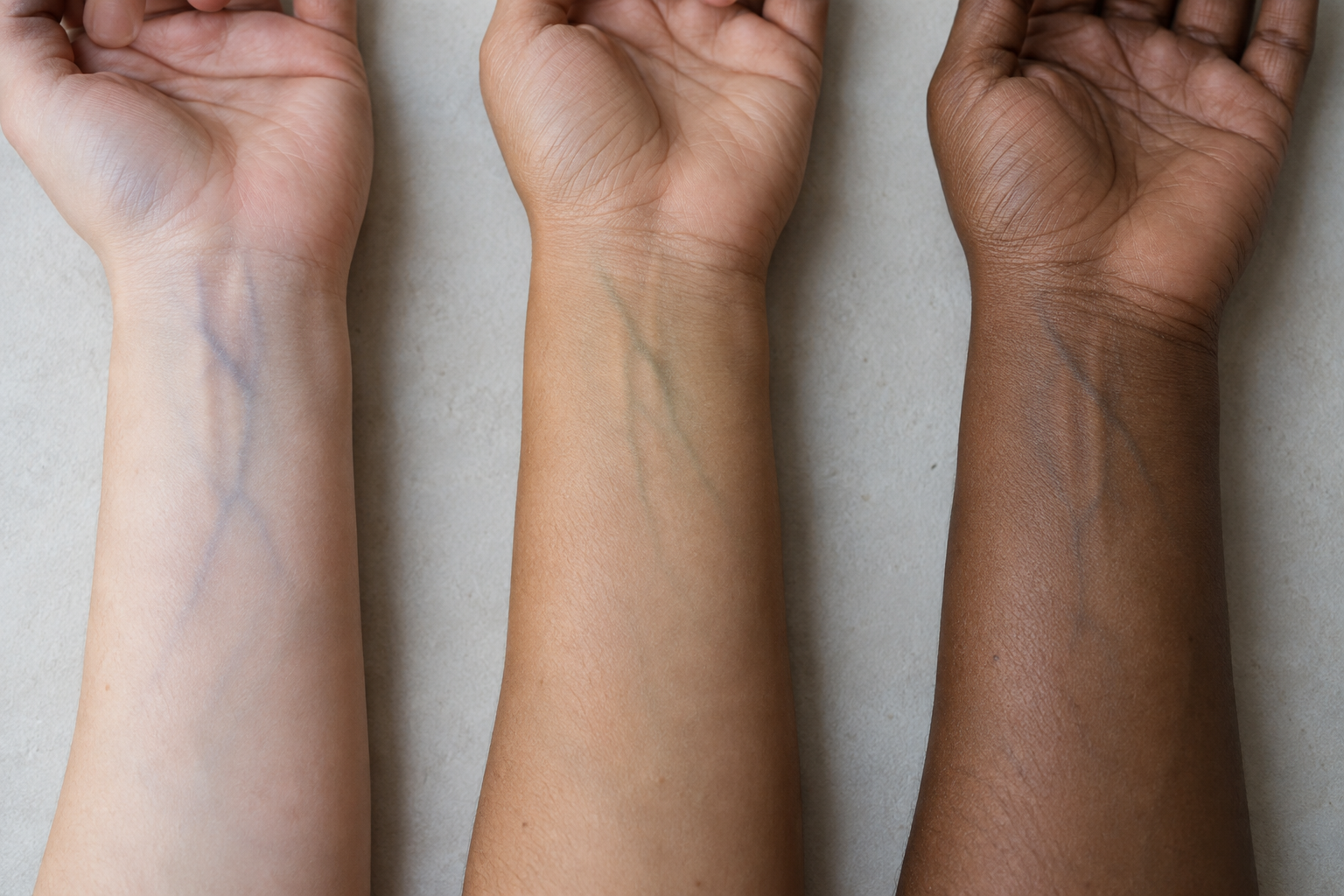
Veins do not reveal undertone directly. Their appearance comes from skin, tissue, vessel depth, light, and visual contrast. If this clue conflicts with your jaw swatches or drapes, prioritize the face-level comparisons. Read the full vein-test guide if this shortcut is the only reason you are leaning warm or cool.
Record: blue-purple, green, mixed, or not visible. Treat it as one low-confidence vote.
Score Your Undertone Test Results
Use a weighted result instead of counting every test equally. Give foundation and fabric two points each because they compare actual color near the face. Give jewelry, paper, and veins one point each. If a test is unclear, award no point. A warm or cool direction is more useful when it leads by at least two points and is supported by either foundation or fabric.
| Pattern | Working result | What to test next |
|---|---|---|
| Warm wins in foundation and several drapes | Warm | Golden or peach foundation; cream, camel, coral, and warm green fabrics |
| Cool wins in foundation and several drapes | Cool | Rosy or cool foundation; crisp white, berry, blue-red, and cool blue fabrics |
| Warm and cool stay close across direct comparisons | Neutral or flexible | Depth, softness, and contrast; neutral foundations and mixed metals |
| Warm looks orange, cool looks pink, neutral looks gray | Olive or muted neutral possible | Olive foundation bases and muted warm and cool drapes at the same depth |
| Only veins, jewelry, or paper produces a clear answer | Inconclusive | Repeat foundation and fabric in better light |
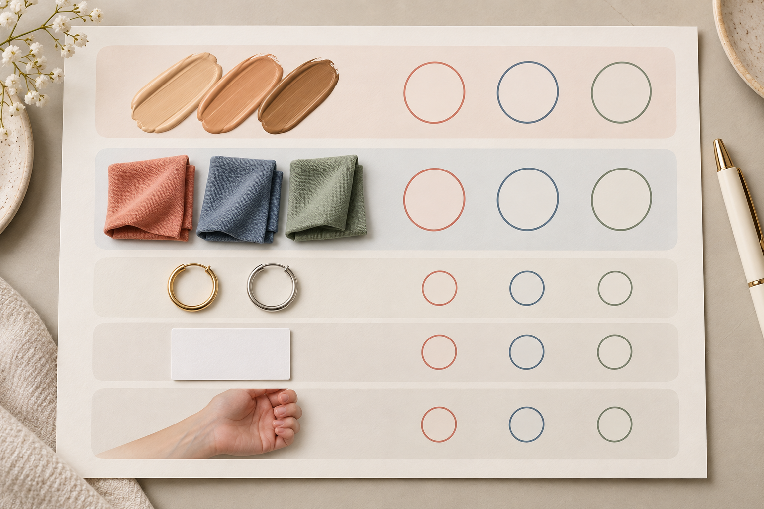
Neutral does not mean that every color is equally flattering. It means temperature is not the only or strongest variable in these tests. Olive can also lean warm, cool, or neutral. If the first round is close, repeat it on another day with different matched drapes rather than inventing certainty.
Avoid These Common Testing Mistakes
- Using one shortcut as a verdict. Jewelry, paper, veins, and sun response cannot establish undertone by themselves.
- Testing in mixed light. Window light plus warm or cool bulbs can cast different colors across the same face.
- Comparing unmatched objects. A bright cobalt fabric and muted camel differ in temperature, depth, and chroma.
- Judging the object instead of your skin. Preference matters for style, but it is different from observing changes in redness, shadows, and continuity with the neck.
- Reading ethnicity or skin depth as undertone. Fair, medium, tan, and deep skin can each be warm, cool, neutral, or olive.
- Using burning or tanning as the deciding test. Sun response is used in skin phototype frameworks, not cosmetic undertone. The FDA describes phototype through UV response; it does not make sun exposure a safe or accurate home undertone test.
Use Your Result for Foundation and Clothing
For foundation, match depth first and undertone second. Compare neighboring bases on the jaw, wait for them to dry, and check the face-to-neck transition. If a product disappears at first and turns orange later, oxidation or an overly warm base may be responsible. If it looks gray, it may be too light, too muted, or wrong in undertone. Because brands use warm, cool, neutral, and olive inconsistently, the undertone reference for foundation shopping is the next step for translating your result into product labels.
For clothing, start with color near the face. A warm result gives you a reason to compare cream, camel, coral, rust, and warm green. A cool result points toward crisp white, charcoal, berry, blue-red, and cool blue. Neutral and olive results often become clearer when you compare softness, depth, and contrast rather than insisting on a strict warm-cool split.
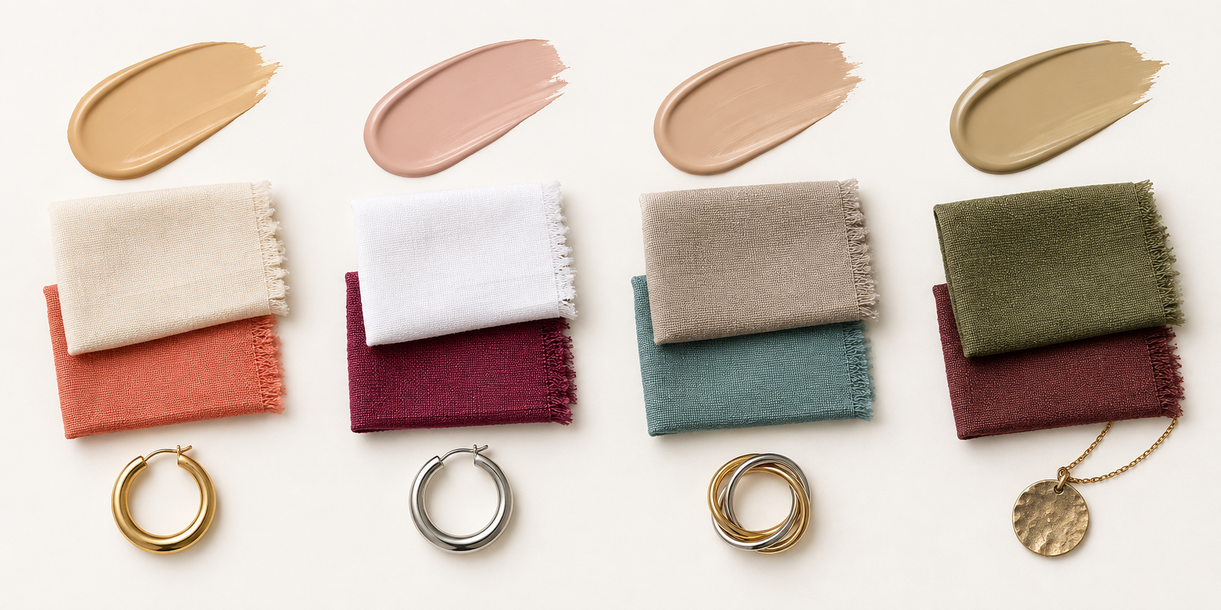
Undertone answers one part of a color decision. It does not determine your complete seasonal palette, which also depends on light-dark value, softness or clarity, and contrast. Save two or three winning fabrics and the best foundation swatch as physical references. They will be more useful when shopping than a label remembered without context.
Turn Your Test Result Into a Complete Palette
Combine your undertone evidence with the depth, softness, and contrast of your hair, eyes, and overall coloring.
Find My Color Palette →Common Questions: The Ultimate Color FAQ
What is the most accurate skin undertone test at home?
Matched foundation swatches and controlled fabric draping are the most useful home checks because they compare real color beside the face. Use both, repeat them in indirect daylight, and treat jewelry, white paper, and veins as supporting clues rather than separate verdicts.
How do I know if my undertone is warm, cool, or neutral?
Compare warm and cool options at the same depth and intensity. Repeated wins for golden or peach foundation and warm drapes support warm; rosy foundation and cool drapes support cool. If neither direction wins consistently, neutral, olive, or an inconclusive test is more useful than a forced label.
Can deep skin have a cool undertone?
Yes. Visible skin depth does not determine undertone. Very fair through very deep skin can lean warm, cool, neutral, or olive. Compare foundation bases and fabric temperatures directly instead of inferring undertone from complexion depth or ethnicity.
Why do undertone tests give me different results?
Lighting, surface redness, olive coloring, unmatched test objects, and the limitations of jewelry, paper, and veins can create disagreement. Repeat the face-level foundation and fabric comparisons first. If they stay close, record neutral or unclear and test depth, softness, and contrast next.
Does undertone change after tanning?
Tanning changes visible depth and can make a previous foundation shade stop matching. The broader color relationship called undertone is often more stable, but it may become harder to read while surface color is changing. Retest products at your current depth and do not use intentional UV exposure as a test.
Can an online undertone test use a selfie?
A selfie can organize observations, but auto white balance, exposure, filters, screen settings, and reflected wall color can shift the result. Use indirect daylight, include the neck, turn off filters, and confirm any digital result with real foundation or fabric comparisons.