What is Your Contrast Level? A Guide to High and Low Contrast Coloring

Key Takeaways
- Your contrast level — the degree of difference between your skin tone, hair, and eye color — is what determines whether bold makeup reads as striking or overwhelming on you. Before you run the classic B&W photo test to find out if you're high or low contrast, turn off Auto-HDR on your phone: that setting quietly smooths out value differences and will throw off your entire contrast level color analysis. Switch to Pro or Manual mode, disable HDR and Auto Enhance, then shoot in natural daylight for an accurate read on your contrast scale.
🎨 Take Your Color Analysis Quiz
Ready to discover your complete color palette? Take our comprehensive color analysis quiz to identify your seasonal type and get personalized color recommendations that perfectly complement your natural features.
Take Color Analysis Quiz →- Locate your contrast with our photo test, value scale in gray tones, feature check, and easy score card. See whether your results are more like the low, medium, or high contrast examples for comparison.
- Low contrast favors subtle mixes and soft fades where high contrast feeds on clean cut light-dark couplings. Medium contrast falls in the middle and looks great in balanced, medium-depth colors.
- Use your contrast each day by coordinating color intensity to your degree in makeup, clothing and hair. Test it out in natural light, and play with the contrast for various scenarios like work, occasions, or pictures.
- Go ahead, with quick actions today. Take a neutral, natural-light picture, desaturate to black and white, observe feature discrepancies, apply a scale, sum up your score, list three signature colors that correspond to your tier.
- Add on contrast or color season for a custom palette. Reassess your contrast after things like coloring your hair, tanning, or aging to keep your selections up-to-date.
Your seasonal palette might be spot-on — and you still look washed out in photos. Here's why: most people discover their color analysis contrast level using a selfie taken with Auto-HDR cranked up, which quietly smooths out the very differences that define your contrast scale. Before you decide whether you're high or low contrast, switch your camera to manual mode and kill the AI enhancement. The real question — am I high contrast or low contrast? — can only be answered honestly in neutral light, with a grayscale filter and zero digital flattery. Your contrast level measures the depth difference between your skin, hair and eyes on a value scale: a stark gap means high contrast coloring, a soft tonal blend means low. Neither is a flaw. You're not "too much" or "too subtle" — you just haven't calibrated your contrast level scale yet. Master it, and every outfit, every makeup finish, every color choice finally clicks into place.
Your seasonal palette might be spot-on — and you still look washed out in photos. Here's why: most people discover their color analysis contrast level using a selfie taken with Auto-HDR cranked up, which quietly smooths out the very differences that define your contrast scale. Before you decide whether you're high or low contrast, switch your camera to manual mode and kill the AI enhancement. The real question — am I high contrast or low contrast? — can only be answered honestly in neutral light, with a grayscale filter and zero digital flattery. Your contrast level measures the depth difference between your skin, hair and eyes on a value scale: a stark gap means high contrast coloring, a soft tonal blend means low. Neither is a flaw. You're not "too much" or "too subtle" — you just haven't calibrated your contrast level scale yet. Master it, and every outfit, every makeup finish, every color choice finally clicks into place.
High contrast types frequently have light skin and dark hair, whereas low contrast types exhibit gentle transitions throughout their features.
Medium contrast falls somewhere in between with obvious but not glaring transitions.
To simplify decisions, this flowchart dissects quick tests, sample swatches, and easy advice for everyday wear and snapshots.
📚 Recent Articles
What is makeup contrast?
Makeup contrast is the contrast between light and dark in your skin, hair, and eyes. Consider it the intensity your features 'pop' against each other. This concept, rooted in makeup contrast theory, provides the context necessary to determine what colors look natural on you and which appear loud. It has major implications for shade selection, placement, and finish across makeup and even clothing.
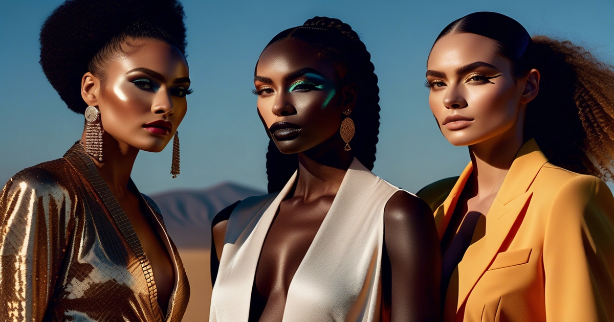
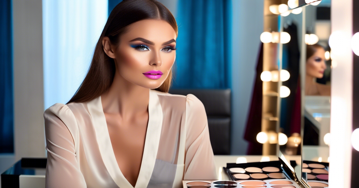
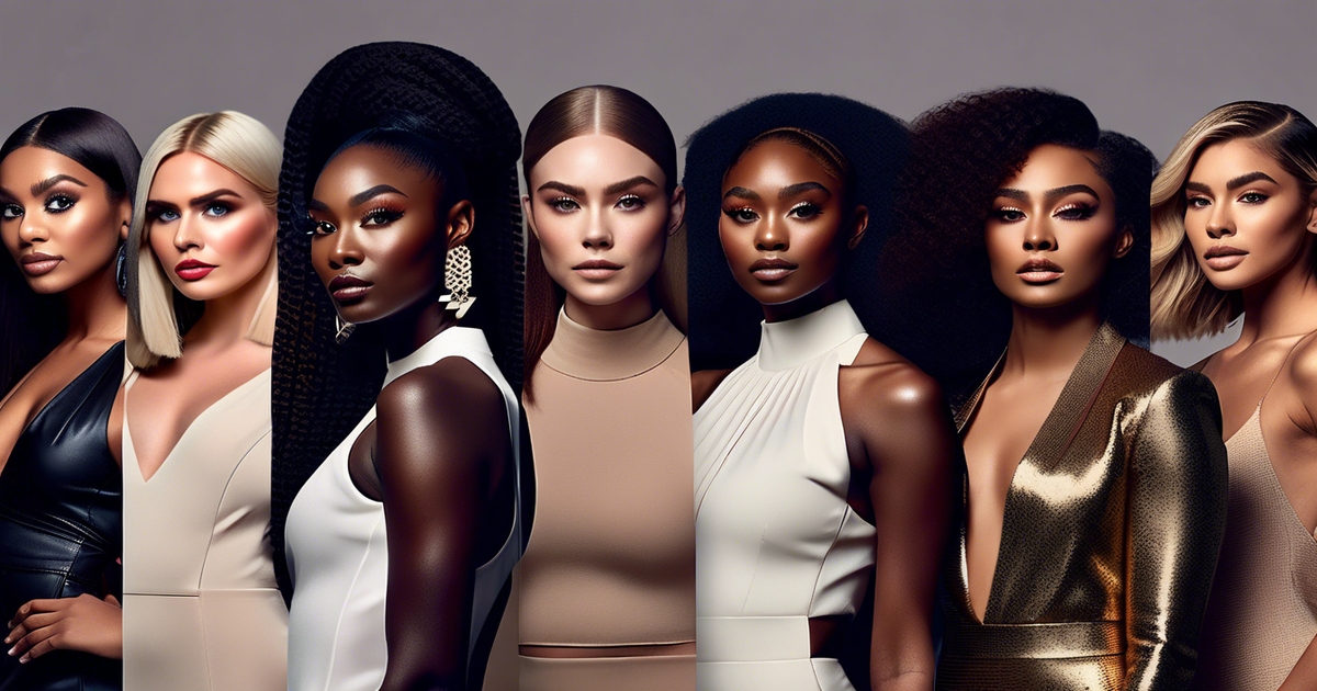
High, medium, and low contrast are three general levels of contrast levels. High contrast displays, such as fair skin with dark hair and dark eyes, create striking combinations. Anne Hathaway and Lily Collins are obvious choices. On them, deep black liner, rich berry lips, and crisp brows feel right at home.
Low contrast looks more blended, where the features are close in depth, such as light-to-medium skin with light hair and soft eyes, or deep skin with dark hair and warm brown eyes that all fall in the same value range. Medium contrast falls somewhere in between, with a constant blend of light and dark, like Zendaya and Emma Watson. Most folks land here, and can swing both soft and bold options with minor adjustments.
Why it matters: contrast guides harmony. If your natural contrast is high, makeup that echoes that space tends to read balanced—hello navy or charcoal liner, see-through red or plum lipstick, and illuminating touches that pull light areas forward around the eyes and cheekbones.
If your contrast is low, softer shifts read more refined—taupe or soft brown liner, muted rose or peach lips, and gentle gradients on lids. Medium contrast is supported by mid-depths—rust, mauve, truffle brown—plus one focal point, like a defined lash line or a medium-bright lip.
Where it shows up: every shade choice. Foundation has to match skin tone and undertone; contrast manifests more in color cosmetics. For eyes, match liner and shadow depth to your level: high contrast can take black or deep espresso; low contrast looks smoother with grey-brown or soft plum; medium contrast does well with chocolate, bronze, and moss.
For lips, high contrast glows with saturated shades (classic red, berry), medium contrast with mid-depth hues (brick, rosewood) and low contrast with low-saturation tones (dusty pink, warm beige). Brows follow suit: sharper definition for high contrast, soft fill for low.
How to gauge your contrast: stand in soft daylight, no makeup, neutral top. Squint your eyes to soften the detail. Pay attention to how far your hair and eyes 'leap' from your skin in terms of lightness.
Big jump = high makeup contrast, slight shift = low, in-between = medium. Take that read across makeup and fashion into account to pull together a well balanced, flattering look.
How to find your contrast level
Contrast is the value gap between your skin, hair and eyes. It directs how brash or muted your top colors should be. Begin by eyeballing value (light to dark), then verify with more than one technique for precision.
Use a checklist: neutral light; no makeup or bold dye glare; pull hair off face; wear a mid-value, neutral top; note whether features blend or pop. Use your natural coloring to locate yourself on a contrast scale as low, medium or high.
1. The photo test
To capture a nice clear picture in shade or soft daylight, position yourself in front of a mid-value background while wearing colors that suit your personal contrast levels. Avoid harsh shadows and turn toward the light for the best effect. By draping yourself in a neutral top, you can better assess your contrast sensitivity.
When you make the photo black and white, research how light your skin tone reads against your hair color and eye colors. If everything smudges together, you're likely at a low contrast level. Conversely, if your hair and eyes jump off your skin, that indicates a high contrast level.
Next, compare your picture to sample images showcasing low, medium, and high contrast. For instance, a bleached blonde with very fair hair typically scores high, while someone with medium brown skin, medium brown hair, and soft brown eyes often sits at a medium contrast level.
2. The value scale
Use a printed gray scale (0 = black, 10 = white) to compare each characteristic. Rate skin, hair and eye color. Write them down.
Calculate your value contrast by subtracting your lowest number from your highest. A spread of 0–3 = low, 4–6 = medium, 7+ = high. Create a small chart: rows for skin, hair, eyes; a final row for highest minus lowest.
For a quick rule of thumb, you can subtract skin from hair and eyes: a difference of 1 or −1 suggests low; 2 or −2 medium; 3 or −3 high. High value contrast can rock black and white with ease. Low value contrast might bypass stark pairs and hold colors within three values for harmony.
3. The feature check
Stand in front of a mirror and take them all in together. Do your hair and eyes nestle near your skin in value, or do they repel flinty hard?
Scan for color jumps: dark hair with light skin, very vivid eyes against muted hair, or very light hair framing deeper skin. These increase contrast.
Note any standout: inky brows, bright blue or green eyes, or pure white hair against medium skin. Getting older can throw this off as your hair goes grey or white, contrast tends to drop and softer palettes tend to work better.
4. The score card
Score points for value gaps and color gaps. Example: value gap 0–3 = 1 point, 4–6 = 2 points, 7+ = 3 points. Add 1 point if a feature color is markedly vivid versus the rest. Record skin, hair, eye values and any notes in an easy table.
Total your points: low, medium, or high. Save the card as a clothes/makeup cheat sheet. Low contrast prefers gentler fades, high contrast can bear bold, dramatic duos.
The three levels of contrast
Contrast is the difference between your lightest and darkest features—skin, hair, brows and eyes. There are three levels: low, medium, and high. As measured by value steps, from 0 (black) to 10 (white), low sits at around 0–3 steps apart, medium is 4–6, and high 7 or more.
This scale directs color selection in fashion and cosmetics, ensures looks stay within three values of each other for cohesiveness and tells you why B&W dazzles but soft beige-on-blush reads tender. Contrast can move with time as hair grays or darkens, so re-check when your features change.
Low contrast
Low contrast means your features are close in value—light skin, light hair, light eyes, or deep skin, deep hair, deep eyes with not much spread between. The result is silken smooth.
- Best colors: soft pastels, dusty hues, medium-light grays, oatmeal, taupe, sage, misty blue, rose-beige, soft navy, and gentle cream rather than stark white.
- Best styles: fine prints, low-contrast stripes, tonal layers, matte or satin textures, soft edges on collars and necklines.
- Makeup: sheer base, diffused brows, soft brown liner, taupe or mauve eyeshadow, petal or cocoa lips, satin blush.
Stay away from punishing combinations like black-and-white, neon brights or thick, high-contrast prints. They can drown out subtle changes in your expression. Aim for monochrome or near-tonal sets: sand top with camel pants; misty blue shirt with slate skirt; deep plum with raisin.
Celebrities: Michelle Williams (pale hair/skin), Saoirse Ronan, Dev Patel in tonal earths. If you've ever asked yourself am I high or low contrast, and the answer leans soft and tonal, you're in excellent company. Low contrast coloring is the quiet backbone of the 2026 quiet luxury aesthetic — think beige cashmere layered over taupe, or dusty rose paired with warm ivory. This is tonal elegance at its finest: no jarring extremes, just a seamlessly blended palette where every shade flows into the next. For makeup, skip the stark matte lip and lean into Cloud Skin — a dewy, diffused finish that mirrors the natural softness of low contrast features. The goal is harmony, not drama.
Medium contrast
Medium contrast sits in the middle: a 4–6 step gap, such as olive skin with brown hair, or medium-deep skin with dark eyes but not jet black. It looks balanced and flexible, so it plays nice with a lot of palettes.
Go for medium-toned colors and combine light with mid or mid with dark, not the polar opposites. In makeup and wardrobe, mirror that same equilibrium.
- Wardrobe: teal, forest, cinnamon, merlot, marine navy, soft white, charcoal, color-block light/mid or mid/dark.
- Prints: balanced florals, plaid with two to three close values.
- Makeup: defined brows, brown or charcoal liner, mid-tone eyeshadow, neutral-rose or berry lips, soft highlight.
- Extras: metallics in brushed gold or silver, not mirror-sharp.
This in-between range is extremely versatile. You can rock both cool and warm families according to undertone, and alternate between chic minimal sets and vintage prints.
Celebrities: Zendaya, Emma Watson, John Cho.
High contrast
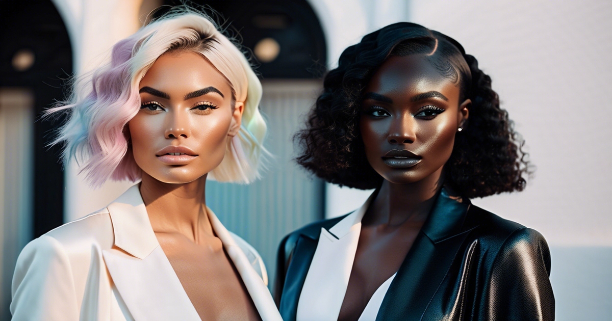
High contrast exhibits a distinct split—fair skin with dark hair, or deep skin with bright eyes or white teeth and dark hair framing. The value jump is a 7+ — like black-and-white.
Lean into bold, saturated hues and clear pairings: ink navy with optic white, crimson with charcoal, emerald with black, cobalt with snow. Graphic stripes, sharp collars, crisp suiting and glossy textures have their place.
Avoid muddy, grayish tones or mashed-together head-to-toe pastels – they silence inherent drama. Keep edges clear: winged liner, defined brows, red or plum lip, clean contour.
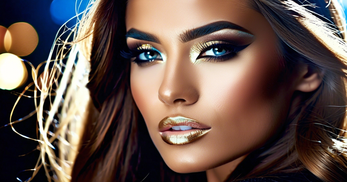
Celebrities: Anne Hathaway, Lupita Nyong'o, Keanu Reeves. The so-called "Anne Hathaway aesthetic" has become the ultimate reference point for high contrast coloring in 2026 — think striking dark hair against a luminous, light complexion, with features that command attention effortlessly. If you have a high contrast skin tone, the vinyl makeup finish is your power move: pair glossy, lacquered lips with a flawless matte base to let that natural contrast do all the talking.
Contrast beyond color seasons
Contrast is a distinct lever than traditional color seasons. A season refers to the color, value, and warmth-coolness that flatter your skin, eyes and hair. Contrast knows how far apart those colors should sit next to your face and across your outfit.
Two people can both be Summer, but one looks best in soft, close values and the other needs a clearer jump between light and dark. Use season as your map, contrast as the scale you dial up or down.
In reality, individuals within a same season frequently require varying contrast. Soft Summer is a low-contrast season, so outfits work best when edges aren't sharply bisected. Imagine misty blue and dove gray instead of navy and stark white.
Light Summer is soft leaning, but lighter, so keep shifts soft and diffused. In comparison, Dark Winter boasts Deep, Rich Contrast. Here, black-cherry with icy pink, or charcoal with crisp white, keeps the face contoured and vibrant. Both Winters, but the contrast targets aren't.
Let season select your hues, then adjust contrast level to suit your features. If your hair, skin and eyes are close in value, seek low to medium contrast. Wear adjacent values, such as medium-light with medium, for effortless accord.
If your features cover extreme values—dark hair, light skin, piercing eyes—lift the contrast with sharper leaps. When values vary, you can maintain the same hue in a soft mono style, light to dark, ombre flow, or combine one color with a neutral for crisp architecture.
Seasonal warmth influences how many colors you can pile atop one another. Warmer seasons – Warm Spring and Warm Autumn – can have more colors at once, without it being crazy. They have vitality in their palettes, so coral, leaf green and camel can co-exist, still grounded in warm balance.
Complimentary color schemes—opposites on the wheel—add perfect contrast when chosen inside your seasonal temperature: teal with warm coral for Springs, burgundy with pine for Winters. The 16 seasons system provides more nuanced controls, so you can fine-tune contrast within color palettes instead of adhering to general guidelines.
Contrast can be your signature. A Soft Summer may opt for a smoky trio—mauve, mist gray, soft navy—whereas a Dark Winter relies on one bold step—ink black with icy blue—plus neutral.
Overall, placing two colours of the same value, or two adjacent values, keeps ensembles serene and cohesive. Some days you turn contrast down for comfort; other days you turn it up for impact. Both can suit your season and still feel like you.
How to apply your contrast
For help applying your contrast, take your personal contrast level—how your skin, hair, and eyes differ in lightness and depth—as a guide to color choices. A big gap = high contrast, a small gap = low. Analyze value contrast by comparing your lightest and darkest features: 0–3 steps is low, 4–6 is medium, 7+ is high.
Pair the intensity of colors you wear to that degree for a grounded, harmonious appearance. Tune up or down for mood, location or season.
- Find your value contrast: note skin, hair, eye values, then measure the difference.
- Select makeup, clothes and hair colors that complement your contrast.
- For major occasions, add more contrast. For lazy days, tone it down.
- Test in daylight; colors shift indoors and on camera.
- Maintain focus on one strong area at a time.
For makeup
Begin by matching foundation to your skin undertone and depth so that it does not lighten or darken your face too much. This keeps your base consistent with your inherent contrast. Blush should echo the flush level your contrast can carry: high contrast takes clearer, more pigmented tones; low contrast does well with sheer, muted shades; medium contrast sits in between.
Eye makeup obeys the same principle—line thickness, shadow depth and mascara all need to increase with your level of contrast. High contrast benefits from bold lips and strong eye definition. Experiment with a true red lip, inky liner and crisp brows, as bold features can support a bold hue.
Low contrast suits softened, blended tones best—taupe lids, brown mascara, diffused liner and a rosy-beige lip, as well as gently softened brows to ground the face. Medium contrast thrives on equilibrium. Pair warm neutral colors such as terracotta or blush plum with a mid-tone liner. Leave either lips or eyes the focal point, not both.
Makeup is always good to check in natural light. Stand near a window or go outside to make sure the shades complement your total coloring and don't overwhelm you.
For clothing
Construct a closet that matches your contrast. This makes outfits feel grounded from head to toe and prevents the eye from straining. High contrast: clear light–dark shifts work well. Black and white, navy with ivory, or deep green with pale beige.
Low contrast: gentle blends. Try to stick to colors within about 3 value steps of each other so you don't get harsh jumps. Medium contrast: mix mid-depth colors and add a pop now and then—like charcoal with muted teal plus a saffron scarf.
| Contrast | Base + Top | Accent |
|---|---|---|
| High | Black + white | Red |
| Medium | Charcoal + teal | Saffron |
| Low | Dove gray + sand | Sage |
For hair
Go with hair colors that maintain or amplify your natural contrast, not combat it. Pair the intensity of your look so your face remains the center of attention. High contrast tends to work well with crisp, defined hair color—jet black, dark espresso, icy dark brown—with minimal lowlighting.
Skip super blended, muted tones that fuzz your edges. Low contrast appears best with gentle transitions. Consider soft frost 1–2 shades lighter than your foundation, or a glaze that imparts color without a pronounced value jump.
Medium contrast can navigate medium-depth shades—chestnut, dark blonde, or soft copper—with measured dimension that outlines the face without abrupt leaps.
Common contrast misconceptions
Contrast is more than just color season names or trend rules; it encompasses how your skin tone, hair color, and eye colors interact with light and patterns, influencing your outfit and makeup choices.
Dispel the myth that only color season matters—contrast level is equally important for flattering choices.
Seasonal palettes may assist, but contrast level determines how those colors resonate with you. What: the light–dark gap among your features. Why: our eyes read edges and pattern first, not color names. Where it shows: a charcoal jacket over a white shirt will look sharp on someone with dark hair and fair skin, yet can drown a person with light hair, light skin, and pale brows.
How to gauge: stand in daylight, squint a bit, and look at the jump from your hair to skin, and from eyes to skin. If big jump, you're higher contrast, if soft, you're low. Note: contrast is driven less by the ratio of two hues and more by spatial frequency—how busy or fine the edges are. Thick blocks (low frequency) come across softer, tiny checks or houndstooth (high frequency) read stronger, even in the same colors.
Clarify that high contrast makeup or clothing is not universally flattering; it must suit your natural contrast.
Bold black liner and stark lips can flatten low-contrast faces; they sparkle on medium or high-contrast faces. Medium to high contrast can manage prints of mixed contrasts and low-contrast folks look best in gentle blends, soft gradients, or one-color textured looks.
If it all feels too loud, tone down the lightest thing a bit—white to cream, or stark white teeth-baring gloss to a soft rose and the apparent contrast decreases.
Address the misconception that contrast only applies to makeup, emphasizing its role in clothing and hair.
Clothes: light text on saturated colors or in dark mode can fail practical contrast, much like the WCAG 2 method sometimes struggles to predict readability in those cases. Font weight matters too—a 400 weight is often perfect in good faces, and the same tip works with prints—medium strokes read clearer than ultra-thin or super heavy.
Hair: going from dark brown to light blond raises the skin–hair gap for some and lowers it for others, based on undertone and brow color. Select dye depth and highlight width to complement your face's contrast. But here's what most color analysis guides won't tell you — your microblading is lying to your color palette. Eyebrow microblading, lash extensions, and tanning don't just tweak your look; they artificially inflate your contrast level, skewing any high or low contrast face test you take. If your brows have been microbladed darker than your natural shade, your contrast level color analysis will read higher than it actually is. Same goes for a fresh tan: it compresses the skin–hair delta and can make a genuinely high contrast coloring appear softer and more blended. Before you assess whether you're high contrast or low contrast, strip it back — no filters, no enhanced brows, no post-beach glow. Your true contrast scale starts with what you were born with, not what your last salon appointment gave you.
Correct the belief that contrast level never changes, noting it can shift with age, hair color, or sun exposure.
Our perception changes as we grow older. The relationship between actual light and apparent lightness is complicated, and human 'perfect vision' differs—some are around 20/12 to 20/16, with 20/09 a record — so what reads 'clear' varies by eye.
Summer sun can deepen skin by a couple of tones. Hair can flake. Brows can gray. Recalibrate at each season. Not all of them — there's no one-size-fits-all. Test in the daylight, take pictures, and believe what strikes an equilibrium.
Conclusion
Contrast speaks volumes. Face, hair and eyes provided the tableau. Clothes and makeup either support it or battle it. High contrast adores striking duos such as black and white, precise liner, and well-defined brows. Mid contrast fares best with subtle gradations in tone. Low contrast glows with gentle gradients, luminous borders and crisp contours.
A quick check aids. Click a black-and-white picture. Notice the leapfrogging of features. Pair that step with your look. Experiment with a red lip on a high-contrast visage. Experiment with a brown liner on a low-contrast face. Notice the contrast immediately.
Ready to put your contrast level to work? Start this week: take a photo in natural light, apply a black-and-white filter to reveal your true contrast scale, then try on two outfits — one that matches your contrast level, one that fights it. Share both on TikTok using a value scale filter to see the difference instantly. If you use a styling service, drop your high or low contrast coloring result into the stylist notes — it's one of the fastest ways to build a capsule wardrobe that actually feels like you. Your color analysis contrast is the blueprint. Trust it, build on it, own it.
Frequently Asked Questions
What is makeup contrast and why does it matter?
Makeup contrast, which refers to the contrast levels of lightness and intensity between your features—skin, hair, and eyes—plays a crucial role in determining how hard or gentle your makeup choices should be. Matching your personal contrast levels enhances your natural beauty, making your face look balanced, defined, and vibrant.
How do I quickly find my contrast level at home?
To capture a good selfie in natural light, turn it to black and white. If your features display a high contrast level in luminosity, you're considered high contrast; if they blend softly, you're low. Moderate value contrast exists in the middle, highlighting the interplay between hair, brows, eyes, and skin tone.
What are the three levels of contrast?
- Low contrast: soft differences, gentle features
- Medium contrast: noticeable but balanced differences
- High contrast: strong light-dark differences. Pick foundation depth and eye shadow to compliment your level for synergy.
Does contrast replace color season analysis?
Contrast goes with color seasons, influencing your personal contrast levels. Seasons speak to you through color and warmth, while contrast indicates depth and intensity, guiding your choices in makeup shades and outfits.
How do I apply contrast in everyday makeup?
- Low: soft brows, tonal eyes, sheer lips
- Medium: defined brows, mid-depth eyes, medium lip color
- High: crisp liner, bold brows, saturated lips. Keep clothing values aligned too: match light-dark patterns to your contrast.
Can my contrast change over time?
Yes. Hair color transformations, including graying and tanning, can shift personal contrast levels. Re-evaluate after major changes to ensure your makeup choices, like eye crease and lip color, remain in sync.
What are common contrast mistakes to avoid?
- Matching high contrast with washed-out makeup
- Overpowering low contrast with heavy colors
- Ignoring brows—they set facial contrast
- Or matching makeup and outfit values for a sophisticated contrast