Soft Autumn Color Palette: Colors, Outfits, and Capsule Wardrobe
 Reviewed by Alexandra Gilmore
Soft Autumn is muted first and warm second, favoring colors that look sun-faded, grayed, or lightly browned. Combine mushroom, camel, olive, dusty rose, muted teal, terracotta, and cream at low-to-medium contrast, then soften black, white, navy, and metallics instead of banning them outright.

Key Takeaways
- Soft Autumn is muted first and warm second. Its most useful colors look gently browned, grayed, or sun-faded: mushroom, camel, warm gray, olive, dusty rose, muted teal, terracotta, and soft cream.
- Build outfits with low to medium contrast. Use one medium-depth neutral, one lighter supporting shade, and one muted accent instead of combining a very dark color with a very light one.
- Soft Autumn and Soft Summer share low chroma, but Soft Autumn usually handles camel, olive, peach, and warm brown better; Soft Summer generally responds better to cool taupe, dusty blue, mauve, and blue-gray.
- Black, white, navy, gray, and silver are not automatic bans. Their softer versions—brown-black, ivory, muted navy, warm gray, and antiqued or mixed metals—often integrate more easily.
💫 Learn Seasonal Analysis
Ready to explore the complete seasonal color analysis system? Discover how to identify your seasonal type and unlock the perfect color palette that enhances your natural beauty.
Learn Seasonal Analysis →A Soft Autumn color palette is a practical set of warm-neutral, muted colors with mostly medium depth. Softness is the priority: a color can be warm yet still feel too clear, bright, or sharply contrasted. Use the palette as a comparison tool rather than a rulebook. Fabric finish, surrounding colors, lighting, and personal contrast all affect how a shade appears.
📚 Recent Articles
Soft Autumn Color Palette at a Glance

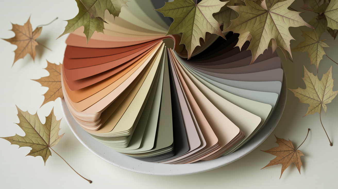
In seasonal color analysis, Soft Autumn sits on the muted side of the Autumn family. Compared with brighter warm palettes, its colors contain more gray or brown. Compared with cool muted palettes, they lean toward golden beige, moss, clay, peach, and softened teal. The result is blended rather than crisp.
| Color role | Reliable starting shades | What to compare |
|---|---|---|
| Light neutral | Soft cream, oatmeal, warm ivory | Against optic white |
| Medium neutral | Mushroom brown, camel, warm taupe | Against cool greige |
| Dark neutral | Espresso, deep olive, muted navy | Against jet black |
| Green | Sage, moss, olive, eucalyptus | Against emerald or icy mint |
| Warm accent | Dusty peach, clay, muted coral, terracotta | Against clear orange-red |
| Cooler accent | Dusty teal, warm petrol, muted turquoise | Against cobalt |
Common visual clues can suggest a direction, but hair, eye, or skin color alone cannot confirm a season. Edited photographs and changing light also distort temperature and contrast. If this palette repeatedly looks balanced in controlled comparisons, use it. If stronger warmth consistently looks clearer, compare the Warm Autumn palette. For the family overview, see the Autumn color palette guide.
Soft Autumn vs. Soft Summer
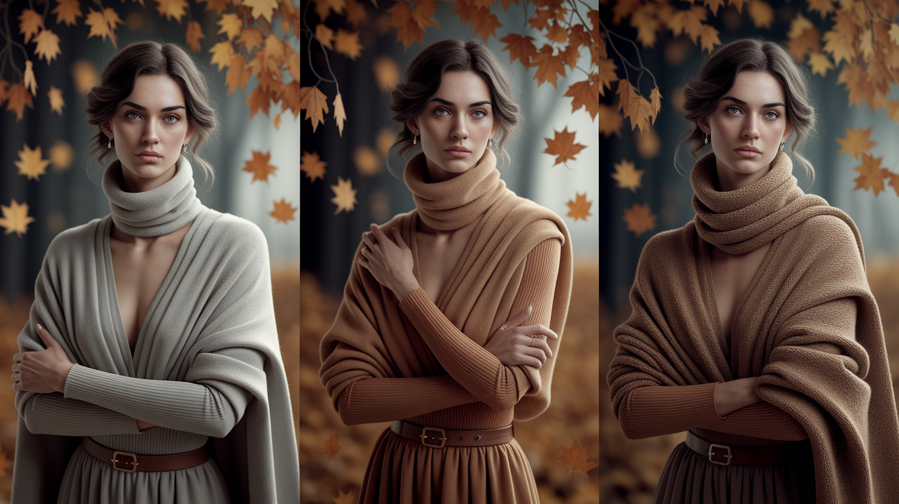
Both palettes are low-chroma and relatively blended. The useful distinction is temperature, not a checklist of eye or hair colors. Soft Autumn is warm-neutral; Soft Summer is cool-neutral. Because both sit near the neutral boundary, one isolated drape is weak evidence. Compare matched pairs with similar depth, saturation, fabric, and surface area.
| Feature | Soft Autumn | Soft Summer |
|---|---|---|
| Priority | Muted first, then warm-neutral | Muted first, then cool-neutral |
| Core brown/taupe | Mushroom, camel, cocoa | Rose taupe, cool mushroom, soft charcoal |
| Greens/blues | Olive, moss, muted teal | Eucalyptus, dusty blue, slate |
| Pinks | Dusty peach, warm rose, muted coral | Mauve rose, berry mist, cool pink |
| Light neutral | Oatmeal or warm ivory | Soft white or cool stone |
| Metals | Brushed gold, bronze, mixed warm metal | Brushed silver, pewter, mixed cool metal |
This is a quick boundary check, not the full comparison intent. If both columns look plausible, use the dedicated Soft Summer vs. Soft Autumn guide for a deeper sequence of comparisons.
Side-by-Side Draping Test
Test in indirect daylight near a window, with direct sun and strong indoor light switched out of the comparison. Remove strongly colored makeup if practical, pull back dyed hair if it dominates the frame, and keep the background neutral. Compare one pair at a time. The drapes should cover a similar area below the face and use a similar matte fabric.
| Matched pair | Soft Autumn drape | Soft Summer drape | Observe |
|---|---|---|---|
| Light neutral | Warm ivory | Soft cool white | Whether redness, yellow cast, or shadows become more noticeable |
| Pink | Dusty peach-rose | Muted mauve-rose | Whether the face looks even or separated from the fabric |
| Green | Warm olive | Cool eucalyptus | Whether eyes and skin retain definition without a color cast |
| Blue-green | Muted teal | Dusty blue | Which drape keeps facial contrast balanced |
| Neutral | Camel or mushroom brown | Cool taupe or soft charcoal | Which neutral looks connected rather than dull or heavy |
Look for a repeatable pattern across several pairs. A useful drape keeps attention on the face, leaves the jawline readable, and does not introduce an obvious cast. Camera auto-processing can change white balance, so trust a consistent mirror comparison before a single phone image. If results remain mixed, try the guided route at What Season Am I?.
Soft Autumn Muted Palette by Color Family
The easiest shopping method is to judge each shade on three axes: mutedness, temperature, and depth. Start with softly muted color, then check that it is not distinctly icy, and finally keep most pieces near the middle of the light-to-dark scale. A little variation is useful; an entire wardrobe of identical beige is not required.
| Family | Start with | Adjust if needed |
|---|---|---|
| Reds | Brick rose, muted rust, soft marsala | Brown down clear scarlet |
| Pinks/peaches | Dusty peach, tea rose, muted salmon | Choose earthier versions of hot pink |
| Yellows | Wheat, ochre, muted mustard | Soften lemon with camel or olive |
| Greens | Sage, moss, loden, warm olive | Choose softer alternatives to bright emerald |
| Blues | Muted navy, warm denim, dusty teal | Reduce the clarity of cobalt |
| Purples | Warm mauve, muted aubergine, brown-plum | Avoid making violet the brightest point |
Brown is particularly versatile: mushroom brown works as a light-to-medium neutral, cocoa as an everyday anchor, and espresso as a softer dark. For denim, look at the wash rather than the product name. Medium warm denim, dusty indigo, olive denim, and ecru can all work when the finish is not highly contrasted.
Best Soft Autumn Neutrals
A strong neutral set prevents the palette from becoming a collection of disconnected earth tones. Pick two light neutrals, two medium neutrals, and one or two dark anchors. Repeat them across trousers, jackets, shoes, and bags so accents remain easy to combine.
| Question | Practical answer | Easy pairing |
|---|---|---|
| Can Soft Autumn wear navy? | Try muted navy, soft ink, or warm denim rather than a very crisp blue-black navy. | Muted navy + camel + dusty peach |
| Can Soft Autumn wear gray? | Warm gray, mushroom, and taupe-gray usually connect more easily than icy blue-gray. | Warm gray + olive + cream |
| Can Soft Autumn wear black? | Keep black if you enjoy it; soften its effect with texture, an open neckline, or a muted color near the face. | Black trousers + moss knit + cognac shoes |
| Can Soft Autumn wear white? | Warm ivory, oatmeal, and soft cream are lower-contrast alternatives; white can sit away from the face. | Ivory shirt + cocoa trousers + teal scarf |
| Which brown works best? | Use mushroom, camel, cocoa, chestnut, or espresso according to the depth the outfit needs. | Cocoa + tea rose + brushed gold |
Pure black and white are styling variables, not identity tests. Scale matters too: a narrow black belt creates less contrast than a black turtleneck, and a white trainer sits farther from the face than a white shirt. Adjust placement before discarding a useful piece.
Soft Autumn Capsule Wardrobe
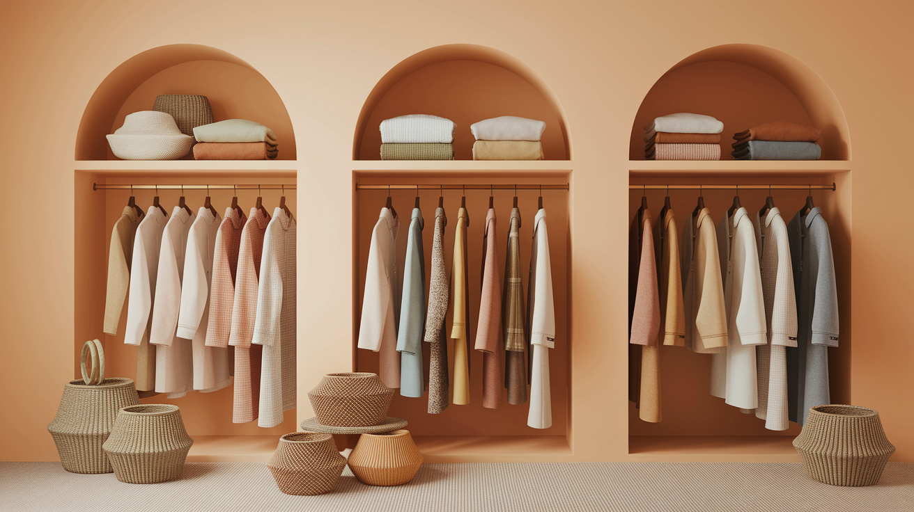
A capsule wardrobe needs repeated anchors, not a rigid item count. Begin with mushroom or cocoa bottoms, a camel or olive outer layer, warm ivory tops, and one dark anchor such as espresso or muted navy. Then add two accents that share the same softened quality.
Choose the anchor that suits the clothes you actually wear. Cocoa and espresso work naturally with leather shoes and traditional tailoring; muted navy connects easily with denim and workwear; deep olive creates a softer alternative for casual layers. The palette does not require every item to be warm. It needs enough repeated warmth and softness for the outfit to read as intentional.
| Category | Capsule options | Why it coordinates |
|---|---|---|
| Outer layers | Camel trench, olive overshirt, cocoa blazer | Repeats medium warm neutrals |
| Tops | Warm ivory tee, sage shirt, dusty rose knit, muted teal blouse | Adds light and muted color near the face |
| Bottoms | Mushroom trousers, warm denim, deep olive skirt, cocoa chinos | Creates interchangeable anchors |
| Dresses/one-pieces | Muted teal dress, terracotta jumpsuit, olive column dress | Provides simple tonal outfits |
| Shoes/bags | Cognac, tobacco, taupe, espresso | Connects the light and dark neutrals |
| Accents | Tea rose scarf, ochre bag, soft bronze jewelry | Adds interest without a sharp contrast jump |
Before buying a new item, test whether it makes at least three outfits with what you already own. For more category-by-category options, use the focused Soft Autumn clothing, makeup, jewelry, and hair guide. For additional outfit inspiration without repeating the full palette, see the Soft Autumn styling guide.
Seasonal changes can happen through fabric weight rather than a new color system. Wear cream linen, warm denim, sage cotton, and cognac leather in warmer weather; keep camel, moss, cocoa, muted teal, and terracotta for heavier knits and outerwear. This preserves the same capsule relationships while allowing texture and layering to change.
Outfit Formulas and Prints
Soft Autumn outfits become easier when the value steps stay moderate. A tonal formula uses neighboring shades; a neutral-plus-accent formula keeps one color as the focus; a three-color formula repeats the temperature and mutedness across every piece.
| Use | Formula | Print option |
|---|---|---|
| Casual | Warm denim + oatmeal knit + olive jacket | Fine olive-and-cream stripe |
| Office | Mushroom trousers + muted teal shirt + cocoa blazer | Low-contrast glen check |
| Smart casual | Camel skirt + dusty rose top + cognac shoe | Tonal botanical print |
| Evening | Deep olive dress + antique bronze + muted peach lip | Soft-edged abstract pattern |
| Weekend | Espresso jeans + sage tee + terracotta overshirt | Washed plaid |
Low-contrast prints tend to integrate well: watercolor florals, softly outlined botanicals, herringbone, marled knits, washed plaid, and blended geometrics. Print scale depends on body scale and style preference, not season alone. If a print feels busy, repeat one of its quieter colors in a solid layer rather than assuming the motif is forbidden.
For tonal dressing, combine different depths inside one family: oatmeal with camel and cocoa, or sage with olive and deep moss. For gentle complementary contrast, pair dusty teal with muted peach or warm blue denim with terracotta. The colors remain distinct, but neither becomes sharply brighter than the other. Accessories can repeat the smallest color in a print to connect the outfit without making it overly coordinated.
Makeup and Metals
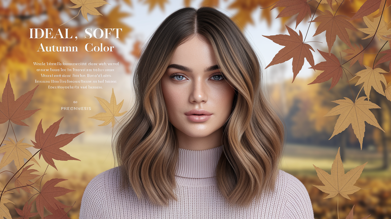
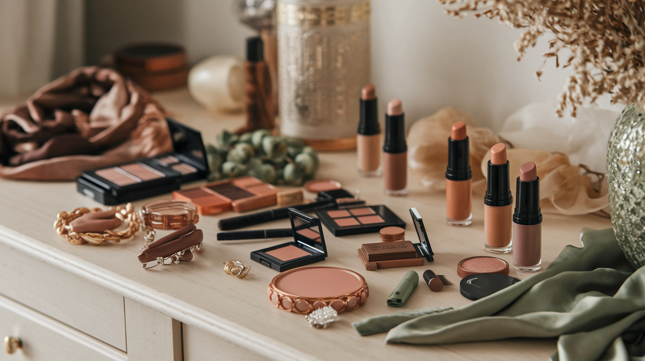
Makeup can echo the palette without changing your natural skin tone. Match foundation and concealer to your actual complexion; the seasonal palette is more useful for blush, lip, eye, and accessory colors. Start softly and compare the finished look in daylight.
| Category | Starting colors | Finish |
|---|---|---|
| Blush | Muted peach, apricot rose, warm dusty pink | Sheer satin or natural |
| Lips | Rose brown, muted terracotta, peach nude, soft brick | Blotted satin, balm, or soft matte |
| Eyes | Olive, warm taupe, cocoa, muted bronze | Matte or softly reflective |
| Liner/mascara | Espresso, deep olive, brown-black | Diffused rather than sharply graphic |
| Metals | Brushed gold, bronze, copper, antique brass | Brushed, hammered, or aged |
Brushed gold is a dependable starting point, but silver is not disqualifying. Antiqued silver, pewter, mixed metals, or a cool metal repeated elsewhere in the outfit may look balanced. Compare the whole composition instead of treating one jewelry test as proof of undertone or season.
Hair color follows the same restraint: softly blended beige-gold, caramel, chestnut, or muted copper can echo the palette, but natural hair does not have to be changed to qualify. Large jumps in depth or very strong highlights alter facial contrast, so preview the overall effect and discuss maintenance and hair condition with a qualified colorist before making a permanent change.
Colors to Adjust, Not Ban
Personal style, uniforms, formalwear, and favorite clothes do not need to disappear. When a color feels too bright, cool, dark, or high-contrast, change one variable at a time.
- Placement: move a difficult color to trousers, shoes, a bag, or a small pattern away from the face.
- Surface: choose washed cotton, suede, brushed wool, linen, or another texture that visually softens the shade.
- Scale: use the color as a narrow stripe, belt, piping, or small print rather than a full top.
- Bridge color: place camel, mushroom, warm gray, olive, or dusty rose between the face and the stronger shade.
- Contrast: replace one extreme in a black-and-white outfit with ivory, cocoa, muted navy, or warm gray.
A palette is successful when it makes decisions faster and outfits more coherent. It is not a requirement to look muted every day. Keep the colors that express your style and use these adjustments only when you want a softer result.
People Also Ask
What are the best colors for Soft Autumn?
Start with camel, mushroom brown, warm gray, olive, sage, dusty rose, muted peach, terracotta, and dusty teal. The shared quality matters more than the exact name: the colors should look softened rather than vivid.
Is Soft Autumn warm or neutral?
Soft Autumn is generally described as warm-neutral. It is warmer than Soft Summer but less temperature-dominant than Warm Autumn. Controlled draping is more useful than guessing from veins, jewelry, or one photograph.
What is the best navy for Soft Autumn?
Try muted navy, soft ink, dusty indigo, or warm denim. A slightly faded or textured surface reduces the crisp blue-black effect and makes navy easier to combine with camel, cream, olive, and peach.
Which prints suit Soft Autumn?
Low-contrast prints with softened edges are an easy starting point: washed plaid, herringbone, watercolor botanicals, marled textures, and blended geometrics. Choose scale according to your proportions and style.
Common Questions: The Ultimate Color FAQ
Can Soft Autumn wear black?
Yes. If black feels severe near the face, try brown-black, a textured fabric, an open neckline, or a camel, olive, or dusty rose layer between the black and your face.
Can Soft Autumn wear gray?
Warm gray, mushroom gray, taupe, and browned charcoal are useful neutrals. Compare them with icy blue-gray to see which direction keeps your coloring clearer.
What is the difference between Soft Autumn and Warm Autumn?
Soft Autumn prioritizes mutedness, while Warm Autumn prioritizes warmth and can usually carry clearer, richer golds, oranges, and greens. Compare dusty terracotta with clearer rust, or sage with warmer leaf green.
How do I start a Soft Autumn capsule wardrobe?
Choose one light neutral, two medium neutrals, one dark anchor, and two accents. Repeat those colors across tops, bottoms, outerwear, and accessories so most pieces create at least three outfits.
Use the palette for a week of side-by-side comparisons, keep notes on the combinations that work, and refine from evidence rather than labels. If you need a broader diagnostic starting point, continue to What Season Am I?.