Soft Autumn Clothing, Makeup, Jewelry, and Hair
 Reviewed by Alexandra Gilmore
Warm coloring that looks dusty rather than golden often needs softness before obvious warmth. Build a coordinated Soft Autumn look from muted clothes, understated makeup, blended metals, and earthy hair shades, using terracotta, sage, warm taupe, and dusty rose without letting any one element become too saturated.

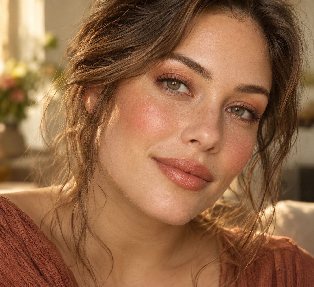
What makeup works for Soft Autumn? Choose peach nude, caramel, or soft terracotta lips; soft taupe, olive khaki, and matte almond eyes; muted peach blush; and a light veil of warm matte bronzer. Keep edges blended and finishes quiet. If your natural coloring reads warm but never vivid—dusty rather than golden—you may belong to Soft Autumn. This guide shows how to coordinate that makeup with muted clothing, jewelry, and hair colors.
💫 Build Your Personal Color Palette
Turn the useful colors from this article into a palette you can repeat across real outfits. A personal palette makes it easier to coordinate neutrals, accents, and combinations without treating every recommendation as a rigid rule.
Build My Palette →The Soft Autumn color palette is anchored by three core qualities:
- Neutral-warm undertones — neither intensely golden nor clearly cool, sitting in a gentle middle ground that leans toward warmth
- Muted chroma — colors that are toned down or slightly grayed, never saturated or neon
- Earthy, soft hues — think terracotta, warm taupe, sage, dusty rose, and caramel rather than primary colors or icy pastels
Those three qualities explain why a color that looks beautiful on a True Autumn or a Soft Summer can fall flat—or actively drain the face—on a Soft Autumn. Wearing cool grays, for example, is a common pitfall: they strip the natural warmth from the skin and leave features looking undefined and tired.
By the end of this article you will know:
- Which clothing colors and neutrals belong in a Soft Autumn wardrobe
- Which makeup shades enhance without overpowering soft, muted features
- Which jewelry metals and stones harmonize with the palette
- Which hair colors and highlighting techniques stay true to the season
- Which colors to avoid—and exactly why they clash
Whether you are new to seasonal color analysis or refining a wardrobe you have built over years, these recommendations give you a concrete, practical framework grounded in how the Soft Autumn palette actually works on skin, hair, and eyes.
What Makes the Soft Autumn Palette Unique
Soft Autumn sits between the Autumn and Summer families, which gives it a character neither season fully shares. Three qualities define it, and together they explain every recommendation in this guide.
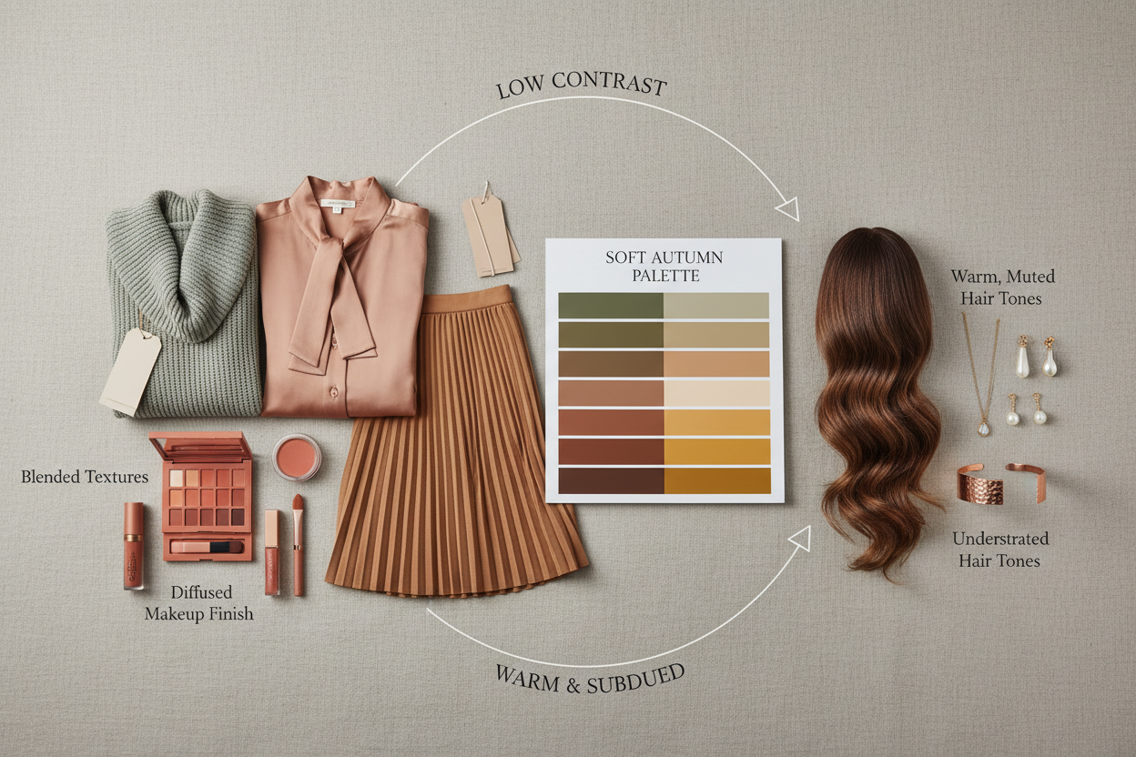
Neutral-warm undertones. True Autumn reads clearly golden or amber. Soft Autumn's warmth is quieter than that—it leans warm but carries a slight gray-beige quality that keeps it from looking richly golden. That's what "neutral warm" means in practice: not the buttery warmth of a True Autumn, not the cool-pink of a Soft Summer, but a gentle, slightly dusty warmth somewhere between the two.
Muted chroma. Every color in this palette has been turned down in intensity—like adding a small amount of gray or brown to a pure hue. Saturated colors overwhelm Soft Autumn coloring because they demand an intensity the natural coloring can't match. The result is the clothes wearing the person, not the other way around.
Soft, earthy hues. Warm taupe, terracotta, dusty rose, olive, caramel, sage, soft rust. These are the colors of an autumn landscape seen through soft light rather than direct sun—organic and blended, never stark.
These aren't arbitrary rules. They reflect what actually happens when color meets the face. When the color next to your face shares these qualities, skin looks clearer, features read as more defined, eye color appears richer. Violate any of the three—too cool, too bright, too stark—and the face suffers first.
Not sure if Soft Autumn is your season? Take the color analysis quiz →
How to Spot When a Color Is Wrong for Soft Autumn
Your face tells you everything. When a color is wrong, it doesn't just look off on its own—it does something specific to your complexion.
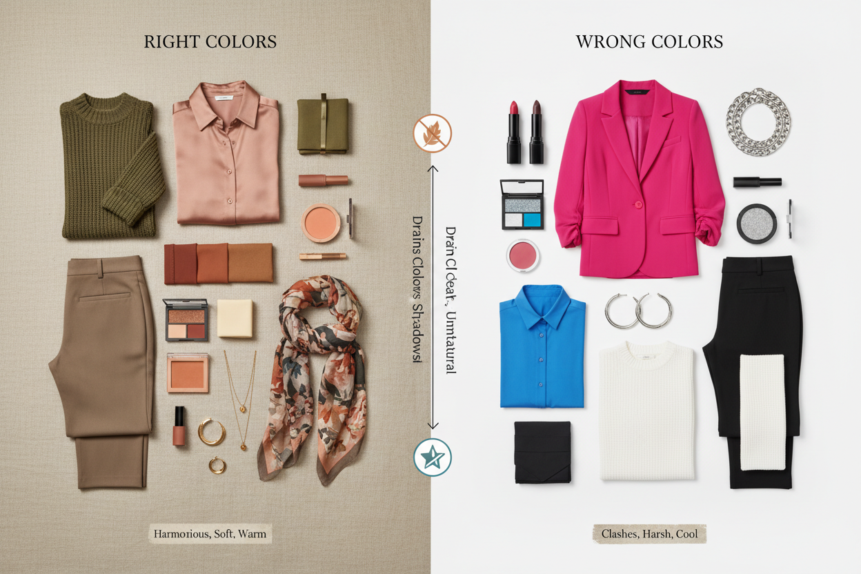
The gray test. Gray is the classic Soft Autumn mistake. A cool, medium gray near the face strips the skin of its warm undertone and leaves it ashy. Features lose definition because there's no warm contrast to make the skin read as alive. You look tired even when you're not, and the facial structure flattens in a way contouring can't fix.
What to look for when something is wrong:
- Dullness. The skin looks flat and lifeless instead of glowing.
- Loss of facial definition. Features blur together in a muddy way rather than a soft one—eyes look smaller, the jaw less defined.
- Sallow or washed-out cast. Cool colors can read as ashy or sallow depending on your specific undertone mix.
- The color pulls focus. An observer notices the garment before they notice your face. The piece is working against you.
A simple shopping check. Whether you're trying something on in-store or holding it up to a screen, look at your face first, not the garment. Do your eyes look brighter? Does your skin look clear and even? If yes, the color is working. If you find yourself reaching for more concealer or blush to compensate, the color is pulling warmth or clarity away from your face.
This same logic applies to clothing, makeup, and hair. If a color is consistently wrong in any one category, it's worth going back to the palette's three core principles to find where the mismatch is.
Soft Autumn Clothing: Building a Wardrobe Around Earthy Muted Tones
Soft Autumn clothing works best when every piece could plausibly have been lifted from an autumn garden—warm, slightly dusty, and grounded rather than vivid. The goal is a wardrobe with low internal contrast that flatters the season's soft, blended coloring.
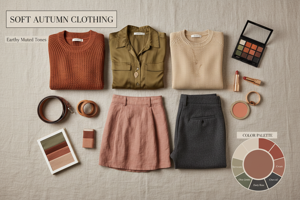
Core Palette Colors for Clothing
Neutrals to anchor the wardrobe:
- Warm taupe and greige
- Camel and soft caramel
- Warm ivory (not bright white)
- Chocolate brown and soft mocha
- Olive and warm khaki
Accent and statement colors:
- Terracotta and burnt sienna
- Dusty rose and muted salmon
- Sage and muted olive green
- Soft rust and warm burgundy
- Dusty teal (leaning warm, not bright)
Tops
Tops sit closest to the face, so they have the biggest impact. Lean toward the warmer, lighter end of the palette here: warm ivory, dusty rose, soft camel, muted terracotta. These pull warmth into the complexion. Deeper shades like chocolate brown and rust are better saved for days you're pairing them with a warmer-toned top or scarf.
Bottoms and Outerwear
Bottoms and outerwear can take the palette's deeper, earthier tones. Warm khaki, soft burgundy, camel, and mocha all work well. A camel or warm taupe coat is probably the single most useful piece in a Soft Autumn wardrobe: it goes with almost everything else in the palette without effort.
Pattern Guidance
The palette's muted chroma extends naturally to pattern choices. Look for:
- Small to medium scale prints — large, bold graphics create contrast that competes with soft coloring
- Blended, tonal patterns — watercolor florals, soft paisley, organic abstract prints that mix palette colors without sharp edges
- Low contrast within the print — terracotta, dusty rose, and warm taupe together will work far better than black with white or bright teal
Avoid sharp geometric prints in high-contrast colorways. Even if the individual colors are technically in palette, the contrast between them can overwhelm the soft overall effect.
Colors to Avoid: Why High Contrast and Cool Tones Clash
Cool-toned colors. Icy blues, cool grays, lavender, and cool-toned pinks tend to emphasize any gray or ashy quality in the skin rather than its warmth. The face reads as tired and a little flat.
Highly saturated colors. Bright red, cobalt blue, vivid emerald, neon shades — these demand an intensity that Soft Autumn's muted chroma simply can't match. The color ends up wearing you rather than the other way around.
Black. Pure black creates a contrast that's too sharp for this season's soft, blended character. It can wash out the face or pull attention to the clothing entirely. Deep espresso brown or very dark olive gives you the same visual weight without the harshness.
Bright white. Like black, bright white creates too much contrast for this palette. Warm ivory, soft cream, or a very light camel give you the lightness of white without stepping outside the neutral-warm range.
Soft Autumn Makeup Routine: Muted Warm Shades That Blend
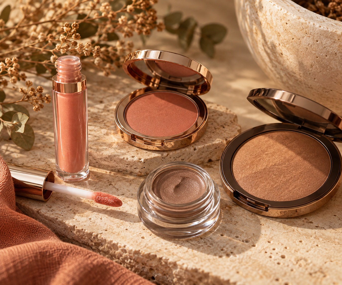
The logic that governs clothing choices—neutral warm, muted, earthy—applies directly to makeup. Soft Autumn features often have a blended, low-contrast quality. Build a simple routine with a skin-matched base, softly defined eyes, warm peach cheeks, and a blurred peach-brown lip. Add only enough bronzer to restore warmth, rather than deepening the whole face.
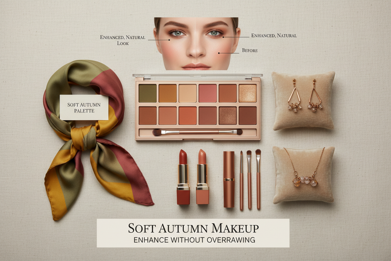
Foundation and Concealer: Matching Neutral Warm Undertones
Foundation is where an undertone mismatch is most immediately visible—and most commonly made. Getting it right makes every other product perform better. Getting it wrong creates the same tired, undefined effect as wearing the wrong clothing color next to your face.
What "neutral warm" means when shopping for base products. You're not looking for a strongly yellow-golden foundation (that's True Autumn territory) or a pink-neutral (that leans Soft Summer). Look for descriptors like:
- Warm neutral
- Golden neutral
- Neutral with a warm finish
- Beige-golden
Avoid foundations described as cool, rosy, pink, or neutral cool. Also avoid very yellow-heavy formulas, which can read as sallow.
A practical test. Apply a small amount to your jawline in natural light. A correct match disappears into the skin—no pink border, no yellow mask. If either appears, adjust the undertone rather than the depth.
Concealer. Same logic. Too pink under the eye reads as ashy against warm skin; too yellow looks mask-like. A warm peachy-neutral usually works well for Soft Autumn.
Blush
Muted, warm-toned blushes are the sweet spot. Sweep a small amount across the upper cheeks and blend the edge into the skin. Look for:
- Warm peach and soft apricot — a gentle everyday flush, especially with peach nude lips
- Dusty rose with warm undertones — works well for those with more neutral lean
- Muted terracotta and soft warm brick — use a light hand for an earthy evening look
Avoid cool berry, pure pink, or fuchsia. They introduce cool contrast that fights the skin's natural warmth.
Eyeshadow
The palette's earthy, muted character translates naturally into eyeshadow. Shades that work well:
- Soft warm taupe through the crease for everyday definition
- Matte almond over the lid and dusty peach for a quiet warm wash
- Muted olive khaki or soft warm brown at the lash line for depth
- Muted gold and bronze for evening—kept soft, not glittery
Avoid cool grays, icy silvers, and saturated blues or purples. Even a small amount of cool-toned shadow can make the eye area look tired.
Lip Colors
The lips respond well to muted, warm-toned shades:
- Peach nude — a warm, softly blurred everyday lip without a pale concealer effect
- Toasted caramel — a peach-brown nude with a little more depth
- Soft terracotta — muted earthy color for a more defined lip
- Muted brick and warm mauve — more color, still within palette
Skip cool berry, blue-based reds, and very pale cool nudes. These shades either introduce cool contrast or pull warmth away from the lower face.
Subtle Bronzing vs Over-Baking
Choose a matte, softly warm beige-brown bronzer only one or two shades deeper than your skin. Tap excess powder off a fluffy brush, then sweep a thin layer where daylight naturally warms the face: the outer forehead and upper cheekbones. Blend toward the hairline and stop before it becomes an opaque stripe. If the color looks orange on your skin, try a quieter neutral-warm brown or use less product; avoid bright copper shimmer and repeated heavy layers. Bronzer should add gentle dimension while peach blush remains the visible cheek color.
Soft Autumn vs Soft Summer Makeup
Both palettes favor softness. Compare a muted peach and a muted rose beside your face in indirect daylight; the better shade makes skin look even without demanding more makeup.
| Makeup | Soft Autumn | Soft Summer |
|---|---|---|
| Lip | Peach nude, toasted caramel, soft terracotta | Cool rose nude, muted mauve |
| Blush | Warm peach or muted apricot | Dusty rose or cool pink |
| Eyes | Matte almond, warm taupe, olive khaki | Cool taupe, dove gray, muted plum |
| Bronzer | Sheer matte neutral-warm beige-brown | Use sparingly; cool contour or no bronzer may blend better |
Brows
Keep brows warm and soft rather than dark and defined. A warm taupe, soft brown, or ash-brown with a warm undertone all work well. Cool ash or very dark products create stark contrast against typically medium-value Soft Autumn brows, so it's worth avoiding those.
Want personalized makeup shade recommendations? Start your color analysis →
Soft Autumn Jewelry: Metals and Stones That Complement the Palette
Jewelry follows the same neutral-warm, muted logic as the rest of the palette. You're looking for metals and stones that carry the same earthy warmth—nothing with high shine or cool contrast.
Metals
Best choices:
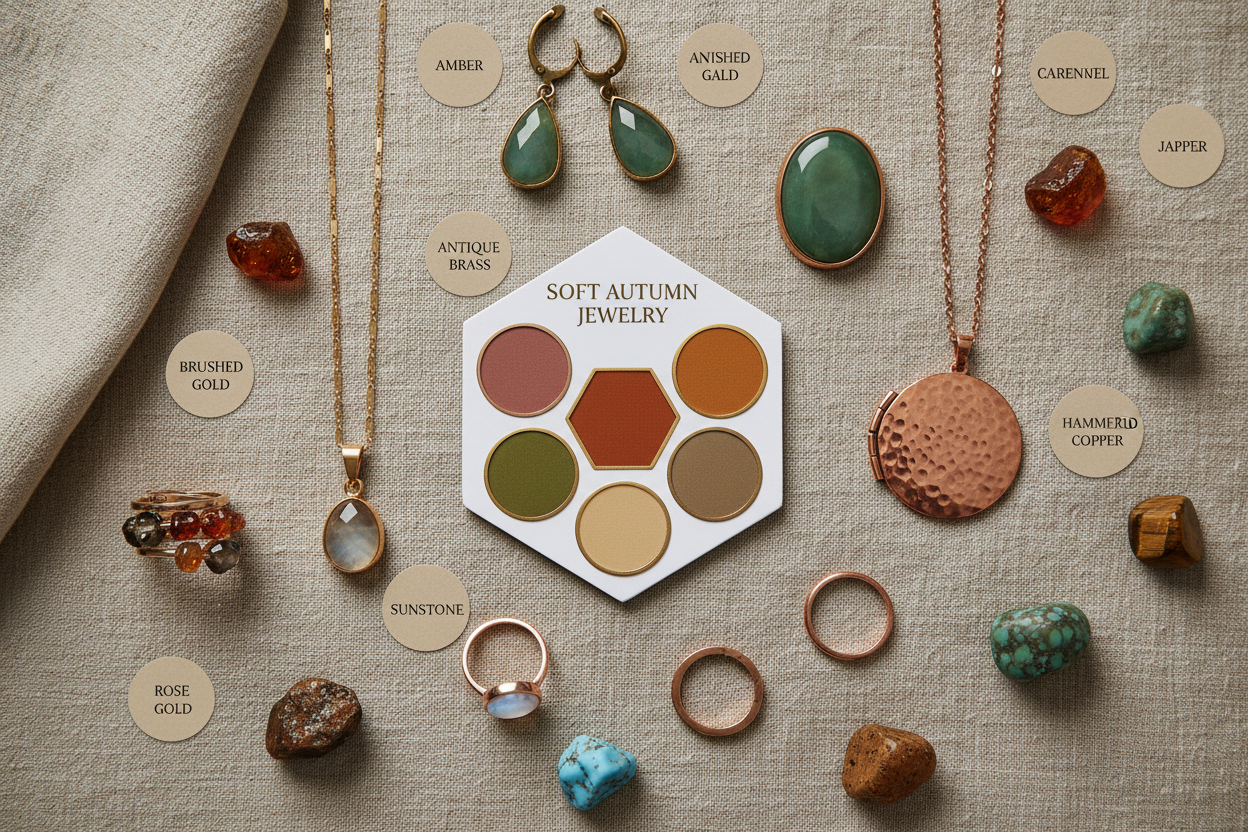
- Brushed or matte gold — the softer finish keeps the warmth without competing with the skin
- Rose gold — sits well against neutral-warm skin and adds a gentle blush quality
- Bronze and copper — earthy and muted, almost purpose-built for this palette
- Antique or oxidised gold — the aged finish brings in exactly the muted quality the palette wants
Avoid:
- Bright polished silver — the cool contrast pulls against the skin's warmth
- Platinum and white gold — same issue; too cool and too stark
- Very high-shine yellow gold — can work, but risks reading as too vivid; a brushed or hammered finish brings it back into range
Gemstones
The palette's earthy, muted character points toward:
- Warm amber and honey tones — citrine, amber, warm topaz
- Muted greens — aventurine, moss agate, olive tourmaline
- Dusty rose and warm coral — rose quartz, morganite, coral
- Earthy browns — smoky quartz, cognac tourmaline, tiger's eye
- Soft warm teal — labradorite in warm tones, warm-toned turquoise
Stones with a cool, saturated, or icy character are harder to wear here. Bright sapphire, cool amethyst, icy aquamarine, and high-sparkle diamonds in silver settings all introduce either coolness or contrast that fights the palette rather than working with it.
Finish and Scale
Hammered, brushed, and organic shapes suit Soft Autumn better than polished geometric pieces. Scale can go anywhere from delicate to medium—very bold, graphic statement jewelry tends to introduce a sharpness the palette doesn't really support.
Soft Autumn Hair: Shades and Techniques That Stay in Palette
Hair is one of the most visible parts of the overall palette, and it has the same power as a clothing color to either harmonise with or fight the face. The goal is hair that reads as naturally warm and slightly muted—rich but never vivid, warm but never overly golden or brassy.
Natural Hair Shades Within the Palette
Soft Autumn natural coloring typically includes:
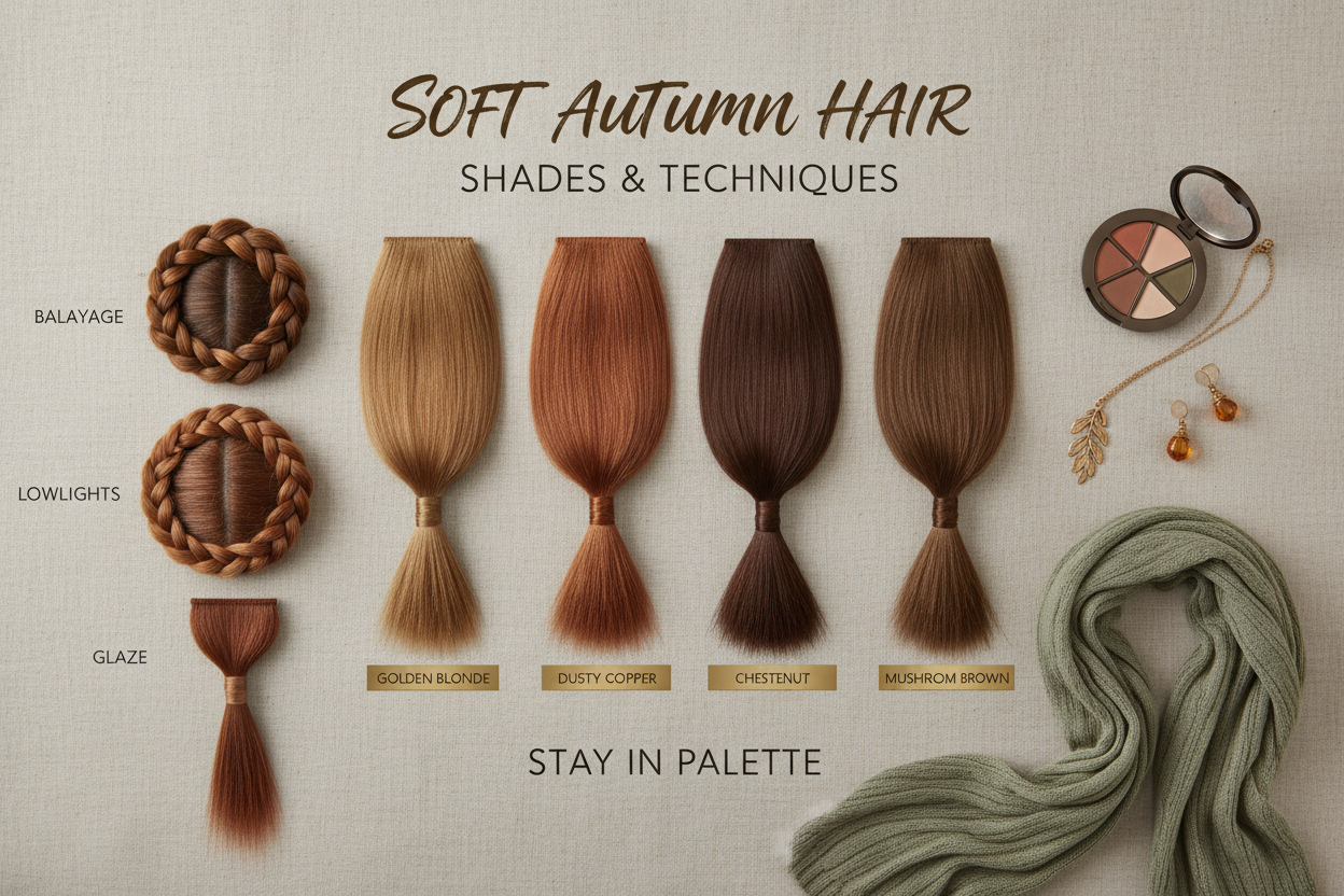
- Warm medium brown to dark blonde — the classic Soft Autumn range
- Soft caramel brown — slightly warm, never red-dominant
- Muted auburn — warm but not vivid copper
- Dark blonde with warm undertones — golden but soft, not platinum
Color and Highlighting Choices
For brunettes:
- Caramel balayage woven softly through the base adds warmth and dimension without high contrast
- Warm coffee and mocha tones deepen the base while staying in palette
- Avoid ash-brown, which introduces the same cool, gray-adjacent effect as wearing gray clothing
For blondes:
- Warm golden blonde and soft honey tones work well
- Avoid platinum, icy blonde, or ash highlights — these pull the hair cool and create the same tired, washed-out effect at the face as cool clothing colors
- Beige blonde can work if it leans warm rather than cool
For those going gray:
- Warm gray toners or soft warm highlights near the face help maintain the palette's warmth during a transition to natural gray
- A warm neutral gloss over natural gray stops it reading as cool ash
For reds and coppers:
- Soft copper and warm auburn sit within the palette; vivid copper or bright flame red tip too bright and saturated for the muted chroma quality
Highlighting Techniques
Balayage and soft blending suit the Soft Autumn palette far better than traditional foil highlights. Balayage produces a graduated, blended result with no hard lines — exactly the low-contrast, organic quality the palette favors. Chunky, high-contrast highlights or sharp ombre create the kind of stark contrast the palette cannot support.
Toning. If a color service has resulted in brassiness, use a warm neutral toner rather than a cool ash toner. Ash toning is the haircare equivalent of reaching for a gray sweater: it introduces coolness that reads as dullness next to Soft Autumn skin.
Building a Cohesive Soft Autumn Look: Putting It All Together
Every category in this guide—clothing, makeup, jewelry, hair—runs on the same three principles. When all four are working together, your face reads as naturally clear, warm, and defined without looking overdone. That's what a palette-consistent look actually does.
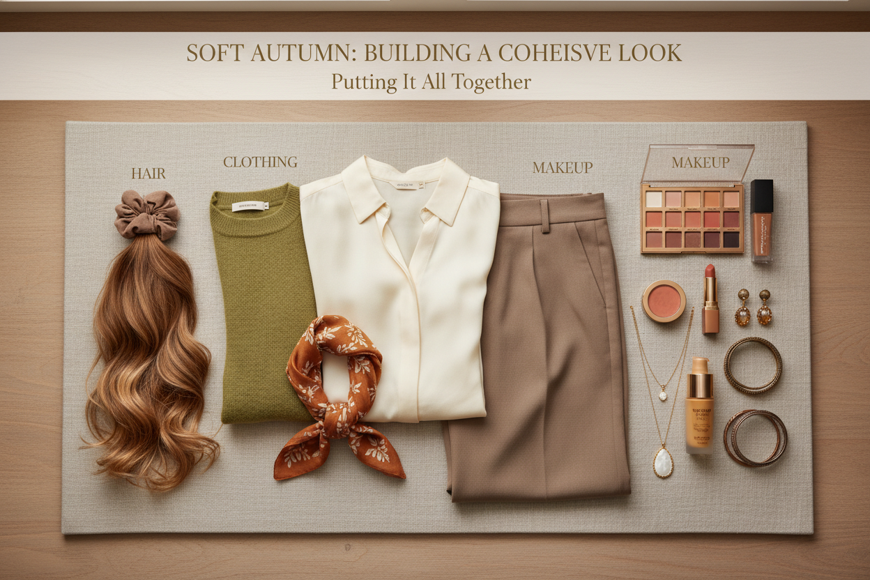
The practical integration checklist:
| Category | The palette principle in action |
|---|---|
| Clothing | Earthy, muted, warm-neutral hues; soft-contrast patterns; deep browns and olives instead of black |
| Makeup | Warm-neutral base; muted peach or dusty rose blush; earthy eyeshadow; caramel to dusty-rose lip |
| Jewelry | Brushed or rose gold, bronze, copper; earthy warm stones; organic or hammered finishes |
| Hair | Warm caramel to soft auburn; balayage or soft blending; no ash tones or platinum |
A day-to-day shortcut. When you're not sure about a specific choice, ask three questions:
- Is it warm, or does it lean cool?
- Is it muted, or does it feel vivid and saturated?
- Does it have an earthy, organic quality, or does it feel stark and graphic?
Warmth, muted chroma, earthy character—if all three check out, the item almost certainly belongs in your Soft Autumn toolkit.
Where most people go wrong. The most common mistake is treating Soft Autumn as interchangeable with True Autumn (too rich and golden) or Soft Summer (too cool and muted). The palette's neutral-warm character is what makes it distinct: it doesn't tolerate the vivid warmth of True Autumn's amber-gold, and it doesn't tolerate the cool muting of Soft Summer's blue-gray softness. Every time a choice drifts toward either extreme, something looks slightly off—not dramatically wrong, just never quite right.
When clothing, makeup, hair, and jewelry all sit in the same neutral-warm, muted, earthy range, that drift disappears. Your face looks clear and alive, features read as naturally defined, and the overall impression is quiet, warm sophistication that feels effortless—because it's working with your natural coloring rather than against it.
People Also Ask
What colors should a Soft Autumn wear?
Soft Autumn works best with colors that share three qualities: neutral-warm undertones, muted chroma, and an earthy, organic character. Core wardrobe colors include warm taupe, camel, terracotta, dusty rose, olive, soft rust, chocolate brown, and sage. Patterns should be low-contrast and blended—watercolor florals or tonal earthy prints, not bold geometric designs.
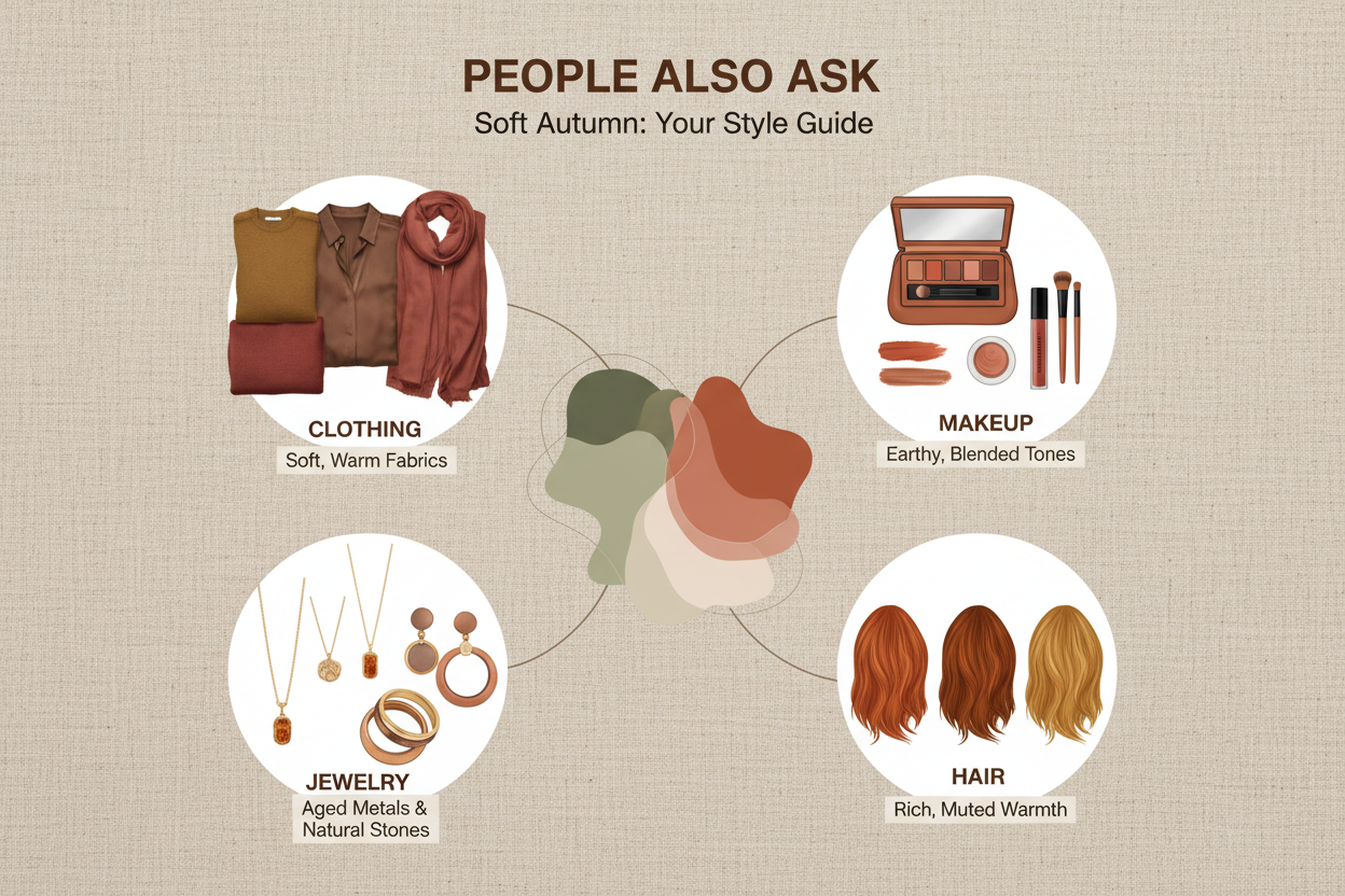
Colors to avoid: cool grays, icy blues, bright white, pure black, and anything highly saturated. These either introduce coolness that fights the skin's warmth or demand an intensity the palette can't match, and the result is clothing that draws attention away from the face.
What is the difference between Soft Autumn and Soft Summer?
Both seasons share the same muted, low-chroma quality, but they diverge in undertone. Soft Autumn has a neutral-warm undertone—the warmth is real but tempered, closer to a dusty beige-warm than a true golden. Soft Summer leans cool, with a blue-gray softness underneath.
In practice:
- Soft Autumn reaches for terracotta, camel, olive, and warm rust
- Soft Summer reaches for cool mauve, dusty blue, soft lavender, and cool rose
The easiest way to tell them apart is the cool-tone test. Cool colors like lavender or cool rose will flatter Soft Summer but make Soft Autumn skin read as ashy or undefined. Warm earth tones do the reverse—they lift Soft Autumn and overwhelm Soft Summer.
What makeup colors suit a Soft Autumn?
Soft Autumn makeup follows the same neutral-warm, muted logic as the clothing palette:
- Foundation: Neutral-warm or golden-neutral formulas; avoid pink-neutral or cool-undertone bases
- Blush: Warm peach, soft apricot, dusty rose with warm undertones, or terracotta
- Eyeshadow: Warm taupe, greige, soft terracotta, olive, khaki, and muted bronze for evenings
- Lips: Warm nude, caramel, dusty rose, muted brick, or warm mauve
- Brows: Warm taupe or soft warm brown; avoid cool ash or anything dark enough to create stark contrast
Cool berry lips, icy silver shadows, and pink-based blushes all introduce coolness that competes with the palette's warmth.
What jewelry metals look best on Soft Autumn skin tones?
Metals with a warm, slightly muted finish work best. Good options:
- Brushed or matte gold — warm without high-contrast shine
- Rose gold — adds gentle blush warmth that sits well against neutral-warm skin
- Bronze and copper — earthy warmth that matches the palette closely
- Antique or oxidized gold — the aged finish has exactly the muted quality the palette calls for
Avoid bright polished silver, platinum, and white gold. The cool tone and high reflectivity create contrast that pulls attention away from the skin's warmth. For gemstones, warm amber, honey topaz, rose quartz, muted green aventurine, and earthy smoky quartz all work well within the palette.
What hair color is best for Soft Autumn?
The ideal Soft Autumn hair color looks naturally warm and softly dimensional—rich without being vivid, warm without tipping into brassy or golden. The most flattering range runs from dark blonde through warm medium brown to soft caramel and muted auburn.
For color work:
- Brunettes do well with caramel balayage woven softly through the base—it adds warmth and dimension without creating high contrast
- Blondes suit warm golden or honey tones; platinum, ash, and icy highlights are better avoided
- Reds and coppers work best in soft auburn or warm copper rather than vivid flame red
Balayage and soft blending suit the palette far better than traditional foil highlights, which can produce the stark, high-contrast look that muted coloring doesn't handle well. Skip ash toners too—they introduce the same cool flatness as wearing gray clothing close to the face.
FAQ
What are the defining characteristics of the Soft Autumn color palette?
Three qualities overlap to define it:
- Neutral-warm undertones — warmth is there, but tempered. Never purely golden or orange.
- Muted chroma — colors are dusty and desaturated rather than clear or vivid.
- Earthy character — the overall impression is organic and grounded, like late-autumn light through mist.
Typical hues include warm taupe, camel, terracotta, dusty rose, olive, sage, soft rust, and chocolate brown. The palette sits between the Autumn and Summer color families, borrowing warmth from one and softness from the other without fully belonging to either.
How do I know if I am a Soft Autumn rather than a True Autumn or Soft Summer?
The key tests involve chroma and undertone:
| Question | Soft Autumn | True Autumn | Soft Summer |
|---|---|---|---|
| How does warmth read? | Neutral-warm, slightly dusty | Strongly warm and golden | Cool, blue-gray |
| How does chroma read? | Low — muted and soft | Medium-high — richer and deeper | Low — muted and soft |
| Does olive or camel flatter? | Yes | Yes | No — reads harsh |
| Does cool lavender flatter? | No — looks ashy | No — looks off | Yes |
Earthy warm tones that lift your complexion but True Autumn's richness feels like too much? That points to Soft Autumn. Cool mauves doing more for you than terracotta? You're probably closer to Soft Summer.
Why does gray make Soft Autumn people look tired?
Gray has no warmth in it. When it sits close to a Soft Autumn face—which does have a warm undertone, even if it's a quiet one—the coolness creates a contrast the skin can't counter. The complexion ends up looking flat or washed out instead of alive.
The same logic applies to everything else on the avoid list: any color that's cooler or more saturated than the face pulls focus away from the skin and makes it look dull by comparison. Swap gray for a warm taupe or greige and you get the same neutral effect without the drain.
Can Soft Autumn wear black clothing?
Black is generally a poor fit for Soft Autumn. The high contrast and cool-neutral depth work against a palette built around muted, low-intensity tones. Worn near the face, black creates a harsh frame that tends to make skin look tired or washed out.
Some alternatives that do what black does without the drawbacks:
- Warm dark chocolate brown — functions as a near-neutral anchor with warmth
- Charcoal with warm undertones — keeps the depth without the starkness
- Dark olive or deep teal — adds drama without pulling cool
Lower on the body—trousers, shoes, a belt—black causes fewer problems. The distance from the face absorbs most of the contrast, so it works well enough there.
What blush and lip colors work best for Soft Autumn makeup?
Both blush and lip choices should stay within the neutral-warm, muted range.
Blush: Warm peach, soft apricot, and dusty rose (with a warm rather than cool base) all work well. Deeper skin tones can handle soft terracotta. Avoid cool pinks, fuchsia, and anything with a blue or berry undertone.
Lips: Warm nudes, caramel, muted brick, soft rust, dusty rose, and warm mauve are all good options. Cool berry, blue-red, bright coral, and icy nudes will clash.
The guiding principle: if the lip or blush color looks cleaner or brighter than the skin, it's probably too saturated or too cool for the palette.
Should Soft Autumn choose gold or silver jewelry?
Gold is the stronger choice. The most harmonious finishes are:
- Brushed or matte gold — warm and soft, avoids high-contrast shine
- Rose gold — the blush warmth complements neutral-warm skin tones
- Bronze and copper — earthy and palette-aligned
- Antique or oxidised gold — the aged, slightly dulled finish mirrors the muted quality of the palette itself
Silver, platinum, and white gold tend not to work well. Their cool tone introduces a metallic contrast that fights skin warmth, and their reflectivity adds intensity the palette doesn't need. For stones, amber, honey topaz, smoky quartz, rose quartz, and muted aventurine all sit comfortably within the palette.
What hair highlighting techniques suit the Soft Autumn palette?
Techniques that blend and diffuse color work far better for Soft Autumn than anything that creates defined, high-contrast lines.
Recommended:
- Balayage — freehand color placement that builds gradual, soft dimension; generally the most flattering technique for this palette
- Tonal color — subtle variation within a close warm range, rather than a dramatic base-to-highlight contrast
- Glossing treatments in caramel or warm honey tones to add warmth without adding contrast
Avoid:
- Traditional foil highlights, which create sharp lines the muted palette can't really support
- Ash or pearl toners, which neutralize warmth and introduce the same cool dullness as wearing gray near the face
- Platinum or icy blonde results, regardless of technique
Ideal tones run from warm honey and caramel through soft golden brown to muted auburn, depending on your base. Not sure which approach fits your coloring? Take the color analysis quiz to find your season and get tailored hair color guidance.