Summer Color Palette: Complete Guide to Cool, Soft Tones
 Reviewed by Alexandra Gilmore
Explore cool, muted Summer colors, compare True, Soft, and Light Summer, and build a wearable wardrobe palette.

Summer coloring is cool, soft, and dominated by blue and rose undertones with a gentle, desaturated finish. The signature palette includes dusty rose, soft navy, slate blue, lavender, sage green, mauve, and heather gray. Harsh black and warm golden tones can overpower this coloring; charcoal, cool taupe, and soft white provide balanced definition. The three Summer subtypes keep that cool, softened family resemblance while emphasizing different qualities: True Summer is coolest, Soft Summer is most muted, and Light Summer is lightest.
Use this guide as a starting palette, then compare real fabrics beside your face in consistent daylight. A season is a practical way to organize colors, not a rule determined by eye, hair, or skin color alone. People with many skin depths can find useful Summer colors. What matters is how coolness, softness, and contrast work together for you.
The Core Elements of the Summer Palette
Summer color analysis describes a family of cool, gently muted colors. The Munsell color sphere explains the underlying dimensions of hue, value, and chroma. Temperature is the first dimension: blues, blue-based pinks, and violet-leaning reds usually feel more connected to the palette than yellow-based orange or gold. Chroma is the second: Summer colors tend to look softened, as if a little gray were mixed into their pigments. Value, the light-to-dark dimension, varies among the subtypes, but the family generally avoids the starkest light-dark pairings.
Cool undertones and a blue-based color story
A cool undertone in clothing means the color leans toward blue rather than yellow. Compare raspberry with tomato red, or slate blue with golden teal: the first member of each pair usually sits closer to Summer. This does not require visibly pink skin. Surface redness, tanning, and foundation shade can distract from the effect of fabric. Instead, compare equal-strength colors near the face and notice whether your eyes, skin, and features remain clear without the fabric becoming the main event. For a broader method, see our undertone guide.
Muted color, not washed-out color
Muted means lower intensity, not dullness. Dusty rose still has enough pink to be recognizable; slate blue remains blue, though less electric than cobalt. Summer pastels are often slightly gray or blue-based rather than sugary or neon. A very pale color can be wrong if it is too warm; a deeper berry can work beautifully if its coolness and softness fit. That is why a useful palette includes medium and dark accents as well as light colors.
Look at the transitions between colors. Soft navy with lavender creates a gentler value contrast than ink black with optic white. Similar value steps can repeat the delicate quality of Summer coloring. Yet personal contrast matters: a person with dark brows and deep eyes may prefer more definition than someone whose features blend softly. The low-contrast face guide explains that distinction without assuming a particular skin depth.
The Three Summer Subtypes
True Summer, Soft Summer, and Light Summer share a cool, softened foundation. Their names identify the dimension that becomes most noticeable. True Summer is often called Cool Summer; Soft Summer leans toward Autumn's muted edge; Light Summer approaches Spring's lighter edge. These are neighboring directions, not three rigid boxes. Test the border colors if two descriptions sound plausible.
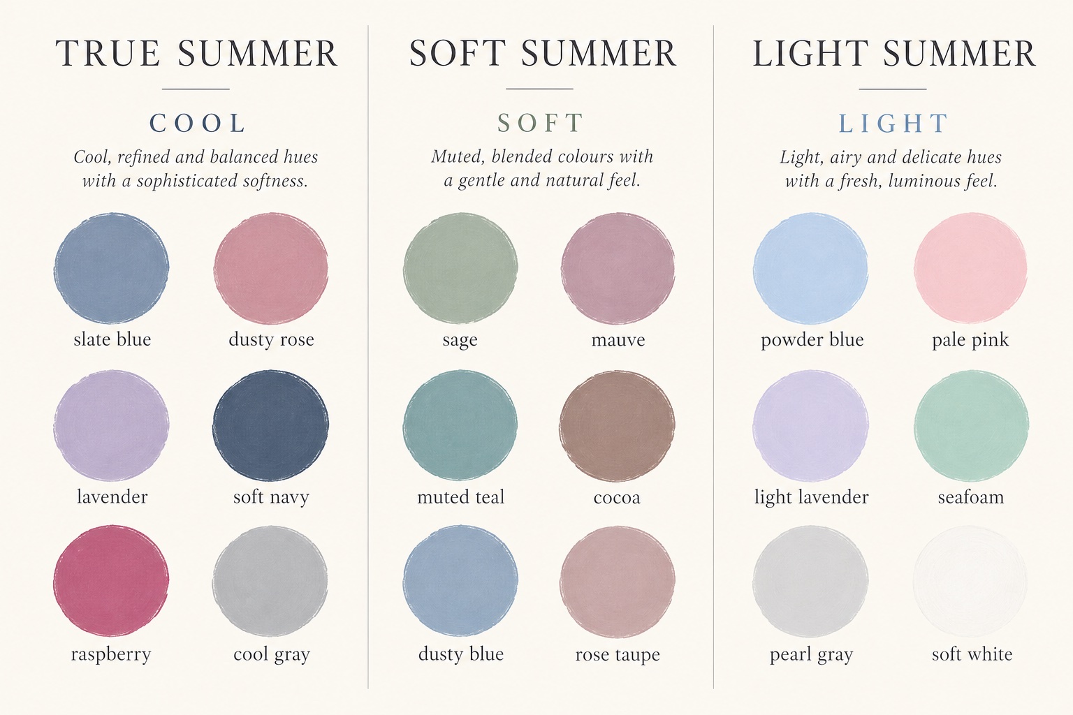
| Subtype | Dominant quality | Good first drapes | Likely warning sign |
|---|---|---|---|
| True Summer | Cool first; soft and medium in value | Slate blue, dusty rose, cool raspberry | Warm beige makes the face look yellowed |
| Soft Summer | Muted first; cool-neutral | Sage, mauve, smoky teal | Clear jewel tones look louder than the face |
| Light Summer | Light first; cool-neutral | Powder blue, pale cool pink, seafoam | Deep charcoal overwhelms delicate features |
True Summer: the coolest center
True Summer makes the cool direction easiest to see. Slate, cornflower, lavender, dusty pink, blue-red berry, and soft navy keep color clear enough to define the face while avoiding Winter's icy brightness. Try a dusty rose top against a peach one of similar depth. If the rose looks integrated and the peach seems to cast warmth upward, True Summer deserves a closer look. Our True Summer guide expands the subtype's individual palette.
Soft Summer: the quietest chroma
Soft Summer emphasizes a smoky, blended finish. Its coolness may be subtler than True Summer's, but its colors remain less golden than Soft Autumn's. Try sage, rose taupe, muted teal, heathered denim, and cool cocoa. If slate-blue and muted rose both work yet brighter raspberry seems too sharp, the softer direction may be more useful. Explore the Soft Summer palette for more specific outfit examples.
Light Summer: the airiest value
Light Summer keeps the Summer blue-rose bias while raising the overall value. Powder blue, light lavender, shell pink, seafoam, and pearl gray can create definition without a heavy dark frame. The distinction from Light Spring is temperature and clarity: Light Spring's peach and warm aqua may look more lively, while Light Summer often responds better to cool pink and misty blue. Our Light Summer guide covers this boundary in detail. If you are deciding between the light and soft branches, use the Light Summer versus Soft Summer comparison.
Signature Colors for the Summer Season
Build a Summer color palette from blue-based pinks, softened blues, gentle purples, and cool greens. Dusty rose and mauve make versatile near-face colors. Slate blue and soft denim offer an easier everyday route than bright royal blue. Lavender gives a lighter accent without turning golden. Sage works when it looks gray-green rather than yellow-green. Berry adds definition for days when the lighter shades feel too quiet.
Choose shades by their relationship rather than by a product name. One brand's “sage” may be warm olive; another's may be cool and smoky. “Lavender” can mean an icy, almost neon violet or a gray-touched pastel. Hold two options together in natural light. The right choice usually makes an outfit feel cohesive with less effort. If a shade looks separate from your face, try a softer, cooler, or lighter version before rejecting the entire color family.
Easy Summer color pairings
- Dusty rose + soft navy: approachable contrast for a shirt and trousers or a dress and jacket.
- Slate blue + heather gray: a restrained work combination that still has more life than gray alone.
- Lavender + cool taupe: a light, gentle pairing with enough neutral grounding.
- Sage + mauve: a muted combination especially useful when Soft Summer is your direction.
- Powder blue + pearl gray: a lighter outfit for Light Summer, with silver adding a small point of definition.
Keep the face-framing piece closest to the shade that works best on you. Trousers, shoes, and bags can be more flexible because they do not reflect as much color onto the face. A warm piece you love does not need to disappear from your closet; move it away from the neckline or interrupt it with a cool scarf.
Colors That Overpower Summer Coloring
Orange, mustard, golden camel, neon brights, and hard jet black are common colors to compare carefully. Orange and mustard contain a yellow warmth that can compete with the Summer blue-rose base. Neon pigments may appear to arrive before the person wearing them. Jet black creates a sharp edge that some Summer faces find too severe, particularly beside optic white. None is forbidden: placement, texture, makeup, and your own preference still matter.
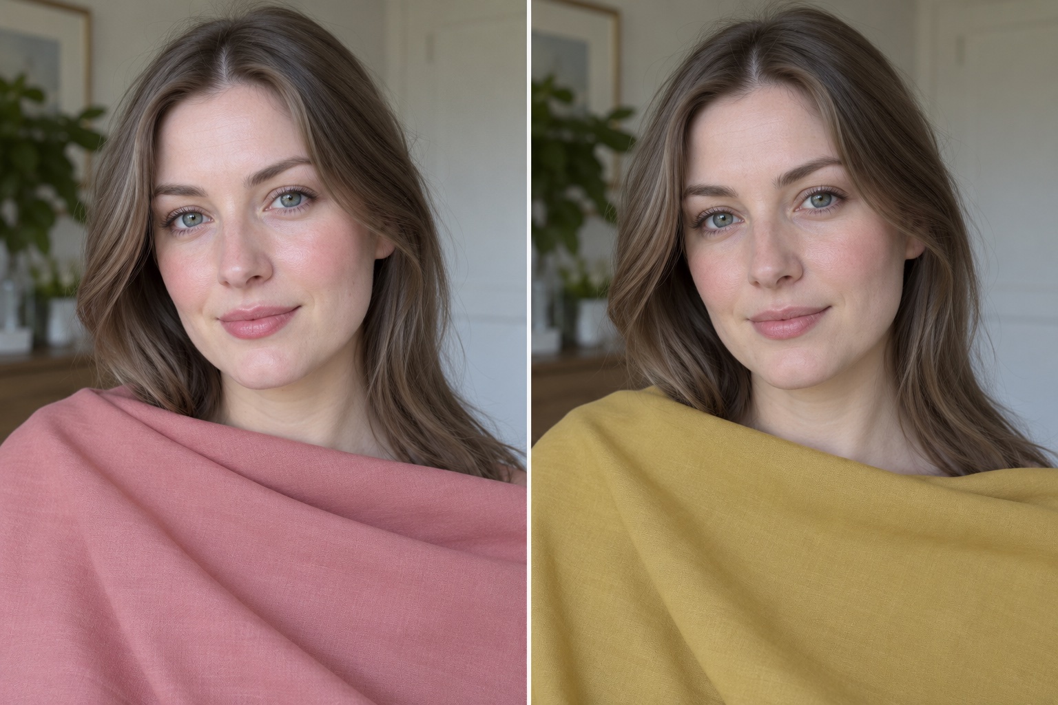
A simple two-color drape test
Stand by a window with even indirect daylight. Remove colored makeup if you want to see the fabric effect clearly, and cover a strongly dyed hair color if it distracts. Hold dusty rose beneath your chin, then mustard of similar darkness. Keep the camera, distance, background, and exposure steady. Observe the skin around the mouth and eyes, the clarity of the whites of the eyes, and whether shadows appear more or less noticeable. Repeat with slate blue versus orange, then soft navy versus jet black. A single comparison can be misleading; look for a pattern across several pairs.
Do not use a dramatic “before and after” photo as proof. Auto white balance and changing sunlight can create differences that have little to do with the clothes. The person in the image above is an illustration of the method, not a diagnostic result. If you prefer mustard despite its warm effect, wear it. Color analysis should help you make choices, not reduce your wardrobe to a list of prohibitions.
Capsule Wardrobe Neutrals
Five neutrals make a flexible Summer wardrobe: soft white, cool gray, slate, soft navy, and cool cocoa or taupe. Soft white is gentler than optic white, especially near the face. Heather and dove gray work as light-to-medium anchors. Slate and navy supply depth without relying on black. Cool cocoa provides a brown option when it has a gray or rosy cast rather than a golden one.
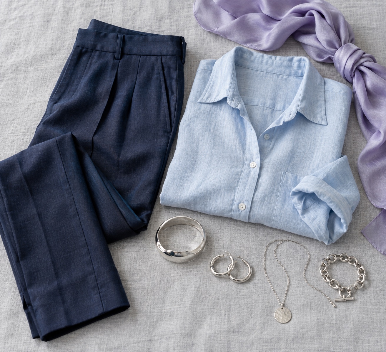
Start with one bottom, two tops, and a layer: soft navy trousers, a powder-blue shirt, a dusty-rose knit, and a heather-gray jacket. Add a lavender scarf or silver jewelry. Every top then connects to the same neutral base, while the jacket creates a practical temperature layer. For more capsule planning, see our seasonal capsule wardrobe guide.
Texture matters as much as exact color. Brushed cotton, washed linen, heathered wool, and matte silk naturally soften a shade. A highly glossy finish can make even an otherwise appropriate blue feel more intense. Put the clothing beside your face before buying duplicates of a “correct” swatch. A usable wardrobe depends on fit, climate, and the colors you actually enjoy wearing.
Summer Hair, Makeup, and Silver Metals
Summer-inspired makeup often repeats the palette's cool, soft pigments. Consider a rose or mauve blush, softly defined taupe or gray-brown eyes, and a berry-rose lip rather than orange coral. The right depth depends on your skin and subtype: Light Summer may enjoy a sheer cool pink, True Summer a balanced berry, and Soft Summer a blurred mauve. Product names do not guarantee the undertone, so test them in daylight rather than assuming every “rose” shade is cool.
Brushed silver and cool platinum usually harmonize easily with the blue-gray palette. Polished sterling silver can add a crisp accent without adding yellow warmth. Gold is still wearable; cooler champagne gold, a smaller piece, or mixed metals can make it feel less dominant. Use the gold versus silver comparison as one clue, not as a definitive season test.
If you color your hair, ash brown, cool beige blond, and softly neutral shades can echo Summer's muted quality. Avoid treating “ash” as a universal prescription. Hair dye interacts with existing pigment, maintenance, and personal style, and a cool shade that is much too dark can feel as severe as a black top. A colorist can help you choose a realistic level and keep the result intentional. Natural hair color alone never proves or disproves a Summer palette.
Summer Palette FAQ
Does tanning change my Summer season?
A tan changes the visible depth and sometimes the surface warmth of your skin. It does not automatically change the cool-versus-warm pattern you observe across multiple fabric tests. You may choose slightly deeper versions of your Summer colors in summer months. Recompare fabrics in consistent light if a familiar shade stops feeling useful; do not infer a new season from a tan alone.
Can a Summer wear gold jewelry?
Yes. Silver and platinum often repeat Summer's cooler quality more effortlessly, but the scale, finish, and placement of gold change the effect. A delicate champagne-gold necklace may blend well, while a large bright-yellow collar may become the strongest color near the face. Personal preference can outweigh a palette recommendation.
What if I need to wear black to the office?
Keep the black trousers or blazer and soften the area nearest your face. Wear a dusty-rose shirt, cool-gray scarf, lavender blouse, or soft-white collar. A matte fabric and a little distance between black and the face can reduce the stark effect. If you are building from scratch, soft navy or charcoal may be easier repeat purchases.
Are all Summer colors pale pastels?
No. Soft navy, slate, deep mauve, berry, and charcoal supply depth. A Summer palette needs enough range to create useful outfits. The unifying traits are coolness and relative softness; the exact value range shifts between Light, True, and Soft Summer.
How do I choose a subtype if two seem close?
Compare the boundary colors at the same depth in daylight. For True versus Soft, test cool raspberry against muted mauve. For Light versus True, test powder blue against medium slate. For Light versus Soft, compare airy cool pink and seafoam with smoky rose taupe and sage. Notice which group supports the face across several drapes. You can still borrow from a neighboring subtype.
Want a structured starting point? Try the interactive color analysis quiz, then check its suggestions against fabrics you own. A useful result is one you can test and wear, not merely a label.
💫 Discover Your Complete Color Palette
Ready to discover all the colors that make you look radiant? Our comprehensive color analysis will reveal your complete personal palette - perfect for hair, makeup, and wardrobe decisions.
Find My Color Palette →