The Complete Guide to the Soft Summer Color Palette

Key Takeaways
- The soft summer color palette thrives on cool undertones, low contrast, and gentle muting — your goal is seamless harmony between skin, hair, and eyes. Every shade you wear should feel like it belongs to the same quiet, cohesive story.
- Build your wardrobe foundation around soft summer neutrals: cool taupe, mushroom, pewter, soft charcoal, and muted navy. Swap stark black and optic white — both are on the soft summer colors to avoid list — for charcoal marl and soft white or blush ivory that won't overpower your natural coloring.
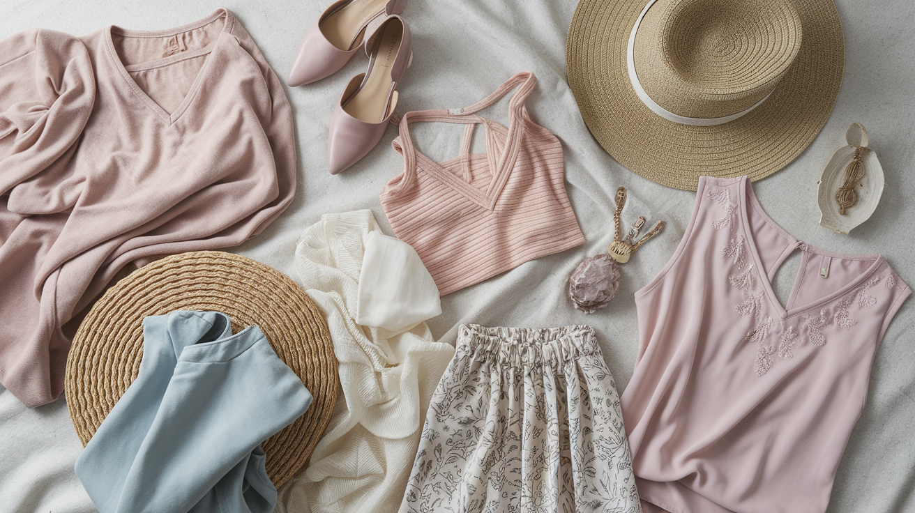
- Anchor key pieces in soft summer's signature hues: muted rose, dusty blue, silvery sage, soft summer teal, and cool-toned reds. Layer in pale plum, gentle lavender, and soft summer beige as accent shades — these soft summer color names keep your outfits grounded without tipping into noise. In 2026, Misty Rose has emerged as the standout lip and accent shade for this type.
- Reach for matte or lightly textured fabrics — cotton, linen, soft knits — that echo the palette's understated quality. Watercolor prints, small-scale patterns, and blurry florals all work beautifully; keep each outfit to three soft summer colors maximum for a polished, intentional result.
- For makeup, lean into cool mauve, dusty rose, and soft berry lips (satin or matte finishes read most naturally). Smoky taupe and lavender-gray eye shadows complement the soft summer color type without adding unwanted warmth. Silver and muted gemstone jewelry outperforms gold every time. Keep hair ashy and close to your natural depth, with cool-toned highlights for subtle dimension.
- Knowing your soft summer colors to avoid is just as important as knowing what works: bright saturated hues, warm oranges, golden yellows, and stark whites all create harsh contrast that competes with your features rather than enhancing them. Even soft summer yellow, if too warm or vivid, can throw off the entire look — reach for a cool, chalky lemon instead.
- How to shop for Soft Summer in 2026: Store lighting and phone camera filters are the enemy of accurate soft summer color analysis. Warm LED retail lighting makes cool muted tones look dull or greenish, while Instagram filters can saturate shades beyond recognition. Always step outside or stand near a window before committing to a purchase. When shopping online, disable any screen warm-shift settings and calibrate your display to daylight (6500K) to see soft summer colors as they truly are. Physical fabric swatch kits — available from specialist color houses for around $30–50 — remain the most reliable reference tool, especially for verifying the difference between soft white and optic white against your skin.
💫 Learn Seasonal Analysis
Ready to explore the complete seasonal color analysis system? Discover how to identify your seasonal type and unlock the perfect color palette that enhances your natural beauty.
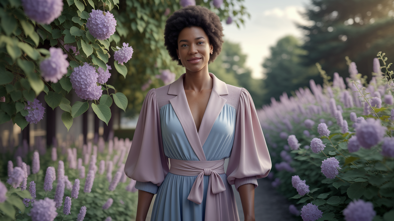
Learn Seasonal Analysis →The soft summer color palette is the quiet luxury aesthetic's best-kept secret — and if you've been sleeping on it, 2026 is the year to wake up. While everyone else chases saturated trends that clash and compete, the soft summer type effortlessly radiates that understated, expensive-looking elegance that no amount of loud color can manufacture. We're talking a low-contrast cool season built on gray-based, beautifully muted tones: think cool sage, heather blue, soft summer teal, dusty rose, and the season's standout lip shade — Misty Rose. The soft summer color analysis reveals a palette that doesn't shout; it commands. And once you understand your soft summer colors, you'll realize this isn't a limitation — it's a genuine superpower.
The soft summer color palette is the quiet luxury aesthetic's best-kept secret — and if you've been sleeping on it, 2026 is the year to wake up. While everyone else chases saturated trends that clash and compete, the soft summer type effortlessly radiates that understated, expensive-looking elegance that no amount of loud color can manufacture. We're talking a low-contrast cool season built on gray-based, beautifully muted tones: think cool sage, heather blue, soft summer teal, dusty rose, and the season's standout lip shade — Misty Rose. The soft summer color analysis reveals a palette that doesn't shout; it commands. And once you understand your soft summer colors, you'll realize this isn't a limitation — it's a genuine superpower.
Metals incline silver or soft pewter. Black can feel harsh, so deep charcoal or cool navy works better for depth. For prints, blurred edges and low contrast rock.
To anchor basics, select cool taupe and stone. Next up: palettes, combos, and real outfit ideas.
📚 Recent Articles
Defining the soft summer essence
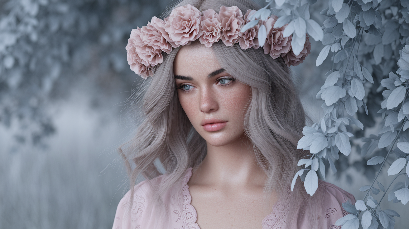
A seasonal color type that mixes Summer's cool base with Autumn's muted hush. Low contrast/medium value/soft chroma define that gentle, calming appearance. Skin, hair, and eyes all feel in harmony, almost velvety, none of them screaming for attention.
Of all the seasons, Soft Summer is defined by cool, desaturated hues and an elegant, quiet spirit. It falls somewhere between True Summer and Soft Autumn on the seasonal flow chart, accounting for its cool-but-muted profile and elegant, sophisticated ease.
1. The overall impression
Think soft edges, not hard lines. Elements blur together so nothing feels sharp or contrasty. Medium depth rules: not very light, not very dark.
A velvety, blended effect across skin, hair and eyes. The entire face leans tonal, like pastels with an edge of gray.
Muted, cool hues keep the look refined. Dusty blues, soft pinks and gentle mauves, these colours reflect the season's calm. Bright, loud hues shatter the spell, so the palette tips quiet and subtle.
Harsh colors and bold outlines inundate. Crisp white or jet black or mustard or orange or fire-engine red or earthy browns feel too hot or too strong, dulling the inherent natural poise Soft Summer carries.
2. Skin undertones
Skin is cool or neutral-cool, frequently with a pink or beige cast. It ranges in fair ivory, light beige, medium beige or deeper beige tones, but always a little grayed rather than golden.
Maintain balance with cool, muted bases. Avoid yellows or oranges – they conflict and can sallow the skin. Search out 'cool', 'neutral-cool' or 'rose-beige' labels and sample in daylight for a perfect merge.
Comparison quick guide:
- Soft Summer: cool to neutral-cool with a signature rose-beige or mushroom undertone — what true soft summer color analysis calls "soft summer beige." Think misty morning, not sandy shore. If a beige reads camel or honey, it belongs to Autumn, not you.
- True Summer: cool and slightly cleaner; handles delicate pastels with more clarity than the soft summer palette allows, but still shares that cool, hushed quality.
- Soft Autumn: neutral-warm and decidedly earthier — this is where the real confusion lives. Stores in 2026 are packed with "muddy" neutrals that sales clerks confidently label as universal, but for the soft summer color type, that warm undertone is simply too heavy. A quick drape test settles it: if the fabric evokes an English Manor or aged terracotta, you're looking at Autumn territory. If it reads like a foggy coastline or a soft grey-blue dawn, that's your soft summer palette speaking.
3. Natural hair
Hair is frequently ash blonde, medium to dark brown or natural gray. Warm golden lights don't come around very often. The tone leans cool, with ashy undertones and minimal luster as opposed to copper or red glints.
Steer clear of high-contrast dye jobs and sweltering heat. No brassy highlights or mahogany reds or rich auburn. Go for cool, smoky lowlights, a soft taupe balayage or pearl-ash tones instead.
When hair color remains cool and muted, it blends with skin and eyes, maintaining that cohesive, serene frame around the face.
4. Eye colors
Eyes are muted blue, gray, green, hazel or soft brown. Very seldom do they appear clear bright or inky. They carry a misty glaze over them, frequently with soft flecks showing the same depth as hair and skin.
High-contrast liner and pitch-black mascara can close in the eyes. Opt for cool taupe, slate or charcoal liner, and muted gray-brown mascara.
Keep shadows dusky: smoky lavender, seafoam gray, or dusty teal. The Soft Summer palette prefers cool, muted tones that comfort – not yell – steering clear of whites, yellows, mustard, orange, red, peach, brown, purple, and black.
Soft pinks, dusty blues and gentle mauves compliment lids, cheeks and lips for a serene, summer-ready look.
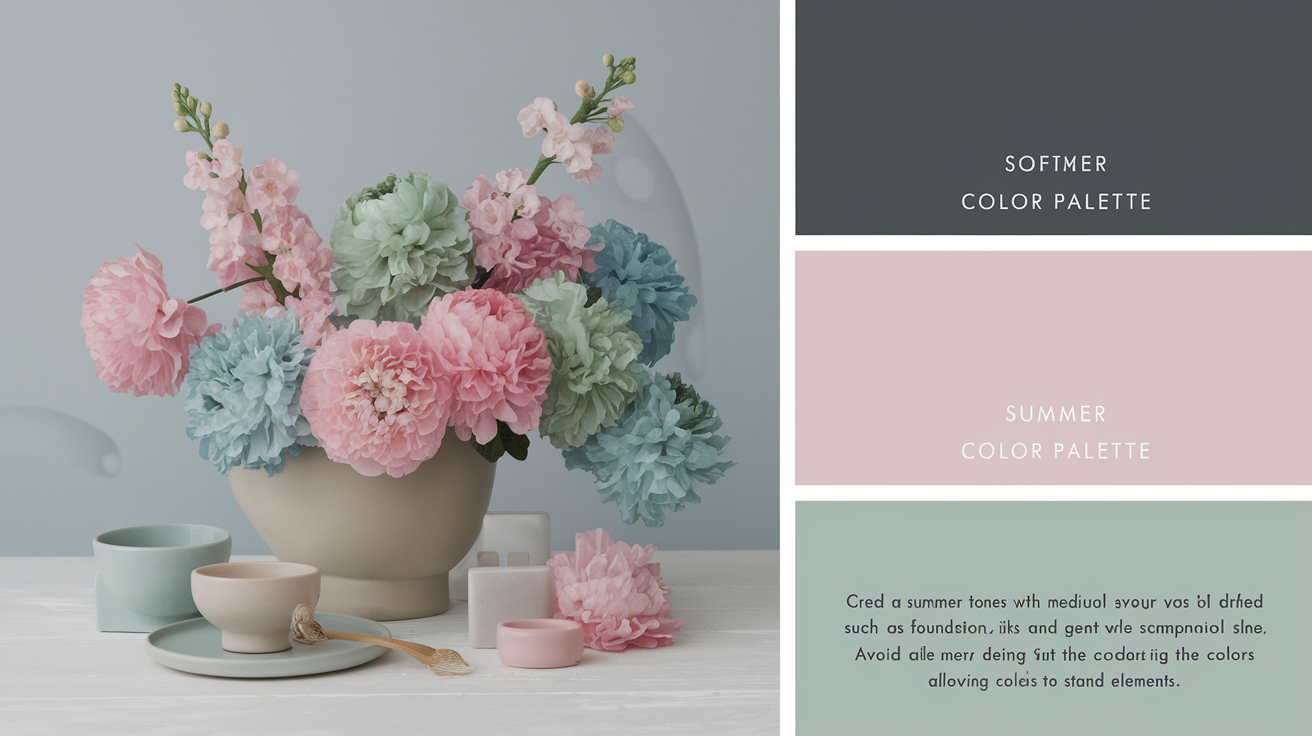
The soft summer color palette
Soft Summer is characterized by cool, muted, and medium in value colors that fall within a soft summer colour palette. This palette features a quiet spectrum of muted tones with soft borders, and neutrals like charcoal and soft white anchor it, as brighter shades can wash out the soft summer complexion.
| Category | Most flattering soft summer colors |
|---|---|
| Neutrals | charcoal, soft white, driftwood grey, muted navy, taupe, denim |
| Blues/Teals | dusty blue, faded cerulean, slate blue, soft teal |
| Greens | silvery sage, eucalyptus, silver eucalyptus |
| Pinks/Reds | muted rose, heather, Mountbatten pink, cool reds, cassis |
| Purples | pale plum, soft lavender, raisin |
Core neutrals
Build the base with soft greys, charcoal, taupe, driftwood grey, eggshell and muted navy. These tones reflect the cool, low-contrast characteristics of Soft Summer hair and eyes—ash blondes and browns, light to medium eyes with grey undertones—so they coexist in harmony rather than vie for attention.
Forget harsh black and pure white. They punch contrast outside of this season's palette and can sharpen features. Warm browns and reds lean too hot.
Reserve these neutrals for coats, pants, sweaters, jeans and footwear. They stack neatly and allow subtle color to sneak in without a ruckus.
For a capsule, choose: muted navy blazer, charcoal trousers, driftwood grey knit, taupe chinos, denim shirt, soft white tee, eggshell blouse, and a slate-blue trench.
Key colors
Depend on muted rose, dusty blue, silvery sage, faded cerulean, cool reds, heather and Mountbatten pink. They read calm and cool, with a medium value that fits the season's more muted contrast than other Summers.
Some Soft Summers get confused as Winters, but the softer value reveals the reality.
Shopping list:
- Dusty blue shirt, muted rose blouse, silvery sage cardigan
- Faded cerulean dress, cool red scarf, heather knit
- Cassis skirt, silver eucalyptus tee
Steer clear of vivid oranges, neon yellows, bright greens and heated warm reds. They drift too warm and loud.
Put important colors near the face for lift, and anchor with charcoal or taupe to keep balanced.
Accent shades
Add in soft turquoise, pale plum, gentle lavender, raisin and cassis for little pops of depth. A skinny belt, a scarf, a beanie, or watch strap will do.
Keep accents cool and hushed, never neon or highly saturated, so your entire look remains cohesive.
Pair accents with core neutrals: pale plum with driftwood grey, gentle lavender with soft white, raisin with muted navy. For prints, choose combinations of dusty blue, sage and heather over taupe.
If you like earthy notes, try sage, eucalyptus and eggshell—they add a soft, grounded feel without warmth.
Styling your soft summer wardrobe
Because Soft Summer individuals lean cool and muted, construct your soft summer colour palette with low-contrast blends that emanate calm and refinement. Go for soft summer colours with a grey cast and soft edges, allowing texture to shine where saturation can't.
- Start with cool, greyed neutrals: ash grey, taupe, soft navy, misty green.
- Add muted mains: dusty blue, blue-grey, muted plum, sage, opal.
- Layer near-face pieces in your top cool shades. Skip black up top.
- Add depth with texture (suede, silk, velvet) on top of bright pops.
- Cap outfits at three colors, low contrast and close values).
- Use soft metallics: pewter, brushed silver, or platinum.
- Create an office core in grey, taupe, navy and green.
- For evening, choose soft neutral dresses with gentle sheen.
Building with fabrics
Matte or softly textured fabrics flatter this palette. Linen, combed cotton, Tencel, cupro, and soft knits fall beautifully and reflect the still mood of cool, grey, muted shades. They soften outlines and help colors bleed together, which flatters Soft Summer's low-contrast harmony.
Pass on high-gloss satin, crisp taffeta or plasticky synthetics. Shiny or stiff surfaces can harden edges and conflict with the palette's hazy aesthetic.
Choose light, airy fabric that drapes instead of stands at a sharp crease. I am talking jersey, fine merino, washed tone lightweight denim and brushed twill.
Add interest with subtle pattern or weave: herringbone, broken twill, heathered knits, or a faint jacquard. Texture becomes your 'accent,' so you don't need loud color.
Mastering patterns
Opt for blurs of edges or watercolor flow in the prints. A misty floral in blue-grey, a smudged paisley or small scattered leaf can nestle close to the body without hijacking attention.
Dodge brash stripes, harsh checks and oversize geometrics. High contrast clashes against skin with cool, soft undertones, and can harshen features.
Keep all pattern colours within the Soft Summer range. Pewter, opal, dusty mauve, sea glass and cool taupe play well together and tie outfits together.
If you mix patterns, vary scale but hold the mood: a small heathered stripe with a tiny, hazy floral in the same values. The outcome seems deliberate, not overwhelmed.
Combining colors
Merge like-value colors for a seamless flow. Pewter with opal, platinum with muted pink or cloud grey with sage all reads elegant and calm.
Use no more than three colors per look. Experiment with soft navy trousers, dusty grey knit, and a misty green scarf near the face to reflect Soft Summer eyes, which frequently read grey regardless of shade.
No bright or warm intrusions. Leave out tomato red, eye-popping coral or sunny yellow. They compete with soft shades and cast a shadow on the face.
For layers, stack kin tones: taupe coat, grey sweater, blue-grey shirt. For night, a soft neutral dress in dove grey or muted slate with brushed silver jewelry feels effortless.
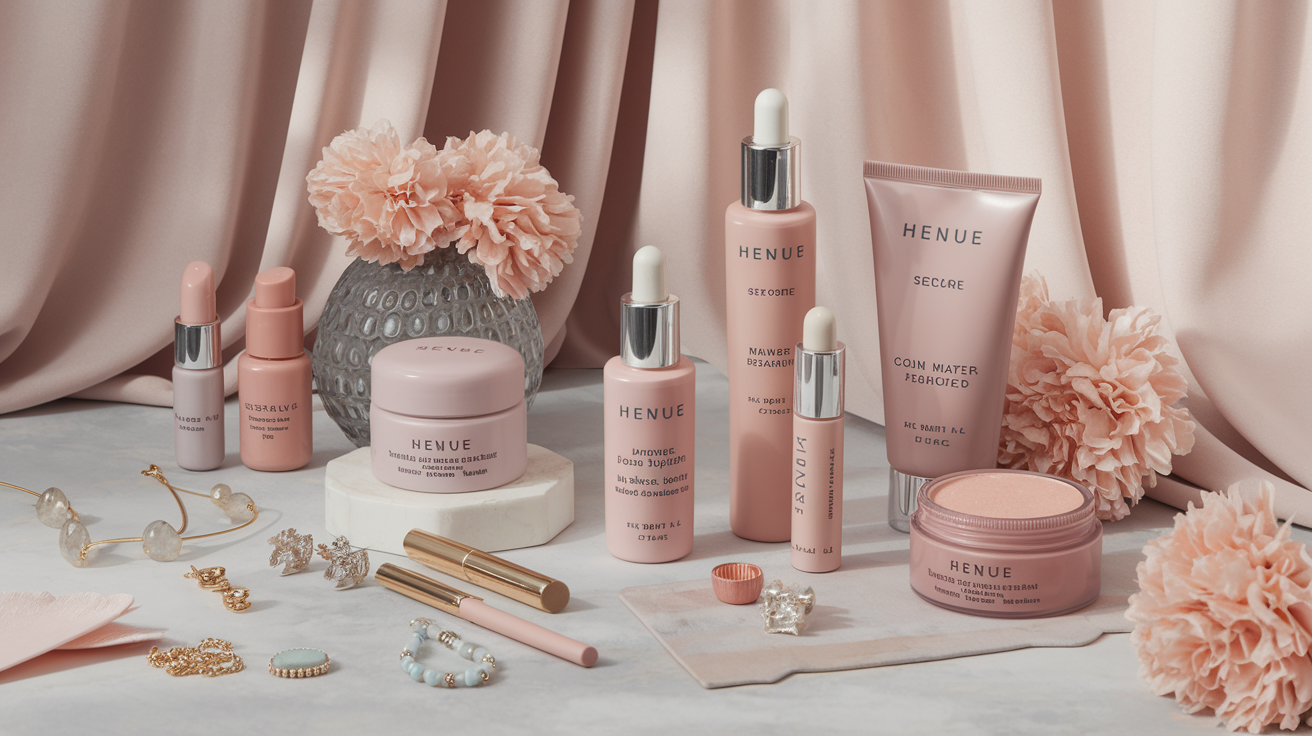
Beyond clothing: beauty and accessories
Take the soft summer colour palette beyond the closet. Shoot for cool, subdued options that reflect the soft summer season's serene vibe. Incorporate subtle color transitions, velvety textures, and muted-tone metals so it all reads cohesive from face to bag clasp.
Makeup harmony
Cool neutral makeup is best – looks fresh in every light. Consider frosty pink, mauve, dove gray, dusky blue and soft plum. Blush and lips reside on the red/pink side of the palette—rose, berry, rhubarb, and subdued raspberry. Maintain depth soft to medium.
Step away from warming bronzers, orange-based blushes, golden highlighters, and vivid lipsticks — they pull yellow into the complexion and leave soft summer color analysis results looking muddy and flat. For sculpting and warmth, reach for a cool taupe contour and a cool pink stain instead. And honestly? Brands are finally catching up. Westman Atelier's cool-toned contour stick in Petite Étoile is a genuine breakthrough for the soft summer color type — it carves definition without ever tipping warm or orange on the skin. Merit has similarly expanded its lineup with muted, cool-leaning formulas that sit beautifully within the soft summer palette. No more compromising or layering over unwanted warmth. For lips, the 2026 standout shade is Misty Rose — a dusty, cool-toned pink that feels tailor-made for soft summer colors. Pair it with a smoky taupe eye and you have an effortlessly polished look that works with, not against, your natural coloring.
Opt for soft, matte or satin instead of high shimmer or glossy shine. A light diffusion balances tone without shine. Cream-to-matte textures provide that "skin, but better" sensation.
Pair eye makeup with your eyes for serene uplift. Gray-green eyes of misty sage and slate. Eyes blue glow with cool taupe, storm blue and pewter. For brown eyes, think mauve, mushroom and soft charcoal. Line with cool brown or charcoal, not jet black.
Flattering jewelry
Choose silver, white gold, brushed pewter or steel over yellow gold or rose gold which read too warm. Matte or brushed finishes trounce mirror shine and wear better on soft summer skin.
Stone selection is important. Moonstone, pearl, labradorite, muted sapphire, gray-blue aquamarine, and soft amethyst all add glow without glare. You can add texture—suede cords, silk ribbons, or velvet chokers—for interest that remains understated.
Keep scale sophisticated. Too ornate or chunky can drown the look. A delicate chain, a flat hoop, or an understated signet ring compliments silk, suede, or velvet in your ensemble, letting texture speak for itself.
Match jewelry to clothes and make-up. Cool metals should appear on hardware, zips, bag clasps, buttons, belt buckles. A lipstick to match your handbag is quiet harmony. Incorporate prints in small dashes, like a misty leopard shoe, for intrigue without shouting.
Best hair colors
Stick a little closer to home with ashy, cool shades—ash brown, soft brunette, mushroom, cool dark blonde or pearl beige. These shades echo the palette's cool half and appear natural.
Stay away from fiery reds, golden blondes and jet black – they bring a hard contrast. If you need dimension, experiment with some subtle, chic, understated highlights or lowlights—silver beige, smoky taupe, or slate—applied delicately around the face. Keep lines blurred, not chunky.
Common soft summer misconceptions
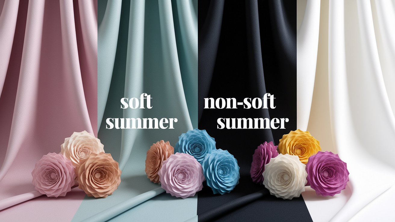
Soft Summer is cool, softly muted and medium in value. Not a mix of Spring and Summer, not pastels. The palette ranges from dusty rose, misty blue, sage, pewter and soft navy, leaving space for darks such as charcoal plum.
They assume warm, earthy colors will enliven it – most are too warm and appear dull or yellow on Soft Summer. Still, a few muted, low-heat shades—mushroom, taupe, faded terracotta—can work if they lean cool. Soft Summers are very common in 12-season systems, and although brights can swamp, there's a broad spectrum of gentle colors.
Wearing black
True black is a high-contrast, cool-neutral that's too deep and crisp for Soft Summer. It distracts attention away from the face and establishes a hard line the skin cannot compete with.
Charcoal Marl and ink navy align far better with the soft summer color palette's naturally low contrast — they define the face without carving harsh lines into it. If you're exploring soft summer colors to avoid, jet black sits firmly at the top of that list: in the mirror, it tends to deepen under-eye shadows, flatten lip volume and exaggerate nose-to-mouth folds. Charcoal Marl is the smarter swap — its heathered texture softens the depth while keeping that grounded, dramatic feel. For those who want an edgier edge, a Washed Obsidian gives a similar mood without the stark, high-contrast clash that true black creates against a soft summer complexion.
A charcoal knit or soft navy, by contrast, blunts features. If black is nonnegotiable, just keep it off the face. Select black belts, watch bands, or footwear. Throw on a cool, muted scarf near the face to soften it.
| Soft Summer Alternatives | Non-Soft Summer Colors |
|---|---|
| Charcoal, soft navy, graphite, pewter | Jet black, inky true black |
Wearing pure white
True white is luminous and shiny and it repels light, which flings light back in a way that muddies Soft Summer skin. Undertones can veer sallow or gray.
Go for soft white, light gray, pearl or an ivory with a cool cast. They provide crisp clarity without glare and play nice with muted make-up such as rose-brown lips and mauve blush.
Picture fabric swatches: optic white tee next to a pearl tee. Optic white is fresh but saps the cheeks. The pearl tee appears collected and composed.
Refresh basics with more gentle counterparts—tees, shirts and sneakers in off-white, dove or ash. They pair nicely with denim in slate or stone.
| Soft Summer Whites | Non-Soft Summer Whites |
|---|---|
| Soft white, pearl, light gray, cool ivory | Optic white, brilliant white |
Wearing brights
Bright, saturated colors—magenta, electric blue, acid lime—overpower the palette's soft, cool base. The eye is drawn to the color, not you–causing dissonance. Makeup follows the same rule: toned-down shades work best.
Choose muted brights instead: dusty teal over neon teal, rosewood over fuchsia, stormy blue over cobalt. If muted, deeper options still fit—smoke berry, slate pine or ink navy.
If you love bold color, wear it farther from your face. A bold ceramic mug, a punchy throw pillow, or journal scratches the itch without competing with your complexion.
Soft Summers tan cautiously and look radiant in cool sunscreen, a rose-beige flush and soft berry balm. The goal stays the same: gentle color harmony.
The psychology of your colors
Soft Summer in the 16 season color analysis system is a cool, muted, and blended palette. These colors impact mood, perception, and personal branding by blurring boundaries and diffusing visual tension. Most folks respond to calm, low contrast shades as more accessible and sharp brights as aggressive.
When your palette fits your skin's cool undertones—which are usually blue, beige or pink—you get a subtle confidence lift as the colors reflect your own features. Personal color analysis demystifies this fit, and the correct palette can boost self-esteem. YMMV, as color psychology is non-trivial, but Soft Summer frequently makes people look better with less work.
Projecting calmness
Soft summer colors come across as cool, quiet, and serene, embodying the essence of the soft summer season. Muted blues, smoky grays, misty lavenders, and soft taupes all lower visual volume, akin to turning down music to a steady hum. We find ourselves responding to these hues with effortless grace, as soothing colors can lower agitation and balance the emotional pendulum. The soft summer colour palette allows for a gentle approach to style, enhancing the soft summer complexion.
A cool slate blazer with a blue gray shirt says calm in a meeting. A lavender knit or dusky teal dress strikes a tranquil note for travel or interviews. Avoid aggressive brights—neon red, high-chroma orange, stark black-white contrast—as they can send mixed signals: confident yet tense.
Leverage your palette to influence context. In work spaces, go with heathered navy, mushroom gray and dusty rose to appear dapper and put-together. For a social situation, experiment with blue-green, wisteria, or soft berry — you come across warm but unassuming.
Creating connection
The amalgamated appearance of Soft Summer generates accessibility. Low contrast prevents the eye from straining, which makes you appear more accessible, accommodating, and credible. Harmonious mixes assist. Match silver-gray with muted mauve, or sage with soft denim.
Avoid loud combos that repel—high-contrast stripes, optic-white beside ink-black, or screaming primary blocks. Soft pinks and greens for amiable, open conversations—sage tee for a light hangout, rose-mauve scarf for a more subdued video session.
If coral lipstick looks aggressive but a coral tee appears okay, that's because clothing is further from your face, so undertone clashes sting a little less. Personal color analysis helps organize these eccentricities and provides definite, consistent options.
The impact of light
Soft Summer glows in sunlight or filtered light. Under soft light, light blue-gray or mauve undertones remain intact. Harsh LEDs can pull warmth where you don't want it, casting cool tones as dull or sallow.
Compensate by pre-experimenting with hues near a window before affairs. Choose makeup with cool, sheer layers: taupe shadow, rose-mauve blush, blue-based berry lip. For evening, add a soft-cool shine—pewter jewelry or a misty satin—rather than sparkle.
Light, airy fabrics—voile, washed linen, matte silk—preserve the ethereal, low-contrast vibe. Think dusty teal blouse, pebble-gray pants and a silvery scarf, the whole seems calm, clear and kind.
Conclusion
Soft summer dwells in serene illumination and refreshing shadow. Imagine fog on a lake, evening sky, timeworn linen. Colors sit silent, but they're not without life. Dusty rose brightens the complexion. Slate blue steadies the soul. Soft teal is a clean pop that doesn't scream.
Real victory reveals itself in modest, everyday fashions. Cool mauve lips can rouse a sleepy day. Pewter watch can tie a look–no muss, no fuss. Soft gray suits can look smart at work and gentle in sunlight.
Style shifts with you. Try out a new scarf, exchange a blush or a muted print tee. Drop your selections or pose a quick query. Prepared to construct your new soft summer ensemble?
Frequently Asked Questions
What defines a Soft Summer?
Soft Summer individuals possess cool-to-neutral undertones, low-to-medium contrast, and a soft summer colour palette characterized by muted tones. Their skin, hair, and eyes blend seamlessly, allowing for a harmonious look that favors cooler shades over bright colors.
Which colors best suit Soft Summer?
Choose cool, muted tones like dusty rose, mauve, and soft plum, which align perfectly with the soft summer colour palette. Medium saturation is best, while avoiding harsh black and bright white. Silver or soft brushed metals flatter most soft summer individuals.
How do I build a Soft Summer wardrobe?
Start with cool neutrals: dove gray, charcoal, mushroom, and cool navy, which are perfect for a soft summer colour palette. Then throw in softened accents like berry, seafoam, and lavender-gray to enhance your soft summer outfits. Keep contrast soft by layering textures, not high-chroma colors.
What makeup suits Soft Summer?
Apply cool muted makeup that complements a soft summer complexion. Use cool or neutral undertone foundations along with taupe, cool plum, and slate eyeshadows, enhancing the soft summer colour palette with blush in dust rose or mauve.
Can Soft Summers wear black?
Sure, with modifications, you can incorporate soft summer colours by softening black with texture, heathered knits, or a low-contrast print. Keep it off the face or break it up with a cool scarf or muted silver jewelry for a soft summer appearance.
Are pastel colors good for Soft Summer?
Yeah, if they're cool and muted, especially for soft summer individuals. Opt for misty pastels such as powder blue, dusty lilac, and seafoam, while striving for a soft summer colour palette that complements your innate softness.
What are common misconceptions about Soft Summer?
Two myths exist regarding the soft summer category: it equals 'light summer,' and it must avoid all color. In reality, soft summer individuals fare well with medium depth and rich, muted colors, including soft summer hair colors. Another myth is that gold jewelry is the only option; many soft summer celebrities also shine in silver, pewter, or white gold.