Soft Summer vs Soft Autumn: Key Differences

At first glance, Soft Summer and Soft Autumn look deceptively alike. Both palettes lean muted, both avoid loud saturated hues, and both flatter coloring that sits somewhere in the quieter, more blended end of the spectrum. It is no surprise that these two seasons are among the most commonly confused pairings in the entire 12-season color analysis system.
Yet the distinction is real, and it matters. Wearing the wrong palette can make skin appear dull, sallow, or washed out—even when every individual color seems soft and subtle on its own.
This article gives you a precise, side-by-side look at the soft summer vs soft autumn color palette, covering:
- The single underlying difference that separates the two seasons
- A full breakdown of each palette's chromatic characteristics
- Practical at-home tests you can use to identify your season
- How current fashion trends translate for each type
- Answers to the most frequently asked questions about these two seasons
Whether you already suspect you fall into one of these categories or you are starting your color analysis journey from scratch, this guide will help you arrive at a confident answer.
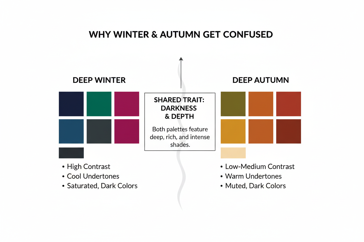
Why These Two Seasons Get Confused So Often
The confusion between Soft Summer and Soft Autumn isn't a beginner mistake—it's structural. Both are officially the most muted of the 12 color seasons, and both rank among the most common seasonal types in color analysis. When two seasons share the same defining chromatic property (low saturation), the overlap is built into the system itself.
Current fashion trends have spent several seasons gravitating toward exactly the kinds of colors these palettes contain—dusty mauves, soft beiges, warm taupes, quiet blues—which only makes the blurring worse. A muted rose on a store rack doesn't announce whether it belongs to a cool or warm palette. That distinction lives in the undertone, and undertone requires deliberate evaluation.
There's also a practical identification problem. Many people who land in this corner of the color analysis spectrum know they're definitively "soft" but can't pin down which season. The palettes are close enough in saturation and depth that comparing swatches side by side rarely resolves the question. What does resolve it is understanding the chromatic features that actually separate them—not just the colors, but the temperature and character of those colors.
→ Not sure which season you are? Take the quiz to find out.
The One Core Difference: Undertone
If you take away only one thing from this article, make it this: Soft Summer is cool, and Soft Autumn is neutral-warm.
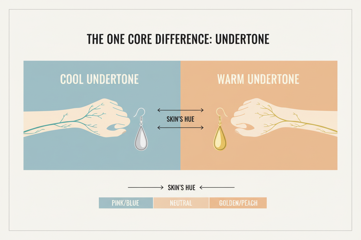
Everything else the two seasons share—the muted saturation, the medium value range, the soft and blended character—comes second to undertone. Undertone is the single chromatic variable that separates them, and it's the one you need to nail down first.
- Soft Summer sits within the Summer family, so its palette is anchored in cool undertones. The colors are slightly grey-toned, airy, and lean blue or pink at their base.
- Soft Autumn sits within the Autumn family, so its palette carries neutral-warm undertones. The colors are earthier, slightly golden or amber at their base, and feel grounded rather than airy.
Both palettes run at low chroma. Neither has bright, saturated hues. But the direction of that muted quality differs: Soft Summer goes grey and cool, Soft Autumn goes earthy and warm. That's what makes certain colors flatter one type and not the other.
Soft Summer Palette Breakdown: Cool, Muted, and Elegant
Soft Summer is a nuanced, elegant palette built around cool, muted tones with a slightly dusty, grey-tinged quality. It's never stark or icy—that's True or Light Summer territory—but it stays consistently cool throughout.
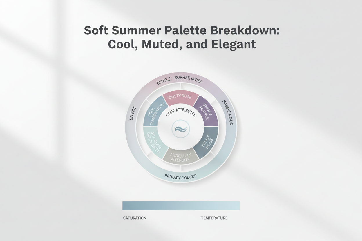
Key chromatic characteristics:
- Undertone: Cool, leaning blue-pink at the base
- Saturation: Low—every color is softened and desaturated
- Value range: Medium—neither very light nor very deep
- Overall mood: Dusty, slightly misty, refined
Core color families in the Soft Summer palette:
| Color family | Character |
|---|---|
| Dusty rose | Cool-based pink, muted not bright |
| Soft lavender | Gentle purple with a grey quality |
| Cool taupe | Greyed beige with no warmth |
| Muted blue-grey | Quiet, cool, slightly hazy |
| Soft sage | Green with a cool, greyish cast |
| Dusty mauve | The signature Soft Summer neutral |
The palette is cohesive and understated. It works best when natural contrast between hair, eyes, and skin is relatively low and the overall impression is soft and cool-toned. Bright or warm colors tend to overwhelm this coloring rather than work with it.
Soft Autumn Palette Breakdown: Neutral-Warm, Earthy, and Rich
Think of the light at 4pm in early October—still warm, but softer and hazier than summer. That's the quality Soft Autumn carries. Colors here are muted and low in saturation, but they have an earthy warmth underneath that keeps them from feeling washed out. More grounded than Soft Summer, but nowhere near the intensity of True or Dark Autumn.
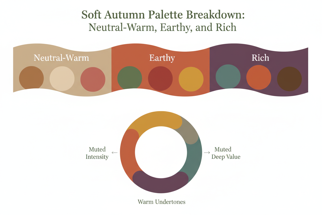
Key chromatic characteristics:
- Undertone: Neutral-warm, leaning golden or amber at the base
- Saturation: Low, but with slightly more earthy depth than Soft Summer
- Value range: Medium, with the capacity to carry slightly deeper tones
- Overall mood: Warm, hazy, rich, and organic
Core color families in the Soft Autumn palette:
| Color family | Character |
|---|---|
| Muted terracotta | Warm, dusty orange-red—the season's signature |
| Warm taupe | Beige with a golden undertone |
| Dusty peach | Soft, warm, low-saturation apricot |
| Olive | Muted yellow-green with earthy depth |
| Soft rust | Warm, subdued burnt orange |
| Camel | A gentle, medium-depth warm neutral |
This palette works best with coloring that has a warm or neutral-warm cast: golden, peachy, or light olive skin; hair with warm or ashy-warm tones; eyes in hazel, warm brown, or muted green. Cool or grey-toned colors tend to flatten this coloring, sometimes making it look drained.
→ Ready to confirm your season? Start the quiz here.
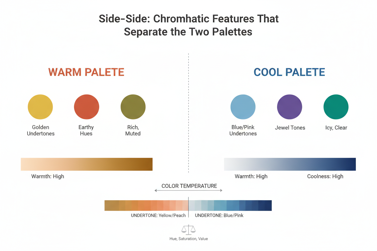
Side-by-Side: Chromatic Features That Separate the Two Palettes
This comparison focuses on chromatic features, not just color swatches—the most reliable way to tell these two palettes apart, and the most useful framework for figuring out which one you are.
| Feature | Soft Summer | Soft Autumn |
|---|---|---|
| Undertone | Cool (blue-pink base) | Neutral-warm (golden-amber base) |
| Saturation | Low—grey-toned and desaturated | Low—earthy and slightly richer |
| Value range | Medium, airy | Medium, slightly deeper |
| Palette mood | Dusty, misty, elegant | Hazy, warm, grounded |
| Signature neutral | Dusty mauve | Muted terracotta |
| Greens | Cool sage, grey-green | Olive, muted moss |
| Pinks | Dusty rose, cool mauve | Dusty peach, warm blush |
| Blues | Muted blue-grey, soft denim | Very limited—tend to read cold |
| Browns/taupes | Cool taupe, greyed brown | Warm taupe, camel |
Dusty mauve versus muted terracotta is a useful anchor for this. Both colors are low in saturation and medium in depth—they look deceptively similar on a shop rail. But dusty mauve has a cool, slightly purple-grey base, while muted terracotta has a warm, orange-earth base. That temperature gap is the whole difference between the two seasons.
Undertone: The Deciding Factor
Both seasons sit at low chroma, so saturation alone won't tell you which one you are. The question isn't "is this color muted?"—for both palettes, the answer is always yes. The question is "does this muted color lean cool or warm?"
Cool muted shades—dusty mauve, greyed lavender, soft rose with a blue base—work with Soft Summer coloring. Neutral-warm muted shades—terracotta, warm taupe, dusty peach with a golden base—work with Soft Autumn coloring. Get the temperature direction wrong and even a beautifully soft color can make the face look flat or slightly off.
Saturation and Depth: Where They Overlap and Where They Don't
Both Soft Summer and Soft Autumn avoid high saturation. That shared low-chroma quality is what makes them feel related—and what makes them easy to mix up when you're browsing a fashion rack or a makeup counter.
The distinction is subtle but real:
- Soft Summer reads slightly more grey and airy. The muted quality comes from a grey modifier added to each color.
- Soft Autumn reads slightly more earthy and rich. The muted quality comes from a brown or golden modifier, giving the colors a touch more warmth and depth.
A Soft Autumn can usually wear slightly deeper tones without the look turning heavy. A Soft Summer can carry cooler, lighter tones that would wash out a Soft Autumn. How depth behaves in each palette is a secondary clue—worth paying attention to when undertone testing alone leaves you stuck.
How to Test Which Season You Are
The most reliable home test is a simple draping comparison using two anchor colors that capture the key temperature split.
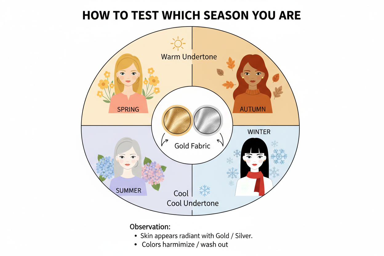
What you need:
- A cool dusty pink fabric or scarf (muted mauve or dusty rose works well)
- A warm muted peach or terracotta fabric or scarf
How to do it:
- Remove any makeup that alters your natural skin tone.
- Stand in natural daylight. Indoor artificial light skews color perception.
- Hold the cool dusty pink close to your face. Does your skin look clearer and more even? Or flat, sallow, drained?
- Switch to the warm muted peach or terracotta and observe the same things.
- The color that makes your skin look healthier indicates your temperature direction—cool for Soft Summer, warm for Soft Autumn.
What to look for:
- A good match makes fine lines and shadows less obvious, not more
- A good match won't make skin look yellow, grey, or blotchy
- A good match looks like the color belongs with your face, not against it
If both colors look equally flattering, you may sit close to the neutral point between the two seasons. A professional draping or app-based color analysis tool can sort out edge cases that a home test can't. The chromatic difference is real—it just takes a trained or calibrated eye to catch it at the margins.
Soft Summer vs Soft Autumn in Current Trends
Current trends have landed squarely in muted, dusty territory—soft neutrals, dusty mauves, warm beiges, quiet blues, gentle terracottas. That's good news for both types, but it also means more sorting work, since the same trend color often comes in versions that suit one palette and not the other.

For Soft Summer:
| Trend color | Soft Summer version |
|---|---|
| Mauve | Cool, slightly grey-purple—opt for versions with a blue or grey base |
| Beige | Choose greyed or cool beige, not golden or warm versions |
| Soft blue | Muted periwinkle or dusty blue-grey works well |
| Sage green | Cool, greyed sage rather than olive |
For Soft Autumn:
| Trend color | Soft Autumn version |
|---|---|
| Mauve | Warm, slightly dusty rose-brown—opt for versions with a peachy or amber base |
| Beige | Warm, golden-toned beige, camel, or biscuit |
| Terracotta | A core Soft Autumn shade—embrace it fully |
| Olive | Muted, earthy yellow-green—a natural fit |
When a trend color spans both palettes, what matters is the temperature of the specific item in front of you. Hold it near your face in natural light and run the same check you'd use in a draping test. That's the fastest way to decide while you're standing in a shop.
People Also Ask
What is the difference between Soft Summer and Soft Autumn in color analysis?
The core difference is undertone. Soft Summer is cool-toned—its muted colors carry a grey or blue-pink base. Soft Autumn is neutral-warm—its muted colors carry a golden or earthy base. Both rank as the most muted of the 12 seasons, which is why they get mixed up so often. Saturation and depth are similar across both; temperature is what separates them.
Can you be between Soft Summer and Soft Autumn?
The 12-season system places everyone in one season, not between two. That said, some people sit very close to the boundary—usually those with a genuinely neutral undertone that doesn't lean clearly cool or warm in either direction. If draping tests at home leave you uncertain, a professional color analysis or a calibrated digital tool will be more conclusive. The distinction is real even when it's subtle.
What colors are in the Soft Autumn palette?
Soft Autumn is built around muted, neutral-warm hues with an earthy character. Key colors include:
- Muted terracotta – the season's signature warm, dusty orange-red
- Warm taupe and camel – golden-based neutrals
- Dusty peach – a soft, low-saturation apricot
- Olive – muted yellow-green with earthy depth
- Soft rust – a subdued, warm burnt orange
- Warm muted brown – grounded and rich without being dark
The palette avoids cool grey-toned shades and bright, saturated hues. Every color in the range is softened and carries a quiet warmth.
How do I know if I am a Soft Summer or Soft Autumn?
The most effective home method is a simple draping test using two anchor colors:
- Remove makeup that alters your natural skin tone.
- Stand in natural daylight—indoor artificial light distorts undertone reading.
- Hold a cool dusty pink or mauve fabric near your face. Does your skin look clearer and more even, or flat and drained?
- Switch to a warm muted peach or terracotta and assess the same thing.
- The color that makes your complexion look healthier and more harmonious tells you your season—cool points to Soft Summer, warm to Soft Autumn.
If both look similarly flattering, your undertone may be close to neutral and professional analysis will give you a clearer answer.
Are Soft Summer and Soft Autumn the most muted color seasons?
Yes. Soft Summer and Soft Autumn are the most muted of the 12 color seasons. Both share low saturation (also called low chroma) as their defining quality, and neither works well with bright or highly saturated colors. That overlap is exactly why people confuse the two—and what makes them stand out within the seasonal system. Most other seasons have more depth, more warmth, more cool intensity, or higher contrast than either of these.
FAQ
What is the main difference between Soft Summer and Soft Autumn?
Undertone. Soft Summer is cool-toned, built on muted colors with a grey or blue-pink base. Soft Autumn is neutral-warm, built on muted colors with a golden or earthy base. Both palettes sit at the low-saturation end of the spectrum—the most muted of the 12 color seasons—but they travel in opposite temperature directions, and that single difference is what determines which palette actually works with your coloring.
Do Soft Summer and Soft Autumn share any colors?
Yes, in a narrow band of deeply neutral, very low-saturation shades. Dusty mauvy-taupes, certain greyed roses, and some soft grey-beiges can work across both. But as colors move away from that neutral middle ground, the two diverge: Soft Summer pulls toward cool lavender-pinks and blue-toned greys, while Soft Autumn pulls toward warm terracottas, peaches, and earthy olives. The overlap is real, just small.
Which season suits neutral undertones—Soft Summer or Soft Autumn?
People with a genuinely neutral undertone often land right at the boundary between these two seasons. Soft Autumn accommodates neutral-warm undertones; Soft Summer accommodates neutral-cool ones. If your undertone reads as neither distinctly cool nor distinctly warm, a draping test—or a professional or digital color analysis—is the most reliable way to figure out which side of neutral you fall on.
Can current fashion trends work for both Soft Summer and Soft Autumn?
Many contemporary trends favor the muted, low-chroma aesthetic both seasons share. Earth-toned capsule wardrobes, dusty pastels, and quiet-luxury neutrals translate well into either palette, as long as the specific shades lean in the right temperature direction. A Soft Summer picks the cooler, greyer versions of a trending color; a Soft Autumn picks the warmer, earthier versions of the same trend. The styling logic is identical—only the exact shade differs.
How do I test whether I am a Soft Summer or Soft Autumn at home?
A basic draping test in natural daylight is the most accessible starting point:
- Remove foundation and heavy makeup so your natural skin tone is visible.
- Use natural daylight—indoor lighting distorts undertone.
- Hold a cool dusty pink or mauve fabric near your face: does your skin look even and clear, or flat?
- Switch to a warm muted peach or terracotta: does skin look healthier and more luminous, or muddy?
- The fabric that makes your complexion look smoother and more harmonious points to your season—cool = Soft Summer, warm = Soft Autumn.
If both look similar, your undertone is probably very close to neutral. A calibrated digital tool or professional analysis will give a more definitive answer.
Why do so many people get Soft Summer and Soft Autumn confused?
The confusion is built into the structure of the seasons. Soft Summer and Soft Autumn are the two most muted seasons in the entire 12-season system, and they sit adjacent to each other in the seasonal spectrum. Muted saturation is so dominant a trait in both that it can visually outweigh the undertone difference, especially in photographs or artificial light. Neutral-undertoned individuals add another layer of complexity because they do not drape cleanly cool or warm. These factors together make the Soft Summer vs Soft Autumn color palette question one of the most commonly debated in color analysis.
Is Soft Autumn warmer than Soft Summer?
Yes. Soft Autumn is warmer than Soft Summer. Soft Autumn sits within the Autumn family and carries a neutral-warm undertone with golden and earthy qualities. Soft Summer sits within the Summer family and carries a cool undertone with grey and blue-pink qualities. Both palettes are equally muted, but their temperature directions are clearly different—Soft Autumn pulls toward warmth, Soft Summer pulls toward cool. That temperature gap is the essential distinction between the two seasons.
Not sure which side of the line you fall on? Take the color analysis quiz to find out whether your coloring aligns with Soft Summer or Soft Autumn.