Light Summer Color Palette Guide

If your coloring feels soft, fair, and quietly luminous — not dramatic, not warm, just gently cool and airy — you may belong to one of the most delicate of the twelve seasonal color types: the light summer color palette.
💫 Discover Your Complete Color Palette
Ready to discover all the colors that make you look radiant? Our comprehensive color analysis will reveal your complete personal palette - perfect for hair, makeup, and wardrobe decisions.
Find My Season →Light Summer sits at the bridge between Summer and Spring, blending the coolness of Summer with Spring's signature lightness. The result is a palette that reads as fresh, ethereal, and understated — closer in spirit to early June mornings than to the saturated heat of midsummer. Think pale blue skies, soft green meadows, and the kind of diffused light that makes everything look slightly washed in silver.
What sets Light Summer apart is a specific combination of three color qualities:
- High value — colors lean light, never dark
- Cool temperature — hues carry a blue or grey undertone, never warm or golden
- Low-to-medium chroma — colors are softened and muted, never vivid or pure
Critically, Light Summer is even lighter than classic Cool Summer, making it the palest of the three Summer sub-seasons. Where classic Summer can carry a deeper navy or a more saturated rose, Light Summer's version of those same hues is noticeably airier and more diffused.
In this guide, you'll find everything you need to understand and apply the light summer color palette — from its defining characteristics and core hues, to outfit formulas, comparisons with neighboring seasons, and clear direction on which colors to avoid. Whether you're confirming your season or learning how to dress it, this is your complete reference.
📚 Recent Articles
What Is the Light Summer Color Palette?
The light summer color palette is one of twelve seasonal color types in personal color analysis. It sits right on the border between the Summer and Spring families, carrying Summer's cool undertone while leaning into Spring's lightness.
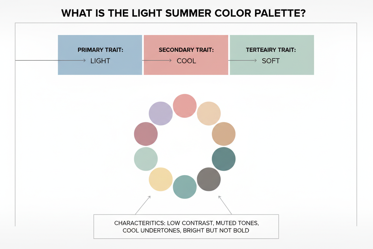
Within the twelve-season framework, Light Summer is a secondary season — its dominant quality is light, its secondary quality is cool. That order matters. Lightness comes first; coolness refines it. This is why Light Summer colors feel airier and less saturated than classic Cool Summer colors, even though both share a blue-leaning undertone.
The palette has three defining qualities:
- Very high value — all colors are inherently light, sitting toward the pale end of the tonal scale
- Cool temperature — hues lean toward blue, lavender, or grey rather than golden or peachy warmth
- Low-to-medium chroma — colors are softened and gently muted, never vivid or sharp
That said, this is not a palette of near-neutrals. Light Summer is genuinely colorful — it just expresses that color in a soft, airy register rather than a bold one.
The Mood and Imagery of Light Summer
It helps to anchor the palette in imagery before getting into technical detail — because Light Summer has a very specific feeling that, once you recognize it, makes the color logic click.
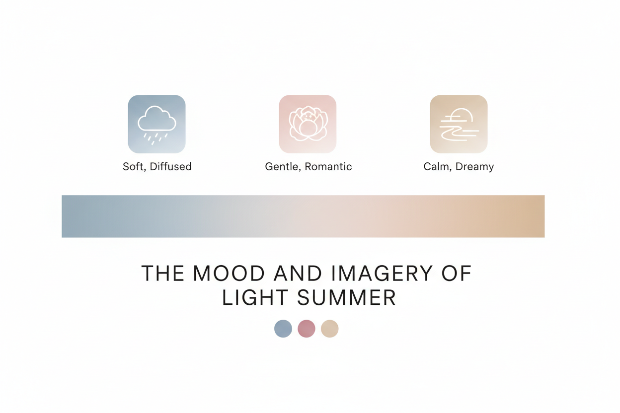
Think of early June: fresh-cut grass in the morning light, a wide blue sky, that particular quality of summer brightness before it turns heavy or golden. There's an openness to it. Things just coming into bloom.
The objects associated with this palette capture that mood well:
- Cherry blossoms — blush pink, soft and fleeting
- Forget-me-nots — clear, delicate cornflower blue
- Pink lemonade — blush-tinted, barely-there sweetness
- Turkish delight — soft rose and lavender in powdery pastel form
- Mother of pearl — iridescent, cool, quietly luminous
- Lemon meringue pie — the palest, most ethereal yellow
- Bubbles — transparent, shimmering, almost colorless but full of light
What these have in common is coolness, lightness, and gentle color saturation. Nothing is heavy. Nothing is warm or golden. The palette is unmistakably colorful — it just carries its color with a soft hand.
Key Color Characteristics: Value, Temperature, and Chroma
Every seasonal palette can be described along three axes: value (light to dark), temperature (warm to cool), and chroma (muted to vivid). Knowing where Light Summer falls on each one lets you identify palette-correct colors on your own, without memorizing a fixed list.
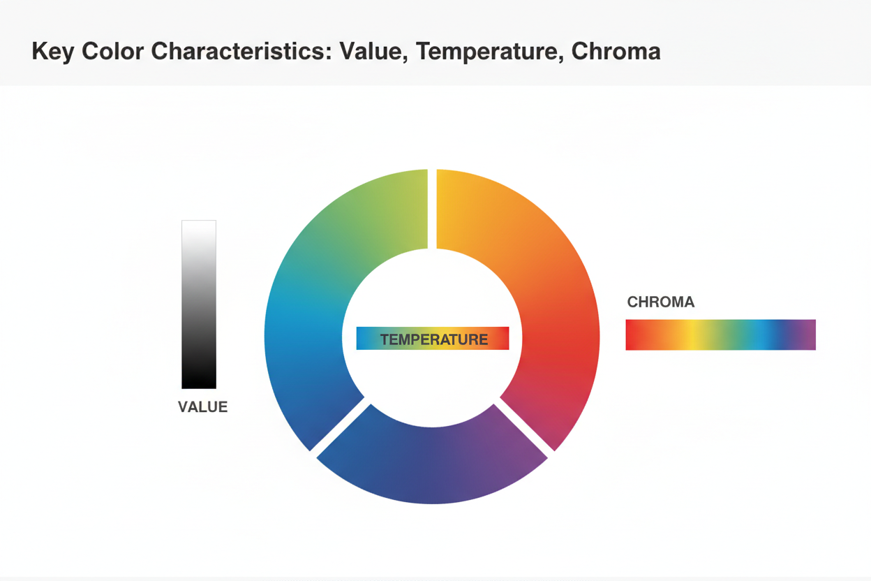
Value: Very High Value is the primary defining characteristic here. Light Summer sits at one of the highest value levels of all twelve seasons — its colors are consistently pale and light. That's what separates it from Classic Summer, which can handle medium-depth colors, and from Soft Summer, which runs slightly darker and dustier.
Temperature: Cool Light Summer's colors carry a cool, blue-based undertone. Anything with yellow, orange, or golden warmth is out — peach, camel, rust, and warm olive don't belong here. The coolness is real but not extreme; these colors feel crisp and fresh, not icy or stark.
Chroma: Low to Medium Light Summer colors are softened — blended with white or grey, which reduces intensity without muddying them. That's where the palette's characteristic gentleness comes from. Fully saturated, pure colors (traffic-light red, electric blue) are too vivid and will read as jarring against Light Summer's natural harmony.
Why Light Summer Is Even Lighter Than Classic Summer
Among the three Summer sub-seasons — Light Summer, Classic (True) Summer, and Soft Summer — Light Summer holds the highest value position. Classic Summer can reach into medium-value territory; its navy blues and deeper mauves still sit within range. Light Summer's version of those same hues is noticeably paler and more diffused.
The reason is that the Light modifier outranks the Summer base when sorting colors. A Light Summer can wear blue — but it needs to be a powder blue, not a medium navy. Pink works, but it needs to be a blush, not a deep rose. The lightness filter applies first, the cool filter applies second. Any color that passes both tests belongs in the palette.
The Light Summer Color Palette: Core Hues and Combinations
The light summer palette runs from soft cool neutrals to pale accent hues — all high in value, none of them warm. It helps to think in two layers: neutral foundations and accent hues.
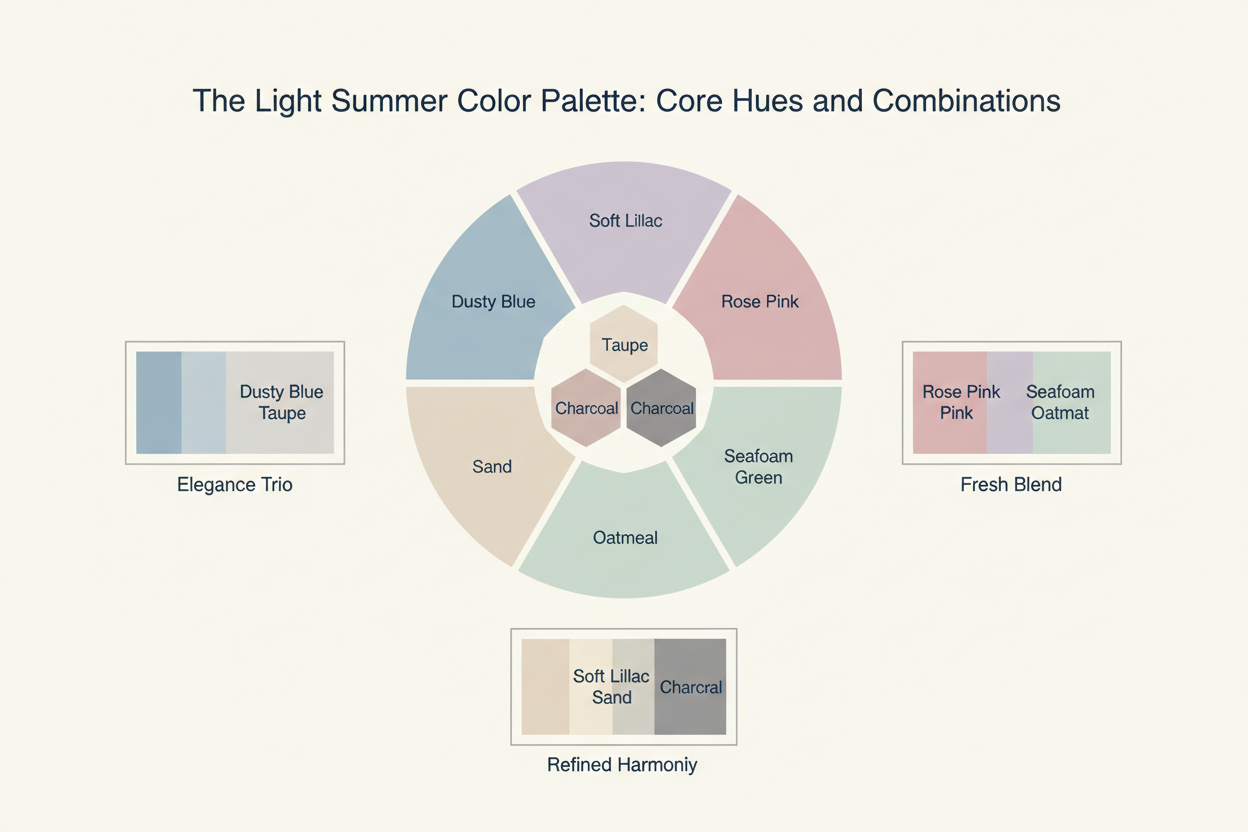
Neutrals and Accent Colors in the Light Summer Palette
Soft neutrals (wardrobe foundations):
- Icy white and soft white — not brilliant or stark, but free of any warm undertone; think the cool luminosity of mother of pearl
- Pale grey and silver-grey — the palette's true neutral, doing the job that black does for deeper seasons
- Powder beige and lemon meringue tones — the palest yellowed whites that still read as neutral rather than color
- Soft navy and dusty blue-grey — the deepest darks the palette offers, and even these stay light by most standards
These neutrals form the wardrobe backbone. They work easily with each other and give accent hues room to land.
Accent hues (color pops):
- Blush and cherry blossom pink — the palette's signature pink family; soft, rosy, cool-toned
- Powder blue and forget-me-not blue — fresh and clear, unmistakably light summer
- Soft lavender and dusty lilac — cool purple tones that sit right in the palette's temperature range
- Pale aqua and soft mint — a nod to the Spring side of the cusp, still cool enough to work here
- Rose mauve and dusty rose — a slightly deeper accent that sits between neutral and color
The palette is genuinely colorful. Cherry blossom, forget-me-not, and lavender are real, recognizable colors — not near-whites. Each one has been softened and kept pale, but they still read as color. Together they make outfits that feel fresh and harmonious without looking washed out.
Sample combinations that work well:
- Powder blue + soft white + silver accessories
- Blush pink + pale grey + dusty lavender
- Soft mint + forget-me-not blue + mother-of-pearl tones
- Pale aqua + rose mauve + icy white
How to Wear the Light Summer Palette: Clothing and Outfit Formulas
The palette's technical qualities — high value, cool temperature, low chroma — translate directly into how you build outfits.
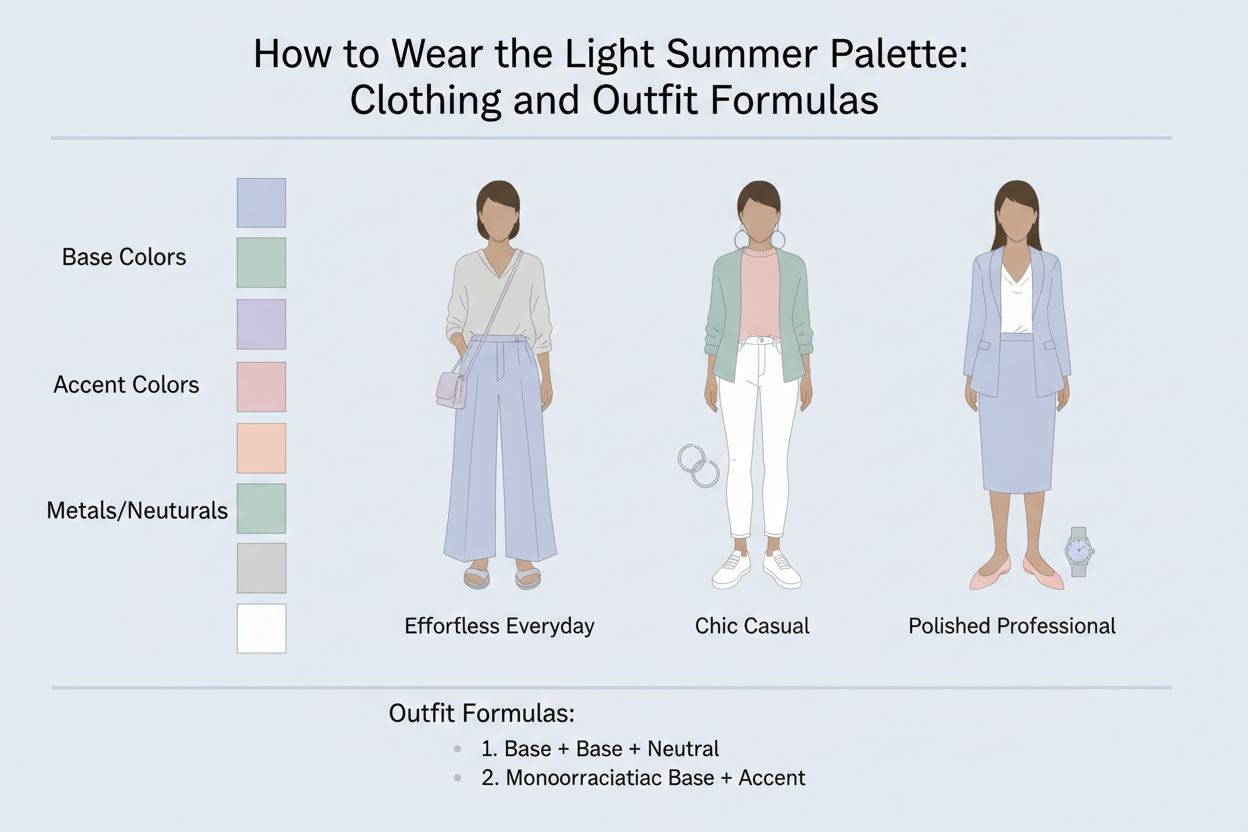
Keep contrast low to medium. The palette operates in a narrow tonal range, so high-contrast combinations like crisp black and white will overwhelm your coloring rather than work with it. Tonal dressing is the move: soft neutrals layered with slightly deeper soft neutrals, with a gentle color accent if you want one.
Avoid heavy, dark, or warm-toned pieces near the face. Deep charcoal, black, and rich chocolate pull visual weight away from your features and create a stark disconnect. Warm tones — camel, rust, mustard, terracotta — introduce the wrong temperature and tend to make the complexion look sallow or washed out.
Match fabric weight and texture to the palette's lightness. Heavy, stiff fabrics like thick wool and structured leather work against the palette's airy quality. Chiffon, soft jersey, linen, and lightweight cotton feel right with these colors in a way that heavier fabrics don't.
Pattern and print guidance:
- Small-to-medium scale prints work better than large, bold graphics
- Soft-edged patterns — watercolor florals, gentle stripes — rather than hard geometric lines
- Keep the colors within the print palette-correct: a floral in blush, lavender, and powder blue works; one with black outlines or warm oranges does not
Outfit formula examples:
| Base | Second Layer | Accent | Accessories |
|---|---|---|---|
| Soft white trousers | Powder blue blouse | None needed | Silver earrings |
| Pale grey dress | Blush cardigan | Lavender scarf | Pearl jewelry |
| Dusty blue-grey jeans | Blush pink tee | Soft mint bag | Silver-tone watch |
| Lemon meringue linen top | Soft white wide-leg trousers | Forget-me-not blue earrings | Clear or rose accessories |
Light Summer vs. Neighboring Seasons: How to Tell the Difference
Light Summer sits between two seasons — Light Spring on one side and Classic (True) Summer on the other — and is frequently confused with Soft Summer as well. Each comparison comes down to one clear axis.
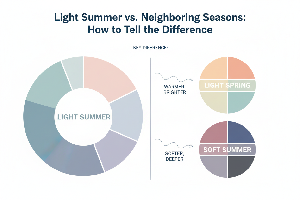
Light Summer vs. Light Spring
Both seasons share the same dominant quality: they're primarily light. The difference is temperature.
| Light Summer | Light Spring | |
|---|---|---|
| Value | Very high (light) | Very high (light) |
| Temperature | Cool — blue/grey undertone | Warm — golden/peachy undertone |
| Chroma | Low to medium | Low to medium |
Any warmth in a color — peach, golden yellow, warm coral — puts it in Light Spring. If it leans cool with a slight grey or blue cast, it's Light Summer. On the complexion level, Light Springs tend to have a warm golden or peachy quality; Light Summers read more neutral-to-cool, sometimes slightly rosy or ashy.
Light Summer vs. Soft Summer
Both seasons are cool and muted. The difference is value.
| Light Summer | Soft Summer | |
|---|---|---|
| Value | Very high — consistently pale | Medium — deeper and dustier |
| Temperature | Cool | Cool |
| Chroma | Low to medium | Low — the most muted Summer sub-season |
Soft Summer colors are noticeably deeper and more greyed-down: dusty rose rather than blush, slate blue rather than powder blue. If the palette that feels right runs to medium-depth tones — a heathered mauve, a muted teal, a soft taupe — Soft Summer is the better fit. If everything needs to stay noticeably pale, Light Summer is the match.
Light Summer vs. Classic (True) Summer
Classic Summer is the anchor of the Summer family — not as light as Light Summer, not as muted as Soft Summer. It can handle a wider value range, including medium-depth navy, burgundy-rose, and soft emerald. Light Summer can't go that deep without colors looking heavy and out of place. The distinction is straightforward: Classic Summer has a higher value ceiling.
Discover Your Season: Is Light Summer Your Color Palette?
You might be a Light Summer if your natural coloring has most of these qualities:
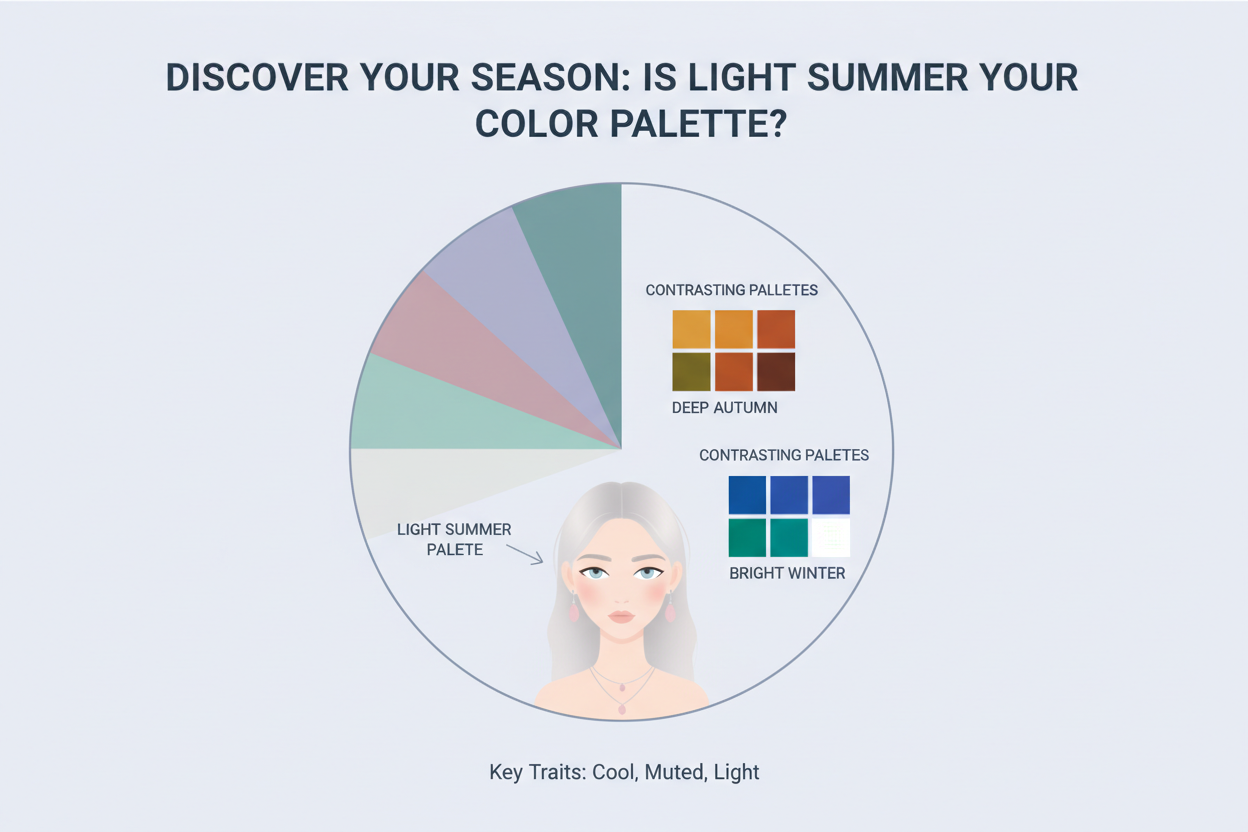
Complexion:
- Fair to light skin with a neutral-to-cool undertone — not warm, golden, or olive
- A slightly rosy, pinkish, or ashy quality to the skin
- Coloring that can look washed out in very dark or very warm tones
Hair:
- Naturally light — ash blonde, light golden-blonde with more ash than warmth, or light to medium ash brown
- Hair that looks lighter or more silver in natural light
Eyes:
- Light blue, grey-blue, pale green, soft grey, or light hazel with cool flecks
- Eye color that tends to be quiet rather than vivid or high-contrast
Overall impression:
- Coloring that reads as soft and understated, not bold
- A gentle harmony between features rather than dramatic contrast
If that sounds like you, light summer is probably your color palette. The most reliable way to confirm is a structured color analysis — where your coloring is assessed against actual color drapes, not photos or written descriptions.
People Also Ask
What colors are in the Light Summer color palette?
The Light Summer palette runs on soft, cool, high-value hues — every color is inherently pale, with a blue or grey-leaning undertone rather than anything warm or golden.
Core neutral foundations:
- Icy, soft white (not brilliant or stark)
- Pale grey and silver-grey
- Soft navy and dusty blue-grey (the palette's deepest darks)
- Powder beige in its palest register
Accent colors:
- Blush and cherry blossom pink
- Powder blue and forget-me-not blue
- Soft lavender and dusty lilac
- Pale aqua and soft mint
- Rose mauve and dusty rose
Every color shares three qualities: lightness, coolness, and a gentle muting. Pure vivid colors (electric blue, fire-engine red) and warm-toned colors (camel, rust, warm coral) sit outside this range.
What is the difference between Light Summer and Soft Summer?
Both Light Summer and Soft Summer sit within the Summer color family, so they share cool undertones and softened chroma — but they differ in value (how light or dark colors are).
| Quality | Light Summer | Soft Summer |
|---|---|---|
| Value | Very high — consistently pale | Medium — deeper and dustier |
| Temperature | Cool | Cool |
| Chroma | Low to medium | Low — the most muted of the three Summers |
Soft Summer colors run noticeably deeper and more greyed-down: think slate blue versus powder blue, or dusty rose versus blush pink. If medium-depth muted tones feel most harmonious on you, Soft Summer is probably the right fit. If your palette needs to stay clearly pale throughout, Light Summer is the better match.
How do I know if I am a Light Summer season?
Light Summer coloring tends to share a few consistent traits. You may belong to this season if:
- Complexion: Fair to light skin with a neutral-to-cool undertone — not visibly warm, golden, or olive; skin may have a slightly rosy or ashy quality
- Hair: Naturally light, with an ashy rather than warm cast — ash blonde, light ash brown, or light golden-blonde that reads more silver than honey in natural light
- Eyes: Light blue, grey-blue, pale green, soft grey, or light hazel with cool flecks
- Overall impression: Coloring that reads as delicate and soft rather than bold or high-contrast; very dark or very warm colors tend to overwhelm the complexion rather than enhance it
The most reliable confirmation comes from a structured color analysis using physical color drapes. Photographs and descriptions alone can be misleading.
What is the difference between Light Summer and Light Spring?
Light Summer and Light Spring share the same dominant quality — both seasons are primarily light — which is why they get confused so often. The thing that separates them is temperature.
| Quality | Light Summer | Light Spring |
|---|---|---|
| Value | Very high (light) | Very high (light) |
| Temperature | Cool — blue/grey undertone | Warm — golden/peachy undertone |
| Chroma | Low to medium | Low to medium |
At the color level, warmth is the deciding factor. A peachy blush, a golden butter yellow, a warm coral — those belong to Light Spring. The same pale hue with a cool, blue-grey lean belongs to Light Summer. On the complexion side, Light Springs tend to have a warm, peachy or golden cast to their skin, while Light Summers read as neutral to cool, sometimes with a faintly rosy or ashy quality.
Can Light Summers wear black or dark colors?
Black and very dark colors fall outside the Light Summer palette, and there's a straightforward reason: the palette is built around very high value, meaning all its colors sit toward the pale end of the tonal scale. A heavy, dark color next to Light Summer coloring creates a stark contrast that pulls attention away from the face instead of working with it.
That said, the palette has its own darker tones:
- Soft navy and dusty blue-grey are the palette's dark neutrals
- These are the functional equivalents of black for a Light Summer — grounding and versatile, without the harshness
For occasions that seem to call for black (formal events, workwear), soft navy or a cool, bluish charcoal is the most flattering substitute. Keeping dark tones away from the face — in trousers, shoes, or bags — also softens their impact when you can't avoid them entirely.
FAQ
What makes the Light Summer palette different from other Summer seasons?
The Summer color family has three sub-seasons — Light Summer, True (Classic) Summer, and Soft Summer — and what sets Light Summer apart is its dominant quality: value. All three Summers share cool undertones and softened saturation, but Light Summer consistently sits at the palest, most delicate end of the range.
| Quality | Light Summer | True Summer | Soft Summer |
|---|---|---|---|
| Value | Very high (pale) | Medium | Medium |
| Temperature | Cool | Cool | Cool |
| Chroma | Low to medium | Low to medium | Very low (most muted) |
In practical terms, Light Summer colors need to stay clearly light — powder blue rather than cornflower blue, blush rather than deep rose. It's also the Summer season most influenced by neighboring Spring, which adds a faint hint of brightness compared to the more thoroughly greyed tones of True or Soft Summer.
Is Light Summer the same as Cool Summer?
No. "Cool Summer" (also called True Summer or Classic Summer) is a separate seasonal category. Both Light Summer and Cool Summer belong to the Summer family and share cool undertones, but they differ in value and where they sit within the seasonal system.
Cool Summer is defined primarily by temperature — it's the most purely cool of the three, with medium-depth, well-muted colors. Light Summer is defined primarily by lightness — it's the palest of the Summers and bridges toward Light Spring.
The choice between them comes down to whether your coloring looks most harmonized by consistently pale colors (Light Summer) or medium-depth, thoroughly cool tones (Cool Summer).
What neutral colors work best for Light Summer?
Light Summer neutrals should stay pale, cool, and softly muted. Stark whites and warm tones both work against the palette.
Good options:
- Soft white and icy white — slightly grey or rosy rather than brilliant; the closest thing to a true white that still works
- Pale grey and silver-grey — cool, versatile, goes with almost everything in the palette
- Powder beige — only works when it leans cool; the moment it picks up golden or warm undertones, it stops working
- Soft navy — the deepest dark neutral, standing in for black
- Dusty blue-grey — grounds an outfit without the weight of charcoal or true black
Warm-leaning neutrals — camel, tan, warm beige, cream with a golden cast — tend to make Light Summer skin look dull or sallow.
Can a Light Summer wear warm-toned colors?
Warm tones aren't really part of the Light Summer palette. The season runs cool — blue-leaning, grey-leaning, softly rosy — so colors like rust, camel, warm coral, golden yellow, and olive sit outside its range.
That said, Light Summer sits at the cusp between Summer and Spring, which gives it a little more tolerance for the palest warm-adjacent tones than you'd find deeper in Summer. A barely-there peach blush can work. A rich warm gold usually won't. The rough rule: if a color reads as clearly warm or golden, it'll fight your coloring rather than work with it. When in doubt, stay on the cool side of the hue.
What metals and jewelry tones suit the Light Summer palette?
The Light Summer palette is built on cool, soft, and delicate qualities, so the metals that work best share those same characteristics:
- Silver — the natural first choice; cool and light, with undertones that sit right at home
- White gold — essentially silver with a bit more polish
- Rose gold — can work, but only in its softest, coolest versions; anything too warm or copper-toned will clash
- Platinum — cool and understated, an easy yes
Metals to be cautious with or avoid:
- Yellow gold — rich or warm yellow gold brings a warmth that tends to fight cool coloring
- Copper and brass — strongly warm-toned and generally a poor match for this palette's cool base
Pearls, moonstones, and soft pastel stones like aquamarine, rose quartz, and pale amethyst all work well here.
How does the Light Summer palette handle prints and patterns?
The same rules that apply to solids apply to prints: keep tones light, cool, and softly blended.
- Low contrast — tone-on-tone, soft watercolor florals, and subtle ditsy prints work better than bold graphics. Colors should blend gently rather than compete.
- Watch the darkest color — if a print includes navy, it should read as soft navy, not jet black. If it includes red, reach for a cool dusty rose rather than vivid crimson.
- Scale — delicate to medium-scale prints tend to suit this coloring better than large geometric or graphic patterns.
- Background color — soft or icy white works; brilliant white is harder. Pale grey or powder blue are reliable choices.
Avoid prints with warm tones (earthy browns, warm oranges, golden yellows) or high-contrast combinations. Both work against the palette's defining softness.
What are the worst colors for a Light Summer to wear?
The colors that work against Light Summer coloring tend to share at least one quality: they're too dark, too warm, or too saturated. Any of these can overwhelm a delicate cool complexion or make it look washed out.
Colors that typically cause problems:
- Black — too stark; the contrast pulls attention away from the face
- Warm earth tones — camel, tan, rust, terracotta, warm brown, olive; these introduce warmth that fights cool undertones
- Vivid or saturated colors — electric blue, bright orange, fire-engine red, hot pink, acid yellow; too intense for a palette that lives in the low-to-medium chroma range
- Deep, rich colors — burgundy, forest green, dark chocolate, mustard; too dark, and often too warm as well
- Cream or ivory with a golden cast — can make fair cool skin look sallow
When you're unsure, two questions help: Is this color light enough? Is it cool enough? If the answer to either is no, it probably falls outside the Light Summer range. Not sure which season you belong to? Take the color analysis quiz to find out.