Soft Summer Color Palette Guide

What Makes Soft Summer Different From Other Summer Palettes
If your best colors tend to be soft, smoky, and cool-leaning rather than bright or bold, there's a good chance you're a Soft Summer. The soft summer color palette sits between True Summer and Soft Autumn on the seasonal spectrum, pulling from the cool side of summer and the muted quality of autumn without fully committing to either.
💫 Discover Your Complete Color Palette
Ready to discover all the colors that make you look radiant? Our comprehensive color analysis will reveal your complete personal palette - perfect for hair, makeup, and wardrobe decisions.
Find My Season →What sets this palette apart is low chroma. Every color is noticeably greyed out and desaturated, creating a quietly blended look that feels effortless rather than stark. Think less jewel-tone clarity, more misty morning light.
The palette's signature shades reflect that throughout:
- Dusty blue and misty blue — soft and atmospheric, never electric
- Lavender and soft violet — cool-toned with a powdery quality
- Mauve and rose-taupe — pinkish neutrals that read warm on the surface but stay cool underneath
- Sage and dusty green — muted, never grassy or vivid
- Slate gray — a workhorse neutral that grounds the entire wardrobe
This guide covers how to identify, use, and build around the soft summer color palette — from the core hues and best neutrals to outfit contrast levels, metals, and the colors that tend to work against this coloring rather than with it.
📚 Recent Articles
What Makes Soft Summer Different From Other Summer Palettes
Summer has three subtypes — True Summer, Light Summer, and Soft Summer — and they aren't interchangeable. True Summer runs cooler and slightly higher in contrast. Light Summer is lighter and more delicate in overall value. Soft Summer is the most muted of the three, sitting at the intersection of Summer and Autumn on the seasonal flow chart.
That border position is what gives the palette its character. Soft Summer takes Summer's cool undertone but pairs it with Autumn's heavy desaturation. The result looks weathered, blended, and quietly sophisticated rather than fresh or crisp.
The practical difference: put a True Summer color (clear cool pink, sharp icy blue) next to a Soft Summer color (dusty mauve, smoky slate) and the True Summer shade will look vibrant by comparison. That extra clarity works for True Summers. For Soft Summers, it tends to overpower.
The Three Color Dimensions of Soft Summer
Every seasonal palette sits at a specific position across three dimensions: hue temperature, value, and chroma. Soft Summer has a clear position on all three.
| Dimension | Soft Summer Position |
|---|---|
| Hue (Temperature) | Cool to neutral-cool — no warm undertones |
| Value (Light vs Dark) | Low to medium — neither very light nor very dark |
| Chroma (Saturation) | Very low — heavily greyed and muted throughout |
Chroma is what defines this season more than anything else. Nearly every color in the palette has been dulled with grey, which creates that smoky, blended quality. Push any one of the three dimensions too far — too warm, too bright, too light — and the harmony falls apart.
Core Soft Summer Colors to Build Around
These are the shades that consistently work across clothing, outerwear, and separates. They share the palette's signature dusty, cool-muted quality.
Blues and greens
- Dusty blue — soft and atmospheric, not sky blue
- Misty blue — greyed, almost hazy
- Slate blue — a mid-depth cool tone that doubles as a neutral
- Sage — muted green with a grey cast, not grassy or olive
Pinks, mauves, and purples
- Lavender — powdery and cool, not vivid violet
- Mauve — a pinkish neutral that reads almost greige in some lights
- Rose-taupe — blends warm and cool without tipping fully into either
- Soft plum — deeper and grounding without reaching jewel-tone intensity
Greys and blued neutrals
- Slate grey — the most versatile anchor in the palette
- Soft charcoal — dark enough for depth, muted enough to stay harmonious
- Blue-grey — cool, dusty, pairs well with almost everything above
What these shades have in common: they look slightly quieter and more complex than a standard color chip. That complexity is the point.
The Best Neutrals and Why Black Usually Fails
Soft Summer coloring is naturally low-contrast — skin, hair, and eyes blend together rather than stand apart. High-contrast neutrals like pure black and stark white work against that instead of with it.
Why pure black is often a problem Pure black introduces more contrast than most Soft Summer features can carry. Near the face, it tends to make the complexion look washed out or harder than it is. That's not a permanent ban — on shoes, bags, or anywhere far from the face, it's unlikely to cause trouble. But as a primary top or dress, it tends to pull focus in the wrong direction.
Why stark white has the same issue Crisp white is too bright for the same reason. It creates a sharp edge where the palette wants soft transitions.
What to reach for instead
| Instead of... | Try... |
|---|---|
| Pure black | Soft charcoal, deep slate, muted navy |
| Stark white | Soft grey-white, blush-white, pale lavender |
| Bright navy | Dusty navy, greyed indigo |
| Warm beige | Cool taupe, blue-tinged stone |
Soft greys, dusty navies, cool taupes, and muted blue-toned browns all anchor a Soft Summer wardrobe without the harsh edge that comes from pushing to either extreme.
Colors to Avoid if You Want the Palette to Feel Harmonious
Two types of colors work against Soft Summer coloring: too warm, or too saturated.
Too warm
- Burnt orange, rust, terracotta
- Golden yellow, warm mustard
- Camel and warm camel-tan
- Any shade with a strong yellow or golden base
These push into Autumn territory. Soft Summer sits next to Soft Autumn, so a small amount of warmth won't necessarily ruin things — but anything clearly warm-dominant will fight the cool undertone the palette depends on.
Too saturated
- Electric blue, cobalt
- Hot pink, magenta
- Emerald green
- Vivid red or tomato red
High-chroma shades make Soft Summer features recede instead of glow. The palette works because of its softness; one fully saturated shade makes everything around it look washed out by comparison.
The practical check: If a color looks bold, bright, or clearly warm on its own, leave it out.
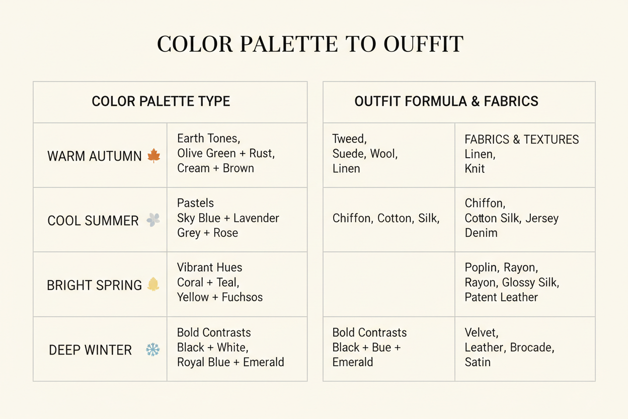
How to Build Outfits With Soft Summer Contrast Levels
Soft Summer features blend rather than contrast, so outfits built on the same principle tend to look most cohesive. The goal is tonal dressing — keeping shades close in depth and temperature so the outfit reads as a unified whole.
Contrast level guide
- Low contrast (ideal): Combine shades within a similar value range — dusty blue with soft lavender, sage with grey-white, mauve with slate. The pieces feel like they belong together.
- Medium contrast (works well): A slightly deeper shade paired with a softer one — charcoal with blush-grey, dusty navy with pale lavender. Provides visual interest without sharpness.
- High contrast (use carefully): Save strong contrast for accessories or lower-body pieces, not head-to-toe combinations near the face.
Fabric choices reinforce the palette
Texture matters here. Matte, softly brushed, and slightly textured fabrics — linen, jersey, brushed cotton, crepe, suede — suit the palette's quiet quality. High-shine fabrics (patent leather, bright satin, metallic brocade) tend to amplify contrast in ways that work against the season.
A few reliable formulas
- Slate grey trousers + dusty blue top + soft charcoal jacket
- Mauve dress + cool taupe accessories
- Sage linen shirt + blush-grey trousers
- Soft plum knitwear + dusty navy wide-leg trousers
Not sure which formula fits your actual coloring? Take the color analysis quiz to confirm your season →
Metals, Accessories, and Sister Palette Borrowing
Metals
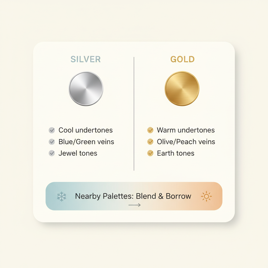
Silver is the safer default for Soft Summer. Its cool tone sits naturally alongside the palette's hue direction, and a brushed or matte finish works better than high-polish shine. Rose gold, slightly warm but still muted, can work as a middle-ground option for some Soft Summers. Bright yellow gold tends to push too warm, though antique or oxidized gold — which reads more neutral and less vivid — is often acceptable.
The guiding principle: lower-saturation finishes in any metal are more likely to work than high-gloss or highly reflective ones.
Other accessories
- Bags and shoes: Cool taupe, slate, dusty navy, soft grey-brown, mauve — all align well. Patent finishes add unwanted contrast; matte leather or suede are usually better choices.
- Scarves and wraps: A strong opportunity to add a palette accent colour (lavender, dusty rose, sage) close to the face.
- Eyewear: Frames in muted tones — grey, blush-brown, soft tortoise with cool undertones — suit the season better than black or bright acetate.
Borrowing from sister palettes
Soft Summer is the most muted Summer subtype and can occasionally pull shades from adjacent palettes, as long as the borrowed colours stay soft and don't veer too far in temperature.
- True Summer: Cooler shades like soft rose, muted orchid, and greyed periwinkle translate well. The cleaner, icier True Summer shades have too much clarity and tend to overwhelm.
- Soft Autumn: The deeper, cooler shades from Soft Autumn — dusty teal, muted terracotta-adjacent neutrals — can work in small amounts, but anything too warm or too earthy will tip out of Soft Summer's range.
The test for any borrowed shade: does it look muted and cool-leaning? If yes, it's probably fine. If it reads vivid or noticeably warm, it belongs somewhere else.
Want to explore your full palette with a personalised breakdown? Start your color analysis →
People Also Ask
Can Soft Summer wear black?
Black isn't the best choice for most Soft Summer types — but it's more nuanced than a flat no.
The core issue is contrast. Soft Summer coloring is naturally low-contrast: skin, hair, and eyes blend softly rather than stand apart. Pure black near the face creates a hard edge that clashes with that natural harmony, making the complexion look washed out, shadowed, or drawn.
Black causes the most trouble in tops, turtlenecks, or shirts worn near the face, in dresses or jumpsuits as the main outfit statement, and in high-contrast color combinations built around it. Lower on the body it matters less — shoes, bags, and accessories below the waist are fine, as are small accents within an otherwise muted outfit.
If you want a dark neutral, soft charcoal is the obvious substitute — deep enough to anchor, muted enough to stay harmonious. Deep slate and dusty navy give similar visual weight without the starkness. Muted dark plum or greyed indigo add depth while staying within the palette's cool, low-chroma range.
The short version: Soft Summer can go dark, just not sharp.
What are the best colors for Soft Summer?
The best colors for the soft summer palette share two qualities — they lean cool and they're heavily muted with grey. Any shade that looks smoky, dusty, or gently blended rather than vivid tends to work.
Blues run from dusty and atmospheric to slate, a cool mid-tone that functions almost like a neutral. Greens work best when they're sage — grey-cast and quiet, not grassy. On the pink and purple side, lavender (powdery, not bright), mauve, dusty rose, and soft plum all sit comfortably in the palette. None of them are loud. That's the point.
For neutrals, slate grey is the most versatile anchor in the wardrobe. Soft charcoal is dark enough for depth but muted enough not to jar. Blue-grey and cool taupe fill the same role — quietly present, not demanding attention.
What unites all of these is that they look slightly quieter and more complex than a standard color chip. That greyed complexity is the signature of the palette, and the reason bright warm colors and heavily saturated shades tend to feel out of place next to them.
FAQ
Is Soft Summer cool or neutral?
Soft Summer is primarily cool, but with a noticeable neutral quality — it sits between True Summer and Soft Autumn on the seasonal spectrum, which means it skews cool without being purely so.
In practical terms:
- Temperature: Cool-leaning, but not intensely so. Soft Summer coloring typically features neutral-cool skin, ashy hair, and softly muted eyes rather than strongly warm or strongly cool features.
- Saturation: Low across the board. Muted is the dominant characteristic — more so than in any other Summer subtype.
- The neutral element: Because Soft Autumn borders this season, there is a slight warmth tolerance that True Summer lacks. That said, cool shades consistently perform better than warm ones.
The simplest way to think about it: Soft Summer is cool first, muted always, and neutral enough to occasionally borrow from warmer-adjacent territory — provided those shades stay quiet and greyed.
How is Soft Summer different from Soft Autumn?
These two seasons are the most commonly confused pair in color analysis, and for good reason — they share the same defining quality (heavy muting) and sit directly next to each other on the seasonal wheel. The key difference is temperature.
| Soft Summer | Soft Autumn | |
|---|---|---|
| Temperature | Cool-leaning | Warm-leaning |
| Undertone | Neutral-cool | Neutral-warm |
| Palette feel | Smoky, blued, grey-cast | Earthy, dusty, golden-cast |
| Best neutrals | Slate, blue-grey, cool taupe | Warm greige, camel, soft brown |
| Metals | Silver and muted finishes | Rose gold and brushed bronze |
Both seasons avoid bright, saturated color — that overlap is what causes the confusion. Where they diverge is whether the muting reads cool and ashy or warm and earthy.
A dusty mauve belongs to Soft Summer. A dusty terracotta belongs to Soft Autumn. Hold both against your face and one will look harmonious while the other pulls your complexion slightly off. That visual test is usually the clearest way to tell them apart.