Spring Color Palette: Complete Guide to Warm, Clear Tones
 Reviewed by Alexandra Gilmore
Explore warm, clear Spring colors, compare True, Light, and Bright Spring, and build a wearable palette.

Spring colors are warm, clear, and illuminated by yellow undertones rather than dusty or heavy pigments. The palette is defined by high clarity and light-to-medium depth, spanning peach, coral, warm turquoise, golden yellow, apple green, and camel. Black, stark white, and dusty gray are often easier to replace near the face with warm ivory, cream, golden tan, and clear navy. The three Spring subseasons share that fresh color harmony: True Spring emphasizes warmth, Light Spring emphasizes lightness, and Bright Spring emphasizes clarity.
Use this guide to identify the common Spring color relationships, compare the three branches, and build a practical wardrobe. Seasonal color analysis is a styling framework, not a diagnosis from a photograph or a fixed list of hair, eye, and skin colors. Compare real fabric beside your face in consistent daylight, and keep the colors that make your features look clear to you.
What Defines the Spring Color Palette?
The Spring family combines warmth, relative lightness, and clarity. Warmth means the color has a yellow, golden, or peach direction rather than an icy blue cast. Lightness means most signature Spring colors feel airy or medium in depth, although clear navy and warm brown can supply contrast. Clarity, also called chroma in color language, means the color looks clean instead of mixed with gray or brown. Spring is not simply “bright colors”: a neon with a cool blue base can miss the harmony, while a clear warm cream can belong to it.
Munsell's explanation of hue, value, and chroma offers useful vocabulary: hue describes the color family, value its lightness, and chroma its strength away from neutral gray. A Spring palette is a practical grouping of warm-leaning hues, generally light-to-medium values, and clean chroma. These are descriptive relationships, not fixed laboratory coordinates for every fabric. The exact result also depends on weave, finish, lighting, and nearby colors.
Warm, light, clear: a three-part test
First compare a warm peach fabric with a blue-pink of similar depth. Then compare a clear coral with a dusty salmon. Finally compare ivory with stark white and golden tan with cool taupe. Keep texture and fabric area as similar as possible. If the warm, clear choices repeatedly feel connected to your face, Spring may be useful. One winning scarf is not enough: shine, makeup, and room lighting can change a single comparison. For the wider map, see our 12-season color analysis chart.
The yellow influence does not mean every Spring color is yellow. It means its reds can lean coral, its greens can look fresh and leafy, and its blues often shift toward aqua or turquoise. The group works because those colors share temperature and energy. A clear turquoise top beside a warm ivory jacket usually feels more coherent than the same top beside a grayed lavender jacket, even though both combinations include a light color.
The Three Spring Subseasons Explained
All three subtypes sit inside the Spring family, but each gives one dimension more weight. True Spring, also called Warm Spring, places warmth first. Light Spring places lightness first and borders Light Summer. Bright Spring, sometimes called Clear Spring, places clarity first and borders Bright Winter. This is a way to refine a palette after finding a broader Spring direction, not a test that classifies someone from eye color alone.
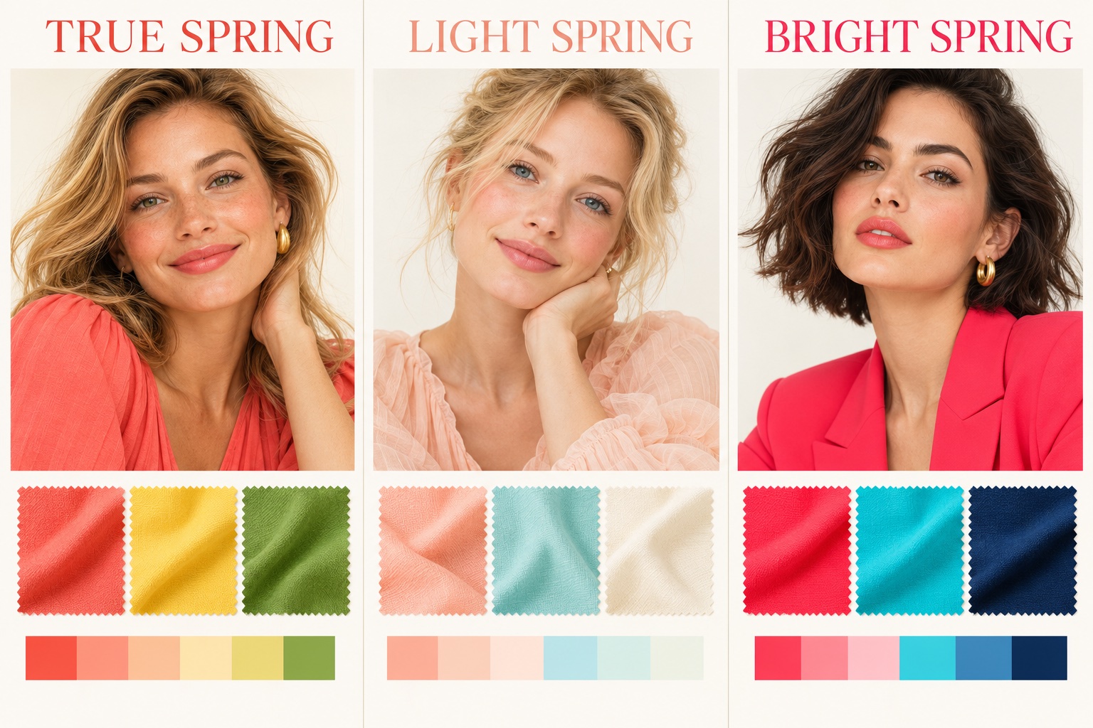
True Spring: warmth leads
The true spring palette leans distinctly golden. Think warm coral, marigold, clear leaf green, turquoise, camel, and creamy ivory. Its contrast is usually moderate: more lively than a soft palette, less sharp than Bright Spring. Hair may look golden blonde, copper, warm brown, or deeper; eyes may be brown, green, hazel, or blue. Those descriptions can help you notice repeated warmth but cannot confirm a subtype. Compare golden yellow with icy lemon and warm coral with blue-red. If the warm pair repeatedly gives the more balanced frame, explore the True Spring palette guide.
Light Spring: lightness leads
The light spring palette still has warmth and a fresh finish, but its colors carry more white and less visual weight. Peach, apricot, pale aqua, light warm turquoise, delicate leaf green, and ivory make a useful starting set. Very dark neutrals can dominate a light combination, so begin with warm beige or a lighter camel. People with naturally light hair and eyes may recognize the effect quickly, but skin depth and feature color are not a rule; compare cloth against your own face. If pastel peach feels alive while saturated coral takes over, read the Light Spring guide.
Bright Spring: clarity leads
The bright spring palette brings the cleanest and most saturated color in the family. Hot coral, poppy red, vivid turquoise, apple green, and sharp golden yellow pair well with clear navy or ivory. More visible contrast can work here than in Light Spring: a saturated top with a dark clean neutral still looks intentional. Hair and eyes may show strong contrast, yet a person with subtler features may also prefer vivid drapes. Compare hot coral with dusty rose at equal depth; the Bright Spring guide develops the full set of outfit choices.
| Question | True Spring | Light Spring | Bright Spring |
|---|---|---|---|
| Leading quality | Golden warmth | Airy lightness | Clean intensity |
| Try near the face | Coral and marigold | Peach and pale aqua | Hot coral and vivid turquoise |
| Compare against | Icy lemon or blue-red | Heavy dark brown | Dusty rose or smoky teal |
| Everyday neutral | Camel and ivory | Light warm beige and cream | Clear navy and ivory |
Use the table as a decision aid, not a rigid checklist. Try the same type of garment in two candidate shades, under the same light. Look for a consistent effect across several colors rather than a single “correct” photo. Neighboring seasons share usable colors, and personal taste still matters.
Best Colors for Spring
Start with five accent families: peach and apricot; coral and warm red; aquamarine and warm turquoise; golden yellow; and fresh apple or leaf green. These colors represent the palette's warmth and clarity without demanding that every outfit be saturated. A peach blouse, coral scarf, aqua knit, golden-yellow bag, or apple-green tee can each introduce one Spring color to a familiar neutral outfit.
Peach and coral: Choose a peach with a warm orange glow rather than a gray-pink cast. Coral bridges pink and orange; adjust its strength by subtype. Light Spring can begin with a soft apricot, True Spring with balanced coral, and Bright Spring with a punchier coral-red. Aqua and turquoise: Favor a clean blue-green that looks sunlit rather than smoky. Light Spring can use a watery aqua, while Bright Spring can support a stronger turquoise.
Golden yellow and green: Clear butter yellow or marigold carries the yellow base visibly. Apple green, grass green, and light leaf green feel fresh; dull olive has more gray-brown weight. If yellow near your face feels too strong, use it in a bag or print and let ivory or peach form the neckline. Color labels vary between retailers, so inspect the actual garment in daylight.
A simple pairing formula is one clear accent plus one warm light neutral plus one medium neutral. For example, coral with ivory and camel, turquoise with cream and golden tan, or apple green with ivory and clear navy. The combinations repeat Spring color harmony across pieces instead of collecting isolated swatches. Our clothing color matching guide explains how to balance accent area and contrast.
Colors Spring Should Avoid
“Avoid” means compare carefully near the face, not throw away clothes you like. Dense black may add more depth than many Spring outfits need. Cold gray can mute a warm face; dusty rose and smoky mauve lack the palette's clarity. Icy pastels may look light but carry a cool blue base. These shades do not literally age someone. The practical question is whether the fabric makes your face look less defined or whether your eye goes to the garment first.
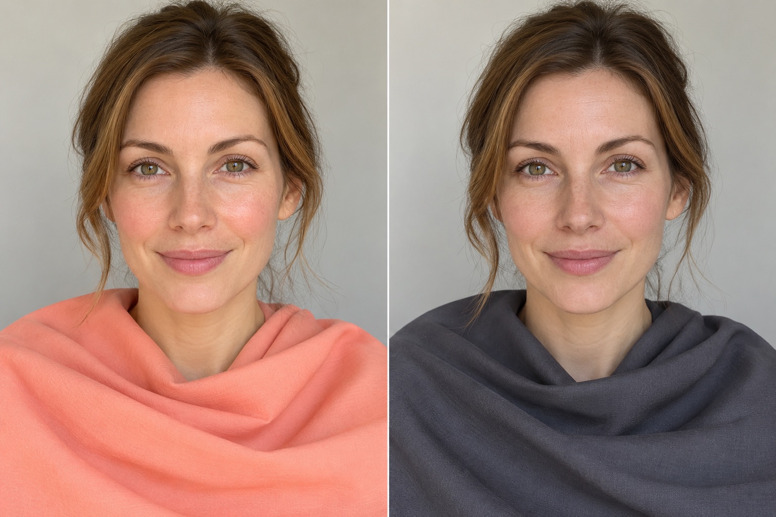
Try direct swaps rather than bans: black to clear navy or warm deep brown; cool gray to warm beige; dusty rose to peach or coral; icy lavender to warm aqua. If a favorite black jacket stays, bring ivory or coral to the neckline, choose warm gold earrings, or wear the jacket over a clear top. A cool or muted shade can also work below the waist, where it has less effect on the face.
To make a drape test useful, sit near indirect daylight and turn off strong colored indoor lights. Pull hair away from the face if it is dyed in a color that distracts from the fabric. Compare similarly sized matte pieces one at a time, take a short break, and repeat the pair. Notice whether shadows, redness, or contrast appear to change, but remember that camera exposure can exaggerate differences. The point is to find wearable colors, not to score your appearance.
Neutral Palette & Wardrobe Basics
Warm ivory and cream replace stark white at the neckline for many Spring wearers. Camel, golden tan, warm beige, and honey brown build a flexible midrange. Clear navy offers a darker anchor that can frame coral and turquoise without flattening them. These are starting neutrals, not identical swatches across every subtype: Light Spring may favor lighter beige, while Bright Spring can use deeper, cleaner navy.
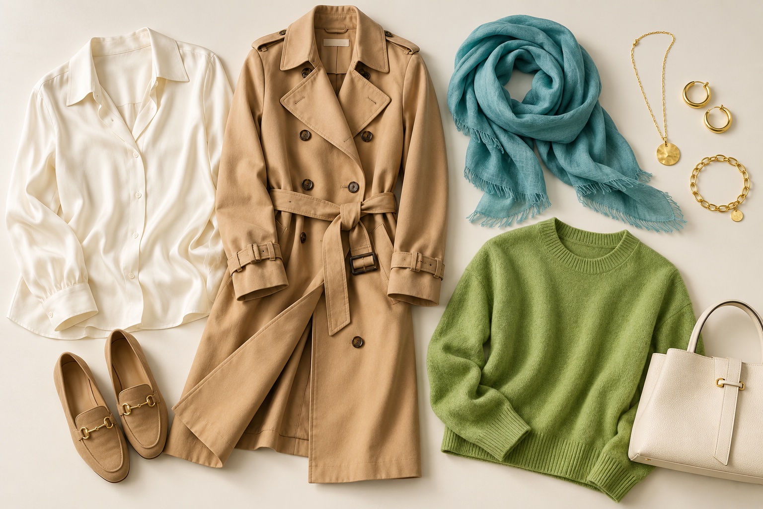
A small Spring capsule that gets worn
Begin with two light tops in ivory or cream, one camel or warm-beige layer, one clear navy or warm-brown bottom, and two accents you enjoy. For a workday, combine a cream shirt, camel jacket, navy trousers, and a small coral scarf. For a weekend, pair an apple-green knit with warm denim and a tan shoe. For evening, try a coral dress with gold jewelry or a navy dress with turquoise earrings. The colors can be repeated in prints, bags, and shoes instead of buying a whole new wardrobe.
Keep the strongest color close to the face when you want the palette's effect. If you prefer quieter dressing, use a clear accent in a narrow scarf, shirt collar, or lip color. When shopping, take an existing cream or coral item and compare the new piece beside it in daylight. Does the pair stay clean and connected, or does the new shade make the Spring accent look dull? This simple check can prevent a closet full of almost-matching beige. The seasonal capsule wardrobe guide gives a broader planning method.
Texture matters as well. Shiny satin can make a color look more intense; brushed knit can make it look softer. A “Spring” color in a heavy matte fabric may feel different from the same hue in silk. Choose the finish that supports your style, then compare the garment on your body. There is no need for every item to match a digital chart exactly.
Jewelry, Makeup, and Hair Guidelines
Yellow gold often repeats the warmth of Spring colors. Polished gold, bright rose gold, and light champagne metals can look especially connected beside peach, cream, and turquoise. Silver is not forbidden; its finish, size, and neighboring fabric all change the effect. Compare pieces of similar scale and shine before deciding. The gold versus silver jewelry test explains how to make that comparison more controlled.
Makeup can echo the same relationships. Peach or warm coral blush, a clear coral lip, light warm bronze, and champagne shimmer are useful directions. Light Spring may prefer a sheer peach wash, True Spring a balanced coral, and Bright Spring a more vivid lip. Test the actual product on your skin, because pigments and base colors vary. A Spring palette does not require makeup; these are options if you enjoy it.
Hair color is similarly optional. Warm blonde, honey highlights, copper, and golden chestnut can repeat the palette's warmth, but natural hair can work beautifully with the right clothing colors. If you are considering color, look at the overall depth and finish rather than selecting a shade from a season label. An ash result may feel cooler than the clothes you prefer, while a very dark dye may increase contrast beyond what feels comfortable. Ask a stylist to test a strand and discuss maintenance before changing your hair.
Across clothing and beauty, keep one principle: choose warmth and clarity at the level that suits you. More gold, more coral, or more brightness is not automatically better. A small, well-placed accent can be enough.
Spring Color Palette FAQ
Can a Spring wear black?
Yes. Black is a style choice, not a forbidden color. If it feels severe directly under your face, compare a clear navy, warm dark brown, or an ivory collar. You can also keep black trousers and bags while using Spring colors above the waist. Bright Spring may enjoy more contrast with black than Light Spring does.
How is Light Spring different from Light Summer?
Both are light, so compare temperature and clarity. Light Spring moves toward warm peach, cream, and clear aqua. Light Summer moves toward cool pink, soft blue, and gentler gray-based color. Compare peach with cool rose and warm ivory with soft white in the same daylight. Our Spring versus Summer guide shows the broader boundary.
Does a tan change my Spring season?
A change in visible skin depth can affect foundation matching and the amount of contrast you prefer, but it does not automatically change the warm, clear color relationships. Recheck your favorite light and dark drapes after a noticeable change. Do not use tanning as a color-analysis test.
How can I choose between True, Light, and Bright Spring?
Compare one pair for each leading dimension: golden coral versus a cooler coral for warmth, pale peach versus deeper coral for lightness, and clear coral versus dusty salmon for clarity. Repeat across blue-green and neutral fabrics. The pattern across several pairs is more useful than hair or eye color. If results stay mixed, borrow from neighboring Spring palettes and use our interactive color analysis quiz to organize what you observe.
💫 Discover Your Complete Color Palette
Explore the color relationships that work for your wardrobe, makeup, and everyday choices.
Take Color Analysis Quiz →