
Neutral vs. Olive Undertone: How to Tell the Difference
 Reviewed by Alexandra Gilmore
Neutral and olive undertones can reject the same obvious warm and cool shades, which makes a single wrist or jewelry test especially misleading. Separate balanced temperature from a muted olive cast by comparing controlled fabrics and equal-depth foundations across your jaw, neck, and chest in consistent daylight.

Neutral and olive undertones are easy to confuse because both can reject very warm and very cool colors. The key difference is not that neutral skin has "no color" while olive skin is visibly green. Neutral describes a relatively balanced warm-cool response. Olive describes a muted visual cast that may lean warm, cool, or neutral.
The best comparison uses several kinds of evidence: controlled fabric pairs, foundation behavior at the correct depth, stable daylight, and repeated observation across the jaw, neck, and upper chest. Veins, jewelry, and one phone photo are too variable to decide the result alone.
Key Takeaways
- Neutral and olive are not opposite ends of one scale.
- Olive coloring can be warm, cool, or neutral in its overall direction.
- Look for repeated muted behavior, not a literal green color in the face.
- Foundation turning orange is a clue, not a complete diagnosis.
- Use at least four controlled fabric pairs and repeat the check on another day.
💫 Discover Your Complete Color Palette
Once you have a working undertone direction, connect it with clothing depth, contrast, and intensity in a complete color analysis.
Find My Color Palette →📚 Recent Articles
Neutral and Olive Are Not Opposites
Neutral is a temperature description used when warm and cool effects are relatively balanced. Olive is a muted undertone description used when conventional warm, cool, and neutral colors do not fully explain the complexion's response. A person can therefore be neutral olive, warm olive, or cool olive.
This language belongs to color analysis and cosmetics, not to a standardized biological taxonomy. DermNet explains visible skin color through contributors such as melanin and blood-related color. Personal undertone labels translate the resulting appearance into practical fabric and makeup comparisons; they do not identify one exclusive pigment formula.
Neutral coloring often handles balanced rose, teal, taupe, navy, and soft white without a strong yellow or blue reaction. Olive coloring often shows a preference for nuanced, smoky, earthy, or slightly complex colors. Extremely peachy foundation may look orange, while strongly pink foundation may sit separately. These are patterns, not rules.
Neutral vs Olive Undertone Comparison Chart
| Observation | Neutral pattern | Olive pattern | What else could explain it |
|---|---|---|---|
| Warm and cool fabrics | Balanced versions often work; slight warm or cool preference may appear | Both extremes may look too saturated; muted versions often improve | Low chroma rather than undertone |
| Foundation at correct depth | Neutral label is often a reasonable start | Neutral may still look peach, orange, or pink | Formula oxidation or wrong depth |
| Beige and taupe | Balanced taupe or greige can integrate well | Mushroom, olive-gray, or muted beige may work better | Contrast or garment depth |
| Photos | Color shifts with light but remains relatively balanced | Gray, yellow, or greenish cast may appear inconsistently | White balance and reflected walls |
| Jewelry | Several metals may work | Finish and mutedness may matter more than gold versus silver | Personal preference and scale |
The chart is most useful as a set of hypotheses. One orange foundation does not establish olive coloring. One flattering silver necklace does not establish neutral-cool coloring. Look for the same direction across skin, fabric, foundation, and several days.
Start With Stable Daylight Conditions
Stand near a window in bright indirect daylight. Avoid direct sun, warm ceiling bulbs, colored curtains, and green garden light reflecting strongly onto the face. Wear no color-correcting foundation and remove bright lipstick. Let temporary flushing from exercise, heat, or skincare settle first.
Use a neutral background and compare the jaw, neck, and upper chest. The center of the face often contains more redness, pigmentation, or cosmetic residue than the connected areas. If the face and neck tell different stories, treat that difference as information rather than forcing them into one label.
Check a mirror before taking photos. A camera automatically changes exposure and white balance. Adobe's white-balance documentation shows how color temperature and tint can be adjusted after capture, which is exactly why a phone image cannot serve as an untouched undertone measurement.
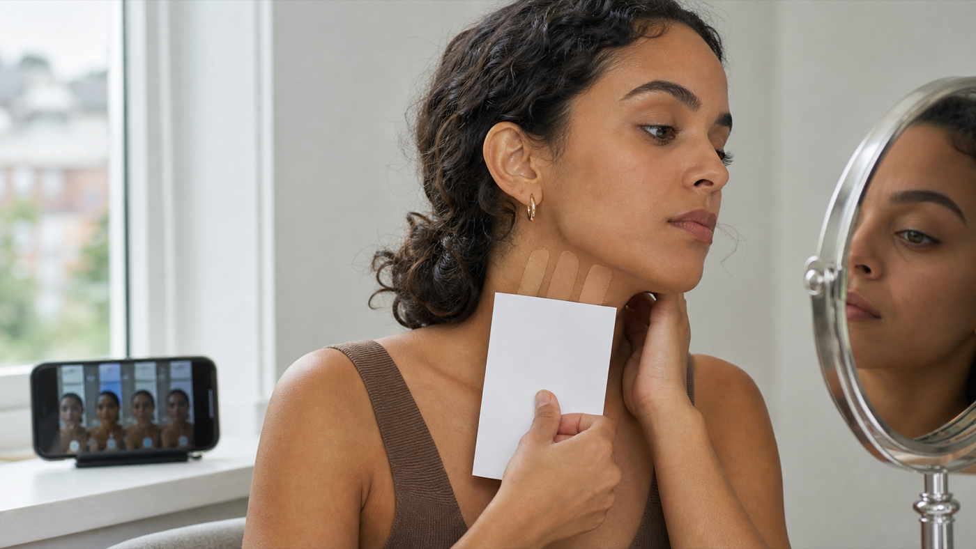
Repeat the setup on another ordinary day. Seasonal depth changes, surface redness, a cold room, or a strongly colored shirt can alter the impression. A stable result survives small day-to-day variation.
A Four-Pair Neutral-vs-Olive Check
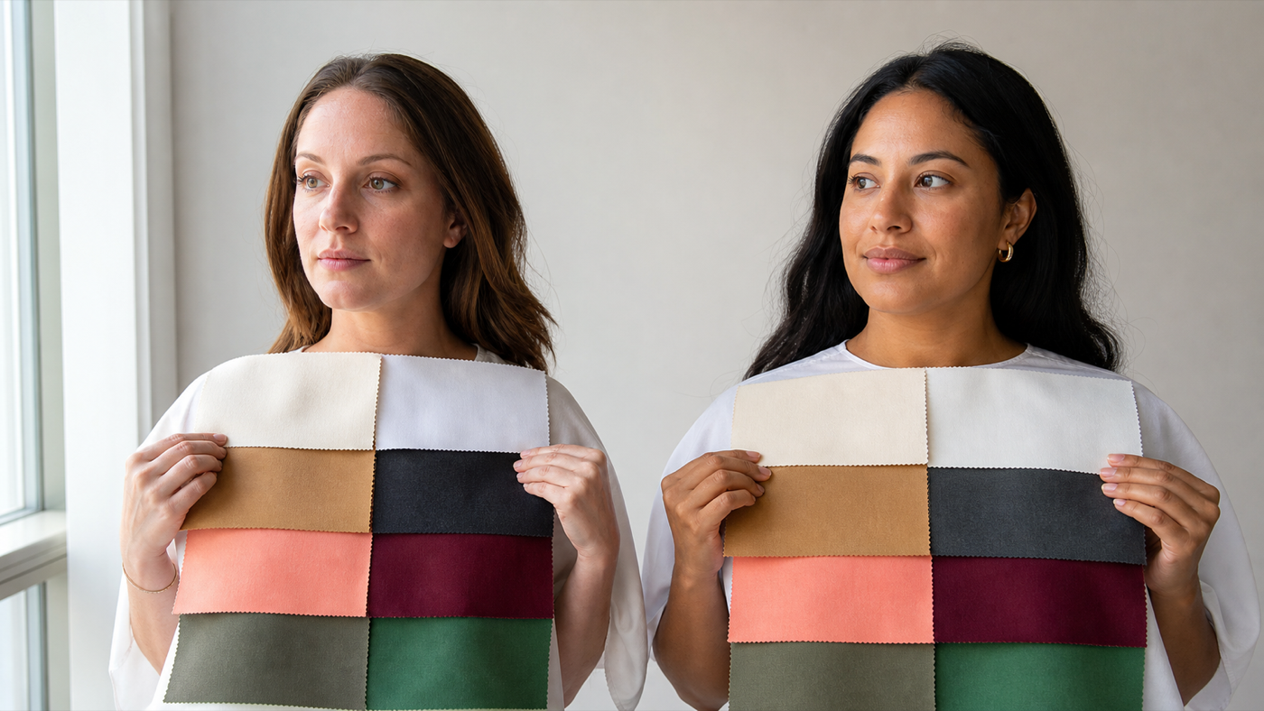
Use matte, opaque fabrics of similar depth and intensity. Large garments, pillowcases, or draping cloths work better than tiny color cards. Hold each pair in the same place and switch several times while watching the face.
- Balanced taupe versus peach-beige. If peach-beige becomes orange or separate while taupe looks natural, note a muted or cooler preference. Do not decide yet.
- Jade versus clear emerald. Jade is usually more balanced or muted. If clear emerald looks sharp but jade integrates, chroma may be important.
- Mushroom versus clean gray. Mushroom carries a complex brown-gray quality. Clean gray may clarify neutral-cool skin or drain an olive complexion, but depth must match.
- Smoky teal versus bright turquoise. This pair checks mutedness while staying in a related hue family. Watch whether brightness supports the features or arrives before them.
Look for evenness, clear eyes, natural shadows, and a connected jawline. A difficult color may reflect onto the lower face, emphasize a yellow-gray cast, or make the mouth and eyes look disconnected. The "prettiest" fabric is irrelevant if the face loses definition beside it.
If muted fabrics consistently win, compare olive with other low-chroma possibilities. Soft seasonal coloring can also prefer muted colors without being olive. Next use foundation behavior and specific warm-cool pairs to refine the direction. The undertone test for olive skin provides a longer olive-focused sequence.
What Foundation Behavior Can and Cannot Tell You
Foundation is useful because it places a controlled color directly across the skin, but it introduces its own variables. Wrong depth, oxidation, coverage, skincare, and lighting can all make a shade look orange or gray. Compare equal depths and similar formulas before using the result as undertone evidence.
Swatch a warm, neutral, cool, and olive-labeled option from the jaw toward the neck. Let them settle for the time recommended by the product and inspect them in daylight. The best starting point should disappear into the face-to-neck transition rather than match the reddest cheek.
| Foundation result | Possible interpretation | Next check |
|---|---|---|
| Warm turns orange | Too warm, too saturated, too deep, or oxidized | Same depth in neutral and olive; compare after wear time |
| Cool turns pink | Too cool or too rosy | Same depth in neutral or muted olive |
| Neutral still looks peach | Possible muted or olive direction | Compare true olive and a sheerer neutral formula |
| Olive looks gray-green | Too muted, too cool, or wrong depth | Try warmer olive or balanced neutral |
| All shades look wrong | Range, formula, depth, or lighting problem | Change one variable rather than forcing a label |
Brand names are inconsistent. "Neutral" may mean peach-beige in one range and gray-beige in another. "Olive" may span golden olive, cool muted olive, and deep green-brown. Use the actual dried swatch, not the marketing label.
Why Veins, Jewelry, and Photos Give Mixed Results
Veins are viewed through skin and under changing light. Their apparent blue, green, purple, or mixed color depends on location, vessel depth, skin depth, and surrounding color. Mixed veins do not prove neutral undertone, and green-looking veins do not prove olive.
Jewelry tests combine several variables at once: metal temperature, brightness, finish, scale, design, and personal taste. Brushed gold may suit muted olive skin while shiny yellow gold feels loud. Oxidized silver may work while mirror-bright silver looks separate. Compare equivalent finishes before drawing a conclusion.
Photos are especially unstable. Automatic white balance may neutralize a wall cast by shifting the whole image. Phone HDR can brighten shadows and increase local contrast. Filters may warm skin or remove redness. If the face looks olive in one photo and pink in another, investigate the lighting before changing the undertone label.
Shortcuts are not useless; they are weak evidence. A good process combines several weak clues with stronger controlled draping and foundation checks. Repetition matters more than any single sign.
Can Olive Skin Be Warm, Cool, or Neutral?
Yes. Olive describes the muted cast; temperature describes the direction in which colors become more harmonious. Warm olive coloring may prefer moss, petrol, cream, terracotta, aubergine, and cocoa. Cool olive coloring may prefer pine, blue-teal, berry, charcoal, wine, and pearl. Neutral olive often works between those groups with balanced, smoky shades.
Test temperature within muted colors first. Comparing electric cobalt with bright orange may show only that both are too saturated. Instead compare smoky blue-green with muted olive, berry with terracotta rose, and cool mushroom with warm taupe. Keep their depth and intensity as close as possible.
The warm-versus-cool olive guide owns this refinement. It is the right next article when olive is reasonably established but its direction remains unclear. Do not use the broad olive label to skip that step.
What to Do After the Comparison
If neutral is the better working result, build a wardrobe with balanced colors and then refine toward neutral-warm or neutral-cool. Track whether depth, chroma, or contrast matters more than small temperature changes. The neutral undertone signs and mistakes guide helps when your evidence remains mixed.
If olive is the better result, identify its warm, cool, or neutral direction before buying a large palette. Then compare hair, makeup, and clothing separately. A foundation solution does not automatically provide the best sweater color, and an olive-friendly wardrobe neutral may not be the right concealer correction.
If neutral olive describes you best, use the dedicated best colors for neutral olive skin guide for wardrobe choices. Start with mushroom, smoky teal, muted rose, petrol, cocoa, softened navy, and complex greens, then adjust depth and clarity.
If the result remains ambiguous, keep a "known good" swatch set instead of chasing a perfect name. Three flattering neutrals and four reliable colors are more valuable than a label unsupported by observation. Revisit the test when daylight is better or when a foundation range provides closer comparisons.
Check the Result Across Different Color Families
A convincing result should travel beyond beige. Neutral and olive coloring can both look comfortable in taupe, so repeat the comparison with red, green, blue, and white families. Try muted rose beside clear pink, smoky teal beside bright turquoise, moss beside clean yellow-green, and oyster beside optic white. Keep each pair close in depth.
Notice whether the same property keeps winning. If slightly muted colors support the face in every family, softness is established, but olive is still only one explanation. If those colors also solve repeated peach, pink, or orange foundation problems and create a natural relationship with the neck, the olive interpretation becomes stronger.
Separate the color result from the style result. You may dislike moss as a garment while recognizing that it makes the complexion look even. Record the visual effect first, then choose a more appealing color with similar temperature and mutedness. Petrol, aubergine, mushroom, soft burgundy, or smoky navy can carry the same useful properties in a different hue.
Depth can hide the pattern. A pale muted fabric may make deep features disappear, while a dark clear fabric may look better simply because it restores definition. Compare a muted and a clearer option at the same value before concluding that olive coloring needs only dark colors. The goal is to isolate one variable at a time.
Common Mistakes in the Neutral-Olive Comparison
The most common mistake is searching for literal green skin. Olive can be subtle, especially at fair or deep depths. Another is assuming that tanning behavior defines olive coloring. Sun response varies and should not replace visual comparison or sun protection.
People also confuse muted coloring with olive. A soft neutral person may prefer dusty colors without showing the foundation behavior or nuanced cast associated with olive. Conversely, an olive person with strong contrast may handle rich, dark colors and not look obviously "soft."
Finally, avoid comparing different properties at once. Cream satin versus charcoal wool changes temperature, depth, texture, and reflectivity. A useful pair keeps everything except the target variable as similar as practical.
People Also Ask
How do I know if I am neutral or olive?
Use matched muted and clear fabrics, compare foundation undertones at the same depth, and repeat in daylight. Olive becomes more likely when conventional neutral shades remain peachy or pink and nuanced muted colors repeatedly integrate better.
Can neutral skin look green?
Lighting, reflected walls, surrounding clothing, and camera tint can create a greenish cast in any complexion. Check a mirror in stable daylight and compare several days before treating that appearance as undertone evidence.
Is neutral olive a real description?
Yes, as a practical color-analysis label. It describes olive mutedness with a relatively balanced warm-cool response. It is not a clinical skin category.
Why does neutral foundation look orange on me?
It may be too warm, saturated, deep, or prone to oxidation. Olive coloring is one possibility, but compare equal-depth formulas after wear time before deciding.
Common Questions: The Ultimate Color FAQ
Do mixed-color veins mean neutral undertone?
No. Mixed vein appearance is common and affected by lighting and anatomy. Treat it as one observation, not a conclusion.
Can fair skin be olive?
Yes. Olive is not restricted to medium or tan depth. Fair olive skin may look muted, neutral, golden-gray, or cool-gray and can struggle with overly peach or pink foundation.
Can deep skin be olive?
Yes. Olive nuance can appear across skin depths. The useful comparison is how muted warm, cool, and neutral colors interact with the complexion, not whether the skin looks light green.
Does silver or gold suit olive skin?
Either can work. Warm olive may prefer gold, cool olive may prefer silver, and neutral olive may wear both. Finish and brightness often matter as much as metal temperature.
Should olive skin avoid pink foundation?
A strongly pink base may look separate on many olive complexions, but formulas and people vary. Compare the shade on the jaw after it settles rather than applying a universal ban.
Can my undertone change?
The stable direction usually changes less than surface color, but hair, tan, redness, medication effects, and lighting can alter appearance. Reassess practical matches when your visible coloring changes significantly.