Warm Color Palette for Clothing: A Personal Style Guide
 Reviewed by Alexandra Gilmore
Warm clothing is not limited to orange, yellow, and red; blue, green, pink, purple, and neutrals all have warmer versions. Learn to judge temperature together with lightness and intensity, then build combinations that suit either Spring clarity or Autumn richness instead of buying by color name alone.

A warm color palette for clothing includes more than red, orange, and yellow. Warm versions of blue, green, pink, purple, and neutral colors can also belong in your wardrobe. The useful question is not whether a color has a familiar warm name. It is whether its temperature, lightness, and intensity work with your coloring.
That distinction explains why two people who both suit warm colors may need very different clothes. One might look clear and rested in coral, turquoise, and light camel. Another may need rust, moss, petrol blue, and chocolate. Both palettes are warm, but the first leans toward Spring while the second is closer to Autumn.
This guide will help you test that warm direction, compare Spring and Autumn, choose practical neutrals and accents, and build outfits from colors you can repeat. Treat the result as a shopping tool rather than a list of rules. A useful personal palette should make decisions easier while leaving room for colors you simply enjoy wearing.
Key Takeaways
Start with a side-by-side fabric comparison near your face. If warmer versions repeatedly make your complexion look more even, decide whether lighter and clearer Spring colors or deeper and softer Autumn colors fit better. Then choose three to five neutrals and three or four accents, test them in indirect daylight, and keep only the shades that work with clothes you already own.
💫 Discover Your Complete Color Palette
If you want to turn these guidelines into a palette you can use while shopping, build your personal color palette next.
Build My Palette →Do not let one undertone test make the decision. Jewelry, veins, and phone photos can all offer clues, but clothing drapes show the result more directly. The better shade should support your face instead of becoming the first thing you notice. If a warm color looks wrong, check its depth and brightness before deciding that the entire warm family is wrong for you.
📚 Recent Articles
What a Warm Color Palette Means in Personal Style
Color temperature is relative. A tomato red looks warmer than a raspberry red because it leans more toward orange. Turquoise is warmer than a blue that leans toward violet. Olive is usually warmer than emerald. Even white changes: ivory has a yellow or creamy cast, while optic white looks cooler and sharper.
A warm color is also different from a warm undertone. The first describes the color of a garment. The second describes one aspect of your natural coloring. A warm season is broader still because seasonal systems also consider how light, deep, clear, or muted the overall palette needs to be. Warm undertone can point you toward Spring or Autumn, but it cannot choose between them on its own.
Three color properties make this easier to understand. Hue is the color family, value is how light or dark a color appears, and chroma describes its strength or intensity. These terms come from formal color organization systems such as the Munsell Color System. Personal color systems translate them into everyday comparisons such as warm versus cool, light versus deep, and bright versus soft.
| Property | What it changes | Clothing example |
|---|---|---|
| Temperature | Whether a shade leans warmer or cooler within its color family | Tomato red compared with raspberry red |
| Value | How light or deep the garment appears | Light camel compared with dark chocolate |
| Chroma | How clear or muted the color feels | Clear coral compared with dusty terracotta |
You need all three properties because temperature alone produces an incomplete wardrobe. A color can be warm yet still feel too pale, too dark, too clear, or too gray against your face. That is the practical difference between identifying a warm direction and building a personal warm color palette.
Are Warm Colors Actually Right for You?
Use clothing or fabric you already own before buying color fans or new pieces. Choose two versions of the same family: ivory and optic white, tomato and berry red, olive and blue-green, or camel and cool taupe. Similar depth and fabric are important. Comparing a shiny pale blouse with a heavy dark sweater tells you as much about texture and contrast as it does about temperature.
Stand near a window in indirect daylight. Remove strongly colored makeup if possible, cover brightly dyed hair when it distracts from the face, and hold each fabric directly under your chin. Switch between the pair several times instead of staring at one color for a full minute. Look at the face first, then the garment.
- Skin: Does one version make the complexion look more even, or does it strengthen grayness, redness, or shadows?
- Eyes: Do the whites and edges of the eyes remain clear, or do they look dull beside the fabric?
- Features: Can you see the person before the shirt, or does the color dominate the whole view?
- Consistency: Does the same temperature direction win across several color families?
One flattering camel coat does not establish a warm undertone. The cut, texture, depth, and surrounding outfit may be doing much of the work. Look for a pattern across at least three comparisons. If you want a fuller process, check your undertone at home and use those results alongside fabric draping. You can also compare gold and silver under the same light, but metal preference should remain one signal among several.
Neutral and olive coloring often gives mixed results. Neutral undertones may handle warmth in some families and cooler shades in others. Olive skin can sit over warm, cool, or neutral undertones, so a green or golden surface cast is not proof of a warm season. If neither side consistently improves the face, focus next on value, chroma, and contrast instead of forcing a temperature label.
Spring or Autumn: Which Warm Palette Fits Better?
Spring and Autumn are both warm families in common seasonal systems. Their difference is not the presence or absence of warmth. Spring generally uses more light and clarity, while Autumn uses more depth and softness. You can see this in paired colors: peach versus rust, fresh leaf green versus moss, light camel versus chocolate, or clear turquoise versus petrol blue.
Do not diagnose the season from hair color, eye color, skin depth, or ethnicity. People with many combinations of features can sit in either warm family. Fabric response matters more than a checklist of physical traits. The table below describes directions to test, not requirements your appearance must meet.
| Signal | Spring direction | Autumn direction | Limitation |
|---|---|---|---|
| Value | Light to medium colors stay connected to the face | Medium to deep colors give useful definition | One dark or pale item cannot type a season |
| Chroma | Clear coral, aqua, and yellow look lively without taking over | Muted rust, olive, and teal look settled rather than dull | Fabric finish can change perceived intensity |
| Contrast | Lighter combinations tolerate a crisp accent | Blended, grounded combinations often feel more balanced | Personal contrast varies within each family |
| Neutrals | Ivory, light camel, warm navy | Cream, cognac, olive, chocolate | Neutral names vary widely between brands |
Try one small set from each direction at the same session. For Spring, compare ivory, coral, turquoise, and light camel. For Autumn, compare cream, rust, olive, and chocolate. If the Spring group looks thin or loud while Autumn looks grounded, explore the Warm Autumn palette. If Autumn feels heavy and Spring keeps the face clear, review the True Spring guide.
A correct temperature with a disappointing result usually points to value or chroma. A warm mustard may be too muted for Spring. A clear coral may be too intense for Autumn. Adjust the version before rejecting the color family.
The Best Warm Clothing Colors by Color Family
A useful warm clothing palette needs variety. Filling a closet with camel, rust, and mustard may look coordinated on a mood board, but it limits outfit choices and can push every look toward one season. Warm versions exist across the color wheel, including blues and purples.
Warm whites and neutrals
Ivory, cream, warm beige, camel, cognac, olive, warm navy, and chocolate form the working base. Spring palettes usually need lighter, cleaner neutrals such as ivory, sand, light camel, and a navy with a green cast. Autumn can carry cream, cognac, olive, and deeper brown more easily. If camel makes you look flat, try a lighter tan or a warmer navy rather than moving directly to black.
Reds and pinks
Tomato red, coral, peach, salmon, paprika, and brick all carry warmth, but they do not have the same weight. Clear coral and peach support many Spring wardrobes. Brick, warm burgundy, and muted salmon fit more naturally into Autumn. If tomato red feels loud, reduce chroma by moving toward paprika or terracotta. If brick looks heavy, lift it toward coral.
Yellows and oranges
Golden yellow, marigold, ochre, pumpkin, rust, and terracotta are easy to recognize as warm. They are also easy to overdo near the face. Spring often handles clear golden yellow and fresh orange; Autumn tends to suit ochre, rust, and burnt orange. Use a scarf or knit for the first test instead of committing to a coat.
Greens
Look for greens with visible yellow or earthy influence: avocado, leaf green, olive, moss, and warm teal. A clean leaf green can act as a Spring accent, while moss and olive make strong Autumn neutrals. Warm teal is especially useful because it adds contrast without leaving the warm direction. If olive blends too closely with the complexion, choose a clearer or deeper version.
Blues and purples
Blue is not automatically cool. Turquoise, aqua, petrol blue, peacock, and some warm navies lean toward green and can work in a warm wardrobe. Purples are trickier, but red-leaning aubergine and warm plum can suit Autumn better than icy violet. Spring may prefer clear periwinkle or aqua, depending on the individual palette. Compare these colors rather than relying on a name printed on a product page.
| Color family | Spring option | Autumn option | Useful neutral pairing |
|---|---|---|---|
| White and beige | Ivory, sand | Cream, warm beige | Camel or cognac |
| Red and pink | Coral, peach, tomato | Brick, paprika, salmon | Ivory or chocolate |
| Yellow and orange | Golden yellow, clear orange | Ochre, rust, terracotta | Warm navy or olive |
| Green | Leaf green, avocado | Moss, olive | Cream or cognac |
| Blue and purple | Turquoise, aqua | Petrol blue, aubergine | Camel or chocolate |
Build a Wearable Warm Wardrobe Palette
Start with what you wear, not with the maximum number of colors you could theoretically suit. A palette for office clothes may need more neutrals than a palette for weekend outfits. Someone who wears denim daily needs to decide which denim washes act as a base. Someone who prefers dresses may need fewer coordinating bottoms and more useful shoe and outerwear colors.
- Choose two core neutrals. These cover trousers, jackets, skirts, and shoes. Camel plus warm navy gives more contrast; olive plus chocolate creates a softer base.
- Add one light neutral. Ivory or cream keeps the wardrobe from becoming visually heavy and usually works for shirts and knitwear.
- Select two repeatable accents. Pick colors you already enjoy and can find in more than one garment category, such as coral and turquoise or rust and petrol blue.
- Add one expressive color. This can be marigold, tomato red, aubergine, or another shade you would happily wear near your face.
- Run the two-outfit check. Before buying, make sure the item works with at least two pieces you own. A flattering but isolated color still creates a difficult wardrobe.
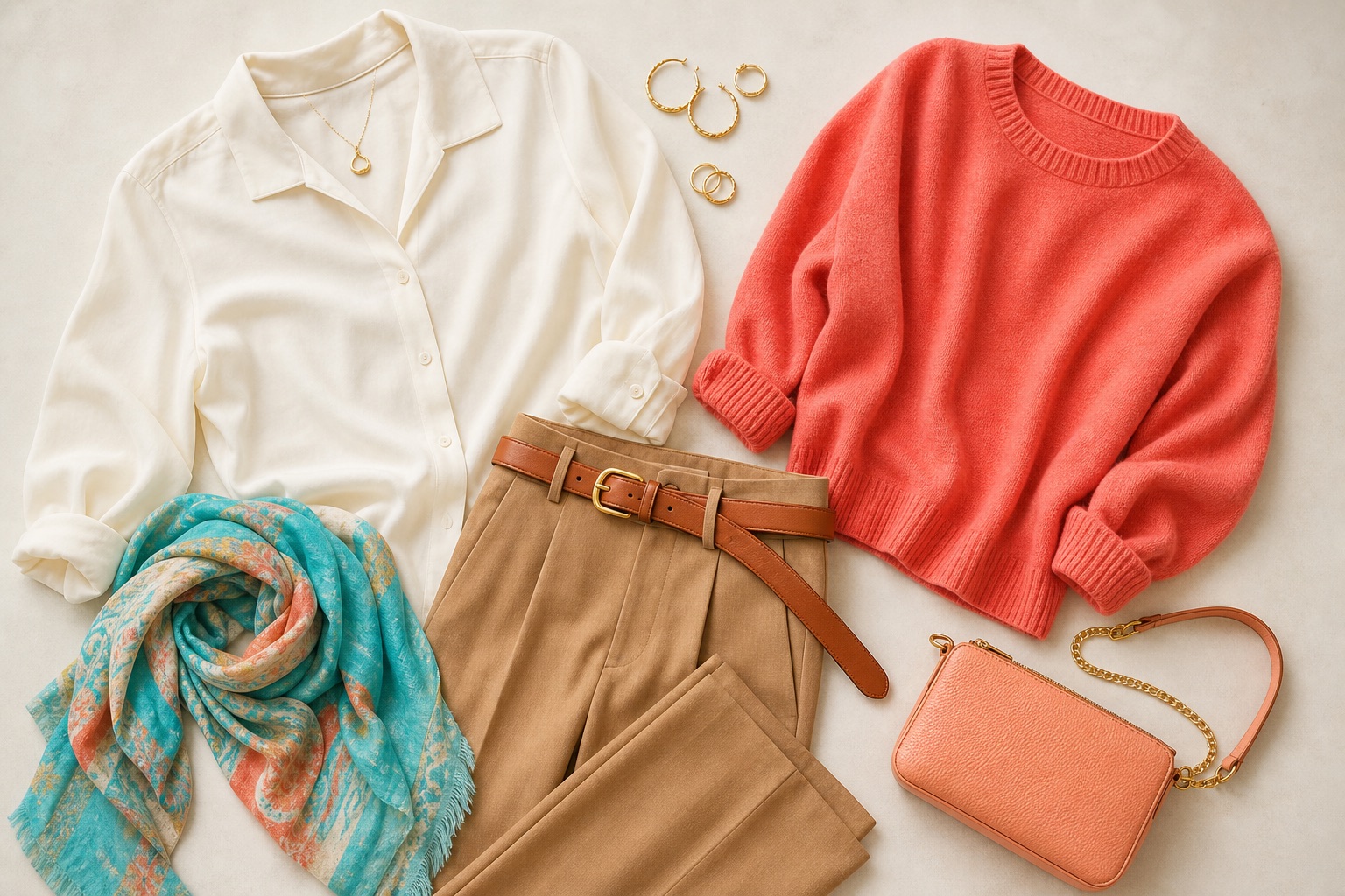
A light and bright warm capsule might use ivory, light camel, warm denim, coral, and turquoise, with cognac leather and restrained gold-tone details. The colors stay distinct, but the light value keeps the set connected. A deep and muted capsule could use cream, chocolate, olive, rust, and petrol blue. Here, softness and depth matter more than adding more orange.
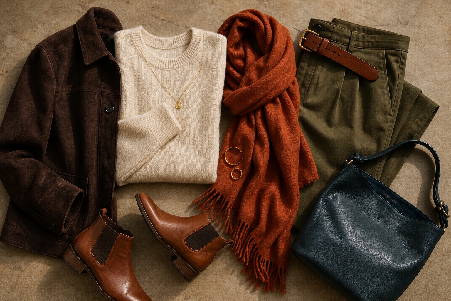
Denim, leather, and metal should support the system rather than dictate it. Medium warm denim can work across both examples. Cognac leather is easier to repeat than a bright orange accessory. Gold-tone jewelry may connect naturally, but mixed metals or silver can still work when their scale, finish, and surrounding colors suit the outfit.
Warm Outfit Combinations That Are Easy to Wear
Color formulas are most useful when they specify the role of each shade. You do not need a fixed percentage rule. Decide which color sits near the face, which anchors the outfit, and which appears only as an accent.
- Ivory + camel + coral: use ivory near the face, camel for trousers or a coat, and coral as a knit or scarf.
- Cream + olive + cognac: a quiet combination for casual clothes, with cognac repeated in a belt, bag, or shoes.
- Warm navy + rust + gold: navy gives structure, rust supplies warmth, and a small warm metal detail connects them.
- Chocolate + peach + teal: chocolate grounds the outfit while peach and teal prevent it from feeling uniformly dark.
- Tan + tomato red + denim: keep the red near the face if it passes your drape test; use tan to soften the transition to denim.
- Terracotta + warm white + moss: distribute the two earthy shades instead of stacking both beside the face.
Prints can solve a color that feels difficult on its own. A pattern that combines one familiar neutral with a less familiar accent creates a visual bridge. Check the background color first because it often occupies the largest area. A cream-based print will behave differently from an otherwise similar print on stark white.
Texture changes the result too. Satin reflects the room and can make a color look lighter or sharper. Brushed wool softens edges and usually mutes a shade. Leather often deepens color. When a formula looks right in theory but wrong on the body, compare fabric finish before replacing the palette.
How to Test a Warm Color Before You Buy It
Store lighting is designed to illuminate merchandise, not to reveal your most accurate color response. If you can, move toward a window and hold the garment under your chin. Testing it against your hand or wrist does not show how the color affects shadows and contrast around the face.
Bring a comparison. If you are considering a coral top, place it beside a cooler pink of similar depth. For olive, compare it with a blue-green. For ivory, compare it with optic white. A side-by-side choice is easier than trying to remember how another color looked last week.
- Check the garment in indirect daylight.
- Compare a warmer and cooler version from the same family.
- Keep depth, fabric, and coverage as similar as possible.
- Look at the face before judging the garment.
- Take a photo only as a record, not as the final decision.
- Confirm that the color makes at least two outfits with your current wardrobe.
Phone cameras alter white balance, exposure, and saturation. Screens add another layer of variation, so an online swatch may not match the delivered fabric. Use digital images to narrow options, then verify the garment in person. A transparent blouse, reflective jacket, and matte knit in the same named color may behave like three different shades.
When a Warm Color Still Does Not Work
If a warm shade looks wrong, temperature may not be the problem. A clear marigold can overpower soft coloring even though it is warm. Deep chocolate may drag down a light palette. Dusty terracotta can make a bright palette look tired, while vivid coral may sit on top of a muted one.
Adjust one property at a time. Keep the hue family and try a lighter, deeper, clearer, or softer version. If the color works in a small print but not as a solid shirt, the issue may be scale or contrast. If it works as trousers but not near your face, keep it below the neckline and pair it with one of your reliable neutrals.
You can use the same approach for a favorite cool color. Move it away from the face, repeat it inside a print, choose it as a bag or shoe, or place a strong warm neutral between the color and your complexion. A palette should organize your choices, not remove every exception.
People Also Ask
What colors are considered warm colors?
Warm colors lean toward yellow, orange, or red within their family. Common examples include coral, tomato red, golden yellow, camel, rust, olive, warm teal, and cream. Temperature is relative, so a blue or purple can also have a warmer version.
Can blue be a warm color?
Yes. Blues that lean toward green, such as turquoise, aqua, petrol blue, and some warm navies, can function as warm or warm-adjacent colors in clothing. Compare them with violet-leaning blues to see the difference.
Are Spring and Autumn both warm palettes?
Yes, in common seasonal systems both are warm families. Spring is generally lighter and clearer, while Autumn is generally deeper and more muted. Individual sub-seasons can sit closer to neutral.
What are the best warm neutral colors for clothing?
Ivory, cream, warm beige, camel, cognac, olive, warm navy, and chocolate are useful starting points. Choose the depth and clarity that fit your coloring and the clothes you wear most often.
Common Questions: The Ultimate Color FAQ
Can neutral or olive skin wear a warm color palette?
Yes. Neutral and olive skin can suit many warm colors, but neither automatically belongs to a warm season. Compare fabrics across several families and pay attention to value and chroma when the temperature result is mixed.
Can I wear black if warm colors suit me?
You can. If black looks severe near your face, use it for trousers, shoes, or smaller details, then place ivory, camel, coral, or another reliable warm shade near the neckline. Warm navy and chocolate are useful alternatives when you want less contrast.
Do I have to wear gold jewelry with warm colors?
No. Gold can connect easily with a warm palette, but finish, scale, and personal preference matter too. Silver, mixed metals, or antique finishes can work when the rest of the outfit supports them.
What if I like a color outside my palette?
Wear it. Try it below the face, in a print, or as an accessory, and combine it with one of your strongest neutrals. Personal color is a decision tool, not a dress code.
How many colors should a personal wardrobe palette contain?
There is no required number. A practical starting set is three to five neutrals plus three or four accents. Add more only when they connect with the clothes and combinations you already use.