Undertone Test for Olive Skin

If your foundation always pulls too yellow, too orange, or somehow too pink — and the standard vein test left you more confused than when you started — you are not doing anything wrong. Olive skin simply does not behave like the undertone charts were designed for.
Olive complexions carry a green-neutral base layer that sits on top of whatever warm or cool undertone runs beneath. That layering is exactly why the usual shortcuts break down. Your veins may not read clearly blue or green. Gold and silver jewelry might both look acceptable. The classic three-category system (warm, cool, neutral) was not built with this dual-signal skin type in mind.
This guide fixes that. By the end, you will be able to:
- Identify whether your olive skin leans warm or cool using a multi-signal approach instead of a single test
- Cross-check your result with the jewelry, vein, and foundation-pull methods — interpreted specifically for olive complexions
- Translate your undertone into concrete foundation shade ranges and clothing color palettes
- Use color season analysis as a backup tool if the standard tests remain inconclusive — the same strategy that helps many olive-toned people finally place their undertone accurately
The process takes a few minutes and a little natural light. No single test gives a definitive answer for olive skin, but when you stack several signals together, a clear pattern almost always emerges.
Step 1 – The Foundation Undertone Pull Test
Of all the signals available to olive skin, how a foundation behaves on your face is the most diagnostic single test. Veins can be ambiguous, and jewelry preference is subjective. Foundation, by contrast, either harmonizes with your skin or it visibly fights it — and that fight tells you something precise.
How to run the test:
- Choose two or three foundation shades in your approximate depth range — one with a clearly warm or yellow-beige label, one with a neutral or olive label, and one with a pink or cool-beige label.
- Apply a stripe of each along your jawline in natural daylight (not overhead bathroom lighting, not filtered window light).
- Use no primer and no moisturizer with a tint. You want the pigment reading your skin directly.
- Step away from the mirror for two to three minutes, then return and look at each stripe with fresh eyes.
Reading the result:
| What you see | What it means |
|---|---|
| The warm/yellow-beige stripe disappears into your skin | Your olive skin has a warm undertone |
| The cool/pink stripe blends most seamlessly | Your olive skin has a cool undertone |
| The warm stripe turns visibly orange | Too warm — but still directionally warm olive |
| Every stripe looks slightly off | The green-neutral layer is interfering; move to Step 2 |
The key distinction to watch for: a warm-olive skin will make pink-toned foundations look ashy or grey, while a cool-olive skin will make yellow-beige foundations look muddy or sallow. Neither reaction is a failure — both are data.
Why this test works better than veins for olive skin: Foundation pigment has to interact with all layers of your complexion simultaneously, including the green-neutral base. That interaction surfaces the underlying warm or cool direction more reliably than surface-level visual cues alone.
Step 2 – The Jewelry and Vein Cross-Check
Once you have a preliminary reading from the foundation test, use the jewelry and vein signals to confirm — not to lead. For olive skin specifically, neither of these tests is reliable on its own, and treating them that way is the source of most undertone confusion.
The vein test (and why it is tricky for olive skin):
Look at the inside of your wrist in natural light.
- Veins that appear blue or purple typically suggest a cool undertone
- Veins that appear green typically suggest a warm undertone
- Veins that look blue-green, teal, or change depending on the light are common in olive complexions and indicate the green-neutral base is interfering with the reading
If your veins land in that ambiguous blue-green zone, the vein test is inconclusive on its own. Note the result but do not overweight it.
The jewelry preference test:
Hold a piece of clearly warm gold jewelry (not rose gold) against one cheekbone, then a piece of cool silver against the other.
- If gold makes your skin look more even and alive → warm direction
- If silver brightens your face and reduces any dullness → cool direction
- If both look acceptable → this is extremely common in olive skin and means the test is not giving you a clean signal on its own
How to weight the combination:
Rather than treating each test as a yes/no vote, stack them:
- 2 or more signals pointing the same direction (e.g., foundation pulls warm and gold jewelry flatters and veins lean green) → high confidence in that undertone direction
- Mixed signals (e.g., foundation pulls warm but silver jewelry also looks fine and veins are ambiguous) → default to the foundation test result, which is the strongest single signal
- All three ambiguous → proceed to color season analysis, which provides a structured framework that was specifically useful in helping olive-toned people identify their undertone when standard tests failed
The goal is a pattern, not a perfect score. Most olive complexions will land on a 2-out-of-3 or 3-out-of-3 result that points clearly warm or clearly cool once all three signals are read together.
Why Standard Undertone Tests Fail Olive Skin
Open any beauty guide on undertones and you will find the same three tests: check your veins, hold up jewelry, look at your skin next to white paper. For most complexions, two out of three signals agree and give a clear warm or cool answer. For olive skin, all three frequently contradict each other — and that is not a personal failing. It is a structural problem with how those tests were designed.
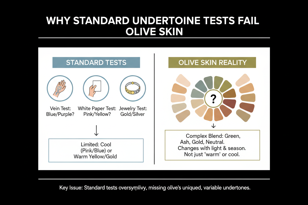
The core issue is that standard undertone tests were built to read a single pigment layer. Olive skin has an additional green or yellow-green layer sitting on top of whatever warm or cool secondary undertone lies beneath. That green-neutral base scatters the signals that vein color, jewelry reflection, and paper contrast are designed to pick up.
Here is how each test breaks down on olive skin specifically.
The vein test assumes veins will appear clearly blue-purple (cool) or clearly green (warm). On olive skin they often read as blue-green or teal — a color that does not vote either way. The green-neutral layer in the dermis shifts the apparent vein color regardless of what your true secondary undertone is doing underneath.
The jewelry test assumes one metal will look noticeably better than the other. Because olive skin sits in a neutral-green zone, both gold and silver often look acceptable rather than one flattering and one unflattering. The test is built on contrast, and olive skin softens that contrast instead of sharpening it.
The paper or white-shirt test assumes your skin will look either pinkish or yellowish against pure white. Olive skin often reads as greenish or golden — a third category the test does not account for.
The result is someone who has genuinely done the work and still has no answer. A multi-signal approach anchored in foundation behavior, and backed by color-season analysis when needed, resolves the contradiction that standard tests cannot.
Not sure where to start? Take the olive skin undertone quiz → to get a guided result based on your specific combination of signals.
What 'Olive Skin' Actually Means: The Green-Neutral Base Explained
"Olive skin" gets misused constantly — people treat it as shorthand for medium-depth or tan skin, but that's not what it means. Olive describes a specific quality: a green or yellow-green pigment layer that sits beneath the surface, giving the skin a muted, slightly earthy cast even when it looks otherwise healthy.
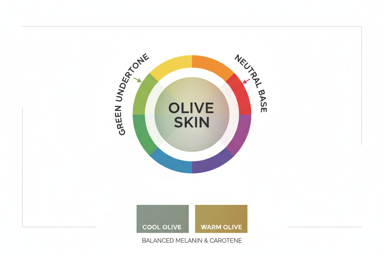
That green-neutral base is what sets olive skin apart from a warm or cool medium complexion. Warm medium without olive reads golden or peachy. Cool medium without olive reads rosy or beige. Olive reads as neither — and that ambiguity is the defining characteristic, not the depth.
Here's the part that trips most people up: olive is a base quality, not an undertone. Think of it as a filter on top of your actual undertone. Beneath that green-neutral layer, an olive complexion still carries a secondary undertone that leans warm or cool. That secondary undertone is what determines which foundation shades, clothing colors, and jewelry metals actually work.
This matters because neutralizing the green cast alone won't fix a bad foundation match. A shade labeled "olive" might correct for the base but still pull wrong if it doesn't also align with your warm or cool secondary direction. You need to identify both layers — and account for both.
The Multi-Signal Diagnostic: How to Tell If Your Olive Skin Runs Warm or Cool
No single test works reliably for olive skin. The most accurate approach combines four signals and looks for a pattern across all of them — not a decisive answer from any one.
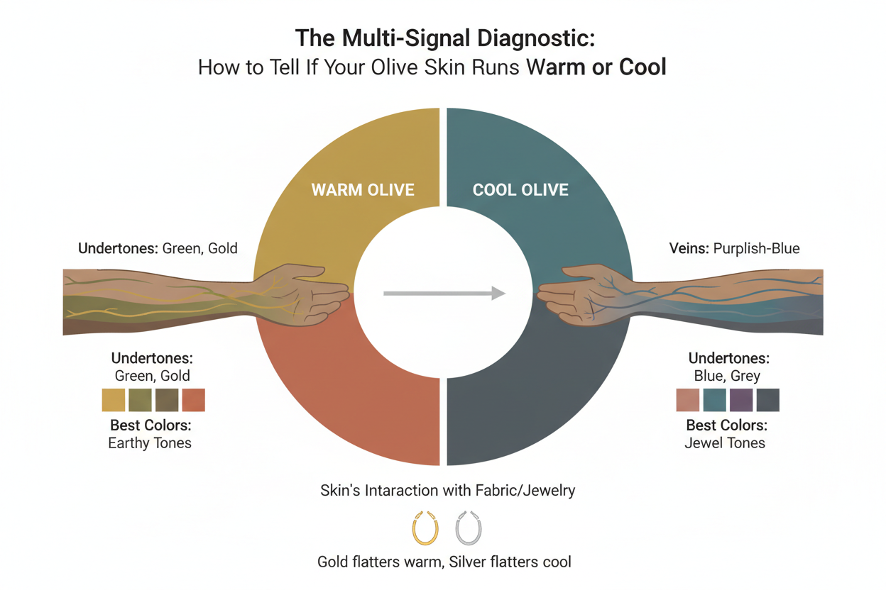
Signal 1: Foundation undertone pull This is the strongest individual signal. Apply a warm-leaning, a neutral or olive-labeled, and a cool-leaning foundation along your jawline in natural daylight. The shade that blends without leaving a visible edge points toward your secondary undertone direction. If warm shades turn orange, you are still on the warm side — the orange cast means the formula is too warm, not that you are cool. If cool shades turn ashy or grey, the same logic applies in reverse.
Signal 2: Vein color under strong natural light Use this as secondary confirmation, not a primary answer. Veins that trend toward blue or purple (even if also somewhat green) suggest a cool secondary undertone. Veins trending toward green (even if somewhat teal) suggest warm. Veins that are genuinely indeterminate — equally blue and green with no dominant cast — are inconclusive and should not override Signal 1.
Signal 3: Jewelry flattery Hold clearly warm gold and clearly cool silver against your face individually in natural light. Look for which metal makes your skin appear more even and less dull, not just which one you find more appealing. A real flattery difference — one metal making your complexion look more alive — confirms the direction from Signal 1. Both looking fine is a neutral result, not a cool result.
Signal 4: Color season analysis If the first three signals are mixed, color season analysis provides a structured secondary route to undertone clarity. The color season system accounts for the full complexity of a complexion — including a green-neutral base — in a way that direct undertone tests do not. This signal is covered in its own section below.
Interpreting the pattern:
| Signal count pointing warm | Signal count pointing cool | Interpretation |
|---|---|---|
| 3 or 4 | 0 or 1 | Confident warm olive |
| 0 or 1 | 3 or 4 | Confident cool olive |
| 2 | 2 | Foundation result is the tiebreaker; re-test in stronger daylight |
| All ambiguous | All ambiguous | Proceed to color season analysis |
Warm Olive Undertone: Signs, Colors, and Foundation Shades
Warm olive is the more commonly recognized subtype, partly because the yellow-green base of olive skin has an intuitive association with warmth. Intuition isn't diagnosis, though. Here are the specific signals that distinguish genuinely warm olive from simply medium-depth skin.
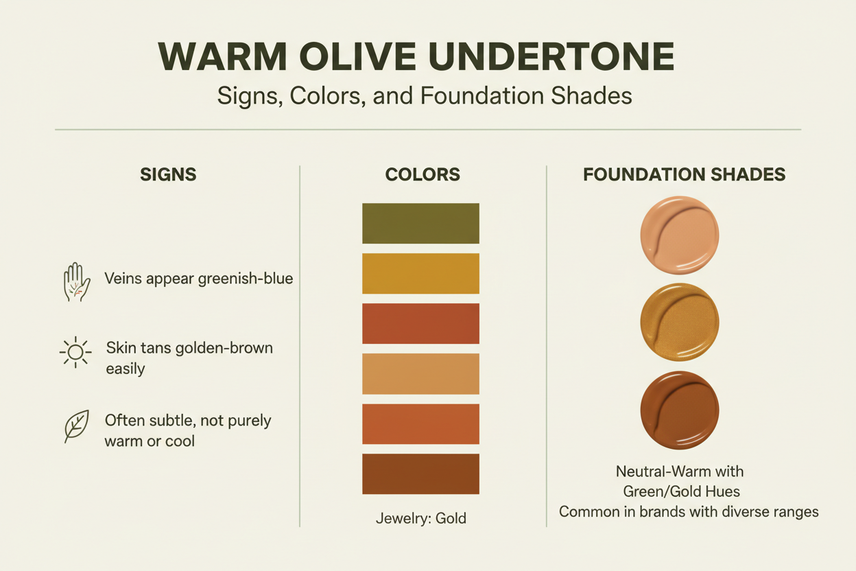
Identifying signs:
- Foundation in warm or yellow-beige shades blends cleanly; cool or pink-toned shades look ashy or grey on your skin
- Gold jewelry makes your complexion look more even and alive; silver can appear slightly stark or cold
- Veins lean more green or teal than blue or purple, even if not a pure green
- In outdoor light, your skin has a golden or amber cast rather than a rosy or greyish one
- Neutral-depth foundations often leave a slight pink residue that doesn't sit well
Colors that work: Warm olive skin responds well to colors that echo or complement its golden-green base. Look for:
- Earthy tones: terracotta, rust, burnt orange, olive green, mustard
- Rich warm neutrals: camel, chocolate brown, warm cream, bronze
- Jewel tones with a warm bias: teal leaning toward gold, burgundy, warm purple
- Avoid: icy pastels, stark white, cool grey, lavender, and blue-pink tones, which tend to make warm olive skin look dull or slightly greenish
Foundation guidance:
- Look for descriptors like "warm beige," "golden beige," "warm sand," or "warm olive" in your depth range
- Formulas marketed for olive skin and listed as neutral-warm tend to perform better than those labeled "neutral," which often carry a pink bias that fights the warm-olive base
- If a warm shade turns visibly orange on your skin, go one shade lighter or less saturated rather than switching to a cool shade
- Avoid pink-beige, cool ivory, or anything described as "porcelain" regardless of apparent depth — these read grey against warm olive skin
Ready to pin down your exact warm-olive profile? Start the undertone quiz → for a personalized foundation shade direction.
Cool Olive Undertone: Signs, Colors, and Foundation Shades
Cool olive doesn't come up much in undertone guides, which leaves a lot of people with this subtype convinced they just can't figure out their undertone. The combination of a green-neutral base with a cool lean is genuinely unusual — and it causes some of the most frustrating foundation experiences, because both warm and cool shades can look off in different ways.
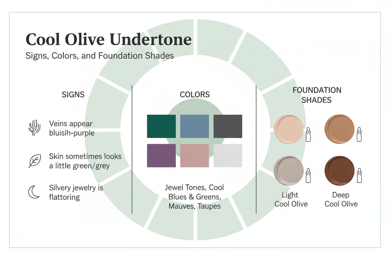
Identifying signs:
- Cool or pink-beige foundations blend more naturally than warm ones; yellow-beige reads muddy, sallow, or faintly greenish on your skin
- Silver jewelry brightens your face; gold can look heavy or flatten your complexion
- Veins run more blue or blue-purple, even with some green interference from the olive base
- In natural light, your skin has a grey-green or muted taupe quality rather than a warm glow
- Foundations marketed as "olive" often still pull too yellow or orange
Colors that work: Cool olive tends to work best with colors that cool down the green-neutral base rather than push it further:
- Cool jewel tones: emerald, sapphire blue, plum, raspberry
- Soft cool neutrals: charcoal, cool taupe, soft white, slate grey
- Muted cool tones: dusty rose, lavender, cool sage
- Avoid orange, rust, golden yellow, and warm browns — these tend to make cool olive skin read sallow or greenish
Foundation guidance:
- Look for descriptors like "cool beige," "cool sand," "neutral-cool," or "rose beige" in your depth range
- Foundations made for olive skin and labeled "neutral-cool" or "olive-cool" will usually perform better than standard cool formulas, which can carry enough pink saturation to sit on top of the skin rather than blend with it
- If a cool shade turns visibly pink or lavender on your skin, look for the same cool direction in a more neutral-cool or olive-adjusted formula rather than switching to warm
- A slightly ashy or muted finish isn't automatically a problem — if the blend line disappears, the shade family is right; adjust depth, not undertone direction
Using Color Season Analysis as a Backup Undertone Identifier
When the multi-signal diagnostic returns mixed results, color season analysis offers a structured alternative. Unlike standard undertone tests, which ask your skin to perform a single isolated reaction, color season analysis evaluates how your whole complexion — depth, clarity, and undertone together — interacts with a broad range of colors at once. That full-picture view handles the complexity of the green-neutral olive base better than most single tests can.
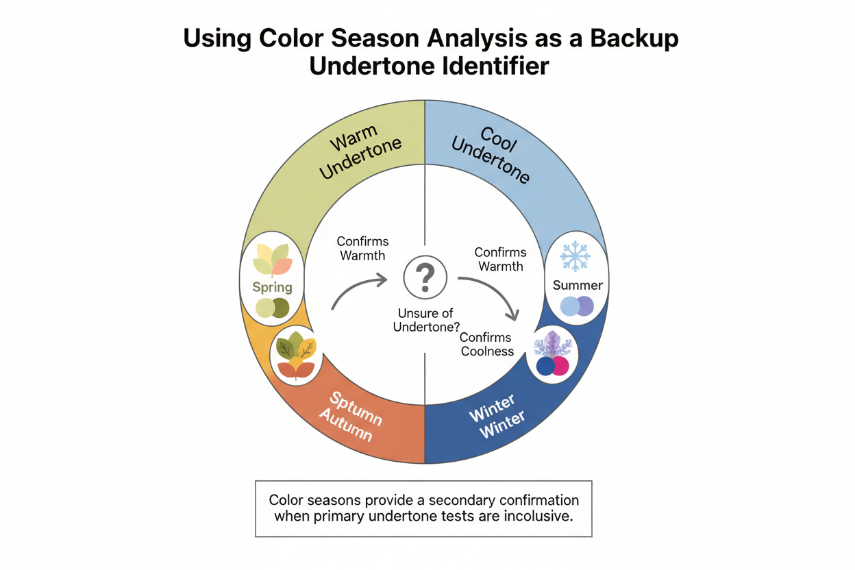
The practical version involves draping yourself in fabric swatches across the warm-cool and light-deep spectrum in natural light, then watching which colors make your skin look clearer, more even, and more alive — and which create shadows, dullness, or a greenish cast. The pattern of what works points to a color season, and that season maps back to a warm or cool undertone.
One person described arriving at her olive identification this way rather than through direct undertone testing — noting that trying to pin down her undertone first led to confusion, while working out her color season gave her the framework that finally made her undertone legible. The method worked because it didn't require her skin to behave like a simple warm or cool complexion. The olive layer was part of the picture, not a problem to route around.
For olive skin, this works best as a secondary confirmation after the foundation test, or as a primary tool when the multi-signal diagnostic is genuinely inconclusive. It won't replace understanding your specific warm or cool direction — but it's a reliable way to get there when direct tests fail.
Which Color Seasons Correspond to Warm vs Cool Olive
The four main color seasons break down predictably for olive complexions, though individual variation always applies and the system is directional rather than absolute.
Warm olive typically corresponds to:
- Autumn (Warm or Deep Autumn): The most common color season for warm olive skin. Autumn palettes center on earthy, muted warm tones — terracotta, olive, bronze, warm brown — that directly mirror the warm-olive complexion's natural coloring. Deep Autumn tends to suit olive skin with more depth; Warm Autumn suits those with medium depth and a strong golden cast.
- Spring (Warm or True Spring): Less common for olive skin but possible when the warm secondary undertone is strong and the olive base is lighter. Spring palettes are warm but brighter and clearer than Autumn, which can sometimes make the olive base look more vivid rather than harmonized. If Spring colors look best on you but Autumn shades feel heavy, you may sit at the Spring-Autumn boundary.
Cool olive skin tends to map onto two color seasons:
- Summer (Cool or Soft Summer): Soft Summer is the most common cool-season match, especially when the complexion has a muted, grey-green quality. The palettes — dusty rose, soft plum, cool taupe — work with the green-neutral base rather than against it.
- Winter (Cool or Deep Winter): A better fit when the cool olive complexion has more depth and contrast. Deep jewel tones, stark white, and cool black can work here, but if those shades read as harsh rather than striking, Soft Summer is probably the closer match.
How to use this mapping: If you already know your color season, find it above and treat the undertone direction as a strong indicator of your warm or cool olive category. Then run the foundation test in that direction to confirm. A known season combined with a foundation pull in the same direction is the most reliable reading you can get for olive skin.
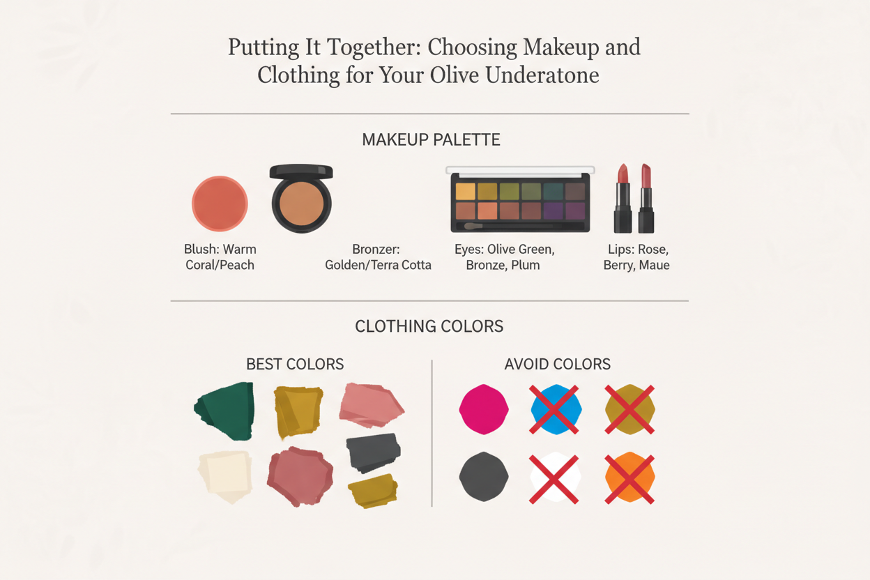
Putting It Together: Choosing Makeup and Clothing Colors for Your Olive Undertone
Knowing your warm or cool olive direction only matters if you can use it. Here is how to apply the result across the two most common categories: foundation and clothing color.
Foundation selection by undertone direction:
| Situation | Warm olive approach | Cool olive approach |
|---|---|---|
| Starting from scratch | Look for "warm beige" or "golden beige" in your depth | Look for "cool sand" or "neutral-cool" in your depth |
| Foundation pulls orange | Try the same undertone direction, one shade lighter or less saturated | Do not switch to cool — orange means too warm, not wrong direction |
| Foundation pulls grey or ashy | Do not switch to warm — look for a less pink-saturated cool formula | Try the same cool direction in an olive-adjusted formula |
| Foundation pulls muddy or sallow | This signals the wrong undertone direction; shift accordingly | Same logic — muddy or sallow is the key mismatch signal |
| Both warm and cool look slightly off | The olive base may be the issue; try a formula made for olive skin before changing undertone direction | Same approach; olive-specific formulas often sit more neutrally on a green base |
Clothing and color palette by undertone direction:
For warm olive, the goal is to echo your natural warmth without pushing the olive base toward green. Terracotta, camel, warm olive, mustard, rust, and warm burgundy work well. Cool pastels and icy tones tend not to. Gold, bronze, and copper metallics enhance warm olive skin rather than fighting it.
For cool olive, the goal is to calm the green-neutral base while honoring the cool secondary direction. Dusty rose, cool plum, slate, soft emerald, and cool taupe tend to make cool olive skin look clear and even. Orange-family and yellow-family colors usually amplify the green cast, so they are worth avoiding. Silver and white-gold metallics work better than yellow-gold.
A note on neutrals: Both warm and cool olive complexions can struggle with standard neutral clothing. Warm olive skin can make cool grey look stark; cool olive skin can make warm beige look sallow. The fix is not to avoid neutrals but to pick them within your undertone direction — warm taupe and warm khaki for warm olive, cool grey and cool off-white for cool olive.
The foundation test and the clothing palette reinforce each other. If earthy warm tones consistently make your skin look more alive, that confirms the warm-olive direction. If cool muted tones reduce any grey-green quality, that confirms the cool-olive direction. Both point toward the same answer.
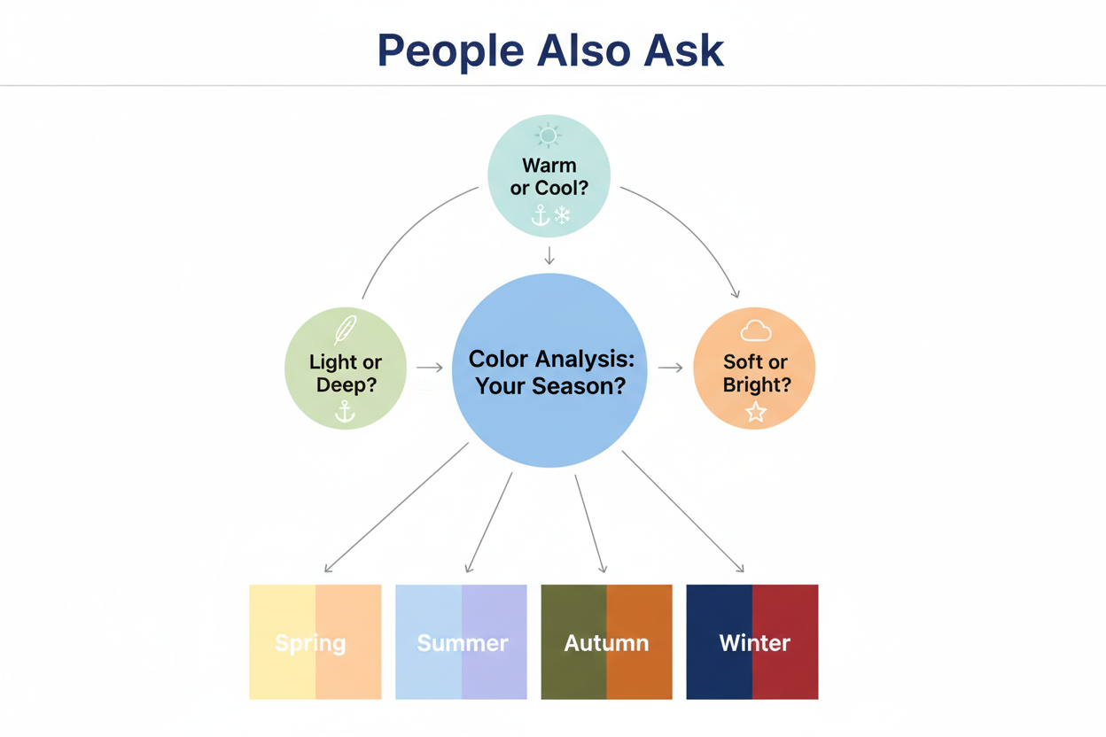
People Also Ask
How do I know if my olive skin has a warm or cool undertone?
The most reliable way to check is the foundation swatch test: put a warm-leaning, neutral, and cool-leaning shade along your jawline in natural light. The one that disappears without leaving a visible edge or color cast points toward your undertone direction. Back it up with the jewelry test (gold looks better = warm, silver = cool) and your vein color (blue-purple = cool, green-teal = warm). No single test is definitive on olive skin, so look for at least two signals pointing the same way before drawing a conclusion. If they still conflict, color season analysis — figuring out which broad palette makes your complexion look clearest — can help break the tie.
Why do standard undertone tests not work for olive skin?
Standard tests — veins, jewelry, and white paper — were designed to read a single pigment layer. Olive skin has an additional green or yellow-green base sitting over its warm or cool secondary undertone, and that layer throws off all three tests at once:
- Veins often read as blue-green or teal instead of a clear blue-purple or green, so they're inconclusive.
- Jewelry flattery relies on contrast, which the olive base softens — both metals can look fine rather than one clearly winning.
- The white paper or shirt test expects skin to read either pinkish or yellowish, but olive skin often reads as greenish or golden — a third category the test wasn't built to catch.
So the confusion isn't user error. It's structural. A multi-signal approach anchored in how foundations actually behave works better for olive complexions than any single classic test.
What color season is olive skin?
Olive skin doesn't map to a single color season because both warm and cool olive subtypes exist. The most common matches are:
- Warm olive → Warm Autumn or Deep Autumn (earthy, muted warm palettes) and occasionally Warm or True Spring when the warm secondary undertone is especially strong
- Cool olive → Soft Summer (muted, cool-toned palettes that calm the green-neutral base) or Deep or Cool Winter when the complexion has more depth and contrast
Color season analysis is particularly useful for olive skin because it looks at the full complexion, including the green-neutral base, rather than asking for a simple warm or cool reaction. If your direct undertone tests keep returning contradictory results, identifying your color season first and then mapping it back to your undertone direction is a common way around that problem.
Is olive skin warm or neutral?
Neither, really. Olive skin has a green or yellow-green base that sits between warm and cool - it acts as a neutral-green modifier at the surface. But underneath that, there's always a secondary undertone pulling either warm or cool.
That two-layer structure is why olive skin fights simple warm/neutral/cool labels. The surface looks neutral or greenish, but the secondary direction underneath is what determines which foundation shades, clothing colors, and jewelry metals actually work. Calling olive skin "neutral" isn't wrong, exactly - it just doesn't tell you enough to make useful product or color decisions.
How do I find the right foundation shade for olive skin undertones?
Work in two steps: match the green-neutral base, then figure out which direction — warm or cool — it leans.
- Identify your secondary undertone first using the foundation pull test described above. Warm or cool tells you which product family to shop in.
- Look for olive-specific formulas within your undertone direction. Standard warm foundations often run too saturated yellow; standard cool foundations often run too pink. Formulas marketed for olive skin tend to neutralize the green base while still reading warm or cool.
- Use these descriptors as a starting guide:
- Warm olive: "warm beige," "golden beige," "warm sand," "warm olive"
- Cool olive: "cool sand," "cool beige," "neutral-cool," "rose beige" in an olive-adjusted formula
- Diagnose the pull, not just the color in the bottle. If a warm shade turns orange, try a lighter or less saturated version before switching to cool entirely. If a cool shade turns ashy, look for a less pink-saturated cool-neutral rather than jumping to warm. Muddy or sallow — not orange or ashy — is the sign you have the wrong undertone direction altogether.
FAQ
Can olive skin be both warm and cool at the same time?
Not exactly — though the confusion makes sense. Olive skin has a green or yellow-green base that sits between warm and cool, which can make it feel like both at once. But underneath that base, your skin has a secondary undertone that leans one way or the other. The surface neutrality is what creates the "both" impression. Finding that hidden secondary direction is the whole point of undertone testing. Think of it as two layers: the green-neutral base stays constant, warm or cool is what you're trying to read.
Why does my foundation always look too yellow or too orange on my olive skin?
The short answer: warm-leaning formulas amplify the green-neutral base in olive skin instead of balancing it. What looks like "warmth" on the swatch ends up pushing yellow or gold toward an orange or saturated cast on your face. A few things to check:
- Shade depth: Going too dark concentrates the warm pigment, making the cast worse.
- Saturation: Some warm formulas are built for skin without an olive base and carry more yellow than olive complexions can absorb cleanly.
- Undertone direction: If the cast follows you across multiple warm shades and depths, your secondary undertone may actually lean cool — which means you've been shopping in the wrong undertone family.
Try a lighter, less saturated warm formula first. If you still get the cast, shift to a cool-neutral formula and run the pull test again from there.
Are my veins supposed to be green or blue if I have olive skin?
Neither answer is reliable on olive skin, which is part of why the vein test struggles with this complexion. The green-neutral base layer can tint the veins themselves - blue-purple veins may read as teal, and green veins may read as blue-green. You often end up with an ambiguous teal that doesn't clearly point warm or cool.
Treat vein color as one signal among several, not a standalone answer. Clearly blue-purple still suggests a cool secondary undertone. Clearly green still points warm. If you're looking at teal or something in between, call the vein test inconclusive and lean on the foundation pull test and jewelry cross-check instead.
Does olive skin look better with gold or silver jewelry?
It depends on your secondary undertone — there is no single answer for all olive skin.
- Warm olive: Gold tends to complement the underlying warmth, creating harmony rather than contrast.
- Cool olive: Silver tends to work better, flattering the cooler secondary direction without clashing with the green-neutral base.
The tricky part is that the olive base itself can make both metals look fine, so the jewelry test is less decisive here than it is on non-olive skin. If gold and silver both seem to suit you equally, the test is inconclusive — weight your foundation pull test more heavily instead. A clear preference for one metal over the other, though, is still a useful warm-versus-cool signal.
What is the difference between olive skin and neutral undertone?
Neutral undertone means the skin has roughly equal amounts of warm and cool pigment, with no strong lean in either direction. Olive skin is not the same thing, even though both can resist easy warm/cool labeling.
The difference comes down to why they're hard to categorize:
- Neutral undertone: Warm and cool signals cancel each other out evenly.
- Olive skin: A distinct green or yellow-green pigment layer creates surface ambiguity, but a secondary warm or cool undertone still exists underneath.
In practice, someone with a neutral undertone can often wear a wider range of foundation shades and clothing colors without running into problems. Someone with olive skin still needs to figure out their secondary warm or cool direction to avoid color casts, even when standard tests make that hard to pin down. Calling olive skin "neutral" describes what you see on the surface. It's not a shopping guide.
How does color season analysis help identify olive undertones?
Color season analysis looks at your full complexion — including the green-neutral base — by testing which broad color palettes make your skin look clearest and most even. Because it considers the whole picture rather than isolating one variable like vein color or jewelry preference, it cuts through the ambiguity that standard undertone tests tend to produce on olive skin.
Many people with olive skin have found it easier to identify their undertone direction through color season analysis first, then work backward to confirm their warm or cool lean. The typical mappings:
- Warm olive → Warm Autumn, Deep Autumn, or occasionally Warm Spring
- Cool olive → Soft Summer, Deep Winter, or Cool Winter
If your direct undertone tests keep returning contradictory results, figuring out your color season and reading the undertone direction it implies is a reasonable alternative route.
Can I have olive skin and a cool undertone?
Yes, and this combination is more common than most beauty guides admit. Cool olive skin has the same green-neutral base as warm olive skin, but the secondary undertone beneath it runs cool rather than warm. A few signs this might be you:
- Foundation pulling ashy or gray instead of orange or yellow
- Silver jewelry looking noticeably better than gold
- Veins reading blue-purple (the olive base can make them look slightly teal, but the underlying hue is still cool)
- Landing in cool-toned color seasons like Soft Summer or Cool Winter when you test against clothing palettes
Cool olive is easy to misread because the green-neutral surface looks warm at a glance, so people assume their undertone must be warm too. The foundation pull test matters most here: if cool-neutral formulas disappear into your skin while warm ones turn orange, your secondary undertone is cool—full stop, regardless of what the surface looks like.
Not sure which direction your olive undertone runs? Take the color analysis quiz to get a personalized read on your complexion.