Bright Spring Celebrities and Why: High-Contrast Warm Style Icons
 Reviewed by Alexandra Gilmore
Emma Stone, Blake Lively, Rose McGowan, and Heather Graham offer useful Bright Spring style references: compare clear, warm color near the face with muted alternatives, then test the effect in your own light.

Bright Spring celebrities are useful style references because clear color, visible contrast, and a touch of warmth can make an outfit look especially lively. Emma Stone, Blake Lively, Rose McGowan, and Heather Graham are often discussed as examples. Think vibrant coral, poppy red, clear turquoise, and canary yellow beside the face; compare those with dusty gray, oatmeal, or drab olive. These are visual examples, not confirmed personal color diagnoses. Red-carpet lighting, hair dye, makeup, and photo editing can change what we see. Use their looks to learn the palette's relationships, then test fabric against your own face in indirect daylight.
The distinction is not simply “bright clothes look good on famous people.” Bright Spring, sometimes called Clear Spring, describes a palette where clarity leads, warmth supports it, and moderate to strong contrast keeps the result crisp. This guide separates that color logic from celebrity labels so you can borrow the useful styling choices without assuming you share anyone's coloring.
What Makes a Celebrity a Bright Spring? (The Rare Intersection of Warmth and High Chroma)
In a 12-season system, Bright Spring sits near Bright Winter. Both favor clear, saturated colors; Spring's versions generally carry more warmth. High chroma means a hue appears pure rather than gray-dusted. Warmth here does not require orange everywhere: a green-leaning turquoise, vivid coral, or yellow with a sunny base may feel clearer than a smoky teal, mauve-pink, or blue-white. The balance of those properties matters more than whether someone has one particular hair or eye color.
A celebrity photograph can suggest a hypothesis when the face remains visible beside several differently colored outfits. Ask whether clear color echoes the eyes, whether skin appears more even next to a warm saturated shade, and whether the garment competes with the person. Compare photos shot under similar light when possible. A single heavily retouched campaign portrait tells you little about undertone, and a dramatic gown may be chosen for theatrical effect rather than color harmony.
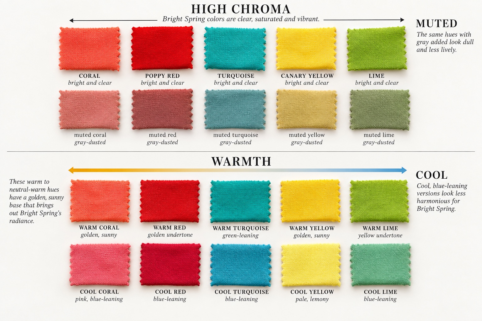
Notice the two independent tests in the swatches. A warm color can still be too muted, while a bright color can be too icy. For a Bright Spring candidate, a clear warm coral may be more useful than dusty peach or blue-based magenta. If clear color is flattering but the coolest versions consistently work better, compare Bright Winter before settling on a Spring label. For a wider view of how seasonal systems group clear and warm palettes, see our 12-season versus 16-season comparison.
Emma Stone: Analyzing Red Carpet Outfits Across Different Hair Color Eras
Emma Stone is an especially instructive reference because her hair has moved through auburn, brunette, and blonde appearances. Vogue's red-carpet hair retrospective documents several of those changes. A hair transformation changes the contrast of an entire look, so it is risky to infer a fixed season from one photograph. Instead, hold the outfit color in mind and ask how the face responds as hair depth and warmth change.
Auburn hair with crisp warm color
Against copper or auburn hair, a clear tomato red, coral, or turquoise can create a lively separation: the outfit is saturated but does not blend into the hair. A muted rust dress might repeat the hair's warmth while losing the necessary clarity. That is the useful Bright Spring lesson in Stone's image, whether or not an in-person draping would assign her that season. Look at the fabric closest to the chin rather than judging a full-length red-carpet shot from a distance.
Blonde and dark hair change the comparison
When Stone's hair looks blonde, a warm bright color may supply contrast that the hair provides less of on its own. When it looks darker, a clear accent can bridge the stronger hair-to-skin difference. The same coral can therefore read differently across eras even before lighting and makeup enter the picture. Vogue's coverage of her return to red hair illustrates how deliberately a red-carpet team can construct a look. Treat that styling as evidence of a design choice, not proof of natural undertone.
To apply the idea, try one bright warm top with your hair worn as you normally wear it. Then compare a muted version at the same approximate lightness. If the clear top makes the eyes easier to notice while the muted top appears separate from the face, you have learned something useful. If both work, test temperature next rather than forcing a season from the celebrity analogy.
Blake Lively and Rose McGowan: High-Wattage Radiance in Clear Jewels
Blake Lively's wardrobe is a good example of high-impact color storytelling. Vogue's red-carpet gallery shows the range of saturated and polished looks she has worn. For a Bright Spring study, focus on vivid turquoise, coral, warm pink, and clear yellow rather than using every gown as season evidence. Her blonde hair, changing makeup, and jewelry can make a color appear warmer or cooler in photographs.
Rose McGowan provides a different contrast reference: darker hair can make bright color appear especially graphic around the face. A saturated jewel shade has a clean edge beside dark hair, whereas an olive-gray or dusty beige can appear softer and less defined. That is an outfit observation, not a claim that McGowan has a verified Bright Spring classification. The useful question is whether the color keeps its clarity when repeated as a small earring, neckline, or lip shade.
Heather Graham offers a lighter-haired point of comparison. With blonde hair, bright color can supply a visible focal point without requiring a black frame. A clear turquoise or coral near the face is an easy styling experiment; a pale beige may need a bright accessory or lip color to create similar definition. Her images, like the other celebrity examples, are references for design decisions rather than templates for diagnosing strangers.
Across all four examples, compare like with like. Match the approximate lightness of two garments, keep the neckline similar, and avoid judging a flash photograph against a sunlit street photo. Eye clarity and apparent skin radiance are observations affected by the camera. A repeated pattern across several looks is more useful than one dramatic image.
Iconic Red Carpet Looks: Bright Coral, Neon Warm Pink, and Vivid Turquoise
Bright coral combines pink and orange energy, so it can echo peach warmth while remaining saturated. Poppy red offers a more formal alternative to burgundy: look for a clean red with a little warmth, not a brown-red or blue-crimson. Neon warm pink is most practical as a smaller accent if a full gown feels intense. Vivid turquoise gives similar clarity on the green-blue side of the palette and pairs especially well with warm gold.
Canary yellow and lime yellow are useful tests because they expose temperature differences. A sunny yellow can make a warm clear palette feel coherent; a greenish or grayish yellow may create a very different effect. In a full outfit, control the contrast by repeating one bright color and keeping the other elements simple. A coral dress with gold earrings and a clean warm ivory bag is easier to read than five competing statement colors.
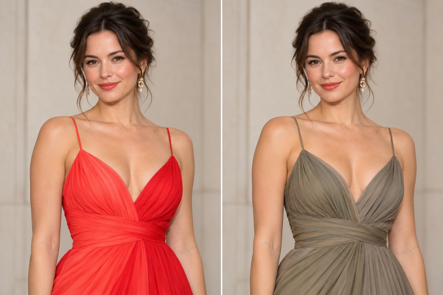
The controlled comparison above is closer to an actual styling test than two unrelated celebrity photos. It keeps the person and lighting broadly similar while changing the gown's color quality. The vivid option has a cleaner edge; the muted one has a quieter relationship to the face. Neither is universally “better.” Choose according to the visual result you want, then check the effect in real fabric under daylight.
The Dull Effect: How Drab Olive and Oatmeal Can Flatten Bright Spring Stars
Drab olive and oatmeal often combine low chroma with little value separation from hair or skin. On a person who benefits from clear color, those fabrics may look disconnected from bright eyes or require more makeup to restore definition. The effect can be subtle: the garment may seem pleasant on its own while the face attracts less attention. That is why a color comparison should include the face, not only the swatch or the outfit.
“Olive” covers many colors. A clear yellow-green can sit in a Spring wardrobe; a gray-brown military olive tells a different story. Likewise, creamy warm ivory can be an excellent neutral, while oatmeal may be heavily gray-dusted. If you own a muted dress you love, add a clear scarf, earrings, or lipstick near the face before replacing it. The goal is a workable wardrobe, not a ban on entire color names.
Camera exposure can exaggerate this dull effect. Dark backgrounds make bright garments look brighter; a warm spotlight can make greige appear golden. When copying a celebrity look, inspect the fabric in your hand under the same light you use for the bright comparison. Avoid treating an edited before-and-after photo as scientific proof of a season.
Celebrity Makeup Signatures: Glossy Warm Lips and Dewy Golden Skin
A Bright Spring-inspired makeup look repeats clarity in small areas. A watermelon or warm coral lip gives the face a crisp color point. Peachy cream blush adds warmth without the muddy edge of a browned rose. Golden-champagne illuminator can add reflected light; use a thin layer so it reads as a finish rather than a metallic stripe. These are color and texture ideas, not requirements for anyone's skin.
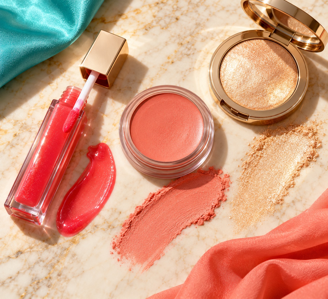
Keep the base matched to your actual skin rather than choosing a foundation labeled “warm” because a seasonal palette is warm. Foundation is a skin match; blush, lip, and clothing are styling colors. A dewy finish can look lively in photography, but a satin finish works just as well if you prefer less shine. If a warm coral lip reads orange, compare a pinker watermelon. If highlighter looks yellow, use a softer champagne or skip it.
Celebrity makeup is often designed for strong flash and long wear. Everyday application can use less pigment and still preserve the palette's clear direction. One saturated lip with restrained eye makeup is a straightforward translation; alternatively, choose a clear turquoise liner with a softer peach lip. For hair color ideas that preserve this bright impression, see the Bright Spring hair guide.
Everyday Wardrobe Lessons from Bright Spring Icons
Red-carpet gowns demonstrate color at a large scale, but the most useful lesson is placement. Put the clearest color at the neckline, on a scarf, or in earrings where it can relate to the face. Use a warm neutral for the rest of the outfit: clean ivory, warm navy, or a clear medium brown can support coral, turquoise, or yellow. Keep fabric color in view even when jewelry is the brightest detail.
| If you notice... | Try this comparison | What it may show |
|---|---|---|
| Coral makes the face look lively, but dusty peach feels flat | Same-depth clear coral and gray-dusted peach | Clarity may matter more than softness |
| Turquoise works, but icy blue looks separate | Green-leaning turquoise and blue-leaning aqua | Warmth may support the bright color |
| Black feels heavy near the face | Black neckline versus warm navy with coral | A warmer dark neutral may be easier to wear |
| Oatmeal disappears, but ivory looks crisp | Equal-depth muted oatmeal and clean warm ivory | Clear neutrals may be more useful |
Try a simple two-top test before buying anything. Wear minimal makeup, stand in indirect daylight, and hold a vivid warm color beside your face. Replace it with a muted version at a similar depth. Look for changes in how clearly you see the eyes, lips, and facial outline, not for a promise of flawless skin. Photograph both with the same camera settings if you want a record, but trust the live comparison when your phone shifts color automatically.
If the clear pair consistently wins, test temperature: turquoise versus icy aqua, or poppy red versus cool crimson. If both clarity and warmth hold up, Bright Spring is a useful palette to investigate. If you are torn, take the interactive color analysis quiz as a starting point and repeat the fabric test; the quiz cannot replace controlled draping.
Bright Spring Celebrity FAQ
Is Taylor Swift Bright Spring?
There is no reliable public draping result that makes a celebrity's season certain from photographs alone. Taylor Swift's styling has included both clear and softer colors, with changing hair, makeup, and lighting. Use a specific outfit to discuss color relationships rather than assigning her a definite season. If her look inspires you, compare the same garment color against your own face.
Can Bright Spring celebrities wear black gowns?
Yes. Black can make a deliberate formal statement. If it looks severe at the neckline, interrupt it with a clear warm necklace, coral lip, gold earrings, or a turquoise wrap. A warm navy or deep clear brown may offer a softer dark alternative. Style preference and dress code still matter more than a palette rule.
Are Bright Spring and Clear Spring the same?
Many 12-season guides use Clear Spring as another name for Bright Spring. The shared idea is high chroma with a warm or neutral-warm direction. Different analysts may place boundary colors differently, so compare actual swatches instead of assuming every palette sold under either name is identical.
Do Bright Springs need light eyes or blonde hair?
No. Hair and eye colors vary. What matters in a practical palette test is how clear, warm colors interact with the whole face. A dark-haired person may wear the same color family with more visible contrast than a blonde person. Celebrity examples are useful precisely because they show different ways to build that contrast.
Which celebrity-inspired color should I try first?
Start with a clear coral or green-leaning turquoise top, then compare a muted version of the same hue. Those pairs isolate the main Bright Spring question: clarity. After that, compare warm and cool versions. A decision made from your own daylight comparison is more useful than copying a single red-carpet photo.
💫 Discover Your Complete Color Palette
Ready to discover all the colors that make you look radiant? Our comprehensive color analysis will reveal your complete personal palette - perfect for hair, makeup, and wardrobe decisions.
Take Color Analysis Quiz →