A Deep Dive into the 12 Color Season System

Key Takeaways
- Let's be direct: a professional in-person seasonal color analysis session now runs anywhere from $200 to $800 — and the best draping consultants book out weeks in advance. Before you spend that kind of money on a 90-minute appointment, it's worth understanding exactly what the 12 season color analysis system offers and whether you're ready to use it. Because color theory seasons aren't a trend — they're a precision tool. And used correctly, they'll save you from every "viral" lipstick that makes you look washed out and every "must-have" blazer that quietly drains your complexion.
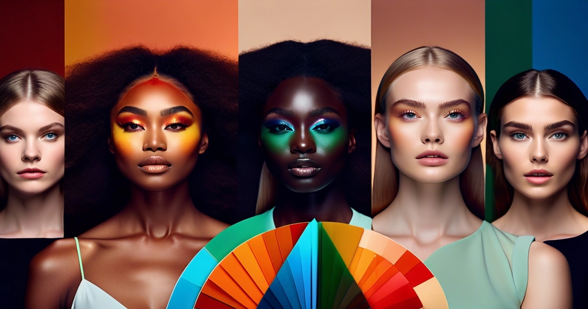
- The 12 color seasons framework — the backbone of what's trending under #seasonalcoloranalysis latest — goes far beyond the original four-season model. Each of the 12 color types is defined by three axes: hue temperature (warm vs. cool), chroma (muted vs. vivid), and value (light vs. deep). The 12 blueprints color analysis approach maps these axes onto distinct seasonal archetypes, giving you a palette that's genuinely calibrated to your features rather than a rough approximation. Within each broad family — Spring, Summer, Autumn, Winter — sit three subtypes that fine-tune the result. Wearing colors from your correct season creates instant visual harmony: your skin looks clearer, your eyes read brighter, your whole face appears more defined.
- Here's how the color analysis 12 seasons spectrum breaks down in practice. Spring types thrive in warm, clear, luminous shades — think peach, coral, warm ivory and fresh mint. Summer calls for cool, hushed, powdery tones: dusty rose, soft lavender, slate blue, sage. Autumn owns the rich, earthy, golden-warm register — terracotta, olive, camel, burnt sienna. Winter commands cool, high-contrast, saturated color: icy white, deep navy, true red, charcoal. Knowing where you sit among the 12 color seasons means you stop buying by trend and start buying by design.
- Before you test digital drapes or use any app, calibrate your screen. This is a step almost everyone skips — and it invalidates the result. Go to your device's display settings and set color temperature to "neutral" or "D65," turn off Night Shift or blue-light filters entirely, and set brightness to around 70–80% in natural daylight. Only then will the colors you see on screen actually correspond to real fabric tones. Once your screen is calibrated, hold fabric swatches or digital color cards close to your bare face in natural light — no makeup, no colored walls behind you — and observe whether your skin looks even and luminous or dull and shadowed. That contrast is the entire logic of colors and seasons.
- If you're not ready to invest $200–$500 in a professional session, AI-powered color analysis apps now deliver surprisingly accurate results at $15–$30 — a practical entry point before committing to a full draping consultation. Once you have your season confirmed, build from it deliberately: a capsule wardrobe anchored in your two or three best neutrals, a makeup kit that stays within your season's temperature range, and accessories that echo your palette's undertone. Color-code your wardrobe, keep a saved folder of your best shades, and treat your 12 season color palette as a living reference — not a rigid rulebook.
- The real power of color analysis 12 seasons lies in what it removes from your life: the impulse buys that never get worn, the "flattering" recommendations from people who haven't looked at your undertone, the exhausting trial-and-error at the makeup counter. Treat the 12 color analysis system as a long-term investment in your wardrobe and your confidence — one that pays back every time you get dressed without second-guessing yourself.
🌸 Discover Your Seasonal Color Analysis
Curious about your color season? Take our in-depth seasonal color analysis to pinpoint whether you belong to Spring, Summer, Autumn, or Winter — and unlock a personalized 12 season color palette that works with your natural coloring, not against it.
Take Seasonal Color Analysis →A 12 seasonal color palette is a system that groups personal coloring into twelve nuanced seasons to guide clothing and makeup choices.
Constructed of undertone, value, and chroma, it divides the four traditional seasons into Light, True, and Deep (or Soft/Bright) subcategories. All of the palettes have defined ranges of hue, contrast and saturation.
To simplify selections, the service associates swatches with actual cloth and common colors. The following sections deconstruct each season with examples.
📚 Recent Articles
The evolution of color theory
Color analysis evolved from turn-of-the-century concepts connecting individual coloring to the colors of nature. The aim was simple: wear colors that echo your own undertones, depth, and contrast so your features look clear and balanced. These steps took us from rudimentary pigment rules all the way to the 12-season system employed by style and beauty today.
Johannes Itten's work at the Bauhaus laid the foundation. He investigated the interplay between warm and cool hues, how contrast alters mood and how harmony arises from balance on the color wheel. His instruction encouraged painters to observe temperature, value and intensity, not just a color's label. That lens shaped early personal color work: warm tones sit best with warm palettes; cool tones with cool ones.
You can observe his impact when a consultant considers not just hue but lightness and saturation in selecting a red or blue for a client. The first wide model was the four-season typology: Spring, Summer, Autumn, Winter. It provided a convenient means for people to classify colors. Warm Springs and Autumns gravitated toward golden, earthy or clear brights.
Cool Summers and Winters preferred blue-based, soft or crisp tones. It did the trick but it was generic. Two Summers could both test as Summer but require very different blues—one soft and muted, the other a little brighter. That gap pushed the transition to the 12-season system. Each of the main seasons split into sub-seasons to capture nuance in undertone, intensity and contrast.
Within the 12 season color analysis framework, Spring and Autumn types are typically refined using True, Light, and Deep descriptors, while Summer and Winter types lean on True, Soft, and Cool. A Light Spring radiates in fresh, warm pastels — think light coral, warm peach, or soft mint. A Deep Autumn commands rich, earthy depth: deep olive, burnt sienna, dark chocolate. A Cool Winter owns clear, blue-based brights like cobalt and fuchsia without a second thought. But here's where many people — and frankly, a lot of AI apps in 2026 — stumble: Soft Summer. This season has quietly become a diagnostic dumping ground. If an algorithm can't confidently place you, it defaults to Soft Summer, because the category's muted, low-chroma, cool-leaning palette feels like a safe middle ground. The problem? Real Soft Summers are a specific, beautifully defined type — dusty rose, foggy blue, lavender grey — and they deserve accurate identification, not a consolation label. If a free tool drops you into Soft Summer without explaining why your coloring reads as low-contrast and cool-muted, treat that result with skepticism. The full color analysis 12 seasons system exists precisely to avoid this kind of lazy categorization — so push for the detail your palette actually deserves.
This finer map guides real choices: lipstick that does not gray you out, a scarf that lifts the eyes, a suit that reads sharp under office lights. Undertone remains my focus. Warm undertones are associated with Spring and Autumn, cool with Summer and Winter. Contemporary practice verifies value (light to dark), chroma (muted to clear) and personal contrast.
In other words, a cool skinned, dark-haired, light-eyed individual might gravitate toward high contrast Winter brights, while another low-contrast cool person might vibe with Soft Summer mutes. Others believe the 12-season model is more accurate for different skin tones, hair and eye colors worldwide. No one standard.
Techniques change, instruments evolve, specialists argue over terminology and diagnostics. Research continues, from virtual draping to improved daylight metrics, all to align color with humans in an equitable, pragmatic manner.
The 12 seasonal color palettes
A 12-season system takes classic **seasonal color analysis** and divides the 4 core seasons into 3 sub types each. It connects hue (warm or cool), chroma (clear or muted) and value (light or dark) to actual human coloring, reflecting the spirit of the 12 months. You're all one dominant trait with two secondary ones, which helps sort whether saturated, mid or soft colors look best.
This subtlety can seem complicated, but it's surprisingly liberating and clarifying for style and beauty decisions.
Table: categories, traits, and key colors
- Light Spring: warm, light, clear; peach, mint, coral
- True/Warm Spring: warm, bright, medium; apricot, grass green, tomato
- Bright Spring: warm, high-chroma; lime, hot coral, cyan
- Light Summer: cool, light, soft; powder blue, shell pink, lilac
- True/Cool Summer: cool, medium, muted; lavender, denim, dove gray
- Soft Summer: cool-neutral, soft; mauve, sage, dusty rose
- Soft Autumn: warm-neutral, soft; camel, moss, clay
- True/Warm Autumn: warm, rich, muted; mustard, terracotta, olive
- Deep/Dark Autumn: warm, dark, high-contrast; forest, auburn, ink brown
- Deep/Dark Winter: cool, dark, vivid; black, emerald, burgundy
- True/Cool Winter: cool, clear; cobalt, cherry, crisp white
- Bright Winter: cool, bright; neon pink, icy aqua, jet black
1. The spring family
Spring is warm, bright and light. Think sunlit colors with yellow undertones, low to medium depth and a vibrant, clear finish. Light Spring reads delicate; True Spring goes bright; Bright Spring pushes saturation.
Signature shades include peach, coral, warm mint, butter yellow and grass green. Throw in melon, tangerine and warm turquoise for pop.
These play up skin with golden undertones, light to medium hair (strawberry, honey, light brown) and clear blue, green or light hazel eyes. The result is fresh and alert.
Build a tight kit: coral blush, apricot lip, warm brown liner, tees in cream, peach, jade, a tomato-red dress and camel shoes to pull it all together.
2. The summer family
Cool, soft and muted sit at summer's core. Colors appear brushed with gray, medium-light in value and low in warmth.
Key shades include lavender, powder blue, mauve, and sage. Light Summer flirts with airy pastels. True Summer likes calm mid-tones. Soft Summer darkens and mutes.
This palette compliments cool undertones, subtle contrast and fair skin. Hair frequently appears ashy, with eyes in soft blue, gray or cool green.
For example, combine slate with rose, or denim with lilac. Silver jewelry and matte finishes keep outfits effortless and sophisticated.
3. The autumn family
Autumn is rich, earthy, and warm—like late harvest light. It prefers muted warmth and deeper value with golden sway.
Staples include camel, olive, mustard, terracotta, and forest green. Soft Autumn mutes with moss and clay, True Autumn glows with pumpkin and ochre, while Deep Autumn adds ink brown and deep teal.
Warm undertones, deeper hair—chestnut, auburn, espresso—plus hazel or green eyes work well.
Ground yourself with suede, matte, russet lipstick, olive jackets, and brass.
4. The winter family
Winter goes cool, high-contrast, and bold. Value ranges from bright white to inky dark with icy clarity.
Signature colors include black, royal blue, cherry red, neon pink, and crisp white. Deep Winter goes dark and saturated. True Winter is pure and cool. Bright Winter is electric and icy.
Best for striking contrast: very dark hair with light skin, or cool medium-deep skin with vivid eyes. DRAMATIC PAIRINGS—black and white, cobalt and fuchsia—shine.
Stay slick with finishes: a red lip, definitive lines, and pure jewel tones make the statement.
How to find your season

To discover where you fit in the 12 seasonal color palette is to read your own coloring carefully, and then map it onto a refined map. The system grew from early 20th-century color theory, moving from four seasons to twelve: Spring and Autumn split into True, Light, and Deep; Summer into True, Soft, and Cool; Winter into True, Cool, and Warm. Each sub-season mimics undertone (warm or cool), clarity (bright or soft), depth (light or deep) and contrast.
Self-analysis, professional consultation, or AI-powered apps — each path into seasonal color analysis has its own strengths. Going solo builds long-term intuition about your own coloring, but a trained analyst brings something harder to replicate at home: calibrated draping fabrics, color-corrected mirrors, and controlled neutral lighting. If your features are muted or sit right on the border between two of the 12 color seasons, that studio environment can be the deciding factor. Look specifically for studios equipped with color-corrected mirrors — they eliminate the fluorescent wash-out effect that throws off even experienced self-analysts. In-person sessions in 2026 typically run $200–$500 for a full 12 season color analysis, with premium consultations reaching $800; many include a physical swatch book (valued at $65–$90) — the only reliable tool for matching colors under unpredictable store lighting. If that investment feels steep, AI-based color analysis apps now deliver surprisingly precise results for $15–$30, making them a smart first step before committing to a full 12 blueprints color analysis session. Digital PDF palettes ($15–$25) work well for online shopping, but when you're standing under harsh retail lighting, nothing beats a physical fan from the 12 color types system in your hand. Use digital tools as a confident starting point — just don't treat them as the final word on your color theory seasons profile.
Depending on your colors 100% can fence in your style, so consider results a springboard, not a corral.
Take a natural light test. Stand by a window, noon if possible. No makeup, no tinted skin care, neutral top. Hold swatches near your face: warm coral vs cool fuchsia, ivory vs stark white, tomato red vs blue-red, camel vs charcoal, soft rose vs bright magenta. You're not watching the fabric, you're watching your face. Good shades even the skin tone, clarify eyes and define lips. Poor shades cast shadows or add redness or dullness.
Duplicate with hair down and with hair pulled up. Notice how eye flecks respond to color—gold flecks tend to warm. Gray rims or slate spokes tend to cool.
Use a checklist to map traits:
- Undertone: veins look greenish and gold jewelry flatters (warm); veins lean blue/purple and silver flatters (cool); both look fine (neutral).
- Depth: hair, brows, and eyes read light to medium (light) or medium to dark (deep).
- Clarity: bright, high-contrast features handle vivid color (bright); blended, muted features prefer soft, grayed tones (soft).
- Contrast: place a white paper by your face. If your features pop, you probably need higher contrast. If they blend, lower contrast aids.
Match your notes to **season characteristics** and sample palettes. Warm or Cool indicates Spring/Autumn or Summer/Winter. Light or Bright narrows further: Light often goes Spring or Summer; Bright often goes Winter or clear Spring.
If you hover between groups you may be a neutral type and belong more in the 12-type split. For example, a neutral-warm person near Autumn, but just barely, will wear lighter olive, soft turmeric and warm gray better than the deep russet that flatters a classic redhead Autumn.
It's practice that helps you find your season. Thorough comparison renders it possible.
Applying your color palette
Apply your 12-season palette as the sieve to every color decision–wardrobe, makeup, accessories. This approach developed out of early 20th‑century color analysis and now translates undertone, intensity, and contrast into a dozen subgroups.
It guides you to find the hues that keep your complexion fresh and vibrant, and avoid those that age or drag you down. Construct decisions around your dominant characteristic and two supplemental traits, pulled from your skin, hair and eyes.
- Build a simple visual board: print your palette, add fabric swatches, and pin makeup swipes.
- Sort by roles: base colors, accents, metals, prints, and beauty.
- Shoot those outfits that work and play light, medium and dark balance.
- Keep the board close to your closet and mirror for last minute checks.
Wardrobe
Begin with a capsule. Pick 2–3 base colors from your season (for example, Soft Summer: mist gray, blue smoke, rose brown) and 3–4 accents (dusty plum, sea glass, soft navy) to mix and match.
These hues resonate with your undertone and chroma, so ensembles connect naturally. Spend on key pieces in your best colors: coats, suits, knitwear, dresses, shoes you wear often.
A trench in your perfect neutral will glow above five mediocre purchases. The reward manifests on your face initially. Clean out your rack and sort by color family.
Pull anything that clashes with your undertone, or looks too stark against your contrast level. Note gaps: maybe you need a light neutral bottom or a mid-tone top for balance.
Synchronize patterns and textures with your season's intensity. Bright seasons manage clear prints, cool seasons prefer blue‑based inks, soft seasons accommodate blurred florals, deep seasons ground high contrast.
Tweed, rib, silk and matte vs sheen can resonate your palette's depth and temperature.
Makeup
Choose shades by undertone and strength: cool seasons look better in blue‑red lips and rosy blush, warm seasons in coral, peach, and brick, bright seasons in clear pigments, soft seasons in muted, gray‑touched tones.
Foundation should fit your undertone first, depth second. Make a core kit: one foundation, one concealer, a daily blush, two lip colors (day and dressy), a neutral shadow quad, liner, and brow product that fit your palette.
Build a streamlined makeup routine by anchoring every product to your confirmed seasonal color palette — whether you follow the classic 4-season framework or the more nuanced 12 season color analysis system. The viral Seasonal Makeup Purge trend sweeping TikTok right now has thousands of creators clearing out every off-season shade and rebuilding their kit strictly around their 12 color analysis results — and the before/after difference is genuinely striking. One category to watch out for: so-called "pH-balancing" blushes marketed as universally flattering. In practice, these products shift on the skin toward warm, peachy-coral tones that can completely undermine a cool-season palette, turning a carefully chosen icy pink into a muddy, warm-toned mess. If your seasonal color analysis places you in a cool or muted season, steer clear. Instead, reach for swatch cards or curated brand ranges built specifically around color theory seasons and the 12 color types — they make shade-matching fast, consistent, and territory-proof no matter where you shop.
- Do choose undertone‑true shades; test in daylight.
- Do maintain chroma according to your season's clarity or softness.
- Don't jump a depth level that drains or overwhelms.
- Don't combine warm and cool bases on one face.
Accessories
Select jewelry, scarves, hats and bags from within your palette to tie looks together. Metals matter: cool seasons glow in silver, rhodium, or white gold. Warm seasons in yellow or rose gold.
Some deep or soft types suit brushed finishes. Use accessories to have fun. A bright scarf for Bright Spring, a moss bag for Soft Autumn or a rich teal beanie for Deep Winter breathe life without a full outfit change.
Layer textures and shades: a matte leather bag, soft knit scarf, and enamel earrings in neighboring palette tones add depth yet stay harmonious.
Don't use default beige or stark black if your palette blooms on richer or lighter tones. Select the neutral your season possesses.
Color analysis is a guide, not a rule
Seasonal color analysis provides the road map for the 12-season palette, not the landscape. It aids in identifying patterns—undertone, depth, and clarity—so decisions are simpler and consistent. It doesn't supplant personal preference, or comfort, or the demands of real life. This method is part of a broader season color analysis system that many find useful.
Most of us don't fit one tidy box. You may observe characteristics of two seasons simultaneously – for example, dark overall coloring overlapping both Dark Autumn and Dark Winter, or cool undertones with a soft, muted appearance that tips toward Soft Summer, yet borrows from Soft Autumn. This is typical, not an error, and reflects the complexity of seasonal color analysis.
Color analysis isn't a precise science. It can take trial and error to find a range that feels right, particularly if your hair, eyes, and skin send mixed signals. Small tests help: try a cool navy against a warm olive, or compare a clear cherry red with a muted cranberry, and take photos in daylight (around 11:00–15:00, when light is steady). Take notice of which hues leave your skin looking even and your eyes sparkling, as these are key elements in determining your ideal color palette.
Let the results be a spark, not a boundary. If your chart says warm greens love you, but you grab cobalt or lilac, wear it. Tweak the dose and placement. Keep your best colors near your face—scarves, tops, glasses frames—and tuck off-season shades in skirts, trousers, or shoes to maintain a vibrant seasonal palette.
Have fun with value and texture as well. A bright, high-chroma orange could feel loud, but a softer terracotta in linen could sit so well on skin and still tip a hat to the vibe you like, showcasing the beauty of color harmony.
Style and life count. A corporate gig might drive you toward more sedate colors, whereas an on-the-go calendar demands interchangeable pieces. Develop a foundation of go-to neutrals that correspond to your **color season**s—charcoal, cocoa, stone, espresso—and sprinkle in accents you adore in controlled pops.
If black overwhelms you but you adore its sharpness, replace pure black with ink, deep espresso, or a near-black green; the mood remains, the conflict disappears. This adaptation allows you to embrace your unique coloring while navigating your preferences.
Others say that rigid systems stifle their ingenuity. If sticking to the palette 100% feels confining, relax it. You can respect your palette and break lines intentionally. Treat the system like a toolkit for fit checks: does this color lift your face, smooth your skin tone, and match your story?
If so, wear it. If not, switch up the shade, the fabric, or the dosage. Confidence reads louder than any swatch, so embrace your natural beauty and express yourself through your color choices.
Common color analysis myths

Too many concepts of the 12 season color analysis system look great in theory but crumble in practice. Human coloring is complicated, as seasonal colors, like warm colors and cool colors, play a significant role.
Debunk the belief that everyone fits perfectly into one exact season or color type.
We don't often sit in one neat little box. Skin, hair and eye tones exist at several levels of depth, warmth and clarity. You'd register as Soft Autumn in shadow but Light Spring by a window, or Cool Summer most days but Neutral with warm highlights following a day at the beach.
Hair color by itself deceives too–brown hair doesn't equal Autumn automatically. Undertone, contrast level and reflection of colors on your face are more important. Most experts employ extended catalogs and flow types to indicate subtlety. That comes in handy when two seasons appear close, like Bright Spring and Bright Winter. Anticipate overlap, not a rigid designation.
Clarify that seasonal color analysis is not just for women—men benefit equally from understanding their color season.
Color impacts all of us. Men can leverage seasons to select shirt colors that clear the skin, tie colors that brighten the eyes, and suit cloth with the appropriate depth. A cool, deep guy may look dashing in navy and charcoal, a warm, light guy may radiate in light camel and soft olive.
The technique backs grooming selections as well–beard hue, glasses frames, even watch bands. It's a pragmatic style tool — not a gendered ritual.
Dispel the myth that certain colors are universally unflattering; context and undertone matter.
Black is not evil for all Springs, and yellow is not a death sentence on cool types. Fabric finish and saturation and placement change the effect. A cool person can pull off yellow in a lemon scarf thrown way out on the body.
A warm person can do black in a matte knit with a warm camel coat. The secret is undertone match and color mixing. Think in degrees: softer, brighter, lighter, or deeper versions often work. Personal preference matters as well – it helps you rock up effortlessly.
Correct misconceptions about needing expensive professional color analyst services to find your best colors.
Analysis is not an exact science. It's instead led by trained eyes and can be arbitrary. Different analysts will provide different palettes, and some walk away confused from sessions.
Apps and online tools can get you testing, but they miss texture, real light, and subtle shifts in undertone. Start with free steps: test swatches by a window, use a white tee as a baseline, note which shades smooth under-eye shadows, and track wins in photos.
Return to it as you get older, tan, change hair or polish your style. If you hire assistance, seek out obvious techniques, genuine-light testing and willingness to embrace subtlety. Consider color a breathing exercise, not a single declaration.
Conclusion
To sum up, color talk remains straightforward. The 12-season map provides defined paths. It highlights shades that brighten skin, eyes and hair. It assists in selecting a jacket in crisp teal or a scarf in vibrant rust. It eliminates guesswork. It's a time and money saver.
Just a quick test in real light says so much. Experiment with a pair of shirts — one warm, one cool. Check out your mug. Less cast shadow. More alive. That's your hint! Keep notes.) Click photos! Create a tiny collection that pulls double duty.
Style mellows with wear. Trends come and go. You mature as well. Maintain your staple colors. Throw in a daring toss by mood or location. Share your victories or queries. Need some help! Leave a comment and request a quick palette check.
Frequently Asked Questions
What are the 12 seasonal color palettes?
The four main seasons—Spring, Summer, Autumn, Winter—each split into three types: Light, Bright/Clear, and Warm/True, along with Soft, Deep, and Cool, create a seasonal color analysis that organizes colors by temperature, value, and chroma to enhance your natural beauty.
How do I find my season?
Begin with undertone (warm, cool, or neutral) to align with your seasonal color analysis. Then determine value (light to deep) and chroma (soft to bright) using natural daylight, no makeup, and drapey different colors.
Can my season change over time?
Your undertone is firm, and a professional color analysis can help you determine your ideal color palette. Hair color, aging, or sun exposure can influence which seasonal colors feel best, prompting a reevaluation after significant style alterations.
Do I have to follow my palette strictly?
Color analysis is a MAP that aids in making simpler decisions and achieving a fresher appearance. If a signature hue falls outside your ideal color palette, consider modifying placement, fabric sheen, or contrast for better color harmony.
What if I'm between two palettes?
That's generic. You might be a "border" type, perhaps between Soft Summer and Soft Autumn in the seasonal color analysis. Focus on your top two drivers, temperature and value or chroma, to create a core closet from the seasonal palette.
Will my makeup and hair color change with my season?
Yes, when in line with your seasonal color analysis, select makeup and hair colors that complement your palette's warmth and coolness. This minimizes clashing and enhances skin luminosity, particularly with warm colors and tones from your ideal color palette.
Are black and white always bad for non-Winters?
Not always, but softer types can dominate in seasonal color analysis. Test off-black, charcoal, ivory, or soft white to enhance your overall coloring. Modify contrast with a seasonal palette of layered neutrals, and if you wear black, distance it from the face or accessorize with a scarf in your ideal color palette.