Warm autumn color palette: a complete guide

Key Takeaways
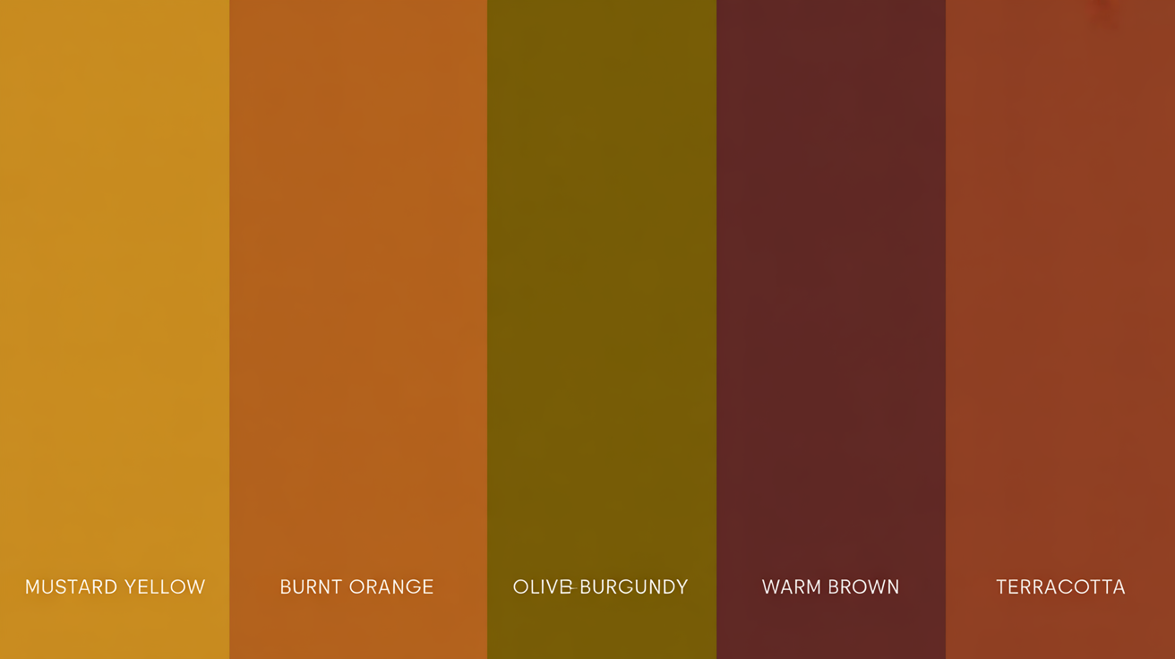
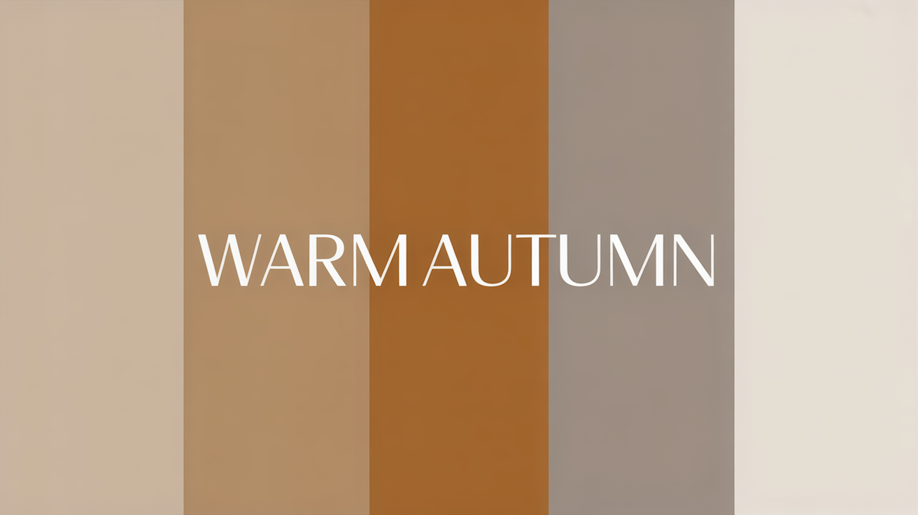
- The warm autumn color palette is built on rich, earthy, sun-baked tones — think corn gold, tobacco brown, burnt orange, ocher, and oxidized copper. These aren't just pretty colors; they're the exact shades that make warm autumn skin glow from the inside out.
- Mastering the colors warm autumn palette means understanding its golden, muted soul. Unlike Deep Autumn's darker drama, Warm Autumn sits at medium contrast — soft enough to blend, rich enough to make a statement. Mustard, caramel, olive green, rust, and terracotta are your non-negotiables.
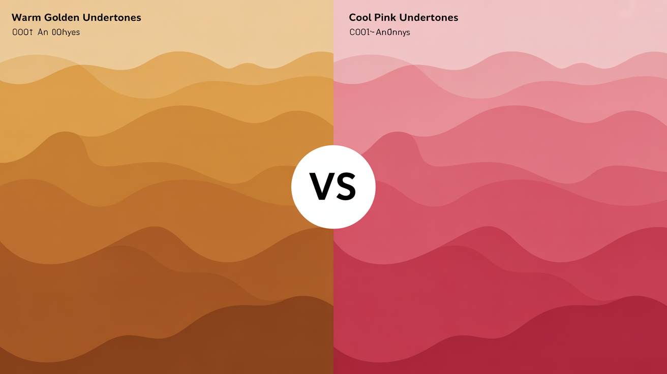
- The secret weapon of the autumn palette warm undertones? Every shade leans yellow-gold, never pink or blue. This is what separates a true glow from a washed-out near-miss. Drape a muted rust near your face — if your skin lights up, you're home.
- Shopping Spring/Summer collections as a Warm Autumn is genuinely the hardest season to navigate. Filter for 'mustard,' 'terracotta,' and 'camel' — skip the brights entirely. Pair olive accessories with muted spring prints to warm them up without clashing. This is the insider move most people miss.
- For a warm autumn palette complete capsule wardrobe, anchor everything in neutrals: chocolate brown, warm taupe, maroon, and camel. Layer in 2026's lace and sheer mesh long sleeves in these same tones for an elevated, season-ready look that works from desk to dinner.
- Skip the $450 in-person session for now — a $24.65 digital palette guide (updated January 2026 with jewelry, hair, and makeup breakdowns) is your real best friend. For makeup, the 'Latte Code' works every time: terracotta cream blush layered with a golden yellow highlighter. Stop buying near-miss charcoal and reach for warm bronze instead — instant glow, zero effort.
If you've been drawn to the "latte makeup" aesthetic sweeping 2026 feeds, chances are you're already living the warm autumn color palette — and this complete guide will show you exactly why. Warm Autumns are arguably the luckiest thrifters on Depop and Vinted right now: mustard, olive, and burnt sienna are the most abundant deadstock shades in sustainable fashion, meaning your ideal wardrobe is hiding in plain sight. Rooted in autumn palette warm undertones of gold, rust, and tobacco, the colors warm autumn palette celebrates are rich, muted, and endlessly wearable — season after season.
If you've been drawn to the "latte makeup" aesthetic sweeping 2026 feeds, chances are you're already living the warm autumn color palette — and this complete guide will show you exactly why. Warm Autumns are arguably the luckiest thrifters on Depop and Vinted right now: mustard, olive, and burnt sienna are the most abundant deadstock shades in sustainable fashion, meaning your ideal wardrobe is hiding in plain sight. Rooted in autumn palette warm undertones of gold, rust, and tobacco, the colors warm autumn palette celebrates are rich, muted, and endlessly wearable — season after season.
💫 Discover Your Complete Color Palette
Ready to discover all the colors that make you look radiant? Our comprehensive color analysis will reveal your complete personal palette - perfect for hair, makeup, and wardrobe decisions.
Find My Season →Colors such as burnt oranges, mustard yellows, rich browns and subdued reds all offer a sense of warmth and welcome. They're popular in fashion, interior design and art to evoke the spirit of fall.
Bringing in these hues can feel cozy and inviting, perfect for seasonal schemes or all-year-round designs with a classic touch.
📚 Recent Articles
What is the Warm Autumn Palette?
Warm autumn is a subset of the autumn family, characterized by its earthiness and golden undertones. It's inspired by the natural shift of fall, mirroring the warm, muted colors of turning leaves and late harvest landscapes. What makes this palette special is the way it balances depth with warmth.
1. The Essence
At its heart the warm autumn palette is cozy and earthy. It's a medium to dark palette, and while it's muted in quality, it's on the deeper side of muted. Not like bright or pastel palettes, it encapsulates autumn's essence—golden fields, weathered wood, soft sunlight through amber leaves.
This warmth plus depth combo is what makes the palette so versatile — equally stylish in casual and formal contexts.
2. The Colors
The warm autumn palette features a range of earthy and golden colors. Key examples include mustard yellow, olive green, burgundy, terracotta and copper. They don't feel too vivid or muted, but somewhere in between, warm and luxurious.
Neutral tones like taupe, tan and toffee take a supporting role in color harmony. Combined, these colors form a unified palette that reflects the rich, earthy splendor of fall.
3. The Undertone
What distinguishes the warm autumn palette is its golden undertone. This undertone lends a warm, radiant quality that makes the hues seem cozy and organic. Warm autumns tend to have skin tones with an earthy undertone — think golden beige or warm olive — and eyes that are flecked with amber, green, or brown.
These golden undertones harmonize beautifully with the palette's colors, amplifying your natural coloring.
4. The Contrast
Although the warm autumn palette is rich and dark, its contrast tends to be medium. It shuns hard contrasts, opting instead for a more seamless, blended appearance. For instance, combining mustard with olive or copper with burgundy adds depth without straining the eye.
This low key contrast approach makes the palette feel cohesive and wearable, especially when paired with earthy neutrals or muted metallics.
5. The Misconception
A misconception is that the warm autumn palette is all dark or too bold. In actuality, it's a harmonious blend of soft and vibrant shades, providing a touch of both intensity and nuance. Colors like tan or taupe offer lighter alternatives, showing us that this palette isn't just heavy colors.
It's frequently considered limiting yet its pairability and style adaptability dispel this notion with ease.
Are You a Warm Autumn?
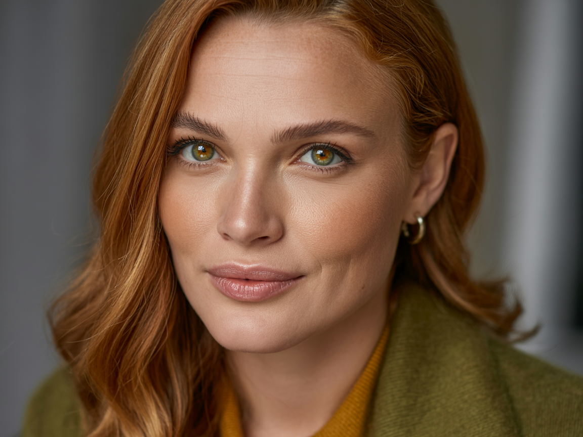
A warm autumn is a perfect marriage of warmth and muted, earthy tones. This type is characterized by a low-contrast look, where skin, eye, and hair hues naturally enhance each other. The color palette favors rich, deep rusts, golden browns and burgundies that compliment the inherent warmth within this seasonal type.
Skin Tones
Warm autumn skin tone usually has a golden or peachy undertones, with a warm base that creates a glowing effect. It can be fair to medium, even deeper, but there's always a subtle warmth. Olive skin, with both greenish and golden components, is prevalent in this group.
Warm autumn skin, on the other hand, doesn't have that pink or bluish undertone that cool-toned skin does. Instead, a gentle warmth that compliments a palette full of earthy tones. These skin types usually discover that light pastels or icy colours tend to wash them out.
Instead, warmer colors like mustard, terracotta, and deep olive green highlight their inherent glow. Sub-types such as light warm autumn have a somewhat brighter tone, while deep warm autumns enjoy the darkest shades in the palette like claret or dark berry.
Eye Colors
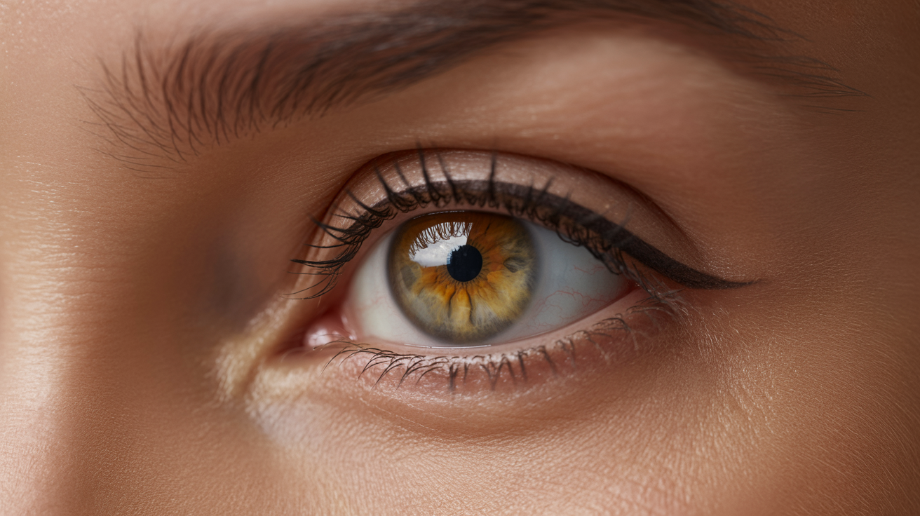
Even eye colors in the warm autumn group tend to be warm and rich, which contributes to the harmonious appearance. Typical eye colors are hazel with golden flecks, warm amber and deep green with brown flecks. Sometimes, you'll come across lighter brown eyes with a golden glow or even green-gold eyes.
These hues are very much in keeping with the earthy feel of the warm autumn palette. Warm undertones in the eye color indicate that earthy tones such as olive green, rust and golden brown bring out their natural brilliance.
These hues accentuate the depth and warmth in your eyes for an overall harmonious look. Stark or cool colors like icy blues or greys can look harsh and take away from the eye's natural charm.
Hair Hues
Hair colors for Warm Autumns are just as warm and earthy, with golden undertones — think golden blonde, caramel, copper, and auburn, or medium-to-dark brown with sun-kissed warm highlights. These shades align beautifully with the warm autumn color palette and its rich, muted depth. But here's what most stylists won't tell you upfront: copper and caramel tones are high-maintenance by nature. Without a sulfate-free color-protecting gloss used consistently, that gorgeous warm autumn palette warm-toned copper fades into a flat, muddy brown within two to three weeks — no matter how premium the salon service was. If you're serious about keeping your hair true to the autumn palette warm undertones, invest in a weekly toning gloss and a color-safe shampoo from day one. The color itself is only half the work; the upkeep is where the real commitment begins.
The feeling is muted and blended, there aren't any dramatic contrasts between hair, skin and eyes. Warm autumn hair seems to go best with the more deep, richer colors in the palette.
Colors such as rust, burgundy and golden yellow work well with golden or reddish hair tones. Lighter or cooler tones, like pastel pinks or icy whites, wash you out but make your hair look dull in contrast.
Building Your Wardrobe
A warm fall color palette provides a practical, cohesive strategy for constructing a wardrobe that highlights your natural features while celebrating the depth of the season. Paying attention to understated color schemes and selecting your patterns carefully, you can develop a wardrobe that feels both timeless and flattering.
Core Neutrals
Neutrals are the foundation of any wardrobe. Beige, camel, taupe and warm greys are perfect for a hot autumn palette. These colors flatter the golden undertones so common with skin, hair and eyes during this time of year.
As outerwear, a rich camel coat or taupe blazer complements casual and dressy looks alike. Oatmeal or warm ivory knitwear can bring textural interest to your wardrobe without taking over your entire look.
Skip cooler neutrals like stark white or icy grey — they can conflict with the warmth of fall hues. Instead, choose softer, more natural tones to complement the rest of your closet.
These shades play great layered with brighter pops, so they're versatile when building outfits.
Accent Shades
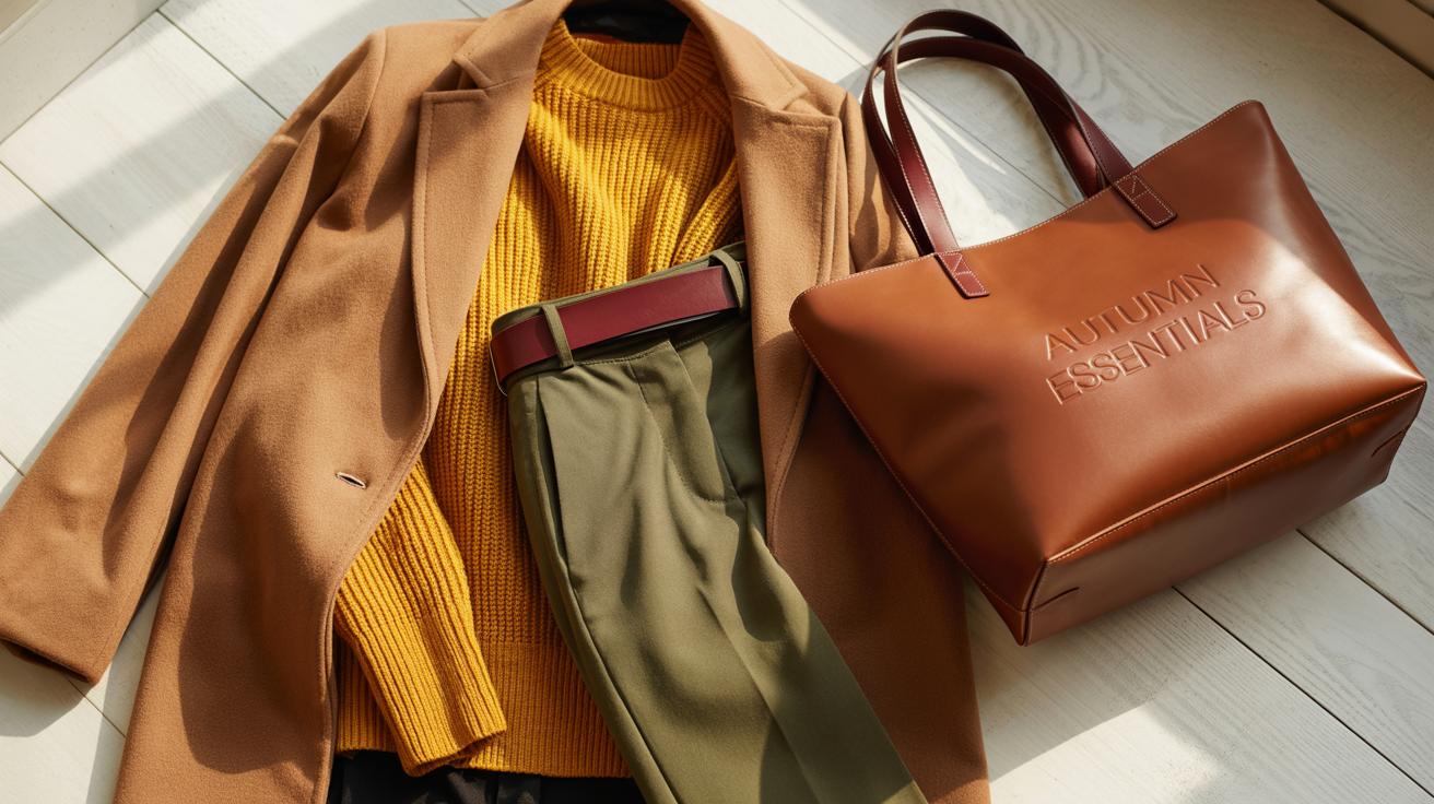
Accent shades add personality and depth to your wardrobe, and warm autumn tones provide a wide palette to choose from. Deep tones such as mustard yellow, olive green, burnt orange and burgundy all look especially good.
These colors reflect the natural elements of fall—imagine fallen leaves or golden-hour light—and pop without overpowering. A mustard scarf or burgundy handbag can throw neutral outfits into high gear, while olive trousers or a burnt orange sweater are bold declarations.
These hues all go together, so mix and match is still a breeze. Personal experimentation, though – try different combinations and see what unique pairings you find!
Denim Choices
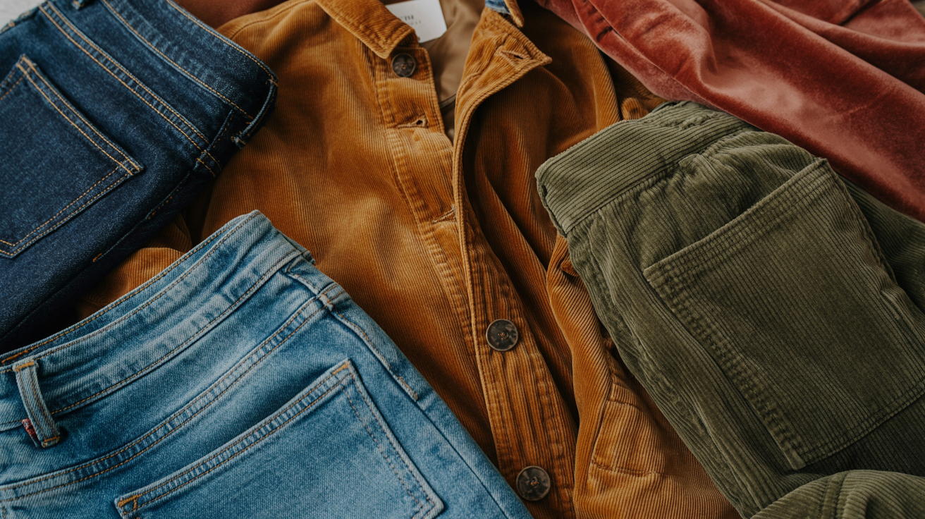
Denim is a staple and choosing the right shades can really pull your autumn palette together. Choose warm, muted washes like a deep indigo, caramel brown or even an olive denim.
These light colors compliment the earthy tones of the season and seem more cohesive than traditional blue denim, which runs a little too cool. Think texture too.
Corduroy velvety finish is an excellent denim alternative and is available in fall-ready hues such as rust or forest green. These pieces not only diversify your wardrobe, but echo the tactile warmth of the season.
Pattern & Print
Patterns and prints can add personality to an Autumn wardrobe while still feeling cohesive. We love subtle nods to rustic motifs such as plaid, herringbone and checks.
A warm-toned plaid scarf, for example, can both complete an outfit and provide a pop of pattern. Flores with soft, earthy backgrounds do the job as long as they don't dominate.
Warm colored stripes or naturalistic prints such as leaves or branches can add another dimension to your wardrobe. Consider the scale of the print, as 'small' patterns tend to be more versatile and less overpowering.
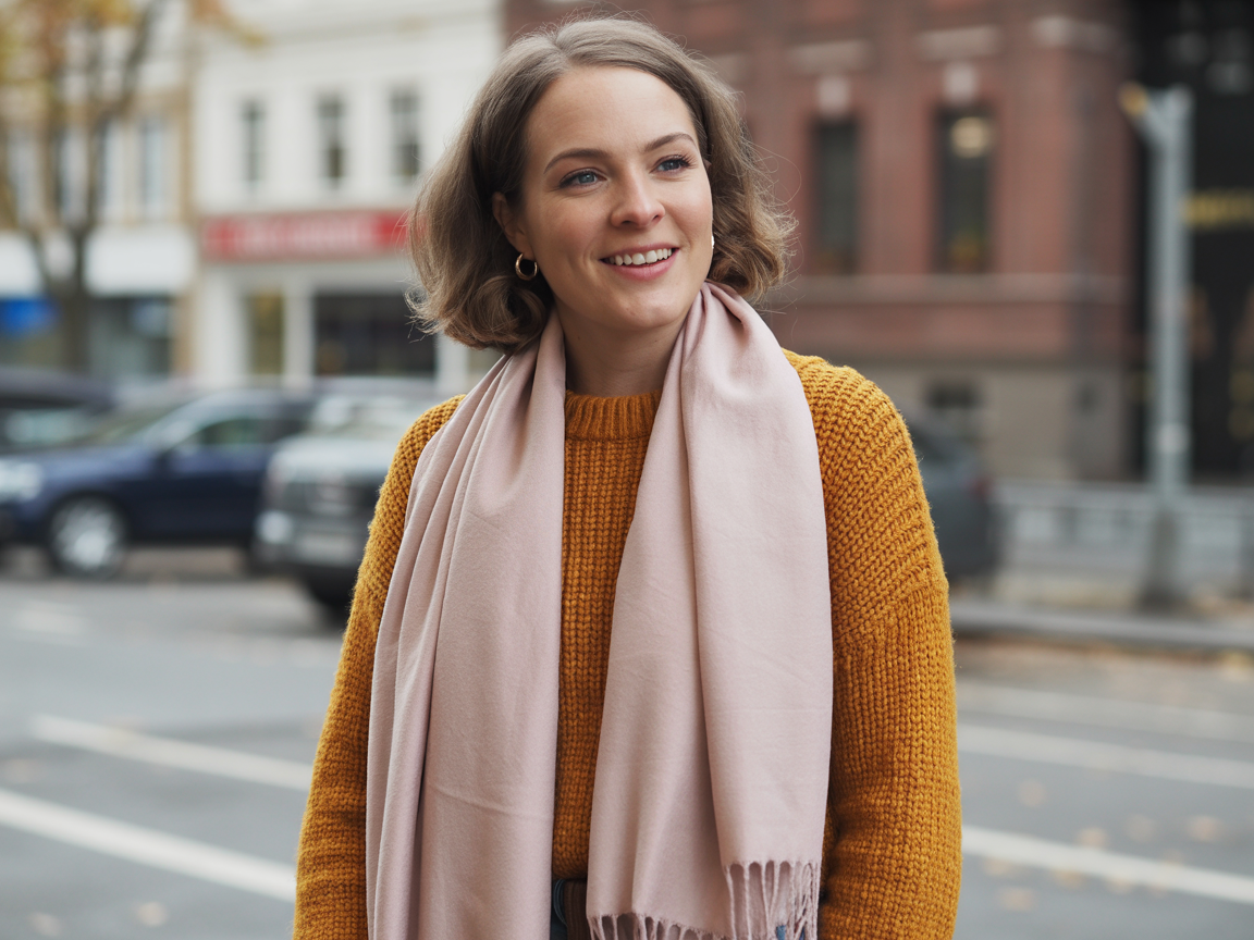
Styling with Warm Autumn Colors
Warm autumn colors mirror the season in all its richness and warmth – earthy, muted, deep tones. Not only do these hues inspire the warm, fuzzy feeling of the fall season, they complement natural features—particularly for those with warm tones in their complexion, hair or eyes.
These colors can be incredibly harmonious and impactful when incorporated into your clothing, jewelry and cosmetics.
Color Pairings
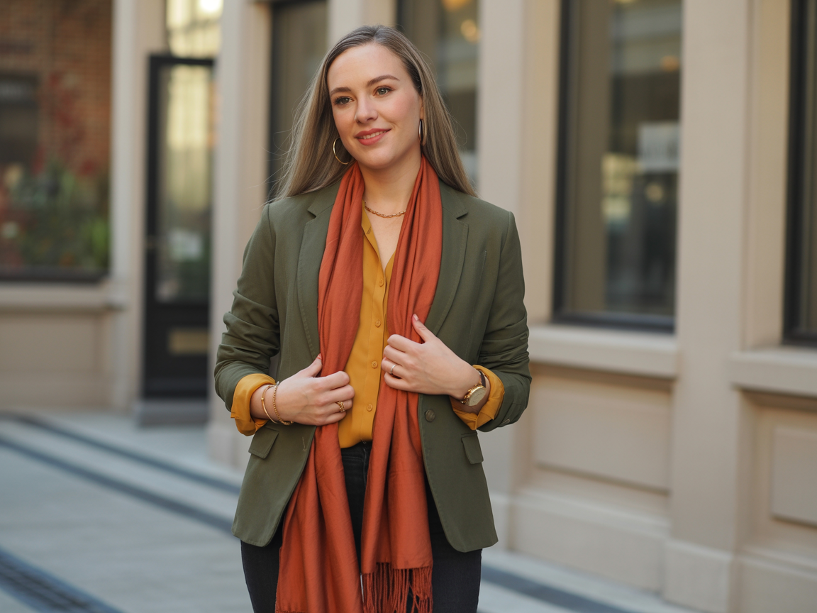
Pairing with warm autumn colors is all about balance and contrast. Analogous combos like mustard and olive green or burgundy and plum make for a nice seamless look. These combinations are perfect for hanging out.
For dressier affairs, neutrals such as taupe or tan can temper the intensity, yet keep things grounded and earthy. For the contrast seekers, warm colors like brick red or fire engine orange pop beautifully against muted shades of brown or gray.
For instance, a brick red scarf with a taupe jacket – it just pops! Forest green, the warm autumn's standout color, is great for layering base outfits, especially when paired with amber or copper accessories. These mixes mirror the season's own palette while emphasizing personal attributes.
Metal & Jewelry
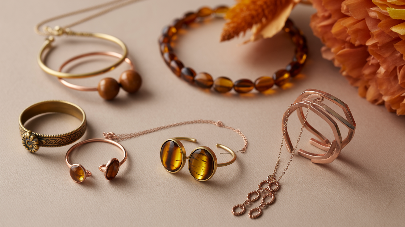
Gold and bronze and copper warm metallic accessories are made for the warm autumn colors. Jewelry in these metals complements the earthy richness of the palette.
Like a gold necklace with a mustard blouse or a bronze bracelet with an olive green dress – it just finishes the look. Earthy gemstones such as amber, tiger's eye or citrine are beautiful options for rings, earrings or pendants.
These stones are not only a great warm autumn compliment, they're a little sophisticated. If accents are more your thing, matte finishes or brushed metals keep the look chic without being over the top.
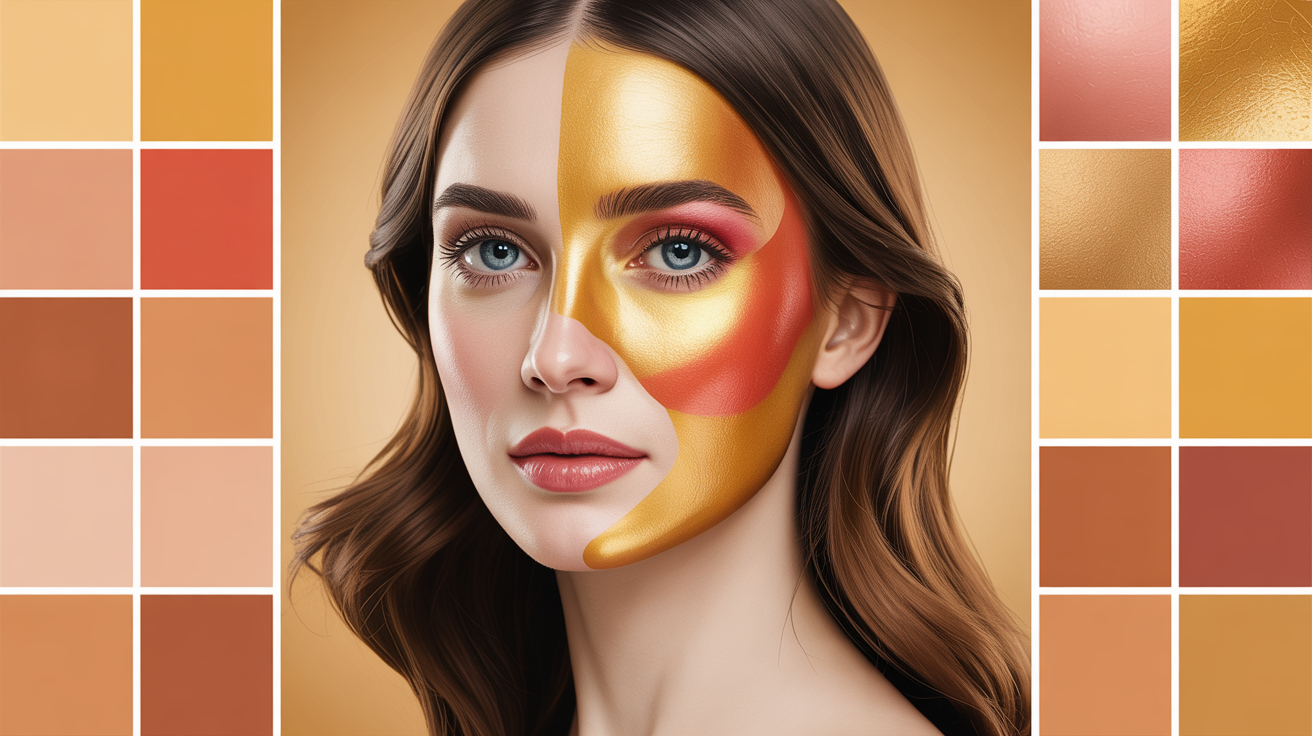
Makeup Tips
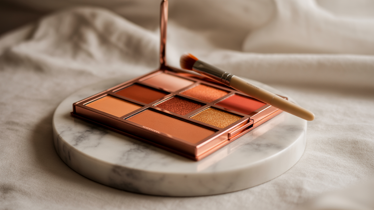
Warm autumn makeup is all about highlighting that natural warmth. Earthy shades like terracotta, copper and plum are perfect for eyeshadow, while olive and mustard can bring out those green or amber flecks in the eyes.
Brick or deep toffee lip colors add a pop of bold, while peachy tones maintain a softer everyday contrast. Blush in warm tones such as coral or burnt orange enhances the skin's undertones, creating a radiant, sun-kissed effect.
For a truly luminous finish that works with warm autumn palette warm undertones, layer a terracotta cream blush — the Rare Beauty Soft Pinch in terracotta is a brilliant drugstore-friendly dupe for pricier pro versions — then build on top with a golden yellow highlighter swept across the cheekbones and brow bone. This combination mirrors the colors warm autumn palette is built around: rich, sun-kissed and never flat. One practical note: blue-light filters on phones and screens tend to make digital makeup swatches appear more muted than they actually are in real life, so always swatch autumn palette warm undertones shades on your wrist in natural daylight before committing to a purchase.
Beyond the Rules: Your Personal Autumn
Warm Autumn is an exclusive color palette that takes inspiration from the subtle but striking hues of fall. It is characterized by warm undertones, medium value and muted chroma, producing an earthy and rich feel. Unlike other autumn profiles, it combines warmth with an understated brightness — making it neither as soft and gentle as Soft Autumn nor as dark and intense as Deep Autumn.
This palette is classic autumn landscape—mustard, olive, deep burgundy—rich in color and warmth. Warm Autumns typically have very specific physical features that work well with this palette. Their skin, hair and eyes tend to have earthy undertones, a bit of golden, amber or brown. These all coordinate beautifully with the burnt orange or rust colors – accentuating their natural glow!
For instance, if you have green or hazel eyes, olive green clothing will emphasize the flecks in your irises – tying the look together nicely. Likewise, warm browns or mustard yellows can play up golden undertones in the skin for an even, flattering appearance. Though Warm Autumn is very earthy, there's still some wiggle room. Certain colors outside the spectrum such as blush pink can create a softer contrast to the overall warmth.
Introducing such hues adds variety while keeping everything anchored to your base colors warm autumn palette. Try pairing a blush pink scarf with a mustard sweater — the contrast is soft yet striking. The real danger zone, however, is black. Worn near the face, it flattens the rich, muted warmth that defines colors warm autumns warm and alive. The rule is simple: keep black below the waist — trousers, skirts, boots — and never let it creep toward your neckline. For 2026, dark chocolate brown has fully stepped into the role that black once played. It grounds an outfit with the same authority but without killing your glow. The catch? It's genuinely harder to source than charcoal, which has flooded the rails. Here's the test: hold the fabric up in the dressing room light. If it reads even slightly grey or cool, put it back immediately — charcoal is not your friend. True dark chocolate will look unmistakably warm and earthy. Pair it with caramel, rust, or tobacco tones and you have a combination that feels both grounded and effortlessly modern — exactly what the autumn palette warm undertones philosophy is built on.
Gray, another neutral, can be tricky for Warm Autumns. Cool, steely grays will conflict with the palette, but warmer options like taupe or greige are lovely. These hues are in key with the soft chroma of Warm Autumn providing flexibility yet without interfering with the overall look. For instance, a taupe jacket can act as the grounding neutral for punchier colors like rust or olive.
Common Color Mistakes
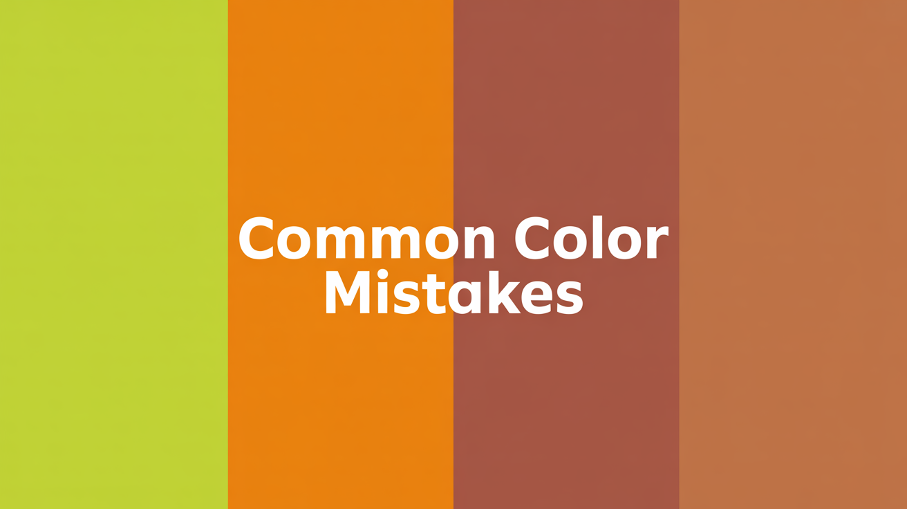
Now, the wrong colors in a warm autumn palette will fight the natural harmony between your skin tone, hair color, etc. Though this palette is composed of earthy, muted tones, the most frequent mistakes tend to come from misjudging your undertones, your contrast level, or how a color impacts the face.
Overpowering with Bright or Bold Tones
Warm autumn colors are usually soft and rich, but if they're too bright or bold they tend to overpower natural features. Bright yellows or neon oranges, for example, can be overpowering to subtle warm-skinned folks and make their skin look washed out.
Choosing less intense variants, such as pumpkin or marigold, keeps the balance and actually does something for the complexion instead of making your shirt the focal point.
Misjudging Undertones
The most common color mistake is wearing colors that don't correspond to your undertones. Those with warm undertones glow in golden yellows, reds with an orange set and earthy browns.
Things like baby pink or powder blue, which are cooler hues, can kill warm complexions, causing them to look washed out or even deceased. Cool undertones, on the other hand, tend to clash with those orange-based hues and tend to fare better with softer, neutral autumn shades, like taupe or olive green.
Knowing this distinction is the secret to steering clear of colors that drain natural vibrance.
Ignoring Depth and Contrast
Warm autumns live for medium to low contrast. Many people miss this point. Take, for instance, high contrast blondes like Madonna who, despite the misconceptions of consultants, often erroneously adhere to soft muted shades exclusively.
In such cases, pulling deeper colors from palettes like Deep Winter, think wine purple or chocolate brown, can offer spectacular contrast while not drifting too far from autumn's warmth. On the other hand, those with softer features should stay away from overly stark contrasts as they tend to upset the natural cohesion of the look.
Overuse of Pastels
Pastel tones are gorgeous, but not for warm autumn collections. These types of colors, such as powder blue, or pale lavender, aren't deep enough to counteract warm undertones, making your features look dull and muted.
Instead, earthy alternatives like moss green or rust orange are much richer and flattering.
Neglecting Versatility within the Palette
Many people assume that warm autumn palettes are restrictive, but when applied with care they're surprisingly flexible. For example, medium-contrast palettes such as Soft Autumn can generate intrigue without overload.
Blending softer hues like camel with deeper tones like burnt sienna adds dimension, but leaves room for subtle personal experimentation.
Conclusion
There's nothing like warm autumn colors to add comfort and richness to a style. These colors are great for putting together outfits that come off as organic and accessible. With their earthy hues and golden undertones, they're a classic way to make a personal statement without making a statement. By emphasizing colors that compliment your features, you can build a wardrobe that feels effortless and pulls together.
Don't be afraid to play around. The aim is not perfection but discovering what suits you. Break the rules where it works, and watch your style grow.
Your adventure with warm autumn hues is all about boldness and imagination. Experiment, pair your faves, and find what suits you. Style is personal–own it.
Frequently Asked Questions
What is a warm autumn color palette?
Warm autumn palettes feature earthy colours and rich colouring, including olive green, rust, mustard yellow, and warm browns, which emulate the vibrant autumn shades of fall leaves and golden sunshine.
How do I know if I'm a warm autumn?
You might be a warm autumn if your skin, hair, and eyes exhibit warm undertones. Typically, people with golden or peachy skin tones and warm brown, red, or golden hair color belong to this true autumn colour palette.
What colors should I avoid as a warm autumn?
Stay away from cool or icy tones such as bright whites, blues or grays. These shades can conflict with your inherent warmth and leave your skin looking washed out.
Can I wear black as a warm autumn?
Black tends to overwhelm the warm autumn palette warm undertones, creating a stark contrast that works against your natural coloring. Skip it in favor of Deep Mahogany, Warm Charcoal, or rich Tobacco Brown — shades that anchor any look without dulling your glow. For those building a colors warm autumn palette from scratch, the January 2026 edition of the Warm Autumn Color Analysis e-book ($24.65) includes dedicated guides on jewelry metals, hair color, and makeup to help you nail every detail of your autumn palette warm undertones styling.
How do I build a wardrobe with warm autumn colors?
Begin with neutrals like camel, beige, or olive, and incorporate soft autumn colours with accents of rust, burnt orange, or mustard. Opt for earthy hues to create a mix and match wardrobe that complements your true autumn colour palette.
Are there exceptions to wearing warm autumn colors?
Indeed, style is important! Although warm colors are definitely your thing, incorporating soft autumn colours can enhance your personal color palette, creating a harmonious balance that empowers your self style.
What are common mistakes when styling warm autumn colors?
The biggest faux pas is wearing extremely bright colours or cool tones, as these can overpower your natural warmth! Instead, stick to muted, earthy colours from the soft autumn palette to enhance your features.