
Soft Spring Color Palette Explained: Meaning, Colors, and Draping
 Reviewed by Alexandra Gilmore
Soft Spring usually describes a gentler kind of Spring rather than a standard category with fixed boundaries. Use Light Spring, Warm Spring, and Soft Autumn as real comparison points, then test warm, softened fabrics in steady daylight to find which direction makes your face look rested.

Key Takeaways
Soft Spring is best treated as a descriptive label, not a fixed diagnosis. The common 12-season model includes Light Spring, Warm or True Spring, and Bright Spring, but not one universally defined Soft Spring category. When someone uses the term, they usually mean a warm, fairly light palette that is gentler than classic Spring and less earthy than Soft Autumn.
💫 Discover Your Complete Color Palette
Use the Soft Spring idea as a starting point, then compare standard neighboring seasons to find the palette that gives your face the most even, rested appearance.
Find My Season →- Compare Light Spring, Warm Spring, and Soft Autumn before adopting the label.
- Judge fabric against the face in indirect daylight; hair and eye color are clues, not proof.
- A possible palette includes warm ivory, oatmeal, peach, soft coral, muted aqua, light olive, and gentle camel.
- If softness helps but warmth does not, test Summer. If earthy depth helps, test Autumn.
📚 Recent Articles
Is Soft Spring a Standard Color Season?
Soft Spring is not a standard category in the common 12-season model. That model normally divides Spring into Light Spring, Warm or True Spring, and Bright Spring. Other systems may use different names or add transition palettes, so two analysts can say “Soft Spring” while referring to slightly different swatches.
This does not make the phrase useless. It makes the definition important. A useful Soft Spring description should state its position on three color dimensions: temperature, value, and chroma. In plain English, ask how warm the colors are, how light or dark they are, and how clear or muted they are. A label without those details cannot tell you what to buy.
| Question | Useful answer | Weak answer |
|---|---|---|
| Is Soft Spring universal? | No; definitions vary by system or analyst | The definition is identical everywhere |
| What does it usually describe? | Warm, light-to-medium, gently softened color | Anyone with blonde hair or freckles |
| How should you verify it? | Compare standard neighboring palettes by draping | Choose from one selfie or a metal test |
Seasonal color analysis is a styling framework, not a medical or scientific diagnosis. Its practical value comes from repeatable visual comparisons. If one named palette consistently makes the complexion look more even and the features more connected, that palette is useful whether or not every school gives it the same name.
What People Usually Mean by Soft Spring
Most uses of Soft Spring point to the quieter edge of the Spring family. Warmth is present, but strong orange, neon coral, and very clear turquoise may feel too loud. The palette still needs more light and freshness than Soft Autumn. Think sun-warmed linen rather than gray mist, and peach skin rather than burnt terracotta.
The closest standard home depends on what dominates. If lightness is the first thing you notice, start with the Light Spring color palette guide. If warmth is unmistakable and muted colors quickly become dull, use the True Spring guide. If softness matters more than lightness and earthy colors improve the face, compare the Soft Autumn color palette.
A person can also like softened Spring colors for style reasons without belonging to a Soft Spring category. Personal taste, fabric texture, contrast preference, and the distance of a color from the face all affect an outfit. The label should help you test colors, not police your wardrobe.
Soft Spring vs Light Spring, Warm Spring, and Soft Autumn
These four labels overlap around warmth, but they emphasize different properties. Light Spring is led by light value, Warm Spring by warmth, and Soft Autumn by muted chroma. Soft Spring, when used informally, often describes a narrow bridge where Spring warmth remains visible but the clearest Spring colors need to be toned down.
| Palette | Dominant quality | Helpful test colors | Typical problem colors |
|---|---|---|---|
| Light Spring | Light, warm-neutral, fresh | Warm ivory, peach, light aqua, primrose | Black, burgundy, heavy olive |
| Warm Spring | Warm, clear, medium-light | Coral, tomato red, golden yellow, leaf green | Blue-gray, mauve, cool charcoal |
| Informal Soft Spring | Warm, gentle, light-to-medium | Oatmeal, salmon, muted aqua, light olive | Neon brights, icy pastels, deep earth tones |
| Soft Autumn | Muted, warm-neutral, medium | Camel, dusty peach, sage, muted teal | Optic white, cobalt, sharp black |
Run the comparison in pairs. Put light aqua beside muted teal. Compare clear coral with soft salmon, warm ivory with oatmeal, and fresh leaf green with sage. If the lighter, clearer drapes consistently win, Light or Warm Spring is a stronger answer. If the medium muted drapes look richer and more settled, Soft Autumn deserves priority.
Soft Spring can also be confused with Summer because both may avoid extreme saturation. The temperature result separates them. Warm peach, cream, and yellow-green should be more supportive than cool rose, soft white, and blue-gray. If the cooler set reduces redness or yellow cast, do not keep the Spring label only because the overall effect is delicate.
A Possible Soft Spring Color Palette
Because the term is not unified, there is no official Soft Spring palette shared by every analyst. The list below is a possible palette for testing: warm enough to remain in Spring territory, light enough to avoid Autumn weight, and softened just enough to reduce the intensity of classic Spring.
| Role | Colors to test | Why they may work |
|---|---|---|
| Light neutrals | Warm ivory, ecru, oatmeal, light warm beige | Give softness without a cold gray cast |
| Deeper neutrals | Gentle camel, mushroom brown, soft warm navy | Add structure without the weight of black |
| Warm accents | Peach, apricot, soft coral, salmon, warm rose | Keep Spring warmth at moderate intensity |
| Cooler balancing accents | Muted aqua, light turquoise, soft teal | Offer contrast while retaining a yellow-green influence |
| Greens and yellows | Pistachio, light olive, moss-tinted green, butter yellow | Connect warmth with restrained chroma |
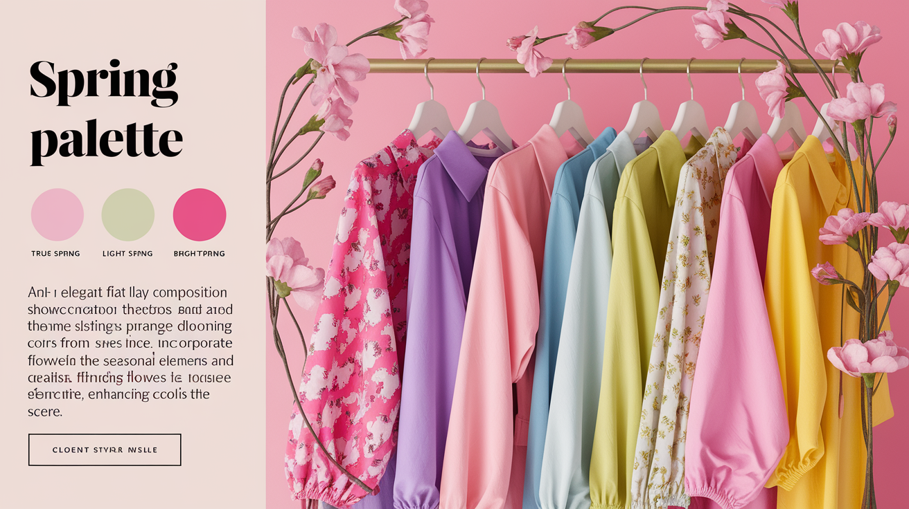
Start with small combinations: oatmeal with soft coral, warm ivory with muted aqua, light camel with peach, or gentle navy with butter yellow. If everything looks too beige, add one clearer Spring accent. If the accent takes over your face, soften it with a lighter neutral rather than discarding the entire palette.
Soft Spring Draping Examples
Use indirect daylight near a window. Remove colored makeup, cover a bright top, and pull strongly dyed hair away from the face. Keep fabric texture and size similar. Phone cameras change exposure and white balance, so make the first judgment in a mirror and use photos only as a record.
Change one color property at a time. Randomly comparing peach satin with thick gray wool tells you as much about shine and texture as it does about color. Matched drapes give cleaner evidence.
| Draping pair | If the first color wins | If the second color wins |
|---|---|---|
| Warm ivory vs soft white | Warmth is likely helpful | Test Summer before choosing Spring |
| Soft coral vs dusty rose | Warm Spring direction gains support | Cool-muted direction gains support |
| Peach vs rust | Lighter Spring value is more likely | Autumn depth may be better |
| Muted aqua vs cobalt | Gentle chroma may be useful | Test Bright Spring or Winter clarity |
| Light olive vs dark olive | Soft Spring or Light Spring stays plausible | Soft or Warm Autumn becomes more plausible |
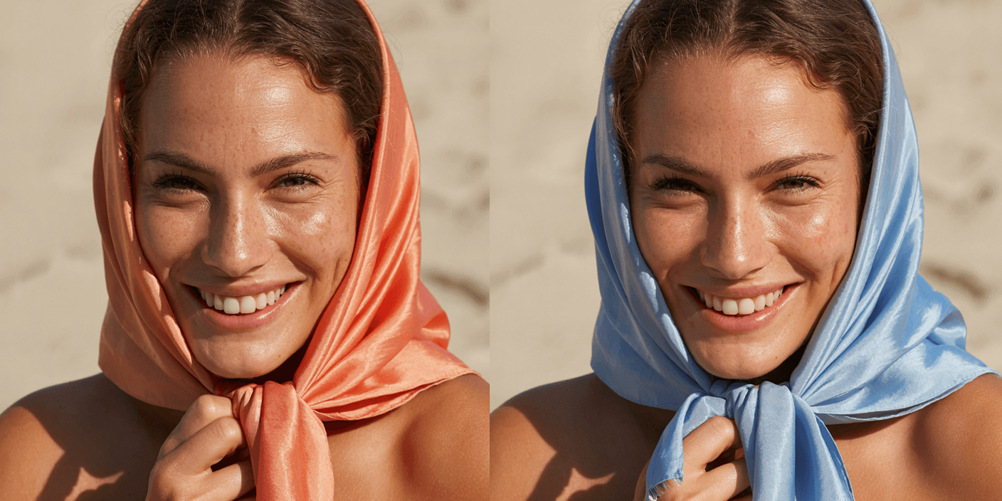
Look for changes in the face rather than whether you like the cloth. A useful drape may make under-eye shadows less obvious, keep redness from spreading, define the jaw, and let the eyes remain noticeable. A poor drape can cast yellow, gray, or red onto the skin, sharpen texture, or appear as a colored rectangle before you notice the person.
Repeat close comparisons on another day. Surface redness, tanning, room color, tiredness, and makeup residue can distort a single session. A stable pattern matters more than one dramatic photograph.
How to Build a Soft Spring Wardrobe
Build a trial capsule before replacing anything. Choose two light neutrals, one deeper neutral, three accents, and one print that repeats at least two of those colors. Wear the test palette near the face for two weeks. Keep what works in ordinary light and real outfits.
For clothing, try warm ivory and oatmeal as base colors, gentle camel or soft navy for jackets and trousers, then peach, muted aqua, pistachio, or soft coral near the face. Medium-low contrast usually supports the gentle effect: oatmeal with salmon will feel easier than black with optic white. You can still use a dark shoe or bag because distance from the face reduces its impact.
For makeup, begin with sheer peach or warm rose blush, soft coral lips, brown mascara, and a champagne or muted bronze eye color. Metals can sit between pale gold, champagne gold, soft rose gold, and mixed metal finishes. None of these details proves a season; they are practical extensions of the fabric result.
Simple outfit formulas make the trial easier. For work, combine an oatmeal knit with gentle navy trousers and a muted aqua scarf. For a casual weekend, try light warm denim, an ivory top, and a soft coral layer. A wedding or evening outfit could use a peach dress with champagne-gold accessories, provided the fabric is not so shiny that it changes the color effect. In colder months, use mushroom brown, camel, soft navy, and light olive as the foundation, then keep peach or warm rose close to the face. These combinations test the palette in context instead of asking one isolated swatch to settle the question.
If a capsule feels flat, do not add more dusty beige. Increase clarity in one place with fresh coral, aqua, or warm green. If it feels busy, repeat a neutral and reduce the number of accents. The goal is a wardrobe you can combine, not a tray of pretty but disconnected swatches.
Keep notes on which combinations you reach for again after the test period.
Common Soft Spring Mistakes
- Assuming “soft” means gray. Too much blue-gray or mauve can cool the face. A gentle Spring palette still needs warmth and some freshness.
- Copying Soft Autumn at a lighter tint. Soft Autumn has more earthiness and can carry medium depth. Simply adding white to rust and olive does not recreate a Spring palette.
- Typing from blonde hair or light eyes. People with many feature combinations can suit warm, cool, clear, or muted palettes. Draping tests the combined face response.
- Using a selfie as final proof. Cameras alter white balance, contrast, and skin smoothing. They are helpful for organizing comparisons, not for creating a certain diagnosis.
- Testing different fabrics at once. Shine, weave, and thickness change the reflection on skin. Compare similar materials whenever possible.
- Buying a full palette before checking neighbors. Test Light Spring, Warm Spring, and Soft Autumn first. Ten useful drapes beat fifty speculative purchases.
Another common mistake is using foundation undertone as a season shortcut. Foundation labels describe a skin-matching problem, while seasonal palettes consider the relationship between the whole face and surrounding color. If foundation matching is the immediate problem, use the dedicated foundation shade finder tools guide separately.
When to Use a Standard Season Instead
Choose a standard season when its drapes produce a clear repeated advantage. Light Spring is more useful if lightness matters most and fresh peach, aqua, and primrose outperform dusty shades. Warm Spring fits better if true warmth is dominant and clear coral, yellow-green, and tomato red look natural. Soft Autumn is the stronger choice if muted chroma is essential and camel, sage, dusty peach, and muted teal carry enough depth.
A standard name makes palette comparisons, shopping references, and consultation results easier to communicate. You can still keep a personal note such as “my Light Spring palette is softer than average.” That sentence conveys more than replacing the established category with a label whose definition changes from site to site.
If no standard neighbor is convincing, use the informal Soft Spring idea as a working palette and keep testing. The season quiz can organize your next comparison, while real fabric checks decide whether the recommendation holds up. A quiz narrows the search; it does not override visible evidence.
People Also Ask
What is a Soft Spring color season?
Soft Spring is an informal label for a warm, fairly light, gently softened palette. It is not one of the usual twelve season names, so always check how a particular analyst defines it.
Is Soft Spring the same as Light Spring?
Not necessarily. Light Spring is a standard 12-season category led by light value. Soft Spring usually implies lower chroma, but the exact definition varies. Compare the swatches instead of assuming the names are interchangeable.
Can Soft Spring wear black?
Black may look heavy near the face when a gentle warm palette works better. Try soft warm navy, mushroom brown, or gentle camel first. Black can still be used away from the face or repeated in a print.
What is the difference between Soft Spring and Soft Autumn?
Soft Autumn is usually deeper, earthier, and more muted. An informal Soft Spring palette is lighter and keeps more fresh peach, aqua, and yellow-green. Compare peach with rust and light olive with deeper olive.
Common Questions: The Ultimate Color FAQ
Which colors belong in a possible Soft Spring palette?
Useful test colors include warm ivory, oatmeal, peach, apricot, soft coral, muted aqua, pistachio, light olive, gentle camel, and soft warm navy. This is a possible palette, not an official universal set.
Should Soft Spring wear gold or silver?
Pale gold, champagne gold, soft rose gold, and mixed metals are sensible tests. Metal preference is supporting evidence only. Fabric draping across temperature, value, and chroma gives a broader result.
Can dark hair fit a Soft Spring palette?
Hair depth alone does not determine a palette. Darker hair may raise the person's natural contrast, but the response of the skin and eyes to controlled drapes matters more than a feature checklist.
Where should I go after this guide?
Compare the Light Spring, True Spring, and Soft Autumn guides linked above. If warmth and depth both increase, the Warm Autumn guide is another useful boundary check.