
Cool Spring Color Palette Explained: Is It a Real Season?
 Reviewed by Alexandra Gilmore
Cool Spring is not a universally defined season, so the label alone cannot settle your palette. Compare warm-neutral clarity against True, Bright, and Light Spring plus Cool Summer, then use controlled draping to see whether aqua, coral pink, mint, or warm navy actually improves your complexion.

Key Takeaways
- Cool Spring is not a standardized season name. The familiar 12-season Spring family is usually divided into True or Warm Spring, Bright Spring, and Light Spring. Some 16-season systems use different labels, but the same name can mean different things from one consultant or palette seller to another.
- Treat the label as a description, not a verdict. It often points to someone who still needs Spring clarity and lightness but looks less golden than a textbook True Spring. That person may land in True Spring, Bright Spring, Light Spring, or Cool Summer after controlled draping.
- Compare color behavior rather than facial stereotypes. Temperature, chroma, value, and contrast tell you more than eye color, hair color, ethnicity, or how pink your skin looks in one photo.
- Start with clear colors that are warm-neutral rather than orange-heavy. Aqua, clear turquoise, fresh mint, watermelon, coral pink, light warm navy, ivory, and bright leaf green are useful test colors. They are a trial palette, not a new universal season.
- Use a standard season quiz for the next step. A quiz gives you consistent Spring and Summer comparisons. Confirm the result with real fabric in indirect daylight before rebuilding a wardrobe.
The phrase Cool Spring color palette sounds precise, yet it does not have one agreed definition. One source may use it for a neutral-warm Spring. Another may mean a Spring who can borrow a few cooler colors. A third may use it as a custom label between Spring and Summer. Those meanings overlap, but they are not identical.
This guide keeps the useful part of the idea and drops the false certainty. You will see where the label fits, how it differs from the standard Spring subtypes and Cool Summer, which colors make a sensible test set, and when to stop using the term.
💫 Discover Your Complete Color Palette
Use the Cool Spring label as a clue, then compare your temperature, clarity, lightness, and contrast in a consistent order.
Take the Season QuizIs Cool Spring a Recognized Seasonal Color Type?
Cool Spring is not a standardized season name across personal color analysis. In a common 12-season model, Spring is divided into True Spring, Bright Spring, and Light Spring. True Spring centers warmth, Bright Spring centers clarity, and Light Spring centers lightness. A 16-season model may add another subtype or rename an existing one, but there is no universal rule that requires a category called Cool Spring.
Seasonal color analysis itself is a styling framework, not a scientific standard. It borrows useful color concepts such as hue temperature, chroma, value, and contrast, then applies them to clothing and appearance. There is no medical test, regulated diagnosis, or single naming authority for personal seasons. Two analysts can use different systems and still give similar practical color advice.
That does not make the label meaningless. It means you need the analyst's definition. If a palette says Cool Spring, ask three questions: Which system is this? What are its neighboring seasons? Which drapes separated it from those neighbors? Without those answers, the name is too loose to guide expensive purchases.
| Claim | Useful interpretation | What needs checking |
|---|---|---|
| "Cool Spring is my season" | Spring colors work, but strongly golden or orange shades may feel excessive. | Whether True, Bright, or Light Spring already describes the result. |
| "I am between Spring and Summer" | The face may need Spring clarity with less warmth, or Summer coolness with more freshness. | Clear aqua against smoky blue, coral pink against dusty rose, ivory against soft white. |
| "Cool colors look better than orange" | Orange may be too warm, too deep, or too saturated. One rejected color cannot set a season. | Several controlled pairs across temperature, chroma, and value. |
Why the Cool Spring Label Appears
Real coloring does not arrive in twelve tidy boxes. A person can sit near a boundary, and analysts often create descriptive language for that edge. "Cool Spring" usually appears when the person responds well to Spring's fresh, clear, light-to-medium colors but needs less obvious gold than a classic warm Spring palette provides.
The label can also appear after an incomplete test. Surface redness may be mistaken for a cool undertone. Ash-dyed hair may pull the eye toward Summer. A phone camera can cool the white balance, while bronzer or a tan can do the opposite. If the analysis started with a selfie rather than fabric, Cool Spring may describe the image more than the person.
Naming systems add another layer. In one method, "True Spring" means the most balanced Spring. In another, "Warm Spring" describes the warmest subtype. Some 16-season systems split a familiar category into two narrower palettes. Read the site's 16-season color analysis guide before assuming that two identical names refer to identical swatches.
A custom label is most helpful when it comes with a clear recipe. "Warm-neutral, clear, light-to-medium, moderate contrast" gives you something to test. "Cool Spring" by itself does not.
What Cool Spring Usually Means in Practice
If we translate the loose label into color dimensions, the most useful working hypothesis is a Spring palette with reduced warmth. The colors stay cleaner than Summer colors. They stay lighter and less severe than Winter colors. They also avoid the strongest orange, mustard, rust, and golden brown associated with a very warm Spring direction.
This is not the same as making Spring cool. Spring still depends on some degree of warmth or warm-neutral balance. If blue-gray, mauve, cool raspberry, and soft charcoal consistently beat coral, aqua, leaf green, and ivory, the result is probably moving into Summer.
| Dimension | Working Cool Spring hypothesis | Sign the hypothesis is wrong |
|---|---|---|
| Temperature | Neutral-warm or gently warm; fresh green and aqua may be easier than orange. | Consistently cool blue, rose, and gray are better than every warm-neutral comparison. |
| Chroma | Clear and lively, but not necessarily neon or Winter-bright. | Dusty, grayed colors make the face look calmer and more defined. |
| Value | Mostly light to medium, with a few medium anchors. | Very pale colors erase the features, or deep colors create the best balance. |
| Contrast | Low-to-medium or medium, expressed through clean color differences. | Only high-contrast brights work, or blended tonal outfits work much better. |
Cool Spring Diagnostic Table
Use this table as a route map, not a scoring quiz. Look for repeated responses across several fabrics. The useful signal is what happens to the face: whether shadows soften, skin looks more even, the jawline stays clear, and the eyes remain connected to the rest of the features.
| If this drape wins | Over this drape | Test next | Likely direction |
|---|---|---|---|
| Clear turquoise | Smoky blue | Coral pink vs dusty rose | Spring clarity is promising. |
| Dusty rose | Coral pink | Soft navy vs clear warm navy | Cool Summer may be closer. |
| Watermelon and bright aqua | Peach and light camel | Bright coral vs pale coral | Bright Spring may fit. |
| Peach, warm green, and golden ivory | Cool pink and blue-gray | Tomato red vs raspberry | True Spring may fit. |
| Pale aqua and light coral | Medium turquoise and strong coral | Light ivory vs medium camel | Light Spring may fit. |
Cool Spring vs True, Bright, and Light Spring
The fastest way to make the term useful is to compare it with the three familiar Spring directions. Read the full True Spring palette guide and Light Spring palette guide for complete wardrobes. Here, the goal is only to identify which dimension leads.
| Direction | Dominant quality | Strong test colors | What tends to fail first |
|---|---|---|---|
| True Spring | Warmth, supported by clarity | Peach, tomato red, golden yellow, warm turquoise | Cool gray, mauve, blue-based pink |
| Bright Spring | Clarity and contrast | Bright coral, vivid aqua, hot pink, sharp leaf green | Dusty, blended, or beige-heavy color |
| Light Spring | Light value with gentle warmth | Pale coral, light aqua, warm mint, light ivory | Deep navy, dark brown, or very strong contrast |
| Cool Spring as a working label | Spring clarity with restrained warmth | Clear aqua, watermelon, fresh mint, light warm navy | Heavy orange, muddy earth tones, or very dusty cool colors |
If the brightest pair consistently wins, the useful answer is probably Bright Spring. If the lightest pair wins, use Light Spring. If warm peach, yellow, and tomato red create the most even result, use True Spring. A separate Cool Spring wardrobe may add complexity without improving your choices.
Cool Spring vs Cool Summer
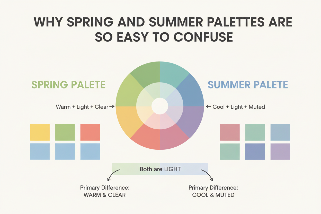
This is the comparison that matters most. Both directions may tolerate aqua, pink, blue, and green, so a list of color names will not solve it. The versions of those colors are different. Spring aqua looks clear and sunlit. Summer blue looks softened with gray. Spring pink has coral or watermelon energy. Summer pink leans rose, mauve, or berry.
The site's Cool Summer palette guide covers the cooler result in detail, while the Spring vs Summer comparison widens the test to both families.
| Test | Spring-side result | Cool Summer result |
|---|---|---|
| Clear aqua vs smoky blue | Aqua makes the eyes and skin look fresher; smoky blue appears flat. | Smoky blue settles into the face; aqua looks loud or yellow-green. |
| Coral pink vs dusty rose | Coral pink lifts the face; dusty rose looks tired. | Dusty rose smooths the complexion; coral exposes redness or dominates. |
| Ivory vs soft white | Ivory looks clean without turning the skin gray. | Soft white looks balanced; ivory adds a yellow cast. |
| Fresh leaf green vs blue-green teal | Fresh green looks lively and connected. | The cooler, softened teal is calmer and more even. |
A Practical Cool Spring Color Palette
Use this palette for testing or for a small capsule while you clarify the season. Keep the colors clean, light-to-medium, and warm-neutral. Do not buy a full fan or replace every neutral until the drape results repeat.
For neutrals, try ivory, oyster cream, light warm navy, clear taupe, stone, and a medium cocoa that does not look red or gray. For color, start with clear aqua, turquoise, fresh mint, leaf green, light teal, watermelon, coral pink, warm clear rose, primrose, and a small amount of light periwinkle that still looks lively rather than icy.
Easy combinations include ivory with clear aqua, light warm navy with watermelon, stone with fresh leaf green, and oyster cream with turquoise. If all four feel harmonious but peach and golden camel feel too warm, the working label may be useful. If dusty rose, smoky navy, and mauve work better, switch the test toward Cool Summer.
Metals are a secondary clue. Light gold, champagne gold, mixed metal, and bright silver can all work near a boundary. Judge metal by its effect on the skin, not by a rule that assigns gold to every Spring and silver to every Summer.
How to Test the Label With Drapes
Test in indirect daylight with makeup removed and colored light kept out of the room. Pull dyed hair away from the face or cover it with a neutral cloth. Hold each pair at the same distance and look at the face before looking at the fabric.
- Begin with clarity: clear aqua against smoky blue, then fresh green against muted sage.
- Test temperature: coral pink against dusty rose, then ivory against soft white.
- Test value: pale aqua against medium turquoise, then light ivory against medium cocoa.
- Test contrast: ivory and watermelon together against soft white and dusty rose together.
- Write one concrete observation per pair. Note shadows, redness, jawline definition, eye clarity, or whether the fabric becomes the first thing you see.
Repeat the strongest pair on another day. Daylight changes, and so do fatigue, surface redness, and the eye's adaptation to surrounding colors. A stable result should survive more than one session.
Do not use veins, jewelry preference, tanning ability, or one foundation label as a final answer. Those clues can start a question, but they do not compare chroma, value, and contrast. Fabric does.
What to Do With a Cool Spring Result
If the result came from a professional analysis, ask for the system name, the comparison drapes, and the palette coordinates in plain language. A good explanation should tell you whether warmth, clarity, lightness, or contrast leads. Save those properties beside the season name.
If the result came from an app, selfie, or online post, treat it as a shortlist. Take the standard season quiz, then compare True Spring, Bright Spring, Light Spring, and Cool Summer with fabric. The standard names make it easier to find consistent follow-up guides and replacement colors.
You can keep the phrase if it helps you shop. Use it to mean "my clearest warm-neutral Spring colors," not "a scientifically proven thirteenth season." The goal is a repeatable wardrobe palette, not loyalty to a label.
People Also Ask
Is Cool Spring a real color season?
It is a label used by some analysts and online palettes, but it is not a universal category. Common 12-season systems use True or Warm Spring, Bright Spring, and Light Spring. Ask which system defines Cool Spring before relying on it.
Can Spring coloring have a cool undertone?
A fully cool undertone usually points away from Spring and toward Summer or Winter. Someone described as Cool Spring may actually be neutral-warm, may need less orange than True Spring, or may sit close to the Spring-Summer boundary.
What are the best Cool Spring colors?
For a trial palette, use clear aqua, turquoise, fresh mint, leaf green, watermelon, coral pink, ivory, and light warm navy. Compare them with smoky blue, dusty rose, mauve, soft white, and soft navy before deciding.
Is Cool Spring the same as Light Spring?
Not automatically. Light Spring is a standard label centered on light value and gentle warmth. Cool Spring usually describes reduced warmth, but its meaning depends on the system. If pale colors clearly beat medium colors, Light Spring is the cleaner label.
📚 Recent Articles
Common Questions: The Ultimate Color FAQ
Why did an app call me Cool Spring?
The app may have detected Spring-like clarity and lightness with less visible gold, or it may use a custom 16-season label. Camera white balance, makeup, hair dye, and background color can also shift the result. Check the app's season definitions and verify the label with fabric.
Should I avoid orange if I was typed as Cool Spring?
No color needs a permanent ban. Compare a clear coral-orange with a heavy rust or pumpkin. A person near the cool edge of Spring may handle the first and find the second too warm or deep.
Can Cool Spring wear silver?
Yes. Bright silver, champagne gold, and mixed metals may all work. Metal tests cover a narrow part of the palette, so use clothing drapes for the main decision.
What if both Spring and Cool Summer colors work?
Build a bridge capsule from the shared winners, such as aqua, teal, pink, navy, and light neutrals, then refine the versions. Choose clearer and slightly warmer shades when the face needs freshness. Choose softer and cooler shades when clarity looks distracting.
Do I need a custom Cool Spring palette?
Only if it improves decisions. Start with the closest standard Spring or Cool Summer palette and record the few shades you borrow across the boundary. A custom fan is optional; consistent color properties matter more than the printed name.