
Muted Olive Skin: How to Compare Soft and Clear Clothing Colors
 Reviewed by Alexandra Gilmore
Muted olive is a useful descriptive phrase for olive coloring that appears softer rather than strongly saturated. It is not a separate official skin category. Compare soft and clear versions of the same clothing color at a similar depth, and keep undertone, depth, and saturation separate when judging the result.

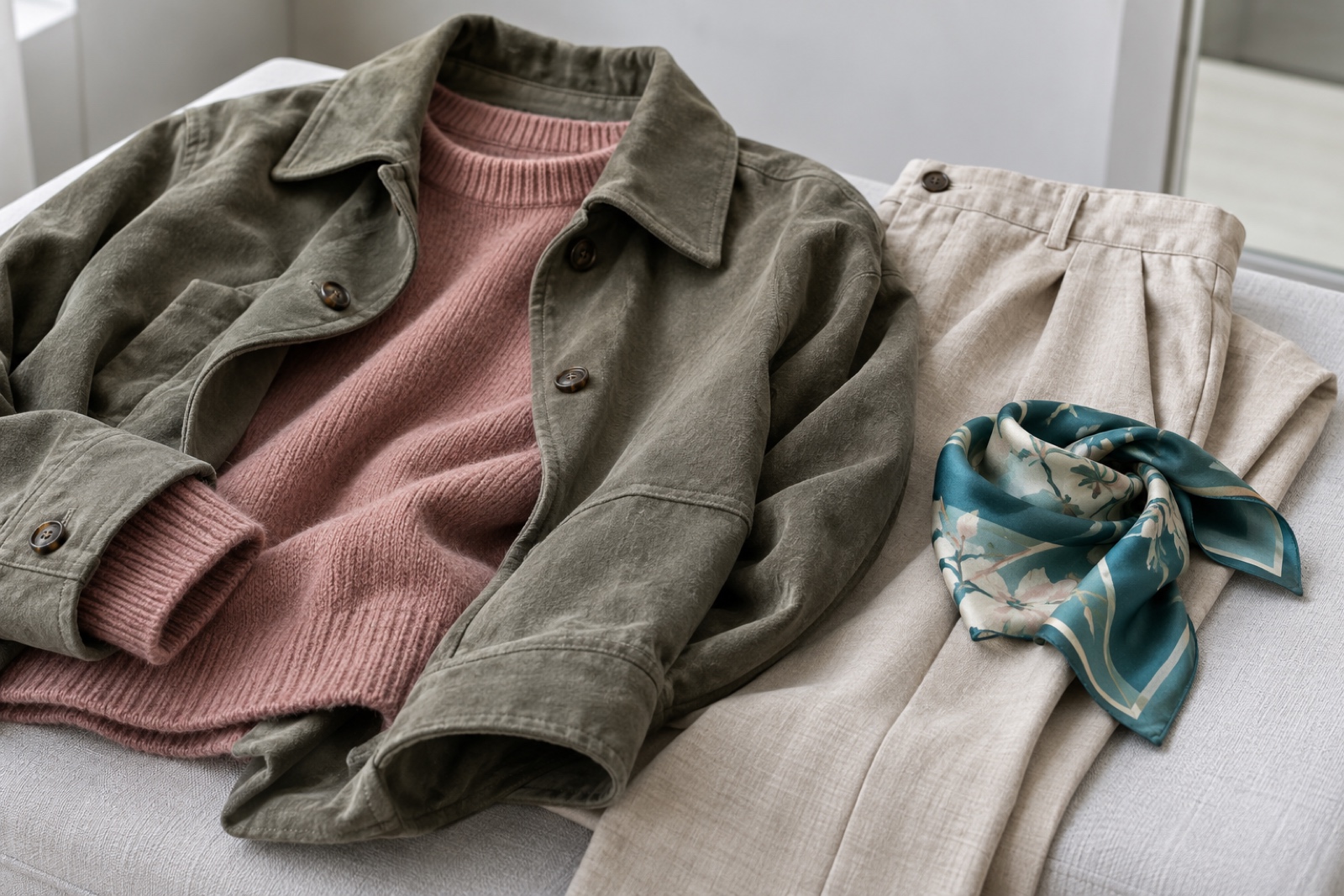
Soft and clear teal at comparable depth.
Muted olive is a useful descriptive phrase for olive coloring that appears softer rather than strongly saturated. It is not a separate official skin category. Compare soft and clear versions of the same clothing color at a similar depth, and keep undertone, depth, and saturation separate when judging the result.
💫 Discover Your Complete Color Palette
Compare your undertone, depth, clarity, and contrast as a complete palette, then check the suggestions against real clothes near your face.
Find My Color Palette →Muted Olive Describes More Than One Color Trait
Olive describes a color direction that may appear green, gray, or muted golden. Muted describes lower saturation: a color looks softer or grayer than a clear version of the same hue. They answer different questions. Neither term establishes a separate official skin type or assigns you to Soft Autumn. If you need to distinguish olive from a generally neutral undertone first, read neutral and olive comparison.
Ulta's undertone guide describes olive coloring with green, gray, or muted golden tones and notes that brands can label olive shades warm, neutral, or cool. For clothing, use “muted olive” as a working description, then test actual fabric. A muted teal and a clearer teal can have similar lightness yet create different effects near the face. The shade names alone cannot predict your result.
Compare a Soft and a Clear Version of One Color
Choose two teal fabrics: one gray-teal and one clear teal. Pick pieces of similar lightness and hold them in the same position near your face, one at a time, under steady daylight. Keep the background and the rest of your outfit unchanged. If one teal is much lighter, warmer, or darker, the test no longer isolates saturation; find a closer pair before deciding. Kryolan separates apparent skin depth from undertone, a useful reminder to change one color property at a time.
Look at your face before judging the fabric. Does the cloth draw all the attention, or do your features remain easy to see? Repeat the comparison once to check that the impression is consistent. If both choices feel extreme, try a teal between them. This is an observation about a garment in your light, not a diagnosis from a photo. For the separate task of matching makeup depth and undertone, see olive foundation shade guide.
| What you notice | What to try next |
|---|---|
| The fabric dominates your face | Try the softer teal at the same lightness, or make the clear teal a smaller accent. |
| Your face remains visible beside the fabric | Keep that version in the comparison and test it with an actual outfit. |
| Both versions feel too strong or too flat | Try an intermediate saturation before changing hue or depth. |
Choose Neutrals and One Accent
Gray-brown, charcoal, and soft navy are practical starting neutrals for a fabric test; muted berry can be the accent. Their depth and contrast still matter. On lighter skin, try a lighter stone or gray-brown near the face before a deep charcoal; on deeper skin, compare charcoal and soft navy without assuming either is automatically too dark. These are options to test, not a list of permitted colors. For the broader olive-color discussion, see The Ultimate Guide to Olive Skin Tone: Are You One of Us?.
Try charcoal trousers with a dusty berry knit, or stone trousers with a soft navy shirt and a small teal scarf. In the second outfit, change only the scarf from soft teal to clear teal. A small clear accent may be easy to wear even if a full clear-teal top feels dominant. Keep the rest of the outfit steady so you can judge the accent's area and placement.
Separate Muted, Neutral, and Cool Olive
Muted refers to saturation. Neutral describes a less obvious warm or cool lean in a particular comparison. Cool olive combines an olive direction with a cooler temperature description. These terms can overlap because they describe different properties. The neutral undertone comparison guide covers the neutral label in more detail; this page stays with clothing intensity.
Someone might describe their coloring as cool, muted, and olive at once: cool for temperature, muted for saturation, and olive for color direction. That description still does not dictate one season or ban every bright garment. Return to the two teal fabrics and choose the version and placement you prefer in consistent light. If the labels themselves remain confusing, the neutral-versus-olive comparison handles that neighboring question.
When Makeup Looks Too Bright
A makeup swatch that looks unexpectedly orange or vivid may be too warm, too saturated, or too deep; more than one cause is possible. Ulta also notes that a gray-looking shade may be too light, too cool, or too muted. Do not use the clothing result as a foundation formula. Compare finished shades at similar depths and let each product settle as directed.
If a swatch appears too vivid but its depth is close, compare a less saturated or olive-labeled shade at that depth. If it is plainly too dark, compare the adjacent lighter depth instead. Change one factor per comparison, and check the jaw and neck in steady light. Do not mix pigments into makeup based on a universal recipe. For a broader starting point for clothing shades, see personal color selection guide.
Questions and Practical Answers
Does muted olive mean cool olive?
No. Softness describes saturation; cool describes temperature. You can test both descriptions separately.
Must muted olive skin avoid all bright clothes?
No. Compare a softer version of the same hue, or use the clearer color in a smaller area or farther from your face.