Neutral Skin Tone Complete Guide

Most people can tell you their skin shade—fair, medium, deep—but far fewer can pinpoint their undertone. That gap matters more than you might expect. The right undertone knowledge is what turns a flattering foundation into a perfect one, and a good outfit color into a genuinely great one.
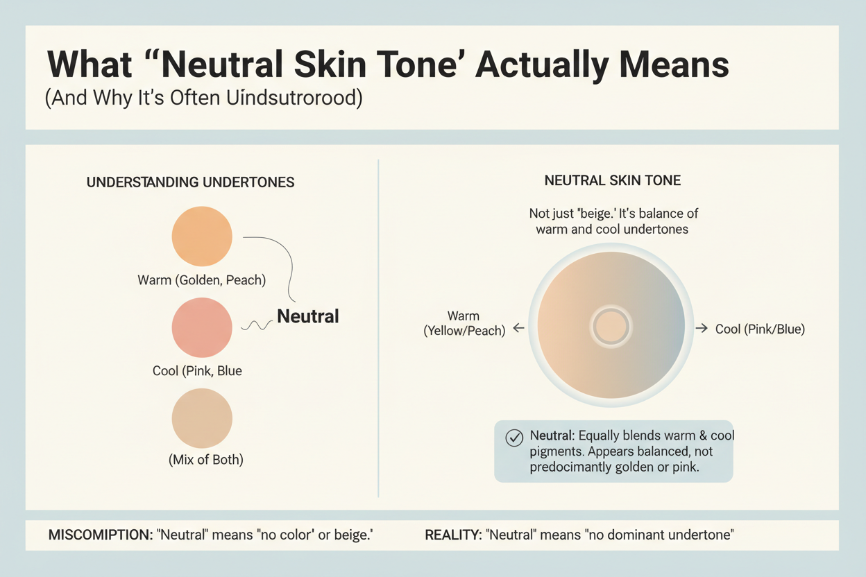
A neutral undertone sits at the crossroads of warm and cool. Rather than leaning definitively toward golden-yellow or rosy-pink, it carries a subtle mix of both—blue and yellow hues that coexist in the skin at the same time. That balance makes neutral undertones wonderfully versatile, but it also makes them tricky to identify without knowing what to look for.
This guide gives you a complete, practical roadmap:
- What a neutral undertone actually is and why it's so commonly confused with other undertone types
- Four at-home self-tests you can do today to confirm your undertone category
- The exact colors, combinations, and makeup products that work best—and the common mistakes to avoid
- How to read foundation shade codes so you stop guessing at the makeup counter
- How a color analysis quiz can sharpen your results beyond what a single vein-check can tell you
Whether you're starting from scratch or looking to refine a hunch you've had for years, the information here is designed to give you confident, actionable answers—not more guesswork.
What 'Neutral Skin Tone' Actually Means (And Why It's Often Misunderstood)
The confusion usually starts with language. "Skin tone" and "undertone" get used interchangeably, but they describe two completely different things.
Skin tone is the surface shade you see—fair, light, medium, tan, deep, rich. It shifts with sun exposure, seasons, and age.
Undertone is the persistent hue sitting beneath that surface. It doesn't change when you tan. It's why two people with identical medium skin tones can look completely different in the same shirt.
There are three undertone categories:
- Warm – golden, peachy, or yellow hues dominate
- Cool – the skin reads rosy, pink, or bluish-red
- Neutral – both blue and yellow hues are present simultaneously, with neither one winning out
That last point is what people most often get wrong. Neutral doesn't mean average or featureless—it means the complexion genuinely holds both wavelengths of color at once. The result is a kind of balance: skin that doesn't pull dramatically warm or cool under different lights.
Because neutral undertones don't lean obviously in either direction, they're easy to misread. Someone with a neutral undertone might check their veins one day and see a greenish cast, then try a warm foundation and think it looks fine, then try a cool one and think that looks fine too. Nothing seems obviously off—which, paradoxically, makes it harder to identify. That ambiguity isn't a testing error. It's the whole point.
The Four Self-Tests That Confirm a Neutral Undertone
No single test is definitive. The reliable approach is to run several checks and look for a pattern of "neither clearly one nor the other" across all of them.
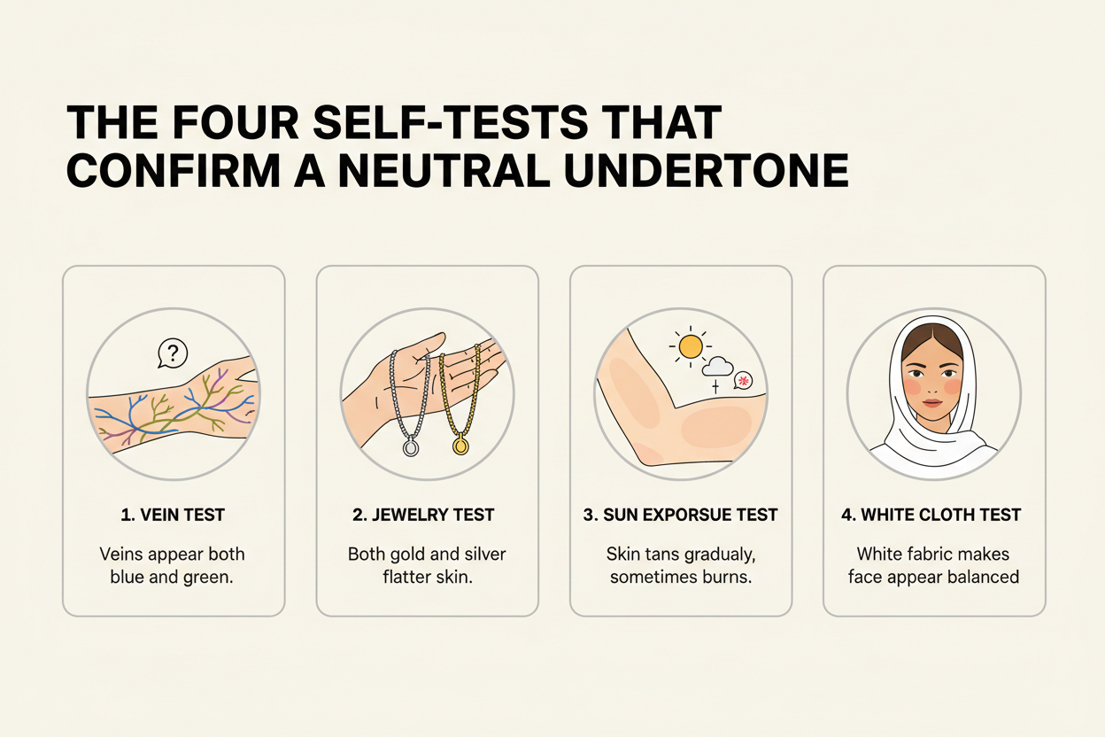
The Vein Test: What Green, Blue, or Invisible Veins Tell You
Turn your inner wrist toward natural daylight (not a yellow-tinted indoor bulb). Look at the veins just below the skin surface.
| What you see | Undertone signal |
|---|---|
| Clearly blue or purple | Cool |
| Clearly green | Warm |
| A mix of green and blue, or veins that are hard to distinguish at all | Neutral |
The "veins don't show at all" result is worth calling out: if you genuinely can't pick a dominant color—not because your skin is very deep, but because the hue is just ambiguous—that ambiguity is itself a neutral indicator. You haven't failed the test; you've passed it for neutral.
Self-test 2: The white fabric drape
Hold a piece of bright white fabric or paper directly under your chin in natural light. Watch what it does to your skin:
- Skin looks yellowish or sallow → warm lean
- Skin looks pink, rosy, or ashy → cool lean
- Skin looks balanced and relatively even → neutral
Self-test 3: Sun reaction
Think about what happens when your skin gets prolonged sun exposure without protection:
- You tan easily, rarely burn → warm tendency
- You burn first, tan slowly or not at all → cool tendency
- You tan moderately and burn only occasionally → neutral tendency
Self-test 4: Jewelry reaction
Stand in natural light and hold a piece of gold jewelry against your jaw, then swap it for silver.
- Gold makes your skin look alive and glowing → warm lean
- Silver makes your skin look brighter and cleaner → cool lean
- Both look fine, no clear winner → neutral
If three or four of these tests come back ambiguous or "both work," your undertone is almost certainly neutral rather than a misidentified warm or cool.
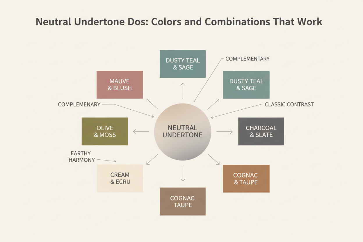
Neutral Undertone Dos: Colors and Combinations That Work
Neutral undertones carry both blue and yellow, which means you can pull from both the warm and cool palettes without much risk. Most undertone types have one sweet spot. You have two.
Warm-side colors that work well:
- Terracotta, rust, and burnt orange
- Warm olive and sage greens
- Camel, caramel, and warm nude tones
- Mustard yellow and golden tones
Cool-side colors that work well:
- Dusty rose and mauve
- Slate blue and soft navy
- Lavender and lilac
- Soft berry and burgundy
Universally flattering for neutral undertones:
- True red (balanced, neither blue-toned nor orange-toned)
- Ivory and warm white (more forgiving than stark white)
- Soft greige and greige-based neutrals
- Emerald green
Combinations that particularly flatter:
- Warm camel paired with dusty rose
- Navy with terracotta accents
- Burgundy with cream or ivory
The practical upside here is that you can wear colors you actually like and just nudge them in whichever direction feels right. A deep cobalt blue works where a muted periwinkle might wash you out. A warm caramel reads great where a harsh neon yellow would overpower. The main thing to avoid is going to extremes in either direction—stay away from the most intensely cool or intensely warm versions of a color and you'll be fine.
Neutral Undertone Don'ts: The Color Mistakes That Wash You Out
Neutral undertones are flexible, but not infinitely so. The colors that consistently cause problems fall into two categories: ones that pull so warm the skin reads muddy, and ones that pull so cool it looks drained.
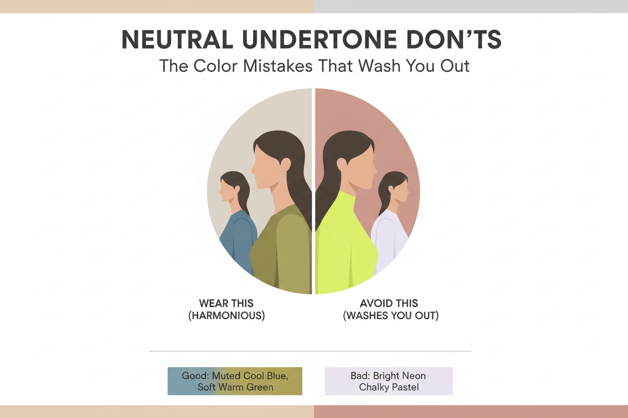
Avoid or approach carefully:
- Very bright, icy cool tones – stark white, icy grey, and white-based pastels (baby blue, mint, cool lilac) can strip the warmth out of a neutral complexion and leave it looking flat
- Highly saturated orange – unlike burnt orange or terracotta, vivid orange at full saturation tends to make neutral skin look sallow
- Neon yellow-green – the intensity overwhelms whatever balance a neutral undertone brings
- Extremely muted, greyed-out cool tones – grey-violet or chalky mauve with all warmth removed can leave skin looking ashy
The practical rule: it's rarely the hue itself that causes trouble—it's temperature and intensity pushed to an extreme. Wearable cobalt is not the same as icy blue. Warm brick red is not neon orange. Keep saturation and temperature in a moderate range and the neutral undertone's flexibility does its job.
If colors you feel certain about still look slightly off when you get them home, that's worth taking seriously. Intuition works less reliably for neutral undertones than for clearly warm or cool ones—neutral is the category most frequently misclassified, partly because neither self-test result ever looks obviously wrong. A structured color analysis quiz catches the nuances that casual self-testing tends to miss.
Foundation and Makeup Matching for Neutral Undertones
Knowing your undertone pays off most immediately with foundation. The right match can genuinely transform a look—not just correct it technically. A foundation that's even slightly too warm or too cool sits visibly wrong on a neutral complexion.
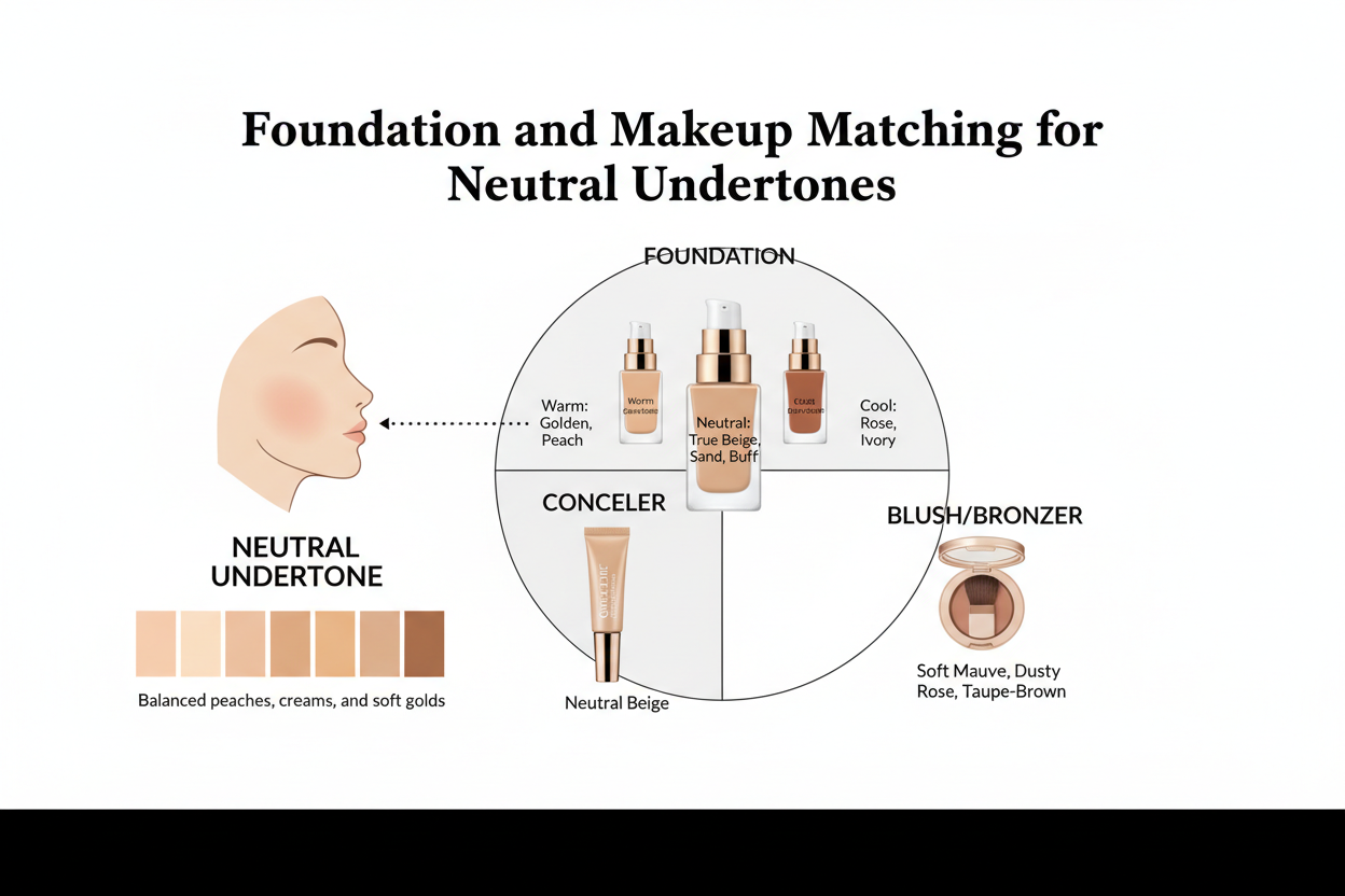
Reading Foundation Labels: N, W, and C Shade Codes Explained
Most major brands use a letter suffix alongside their shade numbers. Once you know the system, you can navigate any new brand without swatching every option.
| Letter code | Meaning | What it does on skin |
|---|---|---|
| N | Neutral | Balanced warm and cool pigments; designed for neutral undertones |
| W | Warm | Golden or yellow-dominant pigments; designed for warm undertones |
| C | Cool | Pink or rosy-dominant pigments; designed for cool undertones |
A foundation labeled 30N is a medium shade with a neutral undertone formulation. A 30W is the same depth but leans golden. A 30C leans pink.
For neutral undertones, N shades are the obvious starting point. Some people with neutral undertones have a slight warm or cool lean and do better with a W or C that's one step lighter or deeper—but N is always the right shade to test first.
Additional makeup matching notes for neutral undertones:
- Concealer – follow the same N/W/C logic; concealer that's too warm looks orange under the eye, too cool looks lavender
- Bronzer – warm-toned and neutral bronzers both work; skip anything with an obvious pink cast
- Blush – neutral undertones sit comfortably with both peachy-coral and soft berry shades; which one works better usually depends on the rest of the look
- Lipstick – product lines that categorize by undertone are a useful reference; a neutral-category red is formulated to sit evenly without pulling pink or orange on the lips
When testing foundation in-store, swatch on the jaw, not the wrist, and step into natural daylight. A well-matched foundation disappears into the skin at the jawline instead of sitting as a visible stripe.
Wardrobe and Accessory Colors That Complement Neutral Undertones
The same flexibility that makes foundation selection easier for neutral undertones makes wardrobe building genuinely freeing. Most color palettes work — the question is which end of each color family suits you best.
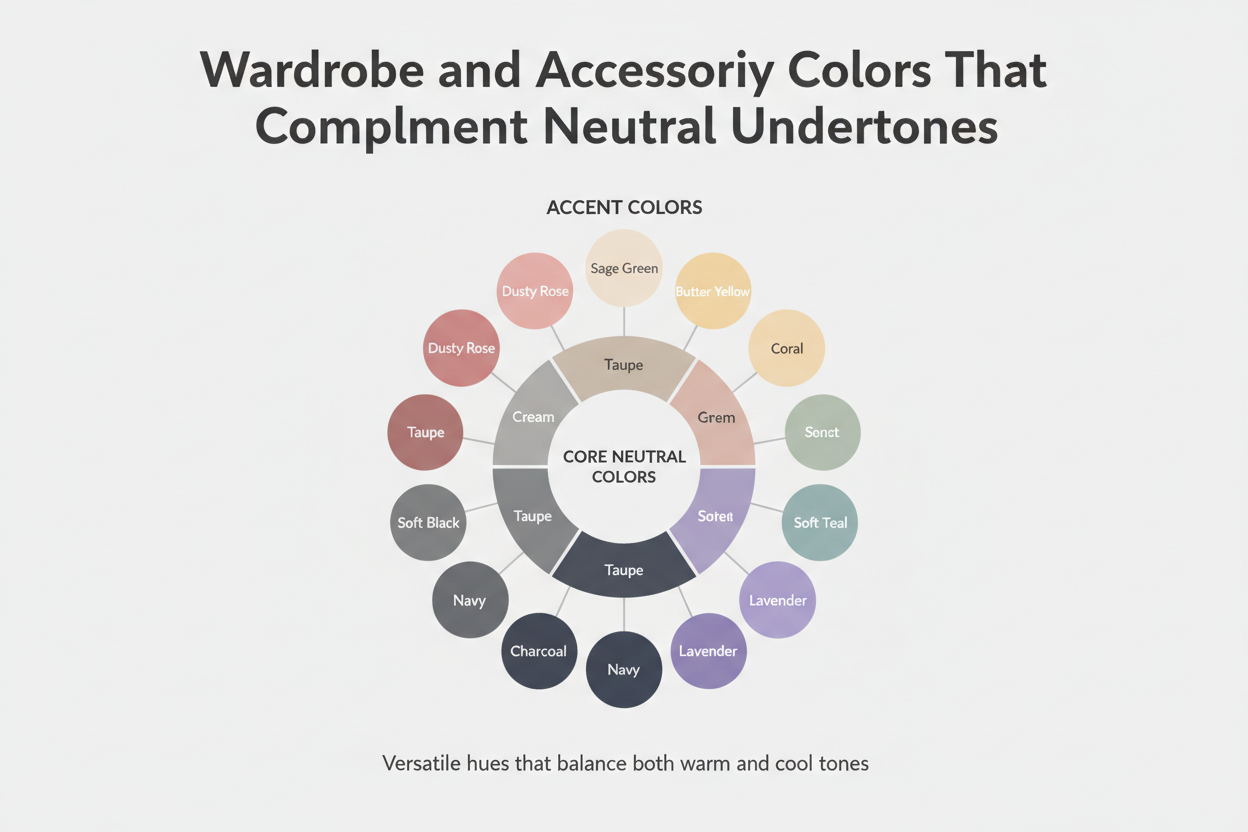
Jewelry: One of the clearest practical advantages of a neutral undertone is that both yellow gold and silver are genuinely flattering, rather than one being obviously better than the other. Rose gold works too. You're not locked into a single metal family, and mixing metals doesn't look like a mistake.
Clothing palette guidance:
| Color family | Best versions for neutral undertones |
|---|---|
| Neutrals | Ivory, warm white, greige, camel, warm stone |
| Blues | Navy, cobalt, slate, denim; avoid icy pale blue |
| Greens | Olive, sage, emerald, forest; avoid acid lime |
| Reds | True red, burgundy, brick; avoid neon or blue-tinted red |
| Pinks | Dusty rose, mauve, blush; avoid hot pink or bubblegum |
| Yellows | Mustard, golden, turmeric; avoid fluorescent or greenish yellow |
| Purples | Soft lavender, violet, plum; avoid cool grey-violet |
Pattern and contrast: Neutral undertones sit in the middle of the warm-cool spectrum, so they handle both high contrast (pairing very light with very dark) and low contrast (tonal dressing) reasonably well. That's less common than it sounds — strongly warm or cool undertones usually favor one approach over the other.
How to Use a Color Analysis Quiz to Confirm and Refine Your Neutral Profile
Self-tests are a useful starting point—but neutral undertones are where they're most likely to produce inconclusive results. Your veins might show an ambiguous blend. The jewelry test might feel like a genuine tie. Fabric draping might look fine either way. These aren't test failures; they're accurate readings of a genuinely balanced undertone. The problem is that "accurate" and "actionable" aren't the same thing.
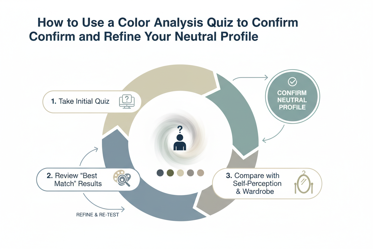
A structured color analysis quiz works differently from individual self-checks in a few important ways:
It asks multiple questions across different domains—light reaction, vein color, jewelry preference, fabric response, and seasonal burn patterns—then weighs the answers against each other rather than treating any single answer as decisive.
It accounts for where in neutral you fall. Even within neutral undertones, some people sit closer to warm-neutral, others closer to cool-neutral. That distinction changes which end of the color families to prioritize. A self-test can tell you that you're neutral; a quiz can tell you where in neutral you sit.
It maps to seasonal color analysis frameworks. Neutral undertones often correspond to specific seasons in the four-season and twelve-season systems—True Spring, True Autumn, and some Soft seasons are closely associated with neutral-leaning complexions. A quiz built around these frameworks gives you a more specific palette than "you can wear warm and cool colors."
If you've run the self-tests and landed on a tally of ambiguous results, a color analysis quiz is the logical next step. Not because the self-tests were wrong—but because neutral is exactly the undertone category that benefits most from a more systematic tool.
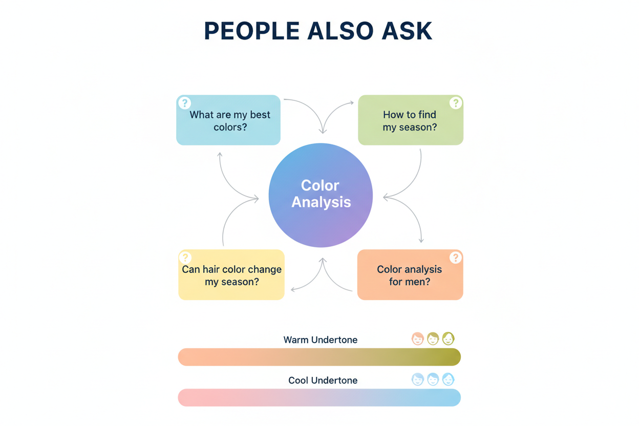
People Also Ask
How do I know if I have a neutral skin tone?
Run at least three of the four standard self-checks—the vein test, the white fabric drape, the sun reaction, and the jewelry test—then look for a pattern rather than a single clear answer.
With a neutral undertone, your results will consistently land in the middle:
- Veins appear as a mix of green and blue, or are difficult to read at all
- White fabric leaves your skin looking balanced rather than clearly pink or sallow
- Sun exposure produces a moderate tan with only occasional burning
- Jewelry looks equally good in both gold and silver, with no clear winner
If three or four of these tests come back genuinely ambiguous, that pattern is your answer. Neutral undertones are defined by the absence of a strong lean—the ambiguity confirms the category rather than suggesting the tests failed.
What colors look best on neutral undertones?
Neutral undertones carry both blue and yellow hues, which means you can pull from both the warm and cool sides of the color spectrum. The main thing to watch is temperature and saturation—stay moderate rather than pushing toward extremes.
Colors that tend to work well:
- True red, burgundy, and brick
- Dusty rose and mauve
- Camel, caramel, and warm ivory
- Navy, cobalt, and slate blue
- Olive, sage, and emerald green
- Mustard and golden yellow
Colors worth approaching carefully:
- Icy cool pastels and stark white (can wash out warmth)
- Highly saturated orange (can read sallow)
- Chalky, greyed-out cool tones (can look ashy)
The practical rule: avoid temperature or intensity extremes, and the flexibility of a neutral undertone continues to work in your favor.
What is the difference between neutral skin tone and neutral undertone?
These terms describe two completely different things, and mixing them up leads to poor color and makeup choices.
Skin tone (also called surface tone) is the shade you can see directly: fair, light, medium, tan, deep, or rich. It shifts with sun exposure, seasons, and age. Undertone is the persistent hue beneath the surface that doesn't change when you tan. It comes in three categories: warm, cool, and neutral.
A neutral undertone means the skin carries both blue and yellow hues at once, with neither clearly dominant. This can occur across any surface shade. Someone with deep skin and someone with fair skin can both have a neutral undertone. Surface tone tells you how light or dark a color needs to be; undertone tells you which hue family will actually harmonize with your complexion.
Can neutral undertones wear both gold and silver jewelry?
Yes, and it's one of the more useful things about having a neutral undertone. Because the complexion carries both warm (yellow) and cool (blue) hues at once, neither metal creates the slight clash you sometimes see with strongly warm or cool skin.
In the standard jewelry self-test, neutral undertones produce a genuine tie. Gold doesn't look dramatically better than silver, and silver doesn't outperform gold. Both read as natural against the skin.
This also means rose gold works as a third option, mixed-metal pieces look intentional rather than mismatched, and you're not locked into a single metal family when shopping or receiving gifts.
If you tried the jewelry test and genuinely couldn't pick a winner, that result confirms neutral rather than indicating an inconclusive test.
What foundation shade should I use for a neutral undertone?
Start with foundations labeled N (neutral) in the brand's shade system. Most major brands use a letter suffix alongside their shade numbers—N, W (warm), or C (cool)—to signal the undertone built into the formula.
For example:
- 30N = medium depth, neutral-balanced pigments (your starting point)
- 30W = same depth, golden-dominant (leans warm)
- 30C = same depth, pink-dominant (leans cool)
Practical tips when shopping:
- Swatch the N shade at your jaw, not your wrist, and check in natural daylight
- A correct match disappears into skin rather than sitting as a visible stripe
- If the N shade looks even slightly too warm or too cool, try a W or C one level lighter or deeper before ruling out neutral entirely
- Apply the same logic to concealer—too warm reads orange under the eye; too cool reads lavender
If you are not sure which depth number to start with, narrow down your undertone first, then work outward from there. It is faster than testing shades at random across the full range.
FAQ
What does it mean to have a neutral skin tone?
A neutral skin tone means your complexion has both warm (yellow) and cool (blue) undertones, with neither one winning out. This is your undertone—what sits beneath your surface shade, separate from how light or dark your skin is.
In practice, neutral undertones don't pull strongly in either direction. Your skin doesn't read pink, peachy, or golden; it just looks balanced. That's why people with neutral undertones can usually wear colors from both the warm and cool sides of the spectrum, and why gold and silver jewelry both tend to work.
How can I tell if my undertone is neutral, warm, or cool at home?
Four self-tests can help, and with neutral undertones, the consistent pattern is ambiguity across all of them:
- Vein test: Check the inside of your wrist in natural light. Green veins suggest warm; blue or purple suggest cool. If yours look like a mix of green and blue—or are just hard to read—that points to neutral.
- White fabric drape: Hold a bright white cloth near your bare face. If your skin looks pinkish, you lean cool; yellowish or sallow, you lean warm. No strong shift either way indicates neutral.
- Sun reaction: Warm undertones tend to tan easily; cool undertones burn first. Neutral undertones often do both—moderate tanning with some burning mixed in.
- Jewelry test: Hold gold and silver jewelry against your wrist separately. A clear preference points to warm (gold) or cool (silver). If both look equally fine, you're probably neutral.
No single test is definitive. Look for the same middle-ground pattern across at least three of the four.
Do neutral undertones look better in warm or cool colors?
Neither, really—and that's the point. A neutral complexion carries both warm and cool elements, so it can work with colors from either side without clashing badly.
The practical rule is to avoid temperature extremes rather than committing to one side:
- Works well: True reds, burgundy, dusty rose, camel, navy, sage green, mustard, and olive
- Approach with care: Icy pastels, stark whites, and highly saturated oranges—these can push the complexion too far in one direction
Staying in a moderate temperature range lets a neutral undertone do what it's good at, instead of working against it.
Can someone with a neutral undertone wear any lipstick shade?
Largely yes. Because neutral undertones blend warm and cool tones in roughly equal measure, fewer shades will visibly clash with your complexion. True reds, cool pinks, mauves, berries, nudes—the risk of an obvious mismatch is lower than it would be if your undertone leaned strongly in either direction.
The extremes can still cause problems. A very icy lavender-pink or a heavily saturated orange may throw the look off. The most reliable choices sit in the middle temperature range: true reds, warm roses, dusky mauves, soft berries. From there, a neutral undertone gives you more room to experiment toward either end without much risk.
Why do my veins look neither clearly green nor blue?
Because that's what a neutral undertone actually looks like. Veins are never purely one color - what you're seeing is how different depths of blood vessels interact with your skin's pigmentation. When the skin carries both warm and cool tones, neither wins, so veins end up somewhere in between and resist easy categorization.
Blue-green, teal, or just "unclear" all point to neutral. The test isn't broken. The ambiguity is the answer. If you're still unsure, try one or two other self-tests and see if the same pattern comes up.
Is neutral undertone the same as having an olive complexion?
Not exactly, though there is overlap. Olive is a surface description—a skin tone that reads as medium-to-tan with a greenish or yellow-green quality. Neutral is an undertone descriptor—a hue property beneath the surface, independent of overall shade.
Many people with olive complexions have neutral undertones, because the green-yellow cast of olive skin often reflects that balanced warm-cool blend. But neutral undertones can appear across any shade from fair to deep, and not all olive skin tones are neutral—some lean distinctly warm. The two terms describe different layers of the same complexion. Treating them as interchangeable leads to mismatched color and makeup choices.
How does a color analysis quiz differ from the vein self-test for identifying neutral undertones?
The vein test is a single physical cue. It gives you a quick directional read by examining one visible characteristic—the color cast of your wrist veins—but lighting conditions, skin thickness, and vein visibility can all throw it off. On its own, it's a starting point, not a conclusion.
A color analysis quiz looks at several things at once: how different colors reflect against your face, how you respond to warm versus cool tones across fabrics or swatches, and sometimes how your hair and eye color interact with both. Because it pulls from multiple signals rather than one, it tends to give a more reliable result—especially for neutral undertones, where single tests often come back ambiguous.
If the vein test left you uncertain, a structured quiz can help clarify whether that ambiguity reflects a genuine neutral undertone or a mild lean in one direction. Take the color analysis quiz at color-analysis.app to map your complete undertone profile.