What Colors Look Best On Me? A Complete Guide to Finding Your Perfect Palette

Key Takeaways
Here's what most people get wrong in 2026: they spend $400–$800 on a professional color analysis session in cities like NYC or LA — or worse, they skip it entirely and keep buying clothes that quietly drain their complexion. But knowing what colors look best on you doesn't have to cost a fortune. A well-calibrated AI quiz can nail your best colors for skin tone in under two minutes, often for $20 or less — and in many cases, it matches the professional result exactly. The real question isn't whether to do a color analysis. It's whether you're doing it right. One honest caveat: if you have olive or neutral-cool skin, AI tools can misread your undertones under certain lighting — so double-check results before rebuilding your wardrobe around them. Get this right, and you'll finally stop looking washed out on Zoom calls, in photos, and in the mirror.
🌈 Discover Your Perfect Colors
Find your ideal color palette with our expert analysis. From undertone testing to feature matching, learn how to build a wardrobe that makes you look and feel your absolute best.
Take Color Analysis Quiz →Push yourself past inflexible rules and try a surprising matchup. Trust your instincts and mix classic and trendy shades to suit your lifestyle, mood and objectives.
Pair colors to your own personal energies to inform your daily decisions. Choose strong colors for when you want strong and delicate shades for when you want gentle and accessible.
Try easy at-home undertone tests before you shop like checking wrist veins, gold versus silver, white versus cream near your face, noting sun reaction, and reading your natural features. Create your palette based on your undertone as that remains the same throughout the year.
Create your own palette of 3–5 main colors + 2–4 accent and build a capsule wardrobe that blends easily. Refresh your picks if your hair color changes or you switch up the style.
Experiment and tweak digitally with natural-light selfies, **color analysis** apps, and virtual try-ons. Maintain digital swatches and a mood board, and let color psychology steer what to wear for your current mood, message, and culture.
📚 Recent Articles
What color looks best on me? Answered by matching undertone, contrast, and context.
Skin undertone—cool, warm, or neutral—directs base shades. Eye and hair contrast determine how bold or soft shades read on your face.
Light and setting change how colors appear on skin. To simplify, this cheat sheet provides fast tests, defined color categories, and real outfit illustrations.
Use quick tips, easy steps, and photos to help you select shades with confidence.
Why colors matter

Color accents your face. The correct hues accentuate your eyes, balance your **skin tone** and enhance your hair to appear lush and vibrant. The wrong ones can sap you, or swamp you, or wash you out. First impressions swing quickly; color strikes the note before you do.
Although some people swear that "everybody looks great in navy or beige," impact is very different depending on undertone, contrast, and even lighting situation. Warm tones tend to flatter golden or olive skin; cool tones sit better on pink or rosy undertones. A seasonal approach—spring, summer, fall, winter—can lead you to harmonies that appear natural instead of contrived.
It assists a lot of folks establish a neat, tourist wardrobe that feels cohesive and offers daily confidence.
Beyond the rules
Rules aid until they don't. If you adore a color beyond your "season," change the value and where you put it. A deep emerald dress may swamp others, but a delicate emerald scarf at the collar bone can ignite the eye without hijacking the attention.
Contrast matters too: low-contrast coloring often looks best in soft blends. High-contrast features handle bold pairings like black and white or cobalt with crisp white. Trust the eye. Stand by a window, place one color at a time under your chin and observe your skin.
If it looks sleek and vibrant, hang on to it. If redness or shadows or dullness jump out, pass. Mix classic and trend: pair a timeless charcoal jacket with a fresh paprika tee, or slip a lavender belt through stone trousers. Bend rules to your life—commute, climate, meetings, nights out—so your palette works hard, not just looks good.
Your personal energy
Clothes should align with your mood and the image you wish to project. On high-powered days, saturated hues—scarlet, royal blue, and jade—exude ambition, while on days craving simplicity, softened tones—sage, dusty rose, and slate—broadcast peace and leave room for others. This is where understanding your color type becomes crucial.
Turn by mood and message. A teacher, for example, might opt for soft teal to remain amicable but attentive. A designer might choose chartreuse for a creative brief, while those with neutral skin tones may find that gray hair can push their best colors cooler or lighter.
A lot of people discover that shifting from fall colors to either summer or winter tones brings everything back in balance. Color is a big differentiator for a lot of people, but not for all. Others find a season and finally understand why rust works but neon coral doesn't.
Others prefer a simpler warm/cool split and build their wardrobe from there, ensuring their outfits reflect their unique skin tone and personal style.
The confidence factor
Dress in what gives you confidence. Notice patterns: if cobalt or soft camel brings compliments, double down. Wear beloved hues close to your face, then repeat them in prints or accessories to pull looks together.
**Bold tones** can feel like armor when you need to make a presence, while sleek neutrals—taupe, charcoal, ivory—offer quiet polish. Strive for harmony, not regulations, and allow your palette to evolve with you.
How to find your undertone
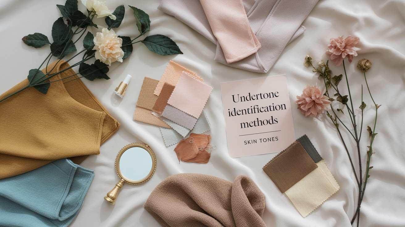
Undertone is the muted hue underneath your skin's surface--warm (yellow, peachy, golden), cool (pink, red, bluish), or neutral (a combination). It doesn't shift with seasons, even if your skin tone gets lighter or deeper. Knowing it helps you choose clothes and makeup that clicks.
So before you shop, test at home, then create a core palette around your undertone.
| Method | What to do | Warm sign | Cool sign | Neutral sign |
|---|---|---|---|---|
| Vein check | View wrist veins in daylight | Greenish | Blue/purple | Mix of green and blue |
| Jewelry | Compare gold vs. silver near face | Gold flatters | Silver brightens | Both look fine |
| White fabric | Hold pure white, then cream | Cream looks better | Pure white looks better | Both look okay |
| Sun reaction | Recall burn/tan pattern | Tans fast | Burns easy | Burns then tans |
| Foundation compare | Test warm vs. cool shades | Warm blends | Cool blends | Both near match |
1. The vein test
Stand by a window at noon and look at the veins on your inner wrist. Blue or violet hints tend to indicate cool undertones.
If the veins bleed green or olive, that's a warm undertone indicator. A combination of blue and green can indicate neutral, which lies between warm and cool. Look at both wrists, as lighting can trick you.
2. The jewelry test
Put gold and silver next to your face in natural light. If gold imparts a gentle, healthful glimmer, then you probably lean warm; if silver ignites brightness and clarity, you edge cool.
If they both work, you may be neutral. Use this as a quick screen for metal tones in buttons, belts and watch cases as well.
3. The white test
Hold a bright white t-shirt beneath your chin. If your skin appears bright and even, that implies cool; if it goes sallow, you're perhaps warm.
Now test off-white or cream. Warm undertones tend to appear seamless in cream, whereas cool undertones retain their purity in stark white. Utilize this when selecting basics—shirts, blouses, tees—because these colors hang near your face.
4. Your sun reaction
Consider your most recent day at the beach. If you burn quick and have a hard time tanning, that typically indicates cool undertones.
If you tan easily and rarely burn, warm undertones are probable. Others burn then tan; that can skew more toward neutral. Let this direct **summer palettes**, coral and honey for warm, or icy pink and navy for cool.
5. Your natural features
Check your hair, eyes and lips. Ashy or blue-black hair, grey or icy eyes and rosy lips lean cool.
Golden brown hair, hazel or warm brown eyes and peachy lips lean warm. Most people demonstrate a predominant undertone, although a few display mixed signals.
Cross-check with foundation. Swatch one warm and one cool shade on your jaw – the one that melts in is your match. Shade names help: warm descriptors (golden, honey, beige, caramel) suit warm undertones; pink, red, or cool labels suit cool. Neutrals are in the middle and frequently match with both silver and gold.
Consider your features
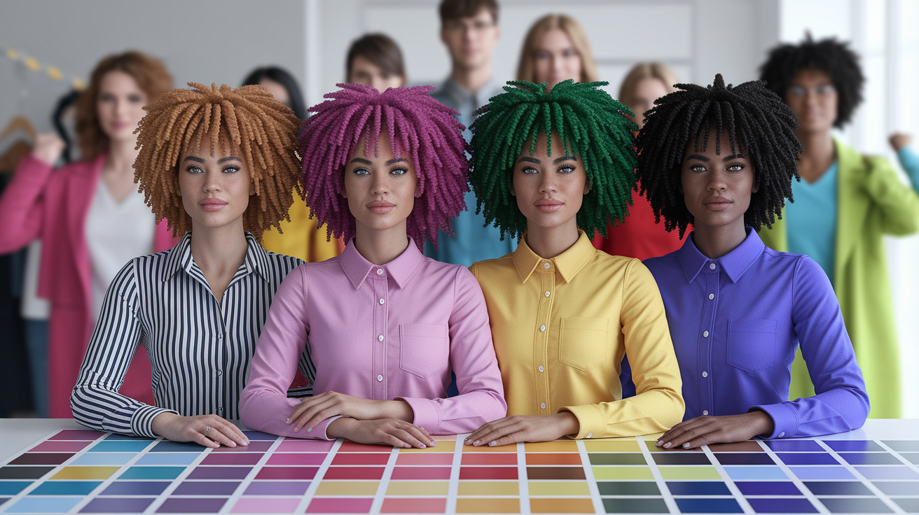
Color is most effective when it resonates with your existing attributes. Hair, eye and skin tones provide the foundation. Certain features demand warm tones, others go cool or neutral. As your hair color changes with dye or age, your best colors change as well.
Feature – A simple feature-based check helps you build a focused, flattering palette.
Your hair
Begin by identifying your inherent tone and undertone. Think ash blonde or brown reads cool, frequently with faint gray undertones. Golden tones appear warm and sunlit. Copper, auburn and authentic red all have heat and depth.
Black hair might be cool (blue-black) or warm (soft black). Silver or white hair cools, but skin warmth still counts. Deliberately seek balance or contrast. Cool ash hair goes with cool blues, charcoal, icy pink, and emerald for crisp lines.
Warm golden hair glows with camel, cream, olive, coral and tomato red. Red hair sings alongside teal, forest green, peacock blue and warm neutrals like tan. Blue-black hair has a very high contrast level, so crisp whites, cobalt, fuchsia and ink navy remind me of looking very sharp as well.
If you move your hair up two or more levels, adjust the palette. Transitioning from brown to platinum? Soften to cool pastels, or crisp sets of navy and black. Dye warm copper. Think your features – splash in teal, moss, rust and cream.
Aging in silver? Lean slate, soft navy, icy lavender and clean white. Pass on muddy beige. Let your hair be a guide for hats, scarves and statement pieces near your face. A camel beret enhances warm blondes, a charcoal beanie flattered cool brunettes and a teal scarf compliments redheads.
With silver hair, a dazzling white scarf does lighten up the face in an instant.
Your eyes
Remember your eyes and the flecks that shift them. Blue can be slate, sky or turquoise. Green, from moss to jade, with gold threads. Brown goes from honey to espresso. Hazel moves with light, drawing in green, gold or brown.
Think about your eye color. Select clothing that reflects or accentuates the iris. Sky-blue shirts light up light blue eyes, deep navy sharpens slate. Olive, teal and petrol green highlight green or hazel. Honey-brown eyes golden with rust, cinnamon and copper.
Rich dark brown that pops with cobalt, magenta and royal purple. Get some lift with the color wheel! Complementary pairs work: blue eyes with rust or peach, green with plum or wine, brown with teal or sapphire.
Not exact matches, but near-antitheses that border the iris. Direction accents to the face. Emerald earrings, a cobalt striped scarf or burgundy rim glasses all pull attention to the eyes without having to completely change your outfit.
Build your personal palette
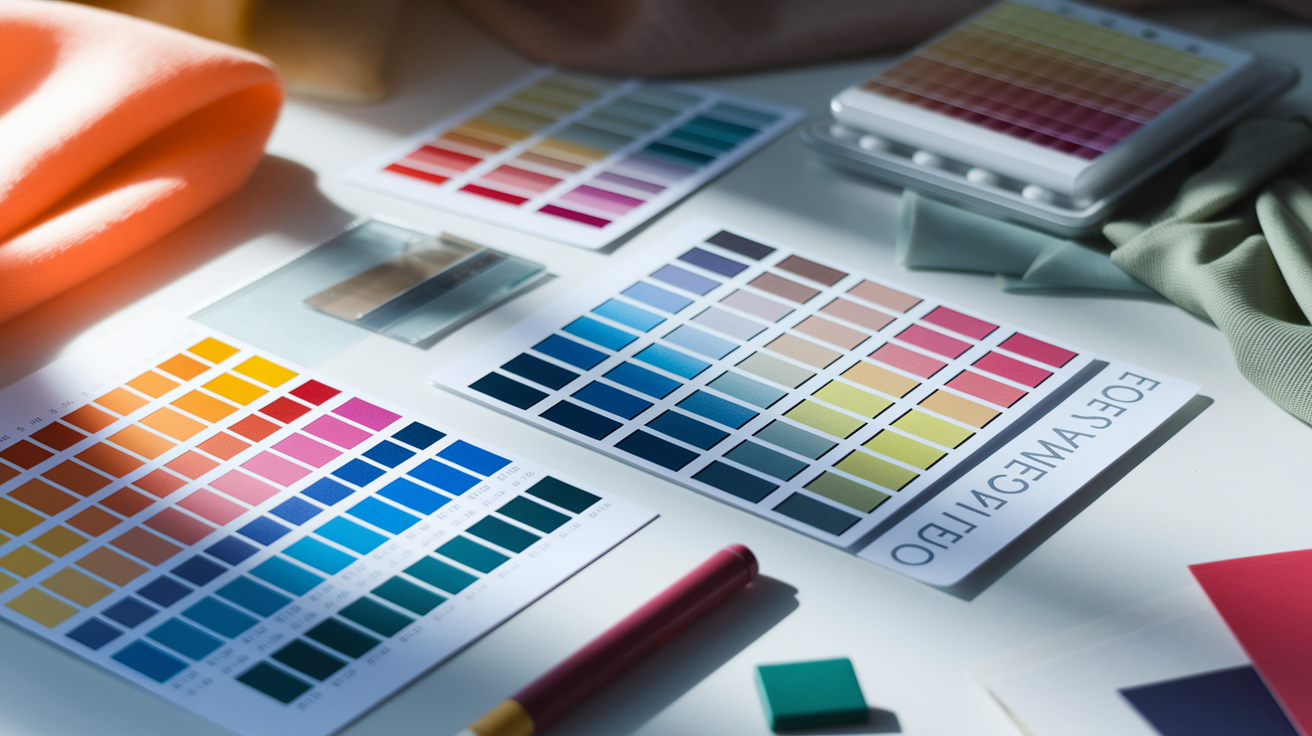
Assign colors to your attributes, then categorize them into core, accent and neutrals that you can wear on rotation. Check undertone first: warm skin, hair, and eyes often sit in Spring or Autumn. Cool in Summer or Winter. Hair depth assists as well—lighter hair leans Spring/Summer, darker hair leans Autumn/Winter.
If you sit somewhere between seasons or lean neutral, experimenting with both ends of the spectrum is completely valid — most people do. When asking yourself what color palette am I, resist the urge to rely solely on a single app. Budget AI tools (typically $15–$25, think Dressika-tier apps) are convenient, but a well-documented bias pushes their algorithms toward labeling nearly everyone "Deep Autumn" — a shortcut that skews your results before you've even held a swatch. For a more grounded read on what colors look best on you, a human-in-the-loop digital draping session (around $50) hits the sweet spot: you get a trained eye validating hue (warm vs. cool), value (light vs. deep), and chroma (soft vs. clear) against your actual complexion, not a training dataset. Use that as your foundation, then build a wardrobe palette around the best colors for your skin tone that genuinely supports daily wear — not a paint chart you'll never open again.
Your core colors
Select 3–5 **core colors** that complement your skin tone and can be worn throughout the year. These flattering colors anchor your suits, coats, dresses, knitwear, and headscarves, making them easy to combine for quick ensembles.
- Find undertone: hold a warm gold and cool silver near your face in daylight. If gold triumphs, explore warm cores (camel, olive, tomato red, cream). If silver triumphs, experiment with cool cores (charcoal, navy, pine, ice gray).
- Match depth to hair and eyes: Light types (often fair skin, light hair, blue/green eyes) suit soft pastels and light neutrals like mist blue or sand. Deep types (dark hair, deep eyes, rich skin tones) dazzle in strong, rich shades like burgundy, ink navy, forest.
- Check chroma: Clear types handle high-contrast brights (cobalt, true red). Soft types appear more attractive in muted combos (dusty rose, moss).
- Stress-test in daylight: wear near the face and note if skin looks even, eyes bright, and lips defined. Filter in winners that do all three.
Your accent colors
Deploy them in your shirts and scarves and ties and jewelry and bags and lip color.
- Choose one feature-highlighter: green eyes with teal, brown eyes with copper, blue eyes with cornflower.
- Pick a statement bright aligned to your season: Spring—coral; Summer—raspberry; Fall—mustard; Winter—fuchsia.
- Throw in a trend-conscious swap you can rotate each season.
- Add one loose print that combines your cores and highlights.
Rotate accents with mood or trend shifts, but keep the core steady so outfits still click.
Your capsule wardrobe
Restrict items to your capsule palette for neat blending and less wastage.
- Tops: 4–6 in your core shades, plus 2 accent colors that add energy and lift to your look — these are often the best colors on me moments people notice first.
- Bottoms: 2–3 neutral cores (e.g., navy, charcoal, cocoa) that anchor your wardrobe and pair with everything.
- Layering: 1 blazer or jacket, 1 knit in a core shade, 1 lightweight accent cardigan — layering is where the best colours to wear really come to life.
- Dresses or suits: 1–2 in a core color, plus a print that echoes your palette for variety without chaos.
- Accessories: belts, shoes, and bags in neutrals; reserve one accent piece near the face — this is prime real estate for your best color for me choices, including the best makeup colors for me.
- Seasonal Hybrids — forget rigid four-season boxes, they are outdated. If you feel caught between two seasons, you almost certainly are a hybrid (think Bright Spring-Winter or Soft Summer-Autumn). Hybrid palettes are now the standard, and knowing your exact blend is the real answer to what colors look best on me and what color palette am i. Lean into both sides of your hybrid and you will always land on the best colors for your skin tone.
- Update cycle: revisit your palette every 6–12 months — as hair color shifts, skin tans, or your style evolves, your season category (Spring, Summer, Autumn, Winter, plus Light, Soft, Clear, or Deep modifiers) may need a tweak. Staying current is how you keep wearing the best colors for me season after season.
Test your colors digitally
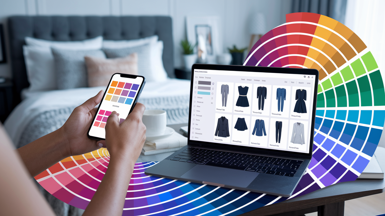
Before you buy, see exactly what colors look good on you — on your face and in your wardrobe. Use the best colors app and its built-in color analysis camera to test shades against your skin tone, hair, and eyes in real time. Save swatches and custom palettes so every shopping decision is driven by clarity, not guesswork. One critical tip most guides skip: if you're reviewing your results on a screen with Night Shift mode enabled or while wearing blue-light filtering glasses, the warm yellow tint distorts every hue you see — making your entire analysis unreliable. Strip the tech first. Turn off color temperature filters, remove tinted lenses, and view your palette under a neutral, daylight-balanced display before you trust what you're seeing. Getting the best colors for your skin tone right starts with seeing those colors accurately.
Use your phone
Stand near a window, switch off brash overhead lights, and snap a series of selfies while wearing neutral tops and some statement colors—soft white, cream, charcoal, navy, tomato red, fuchsia, emerald, and warm rust. Compare how each color treats your skin tone: do under-eyes look darker or do gray shadows fade; do teeth look whiter; does your face seem bright without extra makeup? This is an essential part of your color analysis experience.
Try a digital color analysis app or online quiz for a quick scan. Several utilize AI to analyze your skin undertones, hair intensity, and eye transparency, then assign you to a seasonal palette in seconds. Some take it a step further with 12 seasons color theory and provide a downloadable capsule palette along with matching makeup and hair color lists with your result.
Try lipsticks, blush, and even tops on with virtual try-on features to see what flattering colors look like in real time. A cool berry lip juxtaposed to cool navy might make your complexion look calm and clear, whereas warm coral against camel may lift warmth and impart a healthy glow. A few of the tests will even let you 'drape' fabrics like silk or wool, so you can observe how sheen impacts the color on skin.
Digitally test your colors. Save your top selfies into a Keep folder. Jot down things like 'cool red + soft white = bright eyes' or 'mustard = sallow.' This running log becomes a pocket guide when you shop, online or off.
Find inspiration
Utilize social feeds, fashion blogs, and color analysis galleries to find side-by-side examples of how different color palettes can enhance your appearance. Observe how tops affect your face in various lighting conditions, noting the differences between neutral colors like blue-gray and warm taupe. Track how the palette selection page can help you understand the variations in shades like soft black versus deep espresso.
Look for celebrities with coloring similar to your own—considering skin depth, undertone, hair value, and eye contrast. For instance, a cool winter type may shine in icy pink and cobalt, while a soft autumn might glow in muted teal and oatmeal. This can guide your capsule palette choices.
Save looks that suit your lifestyle: work blazers in navy or charcoal, casual knits in sage or rose, and evening pieces in garnet or deep teal. Don't forget to clip makeup swatches that complement your color types—like browns with a green base or peach blush.
Create a digital mood board to group colors by their roles: personal colors, neutrals for outerwear, makeup shades, and hair options. Incorporate your AI palette and fabric notes to enhance your color analysis experience.
Over time, patterns emerge and your best shades become obvious—skin looks luminous and features sharpen and confidence grows.
The psychology of your colors
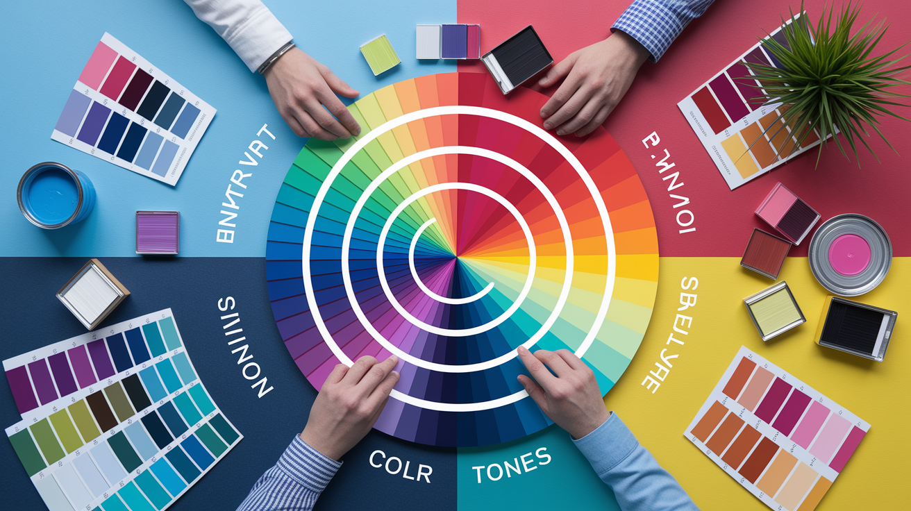
Color influences how people feel, judge, and act, and you can leverage that to shape how you show up. Research on color psychology associates specific hues with moods and even character types, making color palette selection crucial for neutral skin tones and warm skin tones. In style, color works like tone in a story: it sets the mood, signals intent, and leaves a memory.
Your mood
Choose colors that complement or direct your mindset. On hard mornings, a yellow or coral can give a little push to your fuel gauge. Yellow often reads happy, warm and sunny—with many women feeling a lift even with a scarf or bag in that shade.
Soft, muted tones can assist you to decelerate. Blues and greens soothe the mind, blue associated with trust and steadiness and green with balance and nature and even money. A sage shirt or navy knit will steady your breath after a long day.
Pink is a gentle boost when you need care, not noise. Pink leaning people tend to be fun and open hearted, great if you need heat around you. White can clear your eyes of clutter and provide a fresh start sensation, beneficial following a chaotic week.
Switch up your palette with the seasons! There's a psychology to your colors — bright, light colors in the warm months feel alive while deeper, cozier shades feel good on shorter days. Keep a small "mood rail" ready: a joyful yellow tee, a soothing teal sweater, a crisp white shirt.
Your message
Clothe with purpose, for color talks before you do. If you want to convey authority or focus, select red for brazen audacity or navy for calm intensity — both demand attention during a high‑stakes pitch or interview. Blue indicates reliability and faithfulness, a safe choice when you need confidence behind you.
For approachability, go soft pastels. A powder blue blouse or blush jacket abbreviates the space in social rooms, without sacrificing sophistication. Green fits group-oriented get-togethers because it comes across as even-handed and equitable.
You need creative spark. Go for cobalt, saffron or violet hits. Need soothing calmness? Slate, stone, or olive are great options. White, when in doubt, screams simplicity and freshness, particularly for clean, modern lines.
Your culture
Color significance varies across cultures and contexts, so it's important to consider the context. White means 'pure' – therefore, Western brides wear white and hospitals use white sheets – but it can mean other things in other cultures. Red may represent luck in some cultures and danger in others — read the local code before a major occasion.
Throw some heritage in your palette for personal heft. A scarf in a family color, a print with community motifs, or jewelry in a meaningful hue all add quiet depth. If a shade has bad associations in a context, turn down the intensity or shift it to accessories.
Mix in global inspirations cautiously. Create a foundation of neutrals, then add pops that pay respect to narrative and location. This makes your style you, while keeping an ear on the room. Research reveals color preferences follow particular traits, so pay attention to what you gravitate to when you feel most like you.
Conclusion
What color suits me best These small tweaks may look insignificant, but they pay off fast. A cool pink invigorates fair skin! A deep teal highlights brown eyes. Olive skin glows next to coral. Dark hair leaps with cobalt. Light hair pops with navy. Easy changes, big impact.
To lock it in, maintain a short list. Two foundation shades, two brights, a neutral. Snap a fast pic of triumphs on your phone. Do a split screen test in daylight. Observe how your face appears first, not the shirt.
Style develops through wear. Begin with 'safe' hits, then throw in one bold piece. A scarf or a tee or a lip. Need a quick gut check – share a pic with a friend! Prepared to discover your most effective color today!
Frequently Asked Questions
How do I quickly tell if I have a warm, cool, or neutral undertone?
The vein test in natural light reveals your skin tone: greenish veins indicate a warm skin tone, while bluish or purple veins suggest a cool skin tone. If it's difficult to determine, you may have a neutral skin tone, which pairs well with both gold and silver jewelry, making it suitable for a variety of capsule palettes.
Do eye and hair color affect which colors suit me?
Yes. High contrast (dark hair, light skin tones) dazzles with bold, clear colors from a capsule palette, while low contrast suits best in soft, blended hues. Eye flecks matter too: gold flecks prefer warm shades; icy flecks favor cool shades, balancing with your undertone.
What are universal colors that suit most people?
Try true red, teal, eggplant, soft white, and charcoal to create a colorful wardrobe. These tones complement various skin tones and serve as safe starters while you develop a custom palette.
How can I test colors online before buying?
Try digital draping tools or virtual try-ons for your color analysis experience. Post a picture in natural light to test warm vs. cool versions of the same color, aiming for brighter eyes and an even skin tone.
Can lighting change how a color looks on me?
Definitely. Daylight reveals false color. Warm indoor light can yellow cool shades. Cool LEDs can wash out warm tones. Always test in different lighting before picking out key pieces or make-up.
How many colors should be in my personal palette?
Begin with 8–12 colors, focusing on core colors that complement your skin tone. Add 3–4 neutral colors and 2–4 accent colors to ensure cohesive outfits.
Do psychology and mood matter when choosing colors?
Yes. Colors have an impact on the way we are perceived, especially when considering skin tones. Blues and greens soothe, while reds invigorate. Yellows have an optimistic vibe. Pick tones that fit your purpose–work intensity, social boldness, or chill–but remain within your core colors.