
Medium Olive Skin Tone: Depth, Undertone, and Clothing Colors
 Reviewed by Alexandra Gilmore
Medium olive combines a medium skin depth with an olive color direction. It does not specify one season, one ethnicity, or one level of saturation. Compare similar-depth neutral and olive swatches, then test clothing pairs separately for warmth and intensity.

Comparing color direction at a similar skin depth.
Medium Depth and Olive Undertone Are Different
Medium describes the apparent depth of a complexion; olive describes a color direction that may look green, gray, or muted golden. These are separate observations. As Kryolan explains, apparent surface color does not determine undertone, and Ulta describes more than one possible olive direction. Ancestry and how readily you tan cannot establish either label. For a broader discussion of olive coloring, see The Ultimate Guide to Olive Skin Tone: Are You One of Us?
Picture a simple two-by-two comparison: depth can be lighter or deeper, while color direction can read olive or neutral at either depth. A fair olive sample and a medium olive sample may share a muted direction but differ in depth. A medium neutral and medium olive sample may sit at a similar depth but differ in direction. These are descriptive examples, not measured categories or a result for your skin.
| Depth | Neutral direction | Olive direction |
|---|---|---|
| Lighter | Light or fair neutral example | Light or fair olive example |
| Medium | Medium neutral example | Medium olive example |
Compare Medium Olive With Medium Neutral
Start with two to four foundation swatches at a similar depth, then compare different color directions along the jaw in daylight. Include a medium neutral and an olive-labeled option if available. Ulta's swatch guidance uses similar depths with different undertones; its labels can vary by brand. A swatch that looks orange or pink may miss on depth, warmth, or intensity as well as undertone. It does not prove that your skin is olive. For the same color direction at a lighter depth, read the Fair Olive Skin Color Guide: Best Outfits, Undertone Rules & What to Avoid.
Keep the comparison limited to what you can see. If the neutral swatch makes a visible pink edge and the olive swatch blends more quietly, try another pair at the same depth before choosing a label. If both look too dark, change the depth first. The observations below are prompts for another comparison, never a diagnosis from one stripe.
| Observation | Next comparison | What it does not prove |
|---|---|---|
| Neutral swatch leaves a pink edge | Try a same-depth olive and a different neutral. | That olive is automatically your match. |
| Swatch looks orange | Compare a less warm or less saturated shade at the same depth. | Orange alone identifies olive skin. |
| Both swatches look too dark | Move to a lighter depth in both directions. | Either undertone is wrong. |
Test Warm, Cool, and Muted Clothing Options
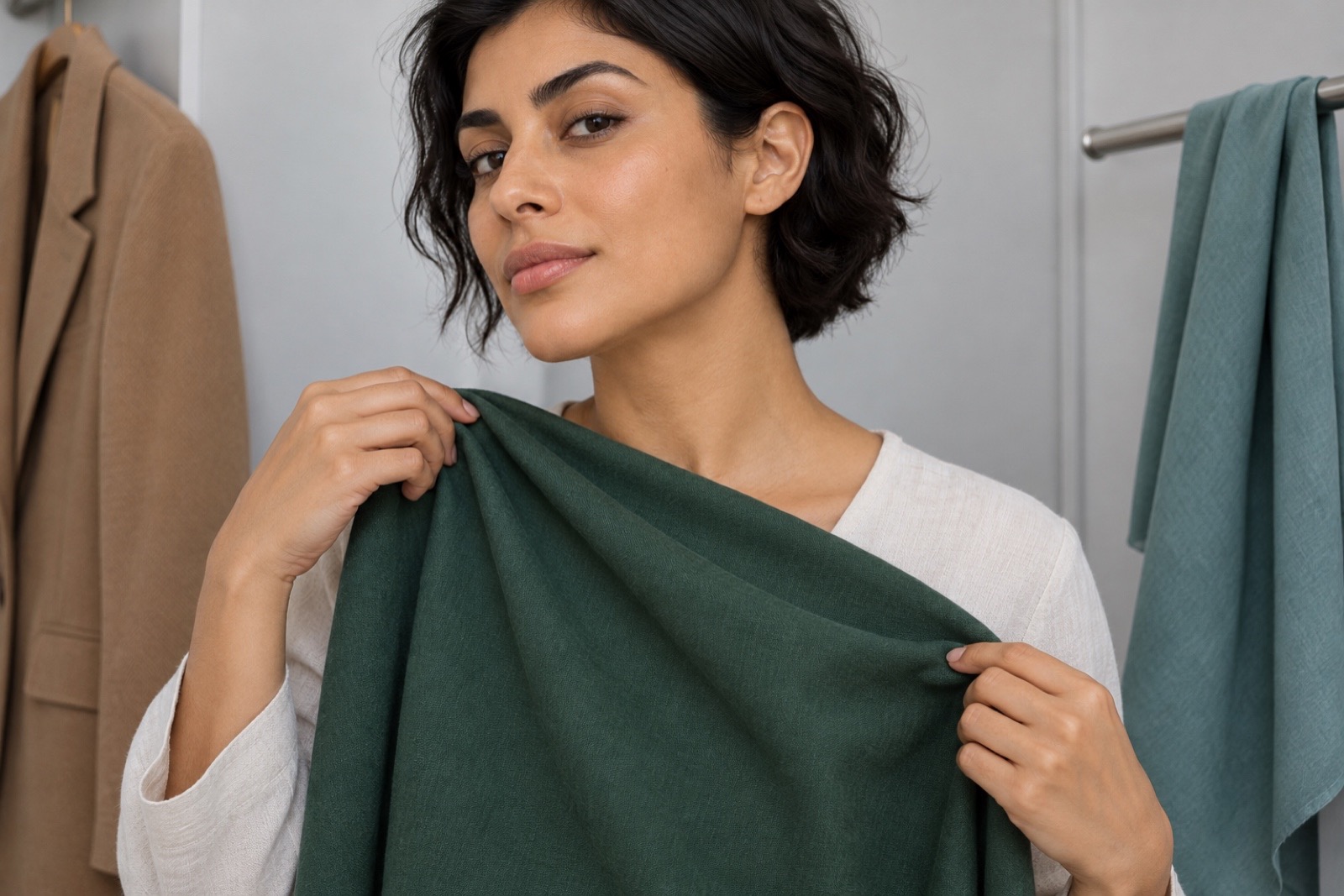
Clothing gives you a separate test from foundation. Hold teal beside blue, camel beside gray-brown, and a clear green beside a muted green. Match each pair as closely as you can for depth and fabric finish so you change mainly warmth or intensity. Watch the overall balance beside your face without assuming which member will win. This is a way to explore colors, not to assign an olive complexion one season. For product matching after the clothing test, the foundation matching for olive skin handles the detailed foundation route.
Place each fabric at the same distance below your face, stand in the same daylight, and keep makeup and the rest of the outfit steady. If one cloth is both much lighter and much brighter, find a closer pair before deciding what changed the effect. Repeat with a second pair; a single comparison can be influenced by weave, shine, or lighting.
Build Two Everyday Outfits
Try navy trousers, a soft white top, and a muted teal layer for one everyday combination. For another, start with cocoa trousers, a cream top, and a rust accent. The dark neutral anchors each outfit, the pale piece opens space around the face, and the accent adds color. These are starting combinations, not a prescribed medium olive palette. Adjust contrast separately: let more of the pale top show for a stronger light-dark frame, or cover more of it for a quieter one.
To compare color direction, keep the trousers, layer, and light unchanged and swap only the cream and soft white tops. Both occupy a pale role, but cream leans warmer while soft white is cooler. Check the real garments in consistent daylight; lighting, makeup, and edited photos can change how skin and fabric appear. Keep the version that gives you the effect you want.
Use Your Result for Foundation
Once you have a working color direction, compare foundation by depth first and undertone second. Swatch similar-depth options along the jaw, then check the face, neck, and upper chest together. Let each formula dry according to its directions before making the final comparison. The foundation guide for fair, medium, and deep olive tones takes you through that process in detail without treating a clothing preference as a foundation shade match.
Medium does not automatically mean tan, and an olive option can be labeled warm, neutral, or cool depending on the brand. If a medium neutral shade leaves a pink edge, compare a similar-depth olive-labeled shade; that edge alone is not proof of an olive undertone. If both options look too deep, resolve depth before drawing conclusions about direction.
Questions and Practical Answers
Is medium olive the same as medium neutral?
They may overlap in brand labels, but compare the visible color direction at a similar depth.
Does medium olive mean an Autumn season?
No. Medium depth and an olive direction alone do not assign a season; test clothing warmth and intensity separately.
💫 Discover Your Complete Color Palette
Use the result as a starting point, then compare real fabric beside your face in consistent light.
Take Color Analysis Quiz →