
Medium Contrast Coloring: Palettes and Outfit Combinations
 Reviewed by Alexandra Gilmore
Medium contrast coloring sits between very similar and sharply different feature values. For clothing, start with a light, a mid-tone, and a darker piece rather than an extreme black-and-white split. Adjust the size of each color area and judge the overall combination near your face.

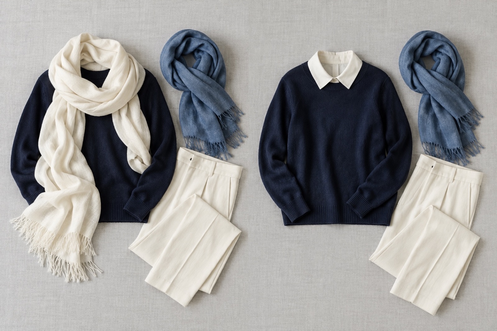
A mid-tone layer connects light and dark clothing in this matched illustration; compare the structure with your own fabrics.
What Medium Contrast Means
Facial contrast describes the difference in apparent lightness among your hair, skin, brows, and eyes. A medium contrast face has some visible separation, but the features do not form the strongest possible light-dark split. This is a relationship between features, not a synonym for medium skin tone or moderately saturated clothing. For a fuller look at skin tone and undertone, read the how to check neutral undertones. For the comparison method itself, see Your Season's contrast guide.
Imagine medium-brown hair, a complexion lighter than the hair, and eyes that sit between them in apparent value. The intermediate eye and brow values can make the overall difference feel moderate. The same relationship can occur at many skin depths; the word medium describes the gap, not the complexion. Compare your own features in grayscale rather than treating this imagined example as your result.
Build a Three-Value Outfit
Give the outfit three roles: a base, a bridge, and an accent. Medium gray trousers can anchor a lighter gray shirt, while a navy cardigan adds depth without jumping straight to a black jacket against a white shirt. The middle value gives the eye a step between light and dark. If you still need to assess that gap in your own features, use the full grayscale process in guide to comparing facial contrast. A styling approach using two neutrals and one accent is described by Imogen Lamport; use it as a starting arrangement, then judge the result on yourself.
| Setting | Light, middle, dark | Small adjustment |
|---|---|---|
| Work | Light gray shirt, slate cardigan, charcoal trousers | Add a navy scarf for a stronger frame; remove it for a quieter one. |
| Casual | Ivory tee, medium denim overshirt, dark indigo jeans | Show less ivory at the neckline to reduce the light-dark area. |
| Evening | Soft white top, pewter jacket, deep navy skirt or trousers | Use a small pale earring instead of a broad light wrap. |
These are sample value structures, not prescribed colors. Change one accessory or the area of the light piece before replacing the entire outfit.
Choose Prints Without Losing the Pattern
A fine navy-and-blue stripe usually has a smaller lightness jump than a black-and-white stripe. Look at two things separately: how far apart the colors are in value and how much space each stripe occupies. A narrow high-contrast line can act as a small accent; a broad stripe becomes a larger part of the visual frame. If gentler transitions are more useful, the soft color choices for low contrast faces has more tonal outfit examples.
Keep navy and medium blue fixed, then compare a tiny repeated motif with a large block print in the same two colors. Their value difference stays similar, while the larger shapes draw attention sooner. This is a print-scale choice, not a change in your facial contrast. Try the fabric beside your face rather than deciding from a product photo.
Keep Undertone and Saturation Separate
Contrast is about lightness differences. Undertone concerns a color's warm or cool direction, while saturation concerns how vivid or muted it appears. You can repeat a three-value outfit with warm colors or cool colors. Medium contrast by itself does not assign you to Soft Autumn or any other season. If you need to compare those other dimensions, continue with how to choose your best clothing shades.
Try camel trousers, a cream shirt, and a cocoa layer for a warm-leaning version. For a cooler version with a similar light-to-dark structure, try slate trousers, a soft white shirt, and a navy layer. Compare temperature near your face separately from the value spacing. A mostly single-hue outfit can still include several lightness steps; the styling guide's discussion of monochromatic color helps separate that choice from contrast level.
Adjust Contrast Near Your Face
Keep the rest of an outfit unchanged and add or remove one scarf, collar, or visible shirt edge. A broad pale scarf against a dark top increases the bright area around the face; a narrow collar keeps the same colors but changes their proportion. Choose the version that gives the expression you want. A high-contrast outfit is still an option when you want a bolder effect.
Before leaving, check three things: can you identify a light, middle, and dark value in the outfit; which value frames your face; and what happens when you make one comparison in consistent daylight? Change one piece at a time. Photos and illustrations can suggest combinations, but only your real fabrics show how the colors work in your light.
Questions and Practical Answers
Can medium contrast wear black and white?
Yes. Try a mid-tone layer or a smaller contrasting area to soften the transition.
Does medium contrast mean muted colors?
No. Value differences and saturation are separate comparisons.
💫 Discover Your Complete Color Palette
Use your results as a starting point for comparing real clothing colors in daylight.
Take Color Analysis Quiz →