What Is My Color Season? Free 16-Season Color Analysis Quiz

Key Takeaways
- Before you take any 16 season color analysis test, run through this checklist: turn off Night Shift and all blue-light filters on your phone, remove glasses, step into natural daylight, and set a neutral gray background behind you. Most DIY attempts fail not because the 16 season color analysis system is flawed — it's actually far more precise than the classic four-season model, pinpointing undertone, value, and chroma to deliver a palette that genuinely fits you — but because a single wrong phone setting silently distorts every color you see. Unlike broad labels like Winter or Autumn, the 16 color seasons system breaks your coloring into refined subtypes, which is especially powerful if you've never quite fit the 12-season charts. Get the conditions right first, and the results will actually mean something.
🌸 Discover Your Seasonal Color Analysis
Ready to discover your seasonal color type? Take our comprehensive seasonal color analysis to identify which of the 16 seasons best matches your natural coloring.
Take the Quiz →- The 16 color seasons system splits each classic season into four subtypes defined by hue, value, and chroma — the same color theory pillars used by professional stylists. Once you understand whether your palette leans muted or vivid, warm or cool, dressing well stops feeling like guesswork.
- Spring, Summer, Autumn, and Winter each contain four distinct subtypes with measurable differences in skin undertone, hair depth, and eye contrast. A proper 16 season color analysis matches you to the exact subtype — not just a broad season — so your complexion looks alive rather than washed out or overwhelmed.
- Before you take any 16 season color analysis test or seasonal color analysis quiz, run this technical checklist: turn off Night Shift and all blue-light filters on your device, remove glasses, step into natural daylight (north-facing window works best), and place a neutral gray background behind you. Skipping these steps is the single biggest reason DIY results go wrong. For dyed hair, photograph your natural roots close-up — the 16 color analysis reads your actual undertone, not your colorist's choice.
- Once you have your result from a 16 season color analysis quiz or a color analysis 16 types test, build your wardrobe around your palette's neutrals first, then layer in accent shades. Track which colors draw genuine compliments — that real-world feedback is more reliable than any chart. The 16 seasons color analysis system is especially useful if you've never quite fit the broader 12-season model, particularly with neutral-olive or complex undertones.
- The next generation of 16 color seasons quiz tools is already moving toward camera-calibrated AI that accounts for a wider range of global skin tones and connects directly to shoppable palettes. A free skin tone 16 season color analysis test on a well-calibrated app is a solid starting point — just make sure your lighting is right before you trust the output.
- The 16 color seasons system splits each classic season into four subtypes defined by hue, value, and chroma — the same color theory pillars used by professional stylists. Once you understand whether your palette leans muted or vivid, warm or cool, dressing well stops feeling like guesswork.
- Spring, Summer, Autumn, and Winter each contain four distinct subtypes with measurable differences in skin undertone, hair depth, and eye contrast. A proper 16 season color analysis matches you to the exact subtype — not just a broad season — so your complexion looks alive rather than washed out or overwhelmed.
- Before you take any 16 season color analysis test or seasonal color analysis quiz, run this technical checklist: turn off Night Shift and all blue-light filters on your device, remove glasses, step into natural daylight (north-facing window works best), and place a neutral gray background behind you. Skipping these steps is the single biggest reason DIY results go wrong. For dyed hair, photograph your natural roots close-up — the 16 color analysis reads your actual undertone, not your colorist's choice.
- Once you have your result from a 16 season color analysis quiz or a color analysis 16 types test, build your wardrobe around your palette's neutrals first, then layer in accent shades. Track which colors draw genuine compliments — that real-world feedback is more reliable than any chart. The 16 seasons color analysis system is especially useful if you've never quite fit the broader 12-season model, particularly with neutral-olive or complex undertones.
- The next generation of 16 color seasons quiz tools is already moving toward camera-calibrated AI that accounts for a wider range of global skin tones and connects directly to shoppable palettes. A free skin tone 16 season color analysis test on a well-calibrated app is a solid starting point — just make sure your lighting is right before you trust the output.
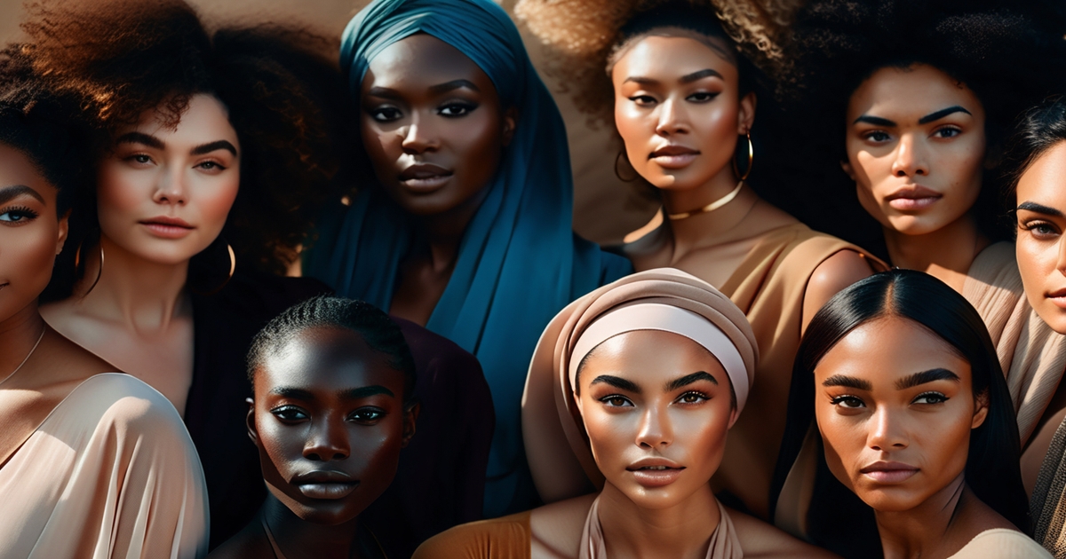
16 season color analysis categorizes personal coloring into 16 refined palettes according to undertone, value, and chroma. Based on the traditional four season system, it introduces light, deep, soft and bright splits to spring, summer, autumn and winter.
Skin, hair and eye mix guide the fit, not surface tone alone. To identify matches, swatches examine how colors appear on the face in natural light.
Coming up next, an unambiguous rule book, a few easy tests, and actual examples for reference.
📚 Recent Articles
Beyond the basic four seasons
Not all of us fit neatly into Spring, Summer, Autumn or Winter. The 12- and 16-season techniques evolved to address that gap by introducing subtlety. They pull from color theory origins (think Albert Munsell's notions of value, chroma, and hue) and project them onto actual features with blended characteristics.
That shift makes a difference for readers who hover in between warm and cool, or read light best but wear muted tones.
| Aspect | 4-Season System | 16-Season System |
|---|---|---|
| Core idea | Four broad groups: Spring, Summer, Autumn, Winter | Four groups split into precise subtypes |
| Key factors | General undertone and temperature | Undertone, value (light–dark), chroma (clear–muted), intensity |
| Personalization | Low to medium | High; fine-tuned to small shifts |
| Examples | "Winter" cool and high contrast | Dark Winter, Bright Winter, Cool Winter, Soft Winter, etc. |
| Fit for edge cases | Often poor | Strong; captures blended traits |
| Variations | Few | Multiple models; not standardized |
The 16-season lens is focused carefully on undertone, intensity, and lightness, since these determine how a color sits on skin. Undertone asks warm or cool, value if your features read light or dark, chroma if you glow in clear, bright color or calmer, dusty tones.
A cool person with cool skin, dark hair and crisp eyes may flourish in Dark Winter blue-green, while a cool person with pale skin and soft gray eyes may require Soft Summer mauve. Both are 'cool,' but color doesn't act that way. It comes in handy when eyes and hair give conflicting signals.
Ash-brown hair and warm amber flecked iris might skew cool in base, but love a bit of warmth in dusty greens. The subtype catches that mix.
Big seasons overlooks important nuances. 'Autumn' means warm, rich and earthy – but two Autumns rarely wear the same brown. One requires Dark Autumn espresso and teal, another Soft Autumn moss and camel.
The 16-season split provides subdivisions such as Light, Dark, Warm/Cool (aka True) and Bright/Soft (Muted) within each season, so you can categorize by what most influences the face. If lightness is the driver, Light Spring coral beats Warm Spring pumpkin. If chroma is the motor, Bright Winter fuchsia trumps Cool Winter burgundy.
Systems vary by school, and titles can move around, which confuses. Still, both the 12-season bridge and the 16-season detail map cater to those who straddle lines.
Strive to hit the upper driver—undertone, value or chroma—and sample test close to near-neighbor subtypes to verify best range.
The 16 season color analysis explained

Based on the principles of undertone, value and chroma, the 16 season system divides the traditional four seasons into Light/Dark, Warm/Cool and Bright/Muted sub-seasons to each. Color theory drives the palettes: hue defines temperature, value sets lightness or depth, and chroma marks clarity or softness.
Primary and complementary pairs steer harmony, while muted vs vibrant notes divide subtypes. There are several models—Sci\ART by Kathryn Kalisz is popular—so a pro kit or calibrated digital tool prevents mixups and captures subtlety.
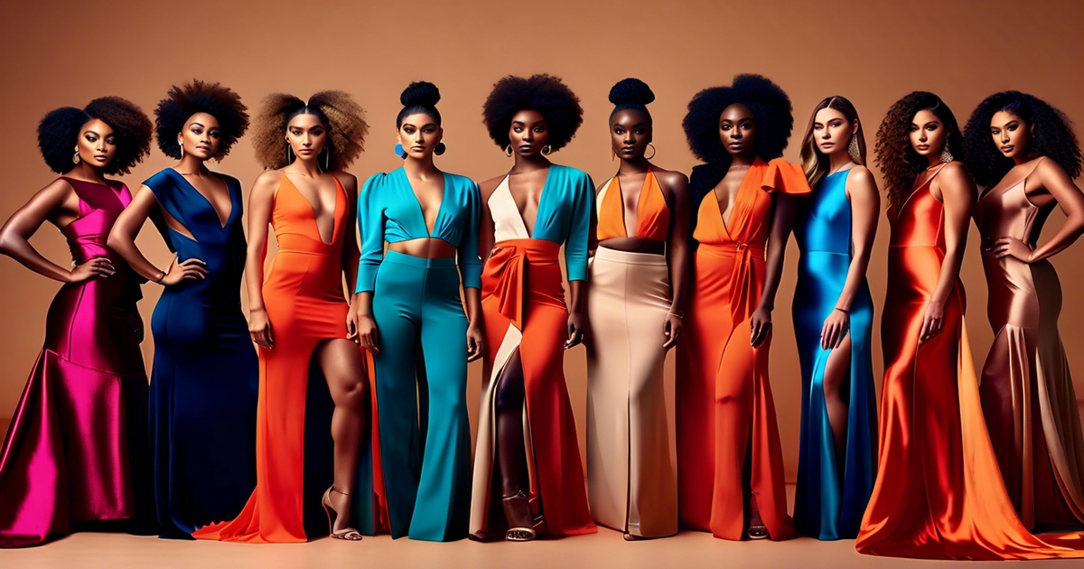
1. The four spring types
Light Spring, True Spring and Warm Spring, Bright Spring. All warm-leaning, lively and fresh, low to medium contrast.
Light Spring has light hair (wheat blond to light strawberry), fair warm skin and clear light eyes. Best colors: light warm corals, spearmint, pale aqua, light peach. Accents: butter yellow, warm turquoise.
True Spring (aka "Clear Warm" occasionally) brings golden skin, warm medium hair, brilliant green or topaz eyes. Best colors: warm clear hues—daffodil, warm coral, leaf green; accents: true teal, tomato red.
Warm Spring leans overtly warm with primavera tinges in hair, peachy-beige skin, and warm hazel eyes. Best colors: warm, slightly softer—apricot, warm olive, goldenrod. Accents: amber, warm teal.
Bright Spring has high chroma: bright eyes, glossy golden-brown or dark blond hair, clear warm skin. Best colors: vivid warm brights—hot coral, lime, bright turquoise; accents: clear yellow, warm fuchsia.
For reference, sketch out a basic chart contrasting undertone, value, chroma, and signature pops.
2. The four summer types
Light Summer, True Summer, Cool Summer, Soft Summer nestle on the cool side with soft, low-contrast mixtures.
Light Summer skews light and cool: ash-blond hair, fair cool skin, light blue or gray eyes. Reach for misty aqua, shell pink, powder blue.
True Summer is cool and muted: ashy hair, cool beige or rosy skin, gray-blue eyes. Go for dusty rose, denim blue, soft navy.
Cool Summer tilts coolest: very ashy hair, porcelain to cool olive skin, icy blue eyes. Most becoming in cool pastels and crisp soft blues.
Soft Summer is the most muted: mousy brown hair, cool-neutral skin, soft green or gray eyes. Select sage, mauve, heather, pewter. Try a color wheel or swatch tests in daylight to detect if you should sub in cooler or more muted shifts.
3. The four autumn types
Soft Autumn, True Autumn, Warm Autumn, Deep Autumn – earthy warmth, medium contrast.
Soft Autumn is warm and muted with blended features. Think moss, oatmeal, soft pumpkin.
True Autumn sits center-warm: golden-brown hair, warm beige skin, hazel or green eyes. Forest green, burnt orange, mustard, terracotta pop.
Warm Autumn (the warmest) is best with cinnamon, camel, marigold, warm teal.
Deep Autumn adds depth: dark hair, warm-deep skin or fair skin with dark features. Best in espresso, deep olive, auburn, pine. Print dominant base colors + 2-3 accents per subtype for convenient wardrobe edits!
4. The four winter types
Cool Winter, True Winter, Deep Winter, Bright Winter are cool, high-contrast, high-chroma.
Cool Winter requires the iciest, bluest of tones. True Winter accepts pure white, black, royal blue, magenta.
Deep Winter leans darkest with saturated jewel tones: ink navy, burgundy, pine, fuchsia. Bright Winter wants sharp clarity: icy cyan, bright raspberry, electric blue, stark white.
Typical coloring: dark hair; fair, olive, or deep skin; striking eyes ranging from icy blue to near-black. If you've ever felt like no standard season quite fits — especially with neutral-olive skin — the 16 season color analysis framework is the one system built to handle exactly that. Unlike the classic 4- or even 12-season models, the 16 color seasons approach maps three distinct axes — intensity (bright to soft), undertone (coolest to neutral-cool), and depth (light to dark) — making it precise enough to separate subtypes like Soft Autumn and Deep Summer that routinely get confused in simpler charts. A dedicated skin tone 16 season color analysis test accounts for the way olive undertones absorb and reflect color differently, preventing the misreads that plague broader systems. If previous quizzes left you stranded between seasons, running a proper 16 season color analysis test or a calibrated 16 color seasons quiz is the most reliable way to finally land in the right palette.
A pro kit or calibrated app enhances precision and minimizes guesswork. Its nuance allows those who fall between seasons the ability to find a tailor-made fit.
How to find your season
The 16-season color analysis is a refinement of the traditional 4-season model. It takes into account undertone (cool or warm), value (light or dark) and chroma (clear or muted) across skin, eyes and hair to provide a more nuanced match. This approach is particularly useful if you've never fit too well inside the 12-season charts.
Begin with natural coloring in daylight. Stand facing a window at noon. Wipe off the makeup, tint moisturizer and bright lipstick. Pull hair back with a neutral wrap to prevent the color from casting on your face.
Observe skin overtone (what you notice initially) and undertone (the underlying shade). Search veins at the wrist—blue or purple can suggest cool, green can suggest warm, mixed can indicate neutral—but trust more how colors bounce on your face.
Check eye patterns: are they soft and grayed (muted) or crisp with high contrast and clear spokes (bright)? Dark brown or black eyes tend to add value depth, while light blue, gray, or hazel can tend to push you toward lighter value ranges. Hair matters for value and chroma: ash tones read cool and muted, golden or copper reads warm, and very dark hair raises contrast even on pale skin.
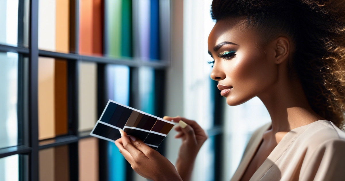
Consult a color consultant by way of either a color analysis kit or a trusted online swatch tool. You desire side-by-side tests with controlled steps. Try scarves, tees, or paper swatches in matched pairs: soft rose vs peach, icy pink vs warm coral, cool navy vs warm olive, bright teal vs dusty teal.
Hold each close to the face and watch for signs: healthy skin, even tone, fewer shadows, and brighter eyes mean "yes"; sallow skin, redness, or harsh lines mean "no." If live swatches aren't convenient, print top-notch swatches on matte paper or calibrated screen in daylight.
Undertones test by reactions to metal and primary colors. Silver jewelry flattered cool undertones. Gold flattered warm. Both looking fine could mean neutral. Put a cool blue swatch and a warm yellow swatch next to the face.
If blue soothes redness and sharpens eyes, that's one cool tip. If yellow exudes warmth without muting skin, that's a warm indicator. If both work only when softened, you can get away neutral-muted.
Document and narrow with a numbered log:
- Undertone: cool, warm, or neutral, with notes (e.g., silver best, gold okay).
- Value: light, medium, or deep based on how dark colors overwhelm or support.
- Chroma: bright/clear or soft/muted by how saturated colors look on you.
- Best test colors: list winners (e.g., cool navy, icy pink) and losers (e.g., warm camel).
- Contrast level: high, medium, or low between hair, skin, eyes.
- Map to families: cool + light + soft might suggest Light Summer or a similar cool-light-soft subtype; warm + deep + muted could indicate Deep Autumn Soft.
Notice that there are several 16 season systems, so names differ, but characteristics remain valuable.
- Re-test edge cases and confirm with neutrals: charcoal vs warm taupe, cool espresso vs chocolate, stone vs camel.
Anticipate overlap, as a few have characteristics of both neighbors. The 16-season grid covers those gray areas better than a 12-season set. Let your notes inform wardrobe choices, from jackets to lipstick, so outfits come together and you feel comfortable.
Why 16 seasons matter more
The 16-season system shatters the broad strokes of the basic four and plots how undertone, depth and contrast actually manifest on real faces. It provides you a palette that feels like a custom suit, not the one-size tee.
A finer tuned palette implies your optimal hues move with genuine subtlety. Nothing like 'Winter = cool and bright', you get specific lanes such as Bright Winter vs Cool Winter, or Soft Autumn vs Warm Autumn. That split matters when your skin reads neutral-cool, your hair ash-brown and your eyes muted-green.
One could radiate in cool raspberry and icy white, while another, a "winter," shine in ink navy and fuchsia, but not white. The 16-season map permits that fine-tune which many find more precise and more useful day to day.
Nuance rewards in what you choose and how you carry it. Clothing: a Soft Summer can swap harsh black for charcoal, dusty rose, and blue-grey, which smooths skin and calms redness.
Makeup: a Light Spring skips deep berry lipstick and wins with sheer coral, peach, and light apricot blush. Accessories: a Muted Autumn often looks best in brushed gold or bronze rather than high-shine yellow gold.
When colors correspond with your undertone, your depth and your contrast level, skin appears more clear, eyes have a glow of brightness and lines are softened—without adding additional product. That shift sounds like color, not noise.
The system embraces that individuals can straddle characteristics. Many of us sit between seasons or show mixed signals: cool skin with warm amber in the eyes, or deep hair with low-contrast skin.
By sub-grouping seasons, the 16-seasons approach defines that space and provides guidelines you can apply. If you're Deep but warm-leaning, you maintain depth (ink, espresso, pine) and introduce warmth (spice, marigold) judiciously.
If you're Light and cool, you remain light and airy (mist, shell pink) but steer away from golden beiges that can make the face look dull. This is when fresh, flattering colors pop up—tones you might never experiment with in a 4-season box.
Global inclusivity is inherent. The enlarged collection contains more breadth of skins, from very dark to very light, with cool, warm and neutral inclines. Silver, jet and copper hair.
Eyes from near-black to icy blue. A Deep Winter on deep skin will sing in saturated jewel tones and clean contrasts. A Warm Spring on medium-golden skin will sparkle in sheer melon, cantaloupe, and warm turquoise.
It's not about shoehorning in a tag but rather helping you read your mix and steer smarter selections across the board—wardrobe schemes, traveling capsules, work uniforms, even wedding palettes.
Applying your color palette

Color analysis really pays off when it informs everyday decisions. Your 16-season palette tells you what to wear, buy, and pair — so tones close to your face resonate with your undertone, value and chroma. The goal is a consistent, complementary appearance that suits your skin, hair and eye coloring.
Keep tabs on what gets compliments or makes you feel great — those feedback data points hone that palette to your perfect contrast and intensity.
Wardrobe
Begin with your best colored clothes. Pull two or three dominant colors from your season, then spice with a few accents. Light Summers shine in cool, diaphanous hues like misty blue, seafoam and cool pewter, never warm beige or tomato red.
Bright Springs can carry off vivid aqua, sheer coral, and optic white with ease. Soft Summers favor muted, cool mixes such as dusty rose and fog gray.
Construct miniature capsules. Let your neutrals–cool navy, charcoal, cocoa, stone, or warm camel depending on season–be your anchors. Add one statement color top and one pattern piece with two of your palette colors for simple mixing.
Mix and match for balance. Balance a bright top with a subdued neutral bottom. Experiment with column dressing (same-color top and pants) with an accent jacket for shape. Experiment with textures—matte knits subdue brights. Sheen intensifies soft tones.
Guardrails are useful. Pass on colors that compete with your undertone or value. If a hue renders your complexion lifeless or sallow, it's probably outside your chroma sweet spot.
Reserve one "test day" a month to sample a new shade in daylight and observe the effects.
Makeup
Select base products that fit undertone first, then depth. Cool seasons tend to like pink or neutral-cool foundations. Warm seasons lean golden or olive. Blush should reflect your lip's natural flush in your palette's chroma.
Accent eyes with coordinating colors. Cool taupe, slate and plums flatter cool types. Warm olives, bronze and copper suit warm types. Eyeliner depth should match your natural contrast: deeper for Bright Spring or Deep Winter, softer for Light Summer or Soft Summer.
Try all the seasonal reds, pinks, and berries. Bright Spring can sport transparent coral-red. Light Summer does better with cool rose.
If a lip renders your teeth yellow or your skin ashy, warm it or cool it or desaturate it. Steer clear of stark contrast that overshadows your face, or muted colors that wash it out. Shoot for lift, not racket.
Accessories
Match metal to undertone: gold for warm, silver for cool, rose gold for many soft or neutral types. If you're not sure, hold metals close to bare skin, in daylight, and select the one that smooths discoloration.
Utilize scarves, hats and bags as color pops. A teal scarf can really wake a navy coat. A cool berry bag enlivens Soft Summer denim.
Save shoe and belts in palette neutrals for clean lines. Rotate accessories by season–exchange light, cool pieces for warmer months to deeper, richer ones during colder months–all while remaining within your color best palette.
The future of color analysis
Color analysis is evolving from a fixed chart to a dynamic ecosystem. The 16 season model is the future of color analysis, and it will continue growing with new tech, new science, and a clear eye on ethics. This evolution ensures that more people see themselves in it and use it with ease in daily life.
Predict advancements in digital color analysis tools and apps for instant, accurate season identification
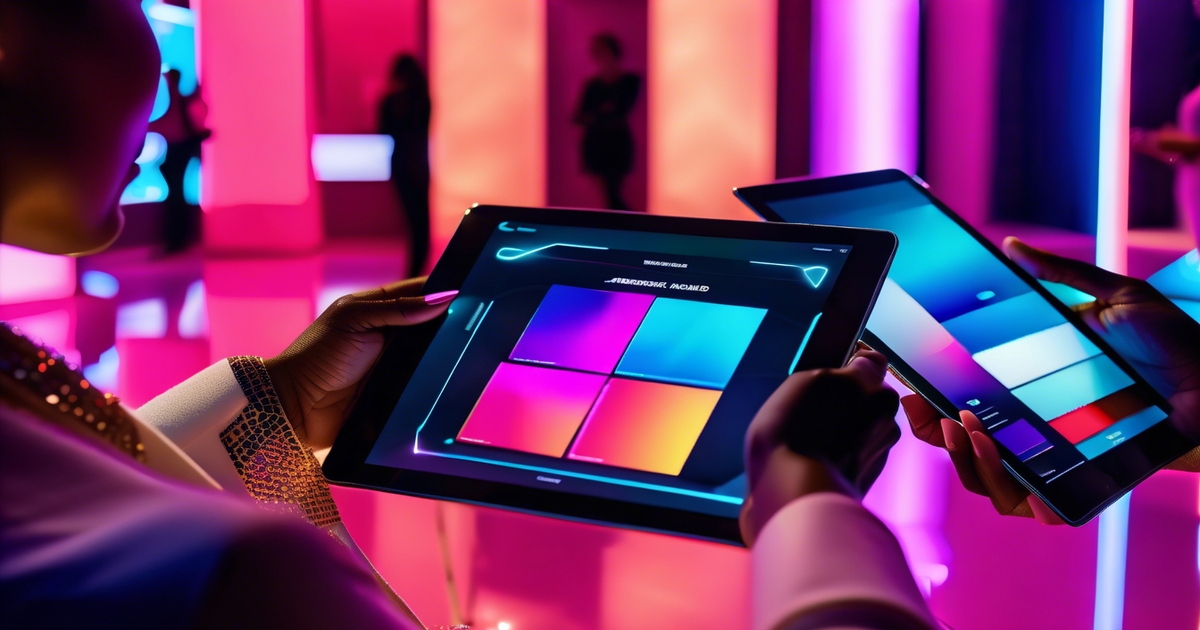
Apps have moved well beyond selfie filters — today's best tools for 16 season color analysis use camera color calibration, daylight simulation, and even portable spectrophotometer support to read undertone, value, and chroma in seconds. One critical trap to avoid: your phone's auto-white balance is the enemy of an accurate 16 color analysis result. Before taking any 16 season color analysis test or seasonal color analysis quiz, switch your camera to Pro Mode and lock white balance at 5500K — this single step eliminates the most common reason people get conflicting results across different apps. Most leading platforms have shifted to a freemium model (typically around $49/year for the full 16 color seasons breakdown), so you can start your 16 season color analysis quiz for free and only upgrade if you want the deep-dive palette report. If you find your skin tone 16 season color analysis test results vary between apps, the culprit is almost always inconsistent lighting or uncalibrated camera input — not the algorithm itself.
AI will cross-reference skin, hair and eye information across frames, eliminating mistakes from lighting or makeup. Think quick scans that recommend Soft Summer vs. Light Summer based on subtle changes in mutedness, then drills down to top 5 shades with hex codes and CMYK values for shopping and design.
With privacy a must, offline processing and transparent data consent will weigh as much as precision.
Anticipate more inclusive systems that recognize a wider spectrum of global skin tones and coloring
Future tools will be trained on wider datasets across multiple areas and generations. That is to say, improved reads for deeper skin with olive casts, cool ash tones in the mid-ranges or warm-leaning fair skin with high contrast eyes.
Anticipate additional micro-seasons or fluid boundaries within each of the 16, so a Deep Autumn with cool sway doesn't get compressed into a monolithic palette. Hair color changes, sun exposure, and cultural dress colors will be input to help tune the match in an unbiased manner.
Expect integration of color analysis with online shopping and virtual wardrobe guides for personalized recommendations
Color profiles will plug into e‑commerce. You'll see "best in your palette" flags, shade filters that filter out near-misses, and try‑on that maps true color under neutral light.
Your wardrobe planner can tag what you own, highlight gaps, and recommend mix‑and‑match sets that fit your season and lifestyle. Travel packs, capsule lists and makeup shade maps will sync across brands, with hex codes that align with both fabric and product lines.
It marries classic draping with AI picks, creating a loop of test, wear, adjust.
Foresee growing influence of color theory in fashion, beauty, and graphic design as consumers seek custom palettes
Brands will construct collections around subtle saturation and brilliance, not just fashion tints. Beauty will tag foundations and lipsticks by undertone clarity and print and digital design will allow users to export their seasonal palette for slides, logos and social posts.
Research will fold in genetics and environment to explain why we see cool vs. Warm shifts, and even observe how mood and personality inform color comfort. The result: tighter, more precise palettes that still feel human and personal.
Conclusion
To bring it full circle, the 16 season color system provides genuine assistance. It reveals definitive choices, not fuzzy impressions. A cool olive tee for a Soft Autumn. A crisp berry lip for a Cool Winter. A crisp mint shirt for a Light Spring. A deep pine coat for a Deep Winter. Because small swaps add up quickly. Clothes look smart. Skin feels fresh. Shopping becomes a snap. Prices come down.
To stay real, test in daylight. Throw on a white tee. Compare two side by side. Take a quick picture. Remember what illuminates your face. Craft a close-knit collection of daily shades.
Don't let a $10 app subscription dictate your $1000 wardrobe without a sanity check. Whether you're wrestling with olive undertones, getting burned by ring-light distortion, or bouncing between three different results on every 16 season color analysis test you try — you're not alone. Drop your wins and fails in the comments: tell me which 16 seasonal color analysis quiz finally clicked for you, or where the 16 color seasons system completely lost you. Two things that worked, one thing that didn't. I'm listening.
Frequently Asked Questions
What is the 16 season color analysis?
It's an elegant system that breaks down the traditional four seasons into 16 sub-categories. It takes into account undertone, value (light to dark) and chroma (soft to bright). This provides more specific palettes that correspond more closely to actual skin/hair/eye combinations for more flattering results.
How is it different from the basic four seasons?
The 16 seasons add subtlety. No broad categories either, you get subtypes such as Light Summer or Deep Autumn. This captures subtle shifts in temperature, depth, and saturation, rendering your palette more precise and more wearable.
How can I find my season at home?
Start with undertone: cool, warm, or neutral. Evaluate value (light, medium, deep) and chroma (soft or bright). Try fabrics or digital swatches near your face in natural light. Notice what colors smooth your skin and sparkle your eyes. Think about a pro consult for precision.
Why do 16 seasons matter more today?
Contemporary lighting, photos and eclectic attributes require accuracy. This 16-season model eliminates guesswork, supports inclusive palettes, and enhances wardrobe cohesion. You purchase less, select wisely, and appear effortlessly put-together from context to context and season to season.
Can neutral undertones fit into the 16 seasons?
Yes. Neutral undertones tend to fall in the neutral-leaning seasons such as Soft Summer, Soft Autumn or True/Neutral. The key is balance: mid-temperature hues, moderated saturation, and neither overly cool nor overly warm colors usually work best.
How do I apply my palette when shopping?
Apply your season as a filter. Focus on tops, scarves and lipsticks in your best shades. Select neutrals that share your undertone and value. Contrast pieces in natural lighting. Build your capsule around 8–12 core colors to make mixing and matching easy.
Will my season change over time?
It can shift a little. Hair graying, tanning, and aging can affect value and contrast. Your undertone typically remains constant, but chroma and depth can mellow. Revisit your palette after significant changes to keep your colors in sync with your features.