What Colors Look Best on Pale Skin? A Complete Guide

Key Takeaways
- Skip the guesswork on undertones — use the vein test as a starting point, but know it regularly misleads on very fair complexions. Cross-check with jewelry (silver vs. gold), your reaction to sun exposure, and how your skin looks against a crisp white vs. warm ivory fabric. The more clues you stack, the sharper your pale skin color palette becomes — and that precision is what separates a wardrobe that works from one that just hangs there.
- Build your foundation on the best colors for pale skin: jewel tones for impact, soft pastels for everyday ease, and carefully chosen neutrals for versatility. Neon shades are a hard pass — they create harsh contrast that pushes fair skin toward a grayish, washed-out look. When you want warmth, reach for muted peach, dusty rose or soft camel rather than anything screaming off the rack.
- Match your hues to your undertone and watch everything click into place. Cool undertones — the ones that make midnight navy universally flattering on pale skin — also glow in icy blue, lavender and deep emerald. Warm undertones come alive in camel, warm taupe and muted terracotta. Neutral undertones have the widest runway: lean into mid-tones that blend cool and warm without tipping either way.
- Think in contrast levels, not just colors. Deep jewel tones against fair skin deliver maximum drama — sapphire, amethyst, forest green. Soft pastels like powder blue and blush pink keep things light and luminous. Mid-tones — dusty rose, warm gray, muted burgundy — hit the sweet spot for polished, everyday dressing that never looks overdone.
- Digital vs. physical matters more than most style guides admit. The best colors on pale skin for a Zoom call are not always the same as what looks stunning in person. On camera, deep darks like navy and burgundy prevent that flat, gray-screen effect — pair them with a cool-white ring light for maximum clarity. In natural daylight or under high-CRI store lighting, pastels and jewel tones both perform beautifully, but always test fabrics near your face before committing. What glows on your phone screen may read differently under fitting-room LEDs.
- Let seasonal color logic streamline your choices year-round. Spring calls for warm, light hues; summer rewards cool pastels like lavender and mint; autumn is the season for rich earth tones and burgundy; winter is where bold jewel tones and crisp white truly shine. Anchoring your shopping to these seasonal cues makes building a cohesive wardrobe — one where the best clothing colors for fair skin always feel intentional — far less overwhelming.
- Fabric finish is the final variable. Matte textures — cotton, linen, brushed wool — keep the focus on color without competing with your complexion. Silk and satin add luminosity in small doses, amplifying jewel tones like emerald or deep plum. The rule: let sheen serve the color, not overpower the skin. Balance both and you'll never look swamped.
Rich jewel tones, cool blues, soft pastels, and clear neutrals look good on pale skin. Emerald, sapphire and amethyst add depth but don't wash out the face. Icy blue, teal and true navy provide sharp contrast.
💫 Discover Your Complete Color Palette
Ready to discover all the colors that make you look radiant? Our comprehensive color analysis will reveal your complete personal palette - perfect for hair, makeup, and wardrobe decisions.
Find My Color Palette →Blush pink, lavender and mint add light warmth and crisp white, charcoal or cool gray keep a clean base. To split options with simplicity, the following sections present tone palettes, ensemble advice and convenient combos for everyday wear.
📚 Recent Articles
How to find your undertone
Undertone lies under surface color and remains consistent throughout the seasons. For pale skin, it lets you choose hues that give you a glow, not a glare. The three classic undertones are cool, warm and neutral.
Cool goes pink, red or blue; warm goes yellow, peach or golden; neutral settles in the middle. Olive skin is its own case: a blend of neutral and warm with a green cast. Hair can hint, as well—ashy blonde or black with blue tones frequently indicates cool.
Quick reference for undertone indicators:
- Cool: silver looks bright, veins look blue, burns fast, blue/pink-tinted colors flatter
- Warm: gold looks rich, veins look green, tans easier, earthy tones flatter
- Neutral: both metals work, veins mixed, most colors look ok
- Olive: some gold works, muted earthy colors flatter, certain bright pinks may look off
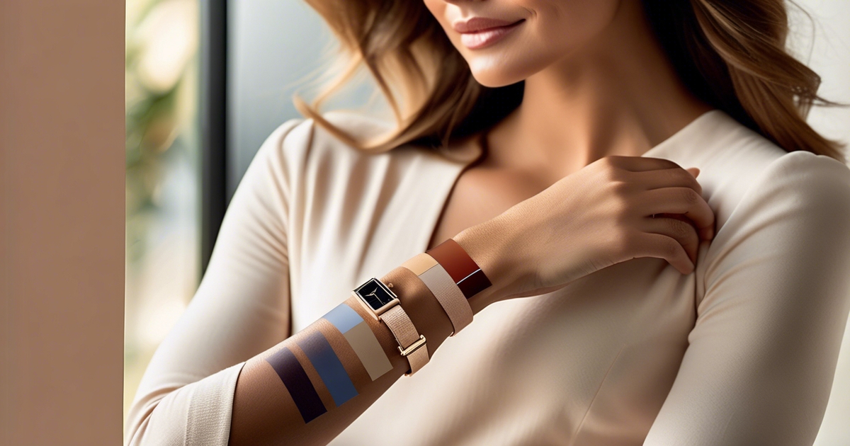
The vein test
Look at wrist veins in daylight by a window. If they read blue or purple, you probably have a cool undertone. If they skew green, warm it is. If you can't tell OR they look both, you may be neutral.
On very fair skin, veins can appear teal – rely more on your other tests if it's ambiguous. Contrast the two arms. One might be closer to a blaring screen or a shady desk all day and skew the color, so take more than one look.
Digital Gray-out Warning: If you spend hours on Zoom calls or work in front of an OLED screen, you've likely noticed how pale skin can vanish into a washed-out, ghostly blur on camera. The fix is deliberate contrast: colors like midnight navy, deep burgundy, or forest green are among the best colors for pale skin precisely because they anchor your complexion against the screen's cold luminance. When choosing what colors look best on pale skin for video calls, push toward higher saturation — muted or pastel shades that look lovely in person can read as flat gray on a webcam feed. There's another sneaky culprit worth knowing about: blue light glasses with yellow-tinted lenses. While they protect your eyes, that warm amber filter subtly shifts how you perceive your own undertone in the mirror. What looks like a clean cool-pink or neutral in natural light can appear as a sickly olive-green on camera — completely undermining your carefully curated pale skin color palette. Always do a final color check under natural daylight before committing to your on-screen wardrobe, and when in doubt, reach for midnight navy — it's the single most reliable anchor in any best colors for fair skin lineup.
Sneak a look at veins of the inner elbow and neck side if wrist is light. Skin thickness and lighting alter the appearance of veins. Take it to begin a palette. Cool undertones fare well with blue-based reds, berry pinks, cobalt and lavender.
Warm undertones glow in olive, terracotta, golden brown, coral and mustard. Neutral can span both without appearing washed out.
The jewelry test
Try on a simple silver link chain, then a simple gold one. See which metal makes your skin appear clear and even, not sallow or gray. If silver awakens your tone, cool is likely.
If gold brings warmth and glow, warm probably is. If both feel fine, perhaps you're neutral; olive might favor softly brushed gold or antique finishes rather than harsh yellow.
Weirdly, preferences inform more than palate–they direct fashion and cosmetic purchases. Use the metal cue for hardware on bags, belt buckles and glasses frames then echo that warmth or coolness in tops and lip colors.
| Your pick | Likely undertone | Metals to favor | Color cues |
|---|---|---|---|
| Silver | Cool | Silver, platinum | Blue-reds, pinks, purples |
| Gold | Warm | Yellow/rose gold | Olive, terracotta, golden brown |
| Both | Neutral/Olive | Mixed metals | Wide range; muted earthy for olive |
The sun's reaction
See how your skin reacts after 15–30 minutes in the sun with SPF. If you burn quickly and seldom tan, that skews cool. If you tan with little burn, that's warm leaning. Neutral can sit in between.
Take this as a hint, not a conclusion. Let it guide swim and summer selections. Cool undertones can frequently appear fresh in icy blues, raspberry and cool emerald.
Warm undertones radiate in coral, tomato red, turmeric and warm teal. If a shade makes you look sallow, it's probably clashing with undertone.
Combine sun behavior with veins and jewelry for the complete read. When all three concur, you can purchase with confidence.
The best colors for pale skin
Color selection can either energize pale skin tones or subdue them. Jewel tones, soft pastels, and certain neutral colors generally do the most good, while harsh neons and stark whites typically work against you. Build a small color palette that complements your overall complexion: emerald green, sapphire or cobalt blue, blush pink, navy, plus a few soft creams and cool browns.
1. Cool undertones
If your skin leans blue or pink, icy blues, lavender and amethyst reflect that cool undertone and make your complexion appear clear — and yes, Digital Lavender is genuinely one of the best colors for pale skin right now, not just a fleeting trend. Pastels like baby blue and mint green bring in light without draining your face. A word of warning about the Strawberry Girl aesthetic, though: those warm, peachy pinks that look dreamy on warmer complexions will make cool-toned pale skin look flushed, ruddy, or even slightly bruised. Colors with a warm or yellow base clash with pink undertones rather than flatter them, so swap the strawberry pinks for cool blush or soft lavender and you'll get the softness of the look without the unintended side effects. When it comes to finding the best color for pale skin with cool undertones, the rule is simple: lean into the cool, never fight it.
Jewel tones are so crisp against fair skin! Sapphire and cobalt blue define features. Emerald green comes off lush and vibrant against pale skin. Deep purple—Bordeaux and burgundy types of shades—throws in some depth for evening and winter.
Avoid super warm earth tones (rust, mustard, burnt orange). They can leave cool undertones lifeless. For year-round mix and match, build a core closet around navy, charcoal, cool gray, soft white-cream and those cool jewel tones.
2. Warm undertones
Warm pale skin with yellow or peach undertones radiates next to peach, camel, cream and soft coral. These shades mirror the warmth instead of battling it.
Pastels assist as well. Mint green and blush pink both feel fresh and soft, perfect for shirts close to the face. Stay away from harsh white and cool, blue-leaning grays, which are capable of giving a sallow appearance.
Throw in warm reds (tomato, coral-red), soft oranges like apricot and golden browns for everyday wear. Brown replaces black when black feels harsh—it maintains definition but appears softer next to warm skin.
3. Neutral undertones
Neutral pale skin invites from both sides. Pair powder blue with a soft beige, or rose with taupe, for equilibrium. Navy, taupe and muted rose are reliable in work or casual looks.
Avoid extremes: ultra-cool ice or ultra-warm neon will tip the balance. Maintain a fluid palette so you can push warmer or cooler as sun, season or spirit shifts.
4. Universal shades
A handful of shades genuinely work across the full spectrum of pale skin color palettes — but the details matter. Midnight navy edges out black as the most universally flattering anchor: it softens features, creates striking contrast, and reads as polished whether you're on a Zoom call or out for dinner. Emerald green is another standout — its depth makes it one of the best colors for fair skin, looking lush and vibrant rather than washed out. Soft gray rounds out the trio beautifully. Teal, however, deserves an honest caveat: while it ranks among the colors that look good on pale skin in theory, the fabric makes all the difference. In cheap recycled polyester, teal develops a harsh plastic sheen that bounces light unflattering ways — leaving fair complexions looking muddy rather than radiant. If teal is your go-to, invest in silk or natural-fiber versions to get the true payoff. The same rule applies to any of these deep tones: the best colors on pale skin only deliver when the fabric quality lets them breathe.
Use these as ground layers, then throw a pastel scarf or jewel-tone bag on top. If you're unsure of your undertone, lean on navy, teal, soft gray and emerald to play it safe.
Top universal picks:
- Navy
- Teal
- Soft gray
- Emerald
5. Colors to reconsider
Neon shades are among the worst offenders when it comes to colors that look good on pale skin — and 2026's trending Electric Moss and Cyber Lime are no exception. These high-voltage hues create a harsh "graying" effect on fair complexions that no amount of highlighter or foundation can counteract. Bright yellows and fiery oranges pose a similar problem, draining warmth from the face rather than enhancing it. If you're drawn to these shades, pivot to softer alternatives: muted mustard, butter yellow, or pastel peach deliver the same energy without the complexion-dulling fallout. When building your pale skin color palette, the rule is simple — the more saturated and electric the tone, the more it works against you.
Swap in cooler, lighter browns for the harsh browns. Restrict pure white. Cream or off-white is more flattering and spares you the washed out, tired effect. Maintain a basic 'warning' list in your phone for shopping days.
Beyond color: the role of contrast
Contrast is the connection between your skin, hair, and clothes that defines how others interpret your face. It's about more than color. It's about contrast — light and dark, warm and cool, matte and shine — and how our human eyes process them. So much so that some color pundits will tell you contrast can be more important than color.
When pale skin is the canvas, contrast levels assist in feature definition, balance construction, and eye direction. With a plan, you can go from soft to bold without revamping your entire wardrobe.
High contrast
High contrast, that is, means strong shifts in lightness or color. On pale skin, deep, saturated tones—black, ink navy, forest, burgundy, aubergine, emerald—immediately sing. Pair them with light pieces — think ivory, soft white, or pale blush — to softly frame the face and make your eyes and lips pop. Even a deep blazer over a light shirt works.
Bring it to this level any time you desire drama or formality. Dinners, football games, overview. Black and white provides the crispest division, but it can overpower certain complexions – experiment with navy and ivory, or deep teal and pearl gray for a gentler contrast.
Complementary pairs, like emerald and red-violet, can work as well, but try them out, because not every combo works with every undertone or style. Clean up the line. Sharp collars, defined seams and precise accessories carry the visual tension. A deep lip or crisp liner can echo the outfit's vibe and hold the face-centric.
Low contrast
Low contrast draws clothing and skin near each other in lightness for a serene, annealed appearance. Think pastels, soft grays, creams, pale peach, powder blue and light sage. These options compliment fair skin when you desire soft simplicity and a dash of romance.
They register as sophisticated, not glossy, if you superimpose patterns—tabby with paisley, matte with a whisper of sparkle—to give you dimension without drastic transitions. Steer clear of harsh leaps that submerge subtle ones. A pale dress with soft beige shoe and pearl earring keeps with the symphony.
Warm hues, such as butter cream or blush lend a softness lift, cool tones such as mist gray or lavender breathe air and space. Both paths can be nuance, simply take a track and remain in a tight band.
Medium contrast
Medium contrast is that perfect middle-ground between the soft and bold, great for everyday wear and lots of work environments. Mix mid-tones—dusty rose, medium blue, slate, camel, sage green—against pale skin to add definition without static. A medium-blue shirt with taupe trousers is sharp.
Incorporate a soft scarf to connect face and get-up. It dies hard. Transition casual to professional by exchanging sneakers for loafers or introducing a structured jacket. Accessories and makeup fine-tune the level: a darker belt, a richer brow, or a berry lip nudges the scale higher.
Nude shoes, soft highlight, and minimal liner pull it lower. Remember warmth shifts effect as well–warm camel next to cool pale skin plays stronger than cool gray, even at the same lightness. Medium contrast is the safe zone for neutral hair and delicate features, offering harmony without hijacking attention.
Your personal seasonal palette
Seasonal color analysis connects what you wear to the undertone of your skin, hair and eyes. Most people are warm/golden or cool/ashy, then one of four main types—Spring, Summer, Autumn, Winter. Each type can be light, soft, clear or deep depending on your contrast level.
Clear season types (such as Clear Spring and Clear Winter) come across the least muted. If you swing between two seasons—like Autumn and Winter—that's okay, try both. Coordinating your closet to a seasonal palette keeps outfits working together, guides makeup decisions, and even simplifies shopping all year round.
| Season | Undertone | Core Neutrals | Best Colors | Avoid |
|---|---|---|---|---|
| Spring | Warm, clear/light | warm beige, camel | peach, coral, neo mint, light aqua | dusty, cool grays |
| Summer | Cool, soft/light | cool taupe, soft gray | powder blue, lavender, blush pink | harsh black, neon |
| Autumn | Warm, soft/deep | camel, warm gray, chocolate | burgundy, olive, muted orange, deep emerald | icy pastels |
| Winter | Cool, clear/deep | navy, charcoal, crisp white | sapphire, amethyst, deep emerald, fuchsia | muddy browns |
Spring
Light, warm colors lift pale skin with a golden or neutral cast. Peach, coral and neo mint add life without overwhelm, particularly if your contrast is light to medium.
Soft beige and pastels are my daily drivers. Think warm ivory blouses, sand chinos and a coral lip. Clear Spring—golden light to dark brown hair, pink leaning skin, green, blue or light brown eyes—look best in clear, bright shades.
Playful outfits go great. Combine a mint tee with a camel skirt, studded with gold. Complete with florals and light fabrics—cotton voile, linen, silk blends—to maintain an airy, bright look.
Summer
Cool pastels flatter cool/ashy undertones. Powder blue, lavender and blush pink soothe pale skin.
Serene blues and soft neutrals—cool taupe, dove gray—set a breezy foundation. Avoid heavy, dark colors that can appear sharp in the sun's strength and dilute you.
Layer airy fabrics in pale shades: a mist-gray cardigan over a blue slip dress with silver jewelry.
Autumn
Dark earth tones flatter warm, soft palettes. Burgundy, camel and warm gray make pale skin look sophisticated instead of flushed.
Add depth with accents like deep emerald and muted orange. Soft Autumns have minimal contrast between their hair and skin, so opt for blended, mellow colors.
Add texture—wool, suede, tweed—for a grounded feel. Bridge seasons by pairing a light chambray shirt with an olive skirt, then top it off with a rust scarf as days cool.
Winter
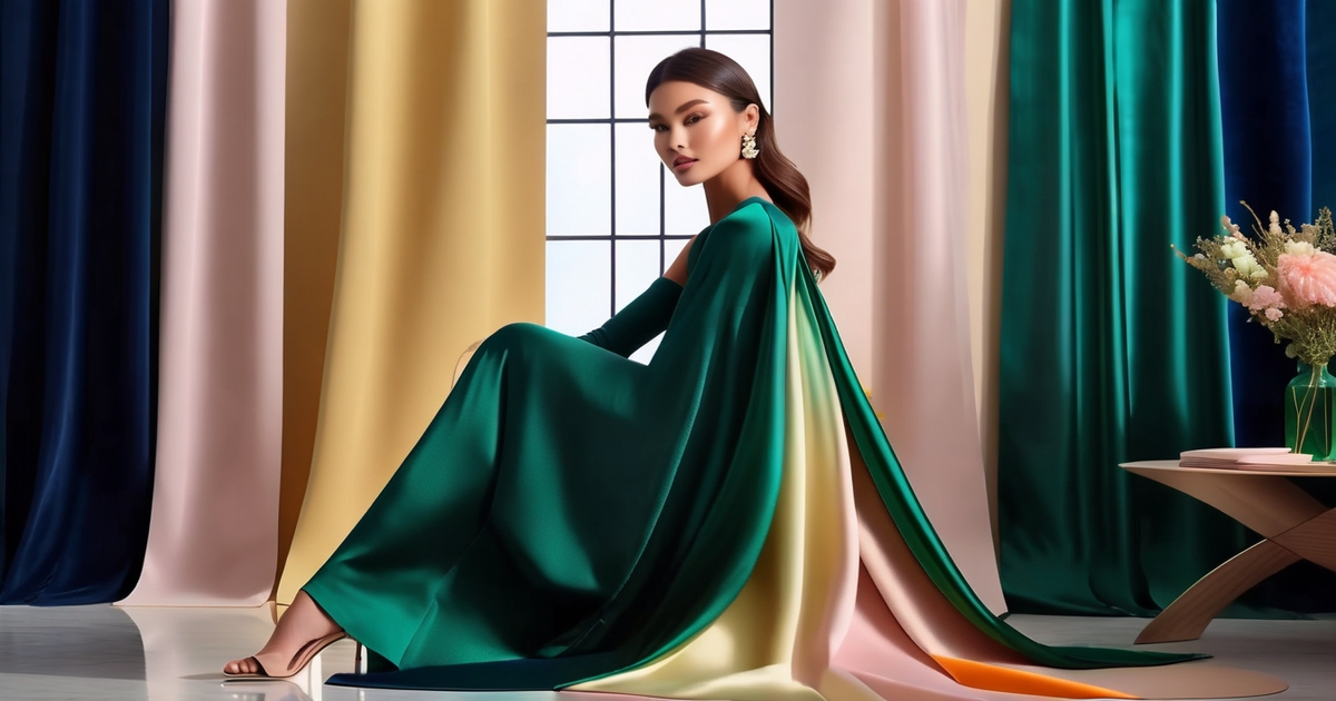
Bold jewel tones adore cool, high-contrast colorings. Sapphire, amethyst and deep emerald pop against pale skin without turning harsh.
Go for crisp contrast: navy, charcoal, and clean white. Structured fabrics—gabardine, satin, fine knits—and metallics (silver, gunmetal) recall winter's clearness.
Create a mini capsule with your navy coat, charcoal pants, white shirt, and fuchsia and emerald tops. Clear Winter types pop best in the clearest, least muted shades.
The texture and fabric effect
Texture can alter the way a color reads on fair skin. Silky, dense weaves reflect light and render shades sharp. Coarse or napped textures absorb light and tone down a shade. Finish counts, too. Matte keeps it zen, sheen adds shine.
Consider season and setting, then combine textures with your color scheme so looks bounce between work, weekends, and occasions.
Matte fabrics
Matte fabrics provide a smooth, elevated foundation that keeps shine away from the skin, something which can assist if you discover glare makes you look washed out. Cotton, linen and wool are good bets for a natural, low-sheen effect.
That they complement a majority of color stories and feel good against the skin for everyday wear. For everyday, grab mid-weight cotton tees, crisp poplin shirts and brushed twill chinos.
In heat, linen suits fair skin and bright light. Its loose weave allows colors to breathe so they appear ever so slightly softer – which can be merciful to bold reds or cobalt. During cooler months, felted wool, flannel and cashmere add dimensionality while maintaining colors matte rather than lustrous.
Matte textures are powerful allies for bold colors. A matte emerald sweater, a navy denim jacket or maroon corduroy skirt looks rich without shine. If you want chic, avoid glossy poly blends or sleek satins around the face.
Keep buttons, zippers and jewelry low-key too, so the skin stays the quiet focal point.
Sheen fabrics
Sheen gives depth and a soft radiance. Satin, silk and soft metallics can illuminate color that can make pallid skin almost glow with life, without the need for thick makeup. Sheen-y textiles such as silk refract light, therefore jewel tones look bright.
Wool or tweed, on the other hand, can soak up the light and mutes even that same color. Apply shine with purpose. Go for a teal silk scarf, a satin camisole beneath a matte blazer or metallic shoes with a charcoal dress.
Little shiny pops close to the collarbone or wrists provide lift without overwhelming the face. Leave the rest matte—denim, cotton, ponte—so the glow remains grounded.
High-sheen pieces fall most appropriately in evening or formal environments. City lights or indoor nooks – satin and soft metallics sing in it. For day, select semi-matte silk crepe or washed satin, which have a more hushed sheen that complements pale skin.
Remember personal taste: some love velvet or lace for a luxe feel, while others favor breathable cotton or bamboo for comfort. Season and context dictate the blend.
In warm weather, lighter, airy fabrics like cotton and linen keep colors crisp. Wool, tweed and fleece in cold months bring weight, so offset with a sleek scarf or satin lining. Tighter weaves make colors look more saturated, looser weaves read muted.
Blend fabrics–matte knit with a silk skirt, tweed with a satin blouse to create dimensionality.
Common color mistakes to avoid
While the right color palette can elevate pale skin tones, the wrong colors can flounder it. These common traps reveal what to skip, why it counts, and how to pivot to shades that feel fresh and balanced.
Steer clear of neon and overly bright colors that can wash out pale skin tones.
Neon pink, highlighter green and electric orange toss sharp light back onto the face. On fair skin, that glare can make features appear flat and skin sallow or even grey-green, particularly in the winter months when skin is bereft of warmth.
When you want pop, pick saturated but softened hues: tomato red instead of traffic-cone orange, raspberry instead of neon fuchsia, or teal instead of acid green. Cobalt blue, a strong jewel tone, can sing on fair skin, but it's not universal.
If it overpowers your face or emphasizes darkening under eye shadows, try gentler blues like denim, slate or soft navy. Brilliant yellow is tricky for many. If it makes you look off or tired, you sit in a true soft warm light family—go butter, marigold, or mustard instead of school-bus yellow.
Avoid wearing only stark white or black, as these can create an unflattering contrast.
Pure white can leach warmth, pure black can drag down the face and accentuate redness or dark circles. Switch to off-white (ivory, ecru, bone) that adds quiet glow, or to midnight, charcoal and ink in place of hard black.
Notice how your skin shifts with combos: black plus crisp white can push skin to that grey-green cast in cold months. Go for ink blue with oyster, charcoal with blush or soft camel with cream for gentler contrast that still looks crisp.
Don't rely solely on trendy colors; prioritize shades that enhance your natural undertones.
Trends are fleeting, your undertone is not. Emerald green looks gorgeous on feeds but is difficult to wear. It works for some spring or summer types, but can clash on others and make skin appear sallow.
If you lean cool, try blue based reds, berry, cool pink and pewter. If you lean warm, think terracotta, coral, olive and warm taupe. If you feel both warm and cool at once—often called soft cool or soft warm—stick with muted, blended shades: dusty rose, sage, smoky teal, and heather.
Pastels can work in winter and provide a fresh pop – opt for misty (ice blue, lilac, mint) rather than chalky.
Keep a checklist of common pitfalls to ensure your color choices always flatter your complexion.
- Does this shade highlight under-eye circles or redness?
- Do I appear ill, grey-green, or just in desperate need of a vacation?
- Is the contrast too harsh (pure black, pure white)?
- Is the color neon or highlighter-bright?
- Would a softer, muted, or off-white/ink swap solve it?
- Do I get a better tan in this on a rested day?
- Have I tried both cool and warm in the same color family?
Conclusion
To conclude, less pigmented skin can glow with the perfect shade, cut and touch. Soft cool pink will lift cool pale skin. Warm peach can warm a golden base. Deep teal will add snap without washout. Or a crisp white shirt can pop next to a freckled face. A rib knit dress provides some dimension where a flat jersey lacks.
One quick test helps on busy days: hold two tops in good light. Choose the one that brings your face alive, not one that washes you out.
Little substitutions get you a long way. Swap black for navy. Trigger mint for sage. Pair a rose lip with a moss scarf. Take a daylight photo and see the glow. Sooooo, who's ready to take just 1 new color for a spin this week! Tell us your choice!
Frequently Asked Questions
How do I tell if my undertone is cool, warm, or neutral?
Examine your veins in daylight: blue or purple suggests cool skin tones, while green indicates warm undertones; a mix points to a neutral skin tone. Silver jewelry flatters cool tones, while gold complements warm hues.
What colors generally flatter pale skin?
Soft pastels, jewel tones, and rich neutrals look good for various skin tones. Try colors like emerald, sapphire, and burgundy while steering clear of beige, which can wash out those with lighter skin undertones.
Should I avoid black if I have pale skin?
Not necessarily. Black always looked good with the contrast. Just balance it out with a softer top or bright lip or textured fabrics. For softer contrast, experiment with charcoal, navy, or deep forest green.
How does contrast affect outfit choices for pale skin?
Match your clothing contrast to your features, especially considering your skin tone. If you have light hair and brows, opt for softer contrasts, while dark-haired individuals with light skin can wear higher contrast outfits that pop beautifully.
Which seasonal palette suits pale skin best?
It's about skin undertones and contrast. Cool skin tones tend to fall into either Summer or Winter color palettes, while warm undertones usually align with Spring or Autumn. Try swatches near your face in daylight to be sure.
Do fabric textures and finishes change how colors look on pale skin?
Yes. Matte and soft textures diffuse color, making bright swimsuit colors easier to wear. Shiny or silky finishes amplify color and contrast, allowing for a bold color palette in your personal style.
What color mistakes should people with pale skin avoid?
Steer clear of near-skin tones such as beige or dusty yellow that fade into your overall complexion. Beware of too neon without moderation. If a color overwhelms you, consider using a contrasting accessory or lip color in flattering colors.