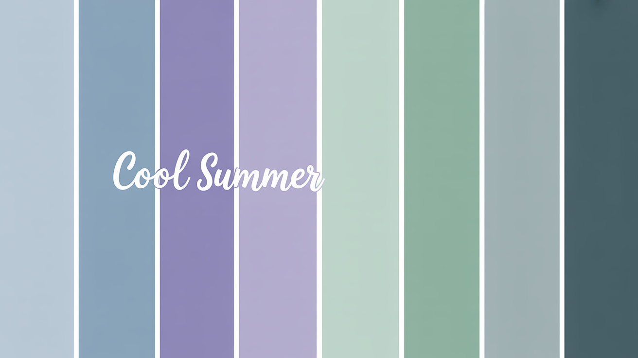
Cool summer: color palette and styling tips guide

Key Takeaways
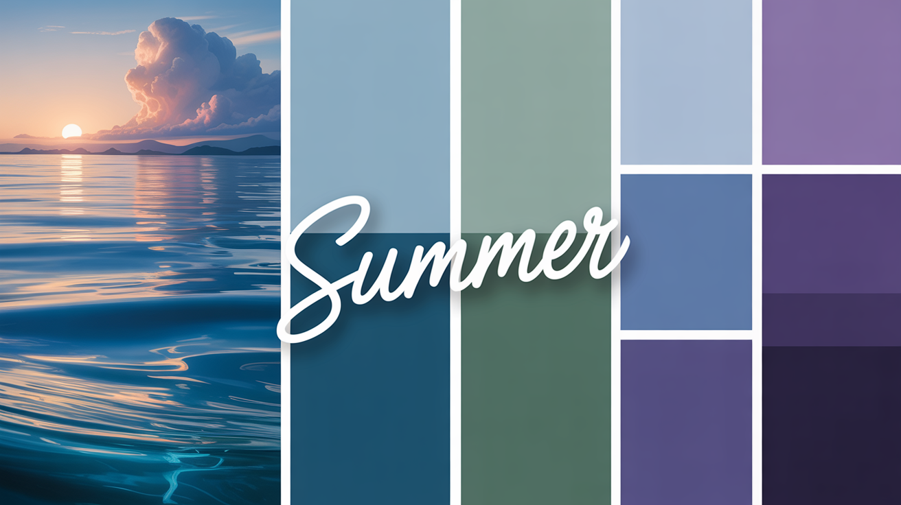
- The cool summer color palette is built on light-to-medium hues with distinctly cool undertones and softly muted chroma — a combination that reads as effortlessly polished rather than flat. The key is restraint: nothing too dark, nothing too vivid, everything in quiet harmony.
- Blue-based undertones run through every shade in the colors cool summer palette, making them naturally flattering on skin with pink or bluish bases. Think misty blues, powdered lavenders, and cool sage greens — the very tones Pantone spotlights as core neutrals for SS 2026.
- The cool summer muted cool quality is what sets this palette apart. Grayed-out, slightly desaturated shades stay versatile across seasons and occasions. Warm or oversaturated tones break the spell — avoid them the way you'd avoid a wrong note in a chord.
- Build your wardrobe foundation on soft navy, light gray, and grayish blues. Layer in American Rose, cool mint, or a whisper of plum for contrast. For metallics, platinum, silver, and white gold echo the palette's cool chic without competing with it.
- Understanding the cool summer light summer distinction matters when shopping: Light Summer leans brighter and more pastel, while the summer palette soft cool of Soft Summer stays closer to neutral. Cool Summer sits between them — more defined than Soft, less airy than Light.
- For cool summer palette styling, pair muted shades with intention: moonlight blue trousers with an American Rose blouse, a Lila scarf over platinum-toned separates. Choose natural linen where possible — it holds cool dyes like sage and misty blue far longer than synthetics.
- Shopping in 2026: AI color-analysis apps have changed the fitting room game entirely. Use them in-store to verify whether a fabric reads as genuinely cool-toned under natural light — not the yellow-cast fluorescents that make everything look warm. On resale platforms like ThredUp, filter by "cool tones linen" or "smoke white"; on Rent the Runway, combine "pastel + navy" to surface pieces that actually match your cool summer palette colors. Return anything with a yellow or orange base — the app won't lie, even if the label says "blue."
Before you spend $250–$400 on a professional draping session, consider this: AI-driven digital analysis now delivers 90% accuracy for under $20 — and it starts with knowing your season. The cool summer color palette and styling tips guide you actually need isn't locked behind an expensive appointment. It lives in understanding which shades genuinely work with your undertone. Think soft blues, misty lavender, sage green, and cool silver-gray — the muted cool summer color palette that defines the 2026 Pantone direction. These colors cool summer palette devotees reach for aren't just pretty; they're strategically low-contrast and blue-based, designed to harmonize with cool, light-to-medium complexions rather than fight them. Whether you're exploring cool summer light summer crossover territory or mapping out a full cool summer palette styling wardrobe refresh, getting the foundation right saves you from a closet full of expensive mistakes.
Before you spend $250–$400 on a professional draping session, consider this: AI-driven digital analysis now delivers 90% accuracy for under $20 — and it starts with knowing your season. The cool summer color palette and styling tips guide you actually need isn't locked behind an expensive appointment. It lives in understanding which shades genuinely work with your undertone. Think soft blues, misty lavender, sage green, and cool silver-gray — the muted cool summer color palette that defines the 2026 Pantone direction. These colors cool summer palette devotees reach for aren't just pretty; they're strategically low-contrast and blue-based, designed to harmonize with cool, light-to-medium complexions rather than fight them. Whether you're exploring cool summer light summer crossover territory or mapping out a full cool summer palette styling wardrobe refresh, getting the foundation right saves you from a closet full of expensive mistakes.
💫 Discover Your Complete Color Palette
Ready to discover all the colors that make you look radiant? Our comprehensive color analysis will reveal your complete personal palette - perfect for hair, makeup, and wardrobe decisions.
Find My Season →These shades are perfect for crafting tranquil rooms, easy-wearing ensembles or slick graphics. Knowing how to utilize these hues effectively can boost aesthetics without sacrificing calmness, making them forever favorites.
📚 Recent Articles
What is a Cool Summer Palette?
The cool summer palette is characterized by its soft, cool, low contrast hues that convey a casual elegance. It's a light to medium value, muted chroma palette with cool undertones — perfect for cool-toned personalities. This palette refrains from very dark or intense shades, preferring muted and harmonious colors.
Below is a concise overview of its key features:
| Feature | Description |
|---|---|
| Undertones | Cool, often blue-based, with a fresh and serene effect. |
| Value | Light to medium shades, avoiding heavy or overpowering colors. |
| Chroma | Muted or grayed-out, ensuring a soft, understated appearance. |
| Suitability | Best for those with cool skin tones, ashy hair, and light to medium eye colors. |
1. The Undertone
Blue undertones dominate cool summer colors, which imparts a clean and crisp appearance. These colors are great matches for pink or blue based skin tones, making them pop all the more. While warm undertones have yellow or golden bases, the cool undertones produce a calming, refreshing effect.
Whether it's the glacial coldness of a quiet lake or the gentleness of lilac, these hues stand for peace. Blue undertones complement cool gray, ashy blonde or dark brown hair, and blue, green or hazel eyes beautifully.
2. The Value
The palette's light to medium values embody this same balance principle. Light powder blue, cool pinks and soft whites offer brightness, but not too much. Darker tones, like navy or rose brown, are used sparingly to keep it soft.
These lighter values suggest an airy, fresh atmosphere – like an English garden at dawn. By steering clear of anything too dark, the palette keeps subtle features the spotlight.
3. The Chroma
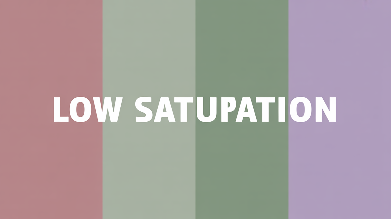
Low saturation is the hallmark of the cool summer palette. Taupe, soft white, and rose beige have that soft, grayed-out quality that makes for a flexible and chic appearance. Bright or overly vibrant colours like neon pink or vivid orange can break up this balance.
Instead, subdued colors such as fuchsia or blue-green provide equilibrium and unity, which allow this palette to be flexible for different environments and events.
4. The Essence
The key for a cool summer palette is soft, cool, understated elegance. Light, muted and cool tones coalesce to create a natural, quiet beauty. From the dainty appeal of orchid pink to the understated richness of taupe, this palette exudes understated bravado.
Subtlety becomes a style, it allows you to be chic without overwhelming your natural beauty.
5. The Misconceptions
Cool summer palettes are not all about blue! In fact, they feature everything from berry pinks to watermelon reds for your clothes or makeup. Another myth – black flatters all; soft browns and grays tend to be much more fitting for cool summer tones.
Warm metallics like gold don't work either, and silver or white gold are much better options.
The Cool Summer Color Spectrum
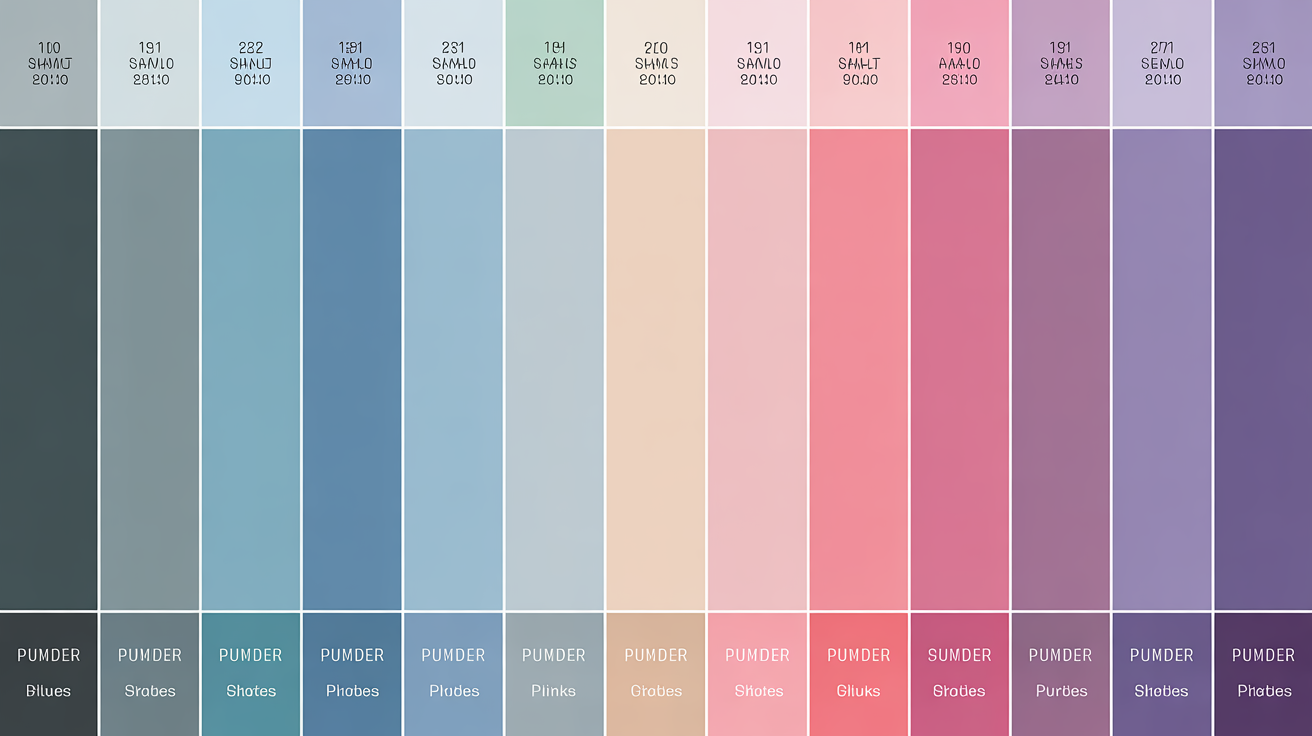
The cool summer color spectrum consists of light, muted, gentle colors that exude understated elegance. These soft, cool, smokey, and understated hues span from the darkest charcoal greys and dark blue-spruce colors to powder blues and soft pinks. This palette suits people with muted looks usually with blue, grey, hazel or green eyes, but light to medium brown eyes show up as well.
Dubbed the 'Sweet Pea Summer', this palette is the perfect balance of cool and soft tones with lightness — a gorgeous spectrum of colors to pull together a cohesive, refined look.
| Color Category | Examples |
|---|---|
| Neutrals | Charcoal, Dark Brown, Light Gray, Grayish-Blue |
| Vibrant Tones | True Red, Lemon, Mint, Orchid, Deep Raspberry, Plum, Dark Blue |
Cool summer tones steer clear of warm, saturated or too dark hues, which tend to dominate the light and soft qualities of this spectrum. The delicate coolness/silence of this color trim guarantees a very handsome look.
Your Neutrals
Dark neutrals such as charcoal and deep brown anchor the cool summer spectrum, providing a grounding base for ensembles. These shades are subtle but offer plenty of depth without going warm.
On the lighter end, you can still have light greys and grayish-blues which have a very calming effect that fits in with the cool tone of this spectrum. Skip beiges or yellow-based neutrals because they conflict with the natural coolness and distract.
With neutrals as your base, you can construct flexible outfits that carry you through multiple events. As an example, combine light gray pants with a pale pink shirt.
Your Colors
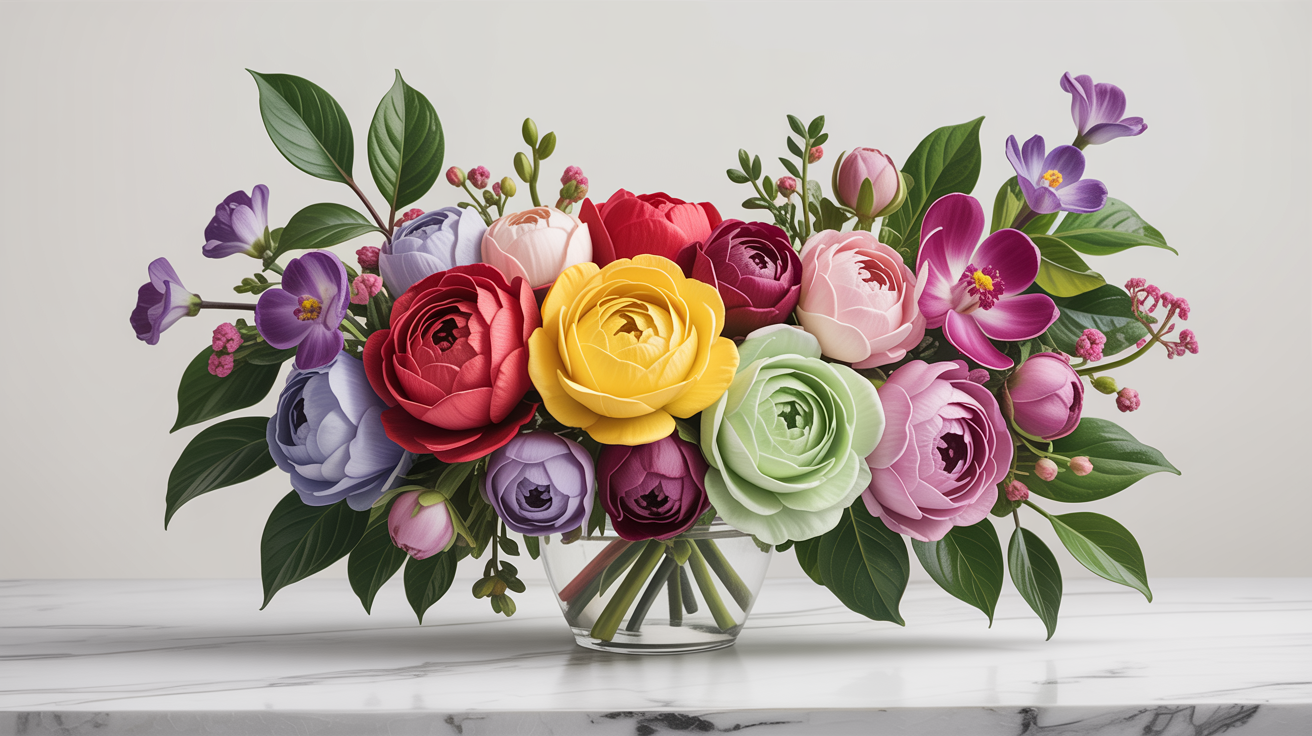
- True red and soft red for subtle vibrancy.
- Lemon and mint for refreshing, cool accents.
- Orchid, deep raspberry, and plum for richness and depth.
- Blues, particularly powder blue and dark navy, for that classic touch.
Avoid warm shades such as orange or hot yellows, which upset the palette's gentle coolness. Muted shades such as dusty lavender or soft teal mix nicely as well, keeping the polished look.
Coordinate deep raspberry with grayish-blue or mint with light gray to keep it together without overwhelming the look.
Your Metallics

- Silver, platinum, and white gold are the natural allies of a cool summer palette styling — they mirror the spectrum's icy undertones without competing for attention.
- Skip warm metals entirely: yellow gold and rose gold clash with cool summer muted cool tones the way a foghorn clashes with chamber music.
- Here's the smart move — sterling silver sits at $2–5 per gram, while white gold has surged past $70 per gram. Both read as equally polished against colors cool summer palette demands, so there's zero reason to overpay. A pair of sterling silver earrings or a brushed silver cuff delivers that effortless, high-end finish that defines the cool summer palette soft aesthetic.
- Cool metallics don't just accessorize — they anchor the whole look, reinforcing the refined, understated confidence that makes the summer palette soft cool approach so compelling.
Your Sister Palettes
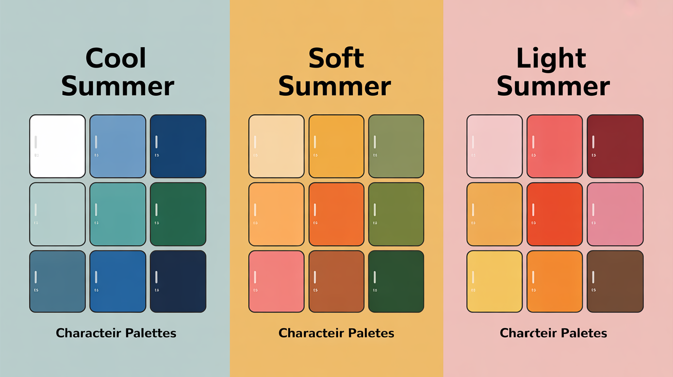
Your sister palettes are a fun way to experiment with different versions of the Cool Summer color family, giving you a bit of leeway and opening up possibilities without going too far from its coolness. These adjacent palettes, such as Soft Summer and Light Summer, have overlapping characteristics, perfect for individuals eager to try new things while staying true to their natural color harmony.
Sister palettes might feature shades that complement Cool Summer's muted, cool base like soft pinks, purples, and greens, but with a different twist that adds versatility.
Soft Summer
Soft Summer is a subdued and neutral take on Cool Summer, for those who like it dulcet and low key. Its colors are gentler and more muted, asserting a grayish airiness that's cool and chill. Think dusty rose, sage green and taupe — the very essence of S/S soft summer coolness gently tempered by neutrality.
These colors flatter those with less contrast in their natural coloring, like medium to light hair and complexion. Soft Summer colors blend effortlessly if you want to dampen the brightness of Cool Summer without losing the coolness.
For example, combining a dusty lavender top with a pale gray scarf creates a cohesive appearance. This palette is great for a softer, more romantic look, especially when you add pastels. By exploring how Soft Summer works with your skin tone and contrast level, you'll feel confident rocking these shades with style.
Light Summer
Light Summer features brighter, airier colors than Cool Summer. Its colors are lighter and more pastel-y, like baby blue, mint green and blush pink. They're great for those with lighter coloring and more delicate features as they illuminate a look, but still retain the cool undertones of your summer palettes.
What I love about Light Summer is how effortless and playful it makes outfits feel. For example, a mint green blouse with white trousers.
Cool undertone sister palettes with Cool Summer, so Light Summer colours can be strategically borrowed to bring brightness to certain outfit elements. Of course, it's essential that these pastel hues suit one's contrast level so as not to swamp the features.
Styling Your Palette
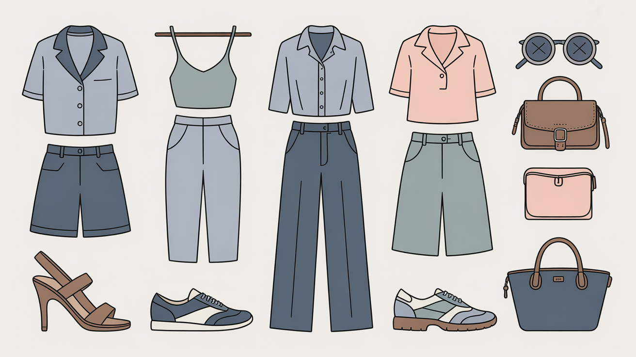
Styling your cool summer palette is all about putting together harmonious, sophisticated looks that accentuate your naturally cool undertoned features. These are definitely the muted, soft palettes and provide a very elegant and versatile base to build an outfit around.
With the right mix of colors, patterns, and textures, you can take your outfits to another level while keeping things visually harmonious.
Color Pairings

- Layer subdued blues with soft grays for a monochromatic, effortlessly polished look — this is the backbone of any cool summer palette styling approach.
- Mix coordinating pastels like sage green and soft lavender for gentle contrast; these tones sit perfectly within the summer palette soft cool spectrum and translate beautifully to 2026 Pantone SS trends.
- Pair rose beige with cool-toned browns or platinum neutrals to build a warm-neutral blend that never strays from the cool summer muted cool family — think misty, chalked, weathered rather than earthy or golden.
- Struggling to find muted berries that aren't too vivid? Skip the generic "pink" filter and search specifically for ashy or smoke tones — on ThredUp, try "cool tones linen" under $15, and on Rent the Runway filter by "pastel + navy" to surface shades that genuinely match the colors cool summer palette demands.
- Avoid warm-dominant colors — bright oranges, saturated yellows, or anything golden-based will immediately overpower the soft, frosted quality that defines the cool summer light summer aesthetic. When in doubt, test in natural daylight, not fitting-room lighting.
Muted colors such as a soft white or a clear watermelon red can be particularly flattering worn near the face. Try layering neutrals for your base and adding accents like pretty pinks or seafoam green for a pop!
This strategy makes styling your outfit easier and guarantees that each item matches the others.
Pattern Choices
Opt for patterns sparingly as well to complement the subtlety of a cool summer palette. Soft watercolor prints, whether it be floral or abstract, are understatedly chic and make for an effortless ensemble.
Meanwhile, medium to large patterns with soft edges can add visual interest without dominating the outfit. Steer clear of bold geometric or high-contrast designs, which fight against the muted spectrum's softness.
Use pattern sparingly–a printed scarf or blouse–to keep the look from becoming overwhelming. These touches keep the emphasis on the palette's tranquil pairings.
Fabric Textures
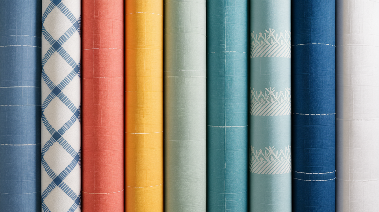
Fabrics are an important part of the cool summer look. Lightweight, breathable fabrics like cotton and linen uphold the airy, soft energy of this palette yet keep you cool.
Silky or satiny textures can further highlight the palette's sophistication. For more dimension, try layering textures.
For instance, combine a silky blouse with a linen blazer or a soft knit cardigan over a cotton dress. These combinations bring in soft contrasts that spice things up and keep things faithful to the palette.
Skip rough or heavy fabrics, like thick wool or corduroy, as they will feel awkward in this aesthetic.
Beyond Your Wardrobe
A cool summer color palette doesn't have to end at clothes; it can easily flow into your makeup, hair, and accessories. When you keep these consistent, you craft a cohesive, polished look that fits your natural undertones. Not only does this make you look good, it makes styling easier. Read on for how to work this palette into your own style.
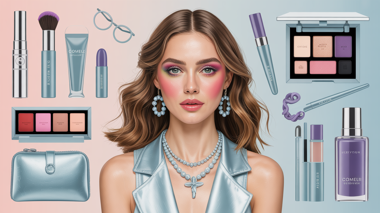
Makeup
For those with cool summer undertones, makeup is key. Start with complexion products like foundations and concealers for cool undertones. Neutral beige or cool porcelain foundations are ideal but stay away from warm or yellow-based products, as they look all wrong.
For eye makeup, keep to neutral shades of gray and taupe as your base. For dimension, accents of plum, navy, or even icy blue can make your eyes pop. Lip shades are another highlight—soft pinks, cool mauves, or timeless roses in matte or satin finishes tend to be very flattering.
Warm-toned shades — corals, peaches, and oranges — tend to fight against the cool summer muted cool aesthetic rather than complement it. The most common frustration? Most "nude" lipsticks on the market skew peachy-warm, which instantly muddies a Cool Summer complexion. Instead, lean into the 2026 Soft Glam movement: reach for PH-balancing cool-pink lip oils that adjust to your natural undertone while staying firmly in the blue-pink spectrum. For a signature look, explore custom lipstick blending bars to dial in your perfect Muted Mauve — a shade that sits at the heart of the cool summer palette soft and understated elegance. Layer sheer Rouge or a soft berry over a clear balm for daytime wear, or deepen the effect with a touch of navy liner at the corners for evening. Keeping your entire makeup palette within the cool summer palette colors — think icy rose, soft plum, and dusty pink — ensures every element works in harmony and your overall look feels effortlessly polished rather than assembled.
Hair Color
Hair color is important in creating a balanced appearance. Cool-toned choices like ash blonde or light ash brown go absolutely perfectly with the cool summer palette. These colors bring out your natural coloring without adding the warmth that could compete with your tone.
To add some dimension, soft silver blonde or platinum highlights can be added. These accents hold on to the cool undertone while providing visual interest. Steer clear of golden or brassy highlights, as they upset the harmony.
Make sure your hair and makeup are consistent in tone to pull the look together.
Accessories
Accessories are the icing on the cake to any outfit. Cool-toned metals, such as silver or platinum, work best for jewelry, as do gemstones that complement the cool summer palette. A survey discovered that 85% of individuals with this color profile wear silver instead of gold to be more harmonious.
Soft or pastel accessories, like scarves or handbags, infuse depth without unbalancing. For something bolder, accent colors such as soft lavender or icy mint can be used. These selections punch up your style without taking over your ensemble.
The Emotional Impact of Color
Something magical happens when the cool summer color palette's soft and subdued tones impact our emotions and self-expression. Colors don't just influence what we see, but what we feel, how others perceive us and even how we perceive ourselves. With a bit of insight into the emotional impact of color, you can select your attire to support your mood and confidence.
Cool Colors Evoke Calmness and Serenity
Cool colors like light blue, soft green and pale purple tend to be calming and peaceful. These colors replicate nature—blue skies or seas—which inherently calms the mind. Cool pastels, such as pale mint or baby blue, can soothe emotions in times of frenzy.
That's especially powerful during stressful or transitional times, as these colors provide a visual anchor for tranquility. For example, a light teal scarf on a hectic day or a lavender-infused room can provide an emotional anchor. Cool colors are particularly effective when contrasted with warmth, like amber or soft yellow light, which makes them feel cozy and comforting.
The Confidence Boost from Flattering Colors
Wearing colors that harmonize with your natural attributes—whether it's your skin tone, hair color, or eye hue—can provide a major confidence boost. The cool summer palette, with its muted and blended tones, complements the softer undertones.
For instance, an ash-blonde could wear a dusty rose or misty gray shirt and feel like he or she looks totally put together. Studies reveal that this visual congruence triggers mirror neurons in the brain and creates warm feelings. This matching of personal characteristics with appropriate colors not only compliments but bolsters confidence in front of others.
Promoting Balance and Harmony
The cool summer palette is naturally inclined towards balance and harmony due to its softness and mutedness. Unlike brights or neons, these hues don't assault, perfect for crafting spaces or ensembles that feel uniform and subtle.
For example, a palette of slate gray and soft lilac in an office can encourage concentration without agitating. In the darker months, when fall and winter are slowly sapping natural light, they can act as an "antidote" to Seasonal Affective Disorder — creating a calm, focused atmosphere that helps stave off feelings of dreariness.
Expressing Individuality and Mood
Cool colors offer endless avenues for personalization as well. Even though everyone might lean towards aquas and silvers for that sophisticated feel, some will tap into periwinkle or sage green to mirror their playful or chilled state of mind.
By blending and layering various shades, each person can create a distinct combination that speaks to their character. For instance, combining a light denim jacket with a lilac scarf is both indicative of a good style sense and just plain playful.
It's this flexibility that makes the cool summer palette a powerful weapon for displaying personality without assaulting the senses.
Conclusion
Cool summer palettes evoke a calm and balanced feeling. Their buttery, velvety tones are great for outfits, cosmetics, or even decorating. These colors lend a fresh, approachable vibe that never feels dated. Diving into these tones allows you to be you, without even trying. No matter if you go for airy blues, pale pinks, or sleepy grays – the possibilities are endless, but cohesive.
The right colors do more than look good. They build confidence and express personality. Cool summer tones encourage artistic expression without going overboard – understated sophistication at its best! Let 'em inspire you, whether large or small.
Begin playing around with these palettes and infuse a bit more balance into your style, space and psyche.
Frequently Asked Questions
What is a cool summer color palette?
A cool summer color palette has soft muted colors with blue or pink undertones. It consists of colors such as pastel blue, lavender, and soft gray. These colors just make for a really cool summer color palette.
How do I know if I have a cool summer color palette?
You probably have a cool summer color palette if you have fair skin with cool undertones, soft eye colors and ashy or neutral hair tones. Personal color analysis agrees.
What are the sister palettes to cool summer?
Cool summer's sister palettes are True Summer and Soft Summer. They have similar cool undertones but are different in intensity and softness.
Can I wear warm colors with a cool summer palette?
Warm colors tend to conflict with cool undertones. You can always opt for sedate or neutral variants of warm colors to work with your palette.
How can I style a cool summer wardrobe?
Concentrate on layering soft, cool colors such as icy blue or baby pink. Add some neutrals like gray or navy for balance. Don't go too bright or warm.
Can cool summer colors be used for home decor?
Yes, cool summer colors in interiors! Soft blues, grays, and lilacs create a serene, calming space. These colors bounce light so pretty.
How do colors in a cool summer palette affect mood?
Cool summer colors are soothing and tranquil. Their subdued hues help set a tranquil and invigorating mood. They're great for stress relief.