
Light vs. Medium Skin Tone: Compare In-Between Shade Labels
 Reviewed by Alexandra Gilmore
Light, medium, and light-medium are descriptive shade labels, not universal measurements. If you fall between labels, compare adjacent depths within the same undertone family and the same product range. Use your jaw and neck as additional reference points, then check the formula after it settles.

Compare neighboring depths within one undertone family.
💫 Discover Your Complete Color Palette
Compare your undertone, depth, clarity, and contrast as a complete palette, then check the suggestions against real clothes near your face.
Find My Color Palette →Light, Medium, and Light-Medium Are Descriptive Labels
Skin tone labels describe apparent depth, but brands do not use one universal cutoff between light and medium. “Light-medium” names a useful in-between area, not a fixed measurement. Undertone is a separate color direction: a lighter and a deeper shade can share it. Kryolan's skin tone guide distinguishes surface color from undertone and uses broad depth categories. For the overall depth and undertone map, read visual skin depth and undertone chart.
For example, “light-medium neutral” combines a depth description with a neutral color direction. Neither word identifies an exact product number or guarantees a match. Keep both observations as starting points, then compare actual shades on your skin in one product range.
Compare Nearby Depths in the Same Undertone
Choose two or three adjacent depths within one undertone family and one formula. Put small swatches beside the jaw with visible gaps, then view the face, jawline, and neck in the same steady light. If one depth blends better but its color direction looks off, hold depth approximately steady while testing another undertone. Ulta's undertone guide recommends comparing similar-depth shades and checking the face, jawline, neck, and upper chest. For descriptions of labels such as ivory, honey, and caramel, see Skin Color Names With Pictures: A Descriptive Guide.
Make one decision at a time: first look for a depth that does not create a pale or dark edge at the neck, then compare color directions near that depth. Depth and undertone can both be off, so a single stripe cannot diagnose the cause. Use the observations below to choose the next comparison.
| What you see | Next comparison |
|---|---|
| Too light at the jaw and neck | Try the adjacent deeper shade in the same undertone family. |
| Too deep at the jaw and neck | Try the adjacent lighter shade in the same undertone family. |
| Depth looks close, but the color direction stands out | Compare another undertone at a similar depth; let each swatch settle first. |
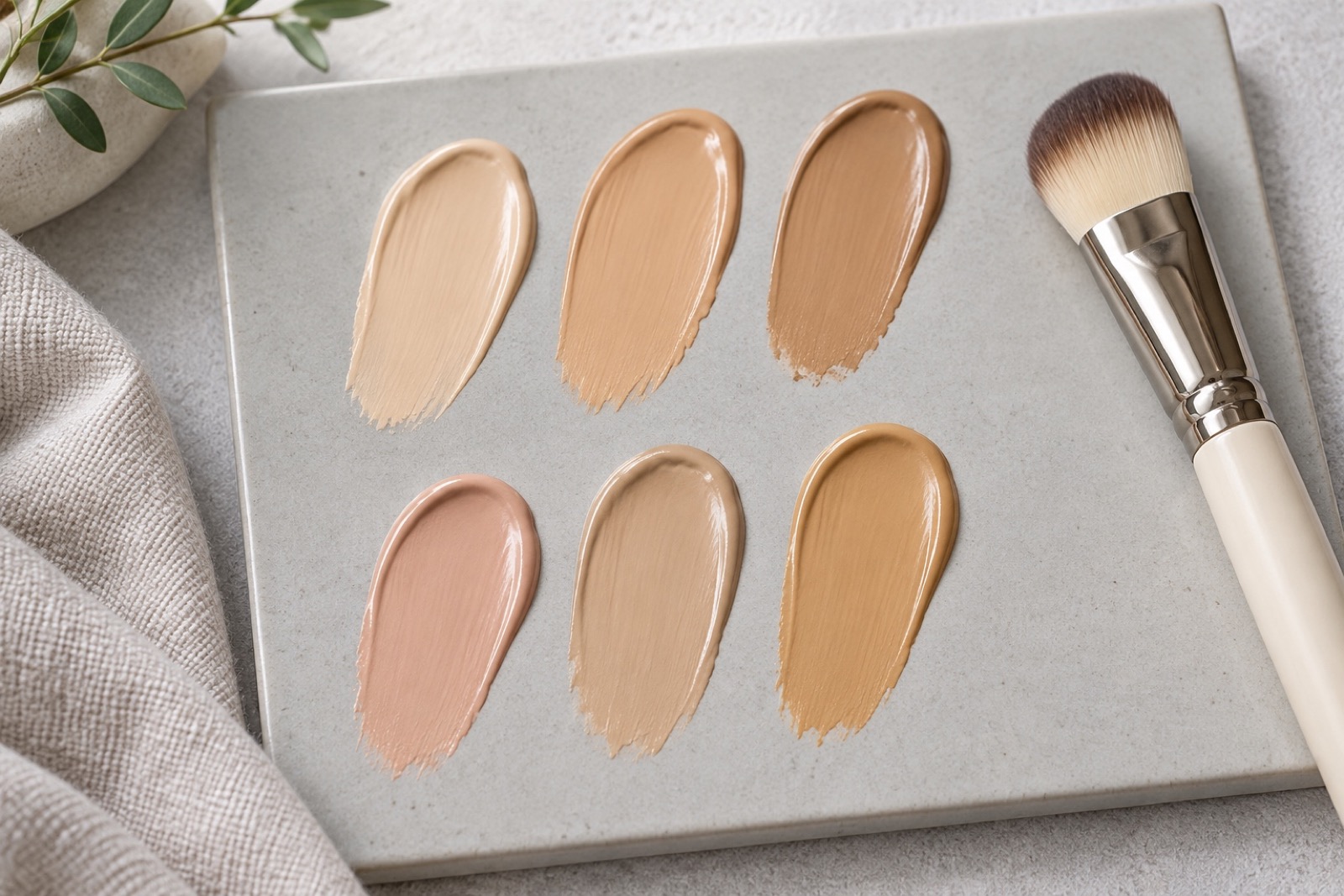
Why Brand Labels Do Not Transfer Exactly
A shade called light-medium by Brand A need not equal a shade called medium by Brand B. Each range uses its own naming and undertone choices. Even olive shades may be labeled warm, neutral, or cool olive depending on the brand, as Ulta notes. Compare the actual formulas rather than assuming the words transfer.
If a foundation already fits, its exact product and shade can be a useful starting input for a shade-to-shade finder. A second bottle saying “medium” is not confirmation of a cross-brand match. Check the suggested shade on your jaw after it settles. The photo shade matching guide explains what photo-based tools can and cannot establish.
Read Your Result Alongside a Skin Tone Chart
A chart can help you name broad depth and undertone regions; it cannot draw a universal boundary for every foundation range. If light and medium both seem plausible, treat them as neighboring descriptions rather than competing identities. The skin color chart guide owns the complete scale, while the skin color names guide explains the vocabulary.
For a practical boundary check, compare a light, an in-between, and a medium option with the same undertone in one range. Which one leaves a pale edge or a deeper band near your neck? Keep the closest depth for the next undertone comparison. This small test is more useful for a purchase than trying to place yourself at an exact point on a general chart.
What to Do When Face and Neck Look Different
Place each swatch across the jaw boundary so you can see it beside both face and neck, and include the upper chest as another reference when useful. Let the product dry down according to its directions before judging. A photo can help you remember the comparison, but lighting, makeup, and processing can change its appearance; check in person under consistent light.
If your face looks redder than your neck, do not choose solely by the red area. Compare how the settled swatches relate to both areas at the jaw, then repeat in another consistent light if the result is unclear. A better match may balance the transition rather than copy the most noticeable facial redness.
Questions and Practical Answers
Is light-medium a fixed point on a skin scale?
No. It is a descriptive label. Compare adjacent shades within one product range.
Should I change depth or undertone first?
Compare depth within one undertone, then compare undertones at a similar depth. Changing both at once hides which difference helped.