Skin Color Chart: Find Your Skin Tone and Undertone
 Reviewed by Alexandra Gilmore
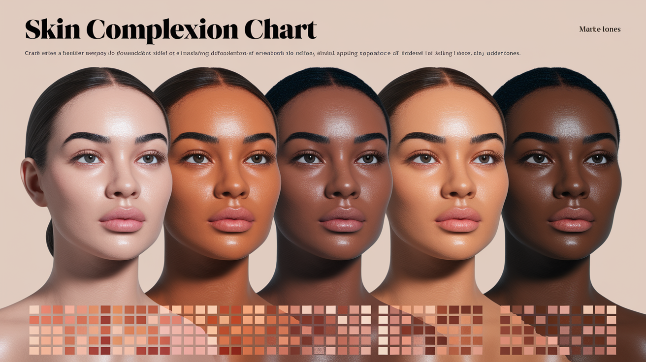
Use the skin color chart by choosing the closest depth row—fair, light, light-medium, medium, tan, deep, or very deep—then compare warm, cool, neutral, and olive undertones within that row. Match clean skin in indirect daylight and treat the result as a range, not a permanent label.

Skin Color Chart: Depth × Undertone
Find the row closest to your overall skin depth, then compare undertones across that row. Warm skin reads more golden or peach; cool skin more pink, rosy, or blue-red; neutral skin looks balanced; olive skin has a muted green, gray-green, or golden-green cast. Adjacent rows overlap, so keep one lighter and one deeper option in view.
| Visible depth | Warm examples | Cool examples | Neutral or olive examples |
|---|---|---|---|
| Fair | Peach, pale gold, warm ivory | Pink, rosy, blue-red | Balanced ivory, muted gray-green |
| Light | Golden beige, peach beige | Rose beige, cool beige | Balanced beige, light olive |
| Light-medium | Warm beige, honey beige | Muted rose, cool tan | Neutral beige, olive beige |
| Medium | Golden, warm tan, amber | Rosy brown, red-brown | Balanced tan, muted olive |
| Tan | Bronze, golden brown, caramel | Cool brown, berry-brown | Neutral brown, deeper olive |
| Deep | Warm chestnut, golden cocoa | Red-brown, plum-brown | Neutral cocoa, olive-brown |
| Very deep | Rich warm brown | Cool ebony, blue-red brown | Balanced or muted deep brown |
A skin color chart is a visual reference for comparing the depth and color direction of visible skin. It can help you describe a complexion, narrow a foundation range, or notice whether a face reads warmer, cooler, more neutral, or more olive. It cannot assign one permanent color to a person. Light, tanning, redness, body area, camera processing, and surrounding colors all change what a chart comparison looks like.
The most useful charts separate two questions. How light or deep is the visible skin? What undertone does it appear to have? A single row of beige-to-brown swatches answers only the first question. Two people can sit at the same depth and still need different foundation shades or clothing colors because their undertones differ.
This page is the visual reference for our skin-tone cluster. For descriptive words such as ivory, beige, caramel, cocoa, and espresso, use the skin color names with pictures guide. For the difference between depth, undertone, Fitzpatrick phototype, and cosmetic skin type, see types of skin tones and classification. When you are ready to test the color direction beneath the surface, follow the at-home skin undertone test.
Key Takeaways
Read a skin color chart across two axes: visible depth and undertone. Compare clean skin in indirect daylight, use more than one area of the face and body, and treat the nearest swatch as a reference rather than an identity label. The Fitzpatrick scale answers a different question about sun reaction. It should not be used as a precise map of visible skin color, race, or ethnicity.
💫 Discover Your Complete Color Palette
Use the chart as a starting point, then discover the clothing, makeup, and hair colors that work with your complete color profile.
Take Color Analysis Quiz →How to Read the Skin Color Chart
Begin with depth. Look for the row that comes closest to the overall lightness or darkness of the lower cheek, jaw, neck, and upper chest. Do not match a freckle, a red patch, a shadow under the chin, or the most tanned part of the forehead. You are looking for the general field of color that connects the face to the body.
Then compare undertone within that depth. A warm swatch may look golden, yellow, or peach. A cool swatch may look pink, rosy, red, or slightly blue. Neutral sits between those directions. Olive skin often has a muted green, gray-green, or golden-green cast, but it can occur at many depths and may lean warm, neutral, or cool.
Use the chart in indirect daylight near a window. Direct sun creates bright highlights and hard shadows. Warm indoor bulbs can make every swatch look more golden, while cool LEDs can drain warmth. If the match changes every time you move rooms, the lighting is controlling the result.
| Chart dimension | What it describes | What it does not prove |
|---|---|---|
| Depth | How light or deep visible skin appears in the current conditions | Undertone, ethnicity, sun sensitivity, or a foundation match |
| Undertone | Warm, cool, neutral, or olive color direction beneath the surface | A color season on its own |
| Surface tone | Temporary or local color from tanning, flushing, irritation, or pigmentation | The stable undertone of the whole face |
| Phototype | Reported tendency to burn and tan after UV exposure | An exact visible shade or racial category |
Why Skin-Color Labels Are Approximate
Depth labels vary between charts and beauty brands. A practical sequence is fair, light, light-medium, medium, tan, deep, and very deep. Some systems use fewer groups; others divide the middle and deep ranges more finely. The boundaries are not fixed measurements, so adjacent labels should overlap.
The words in the opening chart are examples, not official categories. "Honey" may mean light-medium in one product range and medium-deep in another. Use names only after you have located the depth and undertone. If you start with a poetic shade name, you may compare colors that are not actually close.

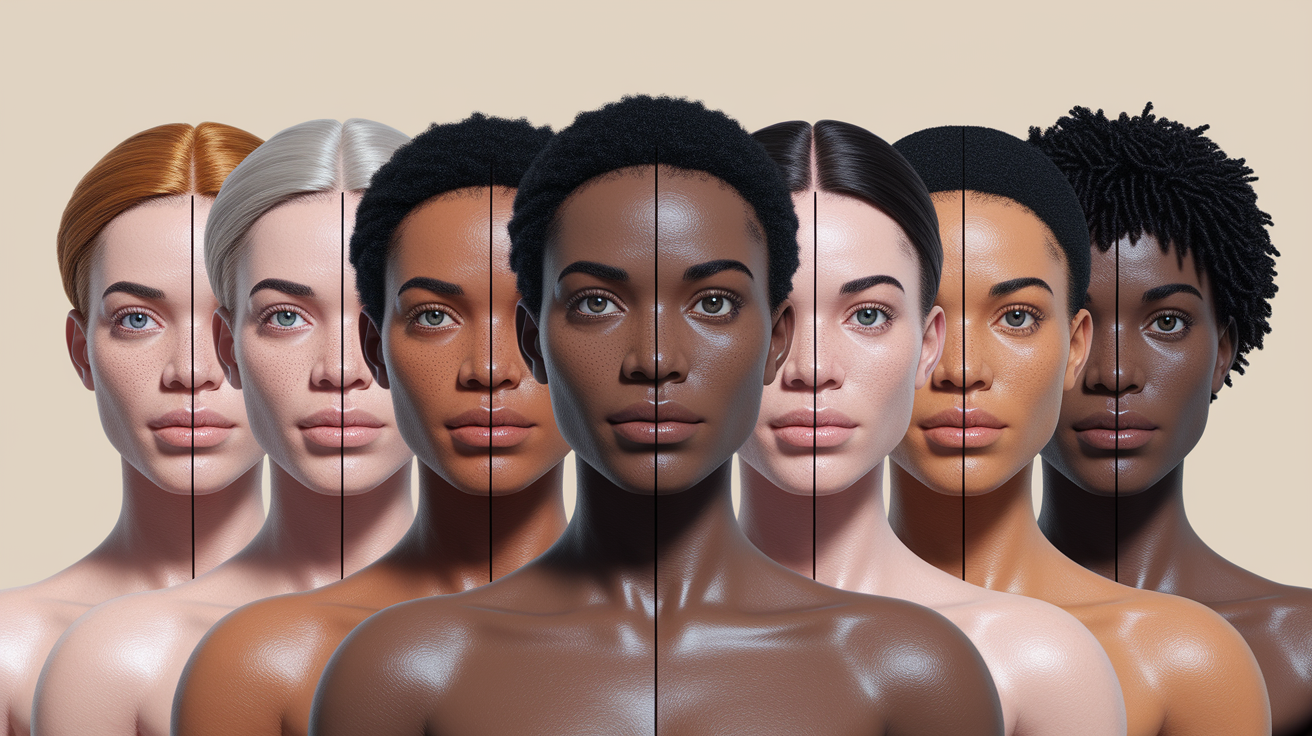
Why the Same Skin Depth Can Look Different
Skin is not flat paint. Melanin contributes most of the lasting pigmentation, while blood flow, carotenoids, the thickness of the skin, and light scattering also affect what we see. The NCBI overview of melanin biochemistry explains that melanocytes produce pigment in melanosomes and transfer it to surrounding keratinocytes. Differences in the type, amount, and distribution of melanin contribute to the range of human pigmentation.
Surface conditions can temporarily pull the visible color away from the underlying pattern. Rosacea or irritation may add red. A tan may deepen the surface. Hyperpigmentation can create local areas that are not representative of the whole complexion. The skin around the eyes and mouth may also differ from the cheeks.
This is why one digital color sampled from a selfie rarely captures the whole face. Phone cameras adjust exposure, white balance, contrast, and saturation. Screens then display that result differently. A chart comparison works better when you view several areas in person and repeat the check in the same neutral lighting.
Depth and undertone can also create optical surprises. A muted olive complexion may look lighter beside a vivid warm swatch and deeper beside a cool gray one. A rosy surface can hide a neutral or warm undertone. If one test says warm and another says cool, compare fabric or foundation colors side by side instead of averaging the labels.
Fitzpatrick Phototype Is Not a Skin Color Chart
The Fitzpatrick scale has six phototypes. It was designed around the way skin responds to ultraviolet exposure, especially the tendency to burn and tan. DermNet defines Fitzpatrick skin phototype by sun reaction and constitutional pigmentation. It is useful in dermatology, but it is often misused as a row of six visual skin colors.
A person should not be assigned a phototype from a photo alone. Two people with similar visible depth may report different burn and tan patterns. The reverse can also happen: people grouped under one phototype can have noticeably different visible colors.
| Phototype | Typical reported sun response | How to use it here |
|---|---|---|
| I | Always burns and does not tan | Sun-response category, not "the palest skin color" |
| II | Burns easily and tans poorly | Do not infer it only from hair, eyes, or ethnicity |
| III | May burn at first and then tan | Can include more than one visible depth |
| IV | Burns minimally and tans readily | Still not a foundation-shade label |
| V | Rarely burns and tans deeply | Does not describe one undertone |
| VI | Very rarely burns and has deeply pigmented skin | Contains substantial visible color variation |
A 2024 dermatology review identified 17 skin-classification systems and noted that Fitzpatrick remains widely used, yet has major limitations when it is conflated with skin color, race, or ethnicity. The review is available through PubMed. Use phototype for its intended sun-response context. Use a color chart for visible color.
📚 Recent Articles
Other Ways Skin Tone Is Measured
Different fields need different kinds of scales. A beauty shopper needs a way to compare products. A dermatologist may need a clinically useful description. A camera team may need to check whether images represent a wide range of skin tones. Those tasks should not be forced into one chart.
The Monk Skin Tone Scale
The Monk Skin Tone Scale uses ten tones. It was developed for more inclusive representation in technology, photography, and product evaluation. Google Research compared the ten-tone Monk scale with Fitzpatrick and a forty-shade beauty palette in a survey of 2,214 people. Participants, especially people from historically underrepresented groups, perceived the Fitzpatrick scale as less inclusive than the other two measures. The study is published by Google Research.
Monk is useful when a team needs a consistent representation scale. It does not identify undertone, prescribe makeup, or replace an on-skin foundation test.
CIELAB color measurement
Instrumental color measurement can record color using coordinates instead of names. The CIE L*a*b* color space describes lightness and two opponent color axes. Researchers can use measured values to compare samples under controlled conditions.
That precision does not make a phone screenshot a laboratory measurement. Lighting geometry, calibration, device processing, and measurement location still matter. CIELAB is a color space, not a list of consumer skin-tone names.
How to Use a Chart for Makeup and Color Analysis
For foundation, use the chart to narrow the depth family and undertone direction. Then compare real swatches across the lower cheek and jawline. A chart cannot account for coverage, finish, oxidation, or differences between product lines. The final match should be checked after the formula dries in natural daylight.
For color analysis, a skin chart is background information. Seasonal color depends on the relationship between skin, hair, eyes, and the colors placed near the face. Depth alone does not decide a season. Undertone clues help, but contrast and chroma also matter. If you are unsure about the undertone direction, use the practical checks in our home undertone cross-check guide.
For illustration or photography, label the lighting and reference conditions. Avoid presenting one hex code as a universal "skin color." A useful palette contains neighboring values and enough range to account for highlights, shadows, and local variation.
| Your task | Use the chart for | Confirm with |
|---|---|---|
| Foundation shopping | Depth and undertone shortlist | Jaw-to-neck swatches after dry-down |
| Personal color analysis | Initial undertone and depth observations | Side-by-side fabric comparisons |
| Photography | Representation and exposure reference | Calibrated workflow and consistent light |
| Dermatology | General visual description only | The clinical scale and assessment required for the task |
A Repeatable At-Home Chart Check
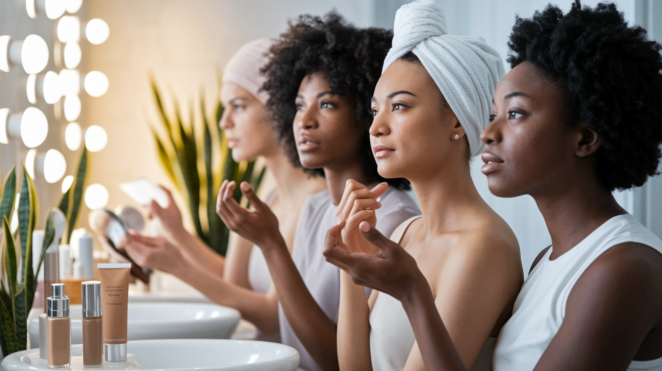
Choose a time when your skin is calm and free of makeup. Stand beside a window with the direct sun blocked. If you are comparing a printed chart, place it near the jaw without pressing it against the skin. For a screen chart, lower any vivid or night-shift display mode and remember that the screen still is not color calibrated.
Make a first pass for depth. Ignore undertone labels and compare only lightness. Pick the closest row plus one row lighter and one row deeper. Step back from the mirror. The correct neighborhood usually looks less separate from the neck; an option that is too light or deep creates an obvious edge even before undertone enters the comparison.
On the second pass, compare warm, cool, neutral, and olive variations within that small depth range. Watch what happens to the skin around the mouth and eyes. A poor comparison may make redness, sallowness, or grayness look stronger. A better one tends to sit quietly beside the face. This is an optical comparison, not a diagnosis.
Repeat the check on another day if you have just exercised, come in from cold weather, removed a mask, used an active skin product, or spent time in the sun. Those conditions can alter surface color. Record both attempts. If the depth remains stable but the undertone choice shifts, keep the undertone marked as uncertain and confirm it with fabrics or foundation swatches.
What may change and what usually changes less
Visible depth can shift with tanning and seasonal sun exposure. Surface redness can change within minutes. Pigmentation may vary across body areas or after inflammation. Those changes explain why an old photo and a current mirror comparison may not land on the same swatch.
The broader undertone direction often changes less than the surface, but it can be hard to see when redness, a tan, or lighting dominates the face. Do not force a permanent label when the evidence is mixed. "Medium depth, neutral-to-olive, checked in indirect daylight" is more useful than a confident but unstable one-word answer.
Common Chart Mistakes
The first mistake is matching under one strong artificial light. The second is sampling one tiny area from a phone photo. Another is treating the nearest swatch as a permanent label. Skin can look different across the face and change in visible depth with sun exposure, while the broader undertone direction may stay similar.
Do not use a chart to infer ethnicity, health, or UV risk. Race and ethnicity are social and demographic categories, not coordinates on a beige-to-brown strip. Medical decisions need the appropriate clinical history and assessment.
Finally, do not confuse a broad chart match with a product match. Foundation ranges have their own pigments, finishes, and naming systems. Two bottles described as "medium neutral" may not be the same color.
People Also Ask
How many skin tones are there?
There is no official finite count of human skin tones. Skin pigmentation varies continuously. Charts divide that continuum into a manageable number of swatches for a particular purpose, so a seven-depth beauty chart and a ten-tone representation scale can both be useful without claiming that only seven or ten skin colors exist.
What is the difference between skin tone and undertone?
Skin tone usually refers to visible depth, such as fair, medium, tan, or deep. Undertone refers to the warmer, cooler, neutral, or olive direction that can appear within any depth. Surface redness or tanning can change the current appearance without fully changing the underlying direction.
Can a photo identify my exact skin color?
A photo can provide a rough comparison if the light is even and the camera does not apply a strong filter. It cannot guarantee an exact value because exposure, white balance, shadows, and screen display change the result. Use the photo to create a shortlist, then compare in person.
Is olive a skin depth or an undertone?
Olive usually describes an undertone or cast, not one depth. Olive skin can be light, medium, tan, or deep and may lean warmer, cooler, or more neutral. A chart that places olive in only one middle-depth box is oversimplified.
Is the Fitzpatrick scale the same as a skin tone chart?
No. Fitzpatrick phototype classifies reported sun reaction, especially burning and tanning. A skin color chart compares visible color. The two can be related, but one cannot be reliably converted into the other from appearance alone.
Which part of the body should I compare with a skin color chart?
For makeup and color analysis, compare the lower cheek, jaw, neck, and upper chest in indirect daylight. Look for the depth that connects those areas. Avoid relying on the hand or wrist, which may have different sun exposure and surface color.
A chart is most useful when it narrows the comparison and leaves room for uncertainty. Record the closest depth, the likely undertone direction, the lighting, and the body area you checked each time. That description will travel better than one dramatic shade name or a single sampled hex code.