What to Wear This Season: The Best Colors for Summer Outfits

Key Takeaways
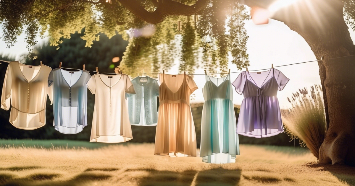
- Light colors are the backbone of the best colors for summer outfits — whites, pale butter yellow (Pantone's Pale Banana 12-0824), mint, sage green, and soft gray reflect sunlight instead of absorbing it, keeping your body temperature noticeably lower. Pair them with breathable cotton or linen and you've got a heat-management system that actually works. Sweat-Visibility Scale: white = high visibility, pale gray = low, sage green = very low.
- Build your summer wardrobe around Cloud Dancer white and soft pastels as your 70% neutral base — they flatter a wide range of skin tones and travel effortlessly from beach to brunch. Layer in cool summer clothing colors like powder blue or pale aqua for that ocean-breeze effect, then add mood-boosting accents — pillar-box red, juicy orange, or lemon yellow — in small doses. Sweat-Visibility Scale: powder blue = medium, pale aqua = low.
- Science backs the high-albedo approach: light-reflective shades genuinely reduce heat absorption. For the current best summertime shade for muted summer palettes, Shale Green and Sage Green are the 2026 standouts — sophisticated, UV-friendly, and forgiving in humidity. Complement with tightly woven, UPF-rated fabrics and wide-brimmed hats in pale tones to shield skin without sacrificing style. Sweat-Visibility Scale: sage green = very low, shale green = very low.
- Matching summer colours for clothes to your undertone makes the difference between looking washed out and genuinely radiant: warm undertones shine in butter yellow and peachy coral; cool undertones come alive in powder blue and lavender-tinged mint; neutral undertones can lean into balanced muted shades like warm gray or soft ecru. Finish with silver or gold accessories to anchor the look. Sweat-Visibility Scale: butter yellow = low, pale coral = medium.
- Swap heat-trapping darks — black, charcoal, deep navy — for their lighter counterparts during peak daylight hours. If bold hues are non-negotiable, keep them to accessories: a pillar-box red bag or an orange scarf delivers the energy hit without turning your outfit into a solar panel. Gray is especially smart in humid climates — it pairs beautifully with butter yellow or pale pink and scores low on the sweat-visibility front. Sweat-Visibility Scale: mid-gray = very low, navy = low.
- Apply the 70/20/10 rule to lock in a cohesive cool summer clothing palette: 70% light neutrals (Cloud Dancer white, pale gray, ecru), 20% seasonal pastels or muted mid-tones (sage green, pale banana, soft blush), 10% punchy accents (lemon yellow, juicy orange, pillar-box red). Rotate prints and statement accessories to refresh looks without rebuilding your entire closet. Sweat-Visibility Scale: ecru = low, blush = medium, bright accents on accessories = irrelevant.
🎨 Discover Your Personal Color Palette
Ready to discover your perfect color palette? Use our expert analysis to identify the colors that make you look radiant and confident.
Find Your Colors →When it comes to the best colors for summer outfits in 2026, the science is just as important as the style. Light-reflective shades — think Pantone's Pale Banana (12-0824), Cloud Dancer white, and sage green — aren't just on-trend, they actively reduce heat absorption so you stay cooler in real terms. Butter yellow has officially dethroned digital lavender as the season's defining hue, spotted on the runways of Rabanne, Valentino, and Patou. If you're searching for the current best summertime shade for muted summer palettes, pair Pale Banana with soft grays or blush pink for an effortlessly polished look. These cool summer clothing colors work hard in high humidity too — layer over a moisture-wicking base and you'll look sharp long after everyone else has wilted. From breezy pastels to bold pillar-box red accents, the full spectrum of summer colours for clothes this season rewards those who dress with intention, not just instinct.
When it comes to the best colors for summer outfits in 2026, the science is just as important as the style. Light-reflective shades — think Pantone's Pale Banana (12-0824), Cloud Dancer white, and sage green — aren't just on-trend, they actively reduce heat absorption so you stay cooler in real terms. Butter yellow has officially dethroned digital lavender as the season's defining hue, spotted on the runways of Rabanne, Valentino, and Patou. If you're searching for the current best summertime shade for muted summer palettes, pair Pale Banana with soft grays or blush pink for an effortlessly polished look. These cool summer clothing colors work hard in high humidity too — layer over a moisture-wicking base and you'll look sharp long after everyone else has wilted. From breezy pastels to bold pillar-box red accents, the full spectrum of summer colours for clothes this season rewards those who dress with intention, not just instinct.
Cool blues and mint green give a fresh vibe on 30ºC days. Warm coral and sunny yellow exude liveliness for your day-time plans. Rich navy, too, for nights, without trapping much heat.
Natural fabrics in these colors enhance comfort. Next, easy color combinations and fabric advice for everyday wear.
📚 Recent Articles
The best colors for summer heat
Light shades do more than look airy; they actually bounce sunlight, including infrared, which reduces heat accumulation. In contrast, dark colors like black absorb that energy, making them feel warmer on the skin. Target whites, pale blues, and soft pastels to create a true summer palette, then supplement with veil-like neutrals for depth. True summer colours, such as mint green, lavender, and powder blue, read cool and calm across many skin tones and settings.
- Crisp whites: the ultimate light-reflectors with a clean, polished finish that transitions effortlessly from beach to brunch. Reach for cotton or linen weaves to keep moisture moving away from your skin.
- Butter Yellow (Pantone's Pale Banana 12-0824): one of the best colors for summer outfits right now — spotted on the Valentino and Rabanne runways and confirmed as a go-to shade for 2026. Pair it with soft gray or pale pink for an effortlessly put-together look. Sweat-Visibility Scale: LOW — the warm, muted tone disguises moisture far better than cooler pastels.
- Soft pastels: blush, baby blue, and lavender dilute heat load and keep contrast gentle. Easy to mix with neutrals, though Sweat-Visibility Scale: HIGH for Sky Blue — despite being one of the most-searched cool summer clothing colors, light blue is notoriously unforgiving in humid conditions. Save it for dry days or layer over a moisture-wicking base.
- Earthy neutrals — Sand & Oatmeal: beige, sand, taupe, and soft oatmeal tones are among the smartest summer colours for clothes in high-humidity climates. They pair beautifully with brights, anchor monochrome looks, and score low on the Sweat-Visibility Scale — making them the practical hero of any warm-weather wardrobe.
- Sage & Shale Green: rising neutrals for SS26 that sit perfectly between earthy and fresh. The current best summertime shade for muted summer palettes — grounded, sophisticated, and surprisingly versatile across skin tones.
- Bold accents — pillar-box red, juicy orange, lemon yellow: used in small doses on accessories or statement pieces, these mood-boosting pops of colour elevate a neutral base without adding heat. Keep the main silhouette light and let the accent do the talking.
1. Crisp whites
White shirts, sundresses and tailored shorts keep you cooler in direct sun because they reflect most light, including heat-heavy infrared. The style holds up crisp in travel shots and boardwalk walks, and works day or night with a swift shoe switch.
Inject color with a straw tote, sea-glass bracelet or citrus scarf. Take white linen set + mint sandals for a light breeze of a accent that doesn't weigh you down.
Select breathable weaves-cotton poplin, linen or linen blends-that assist perspiration to shift off skin and dry quickly. Use white as a base you can rebuild all week: swap a belt, change a hat, switch to light gray sneakers.
2. Soft pastels
Blush pink, baby blue, pale yellow and lavender all read soft and cool. They radiate light, making you feel less hot than deeper shades.
Pastels compliment most undertones, particularly powder blue and lavender/dusted hues, and look great with off-white sneakers or beige slides.
Pair a pastel tee with light gray chinos for contrast. Layer a pale cardigan over a white tank when indoor air-con runs chilly.
3. Earthy neutrals
Beige, taupe, sand and soft browns provide a grounded look that still plays into heat. These hues are functional, serene and effortless to mix and match.
Wear light fabrics–cotton voile, linen, seersucker to allow air to circulate. Beige plays with brights like coral or with itself for a shiny monochrome set.
A sand skirt with a mint green top fuses fashionable chill with subtle undertones. Taupe pants and a white shirt transition from desk to dinner with a single light blazer.
4. Cool blues
Sky blue, powder, denim blue, and turquoise all evoke water and breeze, which is so refreshing. Light blue, especially, soothes the eye and suits nearly anywhere.
Match with white or hued light gray for a crisp line. True summer blues—mint-adjacent blue-green, powder, and soft denim—deflect heat while remaining polished.
Throw blue sandals, a woven belt or a mini crossbody onto neutral looks.
5. Vibrant accents
Sunshine yellow, coral and electric blue add cheer without overheating when restricted to small pieces. Go for a scarf, slim belt, cap or bag for a speedy pick-me-up.
Keep your base layers light — white tee, beige shorts, pale blue dress — so the brights come off balanced. Twist accent hues weekly to rejuvenate ensembles without purchasing additional.
The science of summer colors
During hot weather, the correct hue helps calm skin temperature, reduces sweat and keeps you going. Though trends change every year, physics does not. Think albedo–how much light a surface reflects. High-albedo colors reflect light and heat. Low-albedo colors absorb it.
Combine that with fabric density and UV ratings, and you have a handy little toolkit to stay cool and covered wherever you go.
Heat absorption
Dark colors such as black, ink navy and charcoal soak up more visible and infrared light. That converts light to heat and heats the air immediately adjacent to your skin, which can force your body to sweat more and fatigue sooner on extended days in the sun.
Light colors—white, pale gray, sand, mint, and lavender—reflect more wavelengths, so they slow heat gain. Pastels do this great because their pigments are softer, and they're often in light, breezy weaves. They're easy on the eyes and functional when the sun hangs high.
For hikes, markets and beach walks, opt tops and hats that lean light and bright. If you adore richer colors, select loose fits and airy weaves to counteract heat-trapping. That said, intense colors like cobalt or coral can still feel fresh when the fabric is airy and the cut breathable.
| Shirt color | Relative heat retention | Notes |
|---|---|---|
| Black | High | Absorbs broad spectrum; warms fast in sun |
| Navy | High-medium | Slightly less than black, still warm |
| Medium red | Medium | Depends on dye and weave |
| Olive | Medium | Can feel warmer in still air |
| Pale blue | Low | Reflects well; soft on eyes |
| White | Lowest | Highest albedo; shows stains |
| Mint/lavender | Low | Pastel pigments reflect with ease |
Light reflection
Pick reflective shades for peak cooling: white, pale gray, light blue, soft white. These bounce back both glare and radiant heat, which comes in handy on bright streets and open fields.
Shiny or metallic finishes can bring an extra edge. A subtle shimmer in technical fabrics bounces near-infrared light, good for those lunchtime runs or spin classes. Apply judiciously to prevent shine and opt for open weave knits.
Light hats, scarves and umbrellas shade the scalp and face. A wide brim in pale canvas cools the head, which translates into the whole body feeling calmer.
In activewear, seek reflective prints or yarns that glimmer in light but don't weigh you down. Pair them with mesh zones to dump heat quick.
UV protection
Closely knit fabrics in pale colors shield more UV as well as remaining cooler than numerous dark knits. Hold the cloth to light; if you can't see through it, it probably shields well.
Check the label for a UPF rating (UPF 30–50+) — it delivers consistent, measurable protection without the mess of reapplying sunscreen every two hours. A certified UPF 50+ shirt from Uniqlo or Patagonia typically runs $35–$85, which works out far cheaper than stocking up on SPF 50 cream for an entire season. UPF-rated pieces are especially common in swim shirts and trail wear, where UV exposure is highest. And when you're thinking about summer colours for clothes that genuinely support your skin health, lighter shades like pale banana, sage green, and Cloud Dancer white in tightly woven UPF fabrics give you the best of both worlds — on-trend cool summer clothing colors that also block harmful rays effectively.
Long sleeves in pale taupe, rose beige or light blue protect arms without the stifling sensation. Cool colors such as soft white, rose beige and cool browns complement cool summer skin tones, as well as deep raspberry, plum and dark blues—just balance with loose cuts and breezy weaves.
Trends switch every year, but color selection embraces personality. Color families tend to organize by warmth, intensity, and a foundation of blue, yellow or red, but lots of folks don't fit tidy squares.
Traditional systems are Western biased and neglect undertones in world skin. If "summer" palettes mystify, wing test in daylight, observe comfort, tweak. Pastels are easy wins, and light or strong pigments can feel spirited on long summer days and nights.
Pair UV clothing with broad-spectrum sunscreen from head to toe.
Beyond the color wheel
Color is just half of the summer comfort tale. Fabrics like breathable linen shirts and light colors influence how cool you feel, while true summer colours affect mood and how warm a look reads to the eye. A grounded, pragmatic cocktail is key for true heat and true life.
Fabric first
Let's begin with airflow. Cotton, linen, and bamboo breathe well, wick sweat, and dry fast as well. Linen wrinkles, but those wrinkles raise the fabric away from your body and circulate air.
Light sits cotton poplin and seersucker, while bamboo jersey drapes soft WITHOUT clinging. Ditch heavy synthetics in heat. Polyester and nylon capture heat and seal in perspiration.
If you require stretch, keep blends low (less than 20%) and select open weaves. Go light and loose. A linen camp shirt, a cotton voile dress or a bamboo tee with wide-leg trousers allows heat evaporate.
Where possible, try to go below 150 g/m² for tops and 200 g/m² for bottoms. Match fabric to color. Light colors in open weaves reflect sun and FEEL cooler – pale stone linen, white poplin, and pastel bamboo knits BEAT THE HEAT!
If you like dark colors, select gauzy or perforated fabrics so air still circulates.
Color psychology
Cool tones soothe. Blues and greens indicate shade and water, which cools. A soft aqua shirt or sage shorts feels fresh even on a blazing day. Cheerful colors elevate the spirits.
A crisp coral tank or lemon skirt can punch up a festival or market stroll without seeming shouty when anchored with white or tan. Pastels make it easy. Powder blue, lilac and blush soften edges and suit slow afternoons, travel days and long commutes.
- Blue: cool, steady, mentally refreshing; often feels "cooler."
- Green: balanced, natural, restful; suits parks and outdoor days.
- Yellow: sunny, upbeat; feels "warmer," best in small hits.
- Red: bold, high-energy; reads hot, great for accents.
- White: clean, reflective; feels breezy, shows wear faster.
- Black/navy: sleek, heat-absorbing; choose airy weaves.
Ancient philosophers such as Aristotle and Plato explored how we perceive color, and that interest continues to direct decisions today.
Personal style
Ground your palette, then add yourself. Mix 'n match timeless summer hues–white, navy, tan–with faves, be it teal, rust or fuchsia, so ensembles seem custom and wearable again and again.
Construct with purpose. Use analogous colors (neighbors on the wheel) such as blue–teal–green for low-key harmony. For impact, jump to opposites: high-contrast pairs across the wheel stand out.
Navy plays well with burgundy, red or burnt orange—these hang next to yellow on the other side, giving rich contrast against deep blue. Try what compliments. Hold swatches to your face in daylight.
Others flourish with high contrast (usually "clear" Springs or Winters with very distinct hair, eyes and skin). Others suit undertone-led "cool" palettes (Summer or Winter), where harmony relies on coolness, not contrast.
Color seasons parallel nature's seasons, each divided into three sub-seasons for nuance. Try to keep it consistent. Choose 3–4 core neutrals, 3 accents, and 1–2 brights you can mix for work, travel, and sport.
Pack by weight and function first, then color.
Colors for every skin tone
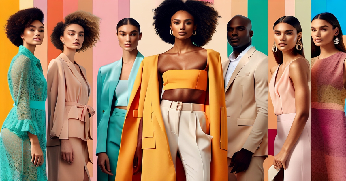
Match summer colors to your undertone — warm, cool, or neutral — to achieve a clean, bright appearance without heavy lifting. Consult a summer color palette chart to identify shades categorized by temperature (warm vs cool), value (light vs dark), and chroma (soft vs vivid).
Which shade is best for you depends on your skin surface color, undertone, value and contrast levels with your hair and eyes. Adjust intensity: go lighter and softer for low contrast, clearer and deeper for high contrast. Seasonal color analysis helps: your natural look can sit in sub-types based on temperature, value, and chroma.
Warm undertones
Opt for golden or peachy based hues. Coral, apricot, warm beige, camel, honey, soft yellows, tomato red and terracotta all evoke a sun-lit glow. Olive green, warm teal and marigold come across as vibrant in summer light, particularly on linen, cotton and silk.
Ditch frosty blues, harsh black-and-white, and icy purples – they'll mute your warmth. If you adore them, soften the edge with a warm neutral like sand or caramel by the face.
Gold jewelry finishes the palette. Think skinny hoops, a dainty pendant or a brushed gold cuff. Tortoiseshell frames and warm leather sandals provide a subtle connection.
Rely on earthy summer neutrals–oatmeal, latte, sesame, and clay–to root bright pieces. A clay skirt with coral top, or warm beige shorts under a striped saffron shirt, looks so polished and easy.
Cool undertones
Choose cool summer colors with blue bases. Powder blue, lavender, mint green, seafoam, and blue greens compliment cool skin. Most cool blues photograph well—from the palest powder blue to deep navy—so a navy dress or sky-blue shirt is a sure bet.
Soft white, rose beige, taupe, rose brown and pretty pinks – berry, fuchsia, orchid, and a clear watermelon red – look crisp and fresh. Cool summer skin tones possess blue undertones, which are usually clear with a fine, silvery appearance.
If you've got medium to dark brown or even black hair, that contrast gives you the freedom to manage cooler, clearer shades at greater depth, such as cobalt or cherry. Skip the orange ones—pumpkin, paprika, rust—they wash you out. If you have to, keep them off the face.
Mix cool hues with clean whites for an updated edge. A mint shirt with white trousers, or lavender with soft white, plays clean and light.
Neutral undertones
You can do warm and cool, but balanced. Concentrate on muted middle ground color—dusty rose, cedar, mist blue, soft teals, gentle beiges, light grays. They perform well together and won't pull too warm or too cool.
Construct outfits with mix-and-match simplicity. A mist-blue tee, light gray shorts and tan sandals. Or soft teal with oatmeal and a hushed stripe. Keep saturation medium, then tone up or tone down brightness based on your contrast.
Pastels come in handy in heat. Go for pale peach, buttercream or fog lavender for lift without glare.
Mix in silver and gold accessories. Mixed metals on one wrist or a watch with a two-tone band keep things interchangeable.
What colors to avoid
Certain true summer colours battle the season. Heat, glare, and cool summer skin tone all factor in — so crop thoughtfully, not by a formula.
Dark solids
Black, charcoal and deep navy absorb heat and increase surface temperature, which can make your afternoon walk or packed train ride feel denser. Certain folks experience more sweat and irritation in dark tees and pants under intense sun.
If you follow seasonal color analysis, black can be too harsh on True Summer and Cool Summer types; it can appear jarring or flat next to their cooler undertones. Save your dark pieces for dinner — parties, air‑conditioned offices or cooler nights when a little extra warmth is appreciated.
A black slip dress at dusk or deep navy trousers post-sunset can appear sleek without the midday heat tax. Swap daytime staples for lighter versions: stone chinos over ink blue, sky‑blue shirts over charcoal, sand or dove sneakers over black.
If you love depth, use it lightly–dark belts, watch straps, or sunglasses keep the look grounded without dulling the outfit.
Heavy saturation
High‑chroma hues — fire‑engine red, neon green, electric cobalt — ricochet in bright light and can get boisterous. On humid days, that visual intensity can be exhausting and distract from your face.
Pick softened takes on favorite hues: water‑blue instead of cobalt, coral‑rose instead of neon orange, eucalyptus instead of acid lime. You preserve the mojo, just with simplified donning.
When you do opt for a punchy color, give it space to breathe. Team a saturated skirt with a white linen shirt, or a bold tee with oat or pebble shorts. The white space soothes the appearance and enhances readability.
Use saturated colors as highlights. A bright bag, scarf or sandals add spark without making the outfit a heat magnet.
Muted grays
Dull, mid grays can appear flat in the summer glare and can retain more heat than some very light tones. They can wash out complexions, particularly in direct sunlight.
Opt for light gray or gentle silver instead. These read light, reflect even more light, and go perfectly with breezy fabrics like linen or voile.
If gray is your foundation, bring life around the facial area. Think light teal, seafoam or soft raspberry to elevate the spirit. Cool Summer and True Summer should avoid grays with yellow or golden casts.
They clash with cool undertones and can look muddy. Reserve gray‑heavy ensembles for the occasional cooler day in high summer. Opt instead for the type of icy pastels, cool blues, and misty lavenders that flatter summer types.
- Black, charcoal, deep navy (daytime)
- Neon green, hot pink, fire‑engine red
- Mid, muted grays with yellow cast
- Heavy, saturated blocks without white space
Transparency Warning: When shopping for the best colors for summer outfits — think butter yellow, Cloud Dancer white, or soft pastels — always run a quick transparency test before you buy. Hold the fabric up to a light source or, if ordering online, check verified buyer photos in natural daylight. Fast-fashion linen and lightweight cotton in pale summer colours for clothes are notorious offenders: what looks opaque on a product photo can turn completely see-through the moment you step outside. Reddit's r/fashionadvice is full of frustrated shoppers who received "sheer" whites and washed-out pastels that were unwearable without a slip underneath. If you're after cool summer clothing colors like sage green or pale pink and can't inspect the fabric in person, filter reviews by photos, look for a thread count or GSM rating above 120 g/m², and don't hesitate to return anything that fails the light test. Finding the current best summertime shade for muted summer tones means nothing if the garment is too sheer to wear confidently.
Notes for summer color types: Black is often too harsh for True Summer, though it can work in small amounts (especially on the bottom) when balanced with a True Summer color near the face. Warm and vibrant, and anything overly yellow or golden, generally swamp Cool Summer and True Summer colorings– softer, cooler hues are usually better.
Building your summer palette
Customize these to build your summer palette — a collection of cool, light and muted shades that compliment your undertone, compliment your lifestyle and compliment your heat and light variety.
Check three things: temperature (cool to warm), value (light to dark), and chroma (soft to bright) of your hair, skin, and eyes. Summer types—soft summer, true summer, light summer, sunlit summer, moonlit summer and calm summer—tilt cool and gentle.
A lot of people find black a bit too severe, particularly around the face, so trade it out for slate, charcoal mist, or deep navy. If your look is muted with ashy hair (dark ash blonde – light ash brown) you might be a soft summer—misti lilac, dusty sky, taupe.
True summer skews coolest: blue, beige, or pink undertones shine in seafoam, powder blue, and rosy pink that make eyes stand out. In hot, bright climes, select breathable fabrics and lighter values. In milder locales, introduce mid-tones such as soft teal or pewter.
The 70/20/10 rule
- 70% base: Stock light neutrals for daily wear. Think cool off-whites, pearl gray, stone, dove and light navy. These mix quickly, keep looks cool, and brave heat. I'm talking tees, shirts, pants, skirts and light knits.
- 20% secondary: Choose gentle summer colors that echo your type. Soft summers do muted sage, faded denim, mauve and mushroom. True summers are cooler with glacier blue, eucalyptus and blue-based pinks. They bring in the intrigue without the clutter.
- 10% accents: Use small hits of bold (but still cool) color to show mood. Mix up the typical neon with berry, marine blue or icy fuchsia. Leave your accents in belts, sandals, light scarves or one top.
- Apply it week by week: Lay out seven looks. 5 outfits built on neutrals, 1 with a secondary-color hero piece, 1 with a bright accent. Track what you repeat – polish the blend next week.
Print and pattern
Add florals, stripes or geometric motifs on cool grounded bases such as ivory, mist gray or pale navy. Pick prints that sit within your palette: dusty sky blue stripes, soft rose sprigs, eucalyptus dots.
Pair a printed skirt with a stone tee, or a striped tee with slate shorts. Keep soft contrast. When in doubt, print on print, one at a time.
FLIP through the pages to find your base color selections. If it contains three of your go to shades, it will go with the majority of your wardrobe and reduce getting dressed time.
Not into a printed dress? Try a patterned headband, canvas tote, or soft-check scarf to experiment with colors with minimal risk.
Accessorize wisely
Then pair those with sunglasses/hats/bags in chill soft tones complementing your base. Pale gray frames, sand or dove bucket hats and light navy crossbodies work in sun and shade.
Accent color with a linen scarf, enamel studs or slim belt in berry or icy pink. Match metals to undertone.
Cool skin tends to photograph best with silver, rhodium, or white gold. Rotate pieces by week: swap bag color, switch hat shape, change scarf hue, and your base outfits feel new.
Conclusion
In choosing colors for summer, rely on light colors which reflect heat. Whites, soft blues, pale yellow and mint do real work in sun. They are cool they just feel. They appear new. Dark colors absorb heat quickly. Reserve them for late.
To dress for skintone, match warmth or cool notes, but remain flowy. Soft coral tees can elevate warm skin. Light lilac shirts can soothe cool skin. For your gear, opt for airy weaves in cotton or linen. A loose white shirt and tan shorts FAR. A pale blue dress and sand flats seem effortless.
To test your picks, step in bright light and notice the change. Ready to construct your own set? Post two staples and one bold pop you want to experiment with.
Frequently Asked Questions
What colors keep you coolest in summer?
Light colors, such as whites, ivories, and soft neutrals, bounce heat effectively, making them ideal for summer wardrobes. Pair these with breathable fabrics like cotton or linen for the coolest summer attire.
Why do dark colors feel hotter in the sun?
Dark colors capture more visible and infrared light, but light colors, especially cool summer colours, reflect more light and help keep your skin cooler in summer attire.
Are bright colors good for summer heat?
Yes, a lot of bright summer colours reflect. Think lemon yellow, aqua, sky blue, coral, or lavender. They feel alive and remain quite cool, particularly in lighter colors and breathable fabrics.
What colors work for all skin tones in summer?
Opt for versatile neutrals and mid-tones like soft white, sand, dove gray, navy blue, sage, and muted blue from the true summer palette. These hues complement most complexions and blend effortlessly into a summer wardrobe.
Which colors should I avoid in extreme heat?
Steer clear of pure black and deep charcoal in direct sun, as these dark colors hold the heat in. Instead, choose light colors or breathable fabrics for your summer wardrobe, especially during the summer season.
Do fabric and color need to work together?
Yes. Color minimizes heat absorption, while breathable fabrics regulate air circulation and perspiration evaporation. Pair light colors with airy fibers like cotton and linen for a cool summer wardrobe.
How do I build a summer color palette that's versatile?
Start with light colors like pale neutrals (white, sand, gray) and incorporate 2–3 cool summer colours as accent colors (aqua, coral, sage). Maintain a true summer colour anchor piece (navy blue) for cohesion.