The Best Chart & Graph Color Palettes for Data Visualization
 Reviewed by Alexandra Gilmore
Key Takeaways
Default Excel color schemes are now a red flag in professional analytics — a signal that no one thought twice about the data. In 2026, the bar is higher: dashboards must pass APCA contrast thresholds (not just legacy WCAG 2.1), hold up on OLED screens without causing eye strain, and use chart color palettes that communicate hierarchy before a single label is read. An 8-color palette hits the sweet spot — enough variety to handle categorical data plots cleanly, tight enough to stay coherent across light and dark modes. When testing four distinct color palettes against a categorical data plot, 8-hue sets consistently outperform both smaller and larger ranges in legibility tests. For executive reports, the 2026 trend points firmly toward restrained, high-authority tones: Mahogany (~#C04000) and Aubergine (~#3D1B24) are emerging as the go-to chart color combination for boardroom dashboards — sophisticated, on-brand, and WCAG-compliant when paired with sufficient label contrast. Apply the 60-30-10 rule in data visualization to structure these palettes: 60% neutral background, 30% primary data color, 10% accent for critical callouts. The result is a chart color scheme that guides the eye without shouting.
💫 Discover Your Complete Color Palette
Ready to discover all the colors that make you look radiant? Our comprehensive color analysis will reveal your complete personal palette - perfect for hair, makeup, and wardrobe decisions.
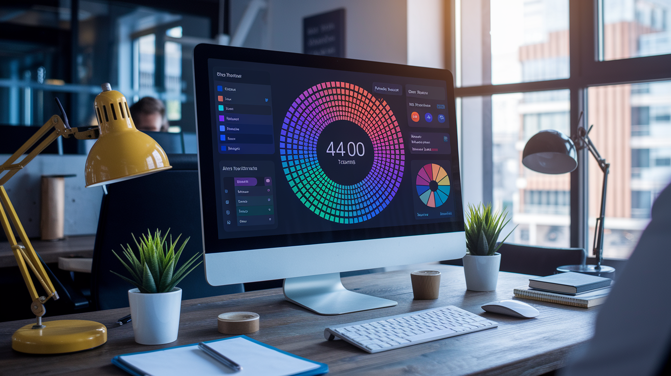
Build My Palette →Construct your palette starting from a base color, then carefully extend with help from a color wheel or color generator, and finally try out over chart types. Save and record your options to maintain consistency for later projects.
Use basic color theory and psychology for direction, using RGB or HSL as a reference. Select schemes such as monochromatic, analogous, triadic or tetradic to lend structure and reflect your message.
Designing the best colors for graphs means going beyond aesthetics — it demands rigorous, standards-driven contrast testing. Don't rely solely on legacy WCAG 2.1 ratios (4.5:1 for normal text): for professional OLED dashboards and modern data visualization, run a dual audit using both WCAG for legal compliance and APCA (Advanced Perceptual Contrast Algorithm) for real-world readability. APCA accounts for font weight and size — requiring Lc 75 for small body labels but allowing Lc 45 for large bold headings — making it far more precise than a flat contrast ratio. Test every palette in grayscale and through colorblind simulators, then reinforce critical data points with patterns, dashes, or symbols to eliminate red-green dependence entirely.
With the color combination chart you can rapidly choose sequential, diverging, or categorical palettes for particular data tasks. Make sequential palettes perceptually uniform, diverging palettes balanced around a neutral midpoint, and categorical sets <8 colors.
Think motion with animatable themes and states, systems that travel across devices. Try it on a test performance and for comfort, export in various formats, keep your master palette file handy for quick changes.
A collection of eight curated colors to establish a distinct, unified visual identity. Designers use it to set primary, secondary, and accent roles, keep contrast above 4.5:1 for text, and maintain brand tone across web and print.
A well-balanced set tends to have one dark, one light, two neutrals, and four accents. To go from theory to practice, the sections below provide examples, hex codes, and use cases.
📚 Recent Articles
Why an 8 color palette?
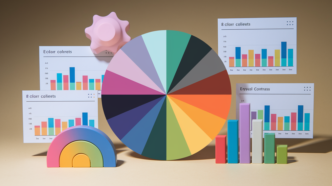
An 8 color palette hits a convenient middle ground, serving as an effective color palette collection. It provides enough breadth to convey meaning while remaining compact enough to direct the eye and maintain message clarity. In data and product work, it keeps teams moving fast, quality high, and visual noise low.
Eight colors strike a nice balance between variety and clarity for charts, maps, and UI states. You get room for key roles: primary, secondary, accent, success, warning, danger, info, and neutral. In an 8 color palette, each category bar in a chart reads as different on sight without vying for dominance, making it an ideal choice for unique color palette creation.
On an interface, eight swatches allow you to delineate states and emphasis without slipping into near-duplicates. This is where many large palettes fail: too many hues, minor shifts, and no hierarchy. With 8, you can give each color a job and keep things organized across pages and across your team.
For categorical data, 8 is a good ceiling before confusion kicks in. Most humans can keep track of 7-9 things in a legend, assuming they are clearly labeled and the hues are evenly spaced. Use hue for category differences and keep lightness consistent so one category doesn't accidentally look "more important.
For instance, a revenue dashboard can map eight business units with different colors, then depend on line weight or shape for additional splits. If you have more than eight categories, club the long tail and use filters or add patterns for print, ensuring your computer color palette remains effective.
Accessibility wins are tangible with eight. Fewer hues mean you can test every pair for contrast and colorblind-safe combinations. Try for a combination of colors that contrast when viewed by someone with deuteranopia or protanopia. Pair color with a second signal—icons, patterns, or labels—so the communication persists when color doesn't.
This is easier to cope with in an 8 color consistent swatch than in a sprawling set. You can maintain high contrast ratios by reserving a dark neutral for text on light backgrounds and a light neutral for dark themes, enhancing your color display capabilities.
Dashboards, graphs, and small visualizations in particular win the most. Eight colors assist in keeping things harmonious, prevent legend sprawl, and lower cognitive load. Get away from an 8 color palette – start with a base set of 8, then define tonal steps for states and hover.
Crafting your graph color palette
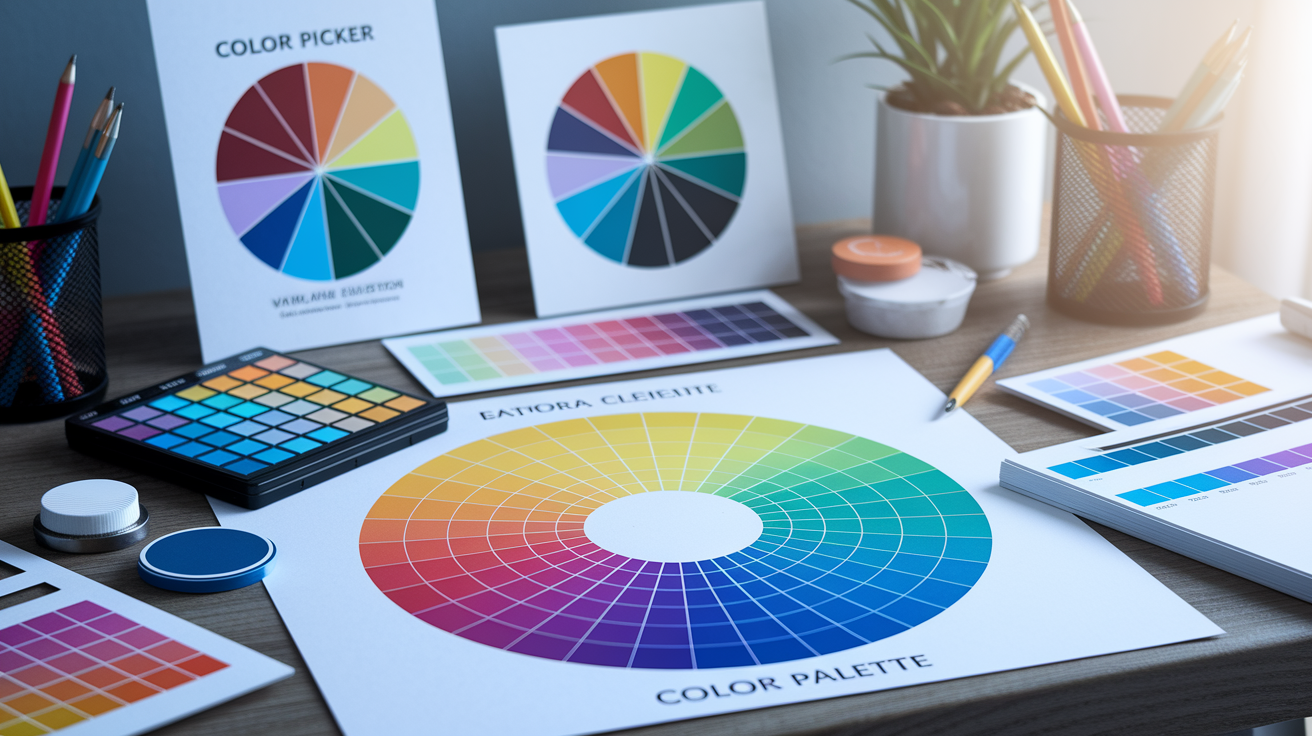
Designing your graph color scheme Work outward to seven companions that fit your data type: categorical, sequential, or diverging. For **graph color palettes**: pull ideas with a random palette generator or image color picker, then refine in a color picker that shows HSL and RGB.
Try it against bar, line, and area charts for conflicts. About: Designing your graph color palette Save hex codes and usage notes so your next chart reads consistent.
1. Foundational theory
With the color wheel (360° sweep) to map relationships. Complementary hues sit opposite, analogous near, triadic and tetradic stable triangles and rectangles. This provides you with quick guidelines for balance and contrast.
Choose an HSL base so you can easily create tints, shades, and tones with small lightness and saturation adjustments. From a single color, you can construct an entire palette for lines, fills and accents.
Color psychology is important. Blues read calm and reliable. Greens seem organic and stable. Reds are alerts. Select hues that fit message and audience.
Familiar with scheme kinds. Monochromatic for focus, analogous for soft flow, triadic for punch, tetradic for breadth. Then map them to data classes: categorical (distinct labels), sequential (ordered low-to-high), diverging (two sides of a center).
2. Visual harmony
Position colors so the eye flows naturally. Cluster proximity tones or comparable saturation to maintain clean flow.
Add depth with lightness steps, not additional hues. A bright mid tone for lines, a lighter fill, a darker outline can give a bit of structure without noise.
Devise a table of quick complementary pairs—e.g., blue 210°/orange 30°, teal 180°/coral 10°. Have 3–4 trusted pairs in your arsenal.
3. Functional contrast
Provide strong contrast between data marks, gridlines and backgrounds so labels pop and small markers don't get lost.
Employ contrast checkers for text and icons on colored backgrounds. Grayscale test and target a 15–30% saturation/lightness gap so differences persist without hue cues.
Have both light and dark choices to work on light or dark backgrounds.
4. Universal accessibility
Design for color blindness. Test your set with Viz Palette or a simulator, and tweak until all series remain distinct.
Always reinforce chart color combinations with patterns, textures, or icons for critical data points. The red–green trap is no longer just a best practice issue — leading global organizations have outright banned red/green success/failure indicators in their design systems. For any professional dashboard, the only credible chart color palette choices are blue–orange (#1f77b4 / #ff7f0e) or purple–green: these best chart color combinations remain distinguishable for the 8% of users with color vision deficiency and hold up across both light and dark mode displays.
Provide a second accessible theme and save both in your style guide.
5. Psychological impact
Color guides emotion and reading sequence. Enter your graph color palette.
Match brand where it aids, but remember function comes first. Define each palette color's purpose and significance so teammates use them consistently.
The colour combination chart
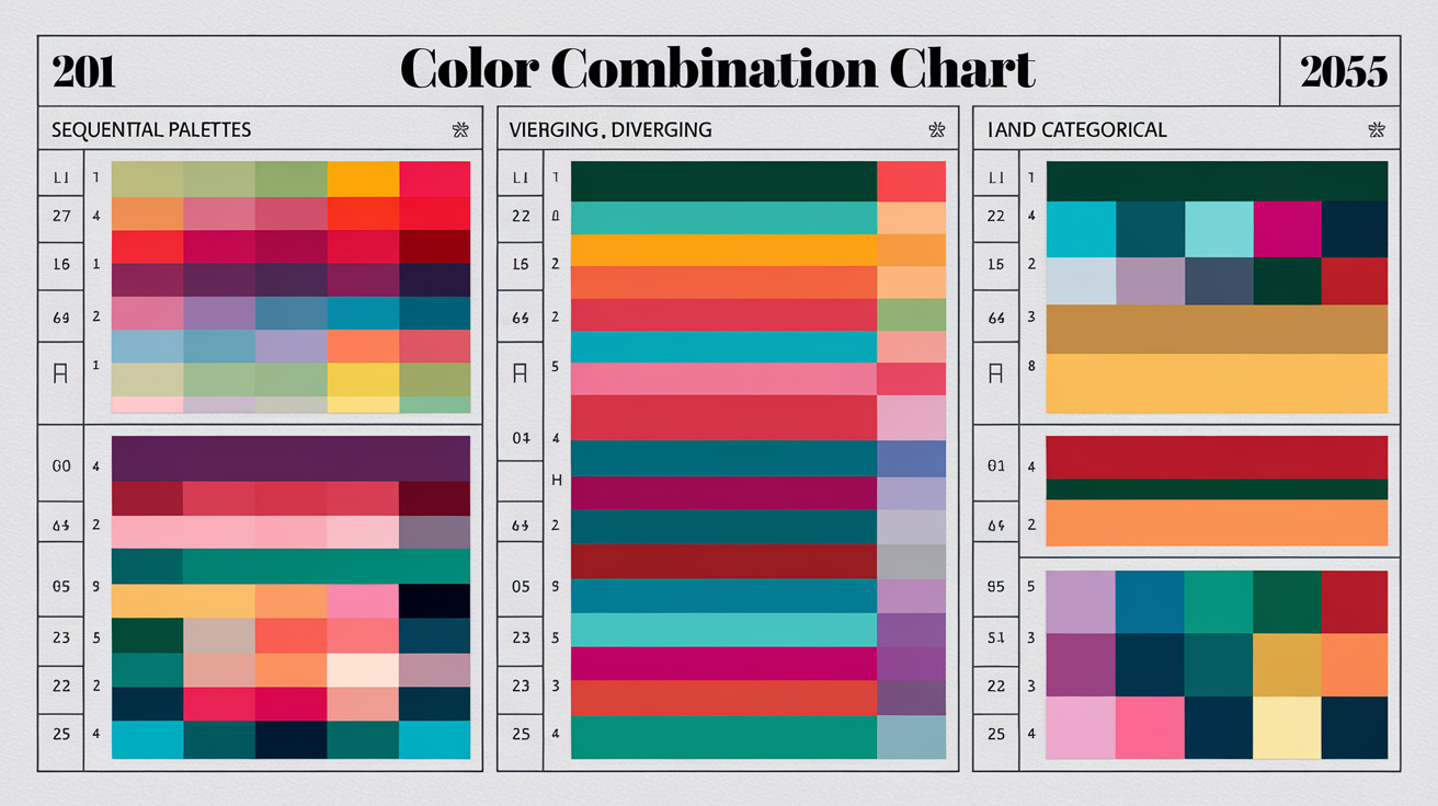
A **colour combination chart** is a quick, trusted guide to creating an 8‑colour palette that sticks together in a squeeze. It charts out which colors go together, why they go together and where to apply them. It can include monochromatic, analogous, and triadic schemes, along with harmony types for data work: sequential, diverging, and categorical.
Use it to pair mood with message—sunny blues and pinks for an airy vibe, warm pastels inspired by coastal villages, or earthy hues to reflect desert stone. Keep it nearby — printed at A4 or saved as a digital board — so you can choose combinations that honour the 60‑30‑10 rule and lock in a consistent visual identity across screen and print. In data visualization, the 60‑30‑10 principle is just as powerful: your dominant neutral anchors the canvas, a secondary chart color carries the structural weight, and a punchy accent drives attention to the insight that matters most. Modern BI workflows take this further — Figma Variables and design tokens let teams encode the entire chart color palette once and switch between light and dark modes automatically, so the best chart colors you've chosen always render with the right contrast, whether on a bright monitor or an OLED dashboard at night.
Sequential palettes
Sequential palettes run light to dark in one smooth sweep, making them perfect for ordered or quantitative information. One hue, many tones. The aim is to display more or less, not various types.
Choose one base color—teal, for example—and adjust lightness, then saturation. Shoot for about six perceptual steps if you require fine detail. Two accent steps for highlights and outliers.
Utilize them for heat maps denoting intensity, bars following growth per year or lines ebbing and flowing across time. Maintain labels dark on light steps and reversed on dark steps.
Test for perceptual uniformity. Click to convert to grayscale and check value jumps, preview on light or dark backgrounds, and run a quick color vision deficiency simulation. Uneven steps can feign trends, so slice banding before you post.
Diverging palettes
Diverging palettes employ two different colors that converge at a neutral midpoint, allowing the eye to identify orientation and separation from a center. This allows extremes to pop without losing track of the balance around zero.
They shine when you chart variance from a baseline: anomalies in scientific studies, positive vs. Negative change, or temperature maps with a known average.
Select end points with strong contrast–deep blue vs. Rust red is a dependable combo–and select a midpoint that is calm and clean, such as light gray or pale sand. Steer clear of a stop in the middle that contends with the information.
Shift the center point to fit your background or theme. On a dark UI, elevate the center to a gentle, cool gray. On warm layouts, a soft beige reads fresh.
Categorical palettes
Categorical palettes give different colors to different categories. Each colour has to be distinct at a glance and remain readable in tiny marks.
Restrict to 8 or less for pies, stacked bars or node maps. Additional colours add clutter and impede reading speed.
Pick hues with clear spacing: cyan, orange, violet, lime, ruby, indigo, gold, slate. Throw in some classic combinations—light aqua and gold—when you crave a sophisticated hue, or embrace strong, mismatched duos for creative designs.
Verify access. Use color‑blind simulators, boost line and small text contrast, and include shapes and textures in legends. Tie choices back to mood: playful Easter‑candy blues and pinks for light topics; earth and clay for grounded themes. Use the chart to key a cohesive identity across slides, reports and apps.
Common pitfalls to avoid

An 8-color palette offers diversity within a beautiful color palette collection, but it increases danger, often eroding transparency and usability.
Warn against using too many colors, which can overwhelm viewers and reduce data clarity.
Eight slots does not equal eight even stars! If every color screams, no one listens to the message. Go with a core set—2-3 primaries for structure, 2 accents for highlights and the rest as quiet support.
On dashboards, use one color per data group only where the groups really count – otherwise, combine small groups and display them with shades. In maps, leave neutral land and grid lines so data colors hold the power.
Clutter emerges as blaring legends, cluttered heatmaps and pie charts with slices that resemble confetti. A leaner mix accelerates scan time, reduces error frequency and makes patterns jump out.
Advise avoiding low-contrast color combinations that hinder readability and interpretation.
Low contrast is a silent throat punch. Pale gray labels on a light background, or red on green, make users squint and guess. Verify contrast using a tool and target ratios that pass accessibility standards–this assists all users, not just those with low vision.
Pure black on pure white creates harsh contrast that strains the eye during extended viewing. For the best colors for charts in 2026, consider swapping pure black for Moonlit Grey (#2F353B) — now widely adopted as the industry standard background for financial dashboards and dark-mode data visualization. It reduces OLED burn-in risk, cuts eye fatigue on long sessions, and pairs beautifully with high-luminance accent colors that pass APCA contrast thresholds (Lc >75). When two colors sit next to each other — as bars in a chart, for example — make sure they differ not only in hue, but also in lightness, so the distinction holds for colorblind users and in low-light environments alike.
Multiple close shades of one color tend to battle each other, creating visual discord. Space them in lightness increments, or convert one to a different color!
Caution against relying solely on color to convey information, especially for accessibility reasons.
Color-only indicators leave out colorblind users and those looking in glare or on black and white print. Pair color with a second cue: patterns in bars, varied line styles, icons, labels, or direct value tags.
For alerts, pair color with icons and brief text ("Error," "Paused"). In forms, don't just highlight errors in red — add an icon and copy. Test it in dim light, in bright light, on other screens — colors skew with ambient light, with materials, with finishes — it can get muted or blown out.
Highlight the risk of inconsistent color usage across different charts or dashboards, which can confuse users.
If blue equals revenue in one chart and then users in the next, trust plummets. Establish a color key early and reuse it between views. Set tints for states (hover, active, disabled) and be consistent.
Verify harmony across the set, disregard harmony rules and the palette feels off. Tune for season or context when required—muted shades in a formal report, sparklier colors for a spring campaign—but keep the base mappings consistent.
Beyond the static: dynamic palettes
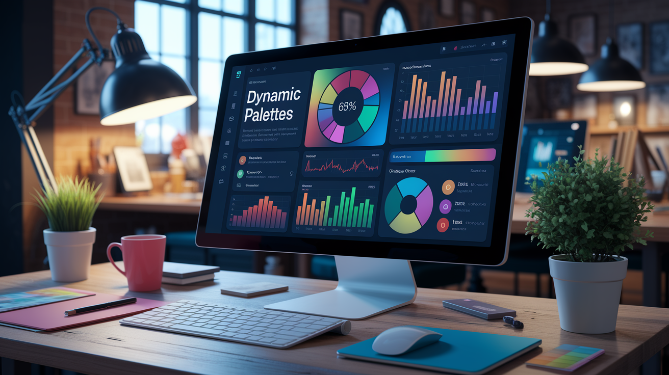
Dynamic palettes change color based on user input or live data. They make eight **color systems** feel cozy and organic by segmenting colors into a rabid flow, then shifting shades, tints and tones as states/values shift. They suit dashboards and streaming charts, where a 60-30-10 balance keeps focus while accents move with the story.
Construct from a foundation hue, test contrast, capture rationale and the experience remains uniform across devices.
Animatable themes
Animatable themes gently transition viewers from one state to the next, so a rising chart can drift from a light teal over to a deeper blue, then into a soothing navy. Utilizing a random color palette generator can enhance this experience by offering a beautiful color palette collection that maintains smooth hue steps, preventing the eye from jumping and keeping the design legible in motion while supporting hierarchy without visual clutter.
A mere eight-color ramp can still seem deep when tones move in small, steady increments. Think lightweight animation libraries or CSS transitions for color changes associated with data updates, hovers, or threshold alerts. By integrating full RGB palettes, you can ensure that your designs remain vibrant and engaging.
Instead of raw hex values, map each data state to a token, then animate the token swap. Short easing curves and 150–300 ms durations work well for subtle shifts. Let harmony and accessibility be your guiding stars.
Fix neutrals, limit saturation, and maintain contrast ranges during animation. Test WCAG ratios at both sides of a transition, not just the resting state. Experiment on real data. Don't let your volatile feeds flicker too fast by throttling updates.
Provide 'reduce motion' support, and revert to instantaneous swaps where people like less animation.
Interactive states
Interactive states are color changes triggered by user actions: hover, press, select, filter, focus, or disable. They assist users in identifying where to click and what's active without hijacking attention from the data.
Design unambiguous signals. Active bars could become a darker shade. Certain pieces could get a special accent stroke. Disabled controls go low-contrast but readable. Maintain signal across views.
Employ subtle increments of luminosity or saturation to signify interactivity. +8% brightness on hover, -6% brightness on pressed, 2 px accent ring on focus — easy, repeatable rules. This maintains the base scheme quiet.
Document a table of state tokens: base, hover, active, selected, focus, disabled, alert-high, alert-low. With hex, RGB and thresholds. Check with color-blind simulators and ratios hold during state shifts.
Portable systems
No palette dumps. No palettes that only work on one device or another–phones, laptops, TVs, projectors. Wide-gamut screens can oversaturate, while older panels desaturate reds and blues. Schedule boundaries to keep intent intact.
Test your 8 colors on popular browsers and platforms. See it in light and dark themes, in bright sun and dim rooms. Print a sample – make sure that tints and tones still read as distinct.
Export anywhere — hex for design tools, RGB/HSLA for CSS and SCSS variables or JSON tokens for apps. Add CMYK for print. Maintain a master palette file with roles and ramps and usage notes.
Include them with variants for monochrome, complementary and triadic modes selected using color wheel logic, each mapped to a 60-30-10 split for consistent flow.
My perspective on future trends
A close 8 color palette, part of a beautiful color palette collection, will maintain its cutting edge by combining inclusiveness, cultural sensitivity, and more intelligent technology. This move away from Y2K pastels to deeper, grounded tones is a response to actual demand for clarity, contrast, and mood across displays and spaces.
Predict increased demand for adaptive and accessible color palettes in data visualization and UI design.
There will be more palettes designed, above all, for legibility. Which means bold light–dark duos, verified contrast ratios and distinctive focus states. An 8 color set will likely split into roles: 2 neutrals for text and surfaces, 3 data hues for categories, 1 highlight, 1 alert, and 1 success.
Deep mahogany and aubergine tones are redefining the chart color palette for executive dashboards in 2026, displacing flat midtone blues that struggle to hold contrast across light and dark environments. These rich earth-tones — think mahogany (~#C04000) paired with aubergine (~#3D1B24) — directly address the dashboard fatigue flagged in G2 and Capterra reviews, where oversaturated, uniform interfaces left analysts visually drained. Moonlit Grey (#2F353B) works as a composed neutral backdrop that lets bold accent colors breathe and stand out. Burnt orange serves as a high-visibility callout that users locate instantly, while desaturated earthy greens and browns anchor dark themes with a sense of professional weight. When building your chart color combinations, pair these tones with APCA-validated contrast (Lc >60 for dark mode labels) to ensure readability holds up on OLED screens and in print alike.
Adaptive systems will exchange swatches by mode, ambient light, and user preferences, not by brand fancy.
Anticipate broader integration of AI-powered color palette generators for personalized and context-aware themes.
AI will read content, time of day and device to dynamically fine tune an 8 color set. It can suggest alternatives for low-vision users, minimize flicker hazard, and highlight low contrast prior to transfer.
It'll localize tone–for example, recommending aubergine or plum accents where bold, ceremonial color is embraced, or softer moonlit greys in more formal settings. As designers gesture beyond soft greens and blues, AI will curate complicated muddier pinks, purples, greens and yellows with earthy bases – maintaining nuance while preserving hierarchy.
Guardrails still matter: lock roles, set minimum contrast rules, and log changes for audit.
Foresee greater emphasis on color harmony and psychological impact in business dashboard color palettes.
Dashboards require peace, peace first, impact second. Rich, warm umber and ochre tones can make long work sessions feel cocooned and restful, instead of exhausting.
Take moonlit grey as your base, then paint earthy browns for axes and labels, aubergine for secondary data and burnt orange for key alerts. Sub out midtone blues for deeper navy-plum mixes to prevent washout over big tables give these a try!
In practice: 3 neutral values for structure, 3 rich hues for categories, 1 warm accent for action, 1 cool accent for contrast.
Recommend staying updated on color trends and evolving best practices to maintain effective and modern visualizations.
Follow trend reports for the year, but A/B test with actual users. Build a small reference library: mahogany and aubergine swatches for depth, ochre for warmth, moonlit grey sets for base layers, and a bold burnt orange for emphasis.
Reload palettes every quarter, audit metrics, do a quick A/B test and refine roles pre-shipping.
Conclusion
An 8 color palette strikes the right balance. Sufficient scope. Bright labels. Fresh style. Teams ship quicker with less mix-ups. Charts look slick on small screens. Legends live brief. They see change immediately.
To build credibility, keep your chart color schemes consistent across screens and presentations. Anchor each visual with one bold accent color, let soft hues carry the background, and always run a contrast check — ideally a dual audit using both WCAG 2.1 and APCA, which better reflects real-world readability across varying font weights and dark-mode dashboards. Speaking of dark mode: test your chart color palette against a dark background before shipping. Swap any red–green success/failure pair for a blue–orange combination (#1f77b4 / #ff7f0e) and add text labels or pattern fills to cover colorblind users. When you need proven best colors for charts fast, reach for Tol Bright or Okabe–Ito — both scale cleanly across categorical data. And for scientific heatmaps, stop guessing: Viridis has become the default for the vast majority of heatmap workflows precisely because it is perceptually uniform, colorblind-safe, and prints well. Use what works.
To advance next, select your 8, secure identities and establish guidelines. Post a swatch file. Do a rapid user check. Drop me a note if you need a hand tuning the set.
Frequently Asked Questions
What is an 8 color palette and why use it?
It strikes the right balance between diversity and simplicity, much like a beautiful color palette collection. This approach provides just enough category for charts without inundating viewers, boosting readability and accessibility across dashboards and reports.
How do I craft an effective 8 color palette for graphs?
Beginning with your brand's main color, utilize a random color palette generator to add complementary hues with obvious contrast. Ensure sufficient luminance contrast and check for color-blindness with simulators. Set roles: main, secondary, highlight, and alert while testing over various backgrounds and screens.
What makes a good color combination chart?
It displays duos or ensembles in harmony, utilizing a beautiful color palette collection. It identifies color roles and contrast ratios while offering a random color palette generator for quick browsing and implementation, sidestepping muddling near-duplicates.
How can I ensure accessibility in my palette?
Verify contrast ratios, particularly for text on color, aiming for WCAG AA+. Incorporate patterns, icons, or line styles alongside colors from a beautiful color palette collection. Check red–green and blue–yellow using a random color palette generator.
What pitfalls should I avoid with 8-color schemes?
Stay away from low contrast and excessive saturated colors in your color palette collection, and avoid cultural color clashes. Don't use color as the only encoding of meaning, and ensure to save hex values for your designs.
How do dynamic palettes improve data visuals?
Dynamic palettes, such as a random color palette generator, personalize colors depending on data ranges, themes, or user preferences. They embrace light/dark mode, emphasize outliers, and expand to additional categories while maintaining visual consistency.
What future trends should I watch in color palettes?
Think snazzy, adaptive palettes powered by design tokens and a random color palette generator. More accessibility-first defaults enhance color display capabilities. Cross-platform, from web to mobile to print, with a beautiful color palette collection for reliable contrast and harmony.