Understanding the Clear Color Season: A Complete Guide

Key Takeaways
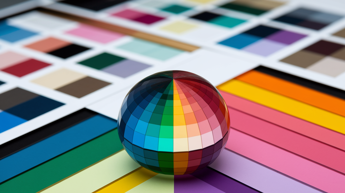
In 2026, owning a bright clear color palette isn't just a style preference — it's a high-contrast lifestyle that makes you look genuinely filtered in real life. Think glass-skin energy, but for your entire wardrobe. The clear season is built on pure, fully saturated hues with zero gray dilution: razor-sharp contrast, zero muddiness, maximum luminosity. Yes, it takes effort to shop this precisely — but the instant face-lift effect of wearing your exact chroma is worth every minute spent in the fitting room. Pro tip for 2026: use your phone's camera in manual mode or a color-analysis app under 5000K daylight lighting to check whether a garment is truly high-chroma before you buy. Warm or cool, clear color analysis divides into two distinct camps — the sun-drenched corals and apple greens of warm and clear spring, and the jewel-bright fuchsias and emeralds of cool clear winter — but both demand the same uncompromising saturation that defines the clear colour palette across fashion, branding and design.
💫 Find Your Color Season
Discover which of the 12 seasons you belong to with our comprehensive seasonal color analysis. Learn your exact color type and get personalized palette recommendations.
Find My Season →Think high saturation and strong value contrast to keep colors vibrant and legible. Construct your palette with clear light, medium, and dark choices so that pairing is simple.
Try to match undertones to your palette for best results. Warm undertones gravitate toward golden, clear springs colors and cool undertones flourish with icy, jewel-bright clear winters shades.
Work clarity psychology to your benefit with bold, pure colors that convey assurance, freshness and optimism. It invigorates spirit in fashion and attracts the eye in graphic communication.
Try your fit by evaluating undertone, eye and hair contrast, and brightness. High-contrast features will often work well with clear palettes, while muted features may want to float in softer tones.
Use clear colors purposefully–brightly colored clothing, bold makeup highlights, and high-contrast screen or branding colors. Write down specific color codes and steer clear of adding some muted shade to keep it consistent.
A clear color palette is an established set of color with specific roles and contrast and usage rules to inform your design — both print and digital work. It slashes guesswork, accelerates handoff, and maintains brand signals consistent.
Typical sets consist of a base, 2-3 accents, and neutrals, all with WCAG contrast goals. Color, hex and RGB codes assist teams to work quickly.
To demonstrate practical application, the following sections outline actionable steps, tools, and examples that resonate in everyday projects.
📚 Recent Articles
What is a clear color palette
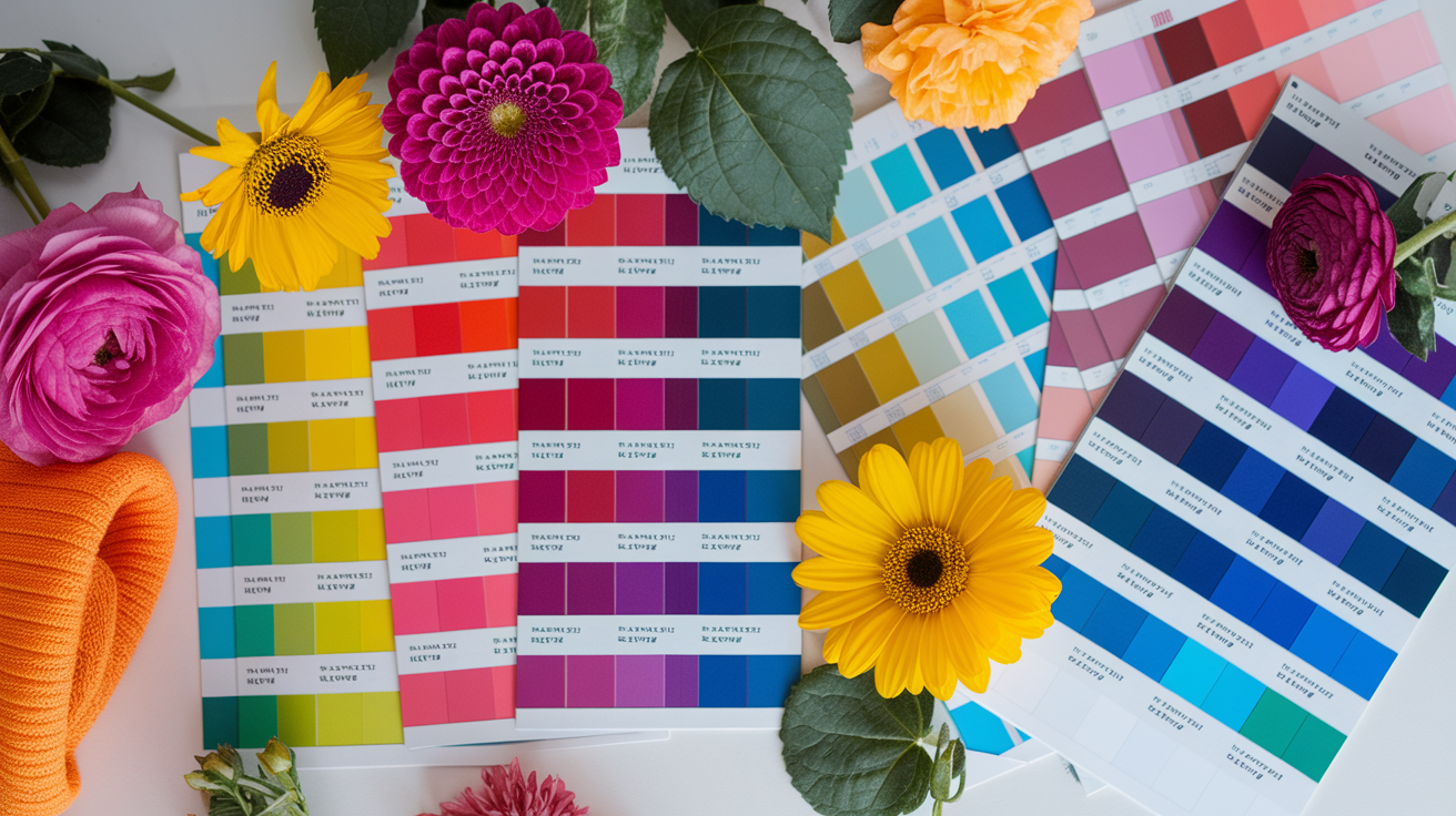
A clear color palette consists of colors that are of high chroma, or brilliant in saturation with minimal or no gray added. Colors are clean, sharp and punchy, with maximum contrast visible from a distance. This clarity underpins the high-contrast, vibrant aesthetic celebrated by clear spring and clear winter.
It enables you to build impactful graphics, assertive ensembles, and unified closets that resonate with vitality but not confusion.
1. Purity and saturation
Clear palettes use high-chroma shades—colors that are pure, not dusty or smokey. I'm talking true red, electric cobalt, emerald, hot pink, lemon yellow, lime and crisp turquoise. These shades bypass muddiness and keep edges sharp.
The high saturation makes every color pop brighter and more distinct. It enhances the 'glassiness' that folks observe in clear palettes. If it appears chalky or brown-leaning or muted, it probably violates the clear rule.
Stop second-guessing your palette — build a dedicated color season swatch card clear deck of 5–8 high-chroma solids and bring it everywhere: to the rack, the makeup counter, even your screen. Hold each swatch against stark white, then pure black. If the color stays vivid and the contrast feels electric in both tests, you're looking at a genuine clear. Want to skip the guesswork entirely? AI-driven apps like ColorWise.me offer a dedicated Clear Season filter for around $10/month — a fraction of what a stylist session costs, and far more consistent. Pair the app with a portable 5000K daylight bulb when shopping under warm store lighting, and your clear colour palette will translate perfectly from screen to shelf.
Clear palettes usually have at least one super-clear accent lip or accessory to ground the look.
2. Value and contrast
Strive for discernable light, medium, and dark steps. Couple white or near white with black, navy or deep emerald, then throw in mid-value brights like coral or apple green.
Use value contrast to frame features: a bright lip against even skin, a white shirt with a saturated jacket, a dark liner with a clear teal shadow. Low-contrast mixes—medium with medium—tend to appear flat, and in clear palettes, can come off muddy.
Create a simple value map: light (snow white, icy mint), medium (cerise, cobalt), dark (ink, bottle green). This makes pairing faster and keeps outfits grounded.
3. Warm vs. cool
Warm clear (clear spring color palette) leans golden with vibrant shades like tomato red, marigold, warm turquoise, and lime. In contrast, cool clear (clear winter types) leans blue-based, featuring colors such as fuchsia, icy cyan, true red, and sapphire. Both categories are bright, with the undertone serving as the key divide.
Experiment with different colors in metals and neutrals. If gold and cream complement your look, you may belong to the warm clears. However, if silver and optic white enhance your appearance, you likely fall into the cool clears category.
Even individuals with neutral to warm skin tones can wear clear winter brights, provided the clarity remains high. Organizing swatches by this undertone can streamline choices for clothing, makeup, or branding.
Balance is essential! Too many bright colors together can be overpowering, so ground your look with crisp neutral colors to maintain harmony.
4. The "clear" seasons
Clear spring: warm undertone, high contrast, light-secondary, warm-tertiary. Colors feel juicy and sunlit — coral, warm pink, apple green, lagoon.
Clear winter: cool undertone, razor contrast, and a clear cool color palette built on jewel and icy brights — fuchsia, sapphire, emerald, true red paired with stark white or pure black. In 2026, Transformative Teal emerges as the ultimate power move for this season: its high-saturation depth hits every note the Clear Winter demands. Steer clear of the Muted Earth tones flooding high-street rails right now — those dusty terracottas and greyed-out neutrals flatten the natural brilliance of this type, draining the face of its signature sharp luminosity.
Pair your skin, hair and eyes to the appropriate clear season for maximum impact. Clear palettes eschew muted or very dark colors, while winter anchors in deep neutrals.
Clear leans winter for most, but can borrow from light and warm spring if the hues remain pure. Anticipate trial and error, clarity being the primary dictate, with 'light' and 'warm' as subsidiary guides.
The psychology of clarity
A clean color palette depends on high chroma, clean hues, and clean lightness selections. All of these characteristics connect to the way our brains parse signals quickly. Color has three fundamentals—hue, lightness, and chroma—and all three influence our emotions and behaviors. Research demonstrates that seasonal color analysis can influence mood, alertness, and even how we evaluate people. Results shift with culture, task, and location, so context is important.
Clear colors are inspiring, evoking feelings of freshness, energy, and confidence as bright signals pierce through the clutter. A high chroma teal feels more "awake" than a muted low chroma teal. Users read that pop as fresh, secure, and raring to go. In a code, unadulterated green arrows soothe the quest for guidance, making them ideal for creating a clear winter palette.
In skincare branding, for example, a bright mint & white set can come across as clean and gentle. For a fitness app, a pure coral call-to-action on white reads buoyant and welcoming. It's not louder color, but clean color that conveys a clear purpose, which is essential when considering color combinations for effective branding.
Clarity and optimism appear when palettes maintain forms straightforward and contrasts sincere. A limited set—two vivid hues, one soft neutral—can tell a straight story: what to click, where to look, what matters now. High-contrast, pure colors scream and drag the eye first.
A saturated blue button on a pale gray background is easy to locate and easy to believe. In safety gear, acid yellow on black screams quick from afar. For wayfinding in a big venue, one high-chroma color per zone cuts mistakes.
Blue needs special attention. Research associates blue light with increased alertness and improved attention task performance. Blue light probably activates melanopsin receptors, which provide input to brain systems for arousal and focus. In the wild, a clear blue header can establish a 'focused' mood in dashboards.
In long reads, softer lightness levels mitigate glare yet maintain the alert cue. Be judicious at night, as intense blue can seem jolting—drop lightness or skew toward teal to ease. This balance is crucial for creating a clear winter wardrobe that feels comfortable and inviting.
Chroma and lightness influence mood as much as hue. As such, high chroma lifts energy, while lower chroma calms. Light backgrounds with crisp accents come across open and upbeat — dark fields with neon accents come through intense and edgy, showcasing the power of color types in design.
Red, when clear and bold, enhances ratings of dominance and aggression. Great when you require urgency in sports or alerts, dangerous in finance forms or support flows. Culture and context reshape all of it, demonstrating the importance of understanding your audience in seasonal palettes.
Test with actual users, in actual light, on actual screens.
Your clear color analysis

The clear color palette is designed for individuals with clear, crisp features that display bright colors in daylight. This seasonal color analysis helps determine if your face has high contrast, allowing for the selection of clear winter colors that complement your natural look.
Assess your natural coloring—skin tone, eye color, and hair shade—to determine if you fit a clear season type.
Begin with what you observe in a mirror by a window. Most clears have golden light to dark brown hair, which appears glossy, not muted. Skin tends to show pink undertones, even when tan, so veins appear blue, and cheeks flush readily.
Eyes are sharp: green, blue, or light brown with defined rims or spark-like flecks. When you drape a clear teal scarf near your face, your eyes pop and your skin looks smooth. Add a dusty, soft teal and your complexion flattens. That snap between clear color and your features is a powerful indication you are a clear palette person.
Evaluate your overall contrast level; high contrast between features often indicates suitability for clear palettes.
Observe the contrast between your hair, skin and eyes. If hair reads dark against fair skin, or eyes read light against deeper skin, that's high contrast. Test your face in neutral light, photograph it and transform to grayscale.
If light and dark points are far apart you wear clear well. Clear analysis folks tend to stick out because their contrasts and colors are clean. They can carry off saturated hues like emerald, cobalt and hot coral without being swamped.
Identify your undertones (warm, cool, or neutral) to select the right clear palette family.
If gold jewelry warms your skin and tomato red looks alive, you may drift Clear Spring—brilliant like Winter but warmer. Clear Spring can borrow from Light and Warm Spring as long as the colors remain glassy-clear, not dusty.
Autumn tones are a near-universal struggle for Clear types — they read heavy, muddy, and oddly aging. But here's where Clear Winter and Clear Spring diverge sharply: if silver jewelry and icy raspberry light you up, you're almost certainly leaning Clear Winter — cool-toned, high-chroma, built for razor contrast. Clear Winters genuinely own jet black; it's their power neutral. Clear Springs, however, look washed out or even lifeless in true inky black — a classic trap in clear color code color analysis. For Clear Springs, the smarter swap is "Coal" (a warm, slightly brownish-black) or "Warm Navy" — both deliver depth without the draining effect. And if you're committed to Optic White as a palette anchor, budget accordingly: keeping it genuinely bright requires optical-brightening detergents or bluing agents, typically running $12–18 per bottle — a non-negotiable upkeep cost if you want your bright clear color palette to stay luminous rather than dingy.
With makeup, keep edges crisp: vivid liner, clear gloss, bright blush. Apply bronzer lightly, as clear types do not have the deep warmth of Warm Spring or Autumn and overdoing it can look muddy.
10 key characteristics of clear types
- High contrast between features.
- Eyes look bright and glassy.
- Hair appears glossy, rarely ashy.
- Skin reads even next to saturated color.
- Best in bold, clear hues over soft ones.
- Can handle sheen and sharp prints.
- Neutrals: optic white, navy, coal-black.
- Metals: bright gold for warm, silver for cool.
- Struggle with muted, dusty palettes.
- Confidence grows as you test and learn what works.
Applying the clear palette
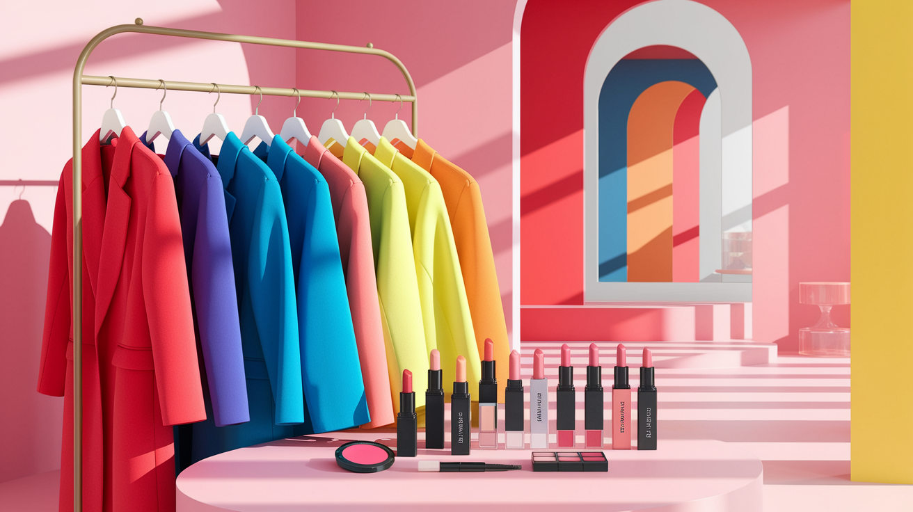
Clear palettes thrive on high contrast and pure color combinations. Target sharp borders, vibrant shades, and fresh strokes in fashion, cosmetics, interiors, and digital art. Balance is key: one very clear accent should contrast with supporting hues, ensuring the look feels sharp, not loud.
Personal style
Choose bright, clear colors in harmony with your natural contrast—cobalt, fuchsia, emerald, lemon, optic white. If your skin is neutral to warm, these shades wake up the face without appearing harsh when worn near the collar.
To take the clean palette, consider a cherry bag with a white tee and dark jeans. Sapphire studs with a navy shirt. A mango scarf over charcoal. These pieces serve as focal points and arrest the eye.
No muted, dusty, or grayish colors — they flatten Clear types and combat the palette's clean light. Black is fine on paper, but warmer coal black, or a dark greenish-gray text, reads smoother.
Checklist for shopping and styling:
- Test contrast at the face: one very clear, high-saturation color paired with a grounded neutral — this is the foundation of clear color analysis done right.
- Texture Warning: Matte fabrics are the enemy of clarity — they absorb light and kill the vibrancy that defines the clear colour palette. Understanding clear chroma meaning starts here: chroma lives in light reflection. Reach for silk, satin, or technical high-shine materials that amplify the glassy, luminous effect your coloring demands. Heathered knits and fuzzy textures belong to a different season entirely.
- Build your look over a solid bright clear color palette foundation; borrow from Light or Warm Spring only when the shade retains full clarity and punch.
- Keep intensity balanced — don't concentrate all the color power in one place. Echo a key hue in at least two spots to create visual harmony without overwhelming the look.
- Choose prints with sharp, clean edges. Watercolor washes and blurred gradients contradict everything the clear season stands for — opt for graphic, high-contrast patterns instead.
Steps to integrate clear colors into your wardrobe:
- Map core neutrals: white, coal black, ink navy, dark greenish-gray.
- Pick three hero brights (e.g., cobalt, coral, lime).
- Place a bright near the face daily.
- Repeat a small accent elsewhere for harmony.
Digital design
Grab clean, saturated RGB/Hex values. No muddy mid-tones that add gray. Make contrast count for readability, combining clear backgrounds with powerful copy to maintain clean, accessible edges.
| Color name | Hex | RGB | Pantone |
| Cobalt | #0047FF | 0,71,255 | 2728 C |
| Coral | #FF4F4F | 255,79,79 | 1788 C |
| Lime | #7DFF00 | 125,255,0 | 802 C |
| Cyan | #00D5FF | 0,213,255 | 306 C |
| Coal Black | #1A1A1A | 26,26,26 | Neutral Black C |
Brand identity
Construct palettes with a champion clear color that's easy to remember, then back it up with two brights and two neutrals for breadth across web, print, and packaging. Align hue to personality: cobalt for trust with edge, neon lime for agility, coral for friendly energy.
Record Hex/RGB/CMYK/Pantone for each asset, then brand guidelines lock usage to maintain saturation, contrast, and finish. Apply clear pairings—hero bright + coal black or white to logos and key visuals. Save a second bright for highlights so the system remains fresh, not crazy.
Makeup
Apply your 'one very clear' color contrasting – usually the lips. Bright cherry, clean coral or vivid fuchsia elevate the entire complexion. For day, select sheer shades that mirror your own color scheme. Keep edges sharp and textures dewy.
No bronzer or very infrequently – it muddy's that clarity on neutral-to-warm skin. Balance eyes, cheeks and lips so that the intensity doesn't rest in one place. Don't forget warmer coal black or deep green-gray fares better than stark black for liners and mascara.
Creating a clear color code palette
A clear winter palette tilts light, cool, and calm, showcasing a beautiful color palette that is clean and crisp. With a silvery blue undertone often referred to as 'Clear,' it screams sophistication and effortlessness, transcending seasons and complementing both warm and cool highlights.
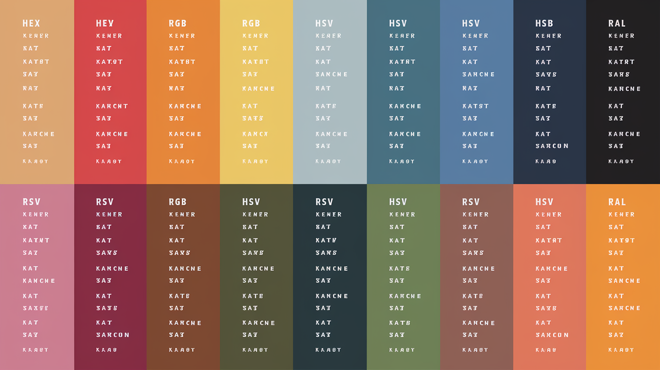
Gather and list precise color codes (Hex, RGB, CMYK, HSV, Pantone, RAL)
Begin by locking down specific codes to ensure the look remains consistent across print and screen. Five core colors work well together: Crystal, Columbia Blue, Ghost White, Bubbles, and Water, creating a beautiful color palette. Build in neutral colors and accent colors for range.
- Crystal: Hex #A7C6ED; RGB 167,198,237; CMYK 29,16,0,7; hsv(214,29%,93%) Pantone 2905 C; Not sure about RAL 5024.
- Columbia Blue: Hex #C4D8E2; RGB 196,216,226; CMYK 13,4,0,11; HSV 199°, 13%, 89% Pantone 5445 C; RAL 7038 (close)
- Ghost White: Hex #F8F8FF; RGB 248, 248, 255; CMYK 3,3,0,0; HSV 240°,3%,100%; Pantone 663 C; RAL 9016 (approximate)
- Bubbles: Hex #E7FEFF; RGB 231,254,255; CMYK 9,0,0,0; HSV 182°,9%,100%; Pantone 656 C; RAL 9003 (app.)
- Water: Hex #D9F1F2; RGB 217,241,242; CMYK 10,0,0,5; HSV 184°,10%,95%; Pantone 629 C; Here's a nice color code palette: RAL 6027 (distant)
- Oatmeal (support): Hex #D9CCB4; RGB 217,204,180; CMYK 0,6,17,15; HSV 38°,17%,85%; Pantone 7500 C
- Dark Gray Blue (support): Hex #4E5A66; RGB 78,90,102; CMYK: 24,12,0,60; HSV 210°,24%,40%; Pantone 432 C
- Deep Red (accent): Hex #8B1A1A; RGB(139,26,26); CMYK 0,81,81,45; HSV 0°,81%,55%; PANTONE 7623 C
- Deep Navy Blue (accent): Hex #0A1F44; RGB 10,31,68; CMYK 85,54,0,73; HSV 217°,85%,27%; PANTONE 296 C
Organize your palette by hue, value, and undertone for easy reference and application
Cluster cool light blues (Crystal, Columbia Blue, Water), near-whites (Ghost White, Bubbles), soft neutrals (Oatmeal), and anchors (Dark Gray Blue, Deep Navy Blue). Maintain values light for air and calm, but use Dark Gray Blue to anchor UI text, menus or jacket seams.
Notice the slight gray-blue undertone that keeps the set "clear," not pastel-sweet. This gives it the sleek, calm aesthetic associated with Clear, still connected to design and understated elegance.
Include variations such as tints, shades, and tones to expand versatility while maintaining clarity
Build three steps for each core: 20% tint for backgrounds, base for fills, 20% shade for focus. Example: Crystal at 20% tint for cards, base for charts, 20% shade for hover. Water for soft dividers, and Ghost White tints for page frames.
Maintain contrast ratios – for example, Ghost White text over Deep Navy buttons. Throw in a few pops of Deep Red to ignite energy, or Deep Navy to give a more 'masculine' vibe. Pair Clear with white or Oatmeal for a quiet, bred look; throw in Dark Gray Blue to indicate safety.
The collection remains ageless and subdued, which suits wellness applications, resort labels, or workwear collections.
Present your palette in a table or chart format for quick selection in design or wardrobe planning
Arrange swatches in rows by hue, columns by value, with codes beneath each tile for Hex and Pantone. Mark suggested roles: Background (Ghost White 100/80), Primary (Crystal base), Secondary (Water base), Neutral (Oatmeal), Text (Dark Gray Blue), Accent (Deep Red, Deep Navy).
For outfits, map layers: base (Ghost White shirt), mid (Crystal knit), outer (Dark Gray Blue coat), pop (Deep Red scarf). This echoes historic use of light grays when dyes were scarce, but imparts contemporary shine.
Although Clear is not a color, its light gray-blue tint cools the composition and establishes a measured, peaceful atmosphere.
Common clarity pitfalls
Clear color palettes, such as the clear winter palette, flourish with purity, contrast, and restraint. When those slip, the eye strains, and sense blurs. The dangers below illustrate what to steer clear of and how to repair with easy, replicable steps.
Avoid mixing clear colors with muted, muddy, or overly greyed tones that reduce vibrancy.
What goes wrong: Crisp hues lose snap when paired with dusty taupes, greige, or dulled pastels. The unspoiled color seems too sharp or even unclean in comparison.
Why it matters: Mixed chroma confuses hierarchy and mood, whether you're building a brand kit or a chart.
How to fix: Set a chroma floor—pick hues that sit in the same saturation band. If you love teal, choose an obvious teal and hold its companions equally pure, like a crisp coral and vibrant navy.
Where it shows up: Product UIs that mix neon buttons with washed backgrounds; decks that pair a vivid red with a brownish blue. For data visuals, skip murky fills — opt for pure blues, greens and oranges with even saturation so slices and bars read quick.
Steer clear of low-contrast combinations that undermine the crispness of a clear palette.
What goes wrong: bright-on-bright with close luminance, like cyan on lime, looks loud but reads soft. Another clarity pitfall is small text on mid-tone backgrounds.
Why it matters: low contrast hurts legibility and slows scan time. Users miss key points.
How to fix: test light–dark pairs. Aim for strong value steps between elements. Dark navy text on a pale mint, or white text on a deep royal blue, keeps edges sharp.
In plots, watch contrast for thin lines and small markers. Feeble contrast obscures trends. Too often it's not watching contrast at all, making charts hard to read.
Don't overlook undertones; using the wrong undertone can clash with your natural coloring or design intent.
What goes wrong: a cool, clear palette (blue base) sits next to a warm clear hue (yellow base) with no plan, and the set looks off.
Why it matters: undertones drive harmony and brand feel.
How to fix: name your bias first—cool or warm—and keep neighbors aligned. If it's cool clarity you want, try sapphire, fuchsia and emerald. For warm clarity, attempt tomato red, marigold, and teal-leaning toward green.
In dashboards, clashing undertones muddle categories; users sense the dissonance if they can articulate it.
Refrain from overcomplicating palettes—stick to a focused range of clear, pure hues for best results.
What goes wrong: too many colors signal too many meanings. Overuse causes confusion, and they get lost in charts when each line has a different color.
Why it matters: around 8% of men and 0.5% of women have color blindness. Without restraint and accessibility, they might read the data wrong.
How to fix: cap your set to two to six colors and build tints for depth. Manage your number of colors. Use a triadic scheme with one dominant and two accents to guide the eye.
Incorporate patterns or labels or icons so color vision deficiency users can still parse the story. Try it out with a simulator and make sure neighboring series contrast in both color and value.
Result: a cohesive look and faster interpretation across cultures and screens.
Conclusion
To construct a clean color palette, begin tiny, experiment quick and retain evidence. Bold colors, sharp contrast and clear spacing do the heavy lift. Bright teal with cool gray looks really sharp on the screen. Deep navy with white text remains clear at 8 pt. A cozy red for alerts trumps nebulous orange. People scan quickly, so color has to lead the eye — not battle it.
Remember actual checks. A mobile map with a clear colour palette and bold blue route saves time. A chart with one highlight tone makes the key data pop. A single-action-color form cuts drop-off.
Let’s seal the deal. Select five basic colors. For WCAG checks. Construct a communal swatch. Ship a little test. Keep on eye on the gains. Then scale cautiously.
Frequently Asked Questions
What is a clear color palette?
A clear winter palette leans on bright, high-contrast colors with cool undertones and crisp neutrals. It's not muted, but clean and vivid, showcasing vibrant hues and brilliant whites. This beautiful color palette enhances brand recognition in both digital and print formats, making it easier to connect with your audience.
How does color clarity affect psychology?
Transparent colors communicate freshness and credibility, enhancing clarity and understanding. Utilizing a clear winter palette can cut down visual noise, making user interfaces and visualizations easier to scan and trust.
How do I know if "clear" suits my brand?
Run a clarity audit: check legibility, contrast ratios, and brand tone. If your brand holds precision, innovation, and simplicity as core values, a clear winter palette of colors probably works. User testing to verify legibility and emotional impact.
How can I build a clear color code palette?
Begin with 1–2 bold brand colors, a true white, and a deep neutral, complemented by accessible accent colors from a clear winter palette. Specify HEX, RGB, and CMYK codes for effective color combinations.
What tools help with clear palette selection?
Tools like Adobe Color and Figma assist in testing contrast and harmony, ensuring accessibility in designs that utilize a vibrant color palette.
How do I apply a clear palette without overwhelming users?
Restrict to saturated colors within your clear winter palette. Apply white space liberally, and reserve one main accent color per page or section. Save bright colors for CTAs and data pops, while using neutral colors for body copy and backgrounds.
What are common clarity pitfalls to avoid?
Avoid low contrasts and too many accent colors, steering clear of overly bright backgrounds and inconsistent tints! Instead of relying solely on color to convey information, ensure readability by testing in various conditions, including bright light and across different color palettes.